
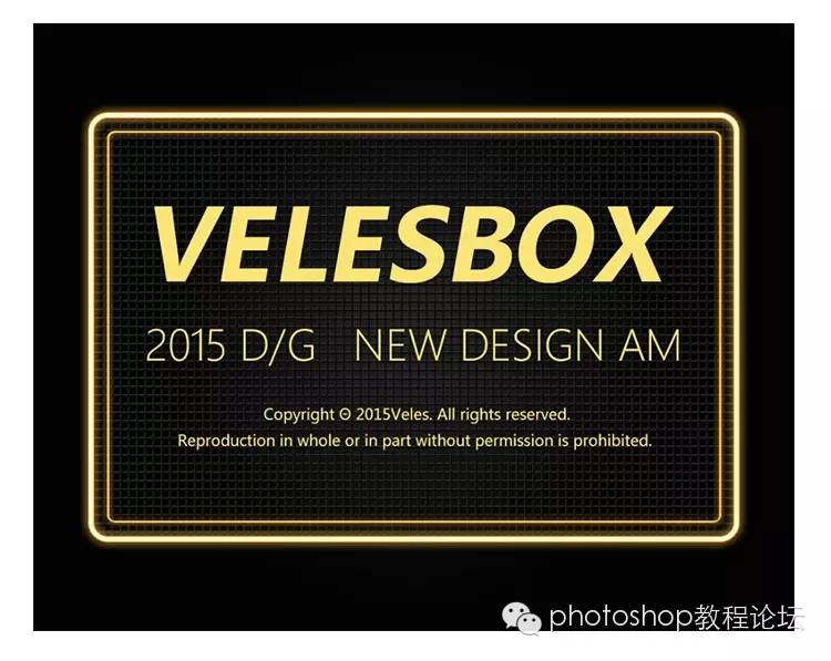
First look at the effect:
first step
New Artboard Width (W): 1000 pixels Height (H): 800 pixels
Resolution (R): 72 pixels/inch Color Mode: RGB Color 8-bit Background: White
second step
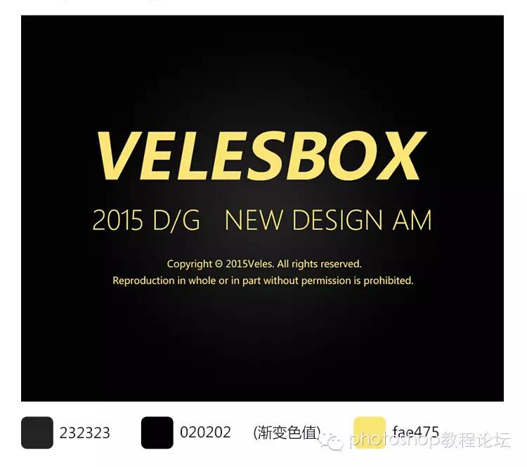
1. Shortcut key (T) to input text
2. Text fill base color yellow color value: fae475
3. Fill the base color with black gradient

third step
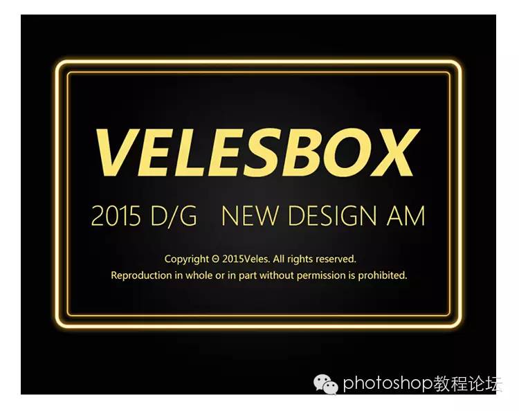
1. Create 2 new hollow rectangles and name them respectively (outer frame) (inner frame)
2. I don’t know how to set the hollow rectangle? Let's talk about it step by step~
3. Adjust the above parameters to the following to get a hollow rectangle (outer frame) with sides of 6 points
Similarly, make a smaller (inner frame) side with 3 points.
the fourth step
1. The basic graphics have been created. The next step is to start to get the effect, which is the setting of the mixing option.
First look at the effect as follows:

2. The layer style is as follows:
Use stroke, color overlay, outer glow
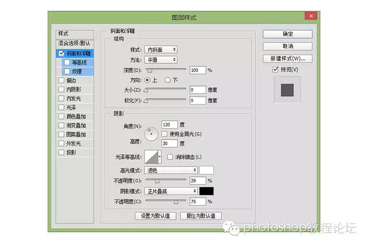
Bevel and Emboss
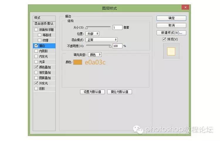
3. (Frame) The specific parameters of the mixed layer are as follows:
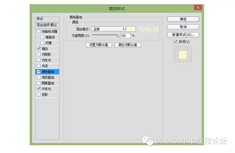
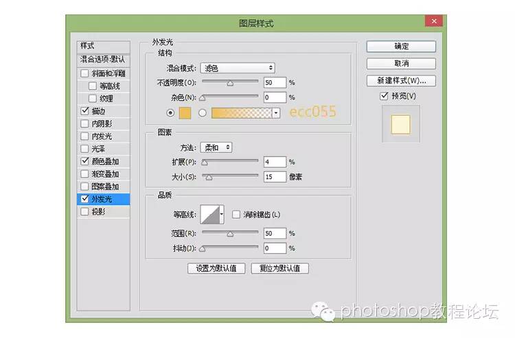
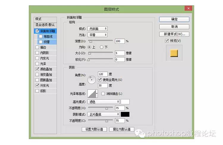
At this point (outer frame) the basic settings are complete~~ continue to the next step.
4. (Inner frame) The specific parameters of the mixed layer are as follows:

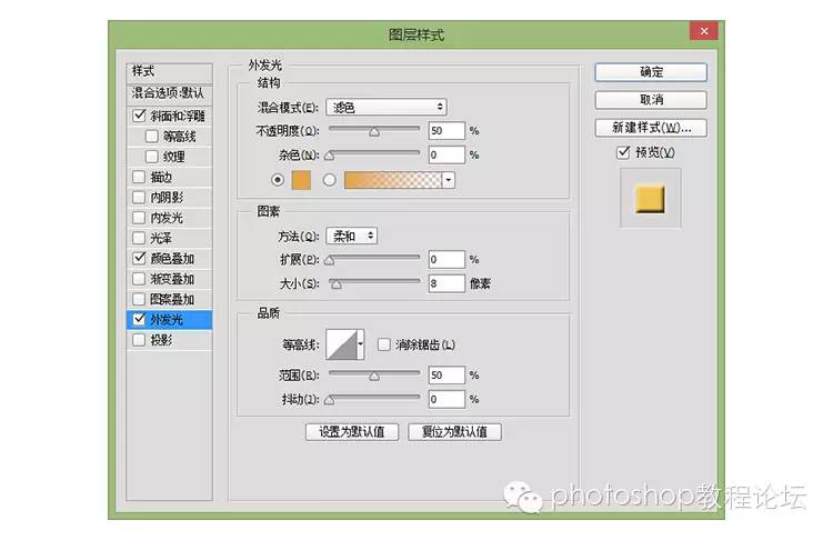

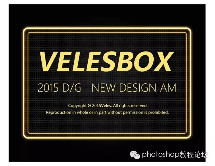
thump thump thump~! Is it already completed, with the following picture?
If yes, half of the success, continue to look down.
 www.16xx8.com
the fifth step
Add a barbed wire under the background, let the fluorescent characters on the barbed wire, add some texture, the effect is as follows:
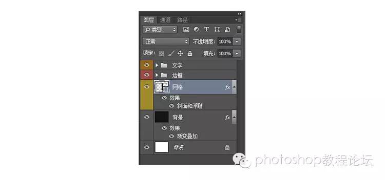
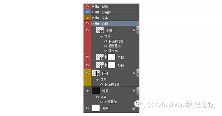
Does your layer look like this at this point? Well, we must have the habit of sorting out and classify well. Haha~ Grid doesn’t know what to do at this time~
Let me continue to talk about the principle of making a grid~~ Well, it is actually a fool~
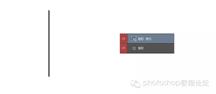
01. Create a new rectangle, and then press the shortcut key (CTRL+J) to copy a layer. At this time, your layer will have a layer copied by a rectangle, right?
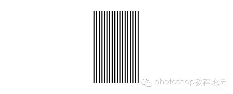
02. Click the layer rectangle to copy (CTRL+T), then press the SHIT key and press the arrow key to move to the right (how much distance you want to move, I moved twice)
Then hit enter! ! ! ! Finally, a moment in history! Press shit+ctrl+alt+t, click and you will find one more layer, and finally it will look like the one above, right?
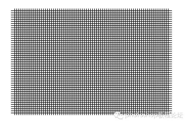
03. Finally, get this net through the above method (if you don’t understand it, you can use a stupid method to arrange it yourself). Finally, right-click the layer of this net-mixing option, and set some parameters as shown in the picture above.
04. Finally, through the above method, you will get the final effect! It already has some effect~ Then let’s start to make fonts! www.16xx8.com
step six
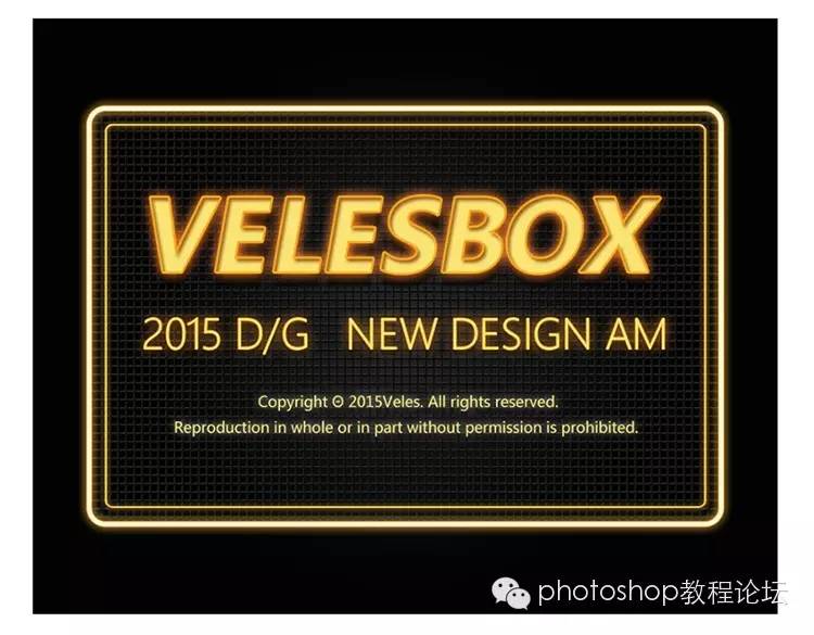
At this time, it’s time to make font texture styles~ Let’s take a look at the renderings below.
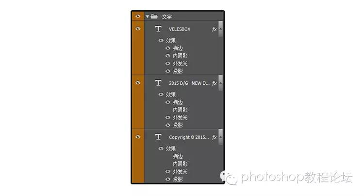
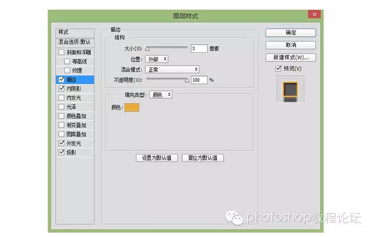
VELESBOX adjustment parameters
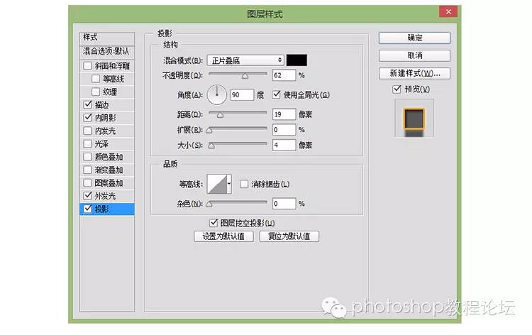
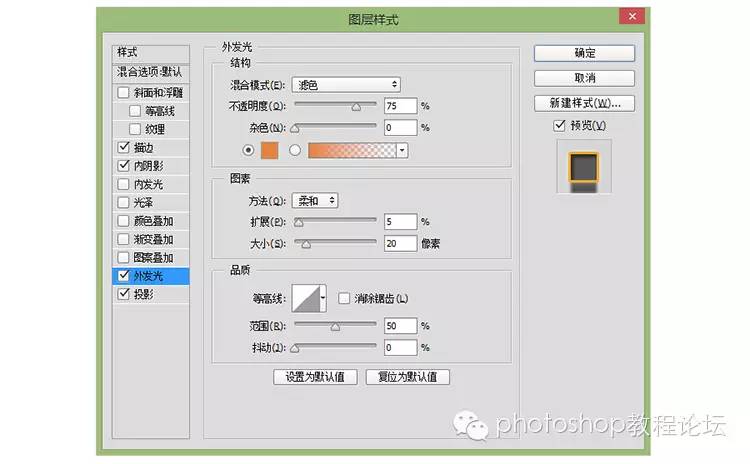
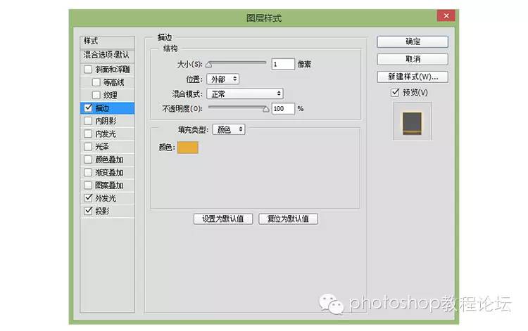
2015 D&G adjustment parameters
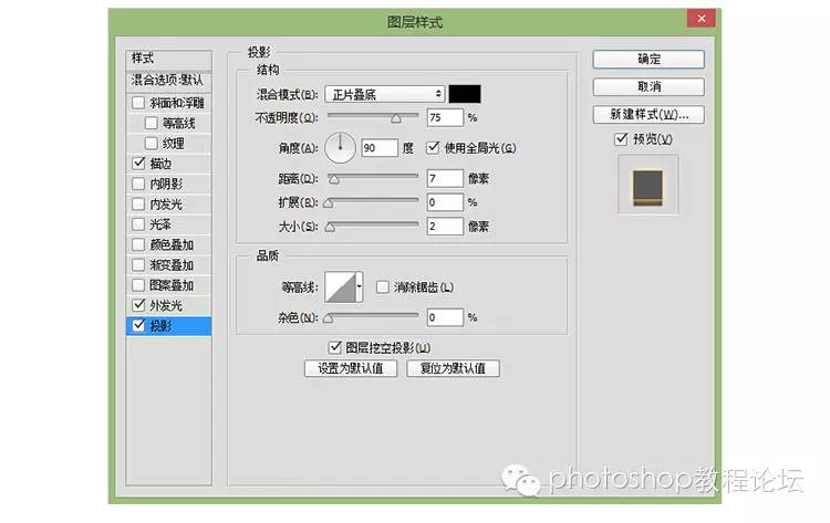
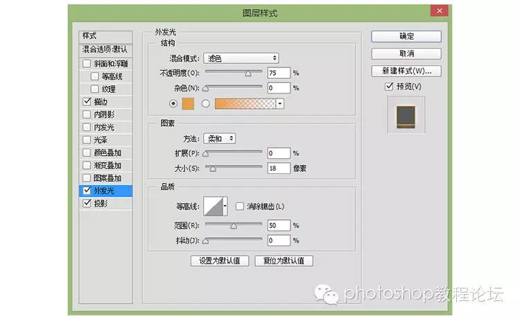
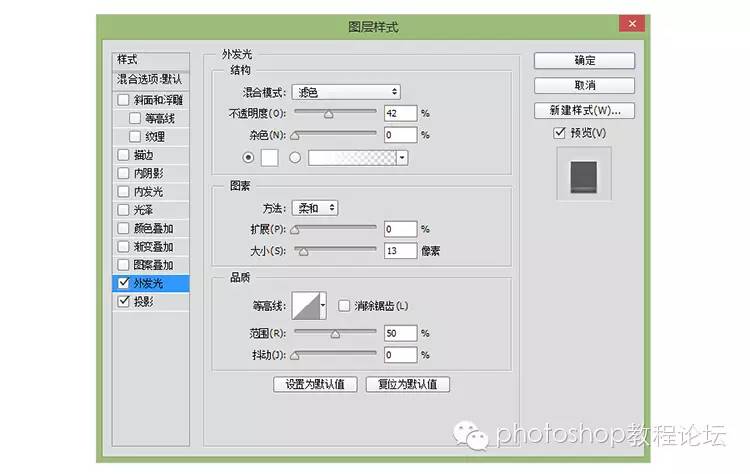
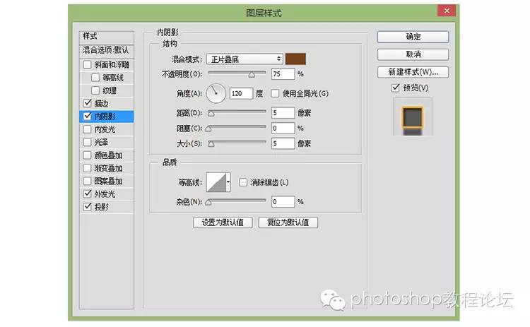
copyright adjustment parameters
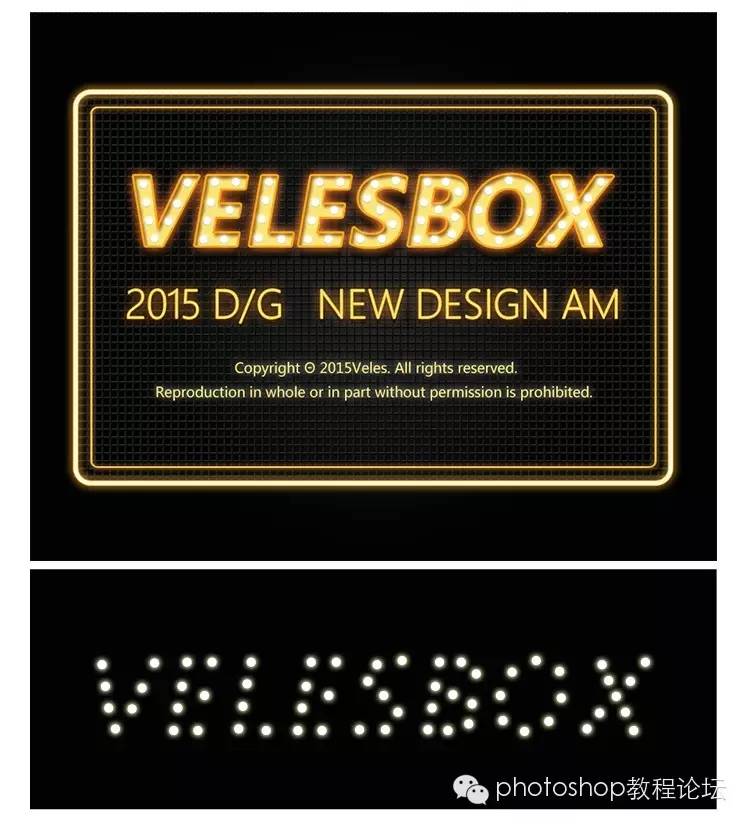 www.16xx8.com
step seven
The basics have been roughly completed, and the details have been drawn, filling in some flashing elements of the font.
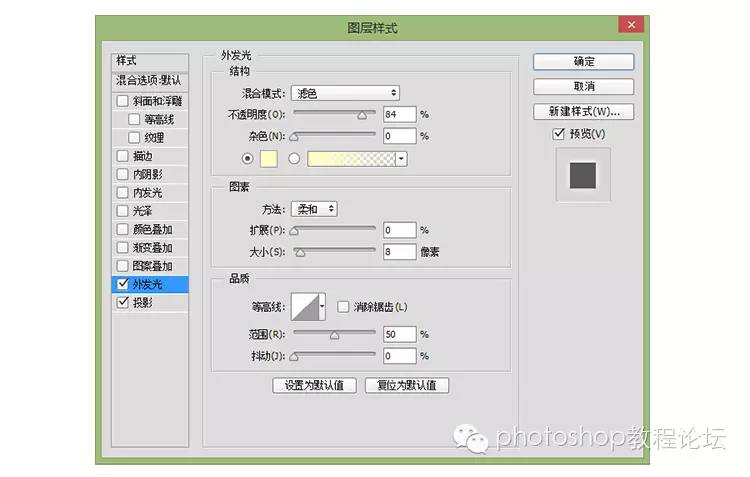
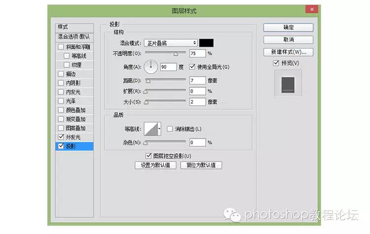
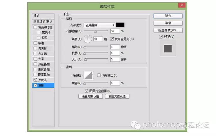
The flash is made with a circle tool, and then add shadow + glow, the parameters are as follows
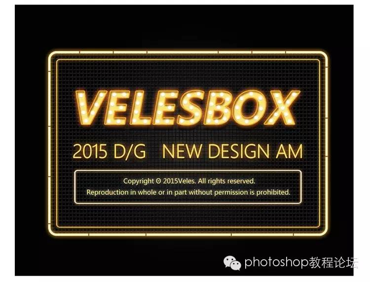

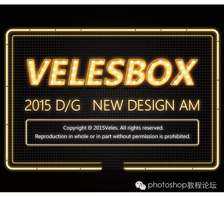
Added a frame on the top, and then increased the details of the edges. Fluorescent lights are usually section by section, so some intervals should be added as shown in the picture above.
The interval method is a rectangle, and the colors on it are as follows:
eighth step
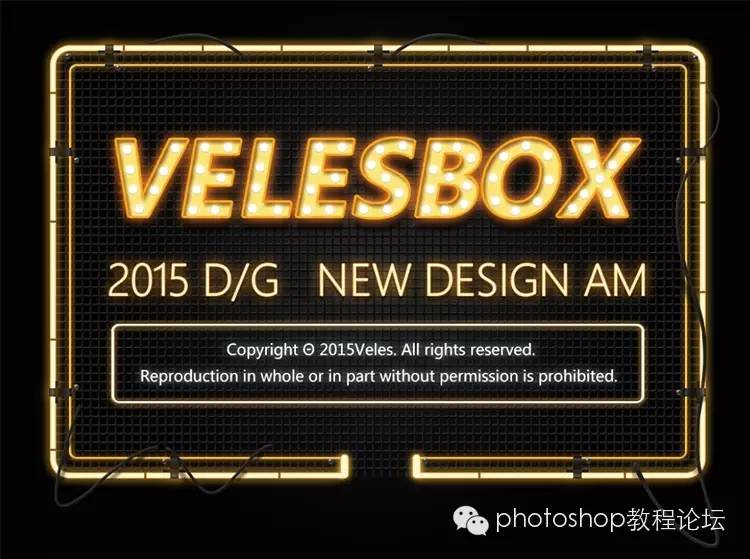
In-depth depiction of details, some small clips, wires and other feelings, and usually the fluorescent lamp should not be closed, so it should be disconnected in the middle to add a little feeling:
Here first turn the (outer frame) (inner frame) into a smart layer and then add a mask, wipe the middle part with black, remove it and continue to the next step

 www.16xx8.com
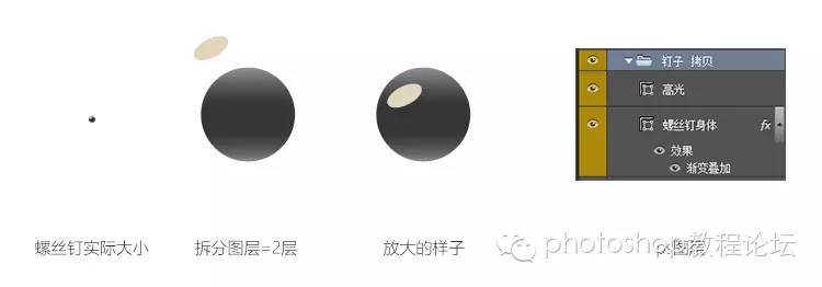
Let’s take a look at the picture again. The last three details, small iron frame + wires + screws, should be easier to understand in terms of decomposition here:
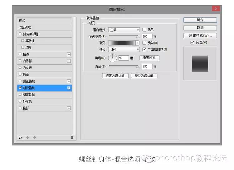
The method of the screw is shown in the picture above, about two layers, and some styles can be added to achieve the effect~ The style parameters are as follows:
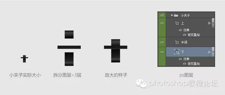
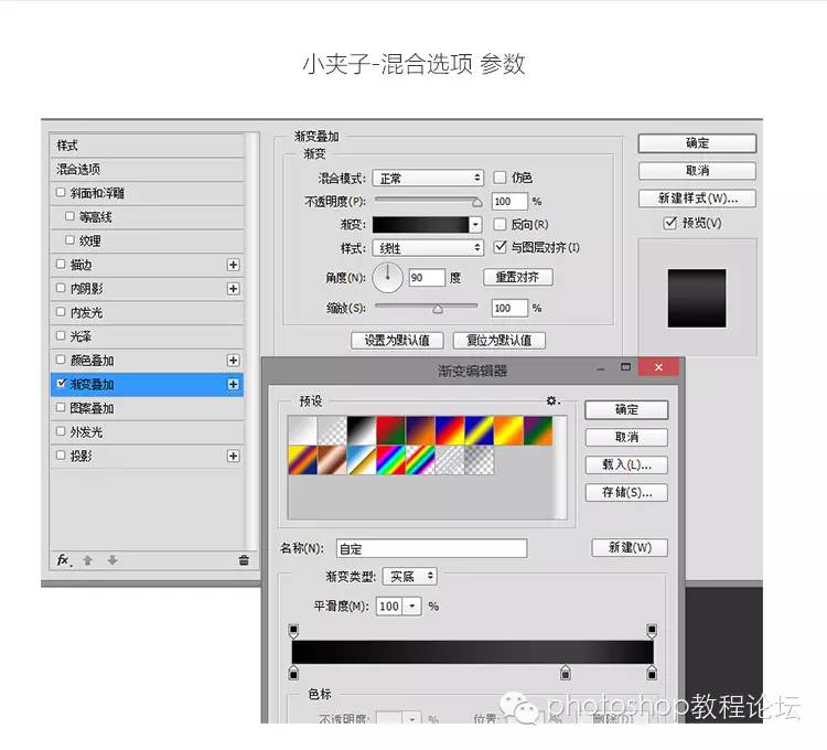
Then continue to decompose how the small iron clip is composed~Basically, it is 3 layers, plus gradient superposition to create some metallic texture~
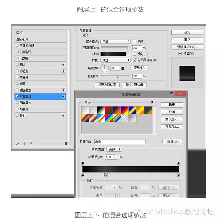

The last thing is to decorate the wires~ Wires are lines that are interspersed more randomly~ How to do it? keep reading~
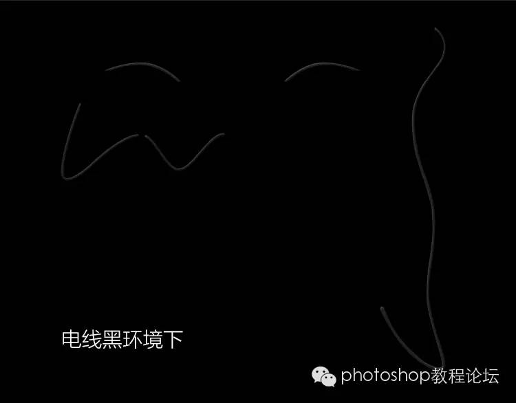
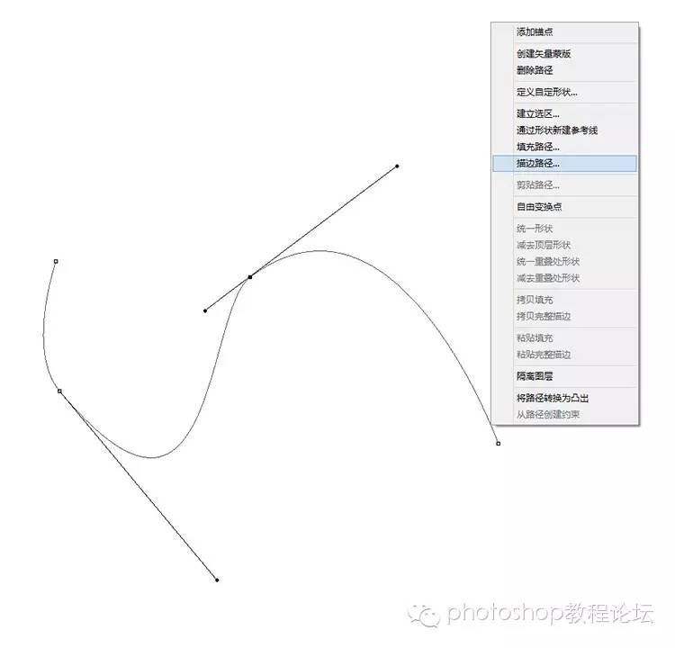
There are many ways to use wires, depending on whether you want to be fast or vector.
01. Vector, draw directly with a pen, there are no skills at all, just use more~
02. Also use a pen to draw a path. After drawing, right click on the path, and there is a stroke path selection, which will be based on your brush. size to draw a line along your path. Remember to delete the path after drawing the line~
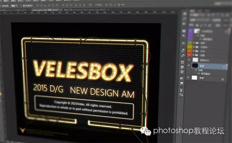
After drawing the line, right-click to add the style-vamp and emboss to see if there is a three-dimensional effect immediately. For some interspersed effects, you can use a mask to cover it~ the basic skills are here!

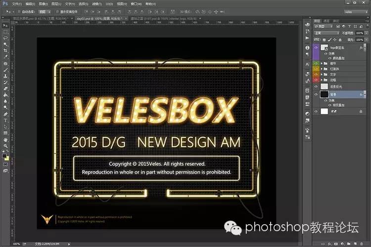
Finally, remember to add some projections under the drawn wires. In some places, you can add some halos to soften the picture~ to make the whole more transparent~
The rookie writes about the design experience, the writing is not very good, I hope it can be helpful to you, your support is the power to continue to share the experience, thank you
Thanks to (U-Set/Veles) for sharing!
If you want to learn PS, please pay attention to us
WeChat ID: ps_bbs
Articles are uploaded by users and are for non-commercial browsing only. Posted by: Lomu, please indicate the source: https://www.daogebangong.com/en/articles/detail/NeonDesign%20a%20glowing%20fluorescent%20font%20tutorial.html

 支付宝扫一扫
评论列表(196条)
测试