
Thank you for your participation! To be honest, everyone's enthusiasm is very high, the moment we randomly selected was very painful, I wish I could give everyone a copy.
Continue! continued! smoke!
To make up for it here, we decided to select two more students from the participating students and send them to the "Florence (China) International Design Biennale". Students who are not giving up, please tell us on our WeChat, This activity is limited to students who have participated in this lottery.
This time we will draw a lottery in the form of red envelopes in the group, and leave the pain of the lottery to the machine^_^
Come back to business, today I will introducea very cool set of NASA fonts.
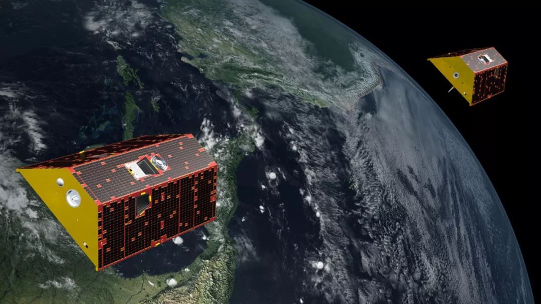
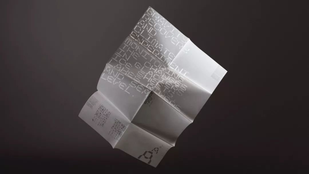
GRACE-FO is the abbreviation of "GravityRecoveryAndClimateExperiment-FollowOn", which means Gravity Recovery and Climate Monitoring Experiment, which are two satellites launched by NASA (National Aeronautics and Space Administration) and JPL (Jet Propulsion Laboratory). /span>The mission is to detect changes in the Earth's gravitational field by monitoring the change in distance between two satellites as they orbit the Earth.
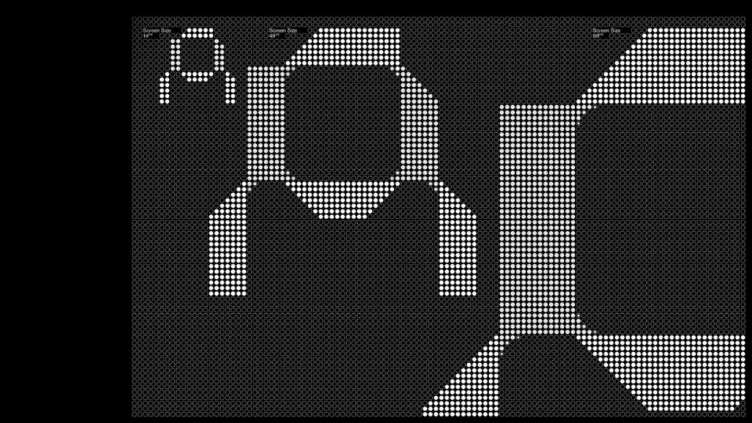
NASA commissioned London's Accept> to design a 4.5-meter-tall screen installation capable of transmitting real-time data to JPL Headquarters, including some promotional materials for surrounding media.
NASA needs to present the vast amount of data these satellites generate in a way that is apolitical and understandable to a senator or a schoolchild.
This commissionis open,everyone is an audience. Working with the Jet Propulsion Laboratory, the AcceptandProceed studio found a design method for visualizing data from space.
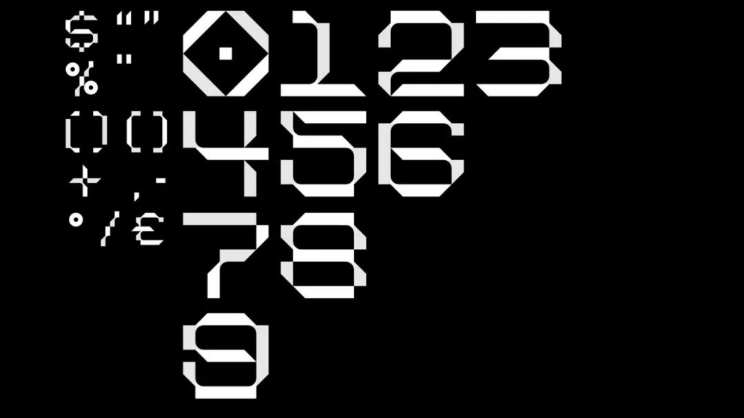
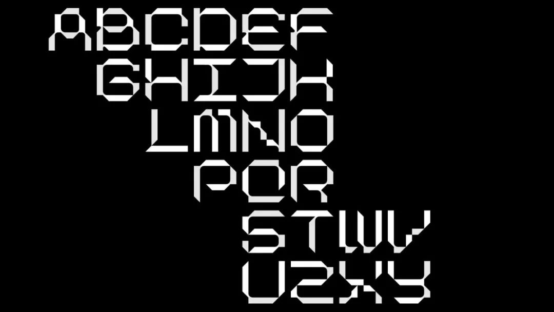
Two satellites are used in pairs and they need each other's data for this project to work. This partnership is critical, and a display typeface called Grace-FODisplay serves as a voice for this shared mission.

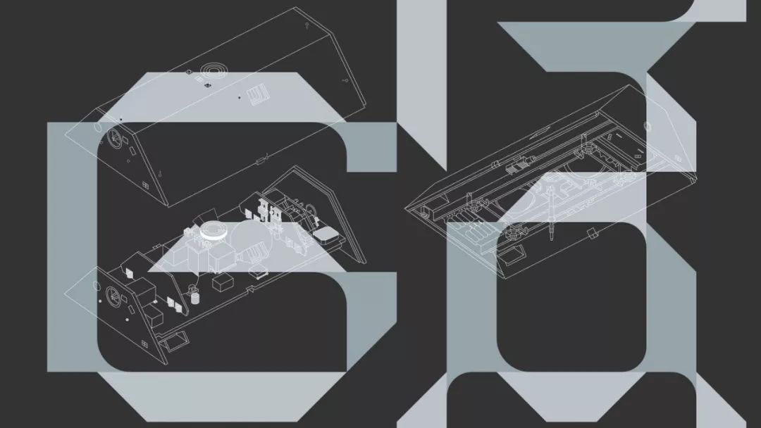
AcceptandProceed studio designed two groups of strokes according to the shape of the satellite, each group of strokes represents a satellite. Each read is symbiotic, like a satellite, and cannot exist independently.

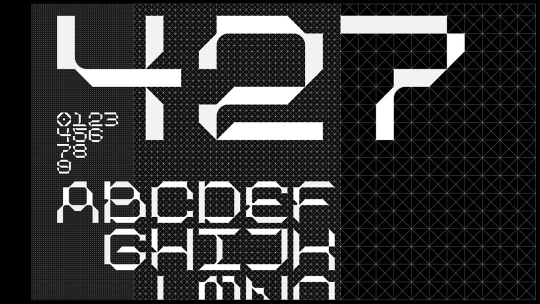
Finally, check out this display set with a cool font.
How about it, can't you think of it? The men of science and engineering who are engaged in aerospace also use super artistic fonts every day.
-
Recommend attention to brand beauty
 -
-
Welcome to MostDesign (ID:iad518)
Join the group to reply "There are chats", contribute to the reply "There are materials"
WeChat (ID: zuisheji)
Articles are uploaded by users and are for non-commercial browsing only. Posted by: Lomu, please indicate the source: https://www.daogebangong.com/en/articles/detail/NASAs%20font%20design%20is%20so%20cool.html
 支付宝扫一扫
评论列表(196条)
测试