For designers, familiarity with the sources and characteristics of various fonts can be said to be a basic skill. In addition to distinguishing various classic Chinese fonts, the classic English fonts also need to be understood. Unlike the Simplified Chinese fonts we are familiar with, many English fonts in use today have a long history, and many of them were even used in the typographic printing industry centuries ago. Of course, most of them were redesigned in the 20th century, which makes them more characteristic of modern typefaces.
Today we made a basic review of the sources and characteristics of these fonts. Many of them have been integrated into your computer font library, and you can easily find others on the Internet.
Helvetica

Helvetica is definitely one of the most classic and frequently used fonts, and it can be said that it is a model of modern fonts. It is also the most recognizable font at present, so it is also one of the most suitable fonts for typography.
Garamond
The Garamond set of serif fonts can be traced back to the 16th century, and its name is derived from the French lead typecaster Claude Garamond. This set of fonts ensures good readability while retaining an elegant texture. This set of fonts has a strong appeal for publishing houses, and many books are printed using this set of fonts.
Frutiger
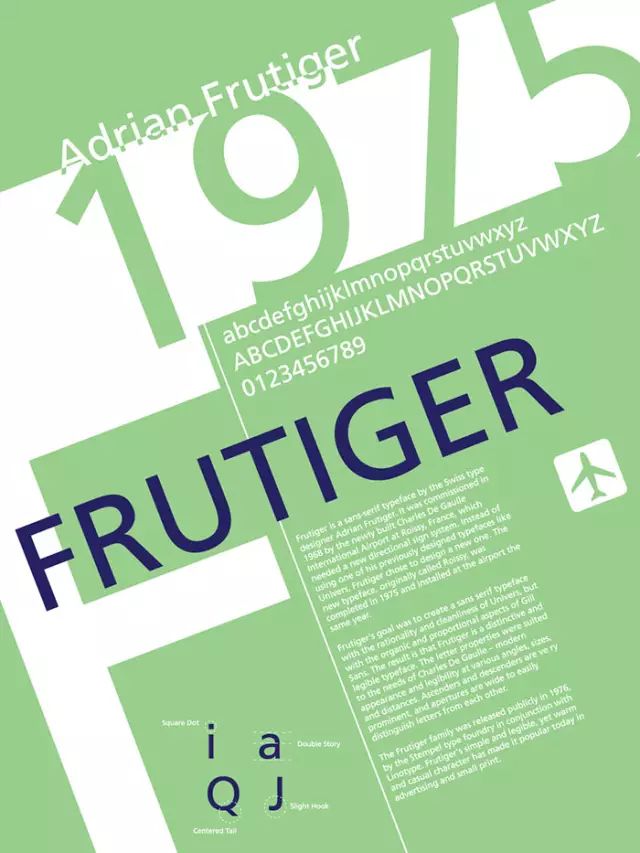
There is an interesting story behind the birth of Frutiger. In 1968, designer Adrian Freudiger was hired to design the logo for Paris Charles de Gaulle Airport. Although Adrian has designed a successful font family Univers, he still decided to design a new set of sans-serif fonts specifically for this purpose to meet the needs of the airport. This font is now Frutiger.
Bodoni
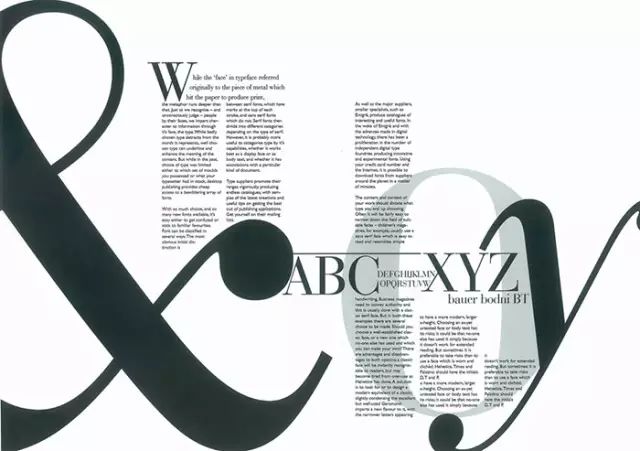
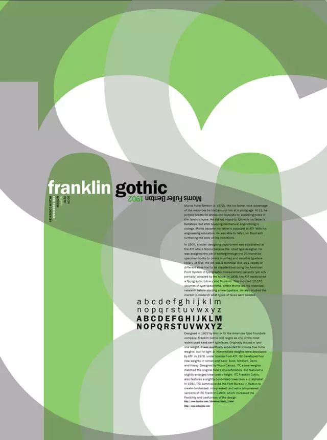
Bodoni is a set of classic fonts from the 19th century, which was finally redesigned and refurbished by Morris Fuller Benton into its current form. This set of fonts has a mechanical quality and is now widely used.
Futura
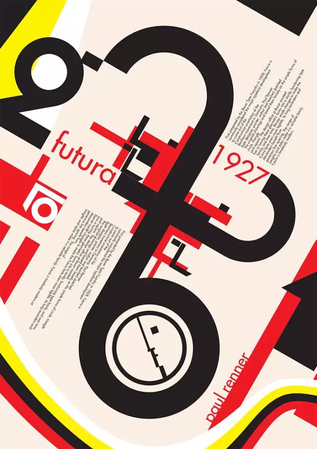
The Futura set of fonts was designed in 1927 and gradually became popular following the design wave of Bauhaus. The designer of the font is Paul Renner, and the font was originally used for a project called "New Frankfurt".
Akzidenz-Grotesk
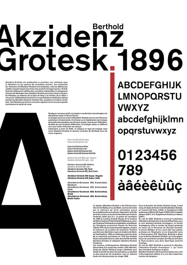
The Akzidenz-Grotesk font dates back to 1880, and it may be a derivative of two serif fonts, Walbaum or Didot. This set of fonts brings together many grotesque geometric elements, which are quite prominent in terms of form.
Gill Sans
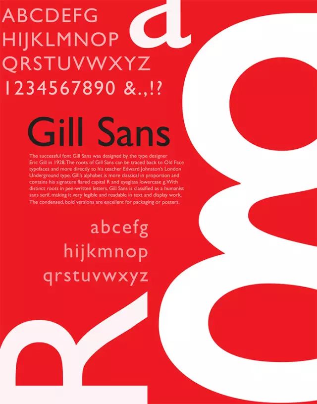
Although this set of fonts is considered very "British", in fact GillSans has been widely used all over the world. Although this set of fonts seems to be very applicable, usually everyone uses it with a clear purpose.
Univers

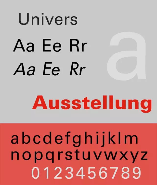
This font was mentioned in the previous article, and he and Frutiger were also created by designer Adrian Frutiger. This set of font families is designed very well, with a variety of styles from thick to thin and wide to narrow.
Optima
Optima is a particularly elegant and classical typeface, based on the Roman alphabet with its iconic flared strokes. This set of fonts was designed for Hermann Zapf, through the variation of line thickness of the typeface to create a beautiful and easy-to-read appearance.
Franklin Gothic

Bembo
Bembo is based on the 15th-century Francesco Griffo typeface, whose designer, Stanley Morison, created the typeface in 1929.
Interstate
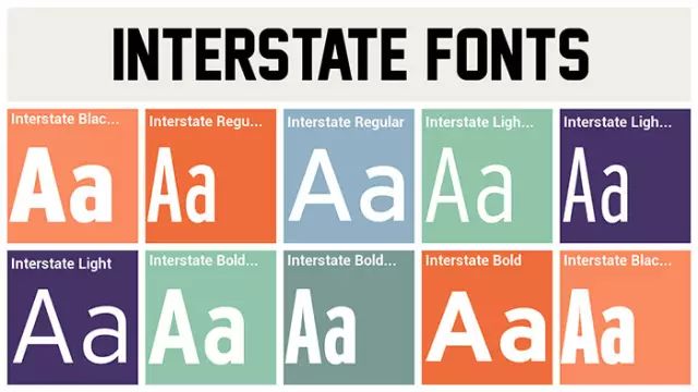
Interstate, as its name suggests, exists to design road signs. It was popular for a while in the 1990s, and its designer was named Frere Jones.
Rockwell
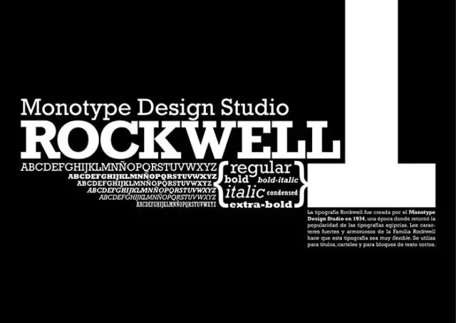
Remember the Memphis design style that was popular in the 80s? This set of Rockwell fonts was originally designed by F.HPierpont to fight against this design trend. Its design prototype is LithoAntique, a geometric font from the United States.
Avenir
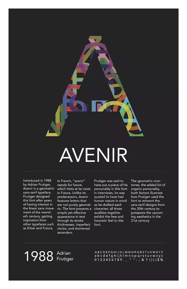
The Avenir font was also created by designer Adrian Frutiger. It was originally released by Linotype-Hell AG in 1988. This set of fonts is based on two sans-serif designs of Erbar and Futura. This set of fonts comes in two different weights that, while looking similar, were designed for different purposes.
Baskerville
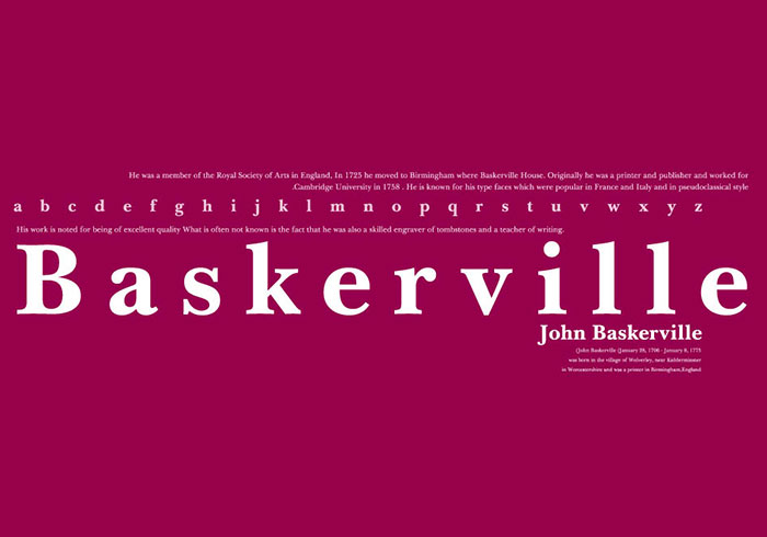
Baskerville is a set of fonts in the 18th century. It is an important watershed in the development of font design from classical to modern. It is no longer as complicated as those earlier fonts. It is more elegant and simple, suitable for reading, and thus widely used.
John Baskerville from Birmingham created this set of typefaces in 1724. It is the forerunner of the modernist design style, which is currently the mainstream typeface.
Caslon
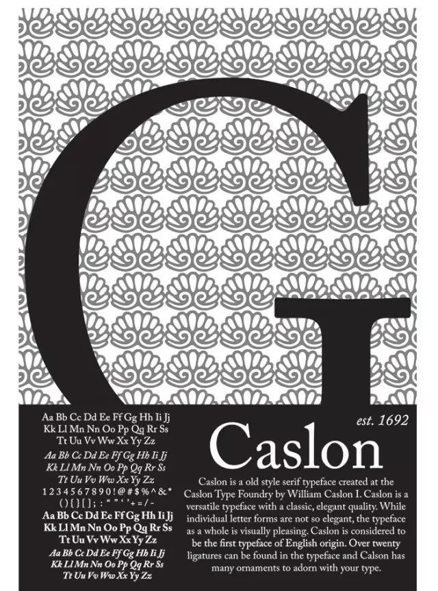
The Caslon font, which was also born in the 18th century, was not only popular in Britain at that time, but even used in the American Declaration of Independence!
Lucida Sans
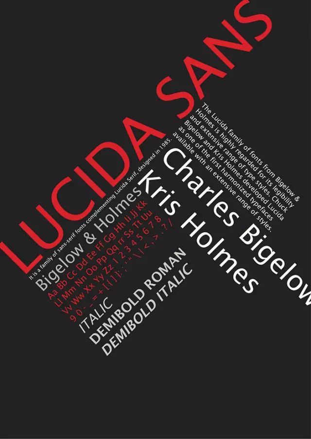
LucidaSans is a typical roman typeface. It is simple and easy to recognize. It is one of the most readable fonts and is very popular now.
Myriad
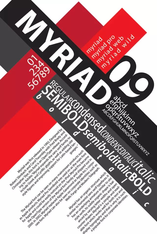
The Myriad font was released in 1992. This set of fonts is considered a "relatively new" classic font. This set of fonts has released the OpenType format version, and covers the Pro character set and complete Western font characters. In printing and typesetting The field has a wide range of applications.
Minion
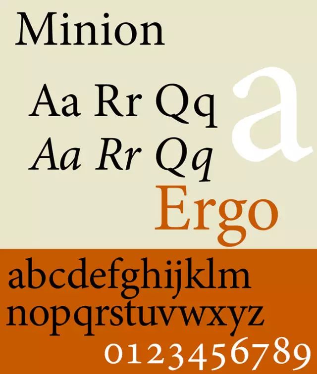
Minion is a serif font developed by Robert Slimbach, originally hoping that this set of fonts could better present the text content on the display. This set of fonts draws design elements of simplicity and elegance from Renaissance typefaces.
Palatino
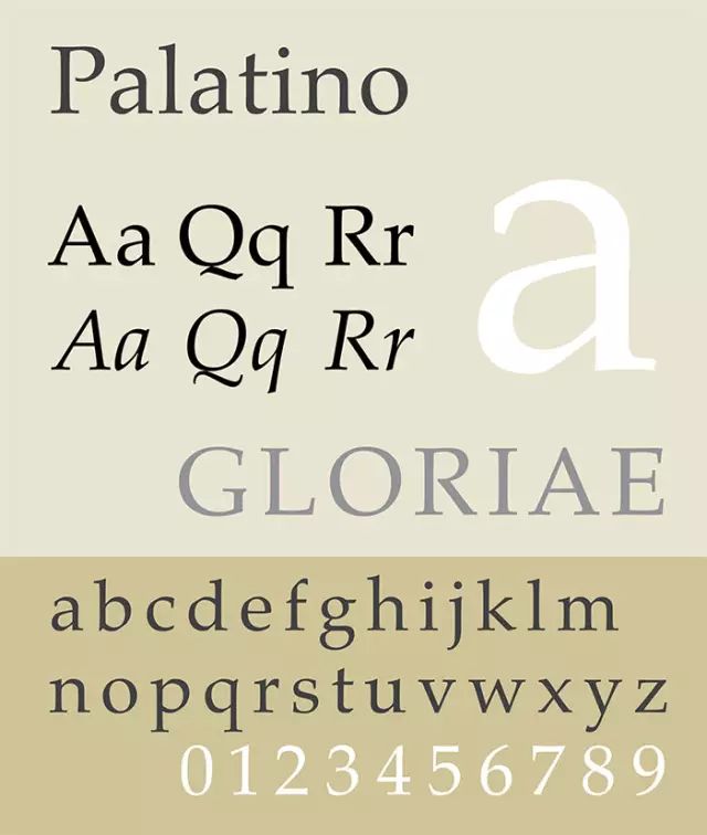
Palatino is one of the most widely used fonts out there. It came out after the end of World War II. This set is attractive, easy to read, and many fonts have taken their design inspiration from it.
TimesNewRoman
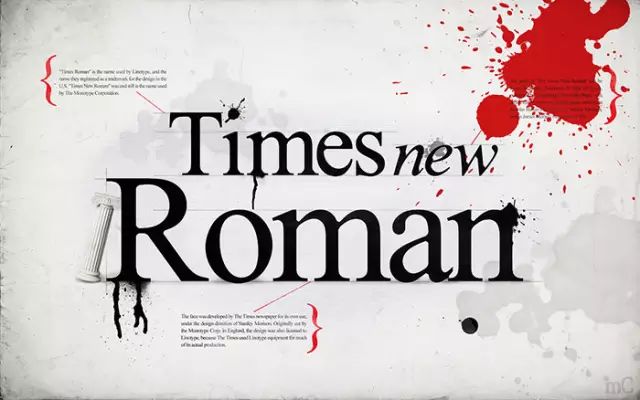
TimesNewRoman is also one of the most commonly used English fonts, and almost all computers will come with this set of fonts. As you can tell from its name, this classic font was originally designed for The Times and is widely used in the typesetting industry. Especially newspapers.
This set of fonts was designed and released by the Monotype company in 1931. The style is strong, easy to read, and balanced. It was a unique and memorable font at the time.
Sabon

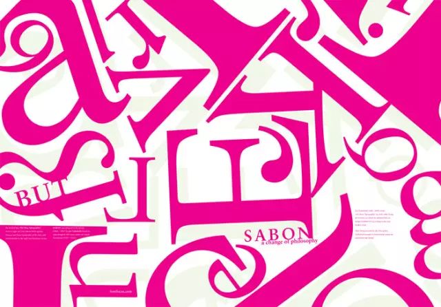
Sabon was designed by designer Jan Tschichold for three years and finally released in 1967. This set of fonts is inspired by the Garamond typeface, which was born in 1592.
Original Address: designyourway Original BogdanSandu Excellent Design Translation: Chen Zimu
The essence of a period of timeThere is a huge difference between the real thing and the picture, but no one thinks it is wrong!
The details are not in place! Do you dare to hang it on the wall?
When the designer is bored, he tosses out strange things
Your childhood photos VS the designer's children's childhood photos, crying out loud after reading.
[Tears] What does it look like to miss to the extreme?
Articles are uploaded by users and are for non-commercial browsing only. Posted by: Lomu, please indicate the source: https://www.daogebangong.com/en/articles/detail/Mustread%20recommendation%20Classic%20English%20fonts%20that%20every%20designer%20should%20know.html

 支付宝扫一扫
评论列表(196条)
测试