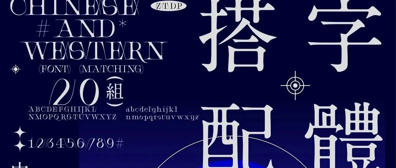
Font is the core part of poster design. Not all fonts can be created in design. Different fonts need to be matched according to design requirements, so font reserves are important for designers Very important! A good-looking font that can take your designs to the next level.
- Store different styles of fonts at the same time, so that we can Match different design requirements;
- Commonly used Chinese fonts are generally Song and Hei;
- The corresponding western fonts are serif fonts and sans serif fonts, and most of the designs need western characters to match and embellish;
Below I have classified and organized some very classic fonts and fonts with popular design styles , and through a certain typesetting, everyone can understand the characteristics of fonts more clearly, which is convenient for everyone to choose.
Directory:
- 1. Acid font
- Second, reverse contrast font
- 3. Serif font & Song type
- Fourth, serif font & Song type

☆The following list of fonts is super practical, and it is recommended to save them for emergencies.
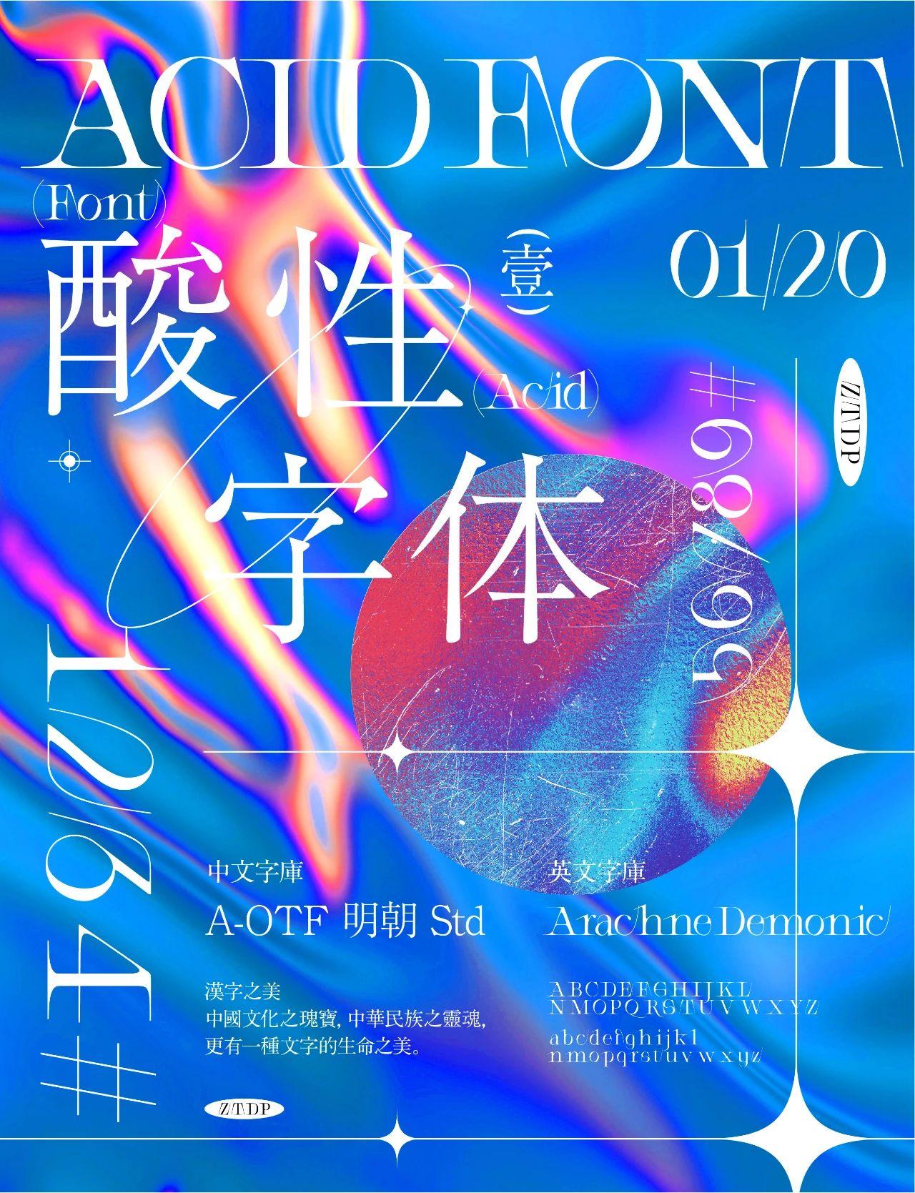
1. Acid font
Acid design is actually a design style that challenges the traditional aesthetics. It escapes from underground music and has its own rebellious spirit. Acid-designed fonts also have a Gothic decorative feel, are exaggerated and sharp, and are usually matched with metallic effects.
01.
English font:Arachne Demonic
The biggest feature of this font lies in the handling of its strokes, like rose thorns The temperament and beauty presented after the strokes of , and overlapping processing on the word spacing, have the characteristics of typical acid fonts.
Chinese font:A-OTF Ming dynasty style
The rounded corners at the junction of the strokes and the start and end have a soft feeling like ink , so that no matter whether it is used in a very large or very small font size, there will be no sense of dissonance, and the thickness contrast between horizontal and vertical paintings looks simple and natural. It is hard to imagine that it was a font born in the 1960s.
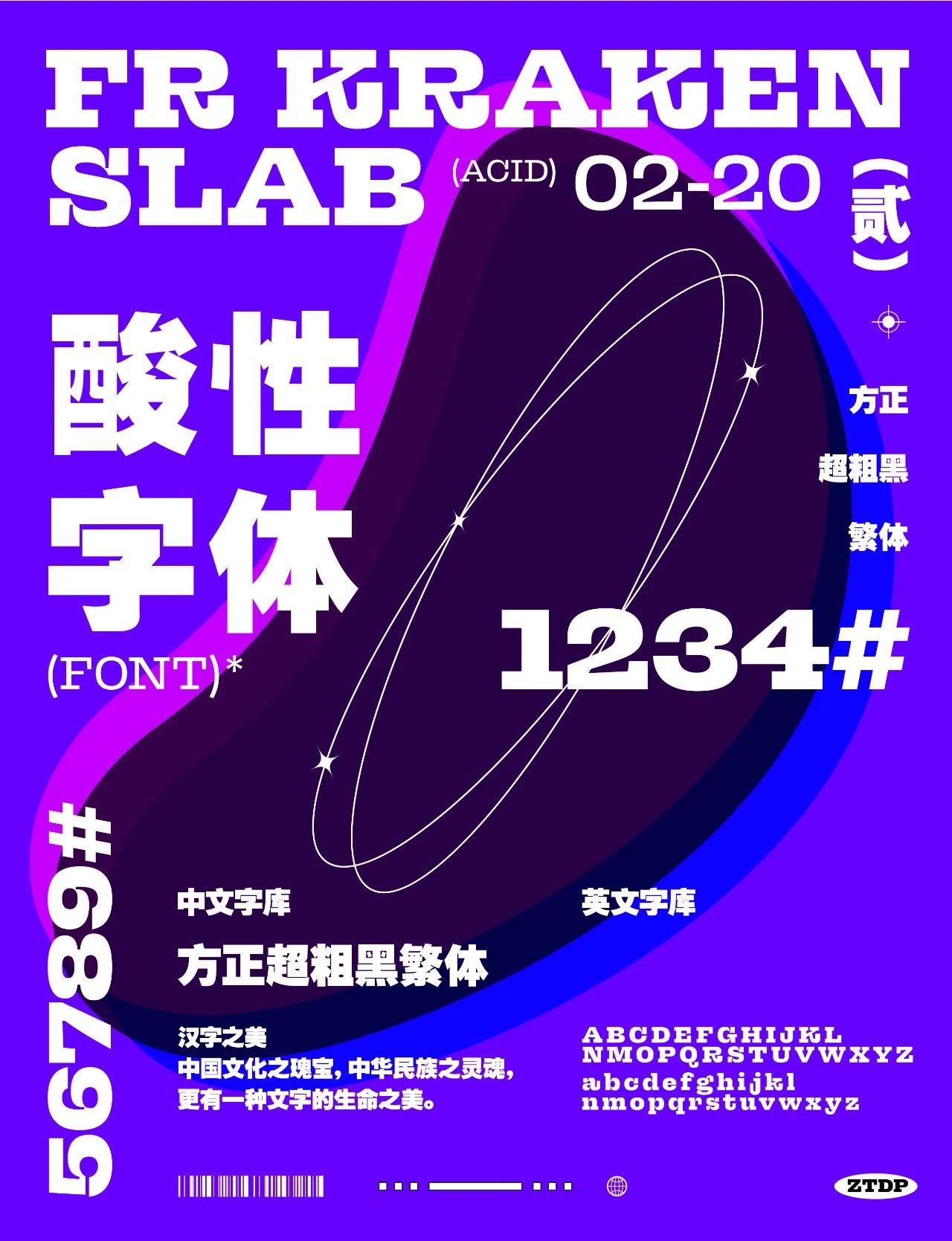
02.
English font:FR Kraken Slab
Chinese font:Founder Super Thick Black Simplified
Founder Super Bold Black is an earlier black body with a traditional font structure , the central palace is compact, and the strokes are thick and solid. Among the traditional boldface fonts, the strokes of this font are the thickest. The square, ultra-thick and black font style is dignified and eye-catching, suitable for headlines in newspapers and magazines, as well as powerful advertising slogans.
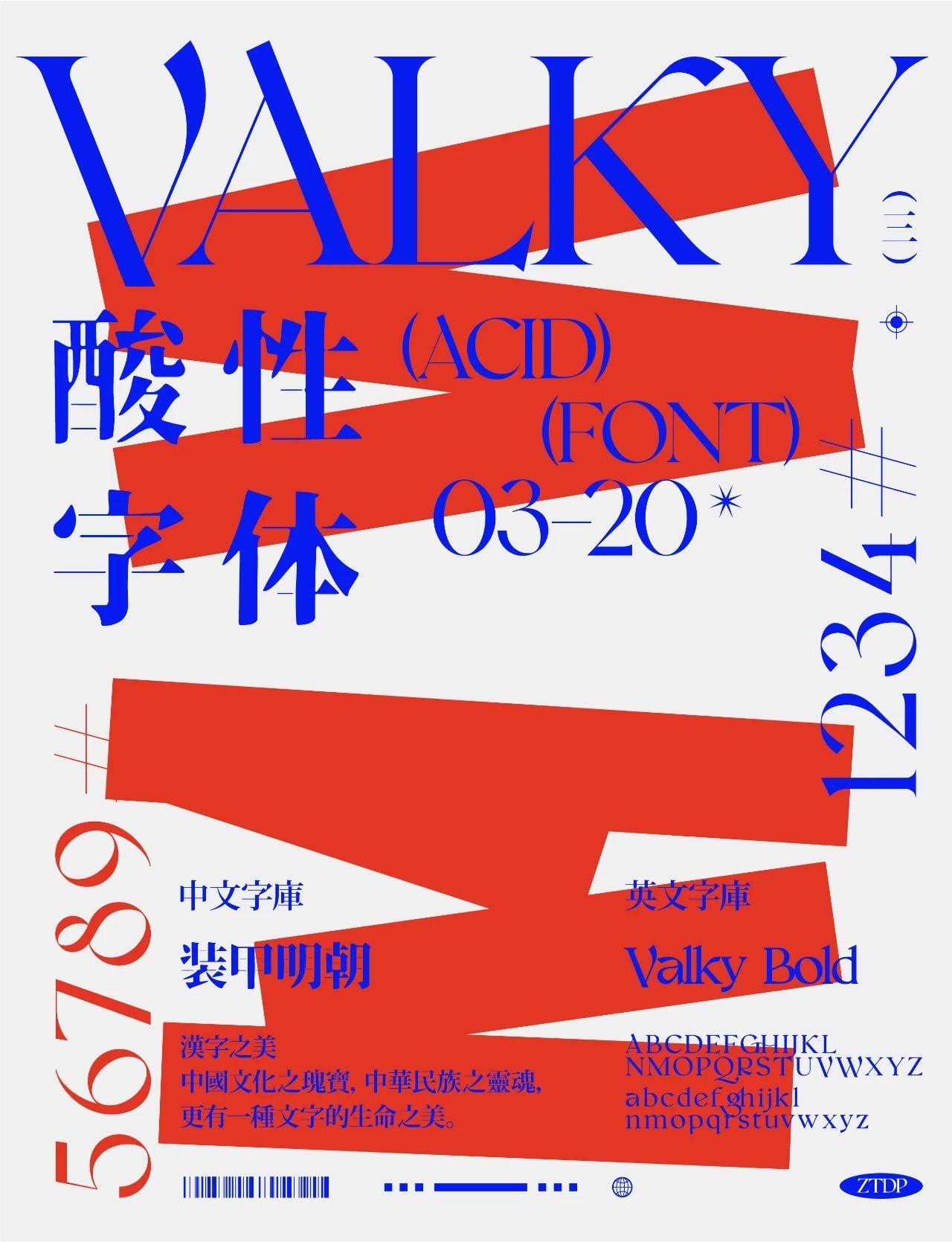
03.
English font:Valky
Valky This is a very versatile font, it is a beautiful and elegant A modern retro serif typeface with beautiful ligatures, tons of alternate glyphs for special symbols, and more.
Chinese font:Armored Ming Dynasty
Armored Ming Dynasty is a new font based on Siyuan Song. It can be simply understood as the old version of Siyuan Song Typeface, which comes from Japanese font lovers. But because it is a font made by a Japanese designer, the support for Simplified Chinese is not very good, but most of the commonly used Simplified fonts are still available. If you find that Simplified fonts cannot be found in this font, you can try to use it Convert to traditional fonts to try!
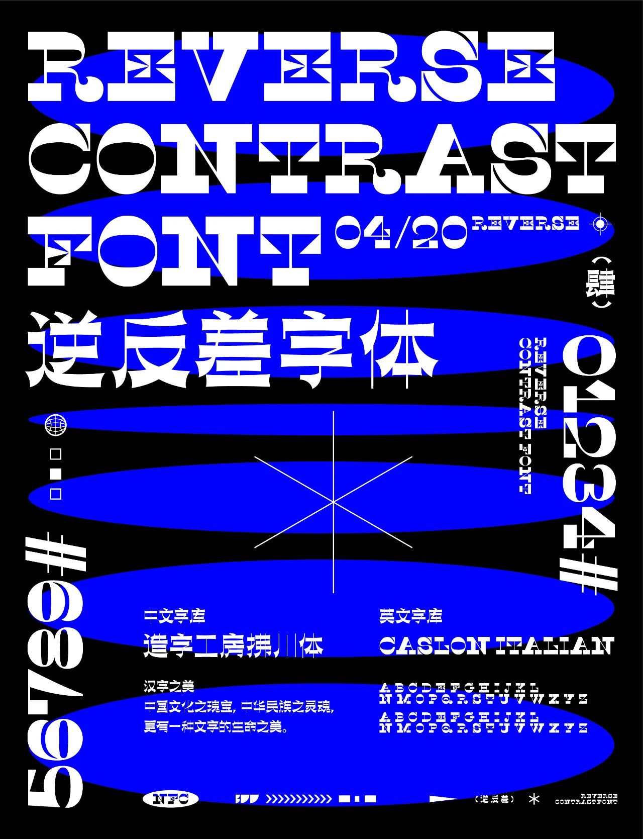
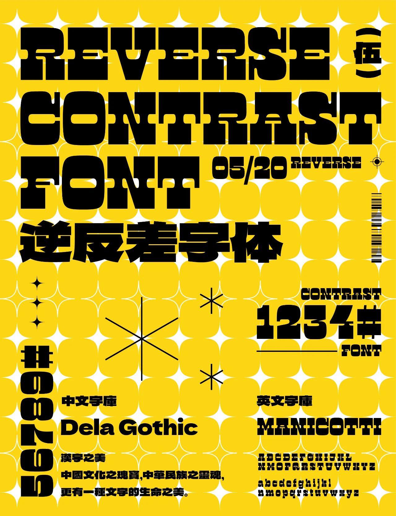
2. Reverse contrast font
The term "reverse contrast" is translated from English "reverse contrast", and is sometimes called "reverse stress" or "reverse stroke". Generally speaking, when writing Western calligraphy with a flat-tip pen with the right hand, the pen tip will maintain a relatively fixed acute angle with the writing direction. Since the length and direction of the strokes of each letter shape are different, the font will have a strong change in thickness when writing, which is enough to become a representative feature of the Latin alphabet. It is called "contrast" in modern Western font design to describe the contrast between thick strokes and thin strokes in the font.
01.
English font:CaslonItalianShaded-Fill
This font is the Shaded version of caslon italian after reverse contrast processing, creating a Compared with ordinary fonts, it has more exaggerated, grotesque and more tense visual effects.
Chinese font:Han Yi Rui Yi Song
The inspiration of "Han Yi Rui Yi Song Family" comes from the architecture of modern cities Style, using modern serif fonts such as Bodoni and Didot as references, uses tall shapes, tough straight lines, strong line-to-surface contrast, and subtle and tense elastic curves to add a fashionable and cutting-edge visual experience to the glyphs.
02.
English font:Manicotti
Because the length and direction of the strokes of each letter shape are different, the glyphs will be different when writing The strong thickness variation is enough to be a representative feature of the Latin alphabet. It is called "contrast" in modern Western font design to describe the contrast between thick strokes and thin strokes in the font.
Chinese font: Dela Gothic One
The Dela Gothic One is a flat, very wideJapanese font. The visual center of gravity of Dela Gothic One font is low, and the strokes of the font are thicker, which makes it appear more stable and powerful. Its stability and strength make it ideal for posters and packaging.
⊕
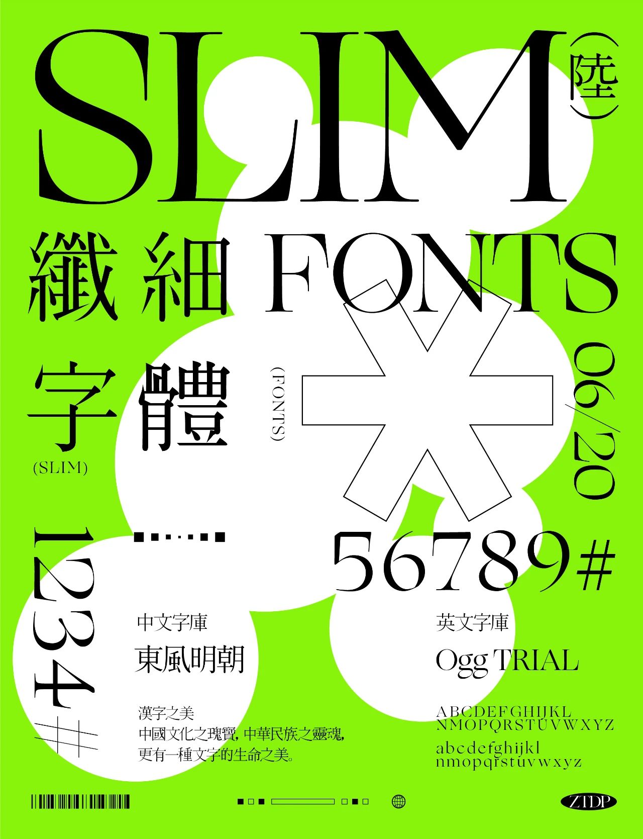
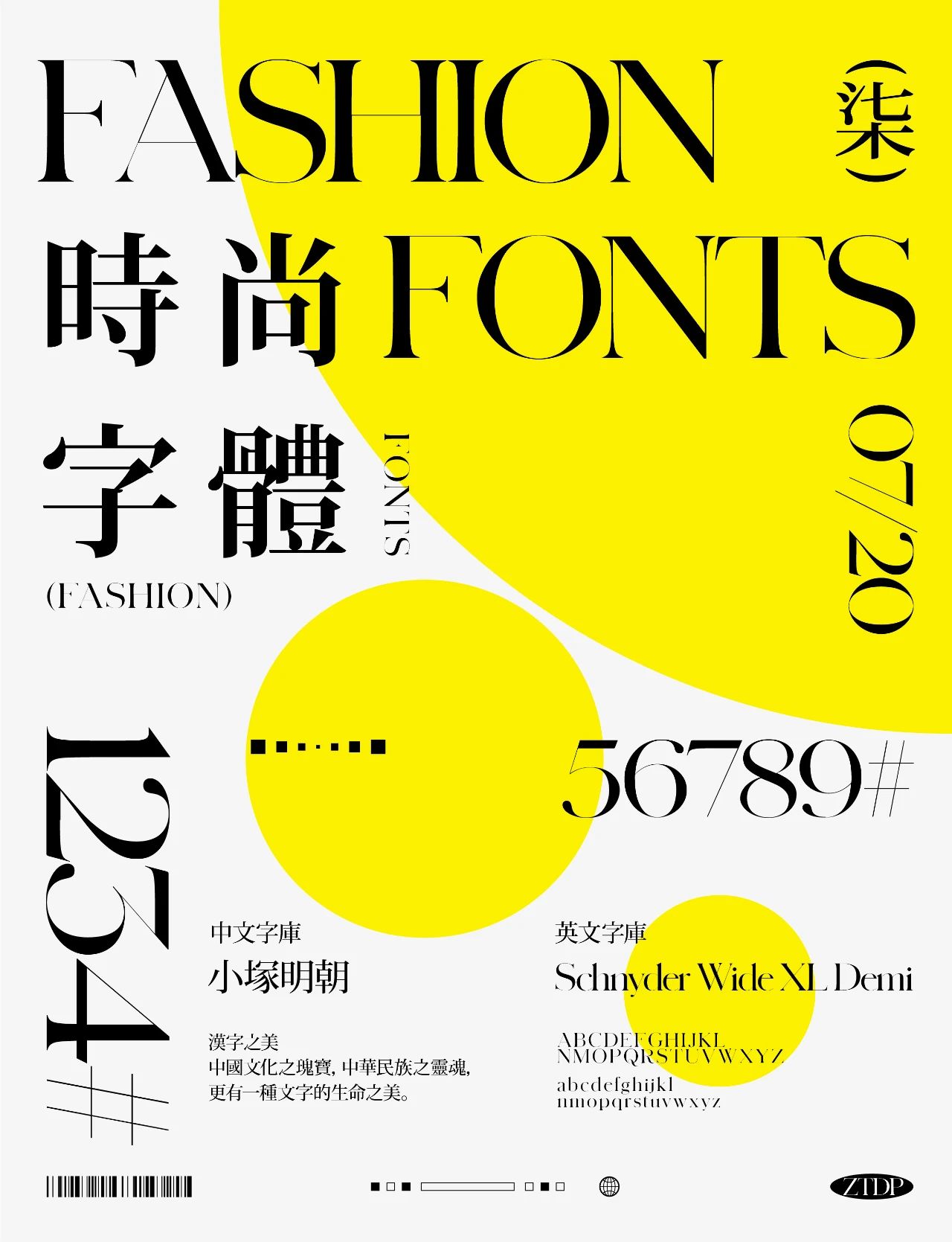
Three. Serif font & Arial
Traditional Chinese characters are much more beautiful in terms of font structure than simplified Chinese characters. Among them, the strokes and structure of Mingshi, Dongfeng Mingchao, and Chikushi are very comfortable. , it is highly recommended for everyone to use when encountering typography that requires exquisite and high-level sense.
01.
English font: Ogg Tkial
Type designer inspired by hand lettering by 20th century book designer and calligrapher Oscar Ogg Inspired, Ogg captures his unique mix of calligraphic and typographic forms achieved through the use of hand-carved nibs, brushes and paint. Inheriting the flavors of the Renaissance while still managing to keep it fresh and modern.
Chinese font: Dongfeng Mingchao
Dongfeng Ming Dynasty (Kochi Mincho) uses Xingkai as the benchmark, keeping the strokes as much as possible Richness, such as changes in thickness, changes in the same radicals, and the effect of flying white, etc. This set of calligraphy title fonts not only conforms to the brushwork and structure of traditional calligraphy, but also has the tension of visual design. It is mainly suitable for advertisements, packaging, titles of film and television dramas, etc.
02.
English font: Schnyder XL
A very nice serif font that is often used in magazines, the thickness of the font is contrasted Obvious, beautiful strokes.
Chinese font: Xiaozuka Mingchao
Otsuka Mingchao is a very beautiful art font, widely used in various In the design and printing of books, magazines and albums, Kotsuka Ming Dynasty fonts have a strong visual impact, and are also commonly used in newspapers, magazines and books.
03.
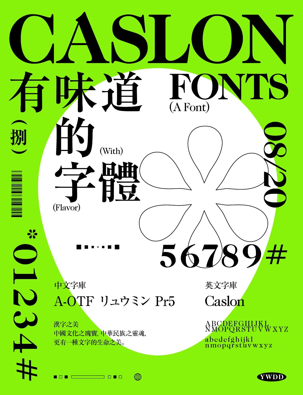
English font: caslon
This font was created by British type designer William Caslon Designed in 1722, the Caslon typeface belongs to the old-style typeface group classification. The Caslon font quickly became popular, not only across Europe but also across the Atlantic to the United States.
The style may be old, but when Caslon font is used for modern typesetting, it still looks It looks very fresh and stylish, and is often used to typeset books and magazines, or to italicize and bold quotes when organizing good quotes. When used in an italic ampersand, it can add a stunning visual element to designs such as invitations and menus. "When in doubt, use Caslon" is the motto of many designers and typographers.
Chinese font: A-OTF リュウミン
Japanese fonts can also type Chinese, but there may be missing characters, many people I don’t know, some characters in Japanese fonts need to be typed into traditional characters,If there are missing characters Yes, it can be converted into a curve in AI and re-spelled.
04.
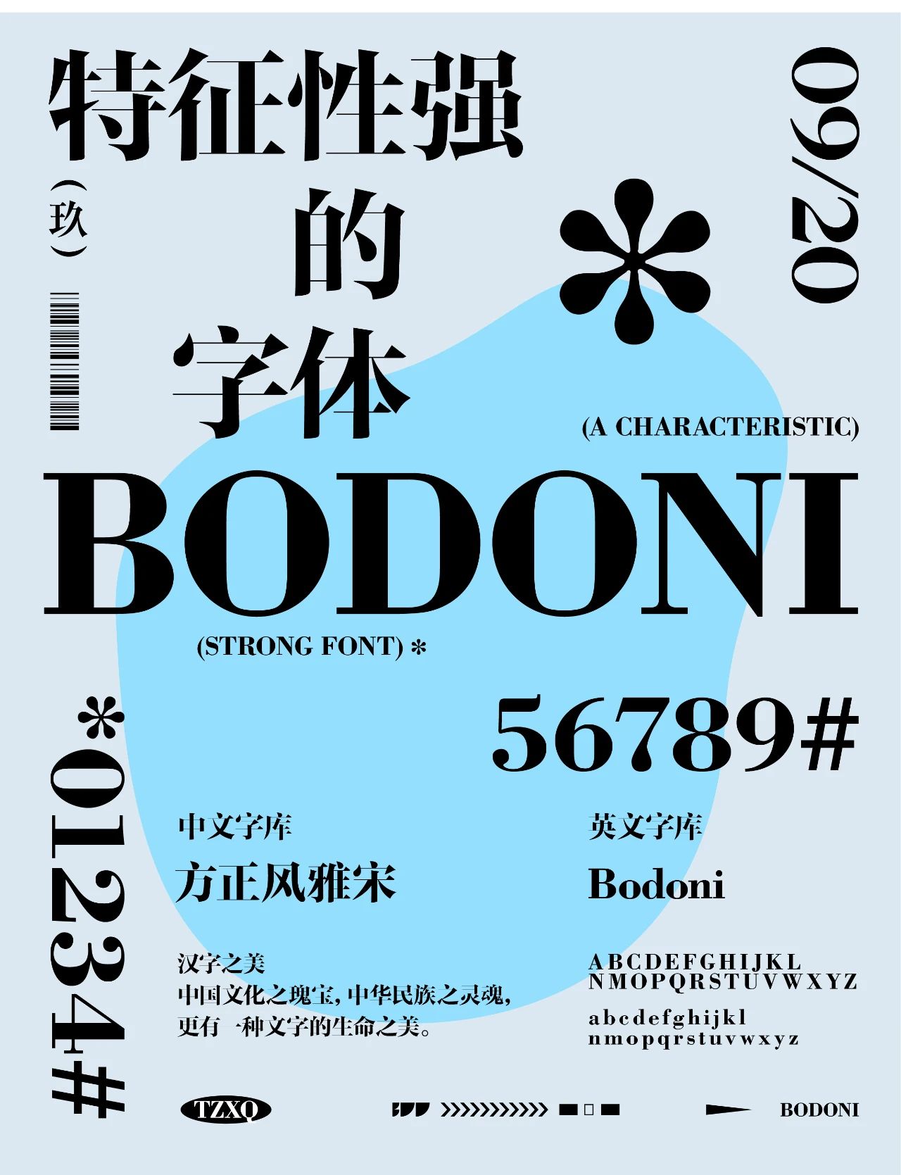
English font: Bodini
1978, Italian Giambattista Bodoni Designed a font later known as Modern, bodoni, which increased the contrast of strokes and more vertical, slightly condensed uppercases, and brought them into a more extreme world. Bodoni font gives people a romantic and elegant feeling, and it can add a lot of color to headlines and advertisements.
Chinese font: Fang Zheng Feng Ya Song
Fang Zheng Feng Ya Song family is designed based on Fang Zheng Ya Song. Fangzheng Yasong is to meet the typesetting of newspapers and books, while Founder Fengyasong is to meet more modern and fashionable titles. Fangzheng Fengya's brush strokes are sharpened and upright, the decorative corners at the starting point of the horizontal strokes are removed, and the retracting form of the left and right strokes is also simplified and straightened, deliberately enlarging the contrast between the thickness of the horizontal and vertical strokes, resulting in a strong contrast. These features make it more concise and modern, with strong visual tension.
Suitable for newspaper, magazine, and book headlines, as well as advertisements, signs, and product packaging the design of.
05.
English font: Baslerville
Baskerville is a transitional font, an old style font like Caslon Successor, also like Caslon font with more pronounced curves. The works created by another British typeface designer John Baskerville (John Baskerville) in 1750 are clearer overall, and the slightly higher design than the Caslon typeface makes the typeface feel more rigorous.
Baskerville is a font representing business, which makes it suitable for more Formal media such as novels, corporate stationery, and newspapers. In fact, the true strength of Baskerville can be better displayed when it is used to typeset large sections of text. Applied to its beautiful line spacing and paragraphs in the article, Baskerville is truly an unrivaled typographic font.
Chinese font: Siyuan Songti
Source Han Serif is the latest pan-CJK jointly released by Adobe and Google The font, which is the Song typeface corresponding to Siyuan HeiTi; aims to provide a multilingual and all-round font that can cover all Unicode characters, responding to the needs of unified design, and serving the population of 1.5 billion in East Asia.

06.
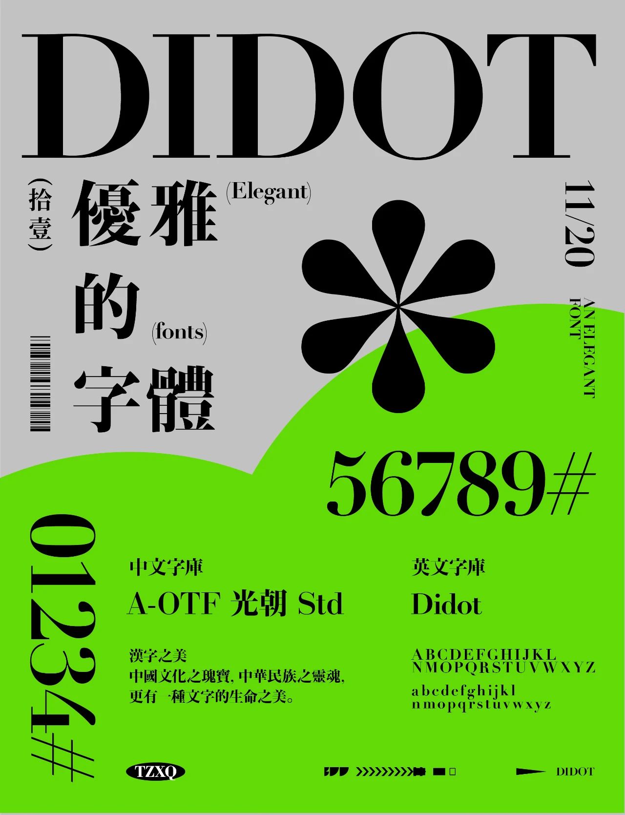
English font: Didot
Didot font originated from the French Didot family. With a long history of three hundred years, it not only It is only a set of fonts, and it has many romantic and elegant characteristics of the French. Coinciding with the French Revolution, the emergence of Didot replaced the previous complex and slanted strokes with vertical strokes, and the serifs of the font were more detailed, which is an innovation in the font industry.
Chinese font: A-OTF 光朝
It is an original Ming Dynasty style, it is extremely thin The horizontal paintings, sharp triangles, and strong vertical paintings constitute a modern and fashionable shape that is concise, sharp, and has the same Didot, Bodoni style and Ming Dynasty style elements. Elegant and slender, it is very suitable for posters, titles and other large fonts.
07.
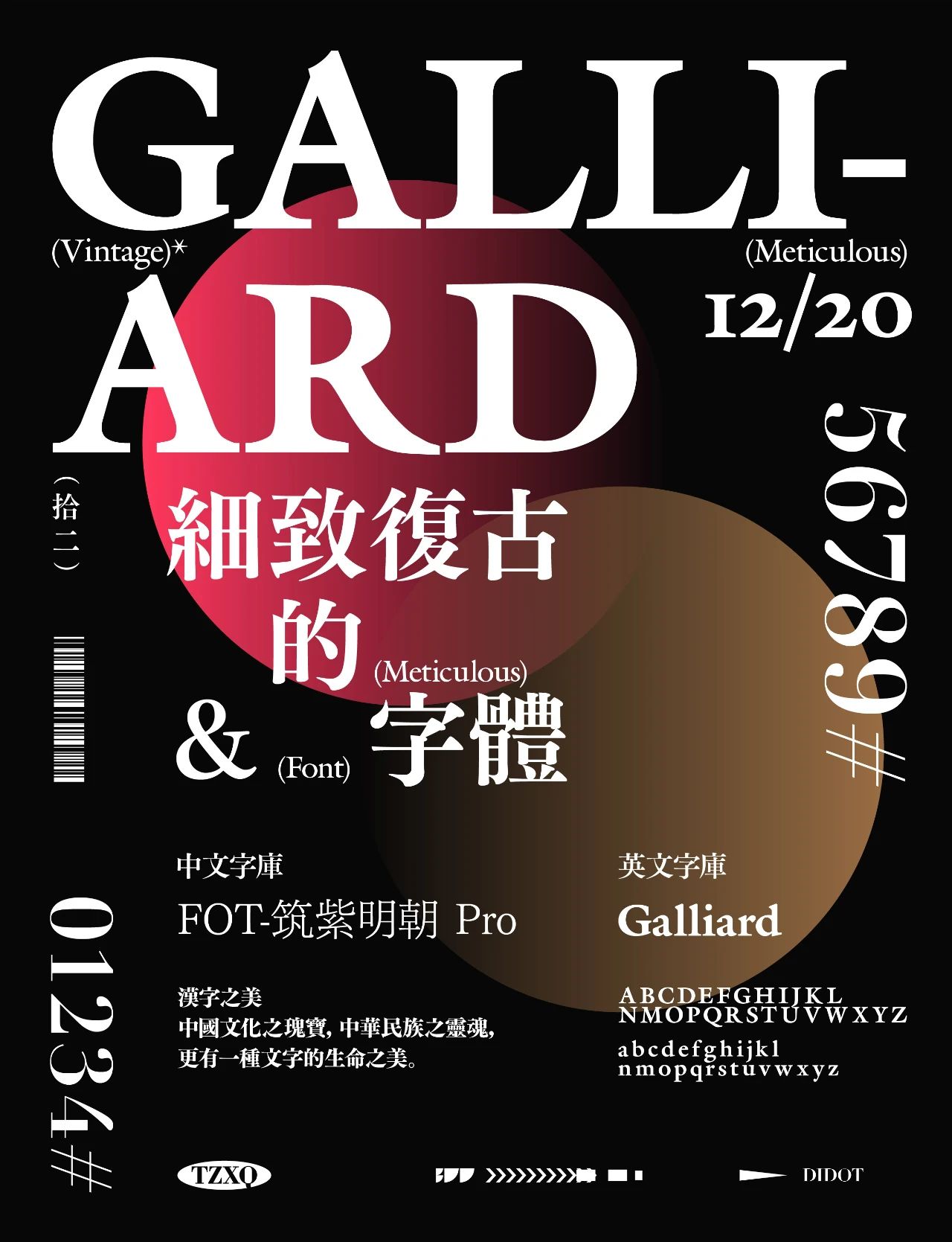
English font: Galliard
galliard regular font is a very good English font, the font writing is quite satisfactory, The transition of line thickness is natural, it looks calm, composed, full of elegance, and the visual effect is very good. At the same time, it also supports the input of numbers and punctuation marks, which can be used in many occasions.
Chinese font: Zhuzi Mingchao
The horizontal strokes of this font are thicker, the closing pen is round and blunt, and the middle palace Close, the curving curve is very tasteful. The whole font looks very soft. Compared with the ordinary Song style, Antique Ming Dynasty has a long curve, a large angle at the end of the pen, and the turning point of the curve is also very interesting.
4. Serif font & Song typeface
These selected classic font combinations are some of the fonts I often use. Each group of fonts has its own characteristics. The structure is very stable and atmospheric. Next, the strokes of some fonts have been slightly changed to make the fonts have strong readability and visual beauty at the same time.
01.
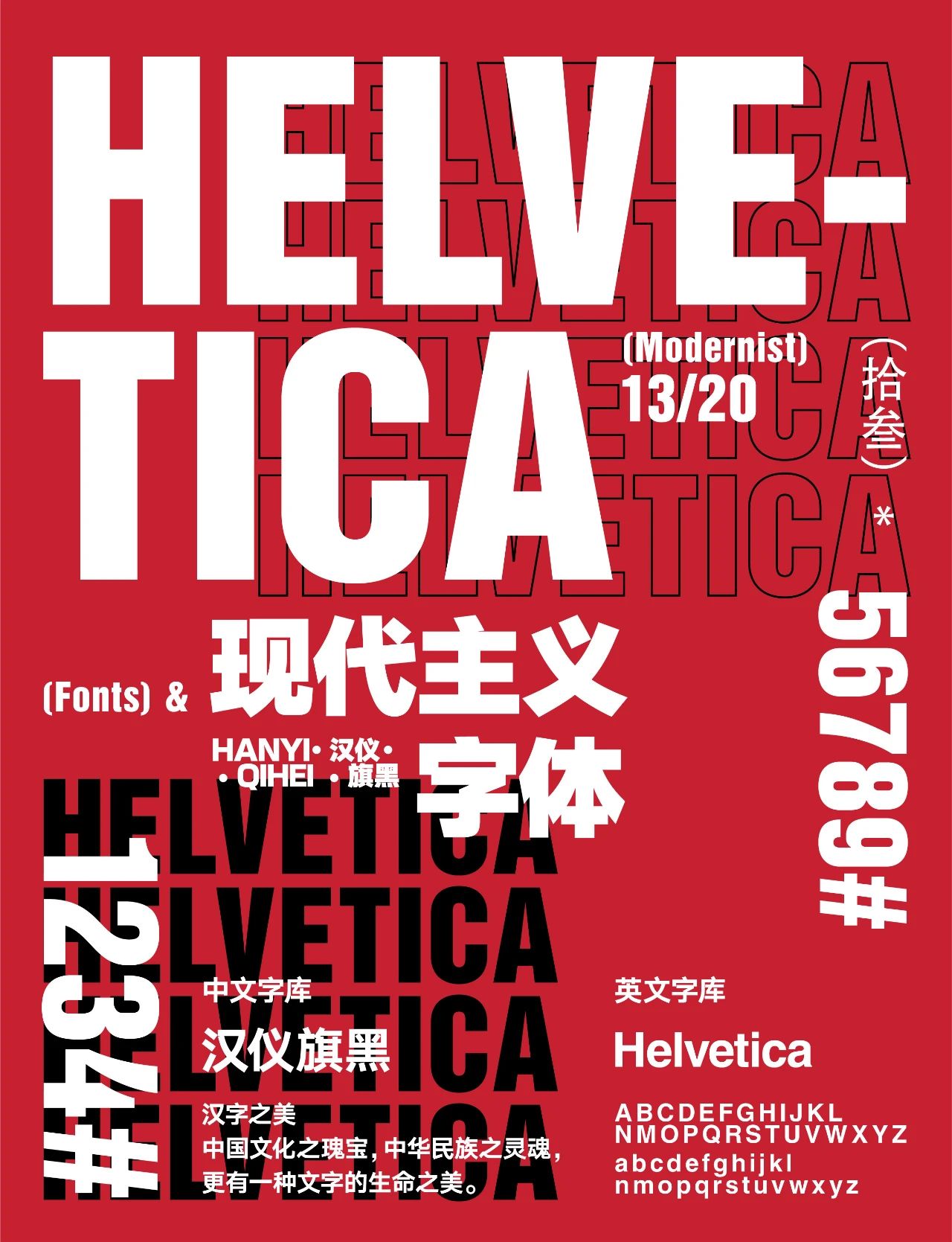
English font: Helvetica
Helvetica is a font that almost every designer knows. There are also countless brands that use Helvetica fonts in their logos. Because of its neutral features, Helvetica can be applied to the subway guide system, giving people a modern, efficient and clear feeling, and it can also be applied to fashion brands such as AA. Because of neutrality, there is a wider application space and a more open way of interpretation.
Chinese font: Hanyi flag black
Hanyi Qihei is composed of three series of fonts (long, square, flat) A huge and complete family of fonts has been formed, ranging from the thinnest 25 to the thickest 105, with a total of 15 weights. It is the largest and most abundant family font in China so far, which can meet the multi-channel and all-round needs of enterprises. Content design and customization requirements to realize the unified presentation of corporate brand image in various channels. It is important to keep the design simple, hearty and full of the atmosphere of the times, but we must not forget the nationality and traditional culture of the characters when designing, and the strokes must have connotations.
02.
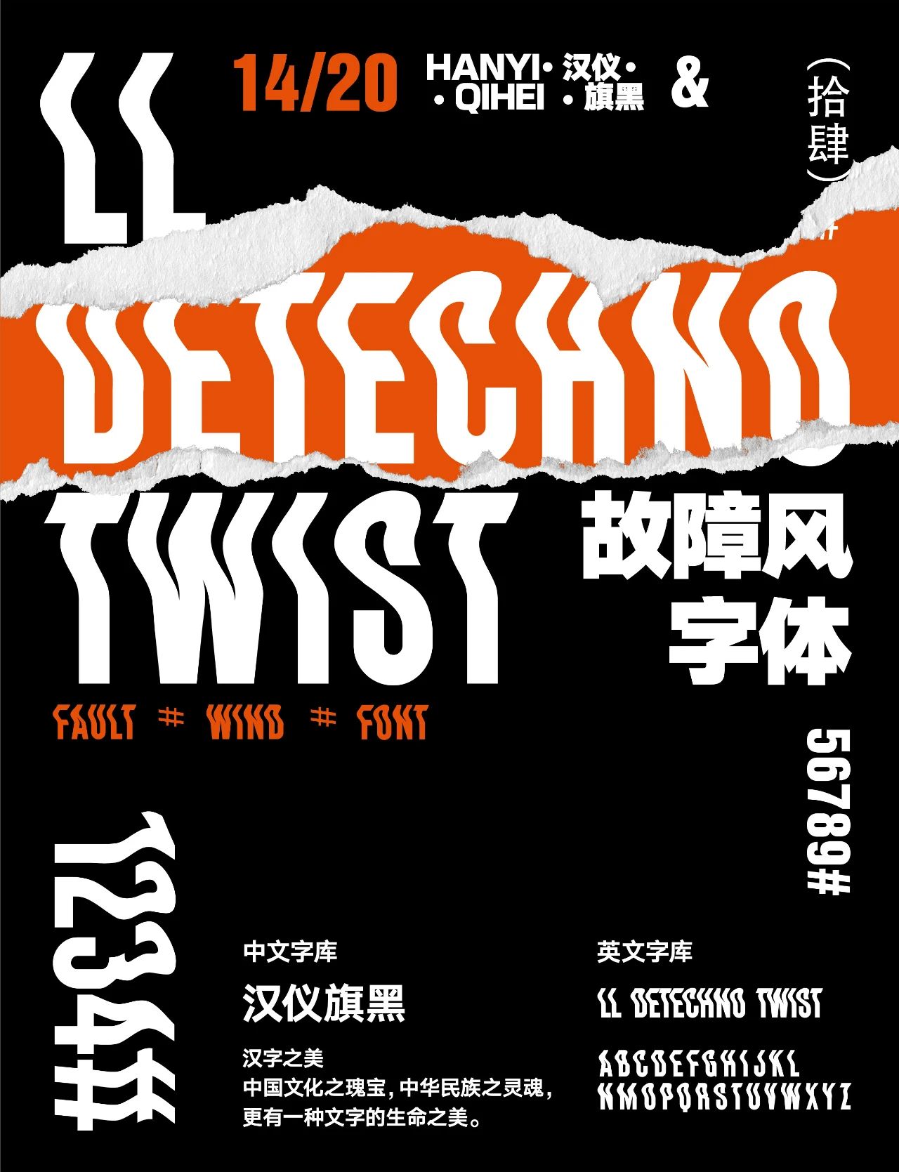
English font: LL Detechno Twist
LL DEtechno This font is inspired by Minimal Techno you listen to every day, Techno music is simple The feature of directness is also reflected in the basic glyphs of this character. The purpose of adding variable features is to make this font more playable. This font is more suitable for titles and is not recommended for use in text.
Chinese font: Hanyi flag black
Look at the above, the same Chinese~
03.
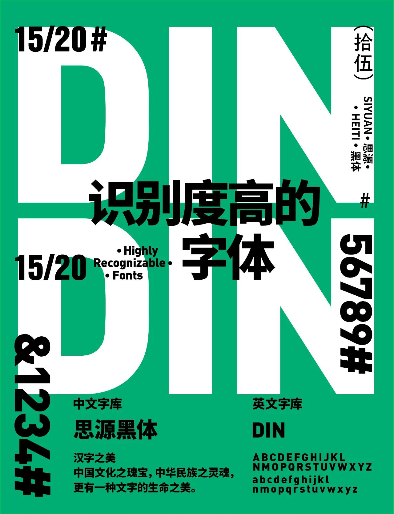
English font: DIN Black
DIN is not only a font, its full name is Deutsches Institut für Normung, German Standards Association, also refers to the German standard system. Behind the DIN font is the rigorous industrial system of Germany, and the rigorous and efficient national spirit of the Prussians it entrusts. The history of DIN fonts is a microcosm of the changes in the German standard system. First, the design concept of DIN is "drawing in the grid". Each letter is strictly aligned with the vertical and horizontal grids, and the width of the letters is also specified; Slender, with a high x height, which makes it easy to recognize; the font is very simple, and each letter can be drawn with one or two strokes without any superfluous decoration, which gives it a bit of geometric beauty.
Chinese font: Siyuan Heiti
Siyuan black body was announced by Adobe and Google in July 2014 after three years An open source font, a new open source Pan-CJK font family for desktop use, available in seven weights (ExtraLight, Light, Normal, Regular, Medium, Bold, and Heavy)
04.
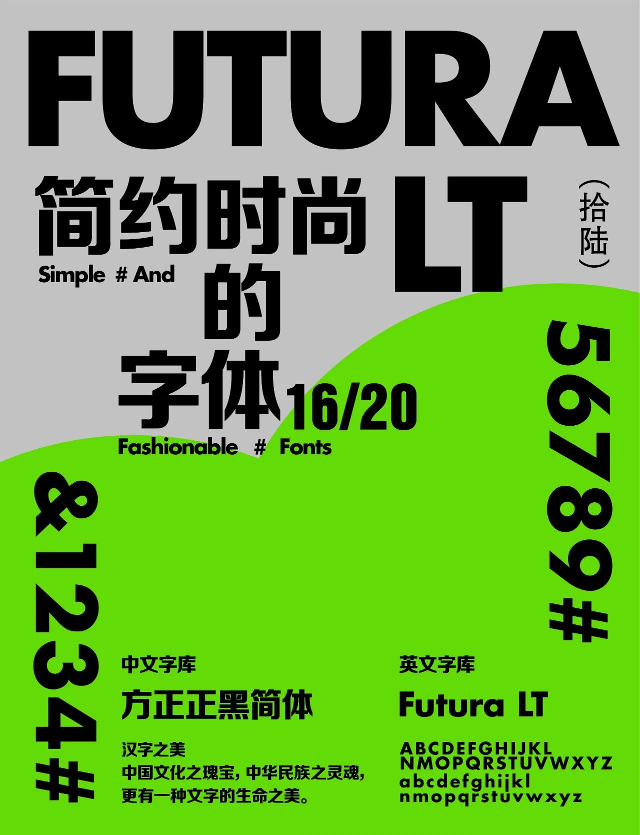
English font: Futura
Futura is a classic sans serif because it spawns a more Multiple sans serif fonts. Futura inherits the design concept of Bauhaus, emphasizing form and composition. The character of the font is obvious and geometric, and the letter o is "almost" a perfect circle
Chinese font: Fang Zheng Zheng Da Hei Simplified
The design of Founder Zhenghei originates from the logo font of "Peking University Founder Group". A set of special fonts designed for enterprise VI systems. This font has a wide face, a high center of gravity, and a symmetrical mirror image of the strokes. The folded pens in the lower right corner are all arc-shaped. Founder Zhenghei's pen shape combines the characteristics of the boldface, and expands into a family-style boldface. Founder Zhenghei family includes 6 font weights, which have been widely used in various newspapers, magazines, advertisements, corporate image, packaging and TV broadcasting media.
05.
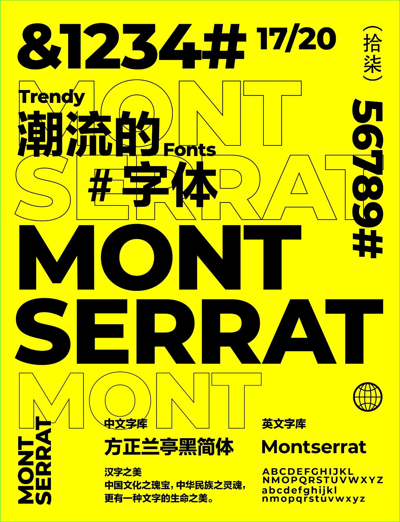
English font: Montserrat
“montserrat font has a very simple line design, users can easily use this font to complete All kinds of advertising and browsing web page design,It is a completely open source font, and commercial use does not require authorization , favored by designers at home and abroad.
Chinese font: Founder Lanting Black Simplified
Founder Lanting Black is the earliest design specially for screen reading in China, and derived from it family of family fonts. Lanting Hei has large characters, simple and elegant fonts, rigorous structure, uniform black and white, and consistent center of gravity; the strokes are well-made, and the lines are firm and soft, concise and powerful. The reading is comfortable and smooth, with a distinct sense of the times.
06.
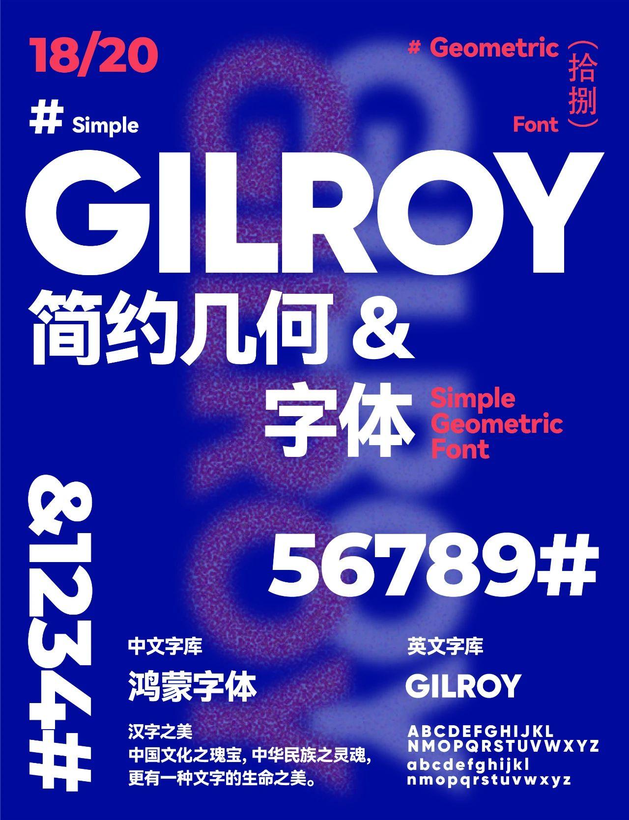
English font: Gilroy
Gilroy is a modern sans serif with a geometric twist. Among the specifications, Heavy is the most dazzling, and it is very suitable for use as an English title font. .
Chinese font: Hongmeng font
The trend of strokes is clearer. Compared with the ambiguity of some system fonts, Hongmeng system The font is displayed more clearly, which is convenient for users to see the content, and it also supports multiple language settings.
07.
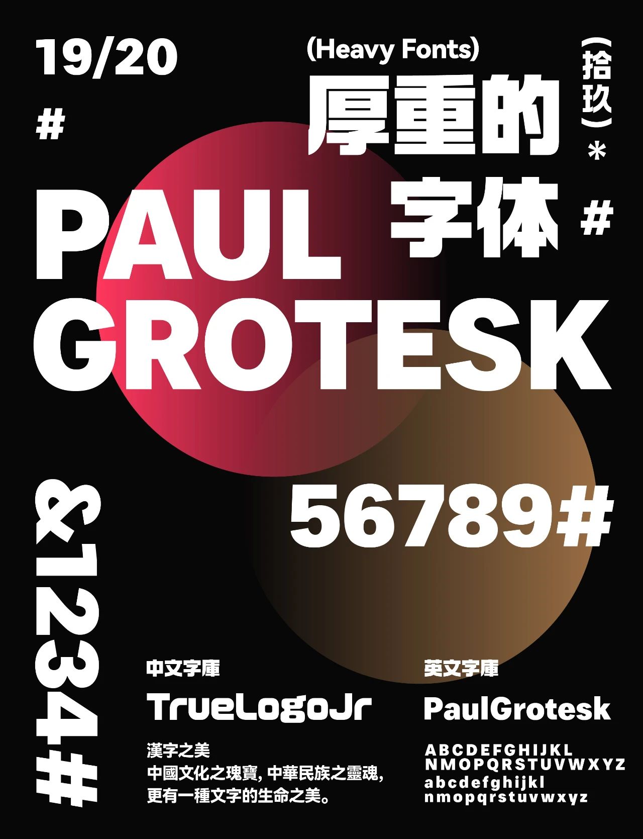
English font: PaulGrotesk
Chinese font: TrueLogoJr-Ultra
08.
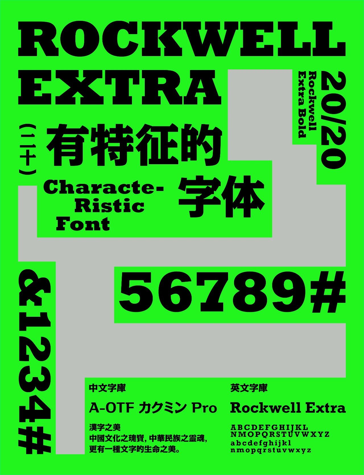
English font: Rockwell Extra
"rockwell extra bold is a very popular English font with flat font , the thickened design looks extremely stable, giving people a sense of masculinity and strength, and has a strong sense of expression. It is suitable for various designs. It is characterized by relatively thick serifs. This type of font is much less than other types .
Chinese font: A-OTF カクミン Pro
Articles are uploaded by users and are for non-commercial browsing only. Posted by: Lomu, please indicate the source: https://www.daogebangong.com/en/articles/detail/Mojinshi%20EducationThe%20current%20popular%20Chinese%20and%20English%20font%20collocation%20case%20very%20practical.html
 支付宝扫一扫
评论列表(196条)
测试