Microsoft is replacing the Calibri default font with Aptos, a new sans serif inspired by mid-20th century Swiss type design. Over the past few years, Microsoft has been looking for a new Aptos default font. The software giant customized five new fonts for Office in 2021, and after years of feedback, it finally selected the Aptos font as the default font.
"Today, we begin the final phase of this major change, and Aptos will begin appearing as the new default font in Word, Outlook, PowerPoint, and Excel," Microsoft principal program manager Si Daniels explained in a design blog post today. Serving hundreds of millions of users. Over the next few months, it will become the default font for all of our customers.
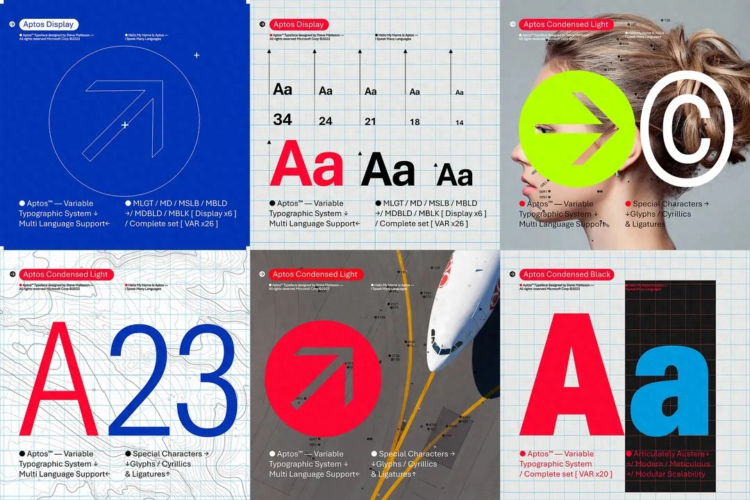
Aptos was created by famous type designer Steve Matteson. Matteson previously designed Segoe, which Microsoft licensed as the default font for Windows. Microsoft first used the Segoe UI font subfamily in Windows Vista, and it is still used in Windows 11. Matteson also participated in the development of the original Windows TrueType core fonts. Bierstadt has been renamed Aptos, after Matteson's favorite unincorporated town in Santa Cruz, California.
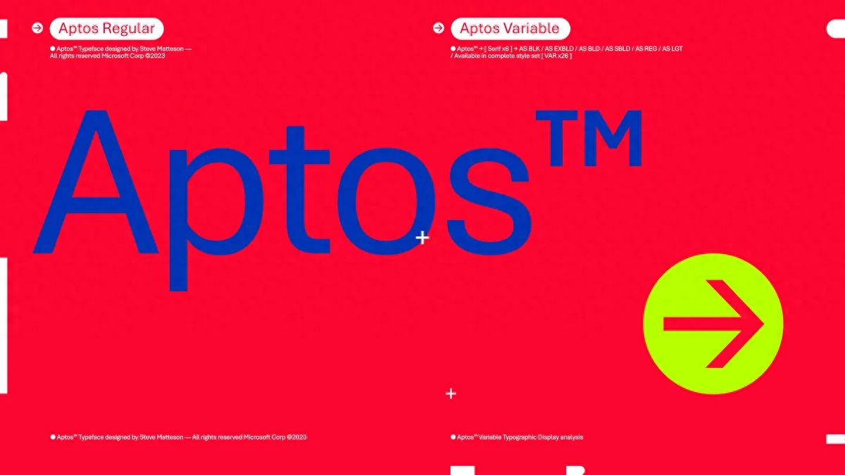
Aptos has a very obvious cut off at the end of the strokes, but there is also some subtle softening to avoid the stiff grid-based typography that is typical of this typeface. Helvetica is the most famous example of this "weird San-Serif" font, and Matteson also compares it to Microsoft's Arial font here. While Aptos will replace Calibri as the default font, Calibri will still be preset at the top of the new font menu (initially only available on the web), along with its predecessors Times New Roman and Arial.
Calibri has been the default font in Office since the release of Office 2007, replacing Times New Roman at the time. Calibri is widely used and even became a key piece of evidence in a 2017 corruption investigation into the Pakistani prime minister. However, not everyone is comfortable using Calibri. One example is the U.S. State Department, which earlier this year instructed its employees to use Calibri in memos. The Department of State has used Times New Roman since 2004. Given that it took them a full 16 years to switch to Calibri, they may have to wait another decade or more before finally switching to Aptos.
The other four fonts not selected as default fonts - Grandview, Seaford, Skeena and Tenorite - are still available in Office, and Microsoft has even kept the name of the Bierstadt font in the drop-down selector for the convenience of users who are already familiar with the font. .
"Aptos is part of a raft of upcoming features for Microsoft 365. We're working hard to make the software more expressive and inclusive," Daniels explained. "A completely redesigned font picker experience, along with new themes, colors, and backgrounds.
Articles are uploaded by users and are for non-commercial browsing only. Posted by: Lomu, please indicate the source: https://www.daogebangong.com/en/articles/detail/Microsoft-Office-jia-ru-xin-mo-ren-zi-ti-Aptos-qu-dai-Calibri.html
 支付宝扫一扫
评论列表(196条)
测试