Written in front: the days of learning font design with the master, today continue to share font design, hoping to play a role in everyone's learning of font design .
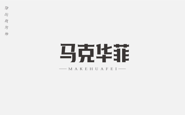
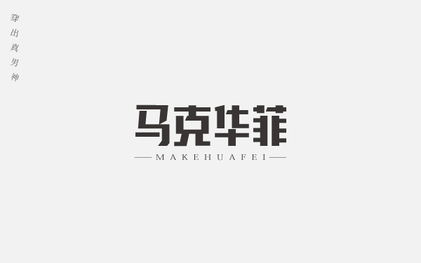
Font Name: Mark Faye
Industry: Men's Apparel
Creative ideas and methods: Mark Faye is a men's fashion clothing brand, and it is also a fashion brand tailored for the world's urban upstarts. Since it is a men's brand, the key words we need to grasp are toughness, strength, and fashion. Usually, the strokes of fonts that express toughness and strength are thicker. There is no need to deform the font too much, keep it simple and generous, and have a high degree of recognition.
Here are a few ways to get creative with fonts:
First of all, it is still the outline of our basic font, using the pen and rectangle tool to outline the basic font shape.

Creativity 1. Expand the basic font, adjust the thickness of the strokes of the horizontal font, so that the horizontal and vertical strokes have a contrast, it looks less dull, and then add small sharp corners at both ends of some horizontal strokes, so that The font looks sharper and more powerful.

Creativity 2. On the basis of the basic font, some horizontal strokes of the font are obliquely cut and left blank. This is also a common method for font design. rigid. The blank part also allows the font to have a breathable space, and the overall look is tough and full of fashion.

My friends, have you learned it? If you have any questions, welcome to add my font world group, group number: 439833287, come and tease me anytime.
Articles are uploaded by users and are for non-commercial browsing only. Posted by: Lomu, please indicate the source: https://www.daogebangong.com/en/articles/detail/Mens%20Clothing%20Brand%20Typography%20Design.html

 支付宝扫一扫
评论列表(196条)
测试