This article will teach students how to use texture materials and layer styles to draw a set of ultra-realistic golden brick fonts. Not only that, in order to increase the authenticity, there is also a post-production coloring tutorial, which can be used directly after learning On the promotional poster, it must be very attractive. By the way, don't patronize Mark, it's yours after you've practiced it, come and accept it!
Tutorial material package:http://pan.baidu.com/s/1dDHO46X
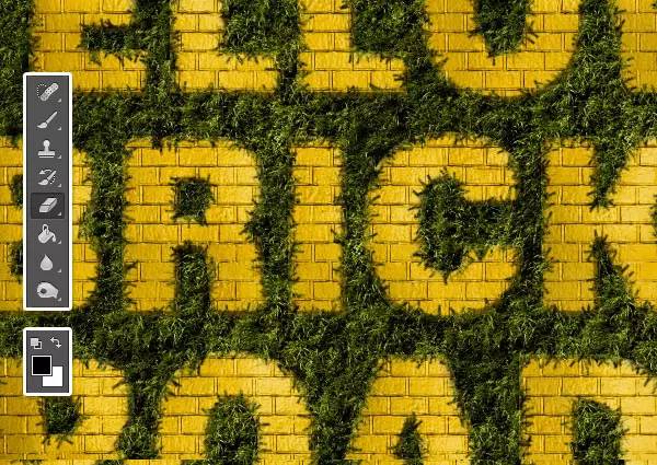
Rendering:

Step>
1. Create a new layer of 1000*700px. In this tutorial, the font we use is "SansBlack"~ the font size is 230px, and the color is #f1cc4c~
2. Duplicate the text layer, change the fill to 0%, and duplicate it once.
Step>
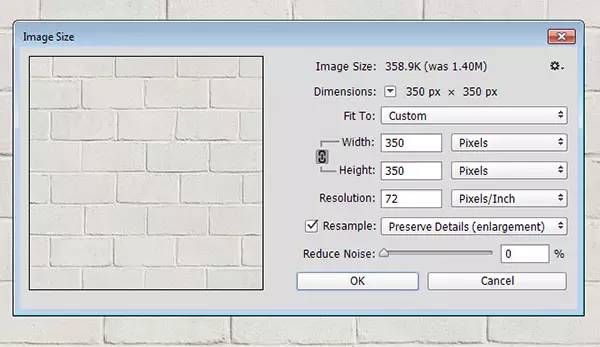
1. Now we need to open the "BrickLargePainted0050" material, then go to Image>Image Size, change its size to 350*350px~
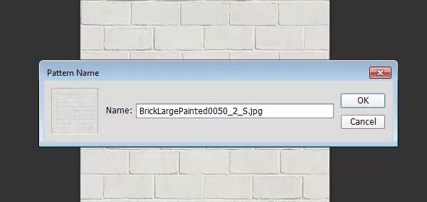
2. Edit> Define pattern, confirm.
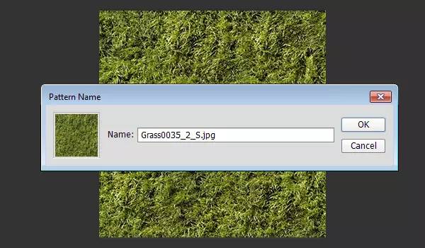
3. Open the "Grass0035" material, change its size to 320*320px, and edit it into a custom pattern.

Step>
1. Open the layer style, bevel and emboss
Inner Bevel, Smooth, Depth 100px, Size 1, Highlight Mode: Soft Light, Opacity 50%, Angle 120°, Shadow Mode: Multiply, Opacity: 10%
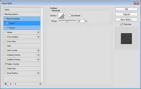
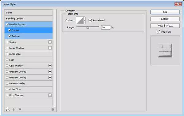
2. Contour setting, range: 50%
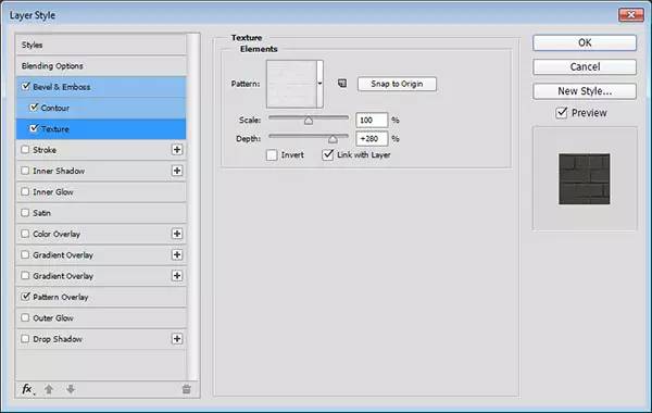
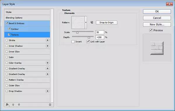
3. Add texture, use the brick texture we just set~ Width: 280%
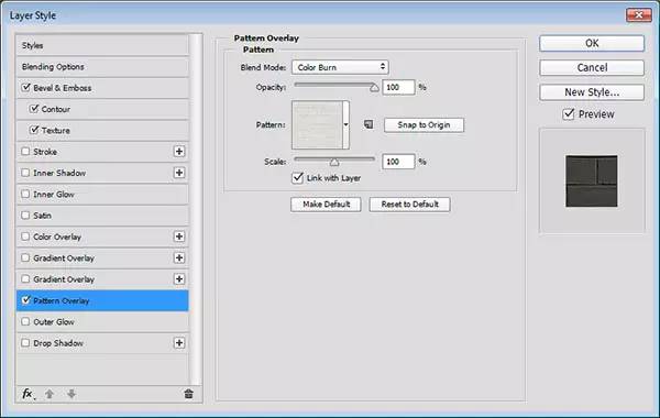
4. The pattern is superimposed, the color is deepened, and the pattern uses the brick texture we just set~
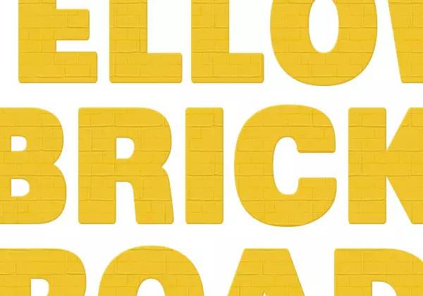
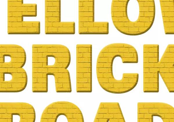
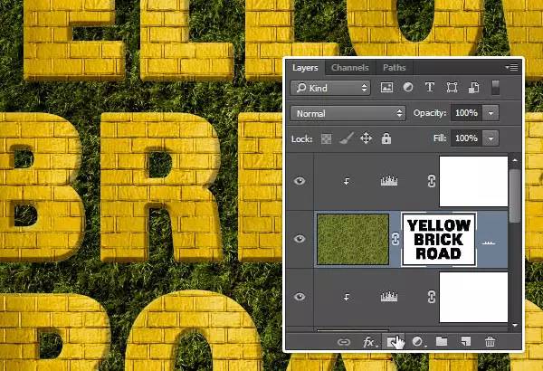
After is set, our text effect will look like the picture below.
Step>
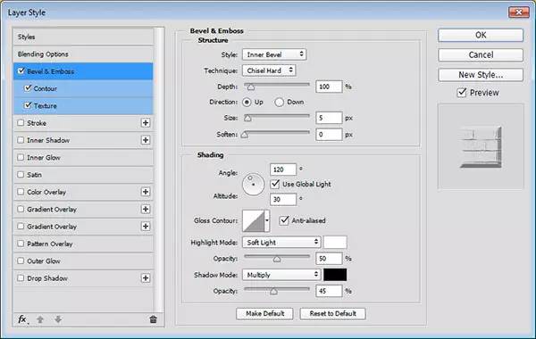
1. Bevel relief: inner bevel, clear engraving, size: 5px, angle 120°, soft light, transparency 50%, multiplication, transparency 45%
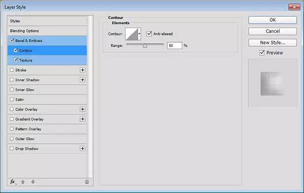
2. Contour lines, anti-aliasing must be ticked~
3. Add texture, here is the brick texture we set up ~ Range: 50%, Depth: 200%.
Then the effect of our first text copy is the same as the picture below~
Step>
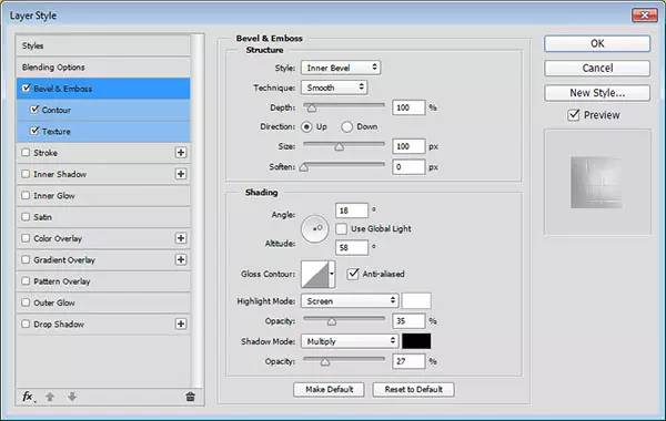
1. Bevel relief: inner bevel, size 100%, note: we don’t use global light here~ angle 18°, height 58°,
Select Anti-aliasing, Highlight Mode: Soft Light, 35%, Shadow Mode: Multiply, 27%.
2. Contour line, select anti-aliasing
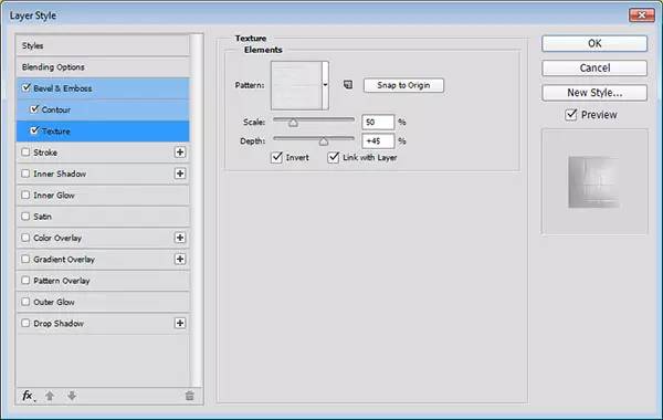
3. Add texture, brick texture, range 50%, depth 45%. Note that you have to choose inversion here~

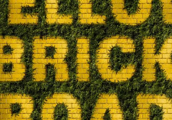
After confirming, our text effect will be as shown in the picture below~
Step>
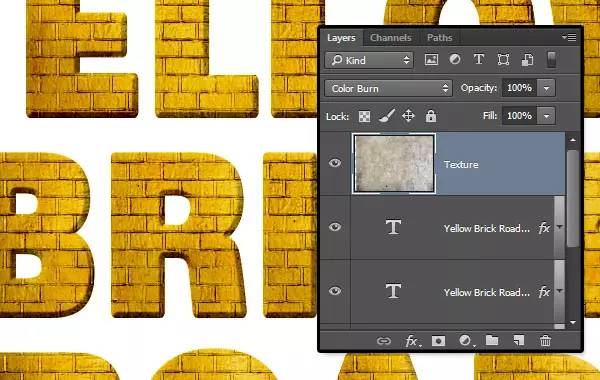
1. Place the "GrungeTexture27" material on the top layer, and then set the setting mode to color deepening~

2. Now we need to create a new color scale to adjust the layer~
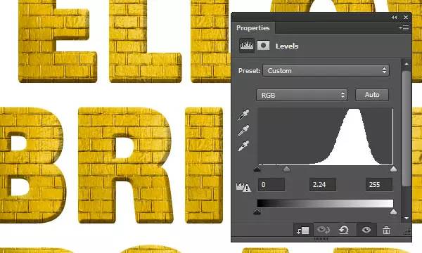
3. The parameter settings are as shown in the figure~then set it as a clipping layer~

Step>
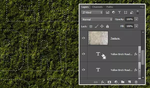
1. Create a new layer at the top and name it "Grass".
Select the paint bucket tool, and then in the option bar, select "Pattern" to fill~ If you can't find it for novice children's shoes, see that there is a paint bucket logo under "File", the default setting is "Foreground", change it to "Pattern" That's it! Fill the "Grass" layer with the grass material.
2. Add a new color scale, and the parameter settings are as shown in the figure below~
3.Ctrl+right click, select the text selection area, and then go to select>inverse selection (shift+ctrl+i)
4. Keep the selection, and then add a layer mask to the "Grass" layer~
Step>
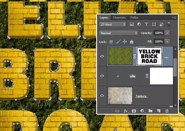
1. Select any text layer and right-click to select Create Work Path, then click the layer mask on the "Grass" layer
2. Select the eraser tool, select the edge brush, set the foreground color to black, and press the Enter key to tap the side brush head. Another way is to choose the Direct Selection Tool, right-click on the Work Path, choose Stroke Path, then choose Erase from the Tools drop-down menu, and click OK. With the Direct Selection Tool selected, hit the Return key to get rid of the working path.
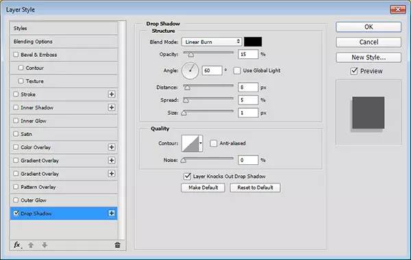
Step>
1. Add layer style, shadow: linear deepening, do not choose global light~
Opacity 15%, Angle 60°, Distance 8, Spread 5, Size 1.
Does the grass with shadows look more realistic~
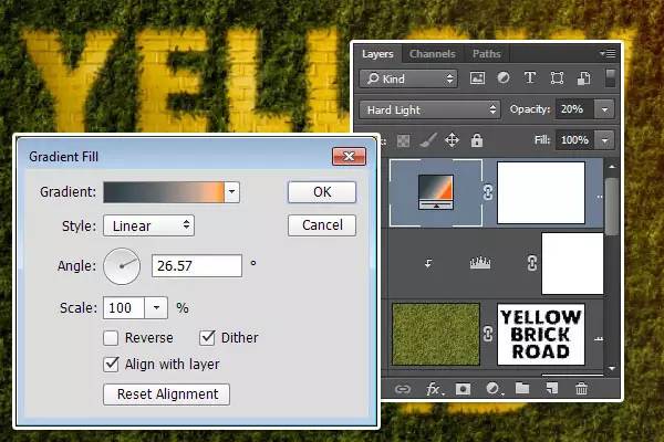
Step>
1. Create a new gradient fill with an angle of about 26° and dither.
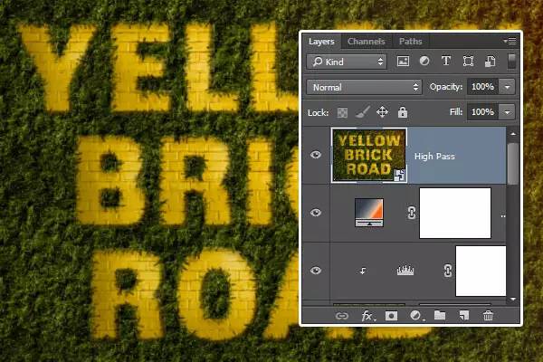
2. Select all the layers, duplicate them, then go to Layer>Merge Layers, rename it "HIGHPASS"~
Then we go to filter>Convert to smart filter library~
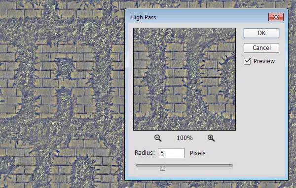
3. Filter>Other>High contrast preservation, change its radius to 5px~
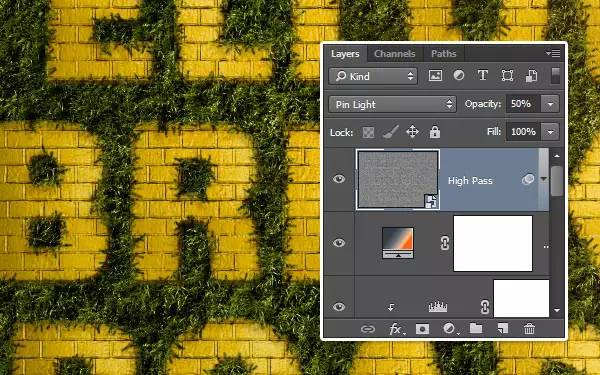
4. Change the "HighPass" layer mode to point light mode, with an opacity of 50%~
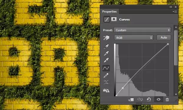
5. Add a curve, increase the brightness a little~ and then we are done!

===========================================
Original address: design.tutsplus Translator: @ChloeRowe林阿诺
==================================================
For other essential posts, please reply to the following keywords:
Newbie, Fire Rose, Light and Shadow Particles, Burst Effect, Polygon, Wireframe Style, Dot Effect, Double Exposure, Drawing Hair, Drawing Apple, Tool Icon, Camera Icon, Doraemon, Rocket, Starry Sky, Pencil, Stone, Donut, Shield, Stone, Milk, Lilliputian, Crystal, Hand Drawn, Floating, Comic, Ripple, Emoji
If you read every post carefully
you will find
There is an additional advertisement picture at the bottom
It already has a halo of blessing of progress
Poke it!
Articles are uploaded by users and are for non-commercial browsing only. Posted by: Lomu, please indicate the source: https://www.daogebangong.com/en/articles/detail/Lost%20Castle%20Special%20Effects%20Font%20Tutorial.html
 支付宝扫一扫
评论列表(196条)
测试