Author: Liu Bokun
The new logos of the nine CBA clubs are officially released today, including the main logo and sub-logo, standard color matching system, standard font number and corresponding Chinese font design.
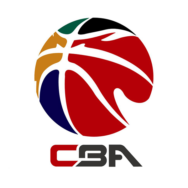
CBA league logo
I don’t usually pay much attention to the CBA, but the logo design of each team is still "impressive". The ancient design and cheap style of painting are really touching! After Yao Ming was elected as the chairman of the Chinese Basketball Association, a series of more professional and market-oriented changes are taking place, and the team's image renewal is an important step.
Let's take a quick look at the new logos of the nine teams!
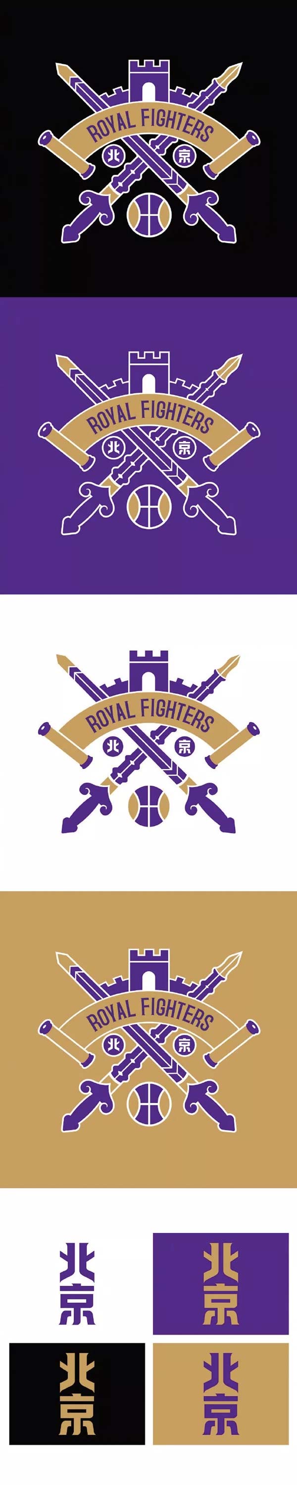
Beijing Forbidden Warriors
BEIJING
The shiny golden logo reminds me of a slogan: You start with a knife, and all your equipment depends on picking it up! Complicated graphics, stacked text and local gold color scheme, two words: Absolutely! The new logo is composed of three main elements, the Great Wall, the sword and the scroll, supplemented by Beijing characters and basketball patterns. The purple and gold color scheme is familiar to those who are familiar with the NBA. Overall, it looks very Chinese!
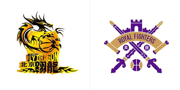
Beijing Forbidden Warriors (formerly Beijing Aolong)
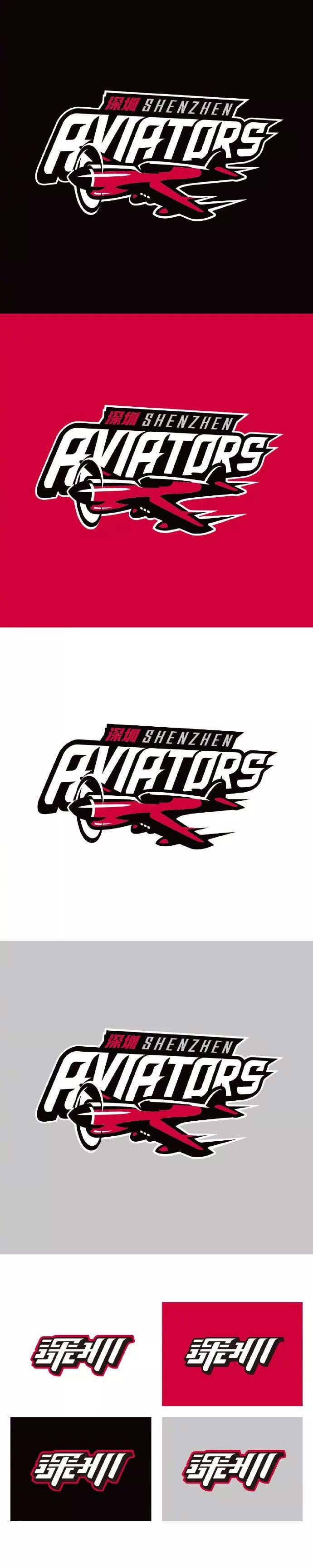
Shenzhen Navigator
SHENZHEN
The original logo is a simple cheetah, and now the name has been changed to a name that better interprets the spirit of the city: Navigator, and the main body of the logo has become a charging fighter, just like the official explanation: looking forward to being able to cooperate with the city in the future. More hard-working, innovative, enterprising and hard-working people set sail together, won one challenge after another, and finally flew to the destination of everyone's dream.
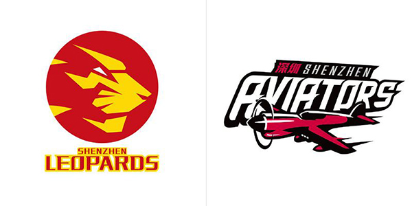
Shenzhen Navigator (formerly Shenzhen Leopard)
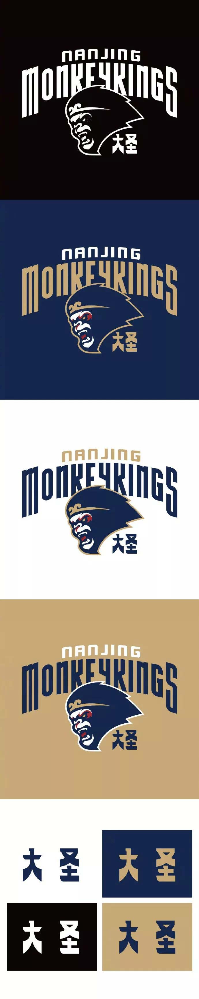
Nanjing Dasheng
NANJING
This is definitely a monkey not to be messed with, but the posture of the monkey holding the ball is not standard! The previous logo was too realistic, and the character illustrations were brought over, which can be regarded as a maverick in today's pursuit of simplicity and flatness.
The new logo is obviously aware of this, and it outlines a simple monkey head, but all the depictions are concentrated on the face, and the side and back are slightly hollow.
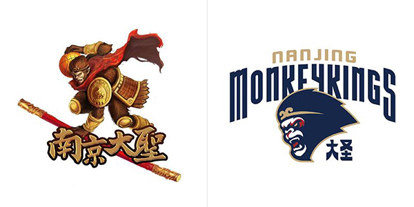
Nanjing Dasheng (formerly Nanjing Tongxi)
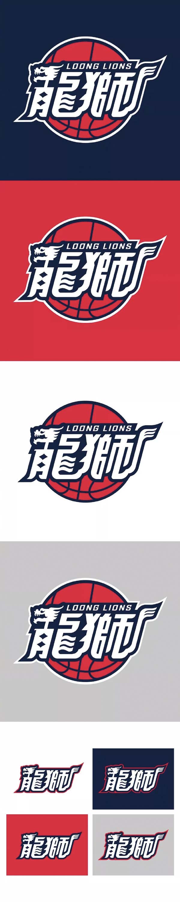
Guangzhou Longshi
GUANGZHOU
To be honest, I prefer the original design, which looks more concise and layered. Maybe there are less basketball elements, and the back is replaced with a basketball; the changes in the main text "dragon head" and "lion tail" are complicated, and the combined It is not as natural as before, and the shape of the whole set of characters is more like the style of "dragon boat" deliberately made, and I feel sorry for the designer for three seconds.
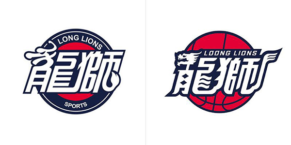
Guangzhou Longshi
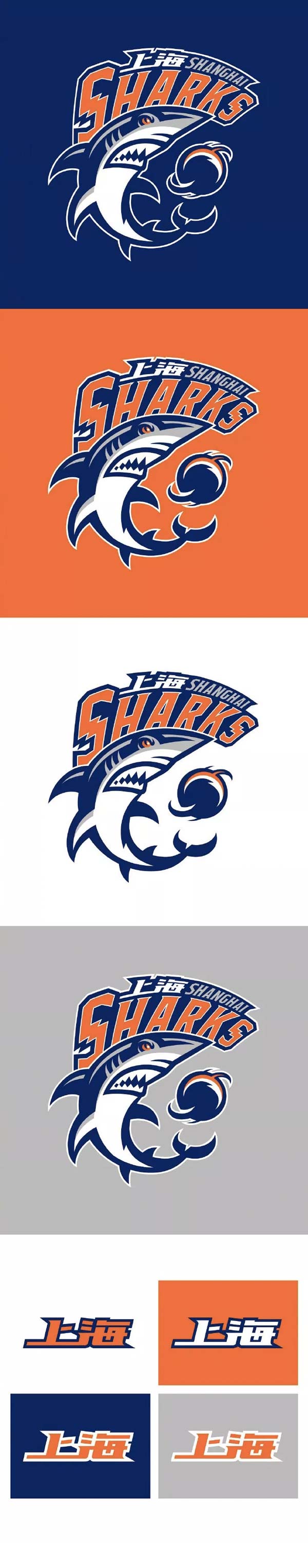
Shanghai Sharks
SHANGHAI
The original logo is still not outdated now. I drew this big shark when I was a child, so I was very impressed. Looking at the new logo, it is very modern and fashionable, but I still like the previous one, and I need to accept it slowly. But a few years later, like many NBA teams now, some retro jerseys will be very popular!

Shanghai Sharks
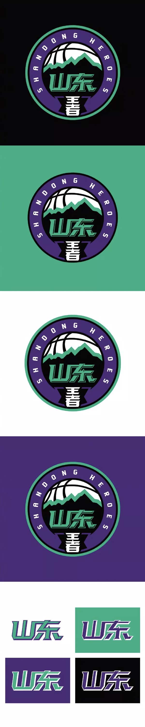
Shandong King
SHANDONG
From Shandong Gold to Shandong Venus to the new team name Shandong Kings, as a native of Shandong, I really don’t want to claim this name! After all, it is also the land of Qilu and the hometown of Confucius and Mencius, so this is the name?
And look at this crappy new logo, it's just a joke! Official explanation: "The font of the team name "Shandong King" uses a simple, powerful, and sharp-edged design style, which more appropriately expresses the tough style of "Shandong Dahan" in everyone's first impression." Well, really! able! pull!
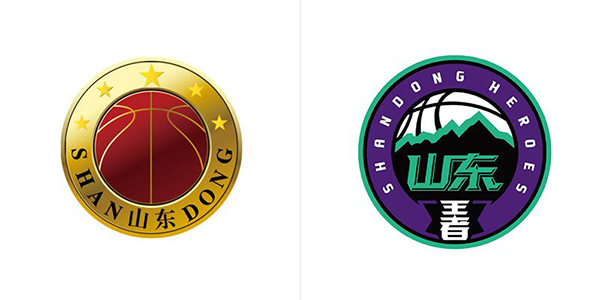
Shandong Wangwang (formerly Shandong Jinxing)
TIANJIN
Tianjin Pioneer
With the change of the team name, the original logo was completely abandoned. If I didn't look carefully, I thought the logo of the NBA All-Star Game was moved here! I have to say that this design is really NBA, so I want to ask which one is better, "Navigator", "Forerunner", or "Trailblazer"?
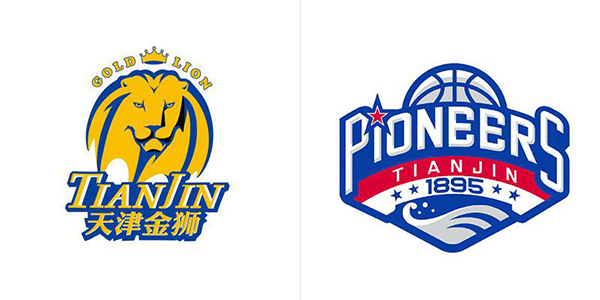
Tianjin Pioneer (formerly Tianjin Golden Lion)
Zhejiang Jinniu
ZHEJIANG
The original logo is amazing. The logo of a basketball team invited all the bulls from the financial street. Can you imagine how casual the English and Chinese are used below?
A new version of the logo, huh? Why do they all look the same? This is just the new logo of nine teams. If all 20 teams were designed like this, wouldn’t it be boring? But only from the design point of view, it is much better than before, this is not denied.
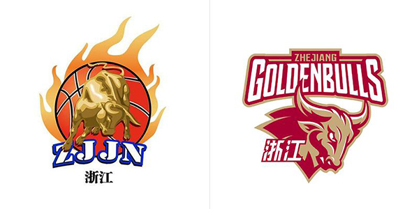
Zhejiang Jinniu
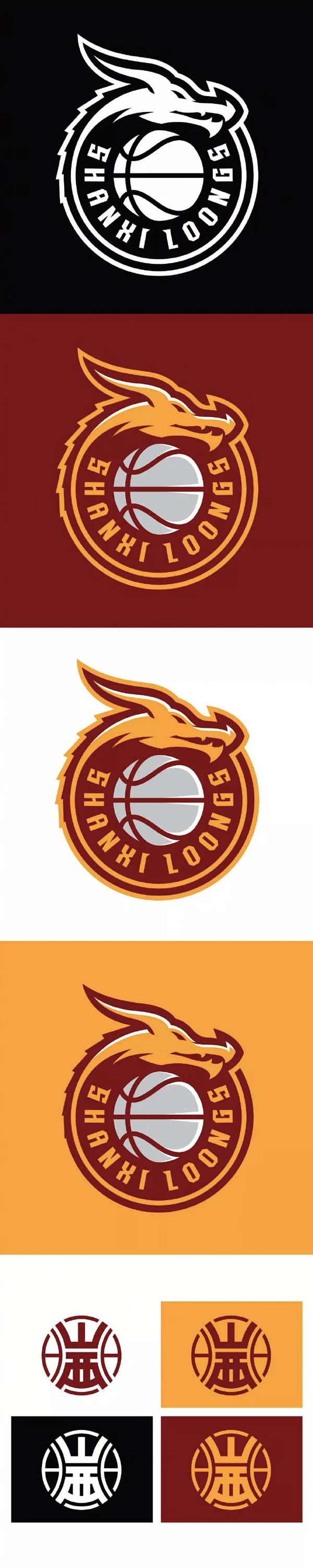
Shanxi Raptors
SHANXI
It took about a season to replace the previous Jiuzun dragon head logo, and the current circular dragon logo has actually been used for a season. Many fans still like the previous logo of Jiuzun dragon head. The new logo is more modern, but the name has to remind people of the NBA's Toronto Raptors.
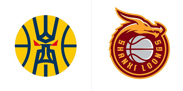
Shanxi Raptors
Every time something new comes out there are different voices, and this time is no exception. The new logos of the nine CBA teams, which one do you think looks better?
Articles are uploaded by users and are for non-commercial browsing only. Posted by: Lomu, please indicate the source: https://www.daogebangong.com/en/articles/detail/Looking%20at%20the%20new%20logo%20of%20the%20CBA%20team%20is%20the%20most%20dazzling%20one%20from%20your%20province.html
 支付宝扫一扫
评论列表(196条)
测试