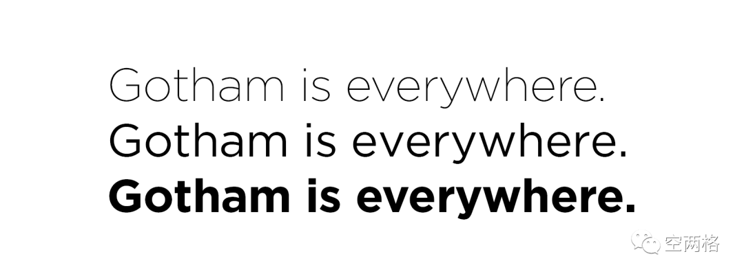
m font. Gotham is a sans serif font created in 2000 by American designer Tobias Frere-Jones. It takes its name from the nickname "Gotham City" for New York City, the city featured in the Batman stories. What makes Gotham typeface unique is its simplicity,
Designer's life divided into paragraphs
Remember to leave two spaces at the beginning
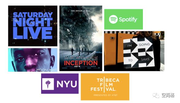
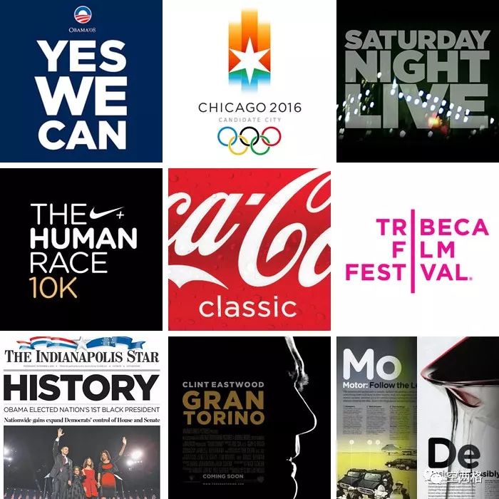
Have you heard of the Gotham font? It doesn't matter, if you've been on the Internet, seen a billboard, been to a movie theater or just walked around the street, you've seen Gotham. This font was still a small trend a few years ago, but it has become prominent in recent years. For example, last year, many brands including Burberry replaced their LOGOs and introduced a more modern visual language. The simple and modern design represented by Gotham Began to show extraordinary strength. Gotham is a font designed for GQ in 2000 and opened to the public in 2002. It appears in many places, from Coke bottles, Twitter, Spotify, Netflix, Saks to NYU, Tribeca Film Festival, and more, TV series including "Conan Show" and "Saturday Night Live", including Films including Inception, Moneyball, The Lovely Bones, and Moonlight have all used this font. If your city's train and bus station ads don't use Gotham, chances are they're using a font similar to Gotham.
As the name of a Tumblr account dedicated to tracking Gotham's popularity (Gotham is everywhere) suggests, the Gotham font is pretty much everywhere. But how did it become so common? How did typefaces take over the market so thoroughly in such a short period of time? What do advertisers of all stripes love about fonts?
The simplest answer is a technical analysis. Gotham is a geometric sans-serif, which means that it lacks the decorative details you see in the corners of the letters that you see in Times New Roman, and its geometry suggests the basic shape's importance to its design. Influence. As a Western font, it has a higher x-height than normal fonts, which means that lowercase letters like x and e are considerably larger, and its font family contains different weights, such as bold , thin, medium, and more. This design makes billboards or signs rendered in Gotham easy to read, which makes it an excellent choice for print advertising.
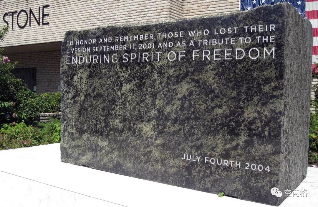
In fact, the Gotham typeface originated from the most common architectural signs in 20th-century New York City. Strangest of all, the geometric logo on the front door of the Port Authority was the inspiration for Tobias Frere-Jones, creator of the Gotham typeface and type industry mogul. Most people would not associate this place with fashion. Frere-JonesThe goal is to find a vehicle to convey the message directly, it can even be blunt. And hope that this non-print font can produce something memorable in this nearly saturated font industry. There is also a more nebulous, more general question of style. Frere-Jones once described Gotham as fresh and masculine (it was originally designed for GQ, after all). Hillary Clinton's 2016 logo designer, Michael Beirut, described it to Newsweek as asleek, ungarish, and very straightforward typeface. Characteristics of a font to easily distinguish whether it has masculine qualities< /span>is somewhat difficult. For example, is it the weight of the typeface, or the straight, clean lines that drive the association? Against the backdrop of GQ itself, Gotham's bluntness and authority can certainly be read as masculine, especially in bold font. However, on thinner strokes, when paired with a specific color scheme, it can easily be interpreted as an elegant, feminine typeface. From this point of view, this is a font that can swing in both directions. Perhaps, the combination of smoothness and straightforwardness is the most critical factor for it to stand out. In many areas, the Gotham typeface is a stylish whiteboard that can be used in a variety of contexts, while at the same time imbuing its surroundings with a kind ofdown-to-earth, outspoken< /strong>Elegance. Gotham is used in even the most bleak situations. In 2004, a 20-ton cornerstone was laid on the site of the rebuilt Freedom Tower, inscribed "in memory of those who lost their lives on September 11, 2001, and in honor of the enduring spirit of freedom." This sentence is engraved in the Gotham font, which until recently was made available to the public by Hoefler & Co. (By the way, licensing fonts like Gotham doesn't come cheap; typography.com sells for $199 for a basic Gotham pack of four weights.)
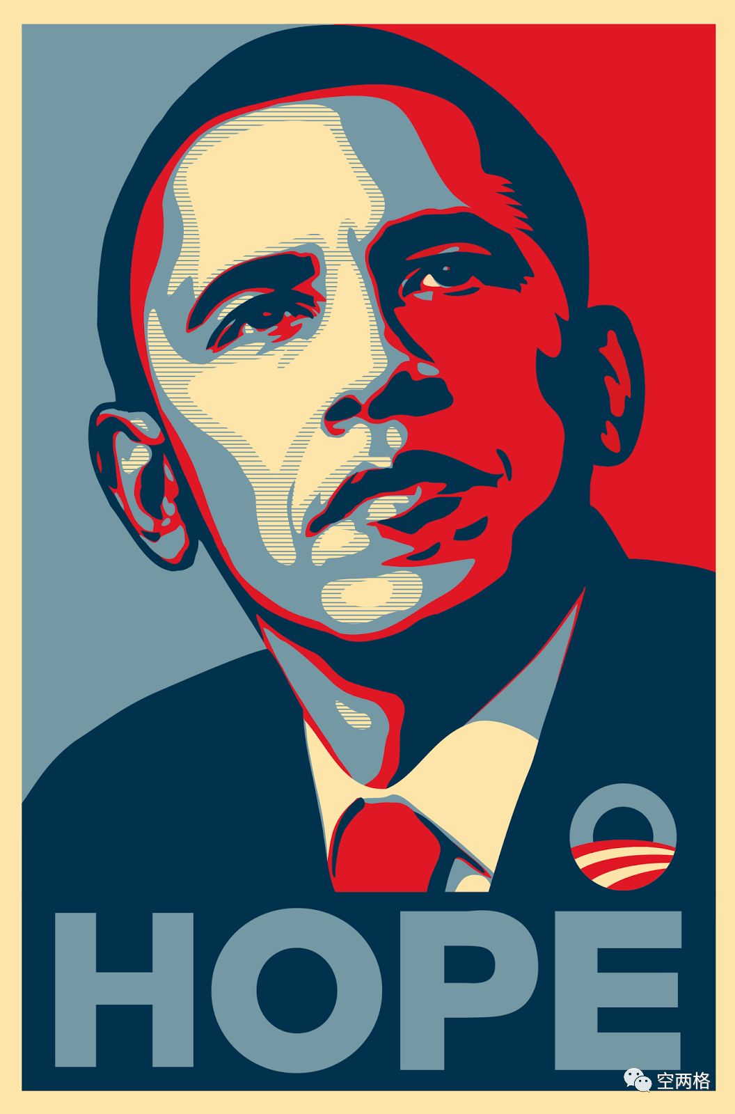
One of Gotham's most iconic and beloved catchphrases is just one word: Hope. Initially, the Obama campaign used Perpetua, a serif typeface in the same style as Hillary Clinton's use of New Baskerville, for its logo and branding materials. But with a new designer on the team, they took a very unique visual direction that highlighted Gotham's original serif form, thus paving the way for a re-election campaign. The new branding, especially the famous "Hope" poster, left a lasting impact on the field of political design. Obama used Gotham in 2008, cutting into the realm of political design that has heavily used traditional serif fonts. Geometric sans-serif fonts and bold colors are all the rage these days in the 2020 U.S. primary election, in addition to the traditional red and blue palette.
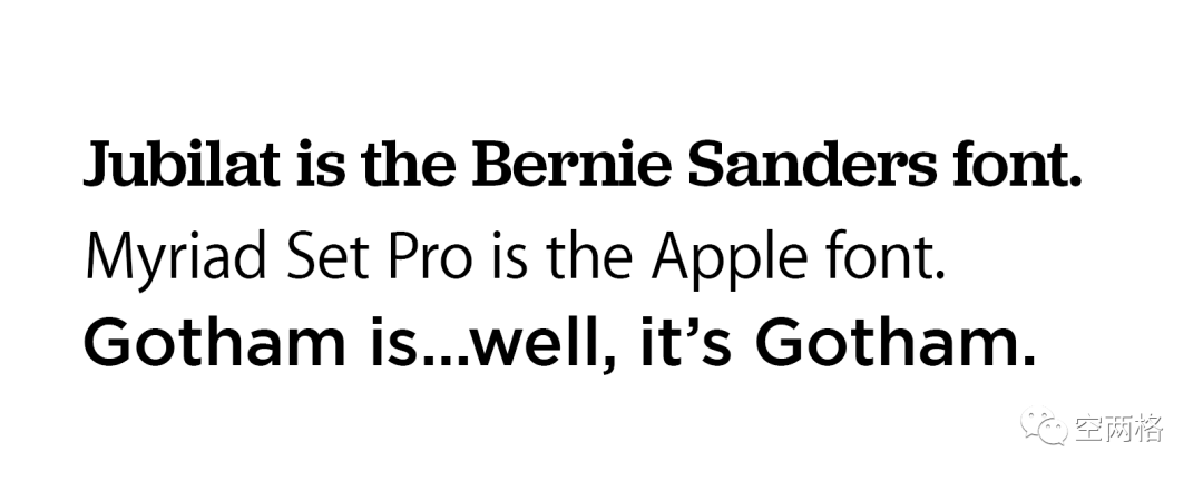
Frere-Jones thinks: Obama's whole design changed the face of politics. These days, campaigns are very aware of their typography and typography in the realm of political design. Perhaps Gotham's blunt aesthetic allows it to turn the lens of democratic politics into the 21st century. In the same Newsweek interview, Michael Beirut noted that unlike other sans serifs, it is neither German, nor French, nor Swiss— It is an American font. However, what makes the Gotham phenomenon unusual is that it has been used by countless industries, by countless products and brands, and at the same time And beyond its association with any one particular industry. If I showed you a sentence typed in Jubilat or Myriad Set Pro fonts, you might recognize them as fonts used by Bernie Sanders and Apple, respectively. Although the differences between these several fonts are obvious, they still have some similarities with Gotham in letter structure.
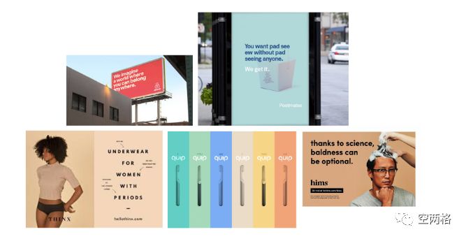
But you probably wouldn't immediately classify Gotham as an "Obama font," "Saturday Night Live font," or a "Spotify font," would you? Gotham refuses to be categorized allowing it to be used by one big brand after another without changing itself Got stale. In the nearly 20 years since Gotham came out, there has been a lot of adoption of more minimalist, modern sans-serif fonts, an area that has seen advertising explode . Like Gotham's predecessors Avenir and Proxima Nova, rising stars including Raleway, Montserrat, Gibson inherited Gotham's clean, straightforward sans-serif style. But it’s not just about fonts, the popularity of sans-serif fonts is one of the major shifting trends towards minimalist design. Fashion brands targeting millennials such as Glossier and Thinx, as well as app and service-based companies such as Postmates, Lyft and Airbnb, are some of the most active users of this style, with mostly flat design solutions. Photography, solid color backgrounds, rich white space and geometric sans serifs.
Minimalism is often described as a millennial phenomenon, and it's not hard to understand why. In fashion, art, interior design and social media platforms like Instagram and Pinterest, young people seem to prefer a minimalist aesthetic, or are being forced upon them. Millennials' minimalism trend has some grim implications:Young people are inheriting a world where they are having more than their parents What we had back then was much less. If we can perceive elegance and maturity in these ordinary design elements, then the creation of this temperament and mood exists only out of necessity, and it is matched with a comfortable and clean The lines and clear boundaries - because the superfluous things are not needed at all, and the world is discarding these useless parts all the time.
All trends eventually dissipate. Some predict that the minimalism embraced by the millennial generation has been eliminated. What happens next depends a lot on how we understand the world 5 or 10 years from now and what new advertisers will create to meet our needs. Geometric sans-serif typefaces may soon follow Times New Roman's footsteps. But I tend to believe that Gotham is here to stay. It stands unassumingly against the backdrop of one iconic moment after another in the 21st century, like the Forrest Gump of typography . Even as trends come and go, Gotham continues to prove its extraordinary staying power. "The pendulum never stops swinging," Frere-Jones said. "The wave of streamlined sans-serif fonts has begun to show its characteristics of the times, and some corporate logo designs have begun to deviate from this trend.But clean, Straightforward design will never go out of style, maybe it just needs a new way of expression.”< section>
Okay, that's all for today's sharing~ We will continue to share this related follow-up ~
The content reference comes from: Excellent Design
If you have any design-related questions, you can leave a message to the background, and there will be a young lady to communicate with you~
Click and you will be more nice
Articles are uploaded by users and are for non-commercial browsing only. Posted by: Lomu, please indicate the source: https://www.daogebangong.com/en/articles/detail/Less%20than%2020%20years%20old%20how%20did%20Gotham%20font%20enter%20the%20trend%20and%20lead%20the%20world.html


 支付宝扫一扫
评论列表(196条)
测试