
If there is a font that can trigger a certain feeling through the visual senses, then that font has been achieved the purpose to be expressed. For example, the words on the logo of an imported sports car make people look very fast and stylish. If you feel this feeling, then this font is very successful; or the words on the high-end cosmetics packaging box in the department store cosmetics store, They attract people's aspirations because they seem to exude a certain air of adulthood. This is the kind of font that evokes a certain feeling.
—— "Unbelievable Fonts", written by Akira Kobayashi
For designers, familiarity with the sources and characteristics of various fonts can be said to be a basic skill. In addition to distinguishing various classic Chinese fonts, the classic English fonts also need to be understood. Like the extensive and profound Chinese fonts, many English fonts also have a long history, and many fonts have been used in the typography and printing industry for centuries. Later, most of the fonts were redesigned in the 20th century, which made them more characteristic of modern fonts. Today we will introduce some of the most representative fonts in Western languages from the perspective of brands, and get a glimpse of their charm.
First appearance It is the famous Helvetica, Apple, Samsung, Intel, MUJI, BMW, Lufthansa, Nestle, Jeep and other world-renowned brands all choose it as their Logo font, creating a font legend of an era.
Helvetica was born in Switzerland in the 1950s and 1960s. In 1955, in order to fight against Akzidenz Grotesk, the best typeface sold in Europe at that time, the Haas Type Foundry in Switzerland invited Max Miedinger, who was also a sales and designer, and designer Edward Hoffmann, and they designed it together A new font "New Haas Grotesk" has been released, which shortens the spacing between letters, making the text more concise and more readable. At the subsequent "Plane 57" exposition in 1957, this typeface attracted the attention of major companies. In order to make New Haas Grotesk more international, the Haas Foundry named it Helvetica with the Latin word "Switzerland", which is still in use today.
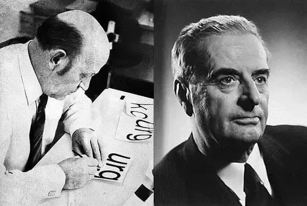
The reason why Helvetica swept the font field is that it is smooth and neutral, and has an excellent reading experience.
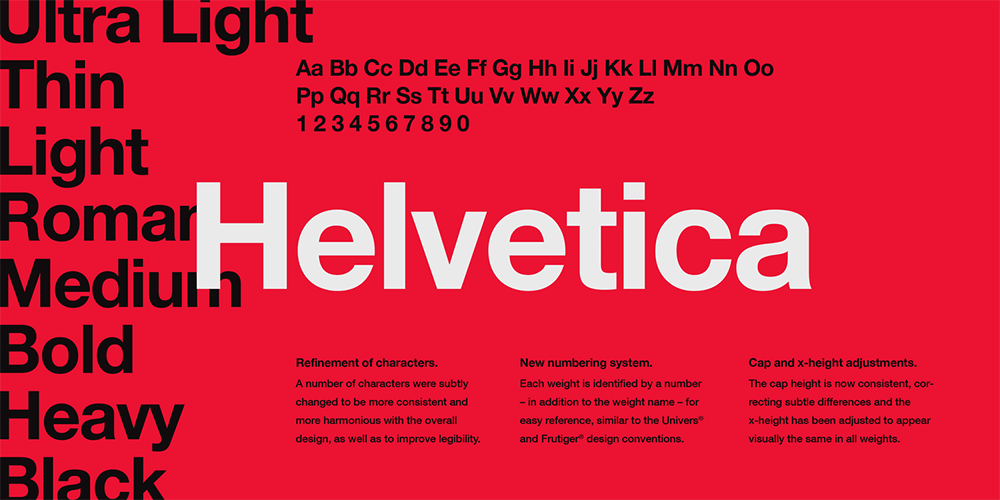
In the 1960s and 1970s, Helvetica almost swept across the countries that use the Latin alphabet all over the world. In 1962, German graphic design master Otto Aicher decisively chose Helvetica when designing a new logo for Lufthansa, and it has become even more famous ever since. Entering the computer age, Apple incorporated Helvetica into its system in 1985, making its influence reach its peak. Hundreds of multinational companies and even government agencies have directly adopted Helvetica as their logo text.
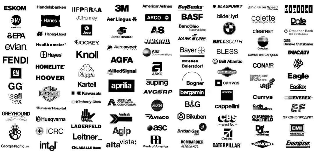
Helvetica has gone through more than half a century now, spanning movable type printing to the era of mobile Internet. Enthusiasts are fascinated.
Times New Roman is mostly used in print media such as newspapers and magazines, and was born in the 20th century In the 1930s, the designer's name was Stanley Morrison.
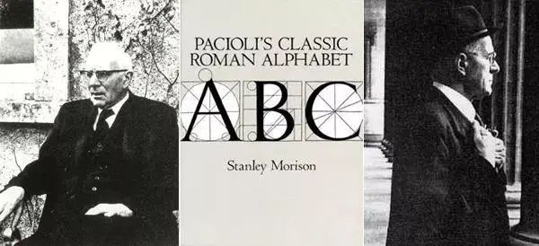
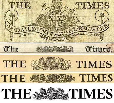
Morrison is a very temperamental designer. He thinks that the typeface of the British "Times" is ugly and outdated, so he writes to the editor of the newspaper and recommends himself to design a new typeface. The "Times" also showed the minds of mainstream newspapers. They humbly accepted Morrison's suggestion and invited him to design a new typeface.
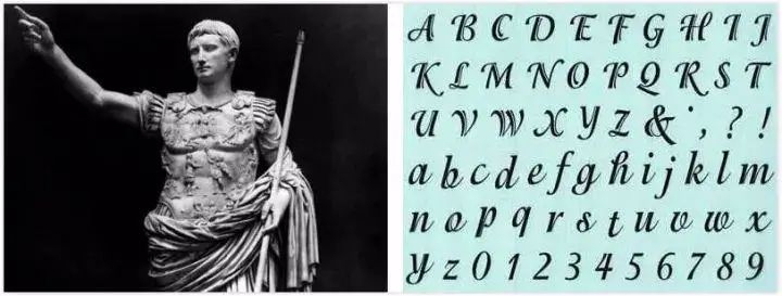
Morrison loves the font style of ancient Rome more than 2,000 years ago. He believes that the Latin alphabet created in the Augustus era is the pinnacle that cannot be surpassed. In the end he chose the 16th-century Plantin typeface as the basis for the design style.
In 1932, a newly designed typeface debuted. The English name of The Times is The Times, and the font used before was Times Old Roman, so the new font was named Times New Roman.
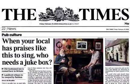
Morrison narrowed the word spacing of Times New Roman on the basis of Plantin font, but retained its beauty and legibility, allowing The Times to print more space per page, but it seems It is not crowded at all, and even small prints can ensure that readers can read without pressure.
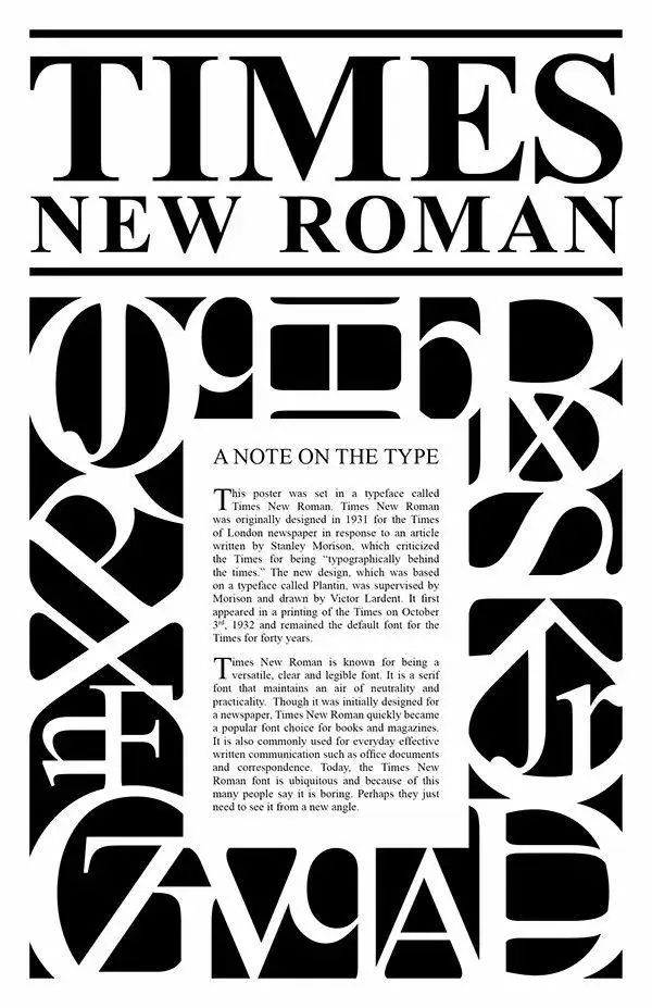
Times New Roman became an instant hit as soon as it came out and became the preferred font for printing all magazines and books. In the 1990s, Microsoft selected Times New Roman as the default font for the Windows system. With its thriving influence, Times New Roman became famous all over the world. So far, its active figures can be seen in books, the Internet, magazines, TV and other media. Although not as popular as Helvetica in the field of brand recognition, it has always maintained its unique style, which is economical and practical, clear and easy to read, and contains elegant beauty in a low-key manner.
The Helvetica and Times New Roman introduced above, although both have unmatched features in the font industry Despite its underestimated status, it has never been able to get into the eyes of the fashion circle, which shows how strict the top fashion brands are to the selection of fonts. When it comes to the logo fonts of fashion brands, one has to mention Didot, which has stood at the forefront of fashion trends since its birth and has been favored by big brands.
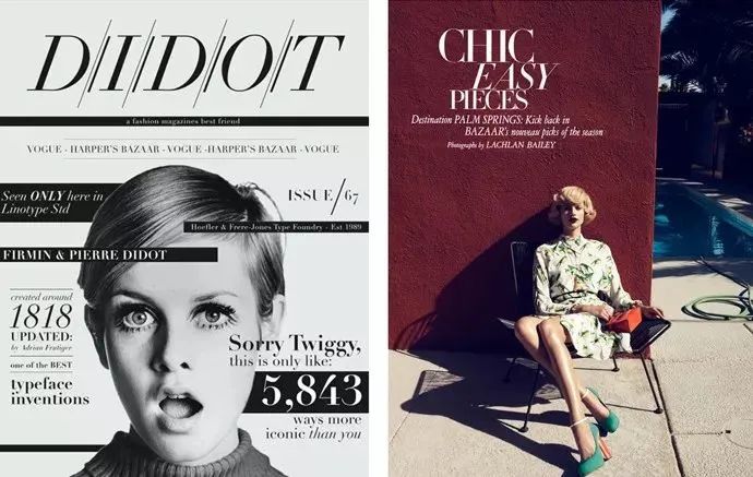
Didot font originated from the French Didot family with a long history of more than 300 years. Along with the impact of the Enlightenment and the Industrial Revolution on social production, Didot fonts were naturally introduced into the torrent of fashion products. Its biggest feature is the strong contrast of thickness and sharp serif, which looks more solemn and solemn, like a proud and slender Frenchman. It is very popular in many magazines targeting high-end people, and it looks high-end and full of quality. The most representative of these is the fashion magazine "VOGUE".
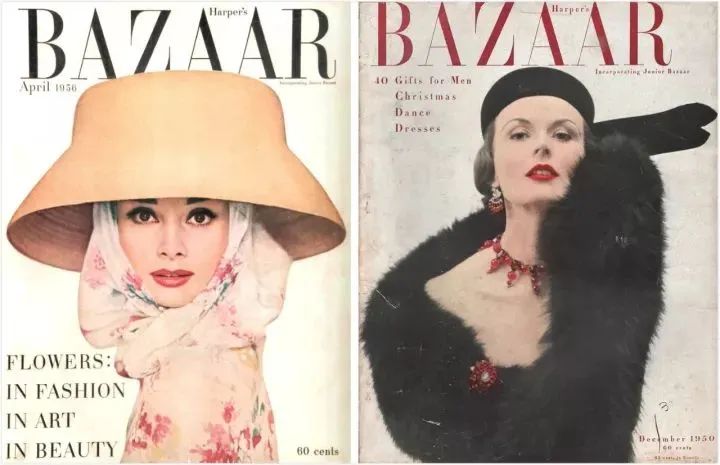
Founded in 1892, VOGUE has been published in 21 countries and has been dubbed the Fashion Bible. And Didot has always been the queen font of "VOGUE". Even if the editor-in-chief changes again and again, the status of the font has never been shaken. Even the "ELLE" magazine, which was founded in 1945, could not avoid the custom of choosing Didot smile font.

Not only high-end fashion magazines, but also many luxury brands are loyal supporters of Didot. For example, Giorgio Armani and Burberry all use Didot font as their logo design prototype.
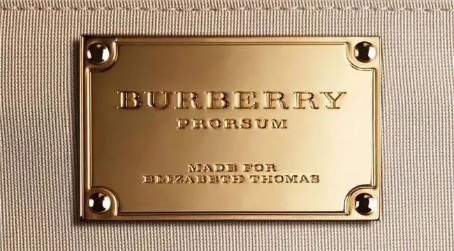
After more than two centuries of baptism, Didot has become an important part of the fashion industry. It was born in France in turmoil, and with its unique font expressiveness, it has always remained in the genes of the fashion industry in France and even the world, and has become an eternal classic.
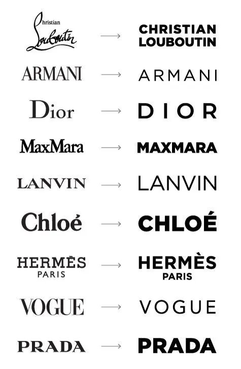
In recent years, as the Internet has made the world flatter and When they were younger, many traditional big names changed their brand LOGOs to sans serif fonts. Such as Calvin Klein, an American fashion brand, and J. M. Weston, a luxury shoe customization brand. Among the many sans serif font families, Futura is particularly popular.
Futura was born in 1927. Like Helvetica, it belongs to sans serif and is also a product of modernism. But the Futura created by designer Paul Renner lives up to its name and has a more futuristic sense, abandoning all unnecessary and fashionable decorative elements, and its sharp geometric sense is its strongest feature.
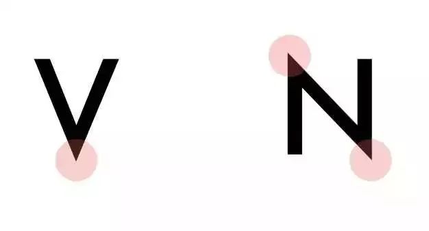
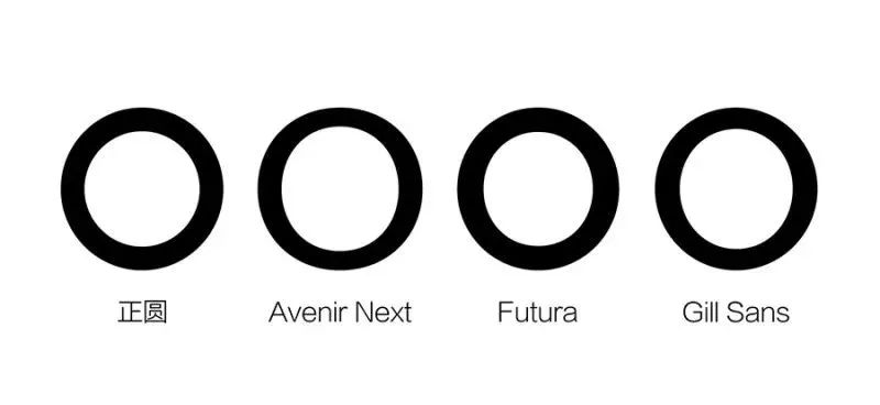
For example, the turns of the letters V and N are very sharp and not muddy at all, and the letter O looks "almost" a perfect circle.
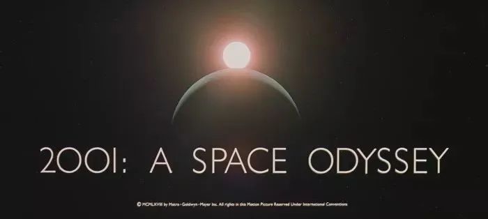
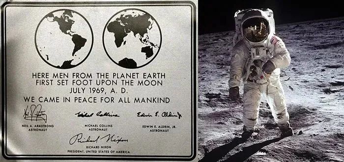
The first time Futura attracted the attention of the world was that it was favored by NASA, and it became a letter-engraved nameplate left by Apollo 11 astronauts in outer space, which is very sci-fi. Coupled with its font style based on traditional Roman proportions and futurism, it will be loved by film industry leaders in the future.
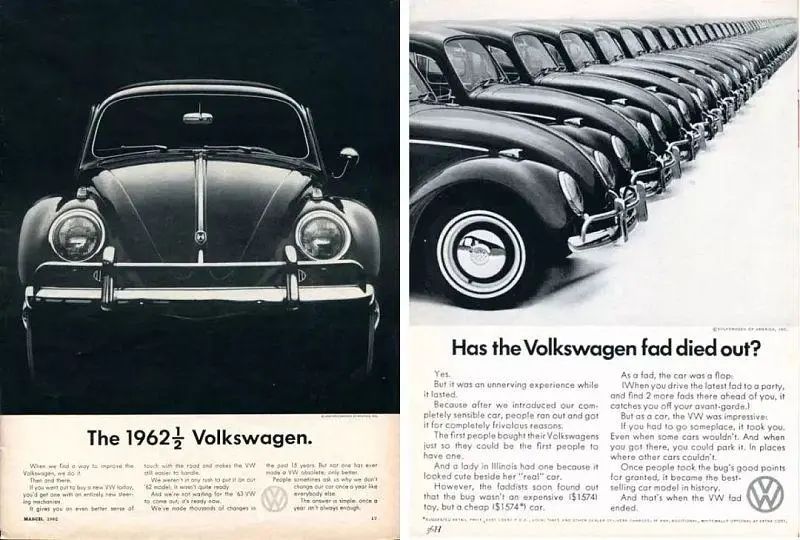
Futura represents the enterprising spirit of an era, and its clear and clean visual expression has made many business owners crazy about it. Just like Volkswagen in the 1950s and 1960s, Futura once represented the image of Volkswagen facing the future and connecting with the industrial age.
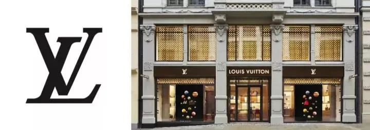
In the fashion world, Futura's name is even more famous. Like the luxury brand LV we are familiar with, Futura is completely used in the trademark and there is no major change, but the word spacing is increased to create the brand temperament, majesty and domineering that belong to LV.
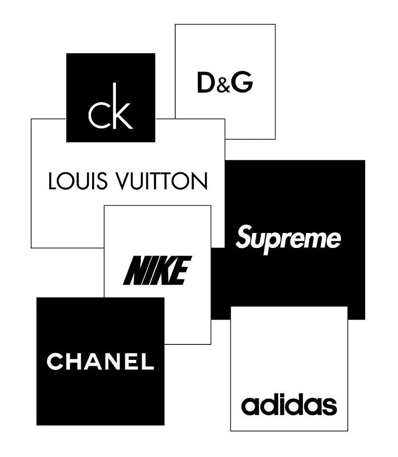
There is also Dolce & Gabbana, which is different from lv. Its brand does not want to convey the heavy feeling of lv, but a young urban feeling, so he arranged the logo very compactly and more lively and independent. Whether it is a young sports brand or a high-end luxury brand Futura, they can handle it freely, and the unique geometry makes the brand appear advanced and cold.
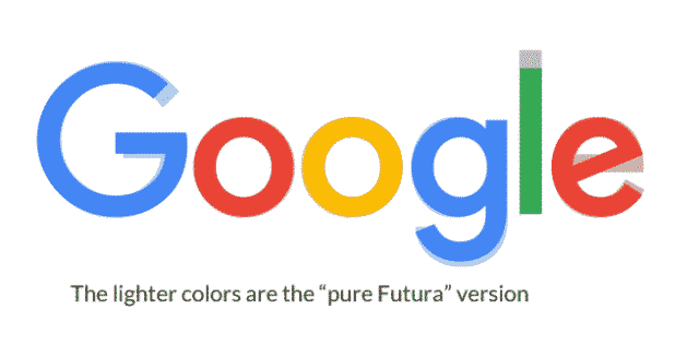
Even Google can’t resist Futura. In 2015, it made the biggest adjustment of the brand font in 17 years, which is a new font design based on Futura.
From 1927 until today, Futura is celebrating its 70th birthday. Paul Renner, who was proud of his talents, made Futura a unique font just like his declaration, and was highly sought after by the world.
With the development of human commercial civilization, fonts have been deeply embedded in it. Many important brands in the world have chosen to form their own fonts based on a certain font, which can be said to complement each other. Its history spanning hundreds of years tells us how important details are to a brand, and the small font is also worthy of our awe.


● Is it worth paying for design tools?
How to use micro-interaction animation to improve user experience?
How to design the first screen of the website well?
The full version of 2020 UI design trends, just read this article
Mike
Make design and collaboration faster and easier
https://www.mockplus.cn/
Articles are uploaded by users and are for non-commercial browsing only. Posted by: Lomu, please indicate the source: https://www.daogebangong.com/en/articles/detail/Legendary%20fonts%20in%20branding.html

 支付宝扫一扫
评论列表(196条)
测试