-
Yesterday afternoon, I posted a dynamic in several of my WeChat accounts:

Refusing to procrastinate, today, I will select a few answers from WeChat No. 7:
->

Answer:
I first searched for an official explanation about highlighting for you:
High light is an art term, which refers to the brightest point on the object when the light source shines on the object and then reflects into the human eye. The high light is not light, but the brightest part of the object.
We can understand that the highlight of the font comes from a virtual light source, and it is a light source from the same angle. Therefore, the position where the highlight line is added is relatively fixed in the font.
When adding highlights, different fonts have different strokes. It is recommended to add them at the same position, such as the upper left corner or the upper right corner, as shown in the figure:
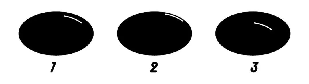
Among the three ellipse strokes, strokes 1 and 2, the highlight is in the upper right corner, and stroke 3, in the lower left corner, so stroke 3 is out of harmony with the front. When making highlights, the added positions should be as consistent as possible. Of course, we do not rule out particularly flexible situations. Now that I have accepted the offer, I will explain it more comprehensively, and continue to look at the picture:

The picture above explains the distance between the highlight line and the edge of the stroke, 1 is an appropriate distance; 2, the highlight is too close to the edge of the stroke;3, The highlight is too far from the edge of the stroke.

Continue to look at the picture above, which explains the thickness of the highlight. In this oval stroke, the thickness of 1 is roughly moderate;2, thicker;< span>3, thinner.
In short, the size and thickness of the highlight is determined by the basic strokes.

Look at the picture above again, these 3 pictures are different from the previous highlight shapes, that is to say, the highlights can also grow into different shapes and can be changed flexibly.
Of course, all the above examples are based on an elliptical stroke. In the following one, we change the posture a little bit and change a rectangular stroke. The reason is the same:
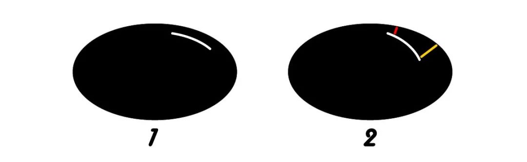
If you are careful enough, you will also find this rule, see the picture below: Highlight lines, generally parallel to the edge of the stroke, 1, is normal;2, the highlight line is not parallel to the edge of the stroke, and the distance between the red line segment is significantly smaller than the distance between the yellow line segment. Such a posture is of course awkward to look at.

The above are some common sense about adding highlights to strokes, and the answer is over.
The font design is really full of details, and any detail can be taken out and organized into a long article.
->

It is a common way to improve the sense of design by making continuous strokes and broken strokes for strokes. Whether it is continuous strokes or broken strokes, one key word must be followed: natural. If the whole font looks weird after you make a continuous pen, then your changes are probably wrong. This question is actually very big, and there are indeed a lot of knowledge points to talk about, but, as a smart person, I have already summarized it a long time ago. I recommend reading these two tutorials:

Link:
https://www.zcool.com.cn/article/ZMTYwMzgw.html

Link:
https://www.zcool.com.cn/article/ZNTU2OTky.html
->

As you all know, handwritten characters are almost every day in the daily submissions of Font Gang, and the quality of the works is also very high. Sometimes some propositions that are very suitable for handwriting, such as the homestay theme of "Akiyama Court" a few days ago, the proportion of handwritten works on the list will also increase significantly. It’s not just our font help. When you open Zakuol’s font/glyph category, the proportion of handwritten or calligraphy works must be about 80% for each page.
Okay, I am not answering your question, but to tell you that handwriting has become very popular in recent years.
Go back to the question and answer the creative ideas. First of all, look at the content of the proposition. Some themes are suitable for quiet and restrained, such as homestays, flower shops, and pastries. Some themes are suitable for wild and domineering, such as hip-hop, fitness, and some promotional titles. In addition, there are many propositions in the font gang in the past, which are hot words on the Internet, and they are spoofs, such as Ollie and Gangjing. These propositions cannot follow the rules, and the strokes are generally special, funny, graphic, or integrated with graphic creativity. That is to say, first determine the proposition, figure out what the other party is doing, and then do it. Of course, the premise of doing it is that you have to have A few brushes and basic handwriting skills are all you need. In addition, the problem of tools is never a problem. You can use the simplest pencils and colored pens, as well as markers and beauty pens. The brushes in the software can also be used, and the tablet and ipad can also be used. Just like the handwriting masters of our font group, the Eight Immortals cross the sea, each showing their magical powers, no matter what tools you use, no matter how simple or complex your handwriting process is, you can express If it is in place and can be accurate and relevant, it is success. - 4 >
Answer:
Like my usual lectures, the students I face are all zero-basic. When you make characters, I advocate the use of rectangular frames. The reason is very simple. Everyone has just started to use fonts and has not yet formed a mature experience. And habits, only judged by the naked eye, it is easy to make mistakes, causing the font to be large or small.
If you have been writing for a long time, the situation is of course different. You can judge whether the proportion of the font is coordinated without a rectangular frame.
So, this is still a matter of experience. If you are worried about making mistakes, use a rectangular frame. If you have confidence in yourself, you can discard this habit.
The rectangular frame solves the literal problem. Next, I will answer the question about the center of gravity.
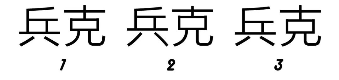
Just think of two handsome words, let's give an example:

1, is a normal pawn; 2, is a pawn with a raised center of gravity; 3, is a lowered center of gravity Bing Ke. Let’s not discuss which of these 3 groups is the most beautiful for the time being. Let’s just focus on the change of the center of gravity. If the position of the strokes is raised, then the upper part of the font will be tighter, and the lower part will be looser, and the lower strokes will be correspondingly longer. And vice versa. Take the handsome Bingke as an example, the change of the center of gravity of these two characters is driven by the change of the two horizontal lines in the middle of the font : will look like Figure 3 above. So, observing the strokes in the middle of the font and adjusting their positions can drive the change of the center of gravity of the font. Of course, let me say a word, generally speaking, the center of gravity of a few words is balanced, and it cannot be high or low.
 - 5 >

How long it takes is normal. The content of the font is different, the requirements are different, the difficulty of stroke design is different, and the time is different. Besides, everyone's writing experience is also very different. Therefore, there is no standardized time for writing. What we have to do is to try our best to standardize our design ideas and methods, so as to improve efficiency . The more abundant your accumulation in the early stage, the easier it will be to make font logos in the later stage. If you don’t have enough knowledge, you will definitely have to do it for a long time, and you must be in a hurry. When you find that in the design process, you are hesitant about many design details, the reason is not because you are pursuing perfection, but because you have not done enough, and you have not seen enough. Not enough. - 6 >

I often say that creativity is endless, and font design changes , also has no boundaries. Assuming that you have no reference in the design process, each stroke is completed independently, and it does not mean that you are doing this type of font The first person, because any details you have done, more or less, have been done by others. We are all mortal designers. It is impossible to do it unprecedented. We see a lot of good fonts every day, and these fonts are worthy of our study and reference,As long as you have read it, you will have an impression in your mind. When doing similar designs, your experience and experience will help you or interfere with you. Standing on the shoulders of others, borrowing existing strengths, and then using your own creativity to make new breakthroughs, this is a normal thing, and there is no shame in it. - 7 >

answer:
This is also a very common problem. Fortunately, I have also written a systematic summary, click on the picture to go directly:

- 8 >

I have also made a lot of fonts, let me summarize the general order: /section>Text, title words, cartoon characters, calligraphy characters, etc. The regular script is the most difficult to make. On the one hand, it is difficult to make breakthroughs in regular bold and Song fonts. On the other hand, it may be useless to make it, because there are many free words of this type, unless Party A is willing to pay a large price. The font library industry has been very hot in recent years. Almost all the fonts you can think of are available on the market. If you really make up your mind to make a font library, you have to carefully study the existing font library products on the market, and you must not be too similar. Otherwise, some font manufacturers may mess with you because of the appearance of your font, regardless of whether it is a real imitation or a fake imitation, because this affects their chicness in sending lawyers' letters. Design each radical and commonly used components to form a complete set of tools. What is integrity? Let me give you an example: For example, next to the word "wood", a single "wood" is one kind; the width of the word "wood" accounts for about two-thirds There is one type, such as "Mu"; Wooden character width accounts for about one-third is a type, such as "tree"; flat wood is also a type, such as "李"... ……… and so on, the more detailed you do, the easier your work will be and the more uniform the font will be. Font library design is a very cumbersome project. If you make a careless move, you will lose everything. If you make a careless stroke, all fonts will have to be overthrown and re-edited. In the design process, no matter how mature your early consideration is, there will always be mistakes or mistakes of one kind or another. Therefore, I think it is not difficult to make 7,000 to 10,000 fonts. It is just a matter of time and patience. Modifying details and controlling the overall situation are the key points and the biggest challenges. The above summary is purely personal experience. - 9 >

No matter what you do or learn, there are some who are good at learning and those who are not good at learning. This question is like: I go to school every day< /span>, can you get into Peking University and Tsinghua University? The answer is: Yes or no. Learn font design, if you can persist in learning and practicing for a period of time, then your design work will definitely benefit from the improvement of font design, and you may be promoted Salary, win Bai Fumei, climb to the pinnacle of life. Conversely, if it’s just a momentary impulse and you persist for three or two days, then you will definitely not learn well. You can only move bricks and do physical work every day, and you will exercise yourself into a muscle Hunk, then, it is possible for a rich woman to fall in love with you, marry a girlfriend in her fifties or sixties, and still reach the pinnacle of life. 
By using this question, I would like to say a happy thing:Two students of mine a few years ago had their wedding just two months ago. I wish them well. I also wish the word friends who raised this question, Bless you who read this article. …………end………
There are 9 questions in total above, continue another day.
From afternoon to night, I wrote while watching my children for several hours. I hope it will be useful to you.
Liu Bingke
February 29, 2020
Articles are uploaded by users and are for non-commercial browsing only. Posted by: Lomu, please indicate the source: https://www.daogebangong.com/en/articles/detail/Learning%20typography%20can%20you%20find%20a%20girlfriend.html
 支付宝扫一扫
评论列表(196条)
测试