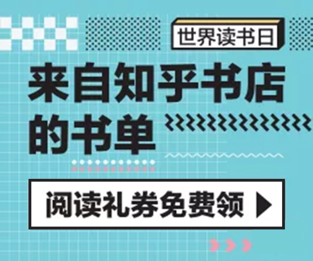
At the end of the article, you can easily get 300 "Zhihu Banner Collection"
Hello Daga! This is the first of our "Stealing Teachers" series... too many to count. Anyway, we like to find inspiration from banner design. Everyone knows that~ because the size of the banner is very close to PPT, and it is displayed on various websites and apps. Very common, if you don't learn, you don't learn!
Today, the object of stealing the teacher is "Zhi·Universal·Hu" who can answer questions and do design.
How good-looking is Zhihu's design? Every time I open the APP, I want to save every banner I see. From color matching to layout, there are many things that can be copied and learned in PPT design!
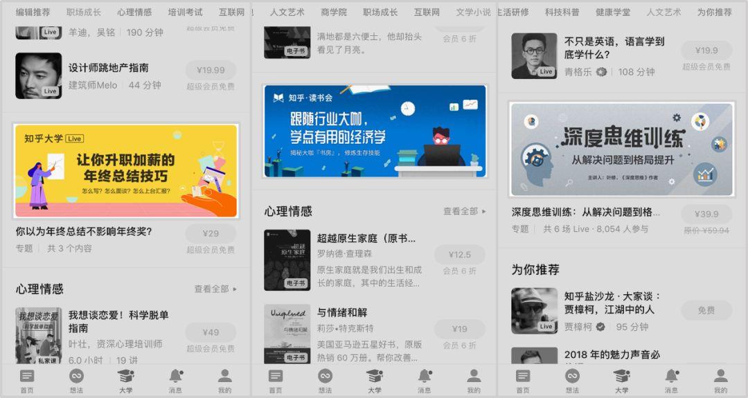
But it’s so troublesome to take screenshots one by one. I’m afraid I’ll miss a certain banner. Do I have to log in every day? T T
In fact, there is a method that gets hundreds of Zhihu banners in minutes without taking screenshots or logging in every day:
Patience read to the end of the article, and you can easily get the "Zhihu Banner Collection", so you won't have to worry about no design references when you do PPT in the future!
Alright, let’s take a look at today’s dry goods content ↓↓↓
01
The beauty of symmetry
◆◆◆
Symmetrical typesetting is a commonly used typesetting method in PPT. Arranging the picture materials left and right can not only fill the blank of the picture well, but also leave enough space for the main text, and the page as a whole is very harmonious.
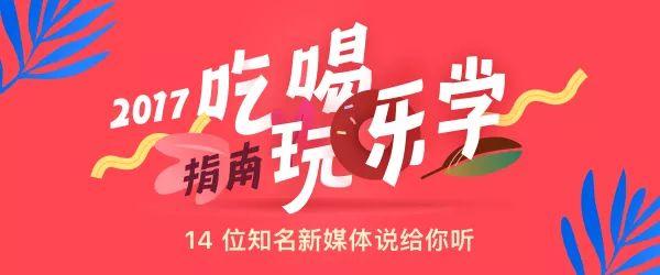
The following banners make good use of the symmetry method:


Let's use the "color block analysis method" to disassemble the page structure, and we can see its layout structure at a glance:
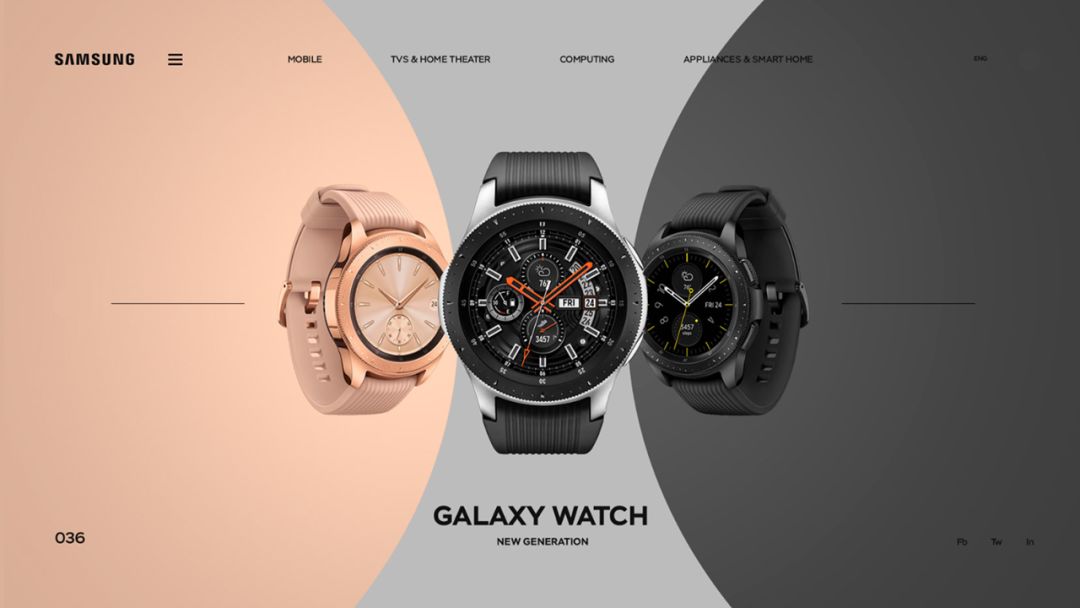
This symmetrical typography is also common in web design:
We use the symmetry method to make a good-looking PPT page without too many fancy tricks:

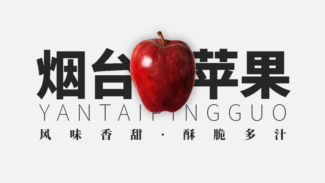
It is also ok to directly use a left-right symmetrical photo as the background:
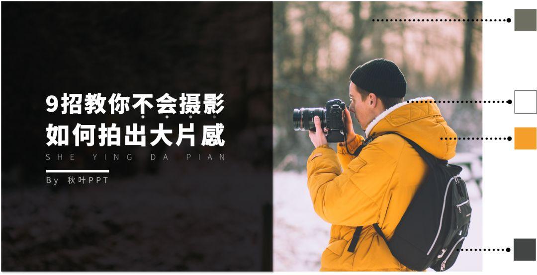
Content pages can also apply symmetrical typography:
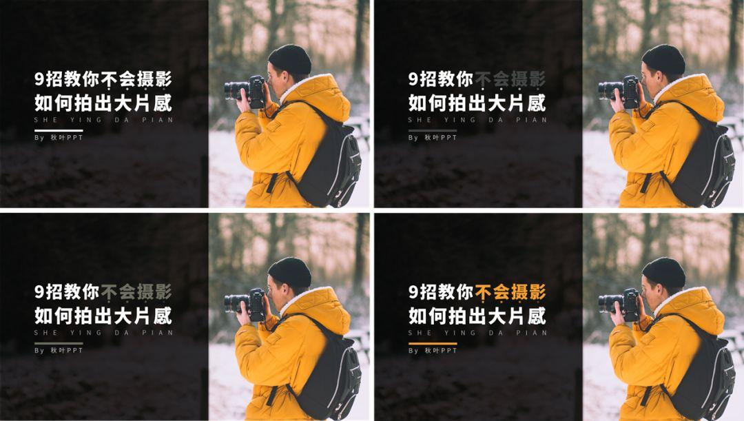
In addition to blindly placing text in the middle, the symmetrical method of placing text on both sides is also very common:
This kind of symmetry with text on both sides can be directly applied in PPT:
In this way, we don’t need too many materials and skills, and we can complete a page of PPT~

02
Pick color in place
◆◆◆
The color matching problem in PPT is really a headache! Tetete especially the color scheme of the text.
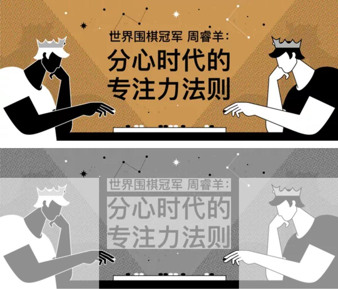
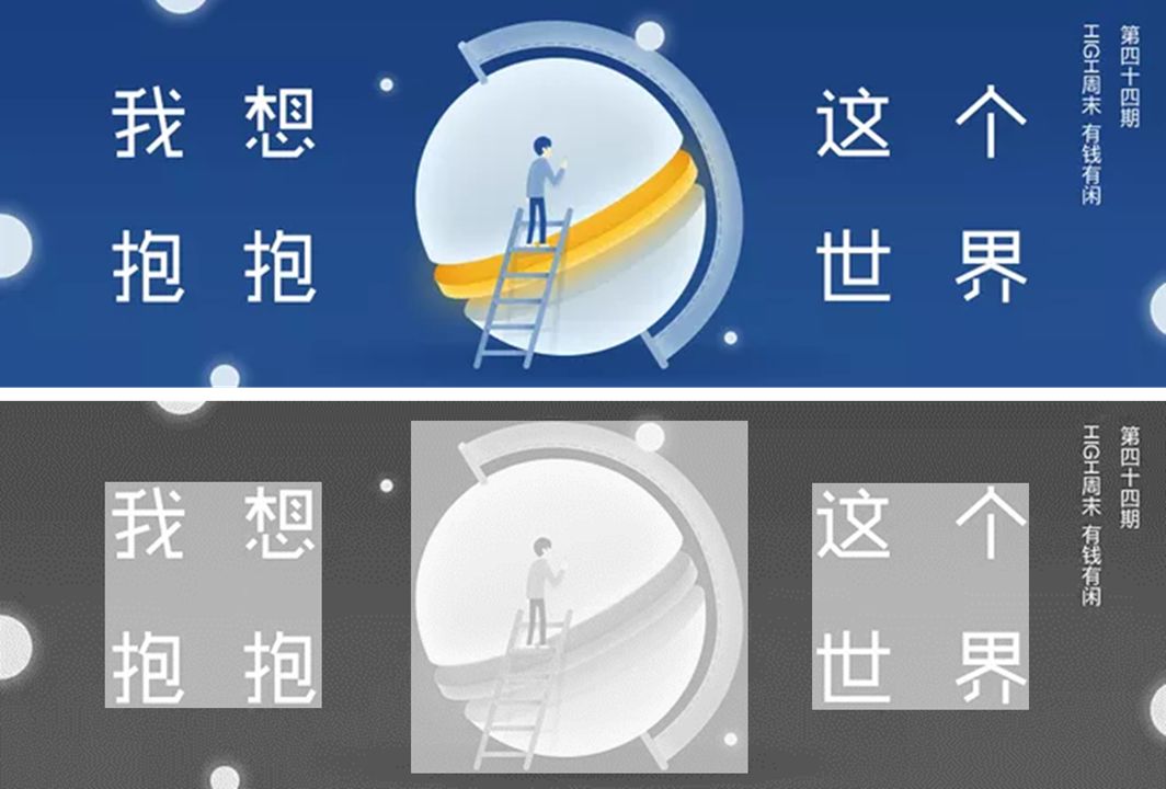
After reading a lot of banners, I finally got a super simple way to quickly color the text - absorbing the color from the PPT picture material!

This little trick can be used directly in PPT. For example, in this picture, the colors we can absorb are (a very strange) green, white, orange, and black:
How to choose so many colors? Let's try them one by one:
Obviously, orange stands out the most on a black background and is suitable for text:
Finally, draw the key knowledge of this section: the text color can be directly absorbed from the picture material, which is easy, convenient and good-looking; for text that needs to be highlighted, you must choose an eye-catching color; light-colored and bright-colored text is suitable for dark-colored backgrounds, and vice versa for light-colored backgrounds .
03
Overlay color blocks
◆◆◆
Students who often do PPT are no strangers to "superimposed color blocks". It is really easy to use and too common. It seems that color blocks can be used to set off any element at any time.
In fact, superimposed color blocks also need to pay attention to the way

❶ The text is set off with large color blocks.
In the picture below, the text is white (light color system), the background is also light color, and the text can’t be found even if you put it on it... Fortunately, there is an artifact of color blocks, as long as the color blocks are superimposed, this PPT page can be saved in an instant:

When color blocks were not used in the past, the text could only be placed in the blank space of the page. The PPT made is really hard to describe:
Now that there are color blocks, you can place the text wherever you want, and you can also change the transparency of the color block to fill the gradient color, so that the layering and layers of the page are richer:
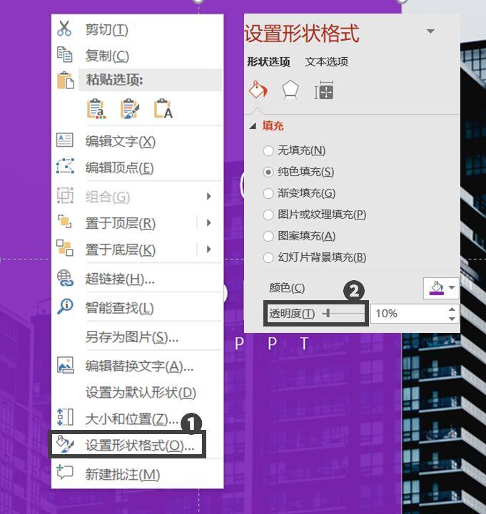
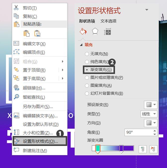
PS: The method of modifying the opacity and filling the gradient color for the color block is here~
① Modify the opacity: Right-click the color block, select [Format Shape], and then modify the opacity in [Fill]-[Solid Color Fill]-[Transparency].
② Fill gradient color: still right-click the color block first, select [Format Shape], and find [Gradient Fill] to fill the color block with gradient color.
In addition to the simple and rude overlay usage of large color blocks, small color blocks can also stand alone!
❷ Auxiliary elements are set off with small color blocks.
Although the auxiliary elements are not as eye-catching as the main text, they cannot be left to dry, not to mention that sometimes the auxiliary elements need to be highlighted~
For example, in the banner below, "Participate now" should be the prominent content, otherwise who will notice that you want to participate in the event... If you leave it alone, be careful to be ugly:
At this time, small color blocks are needed to appear:

With the addition of color blocks, the appearance of the page will immediately rise to a higher level, and the auxiliary elements will also be highlighted, which is the best of both worlds.
Is it over with a simple and rude superposition? In fact, there are other design methods, let’s look at some more banner cases~
The neat right angles of the rectangular color blocks echo the tough edges of the text, and the page is very harmonious:
The color block of the stroke is added to make the whole more stylish, and it is also worth learning:
After mastering the rule of "use large color blocks for the main text and small color blocks for auxiliary elements", you will no longer have a headache when facing PPT typesetting with multi-level information in the future!
04
Creative Text
◆◆◆
The methods of "symmetry", "color picking", and "color block" mentioned above are not as eye-catching as "creative text"~
How can this kind of design be realized in PPT? Two methods: break up text boxes and replace text strokes!
Break up the textbox:
Alternate text strokes:

Worse, it’s a feeling of heartbeat, let’s take a look at how to operate it~
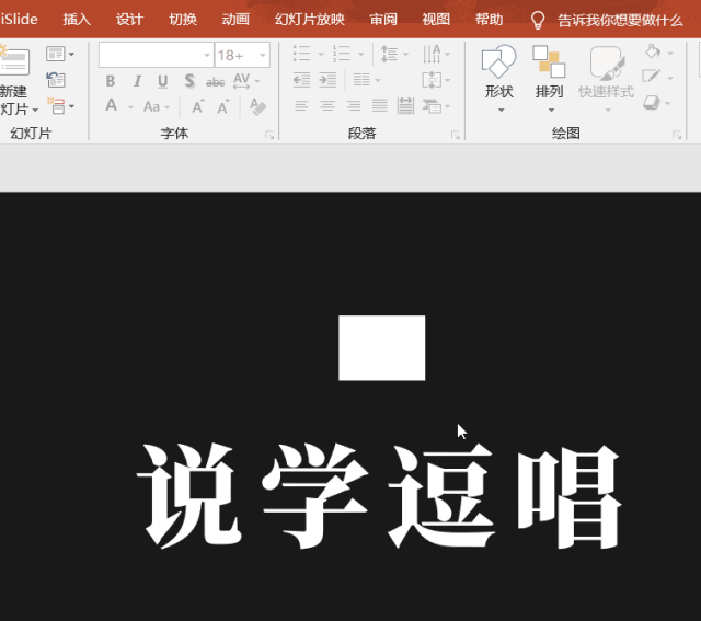
❶ Break up text boxes.
After breaking up the text boxes, we can intersperse some elements between the text to make the page more dynamic.
A simpler and less troublesome way is to change a long list of text boxes into text boxes with only a single word:
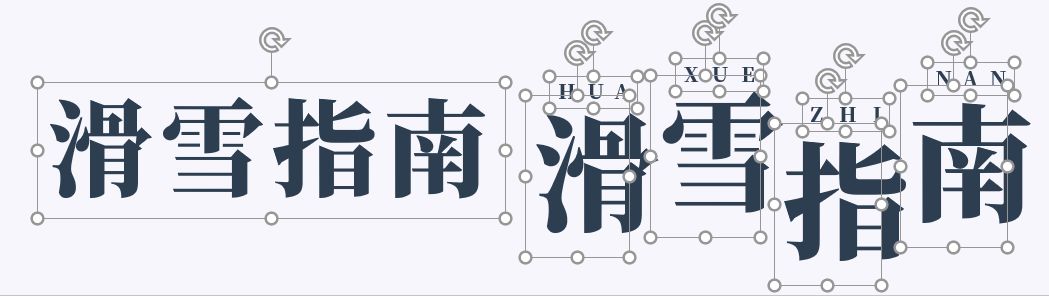
Then put various elements between the broken text:
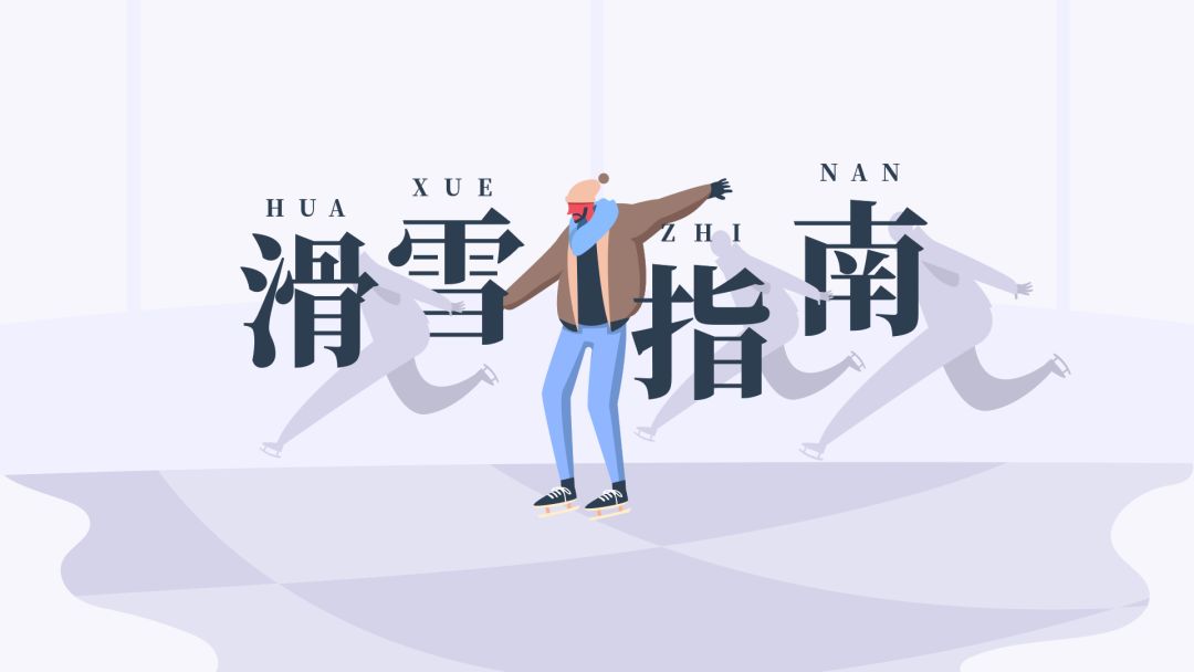
Done!
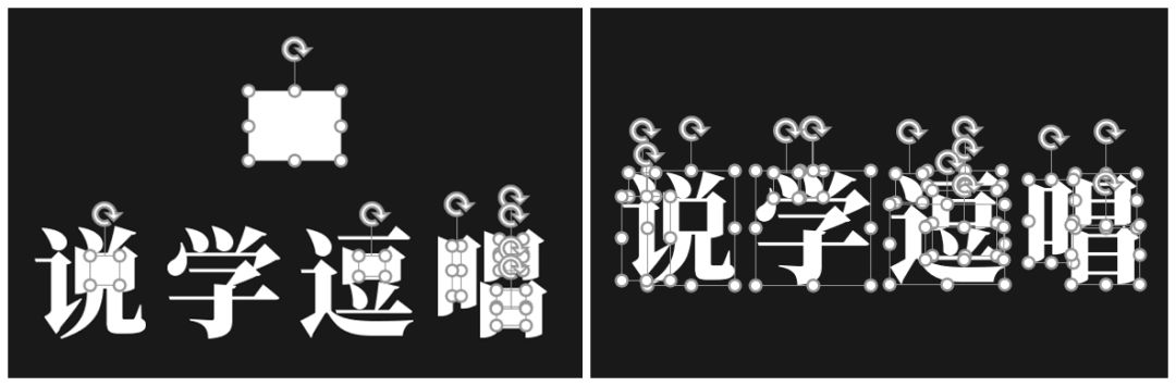
❷ Replace text strokes.
In the banner design of Zhihu, we can see many "textbook-like" methods of replacing text strokes:


So how to replace the text strokes in PPT?
First insert a text box, and then insert a shape at will (just make the color of the shape consistent with the text), then select the shape of the text box at the same time, click [Format]-[Merge Shapes]-[Split] in turn, so that the strokes of the text Let's separate:
Delete the redundant shape, and the strokes we want are all ready:
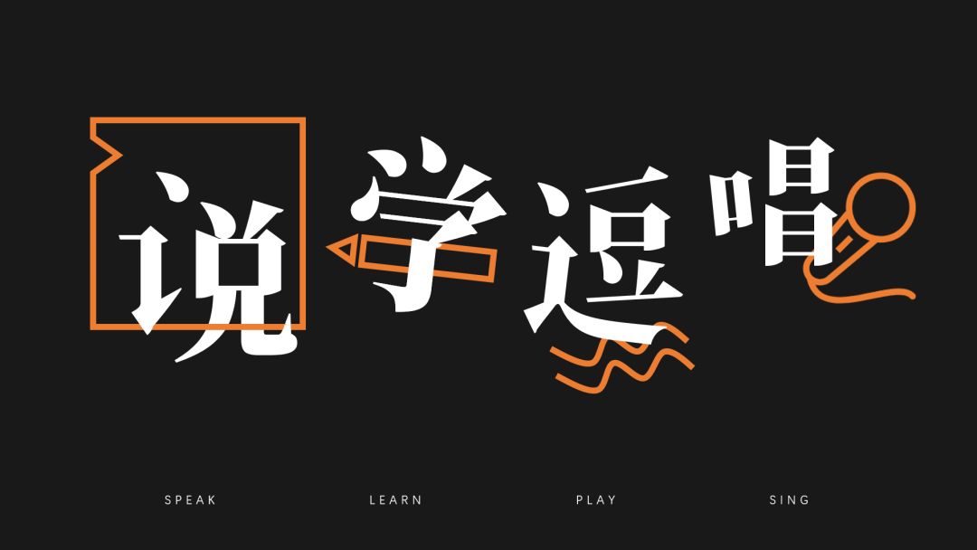
Some easy-to-modify strokes can be directly replaced with graphics. The horizontal line in the middle of the word "learning" in the picture below can be replaced with a pen, which not only shows the shape of a straight line, but also expresses the meaning of "learning":
It should be noted that after the text is creatively designed in this way, it is not easy to modify it again, so remember to confirm the copy before starting the design~

There is also a super-comprehensive "Zhihu Banner Collection", which is also given to fans of Akiba PPT for free.
How do fans get it?
❶ Like + comment on the tutorial case in the article, you can give suggestions~
❷ Follow me, and I will share more PPT templates + dry goods tutorials for you later
❸ After the first two steps are completed, send me a private message with the keyword "Zhihu" as shown below! Remember this is a private message! !
Note: Private messages are not messages, click on my logo, enter the upper right corner of the homepage, and you can see "Private Messages".
At the same time, I would like to thank everyone for their support. Autumn Leaf PPT will always adhere to this spirit of sharing. Your replies and receipts are my greatest thanks!
Articles are uploaded by users and are for non-commercial browsing only. Posted by: Lomu, please indicate the source: https://www.daogebangong.com/en/articles/detail/Learn%20to%20steal%20from%20Zhihu%20Banner%20and%20make%20your%20PPT%20ten%20times%20better%20than%20others.html
 支付宝扫一扫
评论列表(196条)
测试