Author: Liu Baikun

Each era has its specific imprints. Perhaps what we feel more directly is the changes in clothing in each era. In fact, people, things, and things all have the characteristics of the times, and fonts are no exception. But how to travel fonts back in time? Today, we will talk about how to make fonts into what we call nostalgia and retro from two aspects: font changes and font effects.

To give an example that we are most familiar with, telephones are constantly being updated from rotary dial dials to feature phones to smart phones. similar changes. From the past to the present, it is changing every day. Can we summarize some major trends from the countless clues and use them for fonts?
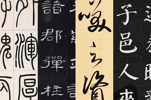
The picture above shows seal script, clerical script, running script and regular script in calligraphy fonts, which are also the evolution process of calligraphy in sequence. If you don’t feel this way, you can think about the change from traditional characters to simplified characters. It is not difficult to summarize from it The law of change from complex to simple. So is it possible to successfully "travel" just by making the text modeling "complex"? Of course not, let’s share some specific methods with a few examples.

1. Use the past for the present
Many deformations in font design must be well-founded. For example, if we want to design an ancient font with age, we can actually borrow ancient times Among the writing methods in calligraphy, the most representative one is seal script.
Seal script has the pictographic characteristics of characters and shapes. Although it has lost its practicality at present, we can make certain optimizations according to our own needs, so as to achieve the purpose of serving the past for the present.
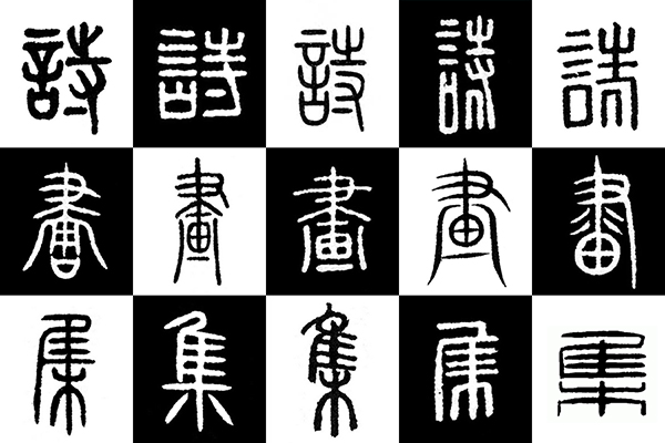
The following is a breakdown of the three words "poetry and painting collection". The text in the above picture is the seal script of "Poetry and Painting Collection" searched from the Internet. At first glance, it is very "complex". There are even many different ways of writing the same character, and there are many structural changes. How should we choose the right one?
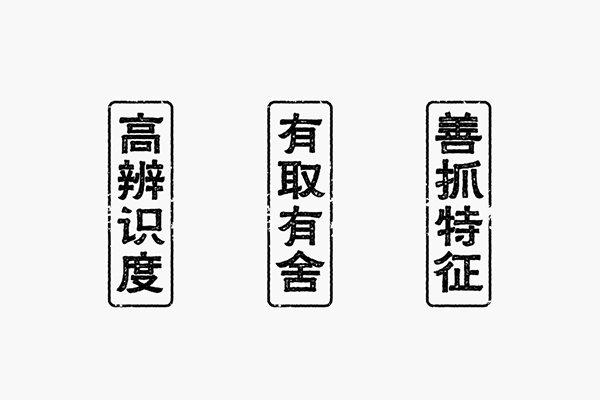
Generally speaking, you can pay attention to the following three rules:
a. The primary exclusion of low recognition, the first word in the picture is for most people It's hard to tell;
B. Learn to splicing and simplification if there are choices and sacrifices. If there is no complete and usable one, we have to make certain choices. For example, the word "poetry" in the first line in the picture, and the words on the left side of the structure The side is easy to identify, but the changes on the right are a bit "over" and do not meet our needs, so we need to do some simplification;
C. Good at grasping features, using the past for the present is not just copying, but to be practical and recognizable as the basic appeal to maximize the preservation of the borrowed text features.
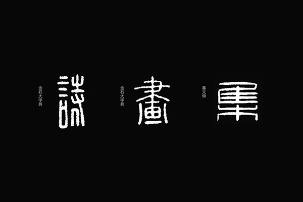
As shown in the picture above, I have selected three characters that I like. According to the above mentioned standards, it is obvious that the first character will be eliminated, but what I value more is the character next to the word "言" on the left. Brushwork, of course, the right side must be discarded and redone.
The first step is to outline the structural framework with lines based on the above characters. The last character is flatter than the previous characters. In the process of making, it must be raised to maintain the unity of the three characters. .
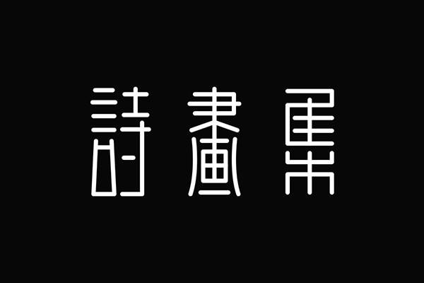
As mentioned earlier, this method is not completely copied, let's take a look at what adjustments have been made:
a. The structure on the right side of the poem is replaced with simplified characters to maintain the recognition of the characters;
b. The strokes change from curved to straight. For example, the horizontal strokes in the original characters all have a certain arc. First, all of them become straight segments. This is done to make the whole more organized. The exception is the two vertical strokes on the left and right of the word "painting".
c. Compared with the previous structure, it should be taller, especially the change of the last character is the most obvious. The height, shortness, fatness and thinness should be adjusted according to the meaning of the font you made.
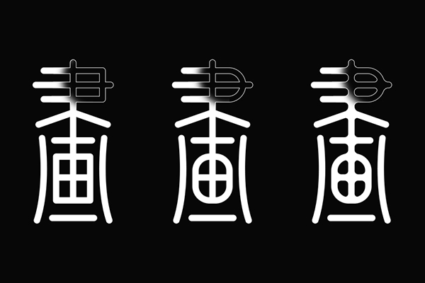
It is definitely not enough to complete the construction of the structure, and the details must be dealt with. The strokes of equal lines are relatively straightforward, and some rounded corners can be added appropriately, which is more in line with the font characteristics of seal script. As shown in the picture above, the first character has not been processed, and the corners of the second character have been changed from straight angles to rounded corners. The third character has increased inner rounded corners from the front, so that the strokes of the strokes have a little bit of frustration, which is more attractive.
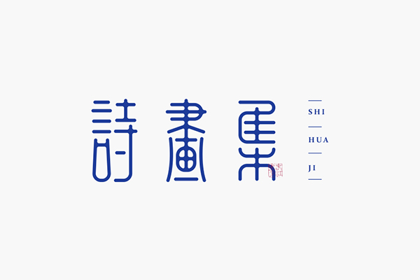
Color and typography are also part of the details. Finally, choose dark blue and embellished with red stamps. A group of text designs that are relatively retro but in line with the aesthetics of modern people are completed. This method of using the past for the present looks very simple, but in addition to the precautions mentioned above, the uniform and orderly space configuration of the font is also a crucial part, as is the case for any character.

Second, new use of old characters
Just like the TV drama set, try to restore the scene at that time as much as possible, so that the filmed film can have a stronger sense of substitution; and The most direct and effective way for us to design fonts with a sense of age is to restore the font characteristics of that era. The principle is similar to the first method, but there are still some differences in practice. Next, we travel from ancient times to modern times, and it is still the word "poetry and painting collection".
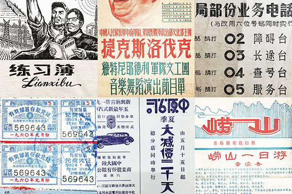
There are many pictures of old fonts on the Internet. If you encounter them, you should save them. You may get them sometime. It doesn’t matter if you don’t save them. Our official account of Font School will update the collected old fonts from time to time Words, convenient for everyone to learn and refer to.
In addition to the mottled paper, the sense of age of old characters is more important than the characteristics of fonts. Generally speaking, one is Song typeface and the other has some geometric changes. In addition, because old characters are mostly made by hand There is a strong randomness in drawing, which is also a major feature of old characters.

The first step is the extraction of conventional strokes. Due to the age and factors such as shooting, many font details are fuzzy and uncertain. Do not copy the changes in font details caused by objective factors. Come over, but it should be optimized while extracting.
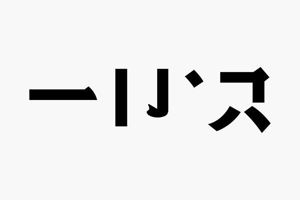
Some of the strokes we need may not be found in the old characters. At this time, we need to expand the strokes according to the style of the old characters; in addition, the corners of the strokes in the old characters will not be very sharp, usually a little The rounded corners and the lines of the strokes are not straight. These can be added later, not from the initial strokes.
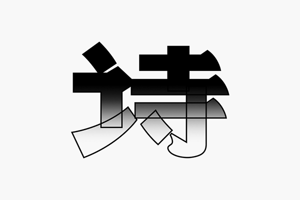
After the basic strokes are done, the next step is to build the structure. In addition to the borrowed structure and space characteristics of the strokes, we can also refer to it. The words "three defenses" are flat as a whole, and the internal space is relatively tight. This is the structural characteristic of this group of words to grasp.
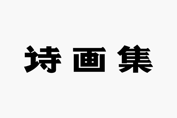
The basic strokes are not static. For example, most of the horizontal strokes of the word "ji" are horizontal. If the original thickness of the horizontal strokes is kept, the space will become very crowded and unsightly. Therefore, the horizontal strokes are thinned; The same stroke will be different in different fonts, which requires everyone to have a better understanding of the glyph structure and "live" writing.
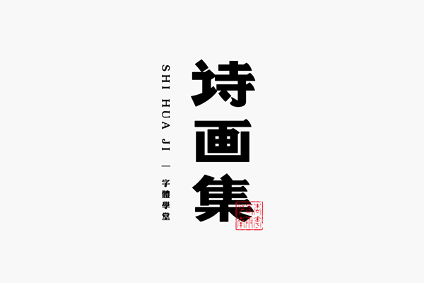
Finally, as shown in the picture above, in fact, from the basic structure to the final font, the result you see is just a two-step process, during which there are many small and repeated adjustments, good words take time!
This method is addictive, let's start with the word "soda". The process is the same as above, so I won’t repeat it, just look at the result.
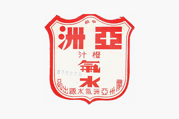
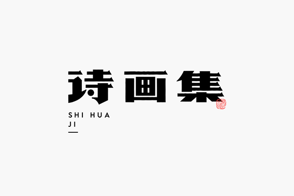
The strokes of the two groups of old characters selected today are not the most distinctive, and some have more prominent personalities. You may wish to try it out and see if it is as simple as you see. .

Third, the texture is combined
If it is too late to design and want to "travel" quickly, it is also possible, so the font effect is still necessary to create a superficial sense of age Let me talk about it, because it is the basic operation of the software, so it is not very detailed.
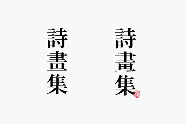
a. Texture overlay
The easiest and most commonly used one is definitely the superimposition of various textures, even this is a must-have option for many students to make text with a sense of age. As shown in the picture above, the left side is a regular font, and the right side is based on the superimposed texture. There are two points to pay attention to: one is that there are not many textures, so we should avoid textures stealing the limelight;
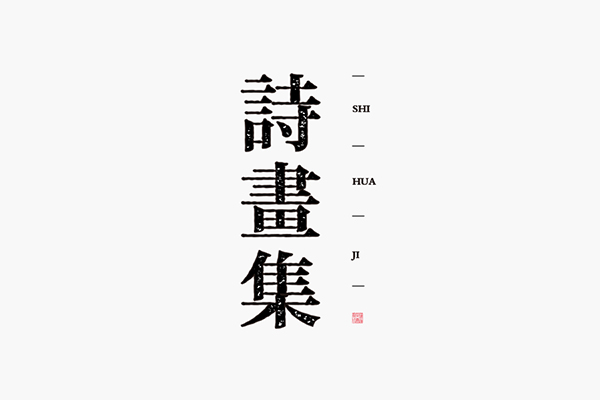
b. Rough outline
Use the same font and use [roughening] in Ai software to achieve rough treatment of font outlines. It is necessary to master the changes in the two numerical values in the roughening process. In addition, it can also be made by path displacement. The texture changes inside the font make it more mottled with time.
Summary
In the above sharing, you will find that the font design with a sense of age is relatively complicated from the inside to the outside. At the same time, you must be good at grasping the characteristics. After sorting it out, did you gain anything?
Articles are uploaded by users and are for non-commercial browsing only. Posted by: Lomu, please indicate the source: https://www.daogebangong.com/en/articles/detail/Learn%20these%20tricks%20fonts%20can%20also%20play%20time%20travel.html

 支付宝扫一扫
评论列表(196条)
测试