

Text丨Ma Zhiqiang
Source丨Design A (ID: designsjj)
Good evening, everyone.
When it comes to font design, you may think of logo, VI, graphic design, etc. more. Indeed, the field of font design has developed rapidly in recent years, many powerful font designers have emerged, and more exquisite fonts have been designed.
Compared with ordinary fonts, well-designed fonts are more creative and attractive to readers.
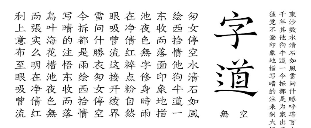
The picture comes from Zhanku@谷龙
So much has been said, what is the relationship between font design and PPT? When we make PPT, content logic is obviously very important, but if you can add points to your PPT appearance through font design, wouldn’t that be the icing on the cake?
I have summed up 5 methods of PPT font design, and I will share them with you one by one today.
/1/
calligraphy
About the brush calligraphy design, I have actually mentioned it many times in my articles, and you must have often seen it on posters and on the Internet.
This proves that calligraphy is indeed a font widely recognized by everyone. Calligraphy is the art of line art, and calligraphy itself has a sense of beauty, so it is very good to use in PPT, as a cover or as an embellishment.
Let's look at a case.
On this page of PPT, there is only one picture and one sentence of copywriting. If we simply put the copywriting above the picture, it is not impossible, but I always feel that there is a sense of design missing.
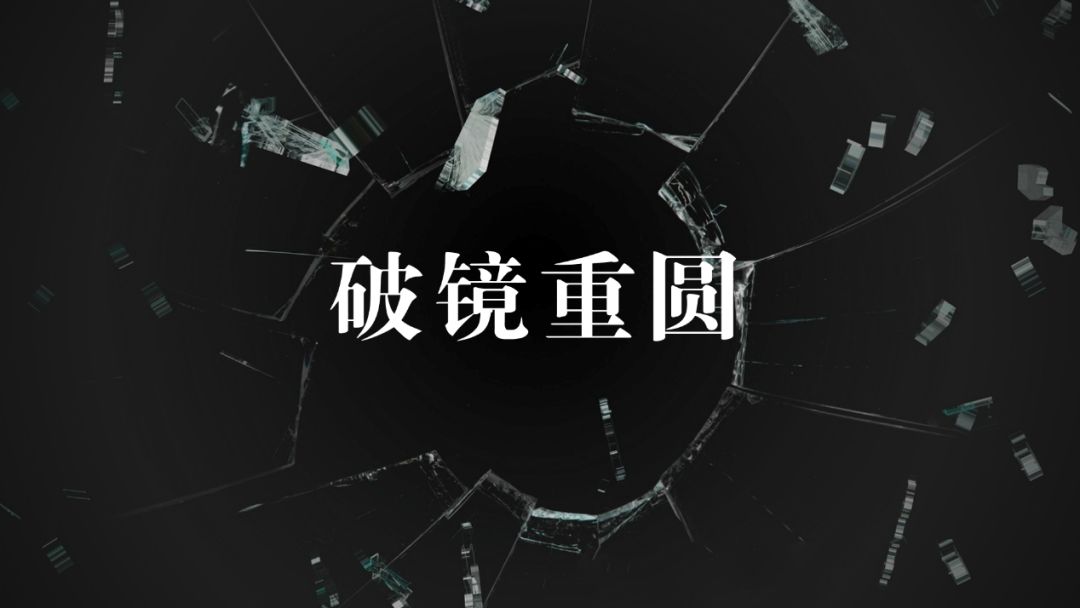
Then if we change the font of the copywriting to calligraphy, you will find that the text is no longer a dry text, but an independent material that exists, and becomes more beautiful, right?
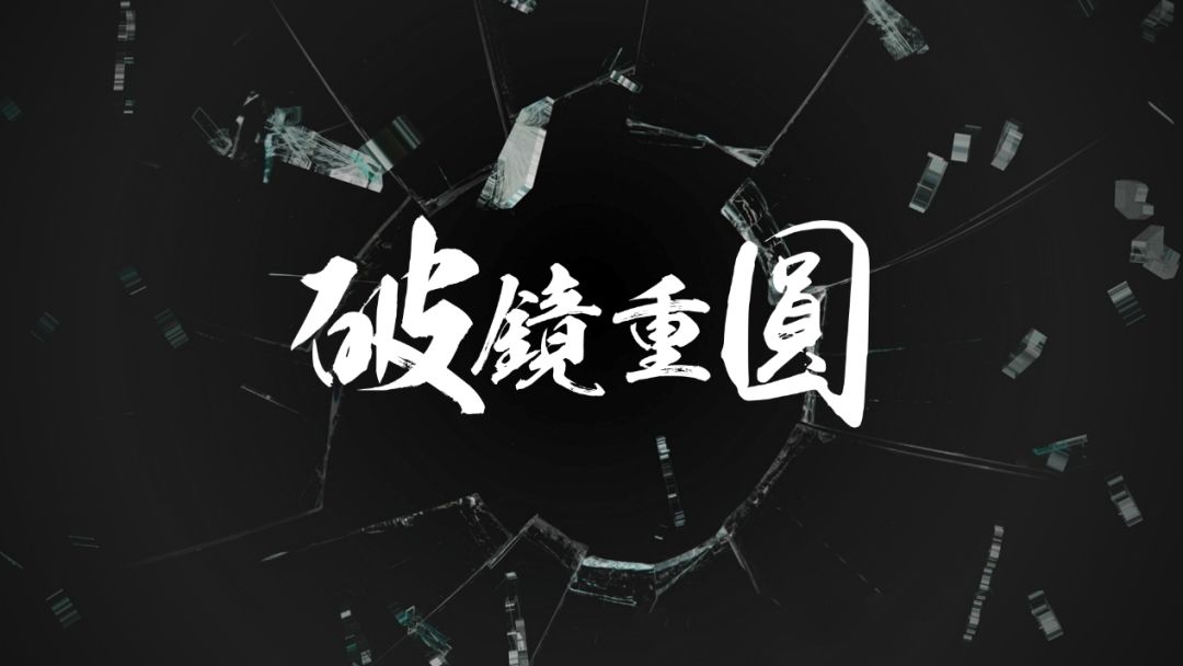
You can also use Boolean operations to add a metallic effect to text.
The production method of is to select all the text, execute the union in the merged shape, place the image material under the text, select the material + text, and execute the intersection in the merged shape.
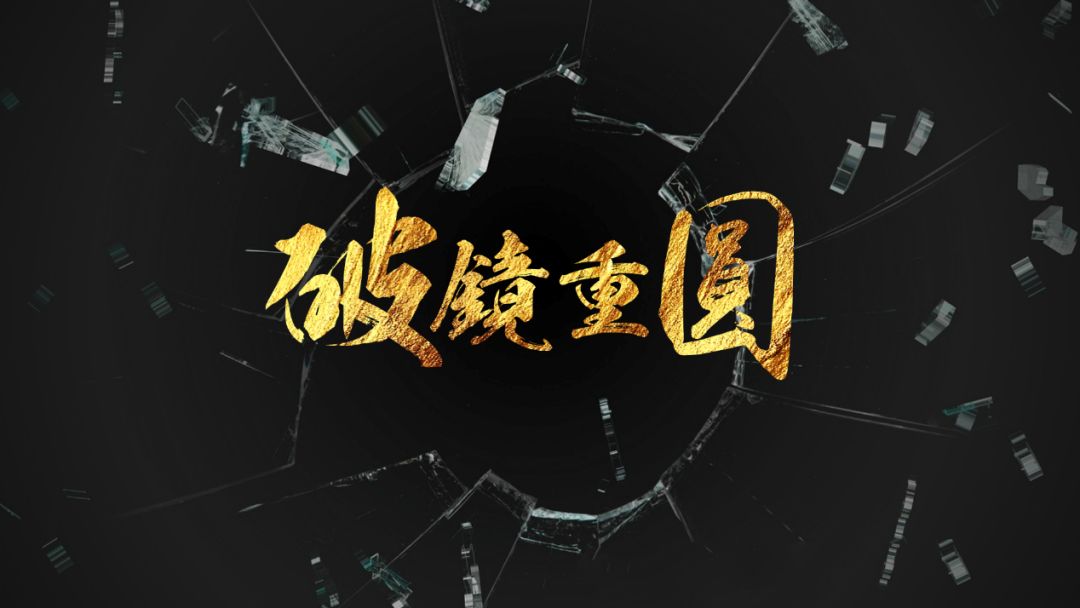
Brush calligraphy design experience: When making brush calligraphy, choosing the right font is the key. A beautiful brush font can reduce a lot of workload; secondly, reprocessing the font, which cannot be placed randomly, pay attention to the space between each character stroke relationship between.
About the production of brush characters, I recommend this article:PPT Xiaobai can learn the brush font design!
/2/
Stroke words
Let's look directly at the effects of normal fonts and stroked characters.

Normal font
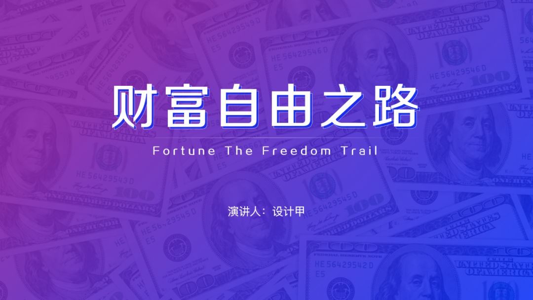
Stroke words
As you can see, the font with the stroke will become more three-dimensional and more prominent than the normal font, and it does not look so monotonous, and the production method is very simple. When you don't like ordinary fonts but don't know how to use other methods, you can try this stroke effect.
production method: copy a text and place it under the existing text. The text effect is a white outline, which can be filled with an appropriate color.
Stroke font design experience: stroke fonts are suitable for thicker fonts, and fonts that are too thin or have obvious thickness contrast are not suitable. You can try it yourself for the specific effect.
/3/
Three-dimensional characters
When it comes to three-dimensional characters, you may first think of design software such as C4D, PS, and 3DMAX. In fact, using PPT can also make good three-dimensional characters.
Let's look at the cover of this PPT.
As far as the current cover design is concerned, it has met the beautification needs of most people. The exquisite background and title font are also very good, and the typesetting of the copy is also appropriate. Can the effect of this PPT page be better?

Let’s take a look at this title. The font used is Hanyi Lingxin Tijian, a font with distinct water chestnut angles. This font is actually very good with the 3D effect. We can design a 3D effect for this title font, the purpose is to make the core content more prominent and easier for the audience to remember.
Look everyone, is the font more prominent and eye-catching after adding the 3D effect? Visually, the effect is better than white text.

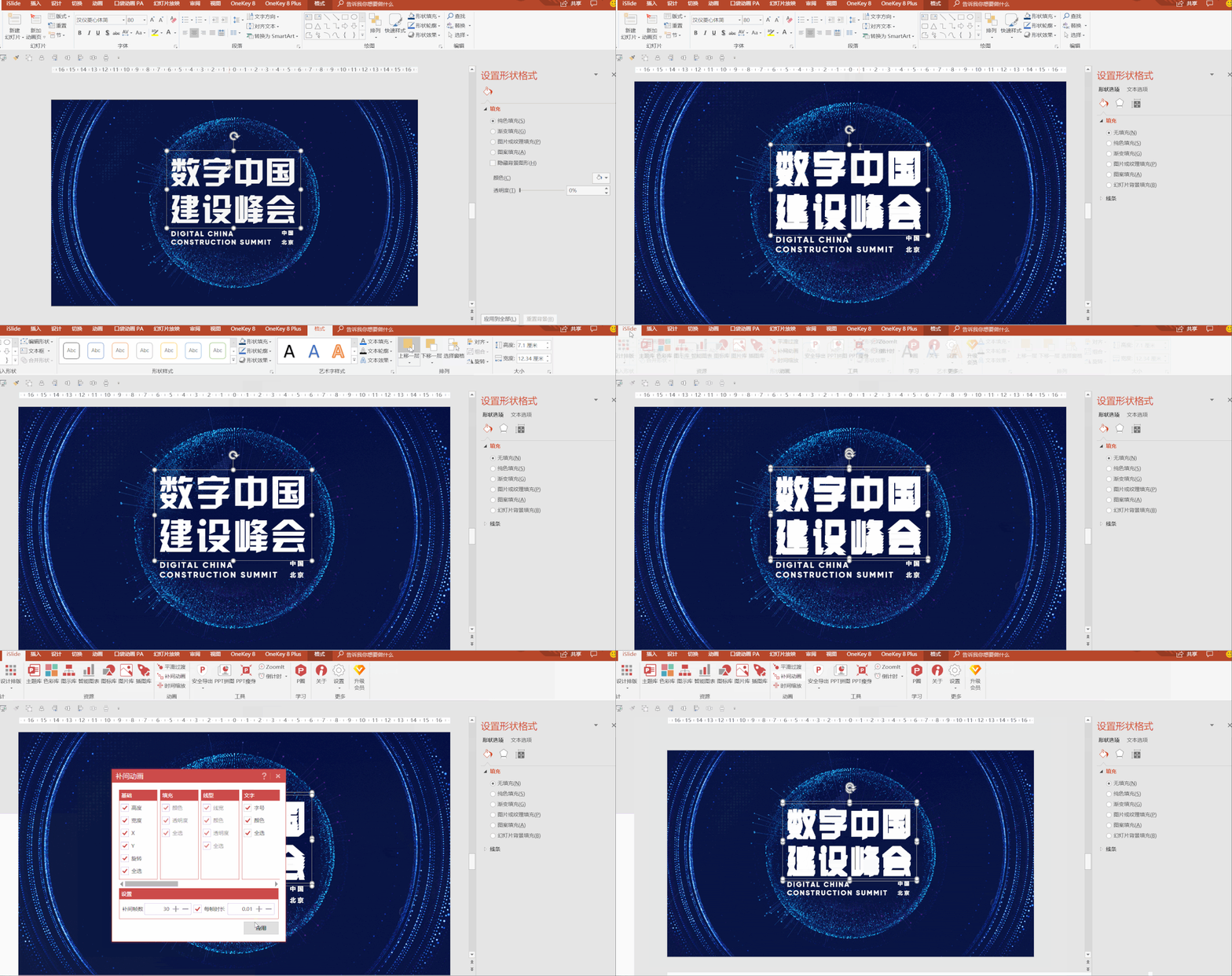
Let me briefly talk about the production process of this three-dimensional character. First copy a text and place it under the original text, then move down some distance, that is, the three-dimensional distance, select two texts, use the tweening animation tool of the iSlide plug-in to create a three-dimensional effect, and the number of tweening frames is 20-30 That's it.
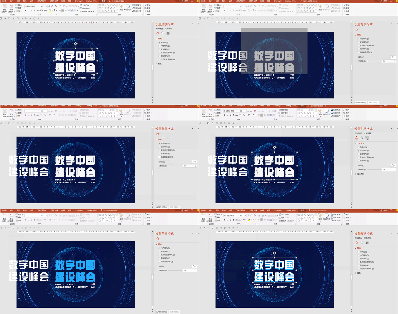
Combine the text below the top layer and adjust the color of these two groups of text.
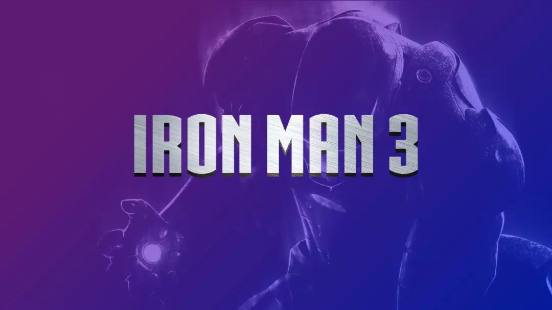
In addition to filling colors, you can also fill picture materials. You can think about how to make the font effect in the picture below?
/4/
overlapping words
The effect of overlapping characters has been out for a long time, and it is not difficult to make, and it is easy to produce the effect. Let's take a look at the font effect.
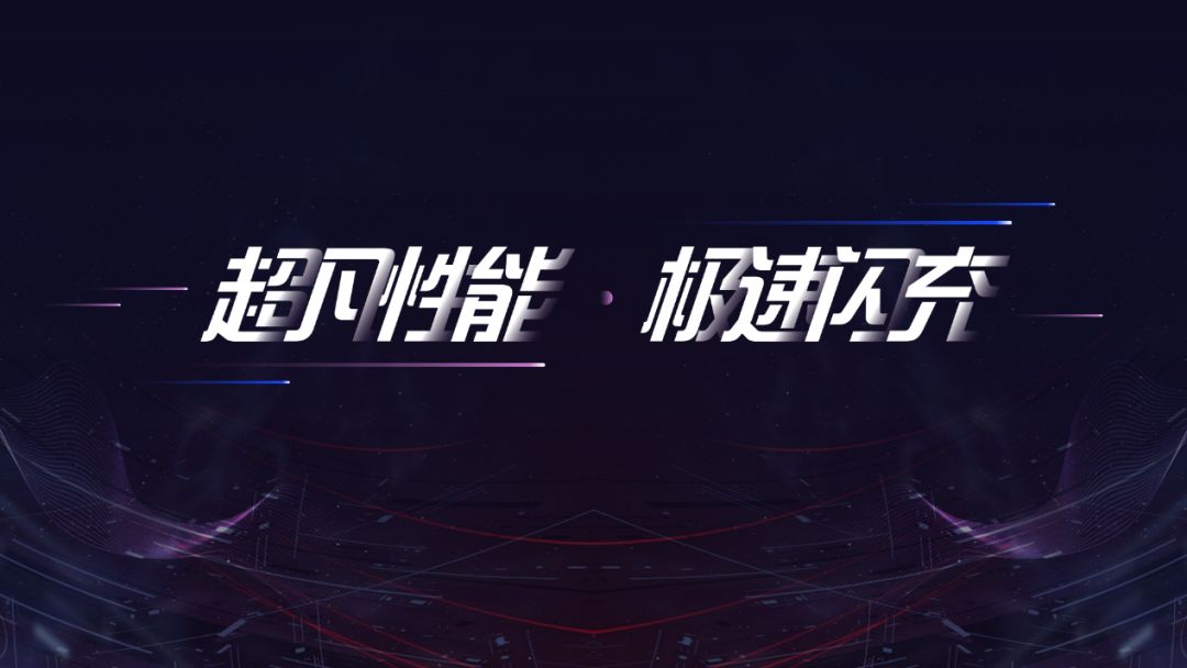
Production process: Divide the text into separate texts and arrange them. Because the effect of the words on the right covering the words on the left is to be made, the text on the right of each word should be above it; then add a gradient to all the texts The effect is enough.
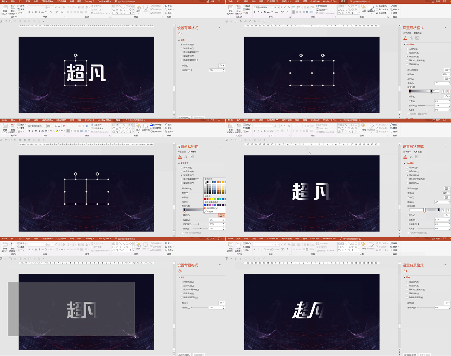
Overlapping word design experience: The distance between each character should not be too loose, otherwise it will not cover the characters; nor too close, otherwise the characters will be difficult to recognize, and should be adjusted according to the font and structure of the characters Location.
/5/
Gradient words
The effect of the gradient font is that I saw a similar effect on the Internet. It is very convenient and quick to make it with Photoshop. The advantage of making it with PPT is that it is easy to modify. However, it took half an hour to make this font for the first time. Let's see the effect.

Compared with the above four fonts, this font is more "advanced ". How should I put it, first of all it is easy to read, without too many special effects, let's look at the strokes of each character, there is a feeling of interspersed, full of creativity!
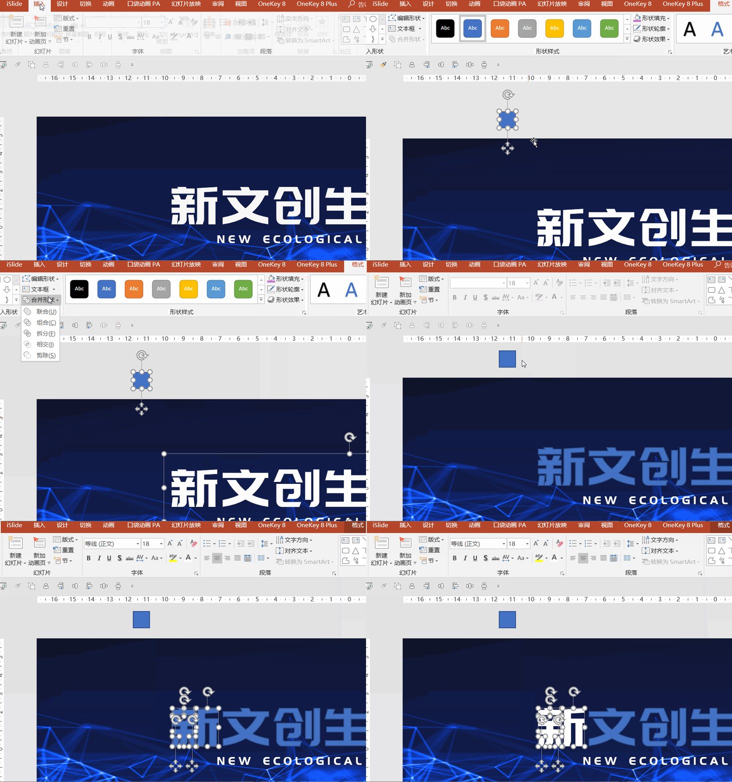
How to make this text effect? As I said just now, it took me half an hour to make it for the first time. The space here is limited, so I will use the word "new " to describe the production process.
Step 1: Insert an arbitrary shape, select the shape and font, and execute the split in the merged shape to turn the text into an editable vector shape, which is convenient for us to modify later.
Step 2: Insert a rectangle whose height and width are consistent with the strokes of the characters, then add a gradient fill to the rectangle, and adjust the appropriate color and transparency according to the background color.
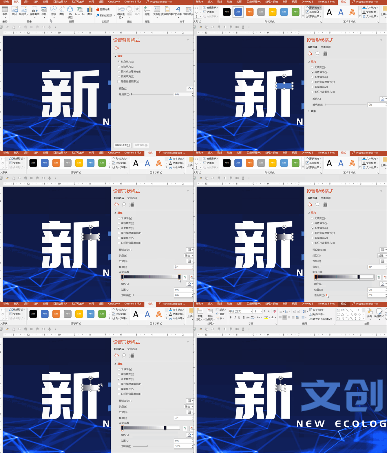
Step 3: Copy the rectangle and add effects to other strokes.
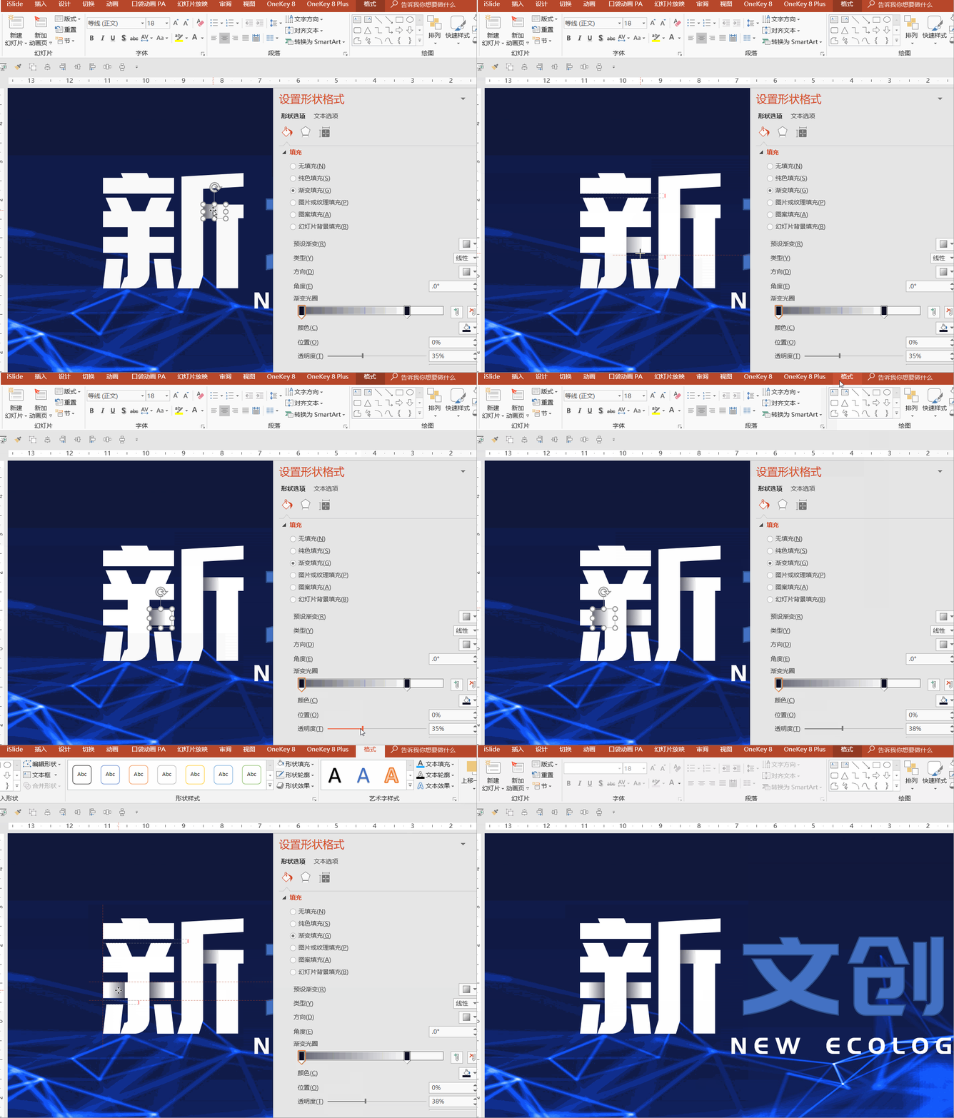
This is the production process of the "new " character. Other font production is the same as this method. It is worth noting that the gradient of the "text " is an arc Yes, you need to use Boolean operations to cut it multiple times. The "big " character has a slanted gradient. Here you need to change the anchor point of the shape.
Gradient word design experience:
The reason why this font is given five stars for its difficulty is because there are too many skills that need to be mastered, such as Boolean operations, shape drawing, gradient fill, etc.
If you are not familiar with these functions, it is difficult to create such an effect, so this font is suitable for advanced PPT players. If you usually only make work-type PPT, then the above four fonts are enough.
Efficient OfficeIf you still want to systematically learn the communication and actual combat of PPT, welcome to study Qin Laoshi's "Working PPT should do this", and take down the PPT-related scenes in the workplace one by one!

ReplyGradientView gradient tutorial
Reply Form TemplateGet Form Template
Reply Find materialGet PPT material website encyclopedia
▲
Pay attention to reply keywords in the official account chat box~
▌About this article
Ma Zhiqiang
Introduction:PPT design knowledge sharing. Focus on PPT customization such as business reports and product launches.
This article is authorized to be reprinted from the public account [Design A] (ID: designsjj), if you need to reprint, please contact the original author.
Click [Read the original text], and you can get 2,500 pages of PPT template source files for free after purchasing!

Articles are uploaded by users and are for non-commercial browsing only. Posted by: Lomu, please indicate the source: https://www.daogebangong.com/en/articles/detail/Learn%20these%205%20font%20design%20effects%20and%20your%20PPT%20will%20gain%20more%20than%20a%20little%20bit.html

 支付宝扫一扫
评论列表(196条)
测试