Go to the design website and browse around, you will find that most of the Chinese design works There is some English mixed in, especially those designs that are more tonally biased, because adding English to the layout is indeed an effective way to make the layout more advanced. Mr. Onion is not opposed to adding English to the layout. However, in actual design work, in fact, many customers and many design requirements do not accept adding English to the layout. First, it is not necessary from the perspective of the target consumer group; More or less interfere with useful information. So if you don't use English, can you arrange a high-level layout?
Of course, what should I do? We can go back to the works to find the answer, and see what role does English play in those excellent layout designs with English? If you don't use English, but use other solutions, can it also play a similar role.
Through observing a large number of cases, Mr. Onion found that despite the fact that the theme or product is in English, in fact, the English in many Chinese designs is not for conveying information, but for visual modification. That is to make the layout look better, have a more design sense, be more advanced, etc., and fall into the specific problems it solves in the layout, which can be summarized as the following:
01. Fill the blank
If the visual subject in the layout is not very large and the information is relatively small, the layout may be relatively empty. At this time, add some English to fill it, and the layout will be fuller.

▲ The English and graphics in the upper left corner, as well as the English next to the product, are mainly to fill in the blanks and make the picture richer.
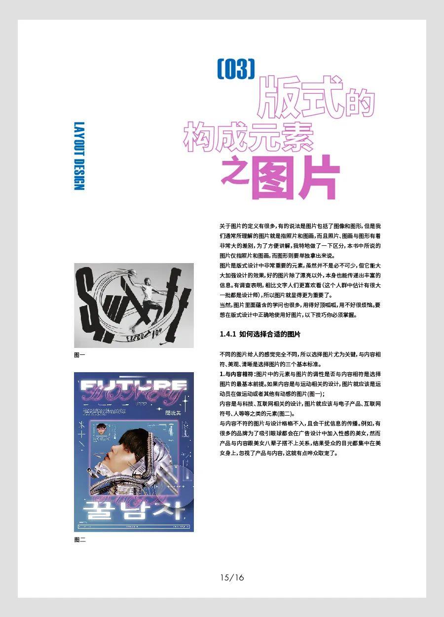
▲ The vertical English on the left is also to fill in the gaps.
Filling blanks can also be done without using English. Other common processing methods include: enlarging pictures or text information, adding graphic elements, directly leaving blank, or changing the typesetting method, etc.
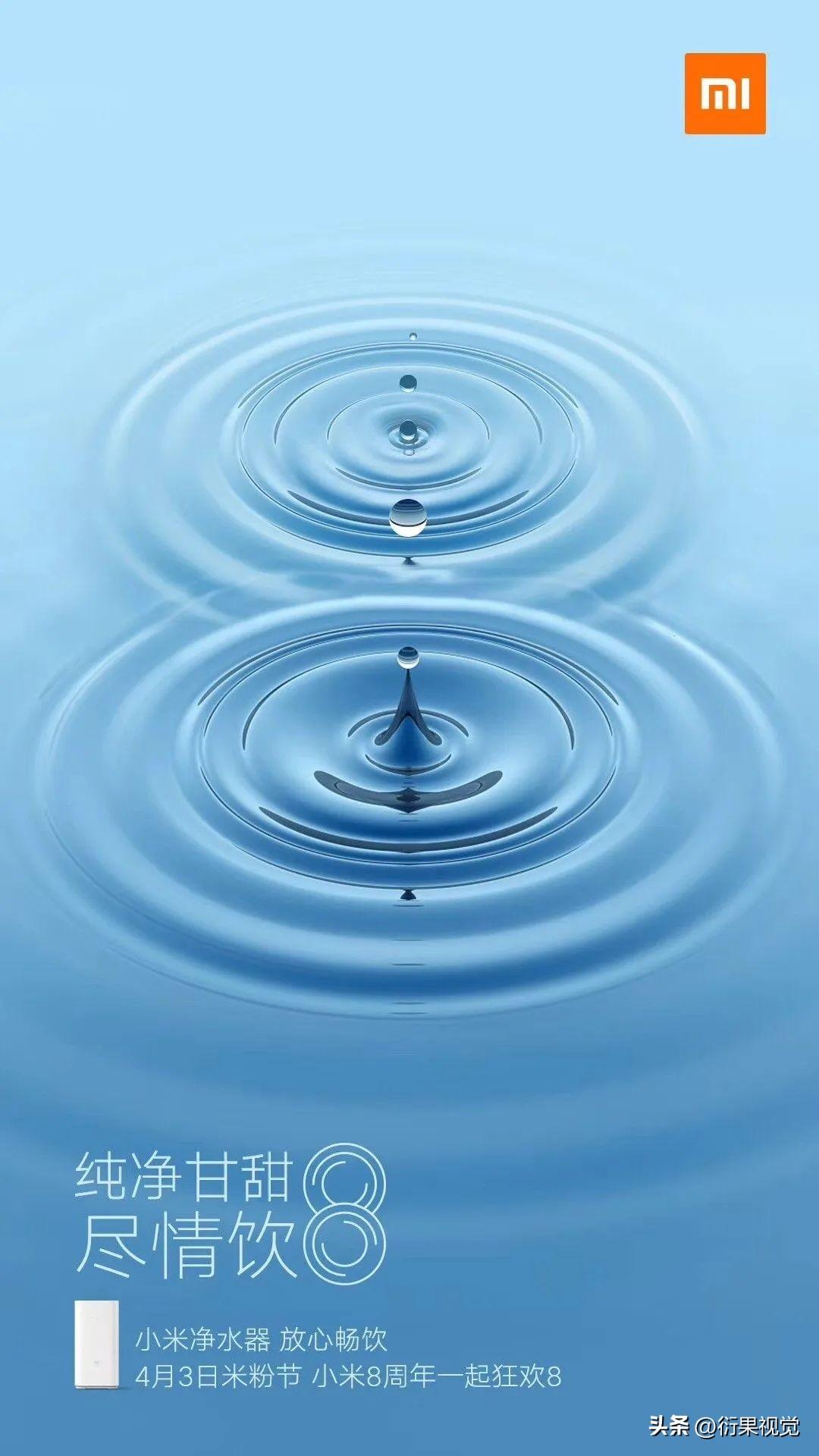
▲ The main visual in the above picture occupies a relatively large proportion of the layout, so even if the information is relatively small and the proportion of the area is small, it will not feel empty, and there is no need to deliberately add English.
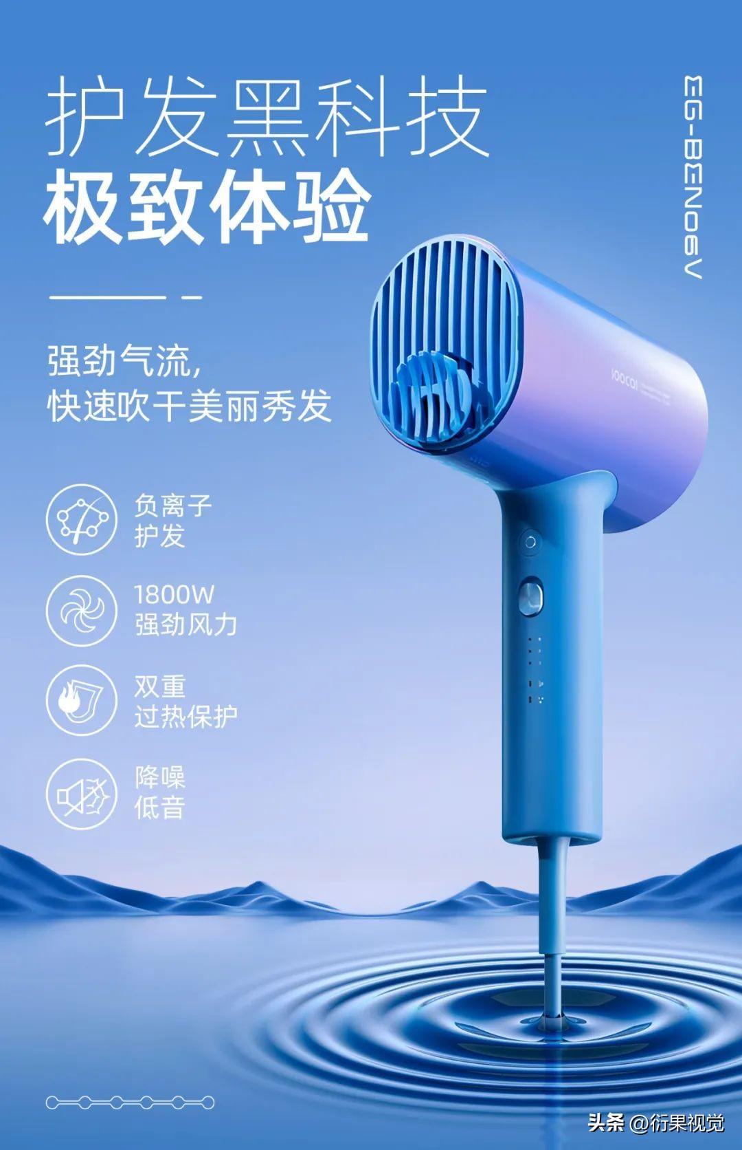
▲ The graphics in the lower left corner of the picture above can also fill in the gaps, and the style of the graphics should match the picture.
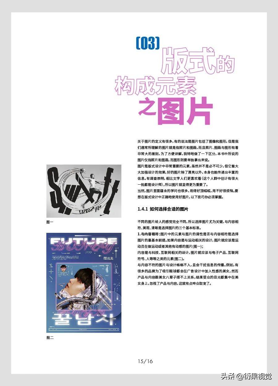
▲ Remove the English in the upper left corner of the original image and leave it blank. This layout is still acceptable, and it is cleaner and simpler.
02. Enhance visual layering
If the text information and information categories in the layout are relatively small, the visual layering of the text layout may be insufficient, and the layout is likely to appear thin and monotonous, so designers often add some English and combine layout with Chinese , due to the increase of information and the weakening of English, the visual changes will become richer, and the layering of the layout will also be strengthened.


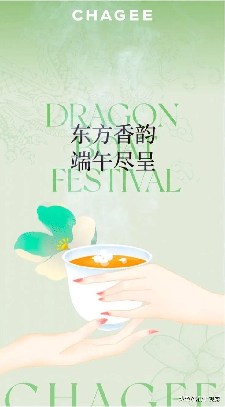
▲ Strengthen the layering of the layout by superimposing Chinese and English.
Of course, besides adding English, there are other ways to enhance the sense of visual hierarchy. The text information is matched according to the combination of large font size, medium font size and small font size.
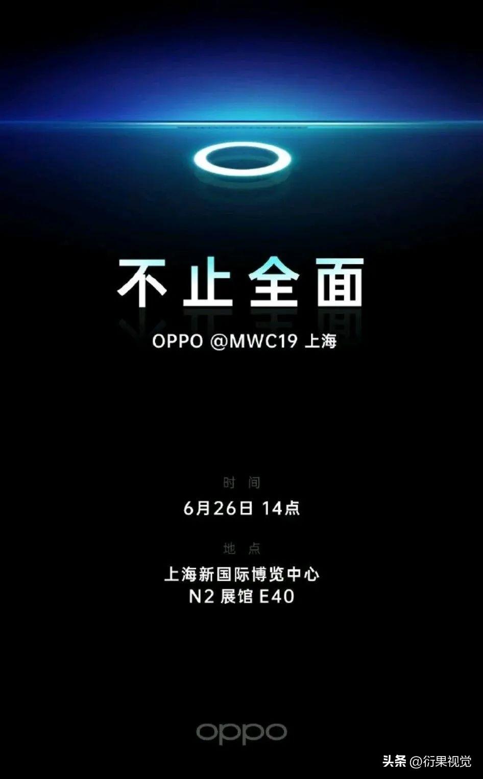
▲ Although there are not many texts in the above picture, there are actually quite a lot of information levels, so the rich visual hierarchy can be displayed without English in typesetting, mainly through different font sizes and colors , typesetting position, spacing to achieve.

▲ The title in the poster above uses methods such as line breaks, dislocations, different text sizes, and punctuation marks to enhance the sense of visual hierarchy.

▲ The poster in the above picture has designed the font of the title, and through gradient processing, the strokes have a superimposed effect, and then the text is dislocated up and down, and there is a foil below the subtitle, so its visual The layers are quite rich.
3. Increase contrast
English and Chinese are two completely different types of fonts. If the styles of the fonts are different, their visual effects will be very contrasting, so many designers like to use Chinese-based layouts Add English to create a sharp font contrast. In addition, by adjusting the shape of the English font, it can also form a size contrast, color contrast, direction contrast, spacing contrast, etc. with the Chinese character, which can have a good decorative effect.

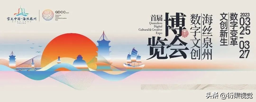
In the typesetting of titles, the combination of handwritten English fonts and thicker sans-serif or handwritten typesetting is a very popular typesetting method in recent years.

In the same way, strong and diverse contrast effects can be created without using English. For example, using handwritten Chinese fonts with HeiTi or SongTi, the font contrast effect is also very strong; for example, superimposing seals and icons on Chinese fonts, It can form graphic-text contrast, outline contrast, direction contrast, color contrast, etc. In addition, you can also add punctuation marks, lines, wireframes, color blocks and other elements to key words, all of which can create a strong contrast effect.
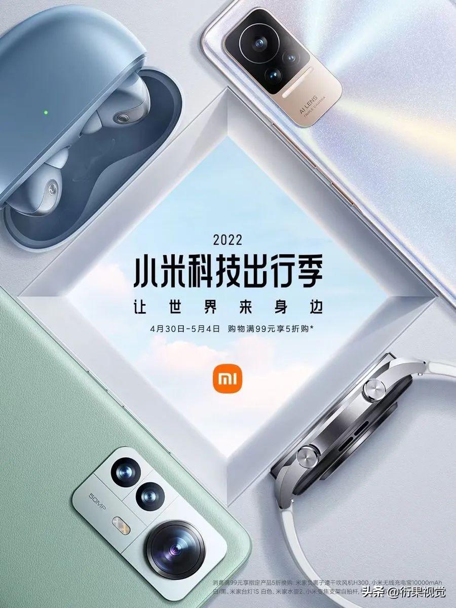
▲ Four lines of characters, the visual effect of each line is different, and the contrast is very rich, including font contrast, size contrast, spacing contrast, length contrast, etc., and forms a color contrast and outline with the logo below Compared.
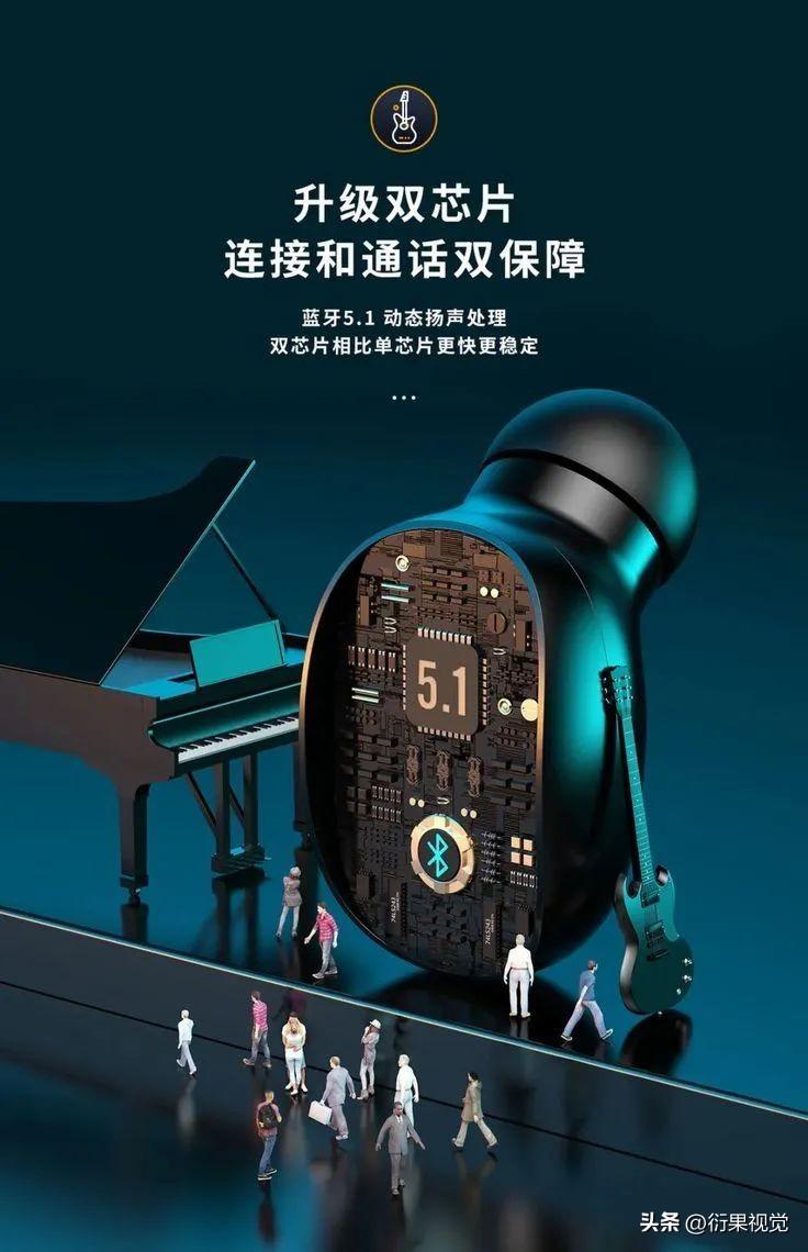
▲ In the typesetting of the above picture, there are graphic comparison, size comparison, line spacing comparison, point and line comparison, etc.
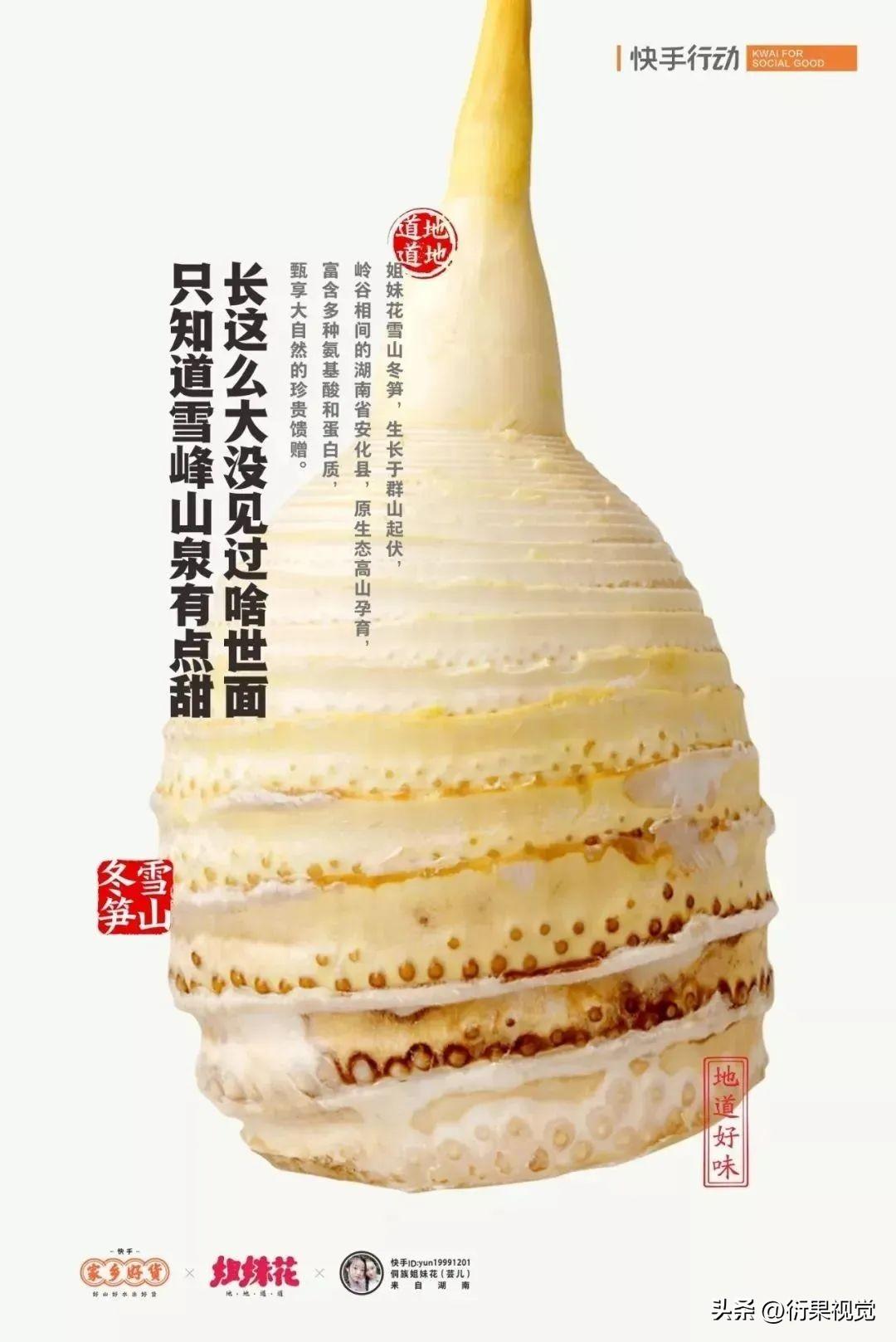
▲ By adding stamps in the picture above, it forms a sharp color contrast, outline contrast, style contrast, etc. with the text, which is often seen in Chinese-style pictures.

▲ Changing the typesetting direction of some text, adding color blocks to text, designing icons for product selling points, etc., are also common techniques for enhancing contrast.
4. Balance< /span>
Balance is also an important principle of layout design. In the process of typesetting, if the information is concentrated, the layout may be unbalanced. At this time, many designers will choose to add English to the corresponding position. Achieve balance.
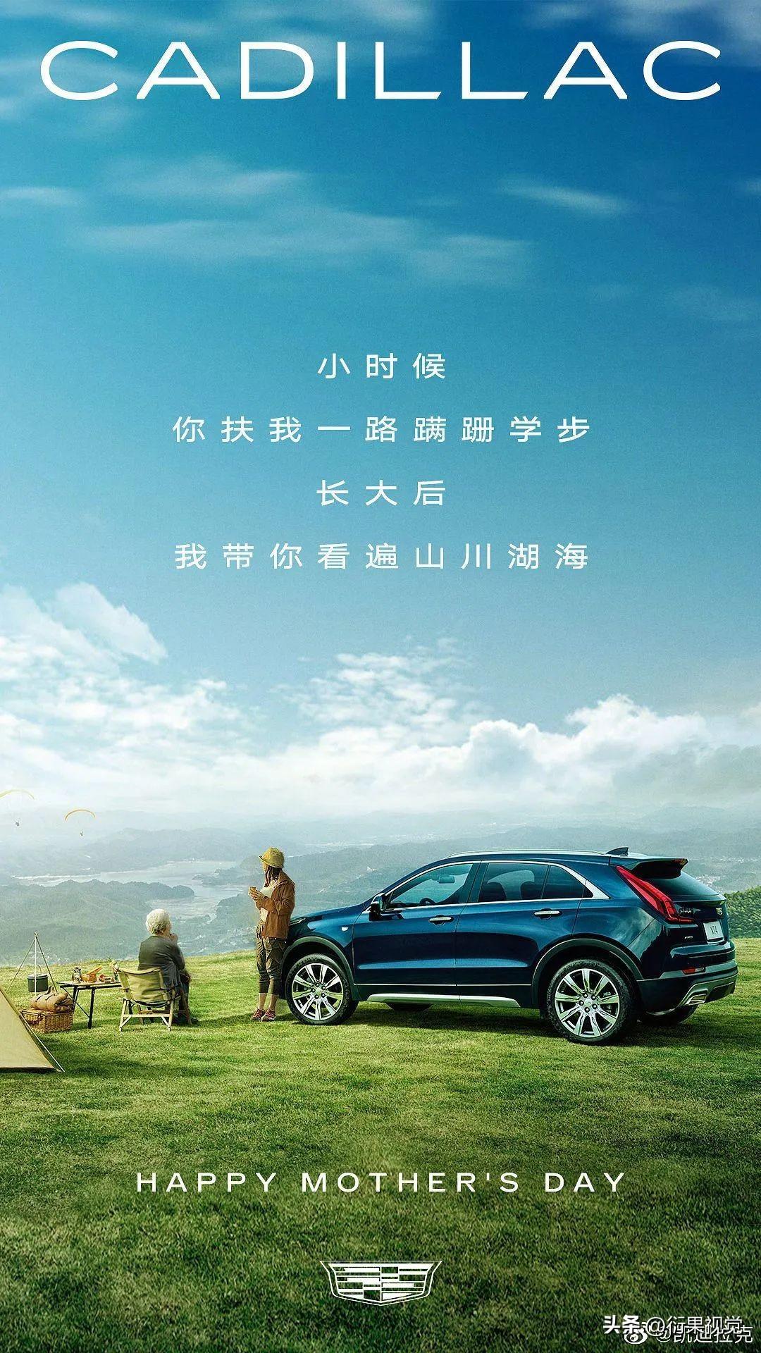
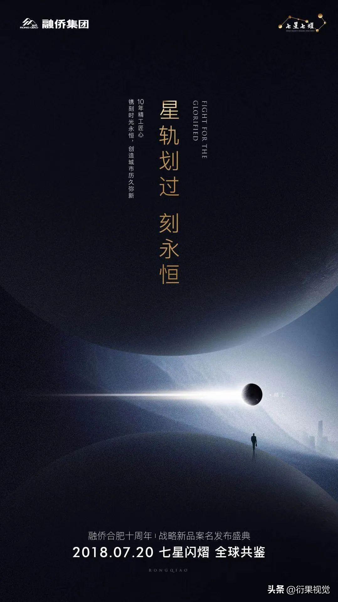
The problem of balance can be easily solved without using English, such as adding graphics, centering typesetting, dispersing Chinese information, adjusting composition, etc.
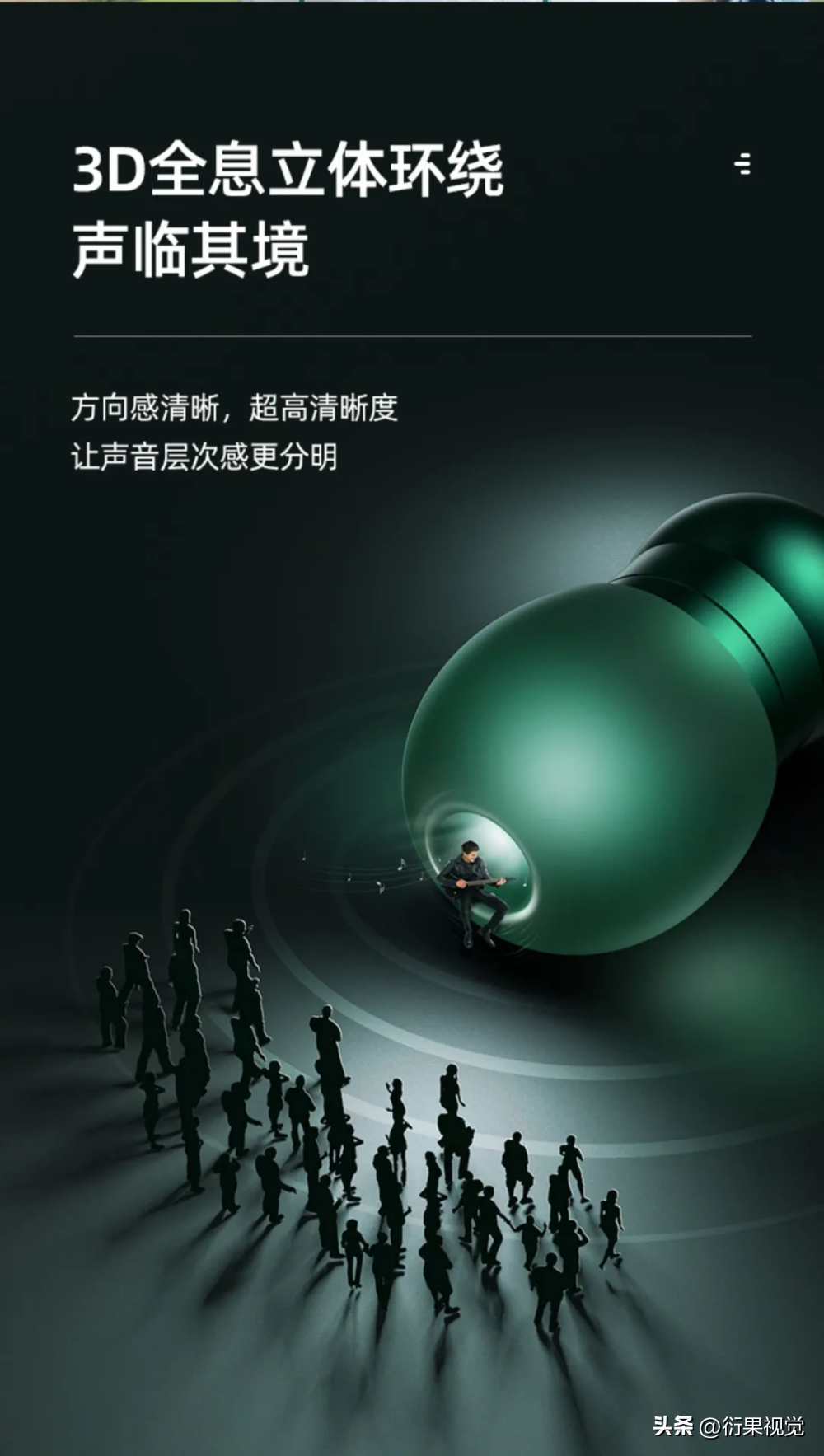
▲ The small graphic in the upper right corner and the horizontal line below the title all play a balance role in the layout.
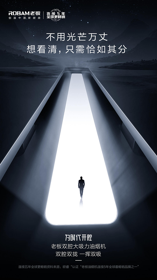
▲ In a picture with a centered composition, the text is centered and typesetting, which is the most effective way to ensure the balance of the picture. The effect is simple and advanced.
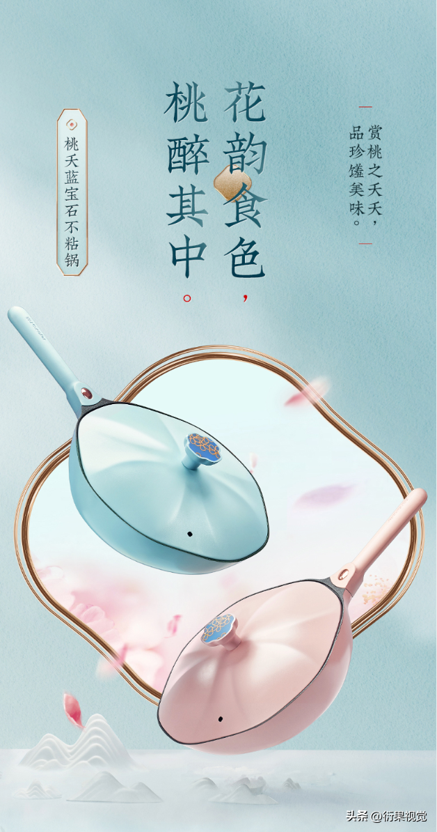
▲ The title of the picture above is aligned with the center of the layout, and other text information is distributed on the left and right sides. The balance of the layout is achieved by evenly distributing information, and with the help of some small graphics, the layout becomes exquisite and advanced .
Using English or not using English for typesetting is not the focus of design, because the designer’s job is to satisfy customers and solve problems. Therefore, when English is needed, we must boldly make good use of the advantages of English. When English is not needed, good-looking, stylish and high-end layouts can also be produced in pure Chinese. This is the ability that every designer should have.
Articles are uploaded by users and are for non-commercial browsing only. Posted by: Lomu, please indicate the source: https://www.daogebangong.com/en/articles/detail/Layout%20skillsHow%20to%20create%20a%20highlevel%20sense%20without%20using%20English.html

 支付宝扫一扫
评论列表(196条)
测试