@大猫, this issue brings you the basic investigation method in the layout. Many friends often feel that their typesetting works are not good enough, but they can’t say why, so this issue will classify the common mistakes in layout design for your reference.
When a work is finished, it can be checked and modified based on these five points.
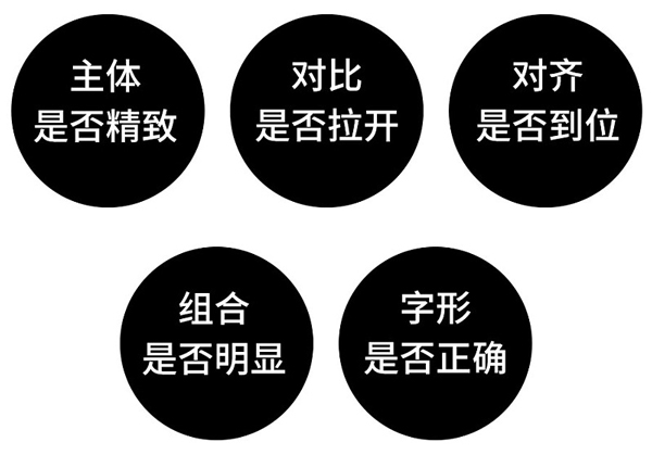
1. Is the theme exquisite?
The subject is the largest and most eye-catching element in the picture, and it is also the most important part of a picture.
The subject in the picture must be exquisite, beautiful and eye-catching. A beautiful subject will instantly upgrade the layout by several levels, while a poorly aesthetic subject will instantly destroy the layout.
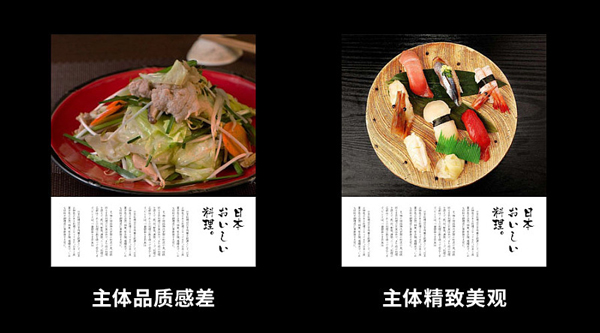
The subject does not have to be an image, any element can be the subject, but the subject must have a sense of beauty, here are a few examples of different types of subjects.
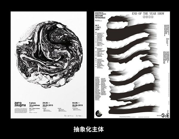

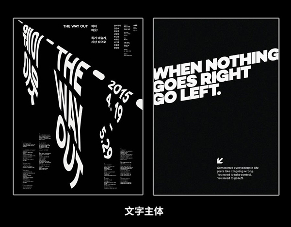
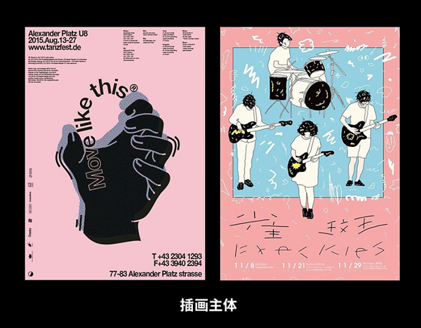
Here are just a few. Everything else, such as animals/food/architecture/calligraphy, can be used as the subject. What we have to do is to choose aesthetic elements as the subject.
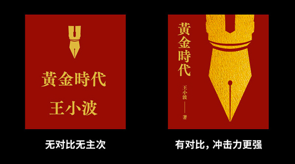
Second, whether to open the comparison
Contrast is the primary and secondary relationship, which can also be called hierarchical relationship. A layout that is conducive to reading must have a clear hierarchical relationship.
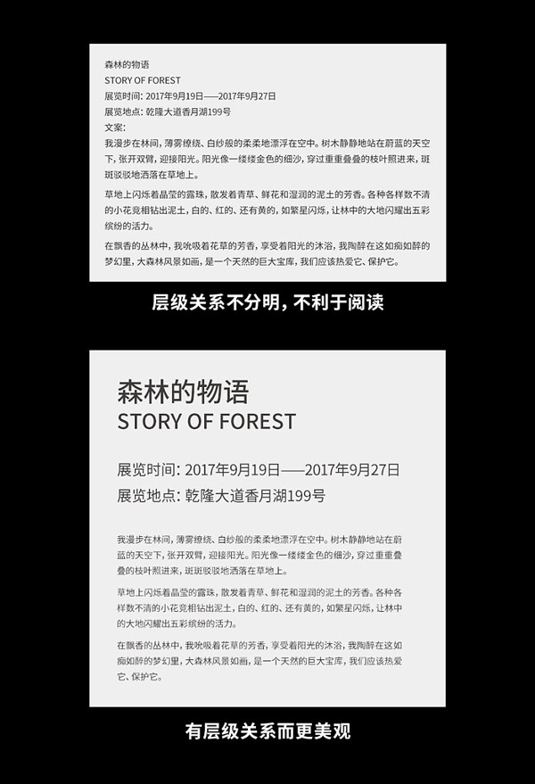
Layer-level information can highlight the theme and make it easier to read.
Third, whether the alignment is in place
The main function of alignment is to establish a sense of order in the screen, so that all elements in the layout can be connected as a whole. If your screen is messy, it is likely that the alignment is not done well.
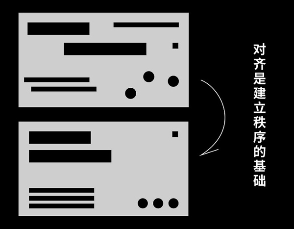
A messy layout can be aligned to give order and a clearer message.
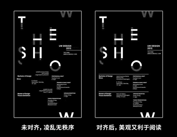
Misaligned information may cause readers to have difficulty reading and affect the reading experience; aligned information is beautiful and easy to read.
Fourth, whether the combination is obvious
Combination is the key to distinguishing two sets of information. The obvious combination is easier to read, and the picture is more beautiful and rhythmic.
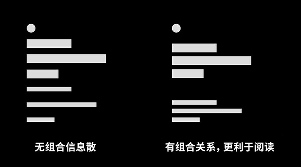
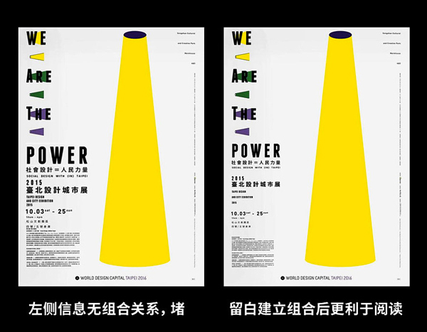
In the first work, a large amount of information is densely arranged in the lower left corner without using the blank space to establish a combination relationship, so it looks very clogged; the second work makes reasonable use of the blank space in the layout to make the layout It is more rhythmic and easier to read.
Is the font correct
Sometimes the unsightly layout is caused by the choice of fonts. For example, a poster of femininity uses rigid fonts such as Variety and Rhombus, which is obviously wrong, so the picture will feel strange. Therefore, when we do layout design, we must choose fonts that match the temperament of the project.
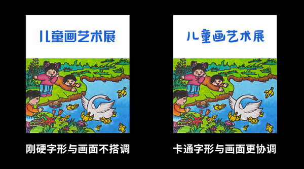
Riff fonts are obviously against the theme of children's art, while cartoon fonts or rounded fonts can be well represented.
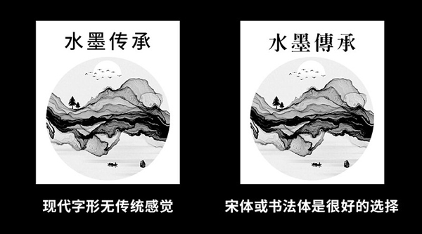
Similarly, the bold font is more modern and not suitable for expressing the traditional theme; on the contrary, the Song typeface and calligraphy style can well express the traditional theme.
So no matter it is black body, round body, song body or calligraphy, they all have their own temperament. When working on a project, you should choose the font according to the temperament of the project. The wrong glyphs can ruin your design. So what is the difference in the temperament of different glyphs? Here I simply compiled a list of keywords corresponding to different glyphs for your reference.
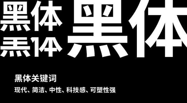
The black body is modern and concise, and it is very neutral and has a sense of technology. It is very malleable. It can express a sense of masculinity in the thick and heavy state, and it can express femininity in the thin and heavy state.
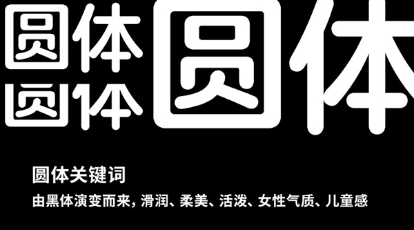
The round body is evolved from the black body, and the difference from the black body is that the stroke ends and turning features are more rounded. The round body has a sense of smoothness, softness and femininity, and it also looks lively and childlike in the state of bold characters.
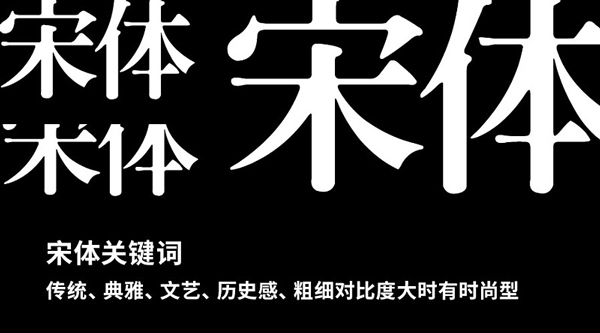
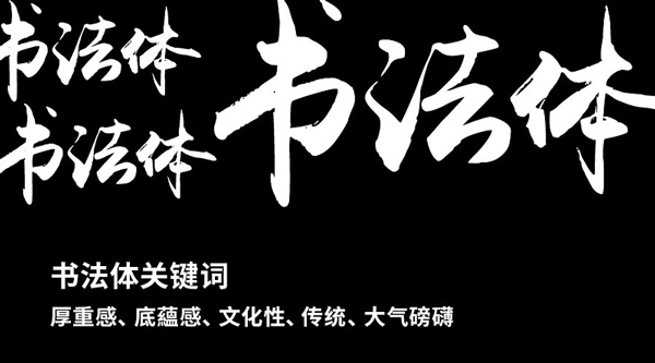
Song style appeared in the Song Dynasty and took shape in the Ming Dynasty. It is traditional and has a sense of history, and it can also express elegance and literary feelings. There is also a sense of fashion in the case of a large contrast between thickness and thickness, such as Fang Zhengfeng Yasong and Japanese Kocho style, which are not only elegant but also fashionable.
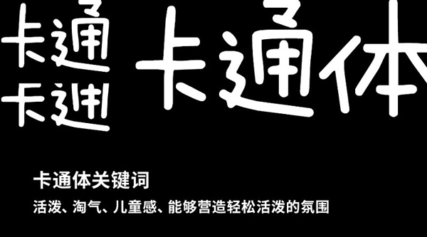
Cartoon glyphs can best express children's feelings, very naughty and lively, and can create a relaxed and lively atmosphere very well.
Articles are uploaded by users and are for non-commercial browsing only. Posted by: Lomu, please indicate the source: https://www.daogebangong.com/en/articles/detail/Layout%20evolution%20%20basic%20screening%20method.html
 支付宝扫一扫
评论列表(196条)
测试