
Last time I shared three techniques for form optimization, so today we will conduct a practical exercise! Let everyone see the progress and the use of skills in actual combat!
"The PPT table I made is ugly, how can I make it more beautiful?"

This is a question I saw on Zhihu. First look at the PPT page made by the questioner, and think about it, what is wrong with such a form, and how would you modify it?
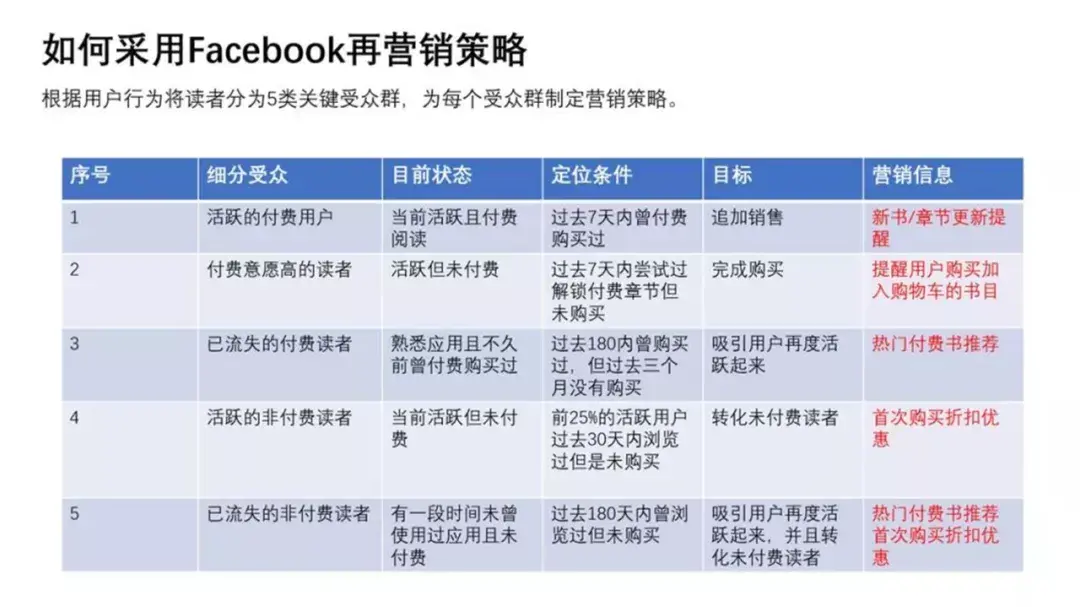

The design level of these two PPT form pages, I feel very suitable to represent the average level of most people! Therefore, let's carry out targeted revisions, so that everyone can have an inspiration in their thinking!
Case 01

Large paragraphs of text should use left alignment, re-plan the position of text wrapping, avoid "small tails":
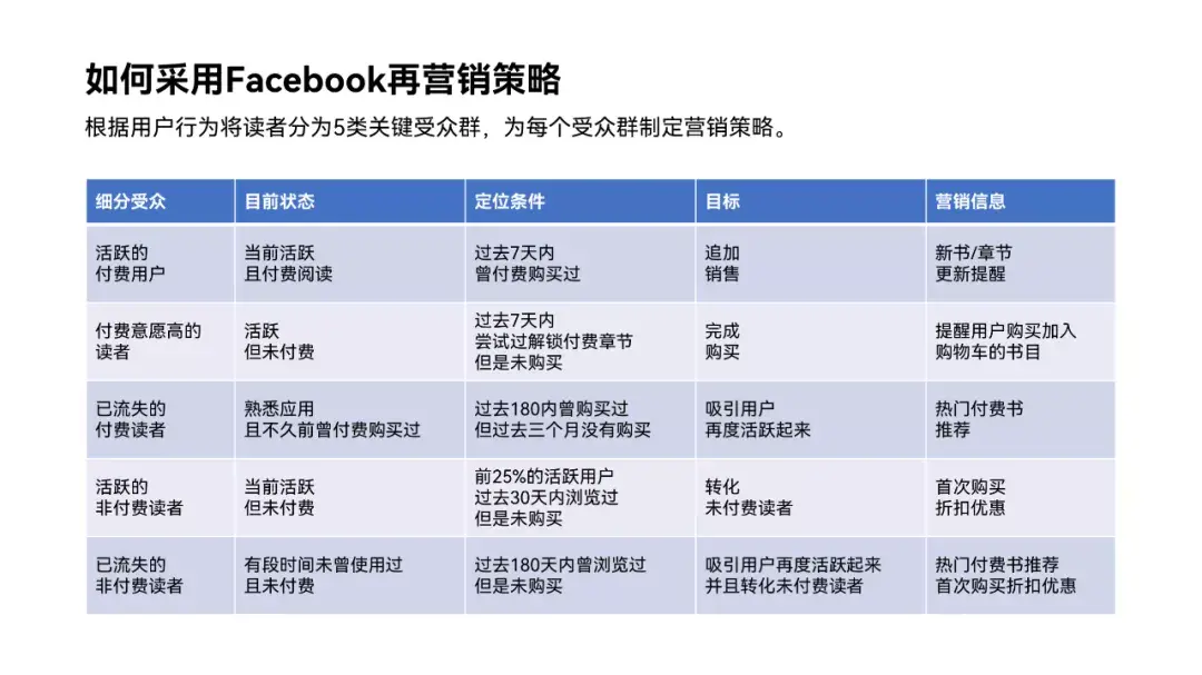
The default table style is too complicated, and the colors are still old-fashioned. Let's change the color and use simple line division:
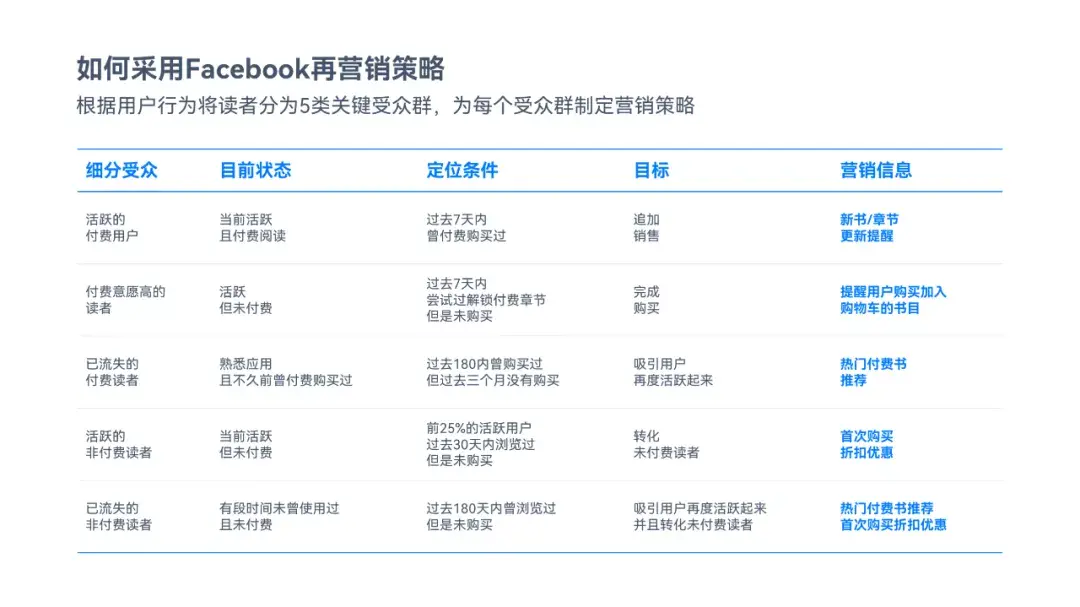
Or use Different shades of color blocks:
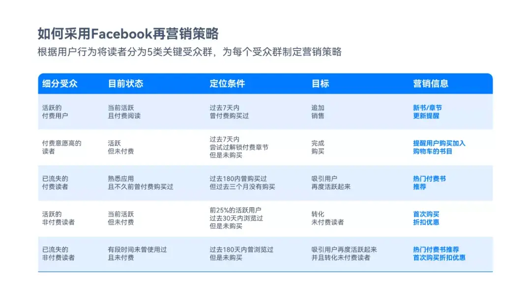
Of course, the color is better to be more western. Try to use some gradient colors:
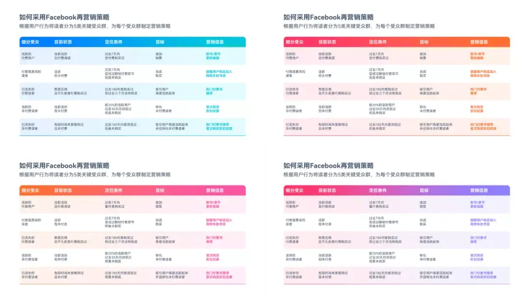
If you think the background is too monotonous, you can find a related background image according to the content of the table:

The style of the table here can be more concise, for example, only 5 transparent color blocks are used:

The key content can also be highlighted with color blocks, which will be more eye-catching~

Let's look at the second case again.
Case 02
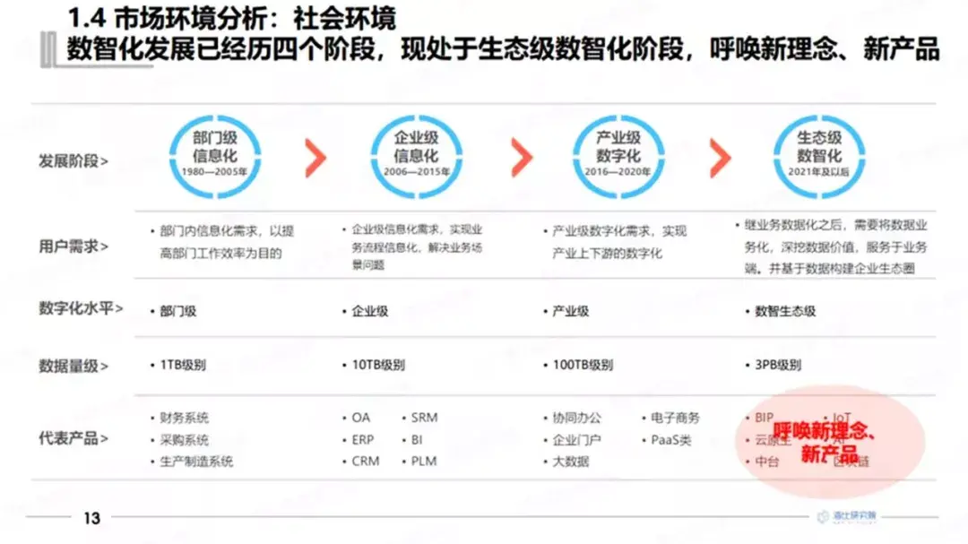
Remove trivial bullets, each column is strictly left-aligned:
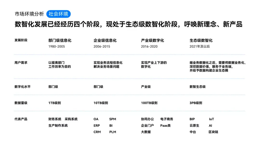
Use polyline arrows to show stage development:

Use gradient transparent shapes to differentiate stages:
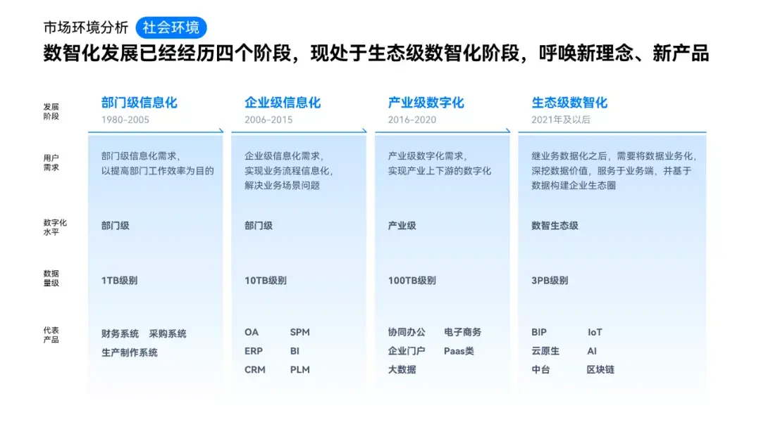
At the same time, to avoid the top-heavy form, for the products at the bottom, you can use a rounded rectangle to carry:
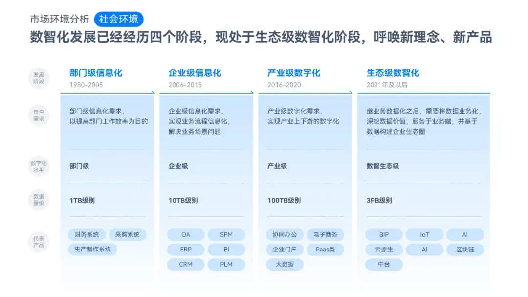
Finally, it doesn’t have to be red for emphasis, it’s still conspicuous to use the main color:
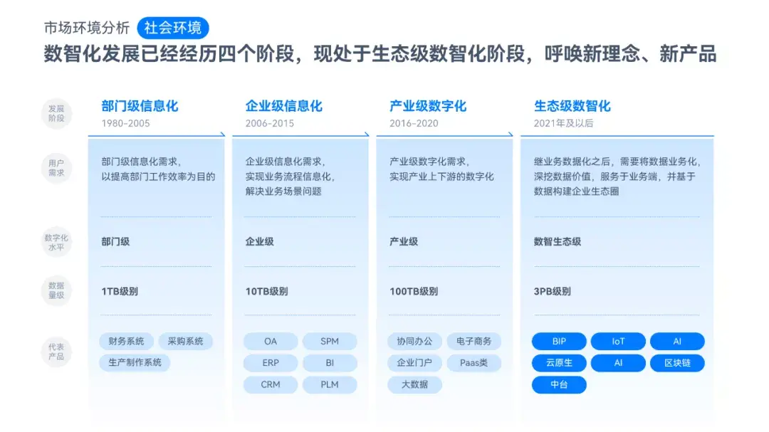
Do you think it is very simple?
Because there are a lot of content on the page, if you want to further optimize, you can start with the color or background.
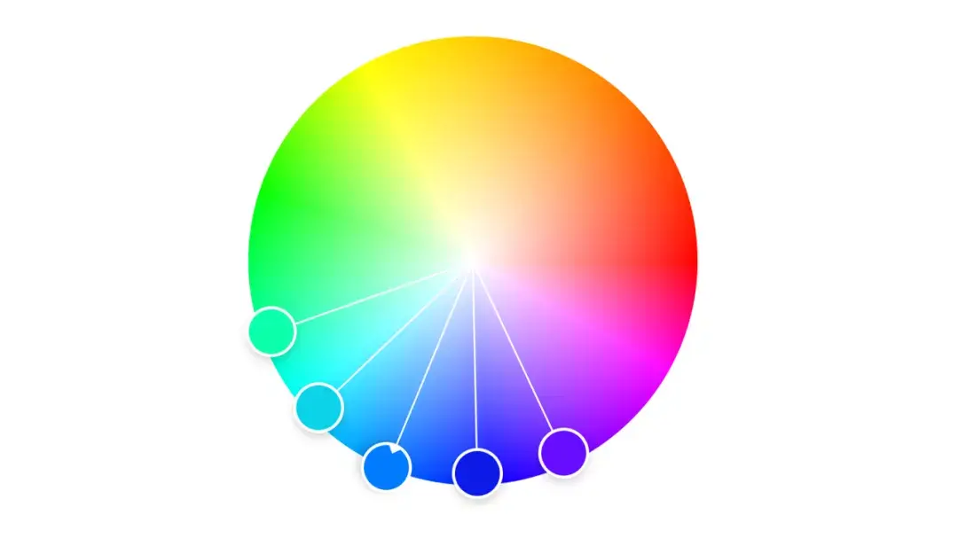
For example, choose some colors similar to the main color on the color wheel:
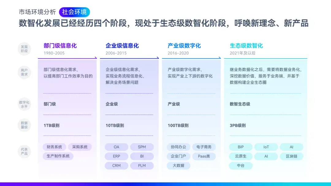
Color-coded stages:
Wouldn’t it be cooler to use a dark background?
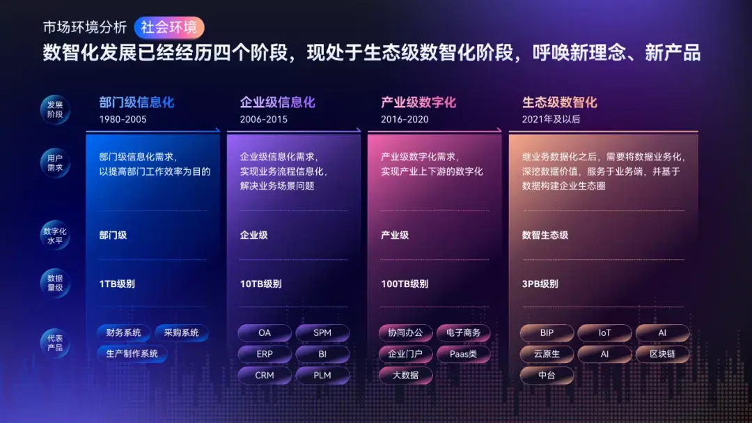
You can even make it into a technological style, after all, it is "digital intelligence"!
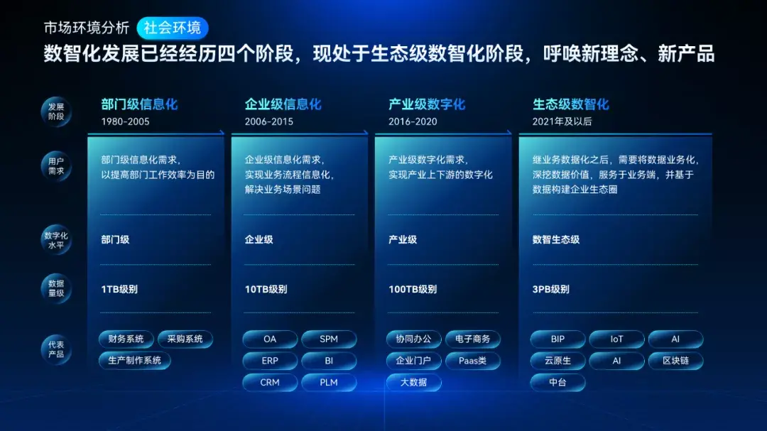
Of course, these are all ways to stylize the slides. For the PPT tables in daily work, you only need to do a good job of alignment, highlighting the key points and clearly distinguishing the content!

Finally, a bonus for everyone! 20 pages of super easy-to-use PPT templates for the workplace, directly to:
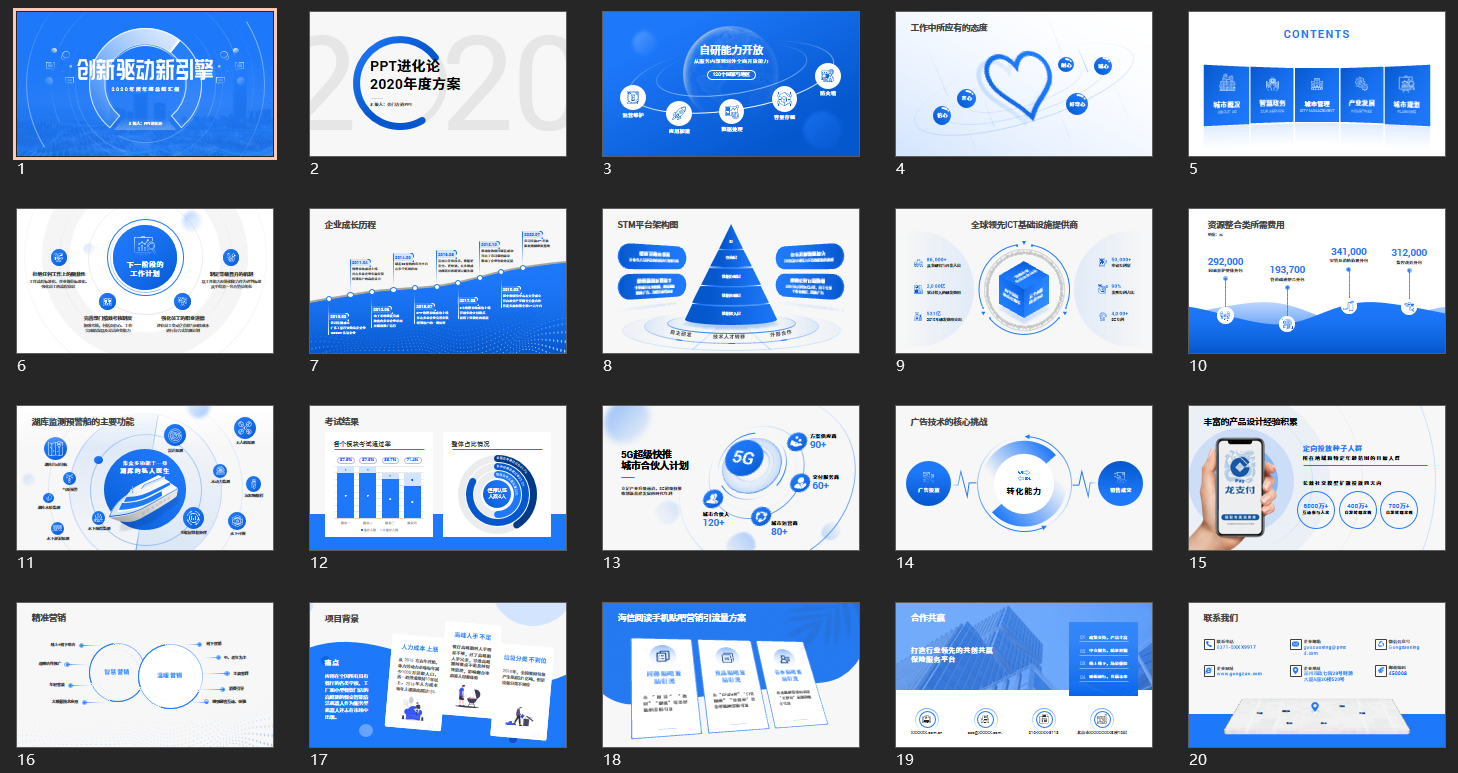
How to get it?
How to obtain the PPT template: follow me + send【20 pages】

Articles are uploaded by users and are for non-commercial browsing only. Posted by: Lomu, please indicate the source: https://www.daogebangong.com/en/articles/detail/Knowing%20the%20PPT%20form%20pages%20of%20netizens%20I%20will%20directly%20open%20them%20to%20the%20full%20level%20of%20beauty%20Netizen%20Niubi.html

 支付宝扫一扫
评论列表(196条)
测试