Different from the previous fonts written directly with Marker pens, hand-painted deformed fonts are more like drawing than writing. Hand-drawn deformed fonts usually need to go through the process of drawing drafts, outlines, and coloring.
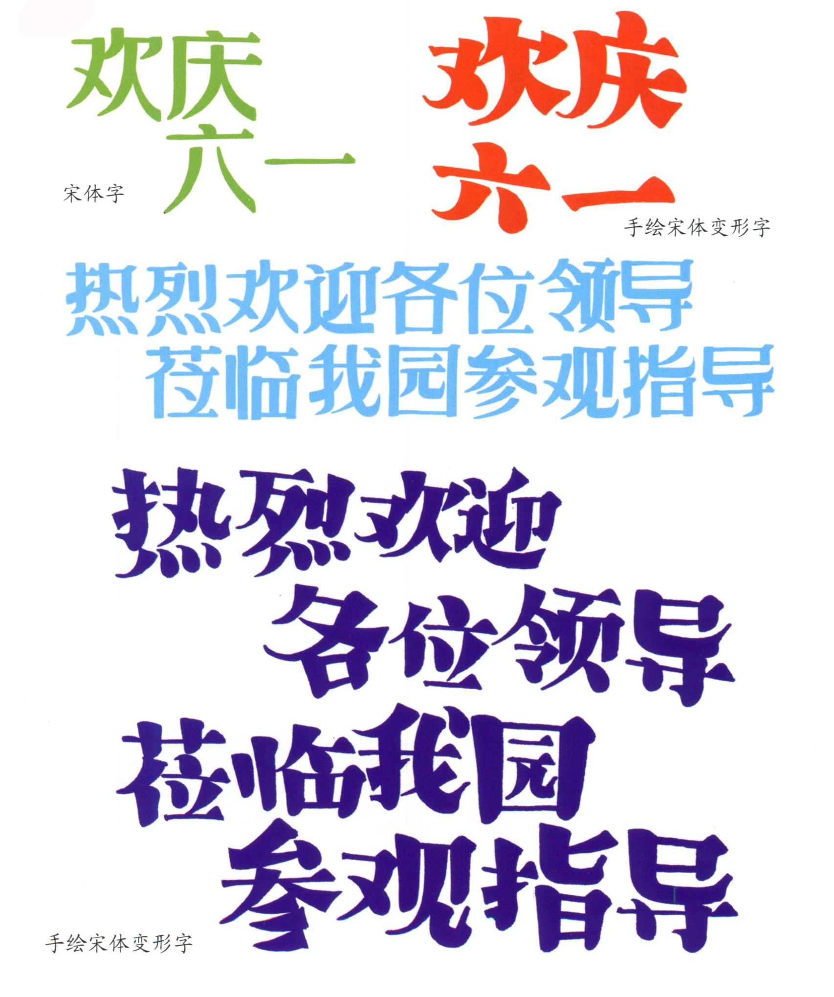
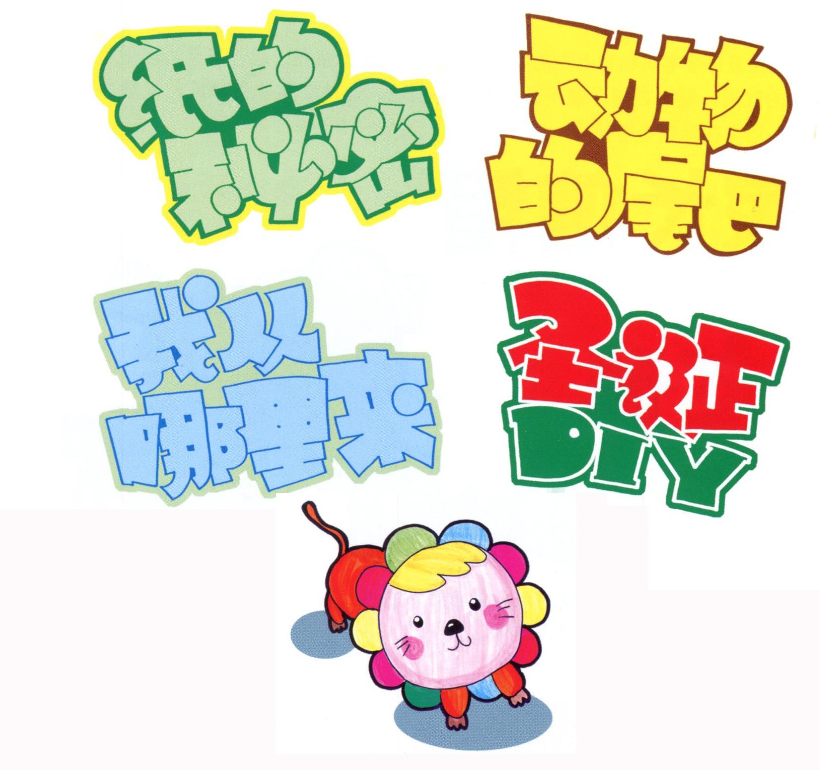
1. Hand-painted song font deformed characters
The shape of the strokes is basically the same as that of the Song typeface, but it is no longer horizontal, flat and vertical. The frame structure is the same as that of the POP font, with the big part and the small part, and the big part on the left and the small part on the right. In particular, the changes in the strokes of "skimming", "dot" and "捷" are more free and easy.

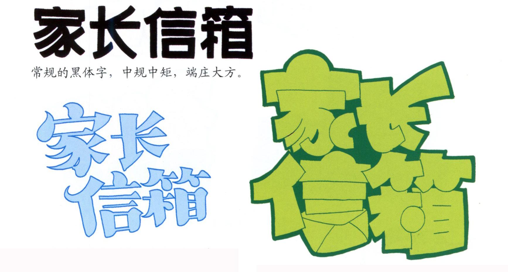
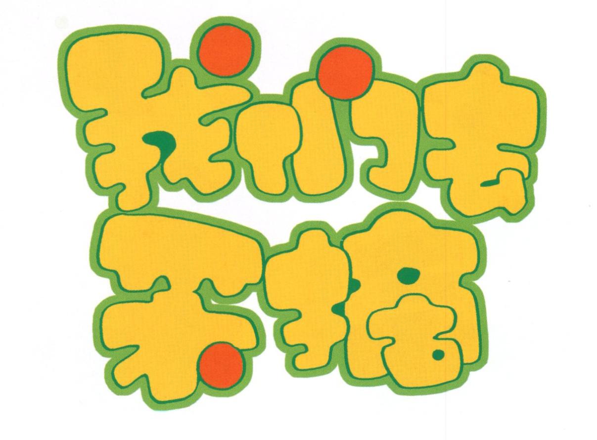
2. Hand-painted blackface deformed words
Strengthen the thick and powerful strokes of boldface characters, let all the strokes squeeze together, and even use the effect of overlapping each other, leaving as little or no gaps as possible between the strokes. This typeface is very thick and has strong visual impact, which is suitable for use in title words.
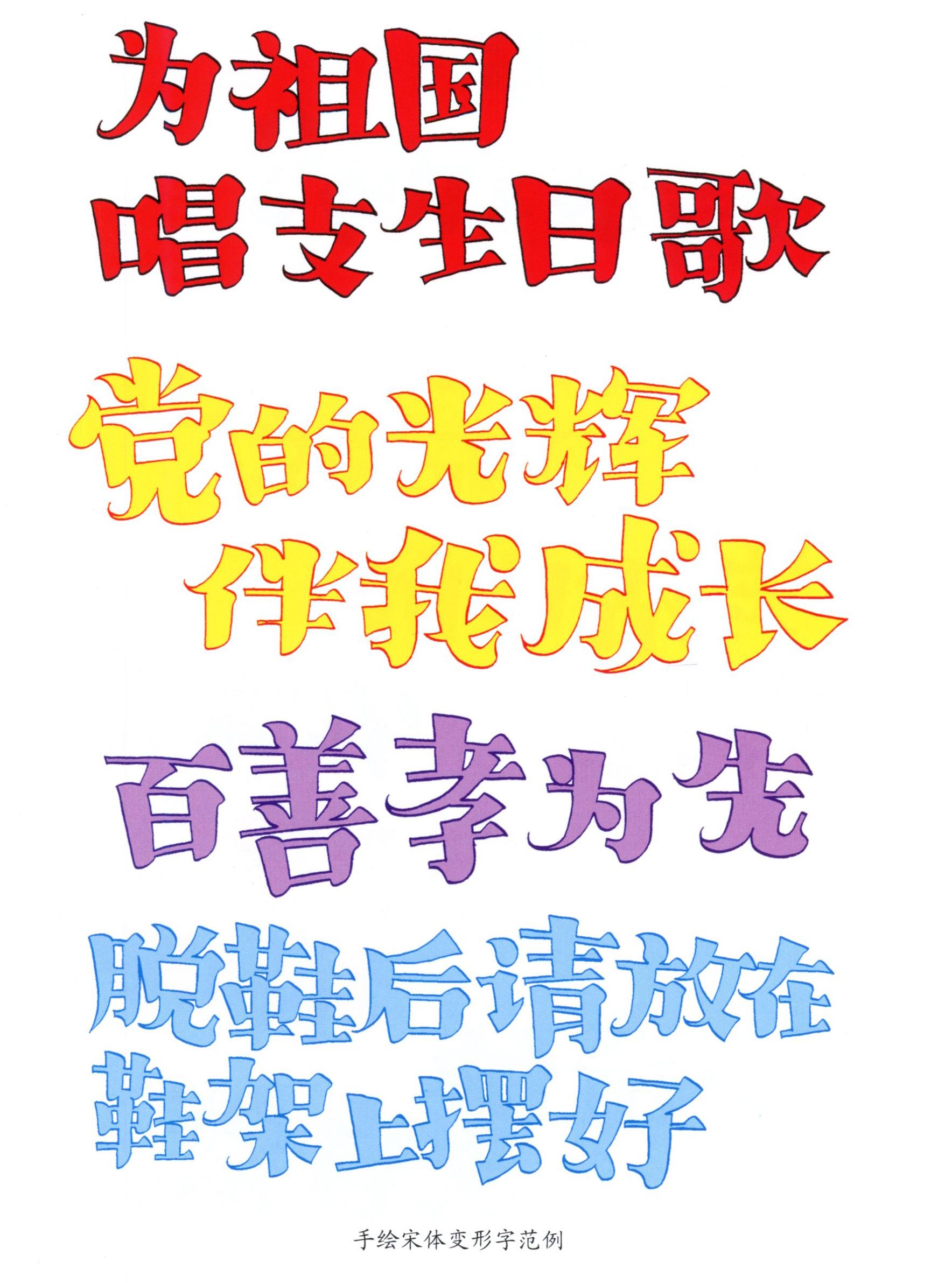
Hand-painted deformed Song typeface characters, with great contrast in thickness and thickness, and vivid strokes. The hand-painted blackface deformed characters have thick and powerful strokes, thick texture and strong visual impact.
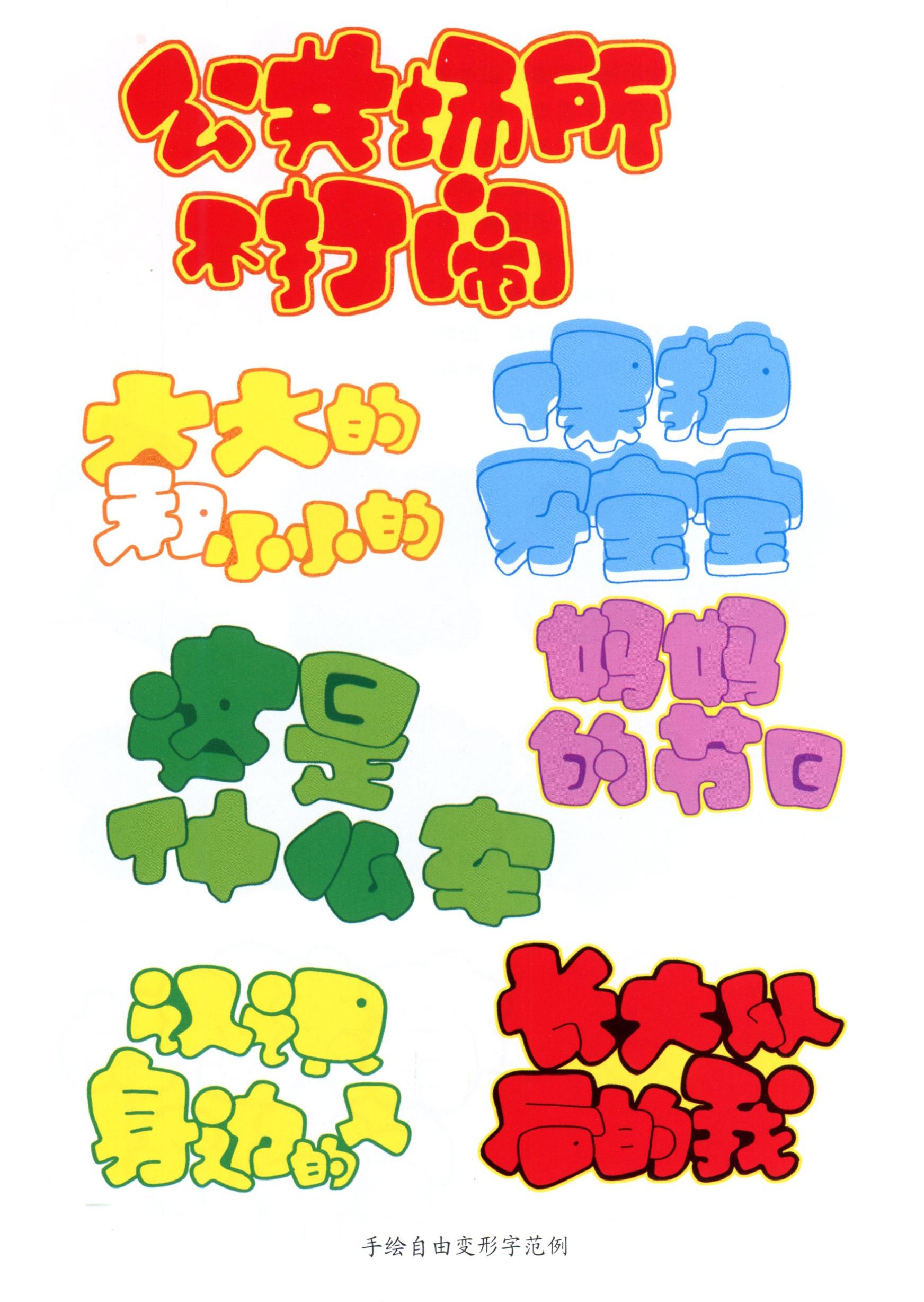
3. Hand-painted free deformation characters (hollow characters)
Based on the deformation of the black body, the strokes should be softer, especially the corners must be smooth, and the thickness can be changed relatively freely, so that the font looks thick and not bulky.
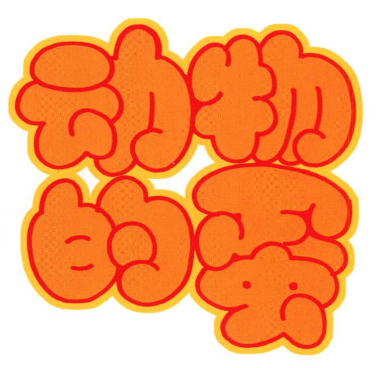
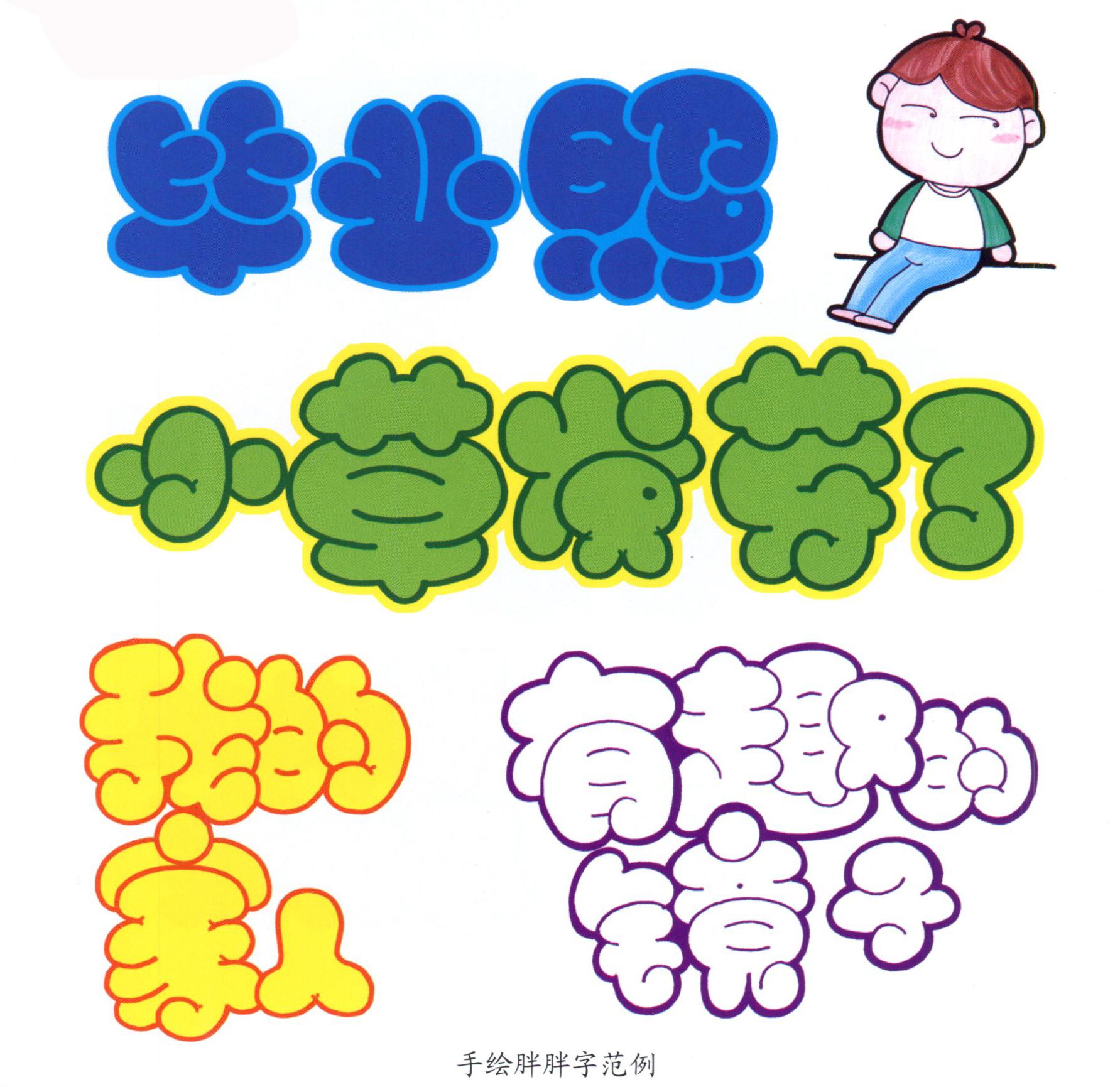
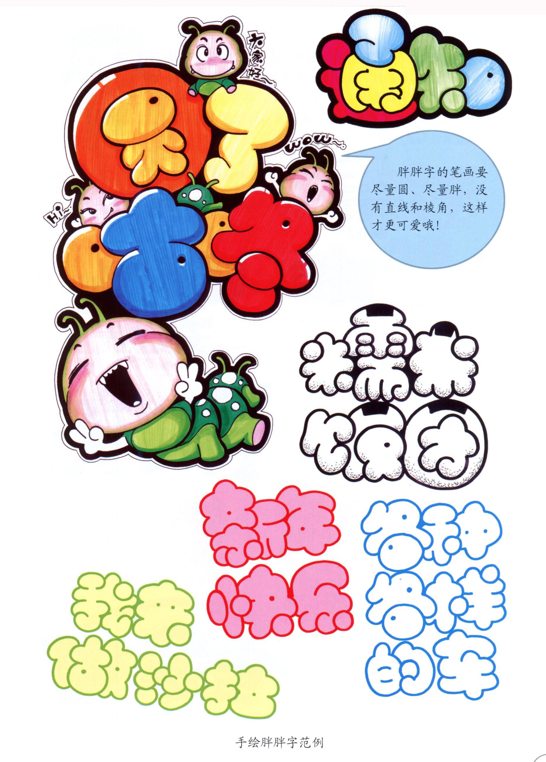
4. Hand drawn fat characters
Pangpang is a very popular font nowadays, especially in posters with preschool education themes. Relatively speaking, fat characters are more difficult than the previous three deformed characters, and it often makes people feel at a loss. However, as long as you understand its laws, it will be much easier to handle. Everyone should keep in mind the two slogans of the fat character: like a sausage, like a balloon, without leaving any gaps; I squeeze you, you squeeze me, and the small ones hide in front.
When writing fat characters, the strokes should be round and full. Each stroke is like a round balloon or a full sausage. The strokes are squeezed and overlapped without leaving any gaps in the middle.
Articles are uploaded by users and are for non-commercial browsing only. Posted by: Lomu, please indicate the source: https://www.daogebangong.com/en/articles/detail/Kindergarten%20handpainted%20POP%20posters%20%20handpainted%20deformed%20fonts.html
 支付宝扫一扫
评论列表(196条)
测试