JetBrains also explains why they built Mono. Because developers spend most of their time looking at code, and they spend time finding the "best" font for them to get the best reading experience.
However, JetBrains believes that most of these "Internet celebrity" programming fonts do not fully consider the difference between reading through the code and ordinary reading, which makes it easy for developers to have dry eyes Fatigue... so they decided to create a font that would make coding easier for everyone.
When looking up the code, the developer's gaze quickly sweeps everywhere on the screen (the eyes need to move along the vertical and horizontal directions at any time), so the eyes are very easy to get tired, and when reading normally, the eyes usually move along the Moving in the same direction is relatively easier.
Therefore, at the beginning of designing the Mono font, the team fully considered the eye fatigue problem that may be caused by looking at the code for a long time, as well as the affected factors, such as the size and shape of the letters, Amount of space, natural monospaced balance, unnecessary detail, ligatures, and indistinguishable symbols or letters (l and I) and ligatures, etc.
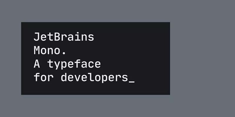
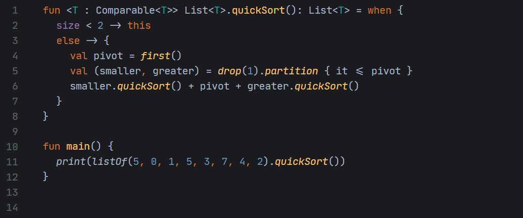
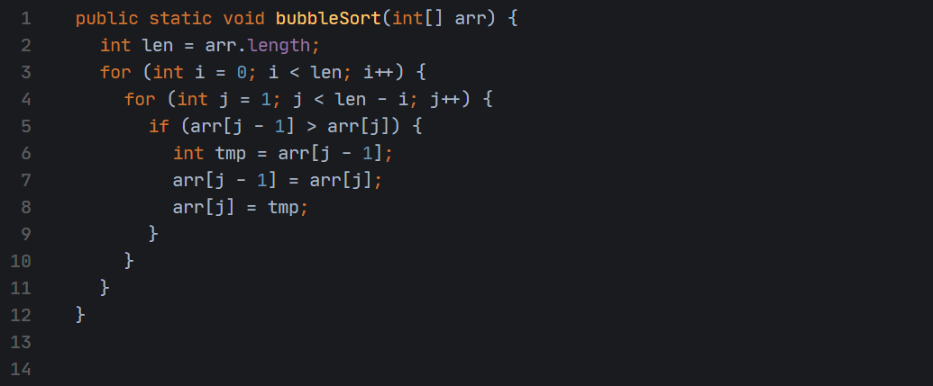
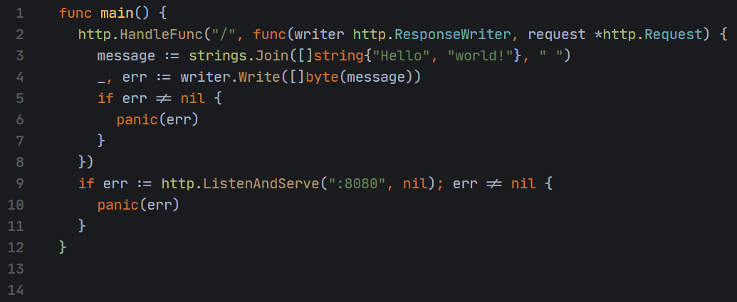
First, let's take a look at what the Mono font looks like. Its display effect in different programming languages is as follows:
Kotlin
Java
Go
Python
In fact, when I first saw the Mono font, because I was not very sensitive to fonts, I couldn't tell the difference between it and the Consolas font.
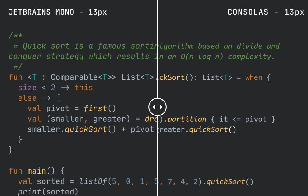
▲ Comparison of JetBrains Mono and Consolas fonts
At first glance, there is not much difference between the two, but the test of the font is the control of details. Although Mono is plain at first glance, it actually implies a lot of tricks.
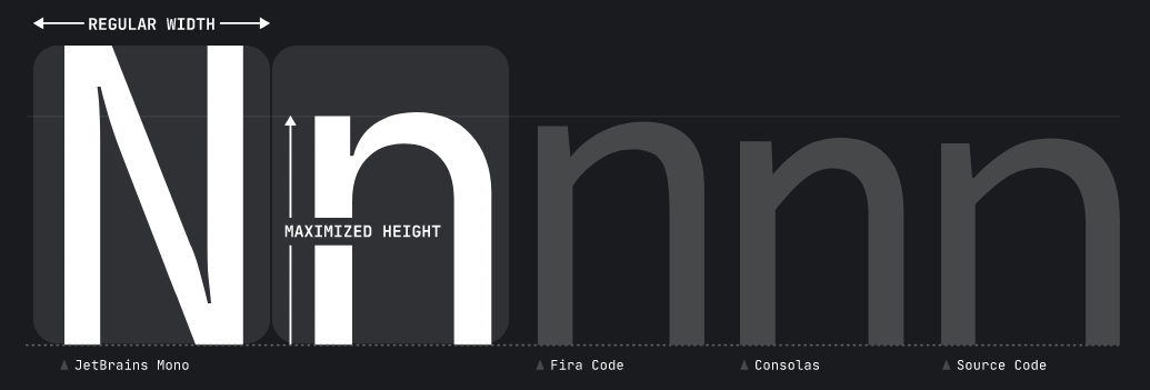
The Mono font increases the height of the lowercase letters while maintaining the standard width of the characters, so that each letter will use more pixels, which will help improve rendering.
In addition, the Mono font discards many unnecessary details. The purpose of this is to ensure the clear display of the text when the font is small. More importantly, the simpler the form of the font, the faster the eye perceives it, and the easier it is to recognize.
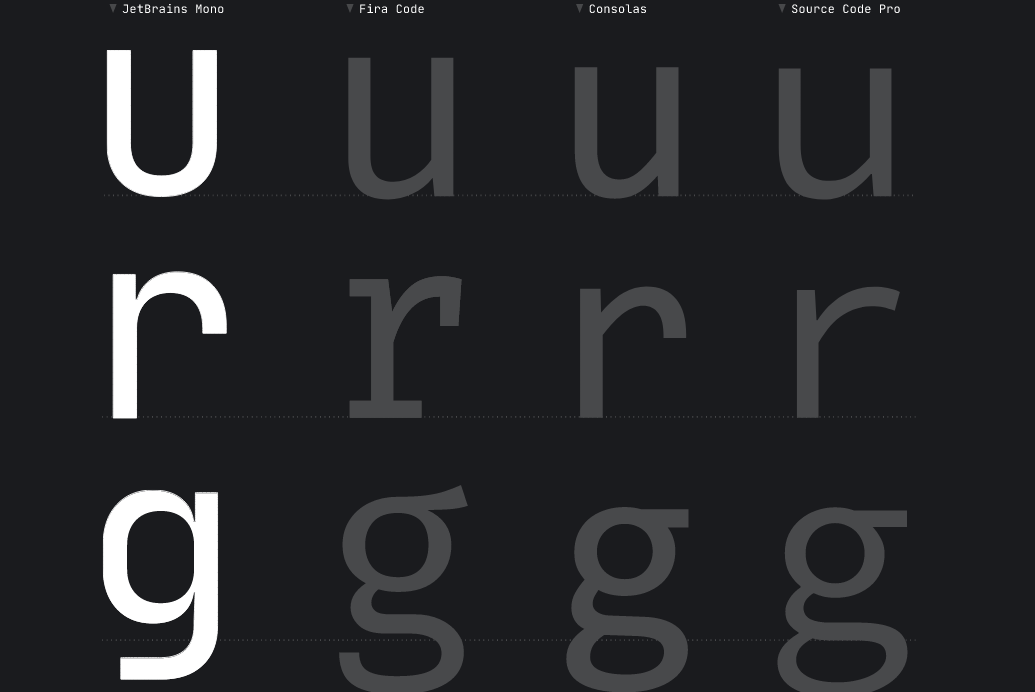
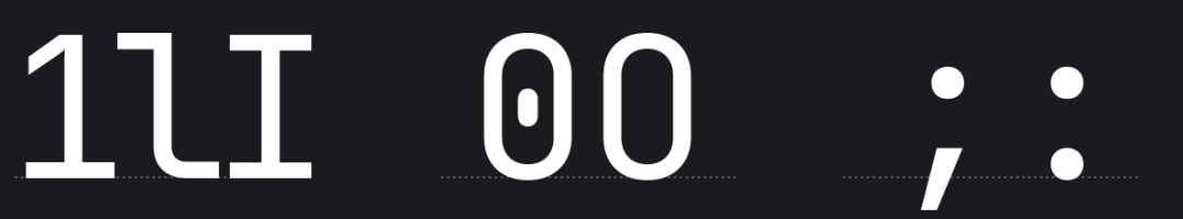
The picture below is a few cases that are easy to confuse users. In this case, the Mono font has also been optimized, and I believe it will be easier for developers to distinguish.
Although the Mono font has many advantages, there is no Chinese among the 143 languages it supports, so the display support for Chinese may not be very good. By the way, the Mono font is still an open source and free font. Users are free to use for any commercial or non-commercial use.
How to use
If you are using the latest version of JetBrains IDE, you can directly set the Mono font in it;If you are using an old version or other IDE, you need to manually download and install the font.
Gitee released the 2019 annual data report, Dart grew by 255%
Java developers need to study JDK, Linux developers need to study Kernel
What are the developments of C++ in 2019?
The author who turned Vi into Vim, and now makes Vim 70 times faster
ZFS On Linux got stuck on Linux Kernel 5.0
Articles are uploaded by users and are for non-commercial browsing only. Posted by: Lomu, please indicate the source: https://www.daogebangong.com/en/articles/detail/JetBrains%20launches%20programming%20font%20Mono%20open%20source%20free%20and%20commercially%20available%20better%20reading%20experience.html
 支付宝扫一扫
评论列表(196条)
测试