Click on the topblue word,Set me as a star ☆ bar span>

Many times you find that your design draft is not as beautiful as others, or you always feel that something is weird, but you just can’t tell.

Japanese designers proposed a golden ratio of color matching, which is 70:25:5, 70% of which is the main color used in a large area, 25% is the auxiliary color, and 5% is the embellishment color.
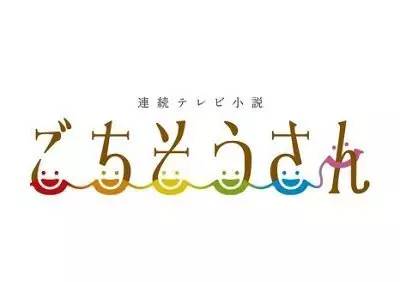
Generally, recommended no more than 3 colors in the picture, 3 refers to 3 hues, such as dark red and dark red can be regarded as a hue. And today, what I share is just the opposite, what I share is a font design composed of multiple colors.
Google's Logo color is the dominant color under the multi-color combination. The relationship between the main color and other matching colors will be richer. There may be matching methods such as similar colors, intermediate colors, and contrasting colors, but one of the colors will dominate.
For Google, which has a rich product line, through the four brand colors according to a certain purity ratio, and then using achromatic black, white and gray to match the ever-changing color schemes, the brand has a strong sense of unity. On most pages, blue will act as the dominant color, and the other three colors will be used as auxiliary colors and set different task attributes. Black, white and gray are mostly used as auxiliary colors. For platform sites, multi-color dominance has very good scalability.
In the application of color design, our understanding of color to different degrees affects the performance of the design page, and the skillful use of color matching will get twice the result with half the effort when designing. For an excellent design work, its color matching must be harmonious and pleasing to the eye. Reflect on what kind of color matching is easier to achieve the design goal in the design process, and what affects our color matching thinking?
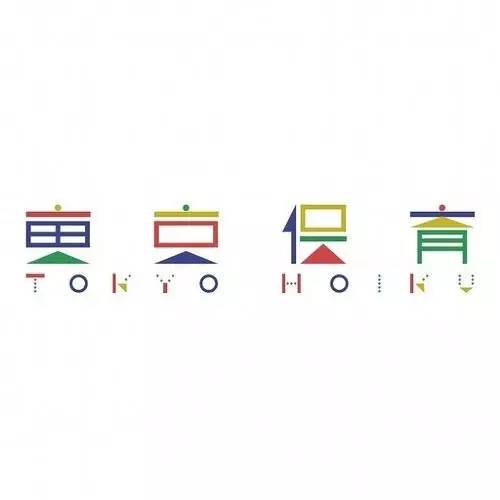

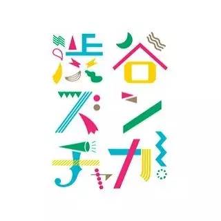
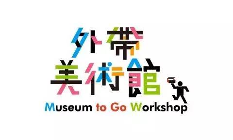
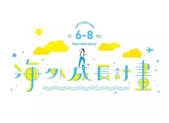
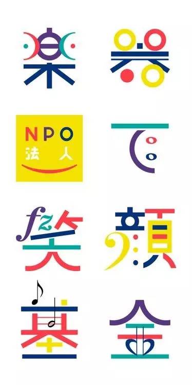

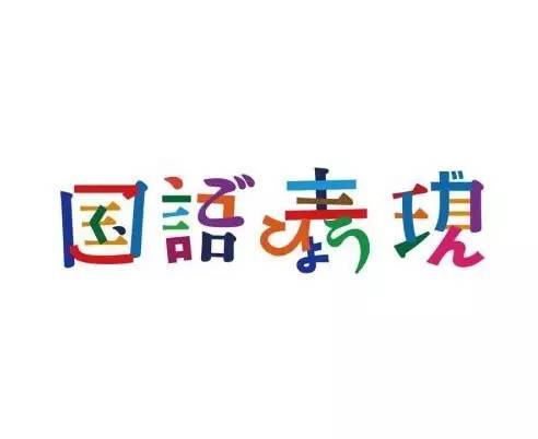
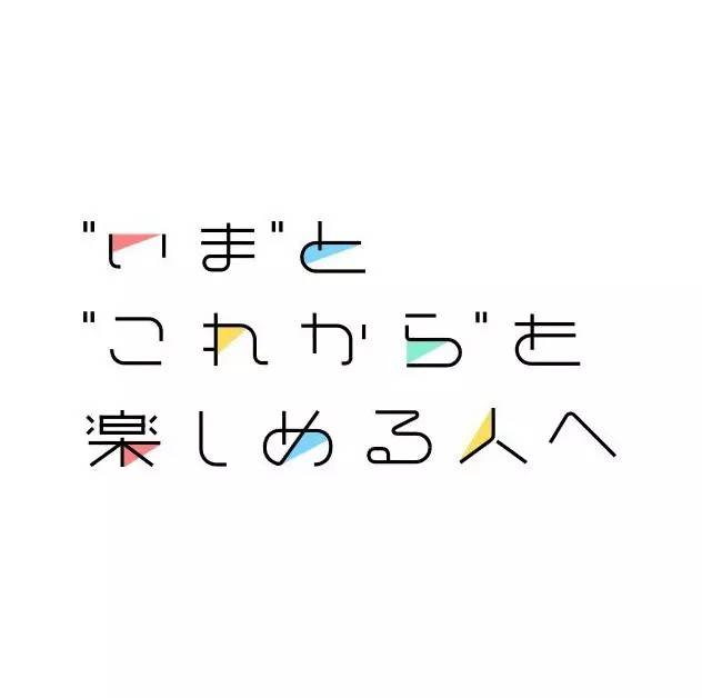
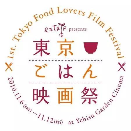
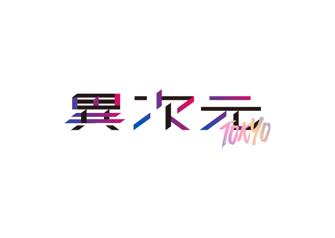

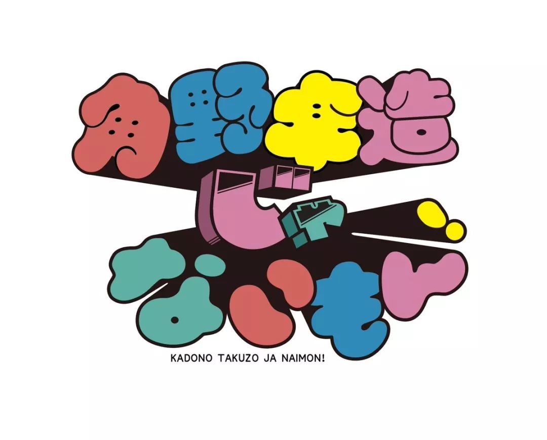
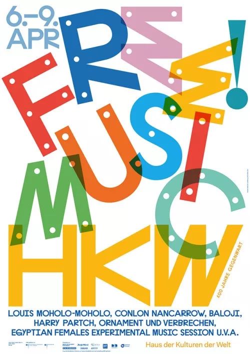

After looking at the above multi-color font designs, they are applied in the design through primary and secondary and reasonable proportions. The multi-colors are processed in a unified tone, and the areas are very coordinated without affecting the overall dark atmosphere of the page. I hope today's sharing can bring you inspiration.
****************
The copyright of the work belongs to the author@字体设计>
The typography geek designer QuimMarin has released a new work, 70P
What was it like designing a poster for Yoshihiko Ueda?
Do you know how many times a typeface needs to be tempered and polished?
A short custom text print documentary
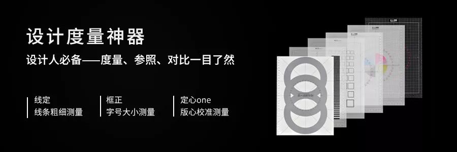
Don't know how to read the layout? Deviation between design and finished product? Because you are missing this set of tools

Articles are uploaded by users and are for non-commercial browsing only. Posted by: Lomu, please indicate the source: https://www.daogebangong.com/en/articles/detail/It%20turns%20out%20that%20the%20font%20design%20is%20also%20lustful.html
 支付宝扫一扫
评论列表(196条)
测试