
Hello everyone~
Some time ago, I promised readers to do an academic style PPT about the defense.
It came today~
Academic-style PPT has relatively more text content, which is very different from the press conference.
So we combine actual cases to explain to you the first issue, how to do the defense PPT?
How to beautify? What precautions.
Read the original first:

There are quite a lot of manuscript pages. Considering the space, I selected 5 typical pages to optimize the design.
Before starting to customize a PPT, we generally need to determine a design specification, that is to say, its style, color matching, proportion and font.
Style: Academic style, focusing on content, looks clean and tidy, but not dull.
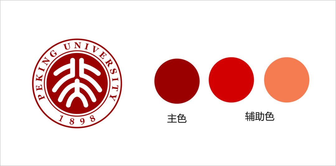
Color matching, this is not particular, usually you can use the VI of the university to match the color.
For Peking University, the color of its LOGO is red, we use it as the main color, and then add two auxiliary colors.
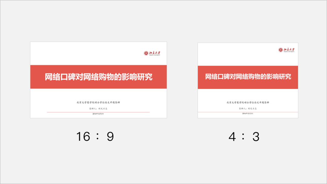
The ratio of the PPT is set according to the ratio of the conference room projector.
In the past, the ratio we used to make PPT was 4:3, but now 16:9 is more in line with the audience's visual aesthetics.
Now our computer screens are still projections, and most of them are 16:9.
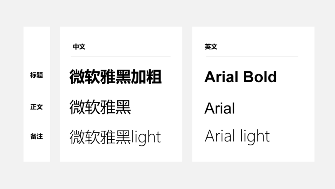
For PPT fonts, academic style PPT, try to use Microsoft Yahei, Pingfang, Siyuan Heibody and other boldfaces as much as possible, which looks more formal.
In order to prevent font loss, it is recommended to use the Microsoft Yahei that comes with the computer.
Next, we start designing.
Look at the first page first:
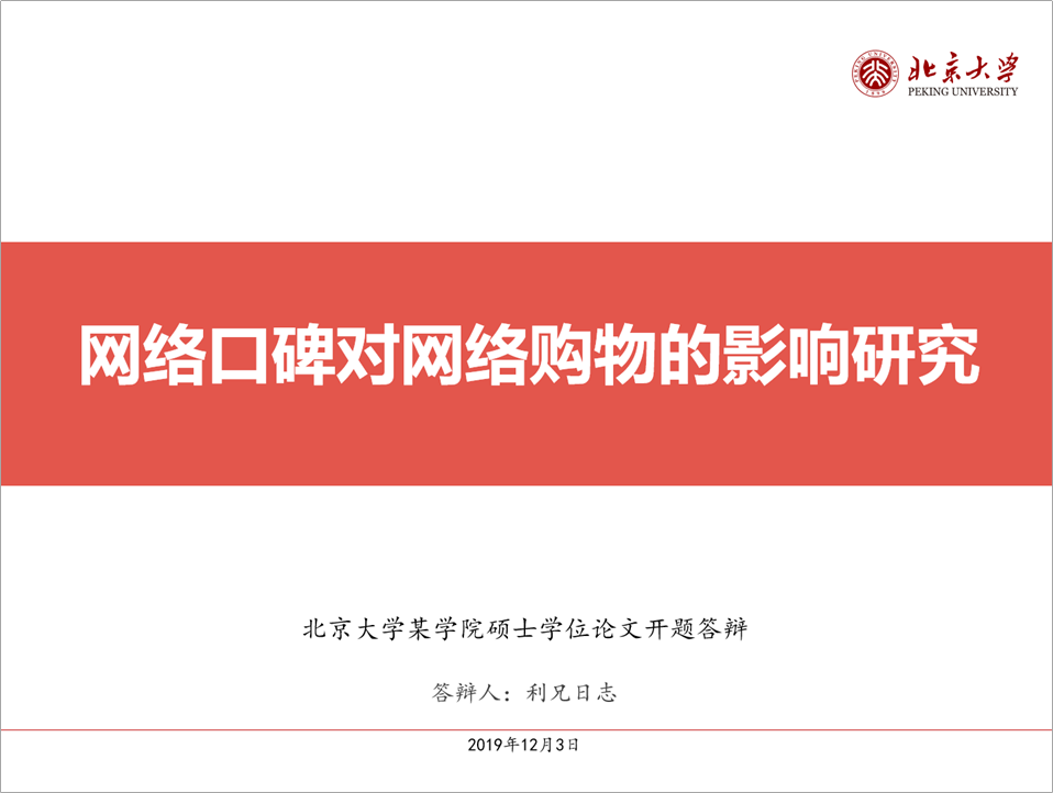
This PPT page is our more common PPT layout. Basically, there is no major problem, but it seems a bit simple and empty.
Another thing is the font, Microsoft Yahei is used for the title, but italics is used for the explanation below.
So how do you change that?
For a PPT, the cover is very important, the text can be plain or "plain", but the title should try to be vivid and highlight the theme.
Let's add pictures first. When searching for pictures, we can use two keywords, One is "word of mouth" and the other is "online shopping".
Then we re-align the text, like this.

Academic PPT has a lot of text, and the school's projection equipment, in order for the audience to see the content clearly, try to use a light background as much as possible.
So I adjusted a version.

The title has nothing to say, much the same.
Next, let's look at
Second page:
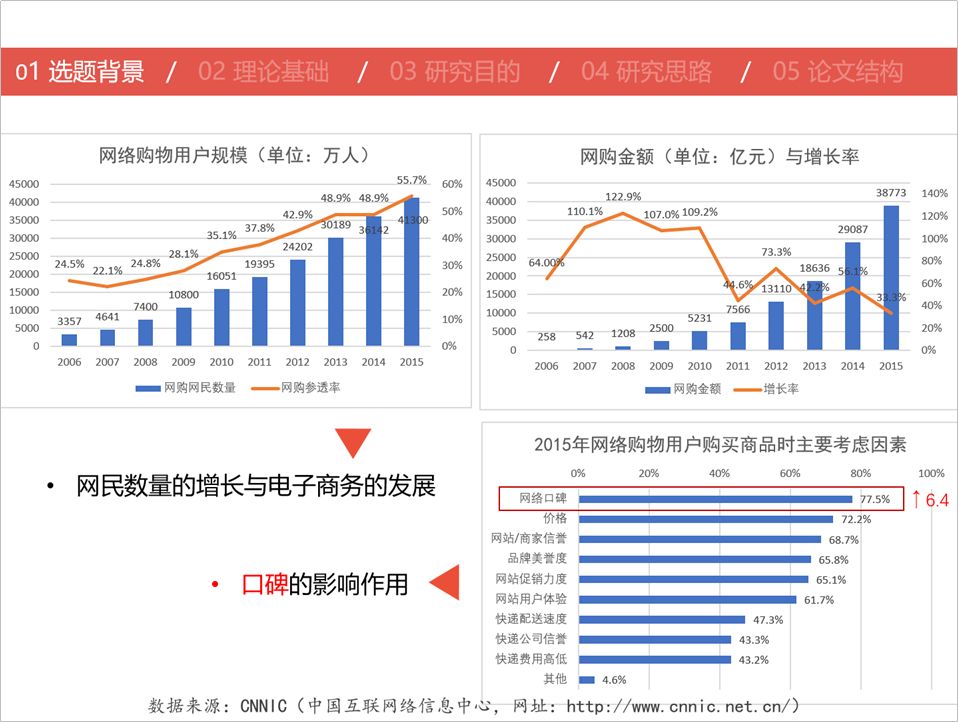
The topic selection background page is a relatively common data page with many charts.
The problem with the original manuscript is:
- The page margin is not left out, and the picture is close to the edge of the page, which looks crowded
- The color is blue The color and red are not very good.
- The text layout is also messy
Before typesetting the text, we usually draw out the guideline to determine the left and right margins, top and bottom margins, and the position of the title.
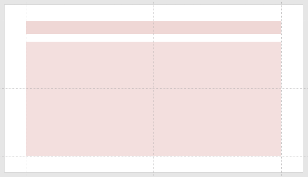
Also determine the design of the title bar and the font size of the title.
In the picture above, it is true that there are too many charts, which adds difficulty to typesetting.
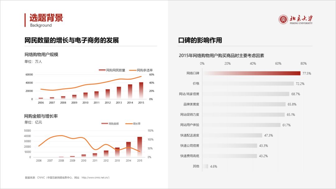
Let's beautify each chart first.
- Remove the border of the chart
- Change the color of the chart, use gradient color
- Change the broken line into a curve
- Remove redundant numbers
When typesetting multiple charts, there are several points to note:
- Don't be too crowded, leave a gap
- Pay attention to the alignment of content at the same level
Next, you can look at the modified.
Next, let's look at
Third page:
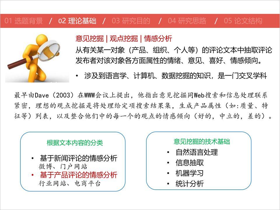
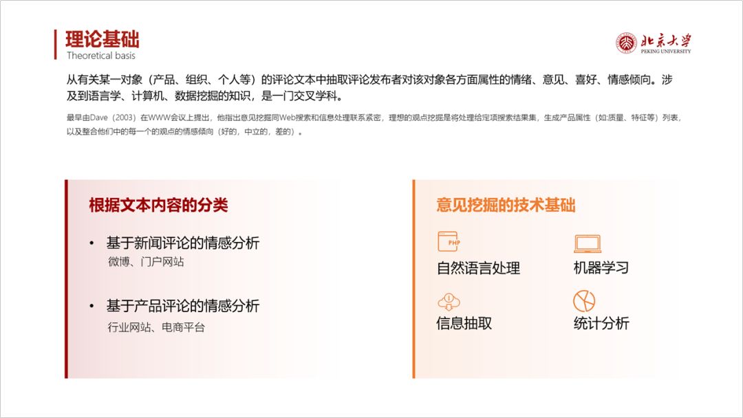
This page of PPT talks about the theoretical basis, mainly some text, and its main problems:
- The picture of the 3D villain is a bit ugly;
- The layering of the text is not obvious and lacks combing .
Let's modify it.
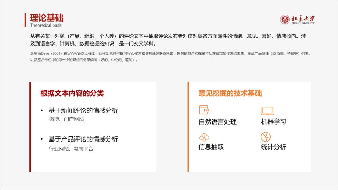
A gray background or a white background is fine. If it is a white background, we will lighten the color of the shading.
Next, let's look at
Fourth page:
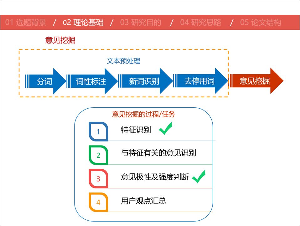
There are three main questions on this page of PPT
- The color is a bit too much, a bit messy
- The text visualization design can be better
- The alignment is a bit messy
Let's modify it.
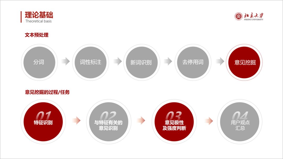
If you feel that the circular shape is somewhat conventional, you can change to other graphics.
For example, the following.
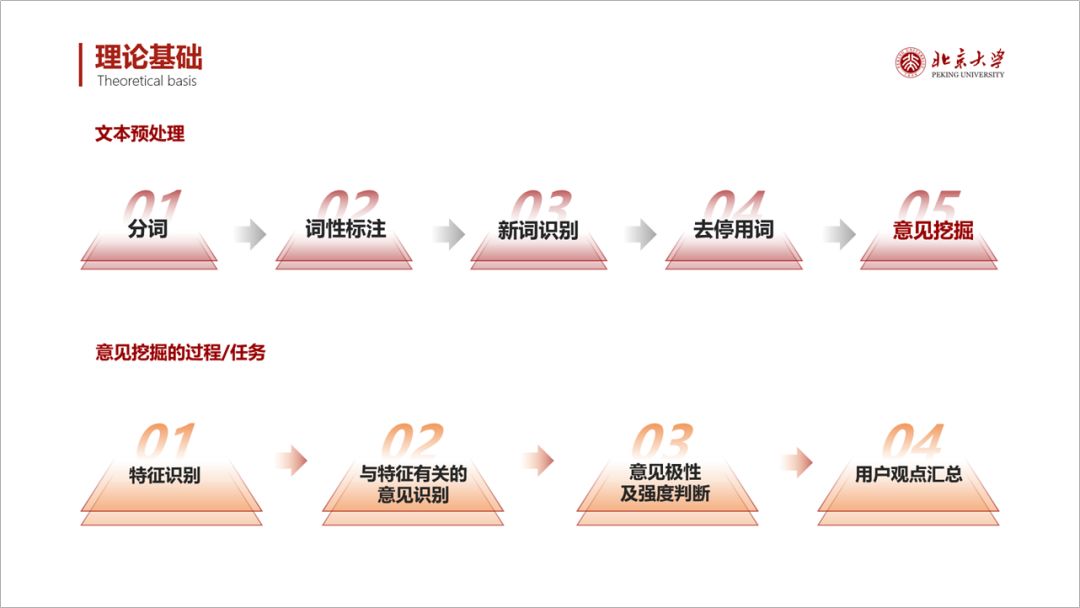
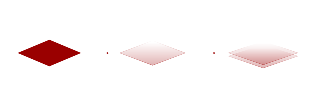
It is very simple to make. It is formed by superimposing two gradient trapezoids.

The superposition of rhombus can also have the same effect.
Next, let's look at
Fifth page:
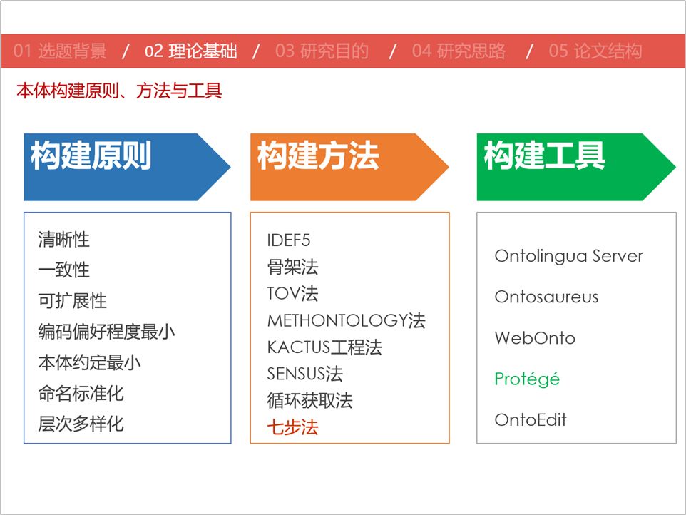
There is not much problem with the layout of this page, and the side-by-side alignment is quite neat
- The only small problem is that the text in the color block is not centered up and down.
- The text in the third column is a bit scattered and the spacing is too wide.
Another point is that the typesetting is somewhat conventional, so let's change to a different type of layout, such as the following split-screen one.
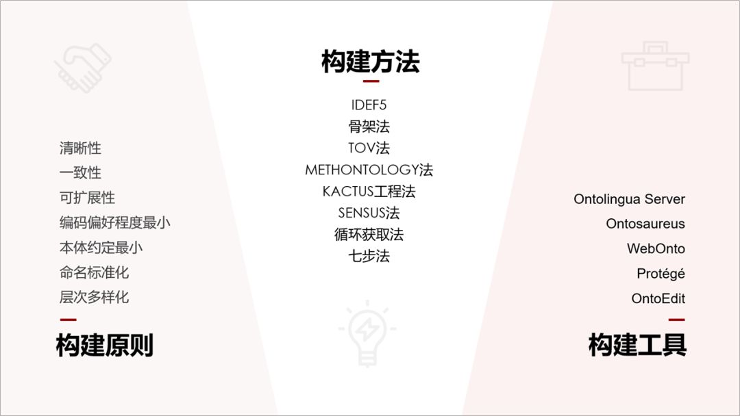
We can also pick out each point separately and typesetting like the picture below.
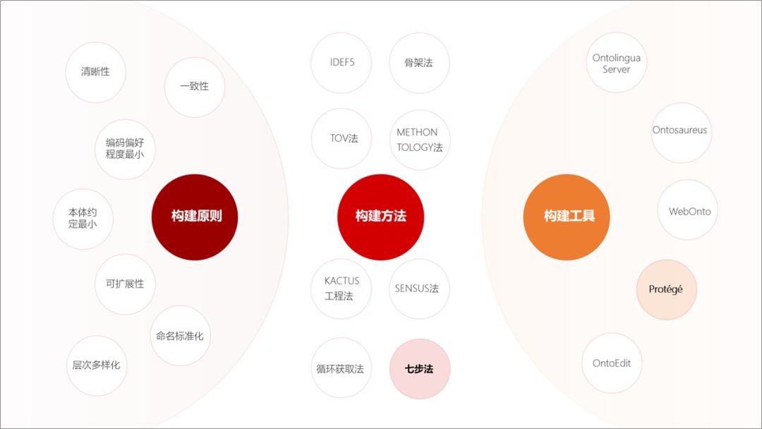
The above is my modification.
For academic PPT, there are a few points to pay attention to.
1. Try to choose a light color for the background, and many projections are not very friendly to dark colors.
2. The typography should be as concise as possible and avoid excessive design.
3. The typesetting is neat and orderly, and the font color is uniform, showing professionalism.
Finally, let's take a look at the revisions in this issue as a whole.
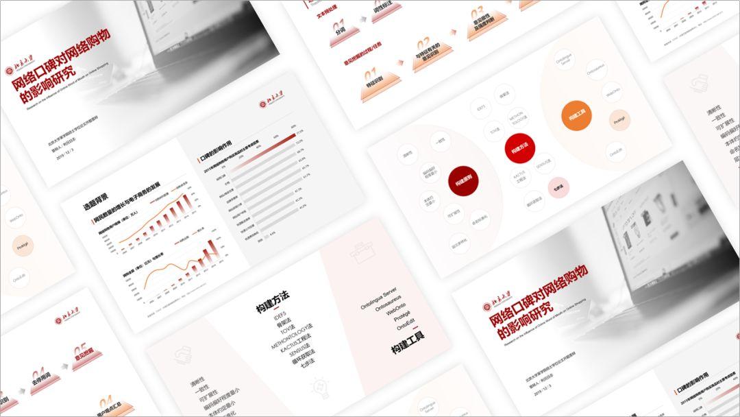
The above is today's content, I hope you like it.
Articles are uploaded by users and are for non-commercial browsing only. Posted by: Lomu, please indicate the source: https://www.daogebangong.com/en/articles/detail/It%20took%20me%203%20hours%20to%20help%20a%20netizen%20revise%20a%20defense%20PPT.html

 支付宝扫一扫
评论列表(196条)
测试