We all know that the fonts of the Windows system are not as good as the fonts of the Mac system Nice, not so delicate. Only under the high score screen and 4K resolution of the Windows system, the fonts will be beautiful and round. But for those who don’t have a 4K monitor, you can actually do it in other ways.
Take NVIDIA as an example here, we need to use DSRDynamic Super Resolution
Then Let’s take a look at the effect comparison first.
This is at a normal resolution, that is, 1080P-2K.
Fonts at 2K resolution

Icon
Look at the font after DSR 4K
4K
Stop talking nonsense, just watch the next operation!
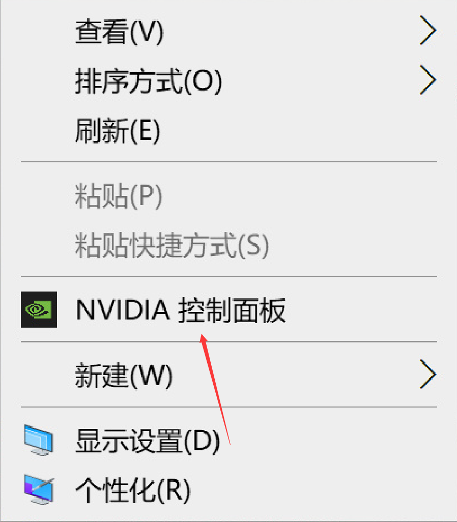
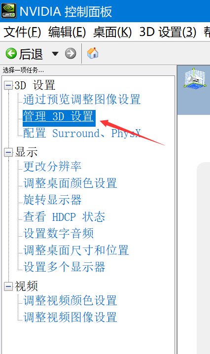
Right click on the desktop and open the NVIDIA Control Panel
Step 2: Click Manage 3D Settings
Then click on DSR, and then select the multiplier. Here, if you have a 1080P display, you can directly use 4.00X. If it is 2K, just check 2.25X. Of course, check 4.00 to achieve a maximum resolution of 5K and clearer fonts.
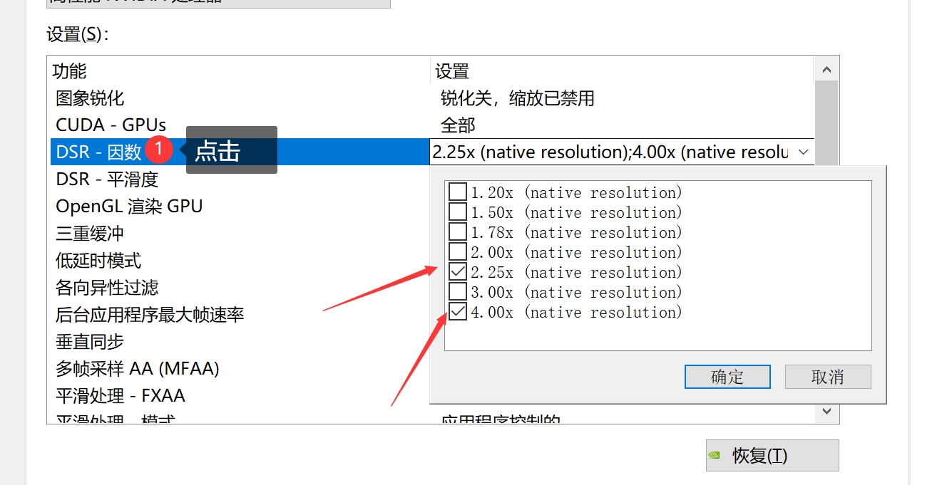
Then DSR smoothness is recommended to be 15-30. The best is 25, too high will blur, too low will cause distortion. After the final confirmation, you can change the resolution and open 4K here.

Now the version of win10 system is getting better and better with high resolution screen. For example, with a resolution above 4K, when opening some software, you will find that it is very blurry, and even the window is very small. In fact, Microsoft can’t be blamed for this. This is the reason why software manufacturers don’t adapt to high-resolution screens, but in fact, even if some software manufacturers are not suitable for high-resolution screens, the system can actually be forced to zoom
Let’s take a look at an example< br>
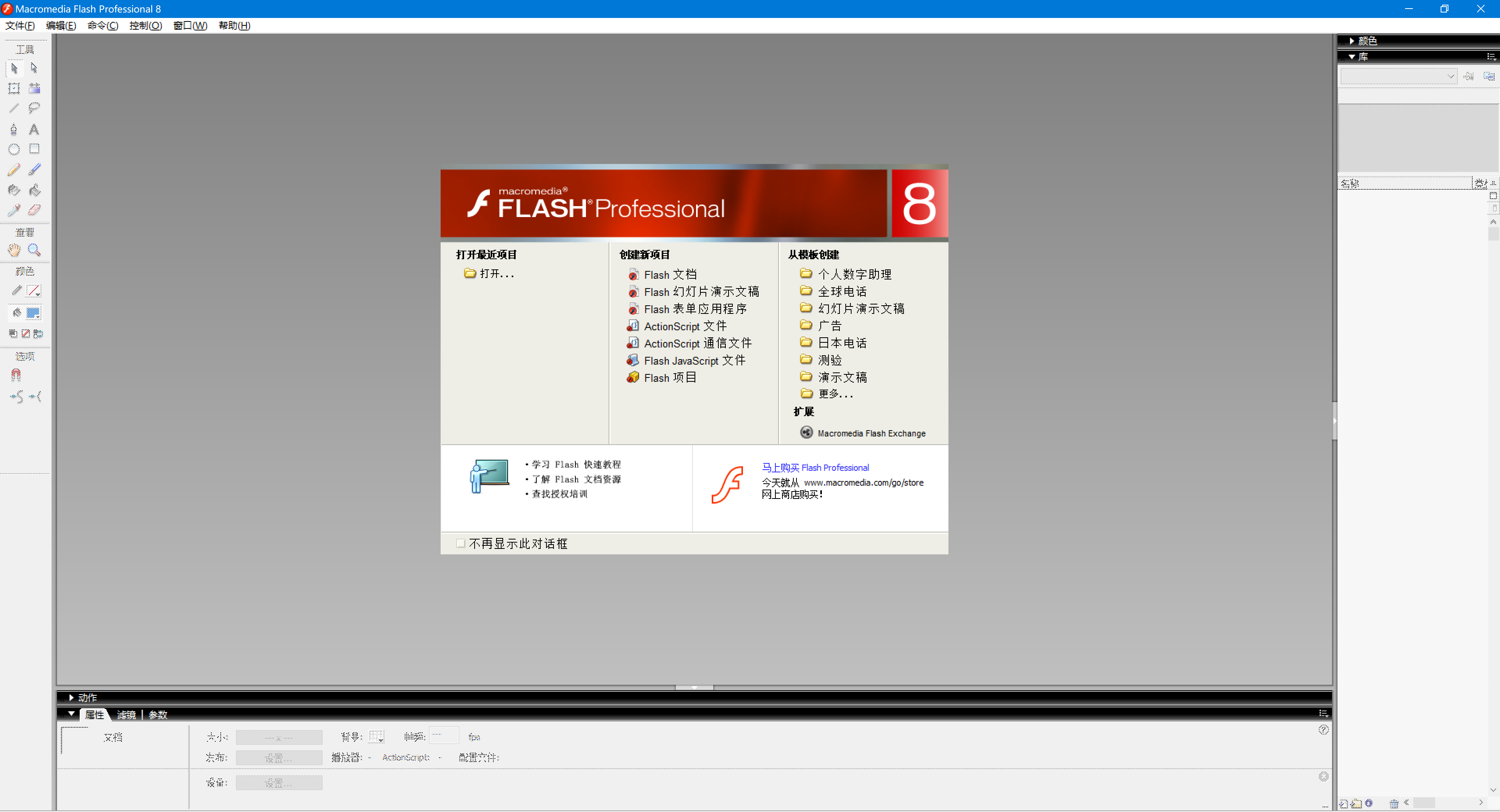
Open by default
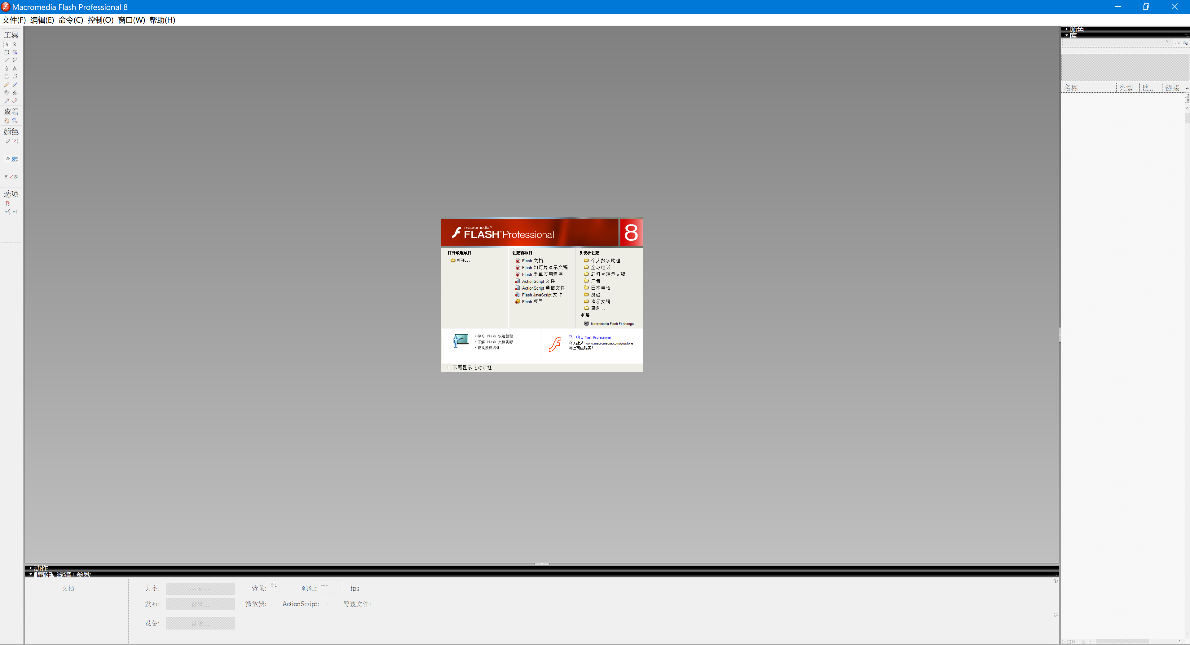
Open the software without zooming
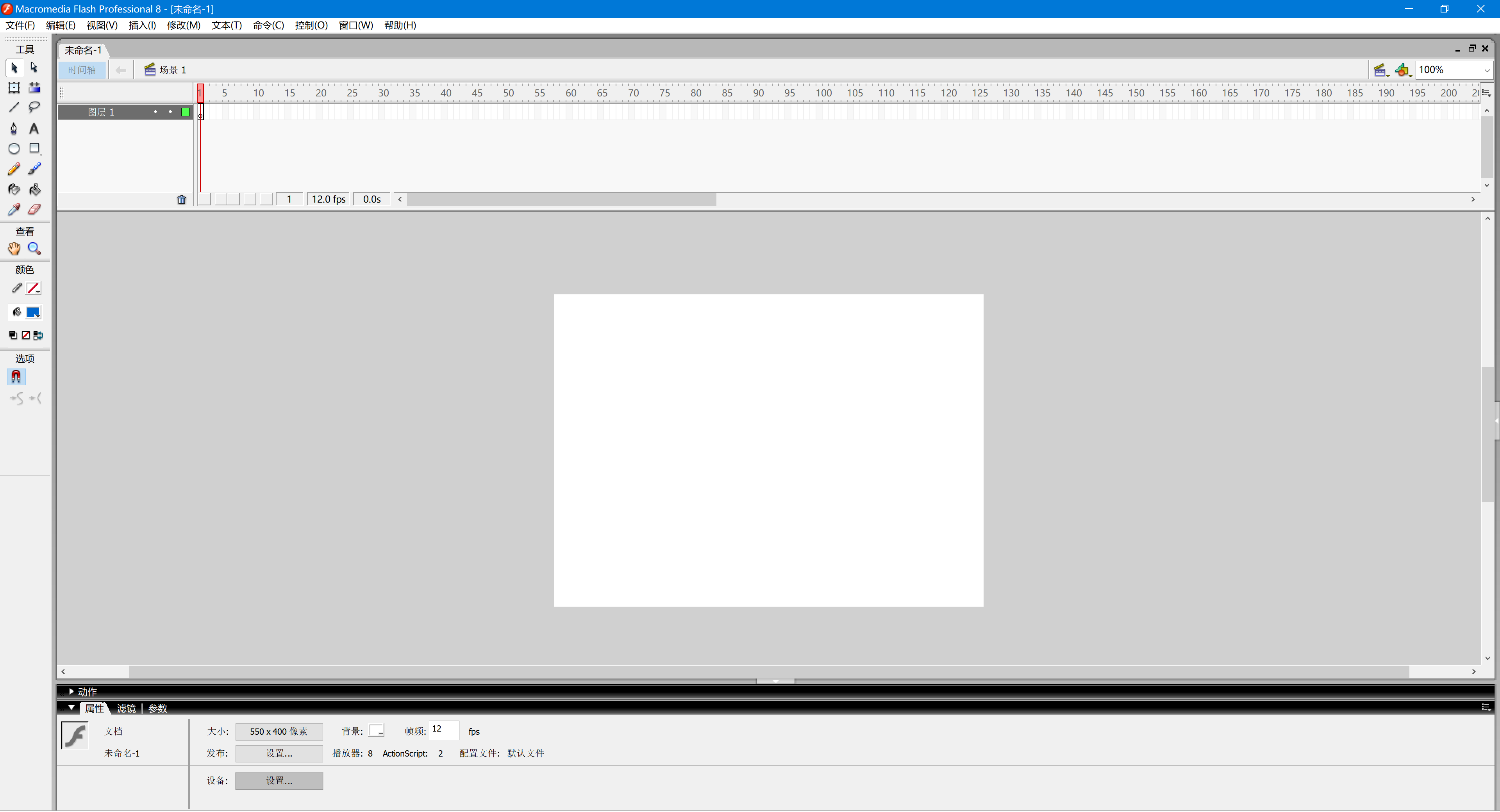
Let's take flash8 as an example. After the software is opened, the font of the overall UI interface has obvious jaggedness. After forced zooming, it is equivalent to forced zooming in, point to point.
Then let's take a look at the effect after the system is forced to zoom and enhance
The first step is to open the software with the right mouse button
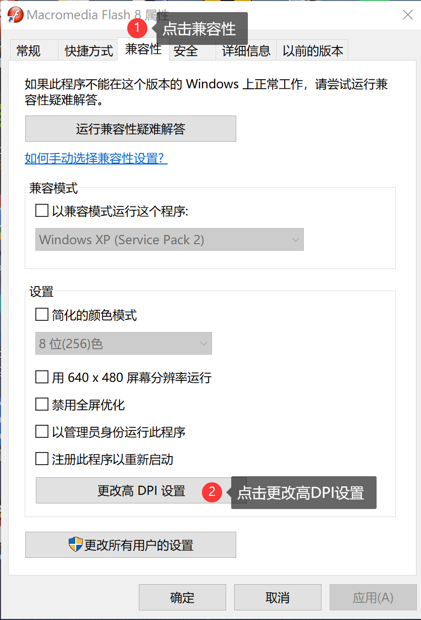
Then check the one on my picture. High DPI scaling alternative select system enhancements here,

Then reopen the software and let's take a look at the renderings
Did you find that the font has become clearer than before? In fact, there are still many software that do not support high-resolution screens, but after this setting, the fonts under high-resolution screens still have the clear effect.
Well, in the end, in fact, the win10 system has already perfected the high-resolution screen experience. It can be said that win10 has high-resolution screens for many software. The win7 system is still not working, and many software in the win7 system do not support it. Then let me talk about the recently released Windows 11, which is still only a beta version. The high-resolution screen support is the same as win10. I thought it would be improved , but nothing has changed. There are still many bugs in the testing stage, and the overall fluency is not as good as the previous generation of win10. It is not recommended to be used as the main system. You can install dual systems to play. What will happen later will not be known until the official version is released.
Then I want to share roughly these, if you have any questions, you can leave a message in the comment area!
Articles are uploaded by users and are for non-commercial browsing only. Posted by: Lomu, please indicate the source: https://www.daogebangong.com/en/articles/detail/It%20only%20takes%20one%20trick%20to%20make%20win10%20fonts%20look%20better.html
 支付宝扫一扫
评论列表(196条)
测试