
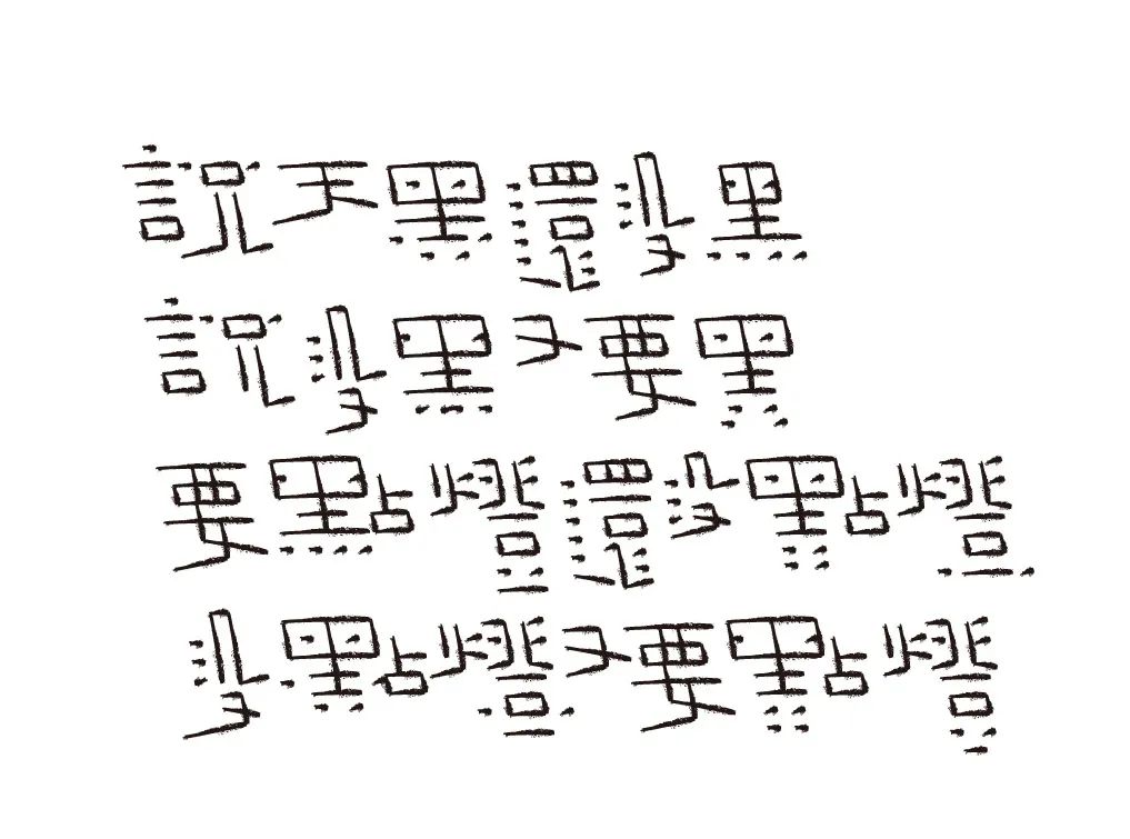
Many people say that font design is a long and boring process. The process of creating characters is like exercising. When facing black and white, it is not easy to persevere. However, Teacher Yue Xin has been persisting in font design for 5 years. (Quiet reminder: There are easter eggs at the end of the article~)
About the Designer
Yue Xin
In 1981, he was admitted to the Decoration Department of the Central Academy of Arts and Crafts
Graduated as a bachelor in 1985, stayed in school to teach in the same year
Since 2003, he has been the art director of Beijing Yuanlong Yatu Culture Communication Co., Ltd.
Member of the 2008 Olympic Official Poster Design Team
External teacher of Changjiang College of Art and Design, Shantou University
External teacher of Tsinghua University Academy of Fine Arts
External Professor of Beijing Institute of Fashion Technology
Major projects designed alone:
1. The logo design of CHINA MOBILE and its overall corporate visual system design, including the marketing visual system and the image design of the service brand "Shenzhouxing"
2. The overall visual system design of China Southern Airlines (CHINA SOUTHERN) (including the adjustment and specification of the logo)
4. The overall visual system design of the National Library of China (including the adjustment of the logo, the overall visual system design of the Ancient Books Library, guide design, etc.)
5. China Post Express EMS (CHINA POST-EMS) overall visual system design
6. Design of commemorative stamps for the 6th Asian Winter Games
7. The First Hanyi Typeface "Font Star" - the first place (text category) and the second place (title category) in the China Heitype Design Competition
8. Five Red Dot Awards
—
Behind any wonderful event is not only inspiration,
It is practice and polishing day after day.
"5 years ago (2016) for some reason, I began to draw and write the appearance of Chinese character combinations that kept flashing in my mind in groups, and sent them to my peers through WeChat. After a long time, it became a habit. Formed I don’t know the reason for this habit. Maybe it’s because of my inner desire for expression, maybe it’s because the combined fonts keep popping up in my mind, and the process of drawing and writing is relatively easy, maybe it’s because I see too many colleagues going astray without realizing it. Maybe it's because of the ugly, disgusting fonts on the market..., my words have been written to this day."
Text layout itself is very boring work,
But the designer's personal interpretation is what makes it interesting.
"During the process of drawing and writing, I discovered the core and soul of combined font design, practiced the ever-changing expression methods, summed up the design practical experience, saw the fallacy of the so-called font design training course, and mastered the theory of font design. Specific, detailed and critical font design problems and solutions that must be discovered through long-term practice.
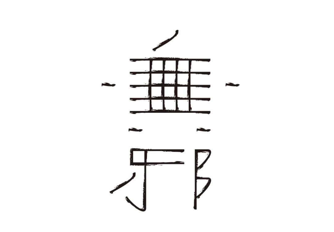
I think the most important thing is that the design rules should be set according to the font of the text, and the design rules without basis are just empty and unpracticable forms. The "glyph" is the appearance of the character itself, and the designer cannot change it, just like changing the three horizontal lines of the character "three" into three vertical lines. "Font" is a font style designed according to the characteristics of the font. Typography is the work of creating words, which belongs to another category, and the design of fonts is the job of our designers. "
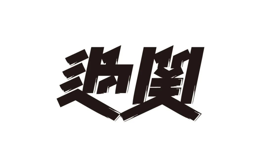
About "Hot"
“It seems that combined fonts have wider error tolerance space than font font design, but this does not mean that combined fonts are easy to design, but their design purposes are different, so the design ideas and specific design methods are different. They are all the same. Using the same frame structure, pen shape and stroke position transformation, the design styles are completely different.
“I am not in favor of adding concrete graphics and images to replace partial strokes in fonts. Although this is common now, it is also a design technique adopted by most people. But I think this method is too simple, superficial, and colorful. In particular, there are great limitations in the expression of text content. The combined font design based on the text content should give full play to the elemental characteristics of the text itself, such as font shape, frame structure, and stroke shape, and carry out in a pure and professional way. Design, so as to obtain the true value of typeface beauty and the true charm of typeface."
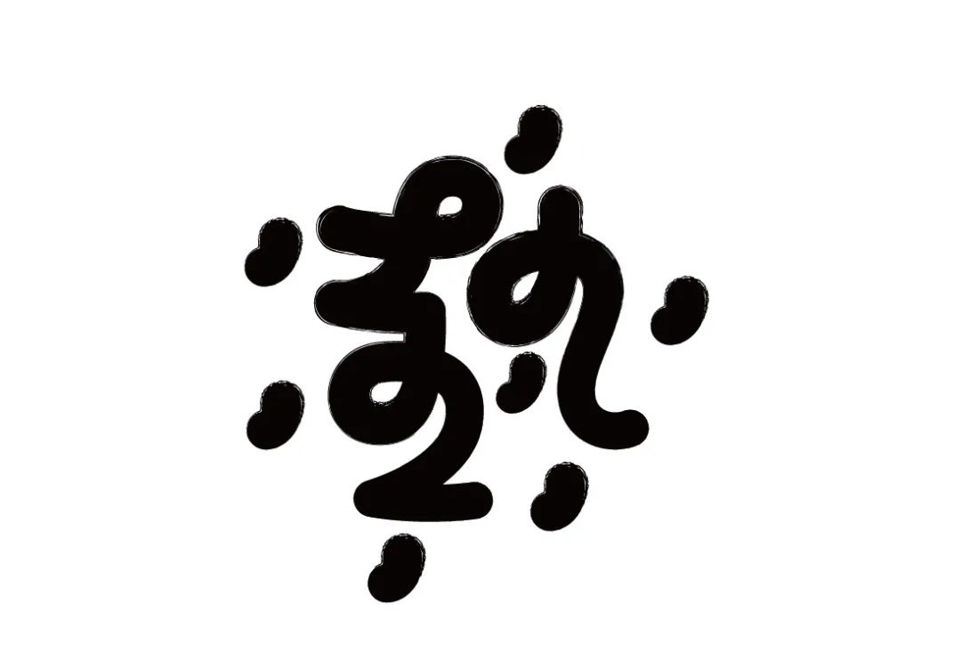
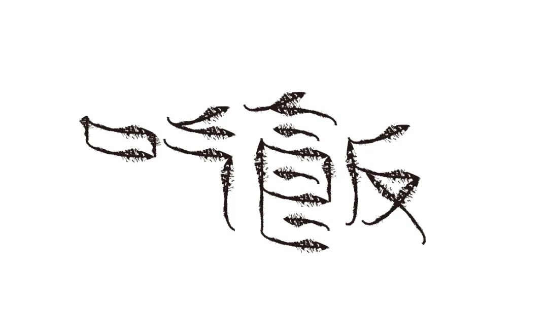
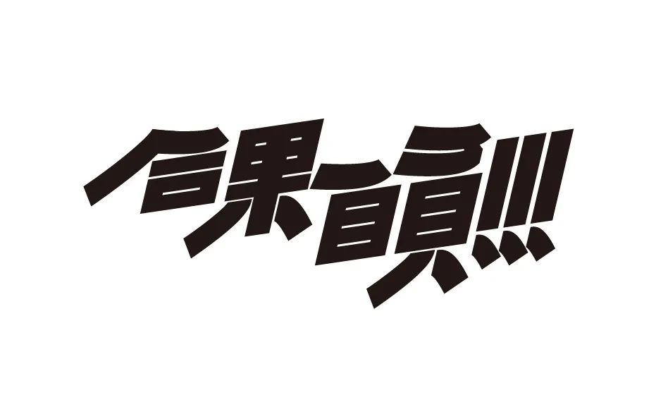
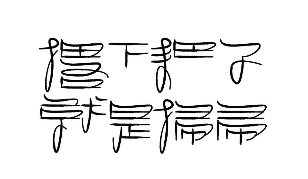
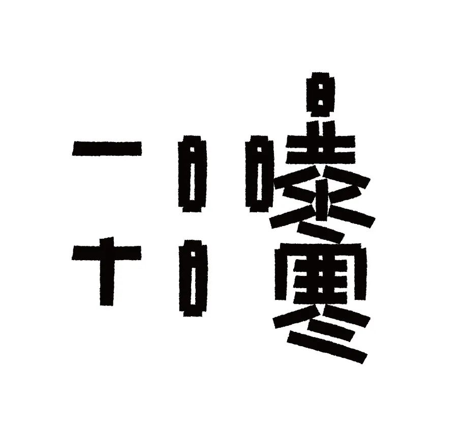
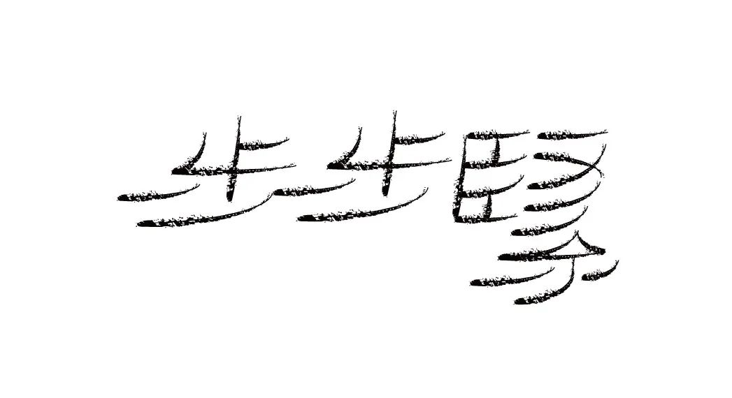
Hot
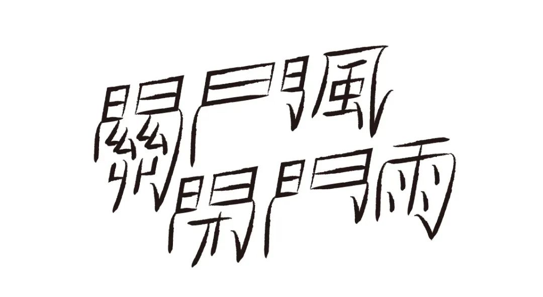
Closing the wind, closing the rain
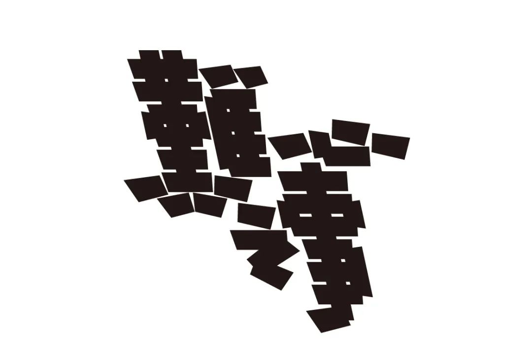
Difficult things
Go away
Wish to fight
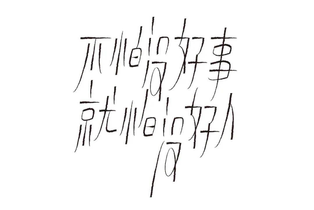
Not afraid of bad things, but afraid of bad people
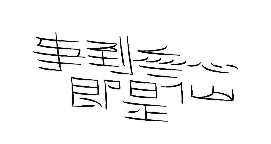
When things happen unintentionally, they are immortal
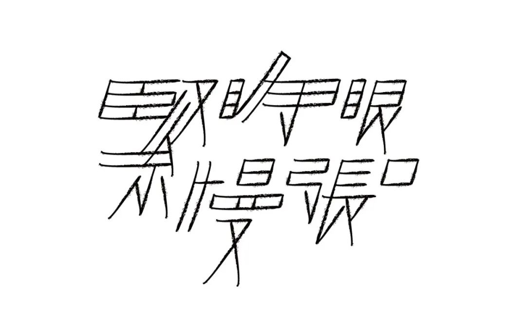
Close your eyes and open your mouth slowly
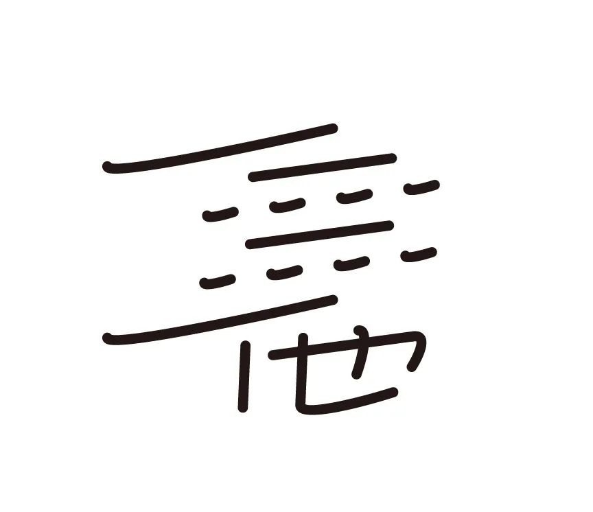
pass
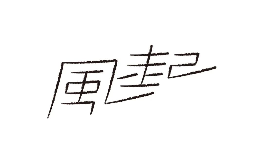
The Wind Rises
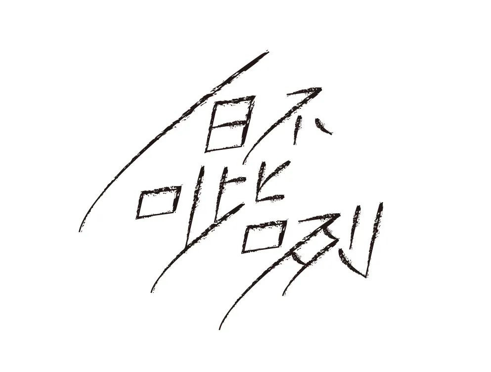
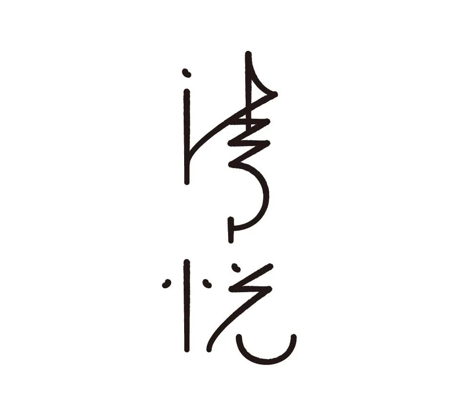
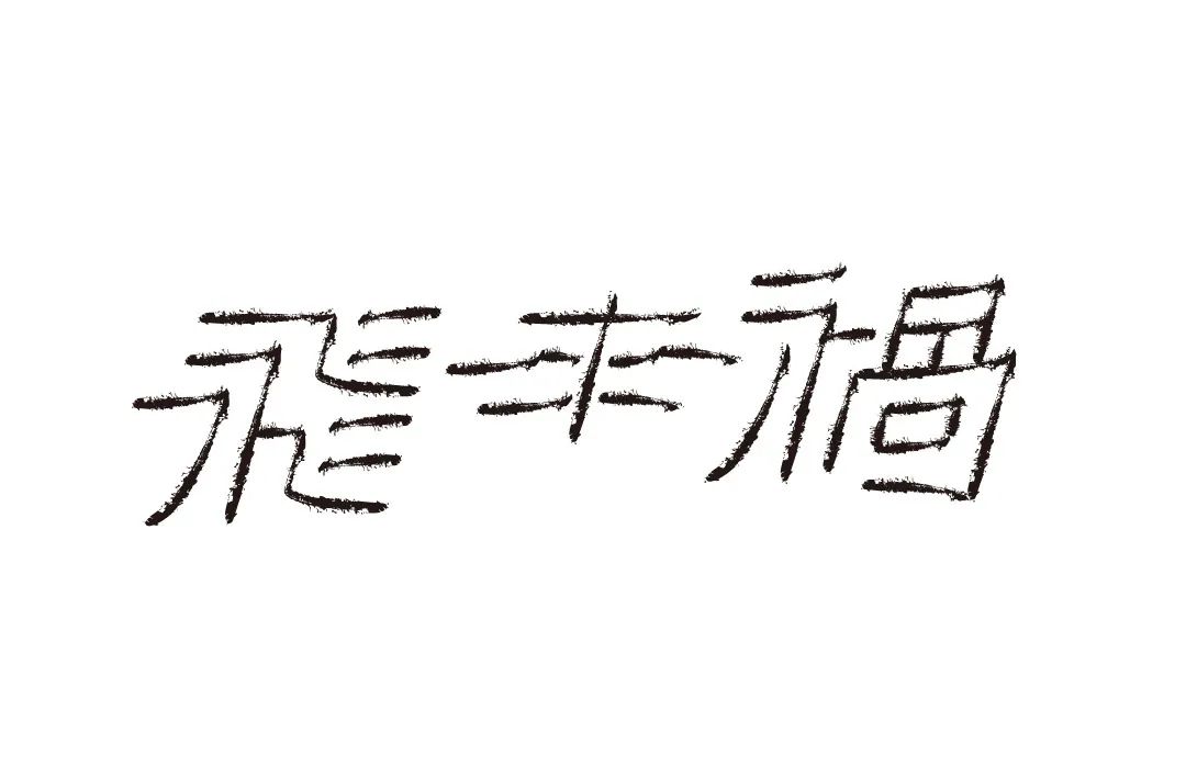
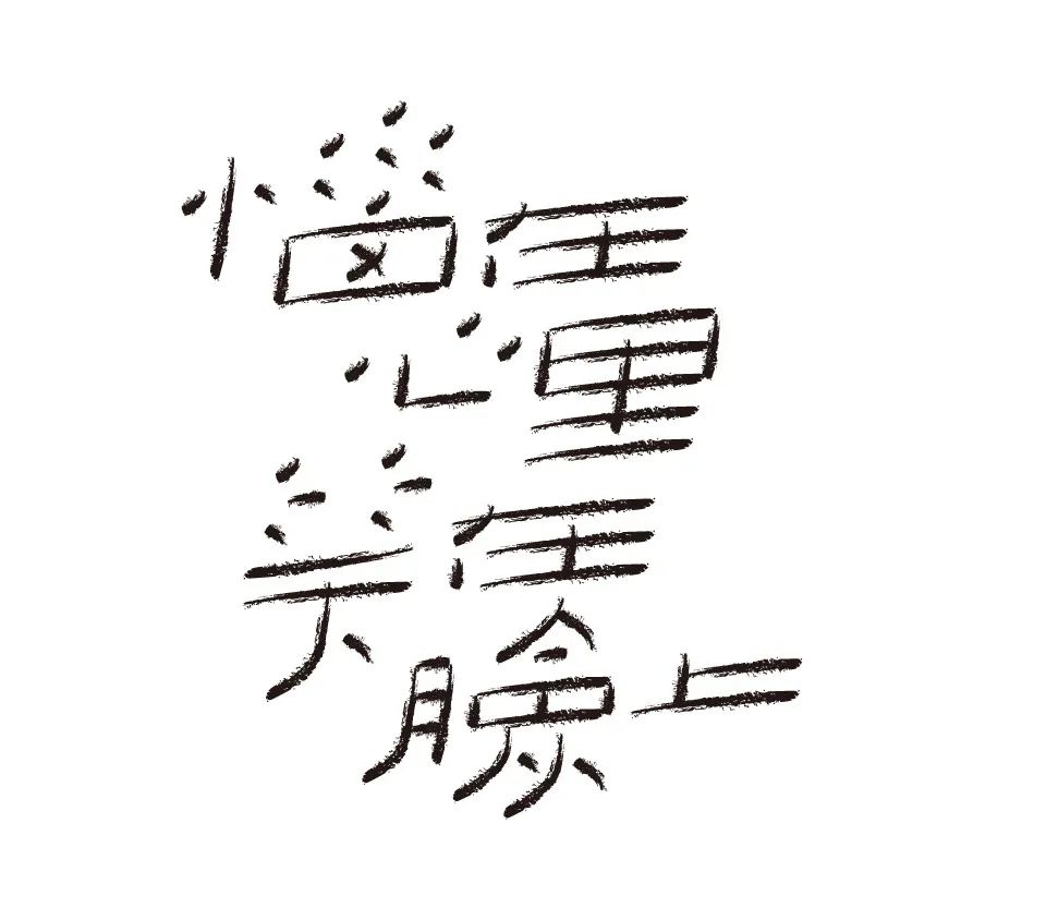
「Moment」
"The designer's understanding of the text content is very important, and the content lacking the designer's unique insights is boring and pale. I am afraid that time will stop for a moment, and I often dream of time stagnation. Through exaggerated structural changes and mutual Constrained and conflicting overlapping forms of strokes examine and think about the deep understanding and abstract visual expression of the concept of "moment" from a unique perspective."
Time
There is also Yangsha
Innocence
Nowhere
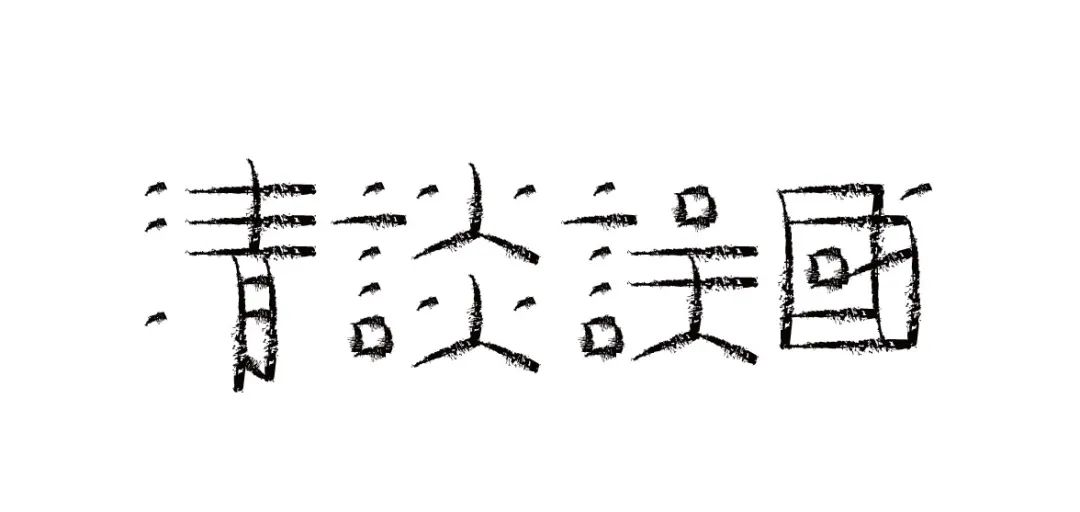
Talk about harming the country
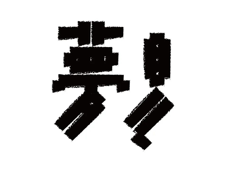
dream
Do nothing
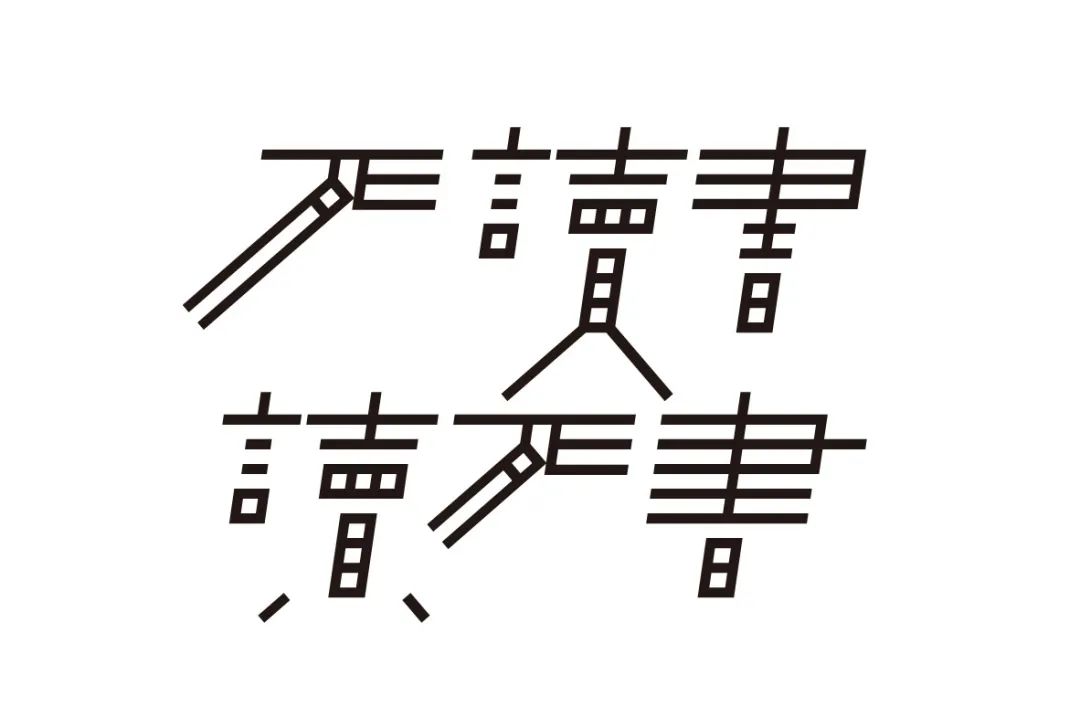
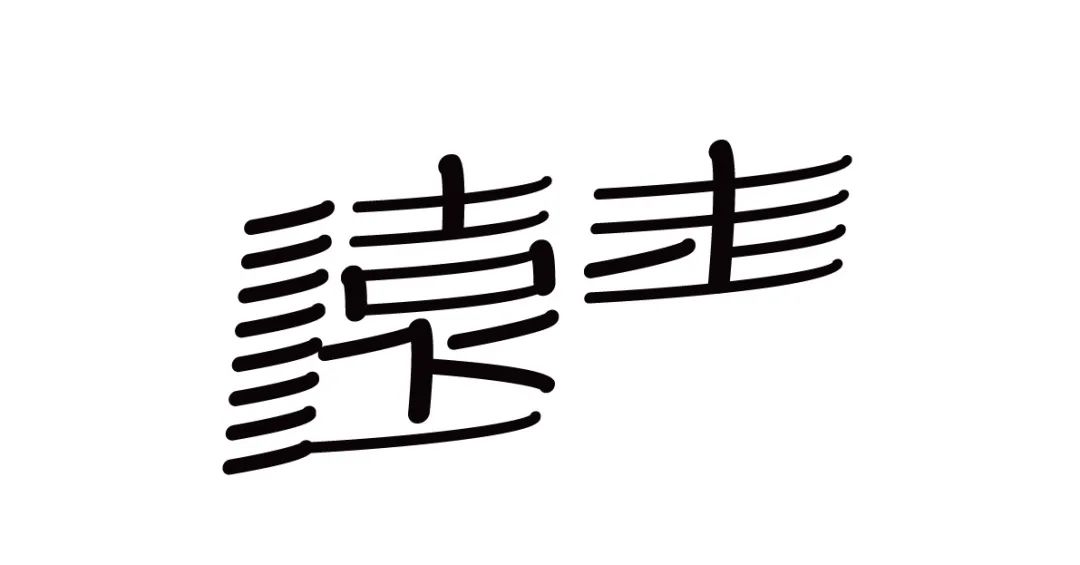
Dead reading, reading dead book
Drunkard
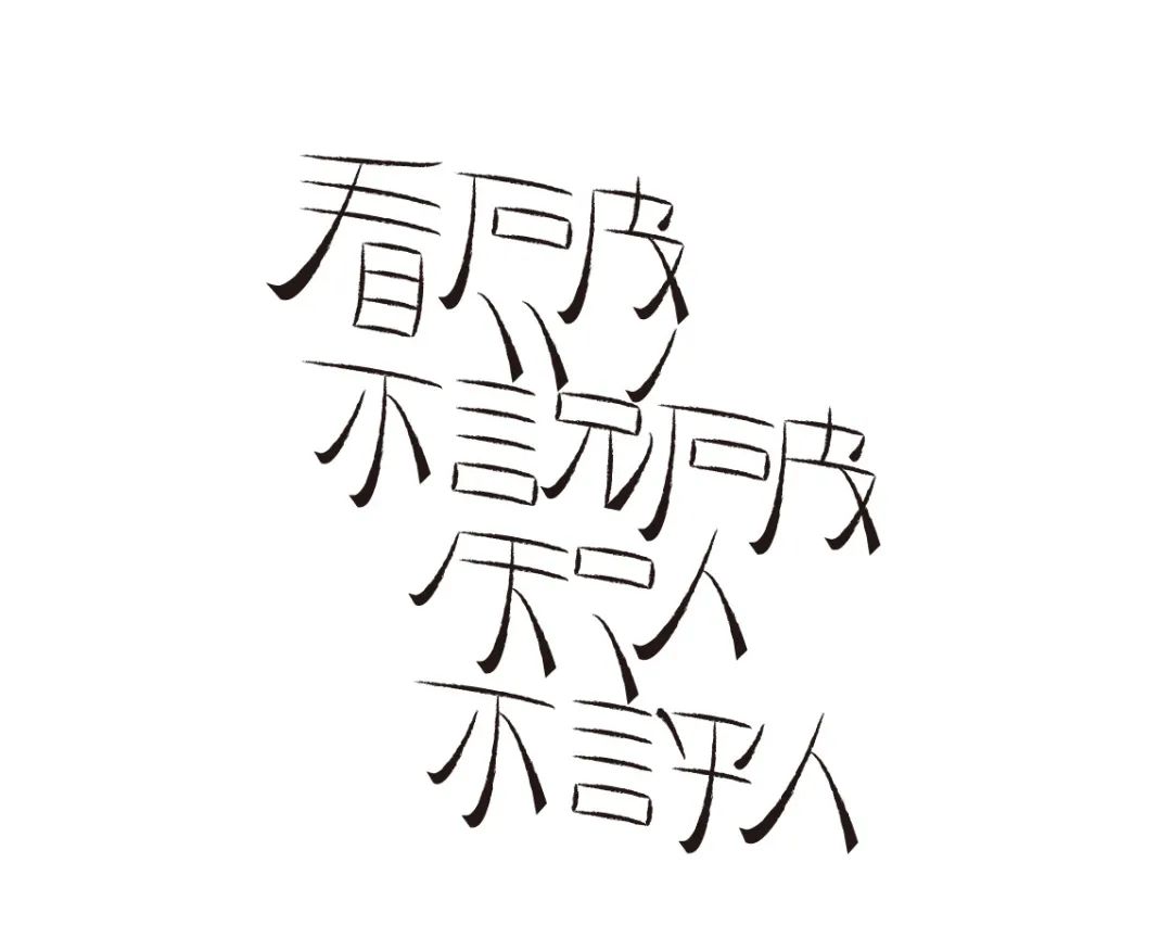
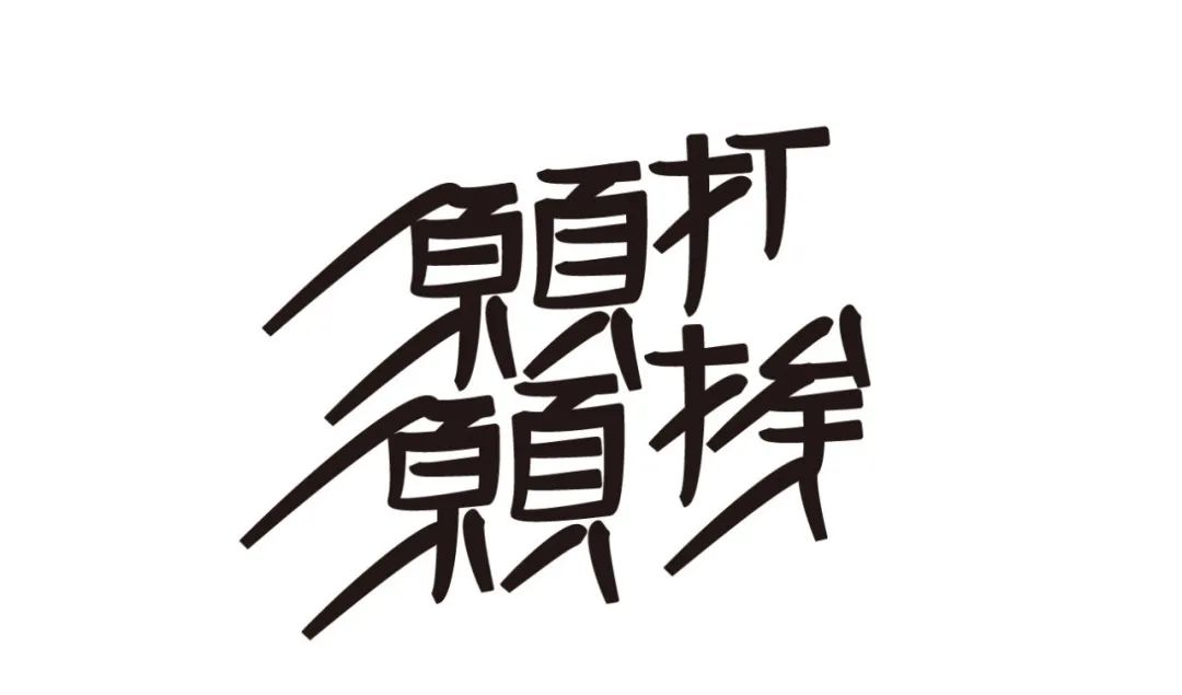
See through without telling others
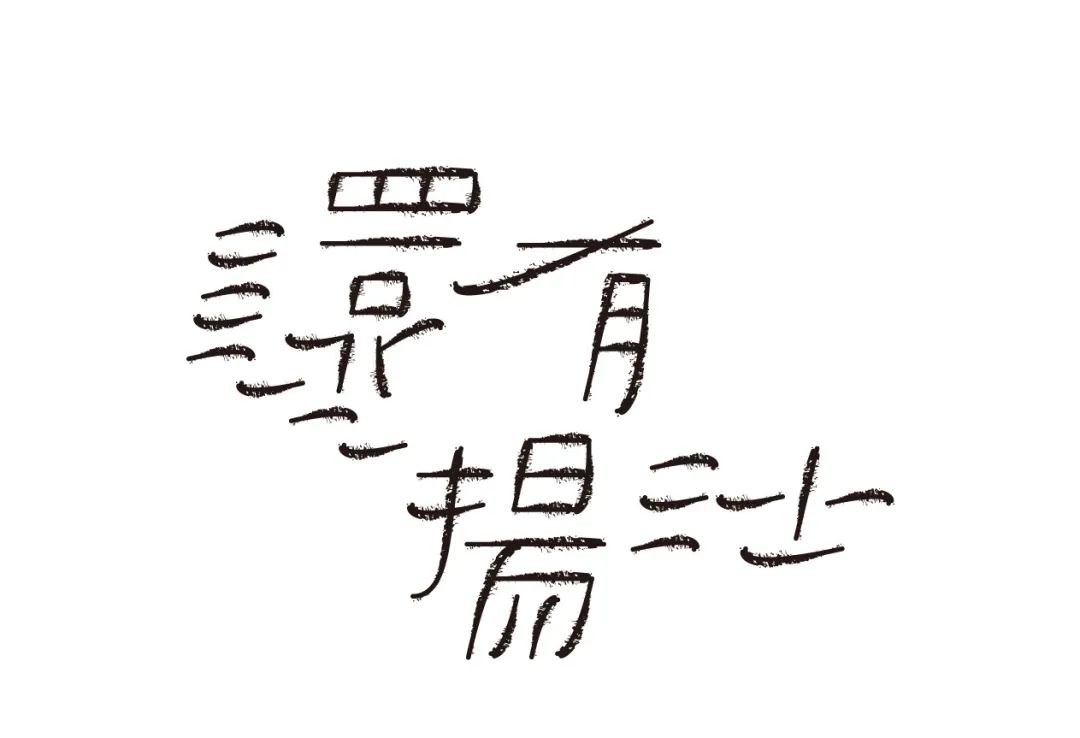
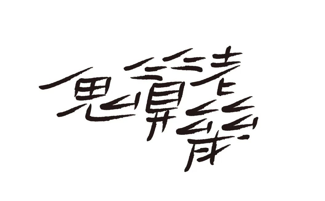
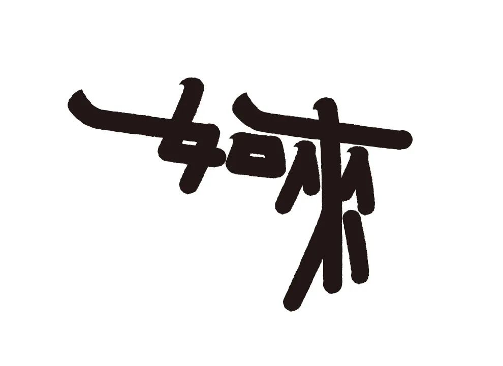
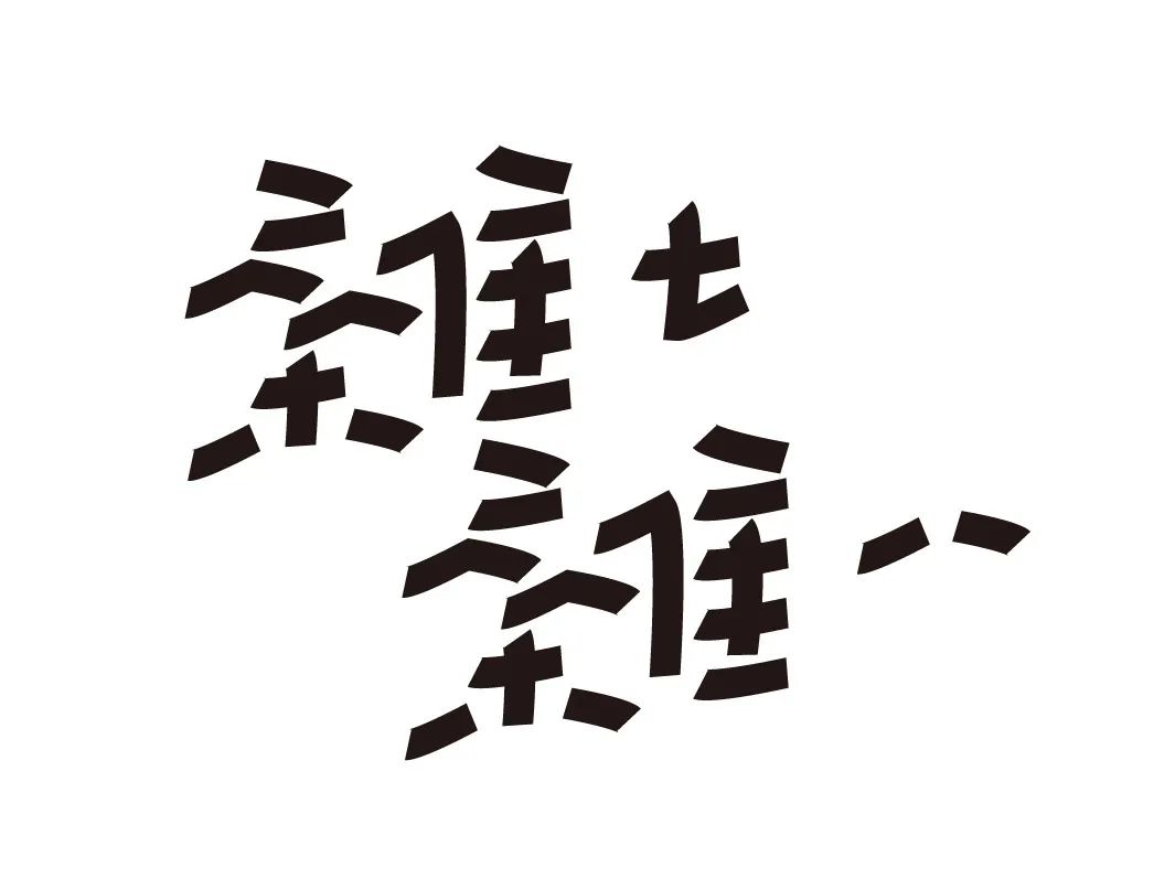
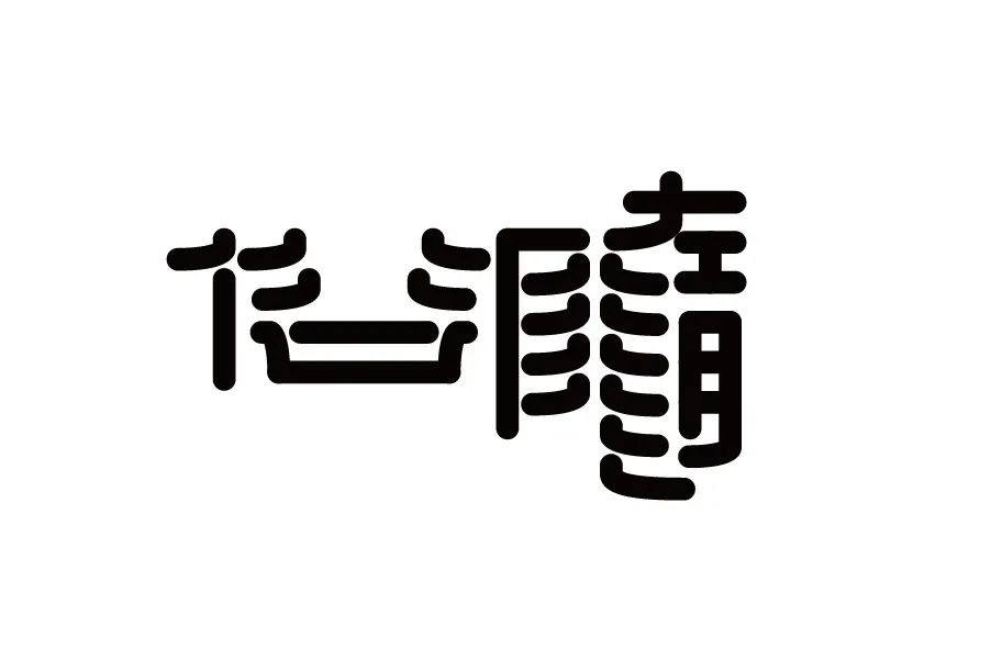
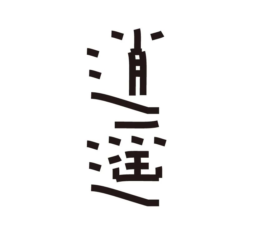
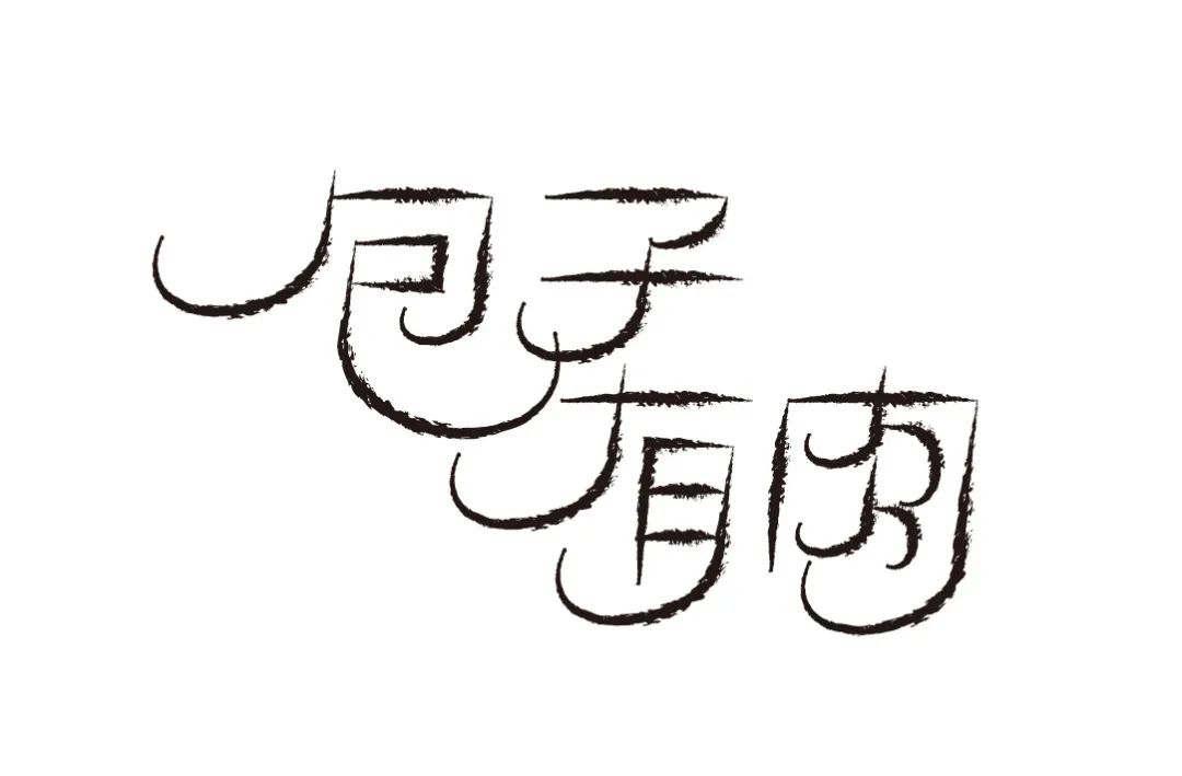
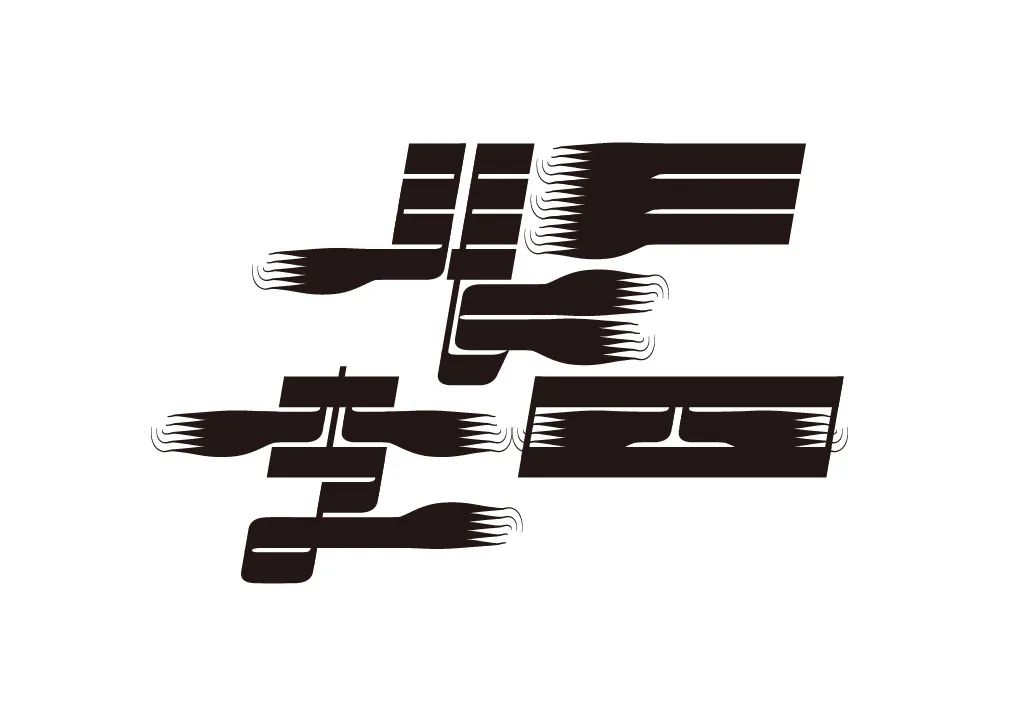
「Wide sitting」
The word "wide sitting" is both concrete and abstract. It is a respectful word for early restaurants to reserve seats for guests.
I use the method of enlarging the space inside the font and reducing the shape of partial strokes to express my respect for the guests and the elegant feeling they enjoy.
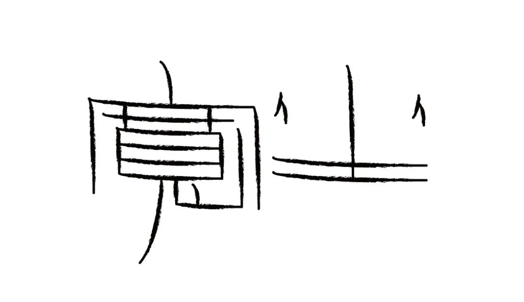
wide seat
No fraud
play
Small chat
Without me
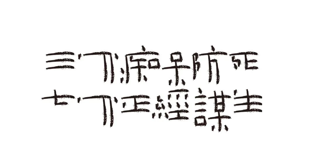
Three points for dementia to prevent death, seven points for earning a living

Often say what you say, but you are not stupid
Fearless
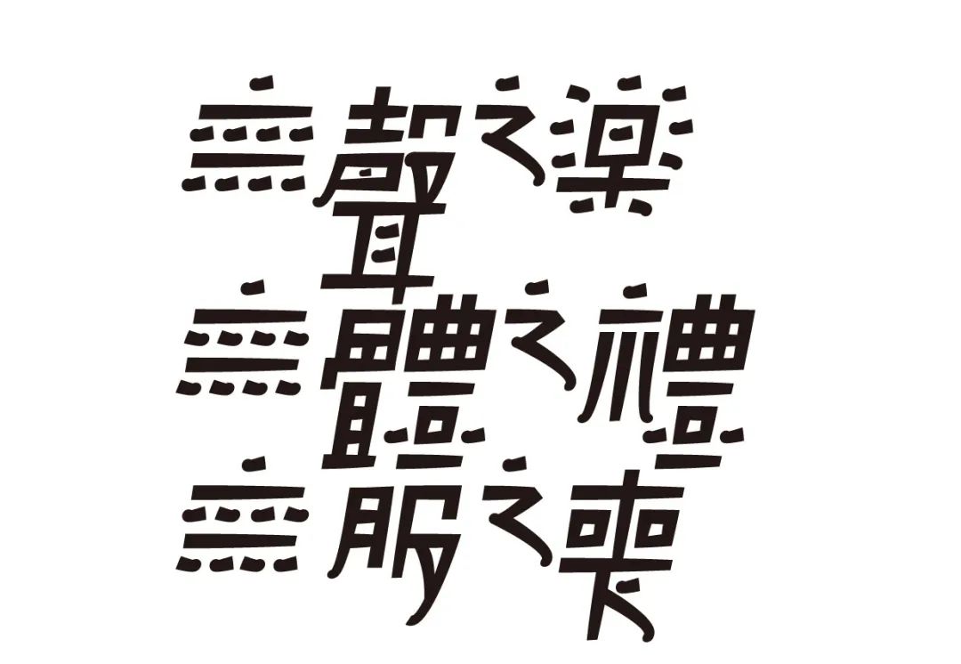
Music without sound, ceremony without body, mourning without clothes
You get what you pay for
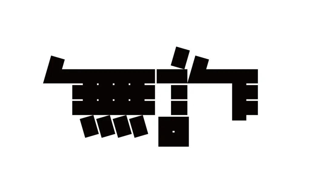
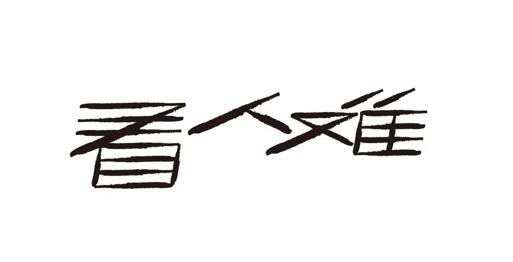
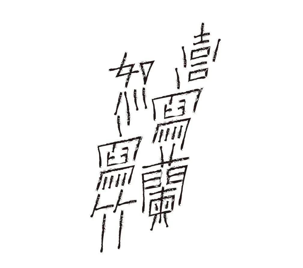
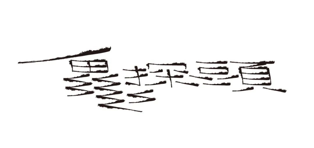
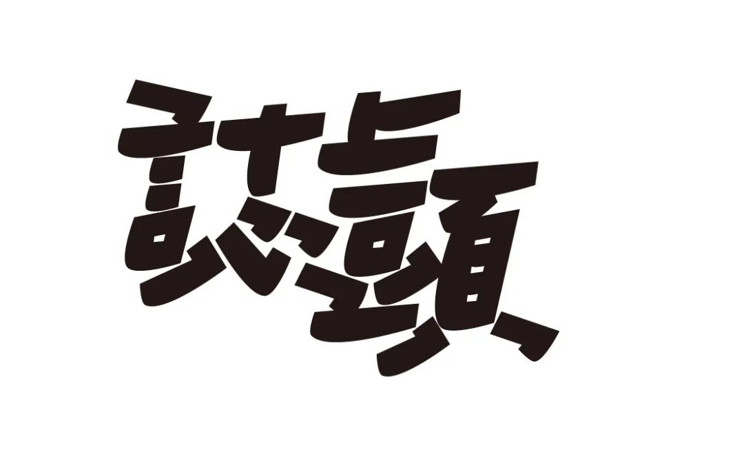
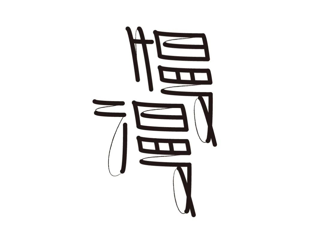
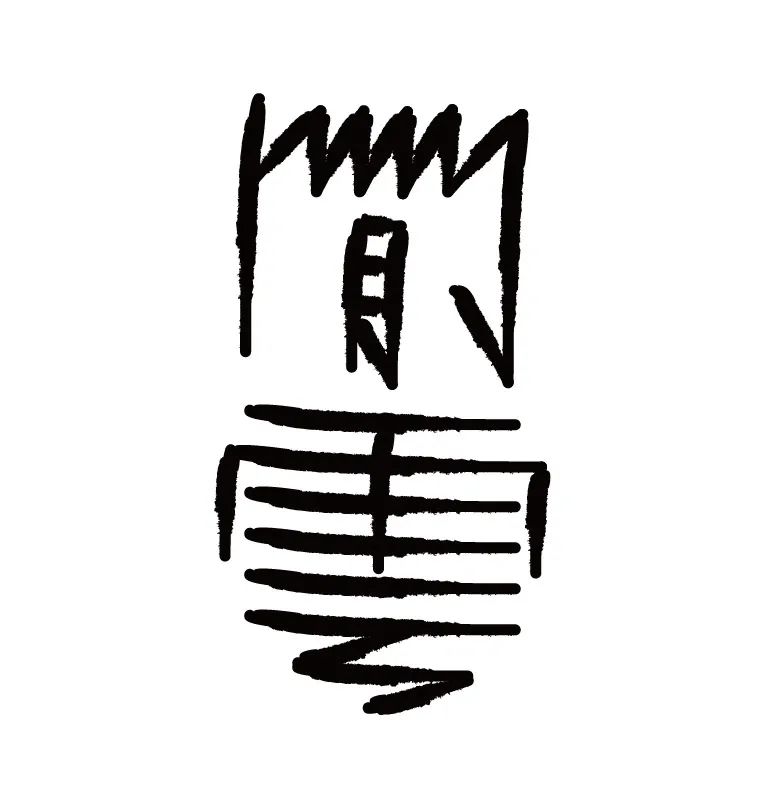
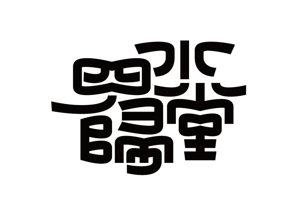
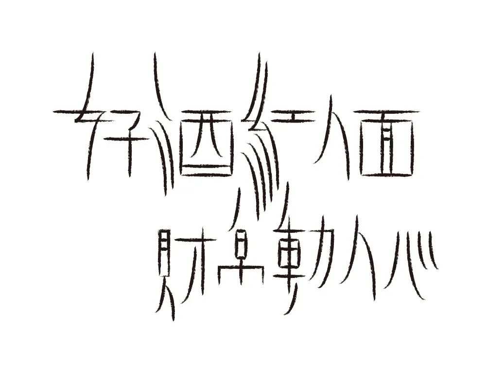
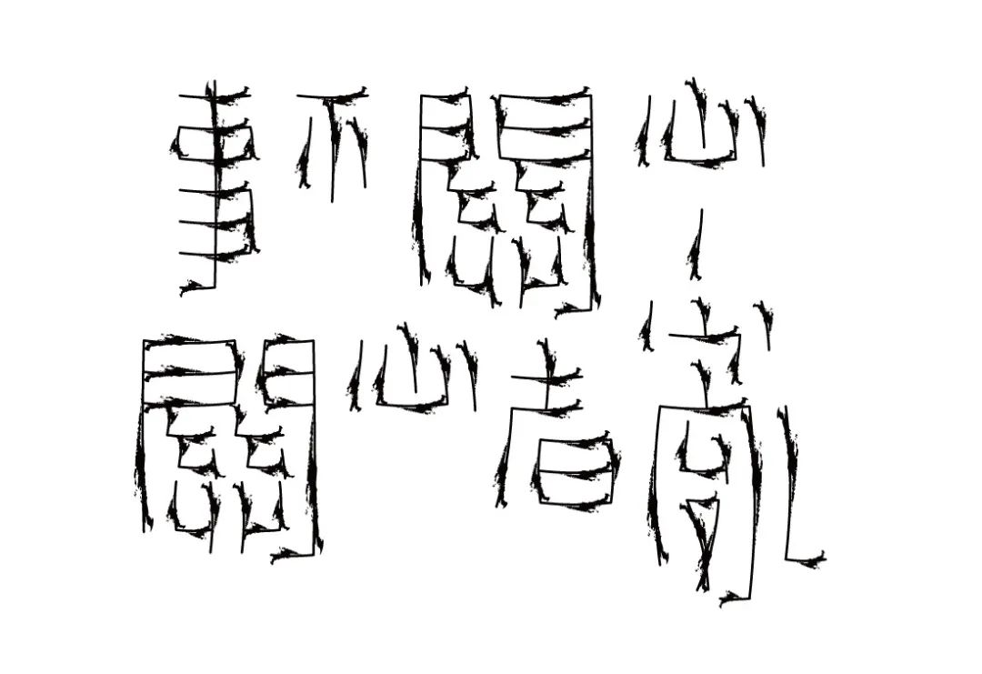
「叫咒」
“Forms, norms and rules should be set according to the style of text characters and their structural features. Different characters have different design forms and tailor-made rules. Two openings on the left side of the word, and multiple opposing dots and short primes on the right side of the word, this design rule is not suitable for the design of other text characters.”
Nawk
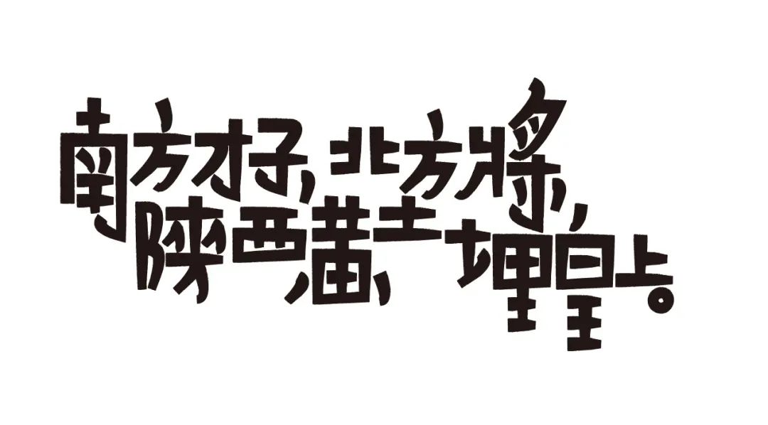
A genius from the south, a general from the north, buried in the loess of Shaanxi.
It's hard to see
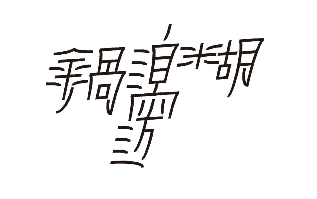
Pot side paste
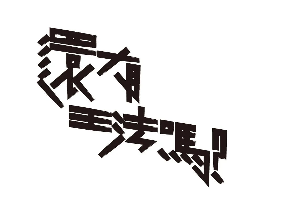
Is there still a king's law?
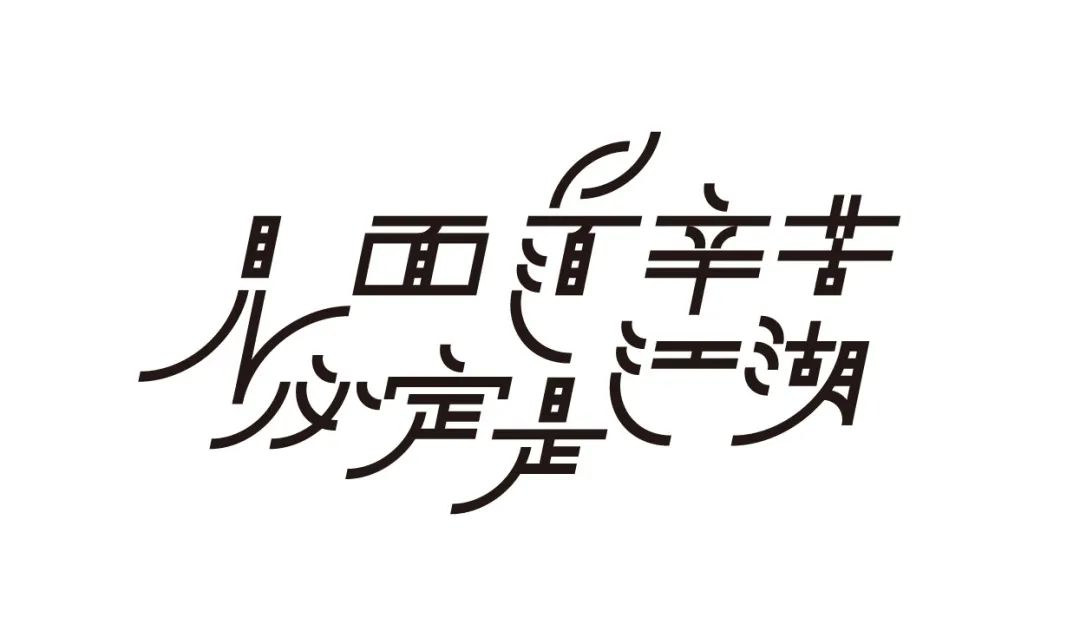
It is hard to meet each other, it must be a world
Eat
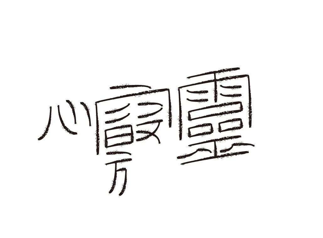
Mind and Spirit
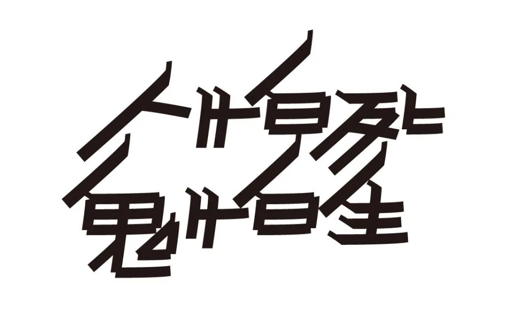
People are afraid of death, ghosts are afraid of life
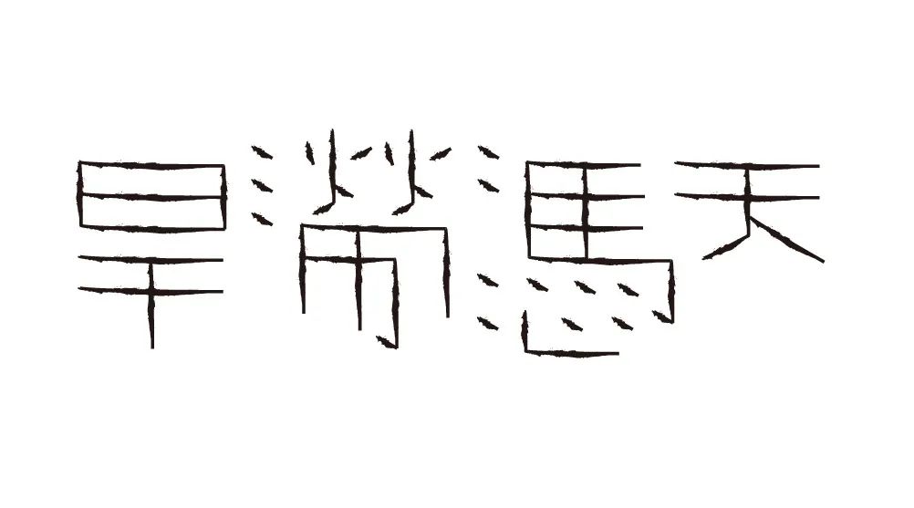
Drought and flooded
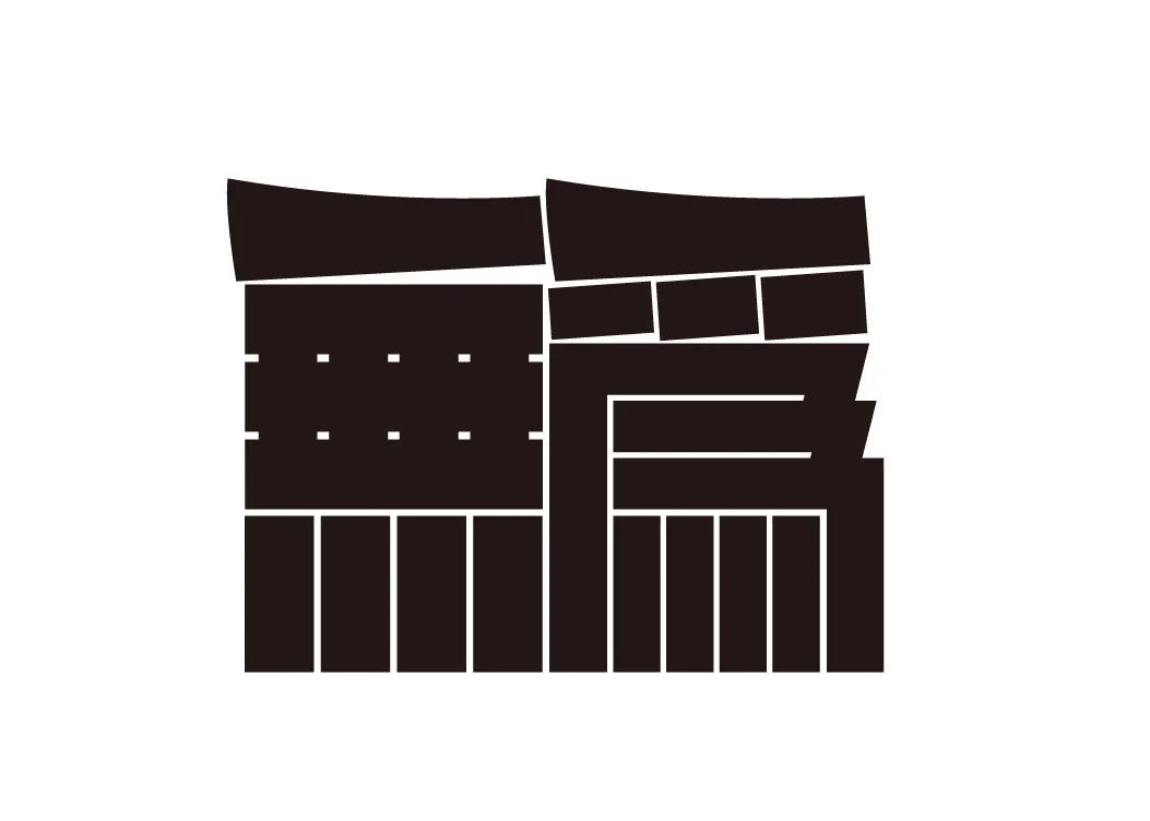
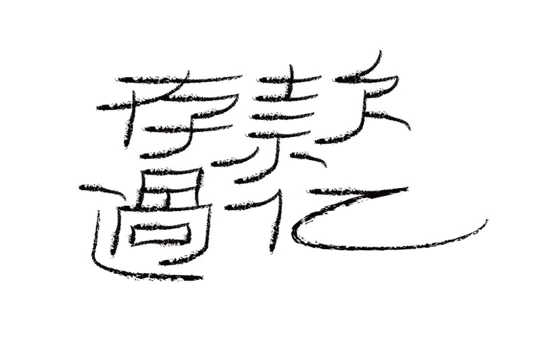
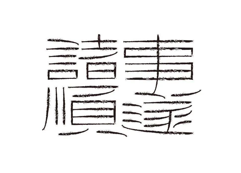
"Storytelling mouth singing opera legs"
“This is a case of visual expression of combined font design. We need to express the strong dynamic and humorous emotions in the text through professional design techniques. Specifically, we use the transformation of the frame structure, The reshaping and directional changes of the strokes make them appear between the lines, not the surface."
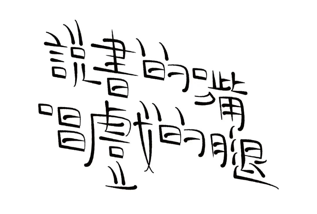
Mouth for storytelling, legs for singing
If you say it’s dark, it’s not dark yet, if you say it’s not dark, it’s going to be dark, you need to turn on the light, but there’s still no light, and if there’s no light, you need to turn on the light
Please yourself
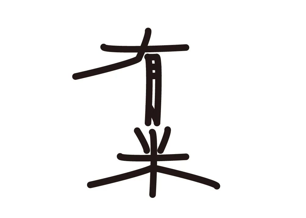
There are rice
At your own risk! ! !
White is not barking
Who is the ghost
Happy to write orchid, angry to write bamboo
Ghost Probe
There are no typos in the calligraphy of the calligrapher
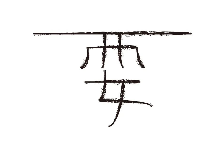
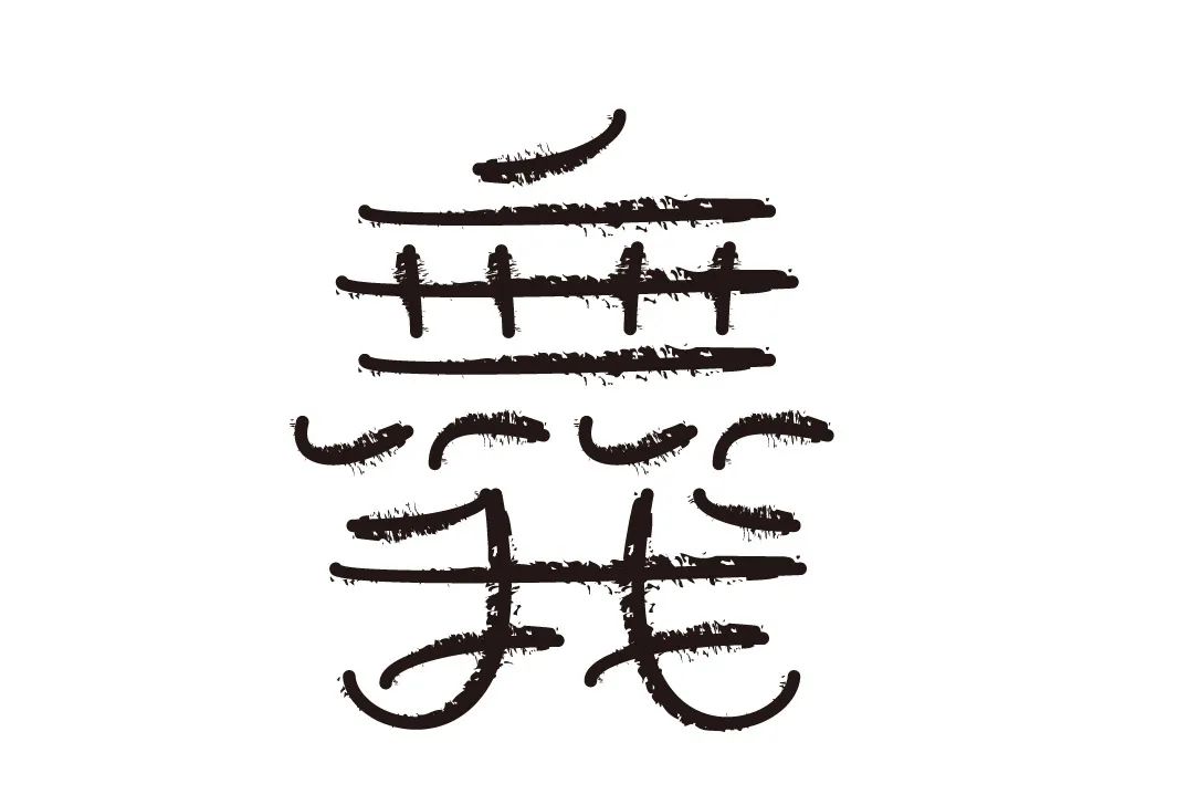
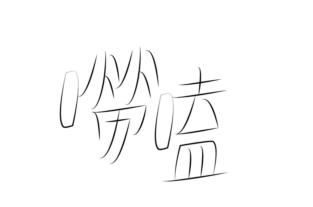
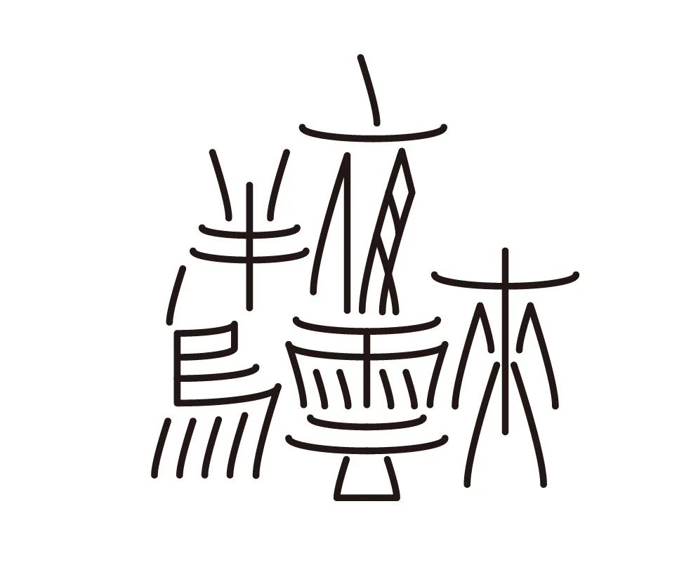
"Noisy"
"Variating the size, length, and position of strokes without compromising reading is often an excellent design tool for expressing textual content."
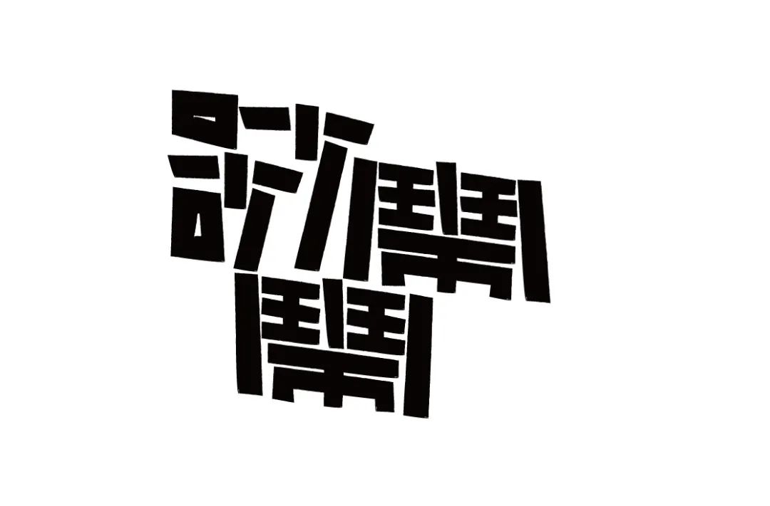
Noisy
Tathagata
Rende
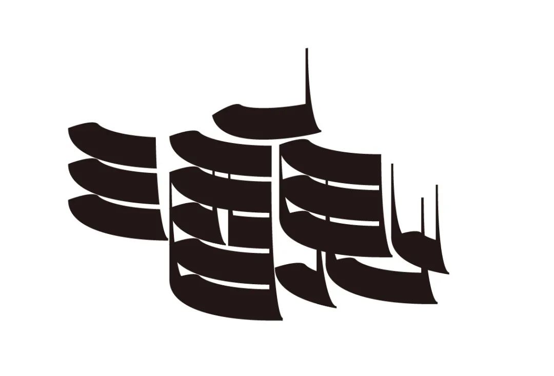
There are bandits in every mountain, and thieves in trees
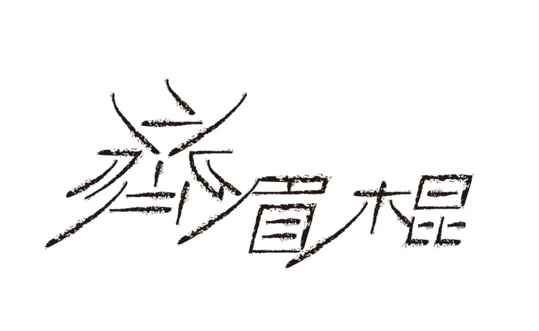
Chaoshan "poison"
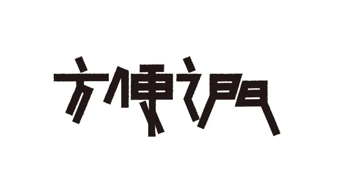
The Door to Convenience
Qingyue
Eyebrow stick
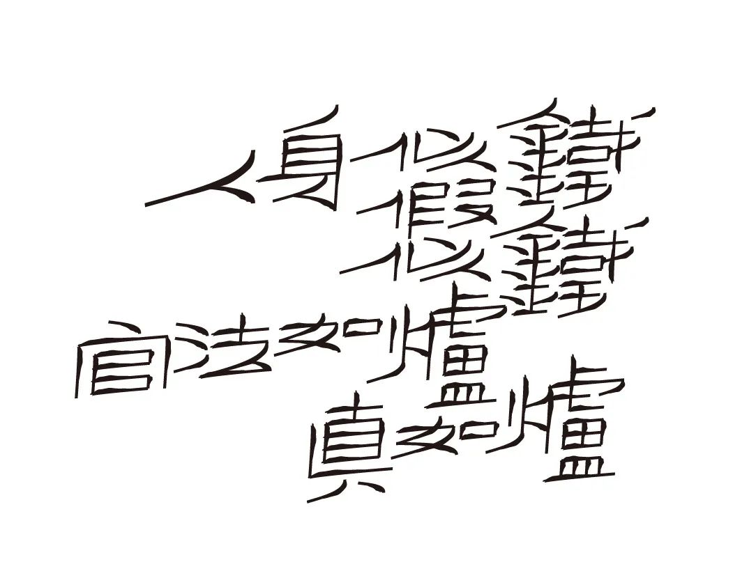
The human body is like iron, the fake is like iron, the official law is like a furnace, and the truth is like a furnace
No leisure
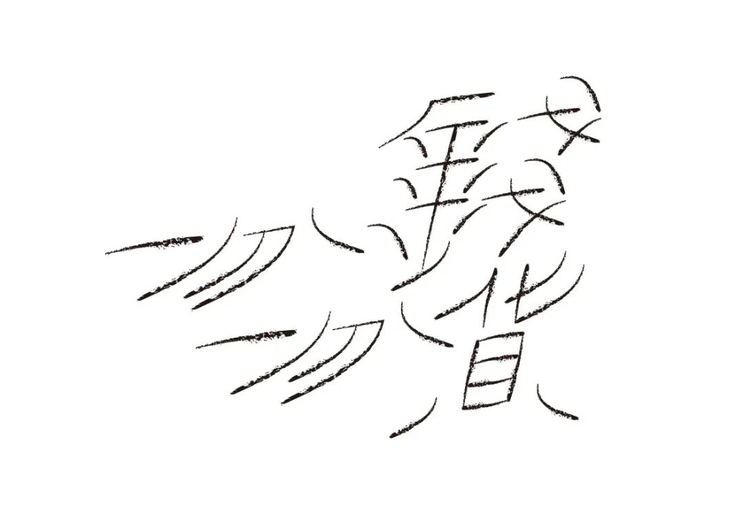
「发布」
"Smiling faces are more expressive and appealing through changes in stroke shape and position than direct, simple placement of pictures."
Send
Kind mind
The speaker has no intention, but the listener has intention
Disturbing the world
Leave the rake down and it's a broom
Flying disaster
Miscellaneous
Slow Man
One day of exposure, ten days of cold
Annoyed in my heart, smiling on my face
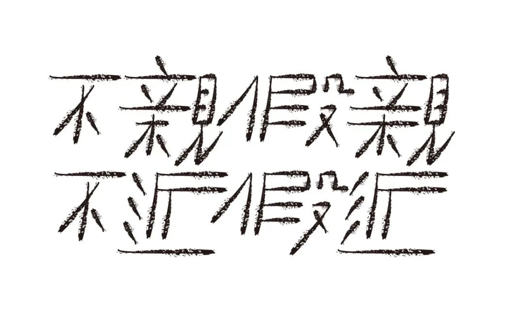
“Do as the Romans do”
“The word “Suisu” adopts a very simple vertically bent stroke shape, but the character “Sui” has a rigorous structure and even space, while the character “Sui” has a loose structure and funny expressions. The design emphasizes the contrast and highlights the key points of the text content, and uses the change of the frame structure to make the combined fonts both unified and contrasted. It has both the rigorous frame structure support and the structural changes made to express the text content. "
Do as the Romans do
Idle Cloud
Sanddust
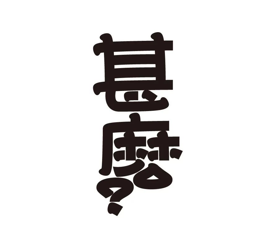
What?
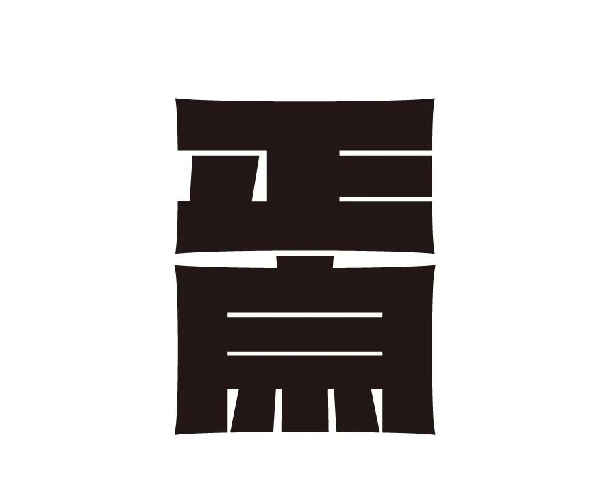
Authentic
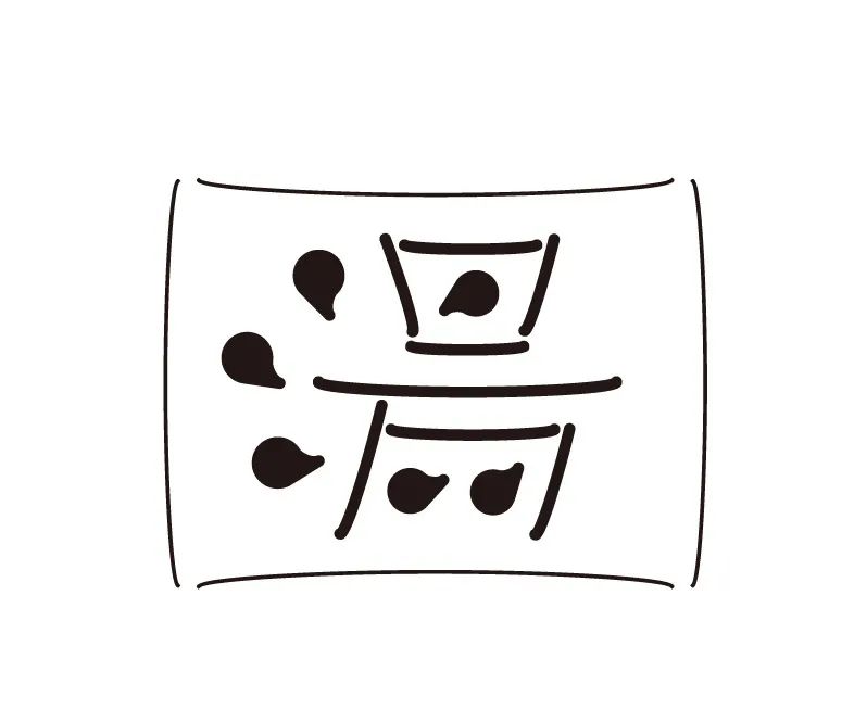
Soup
There is no other
Happy
Four waters return to the hall
Deposit over 100 million
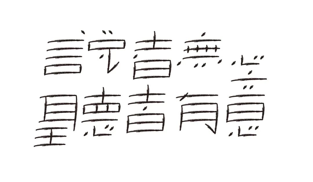
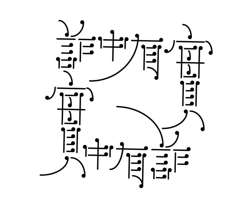
“There is fraud in the truth”< /span>
“Combined font design is not the texture of the pen shape, the atmosphere of the font color, or the expression of the three-dimensional space, nor is it a software tutorial. The fundamental method of the combined font design is the transformation of the frame structure, the innovation and application of the pen shape, The setting of the position and direction of the pen shape, and the middle frame structure are the core and soul of these methods.”
There are lies in the truth and there are lies in the truth
There are three mouths in the story, long worms also long legs
Not close, not close, close
Poverty
Every step is tight
Buns with meat
Good wine, red faces, riches and silks touch people's hearts
Poverty
Everything goes well
Zhang San Li Si
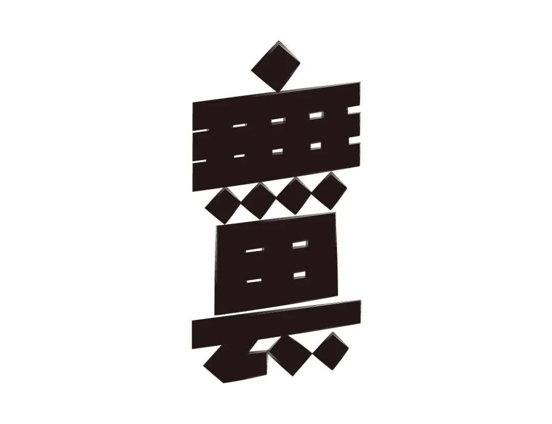
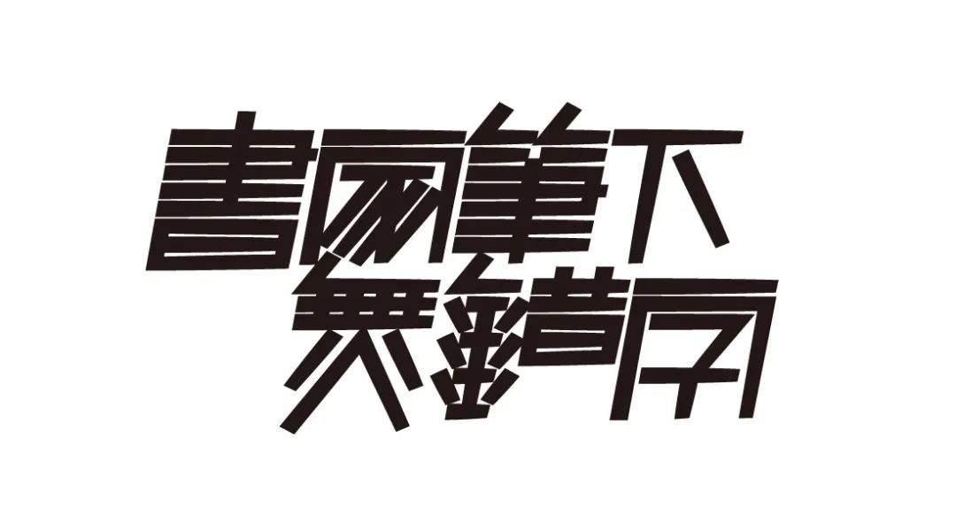
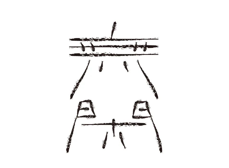
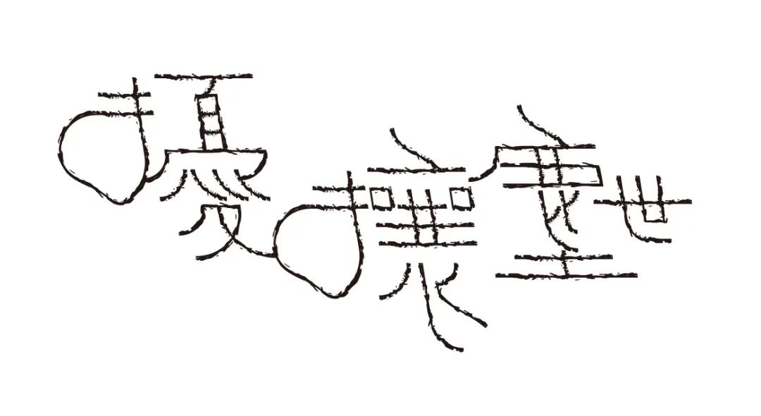
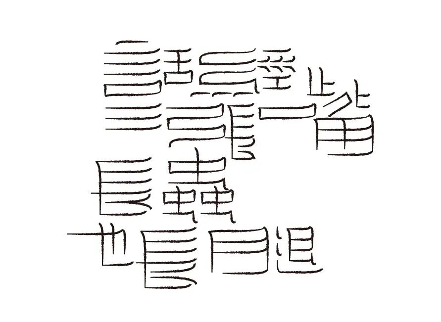
"Stone Paved Street"
“The method of font design training is the same as that of graphics training. Think of the strokes of text as long and short lines or large and small, wide and narrow planes. Once the specific strokes are regarded as abstract points Design becomes easy and free when you read lines and planes. The best way to acquire representation of textual content is the basic training of abstract observation, thinking, and representation.”
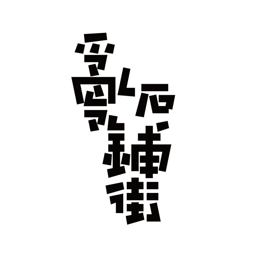
Stone paved street
Dark clouds come in the middle of the night
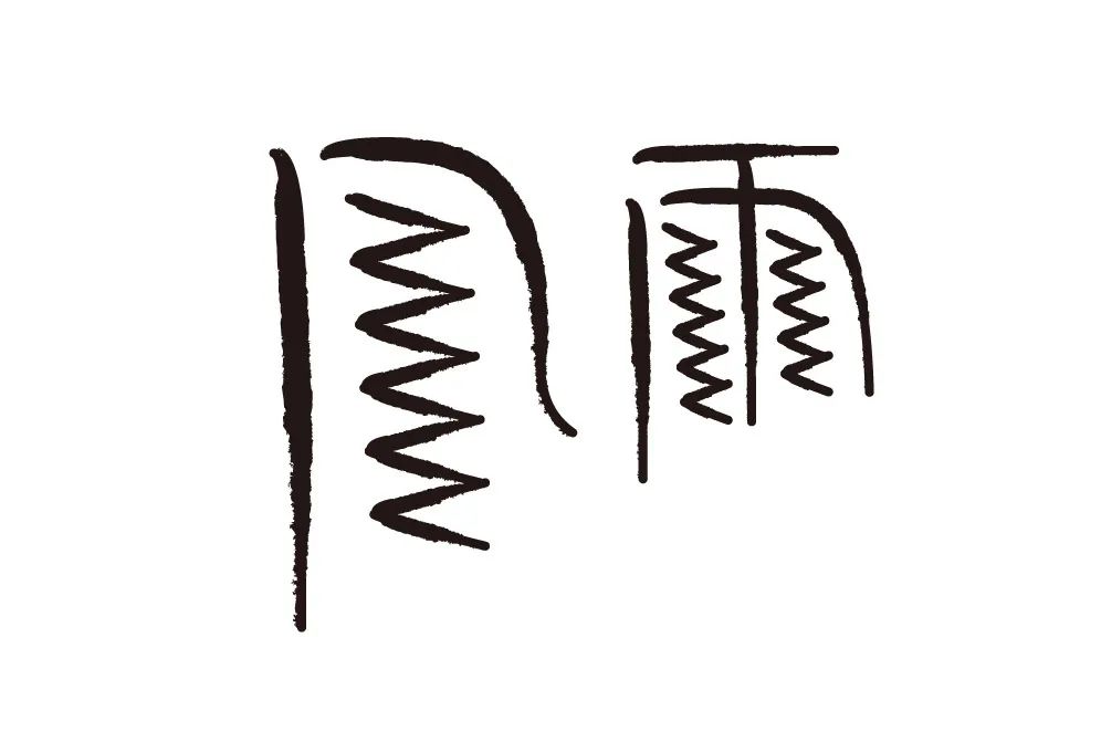
Wind and rain
Those who don't care about things are chaotic
Honest
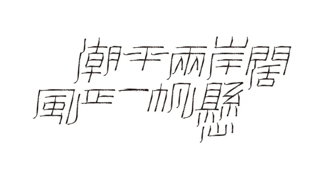
The tide is flat and the wind is blowing on both sides of the river
Goodness
The handicrafts of the former tooth slaves beat pedestrians
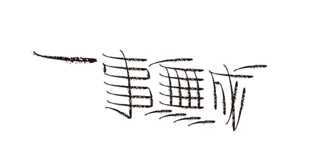
Rejoice at your own pace
None
Only those who read carefully can see Easter eggs

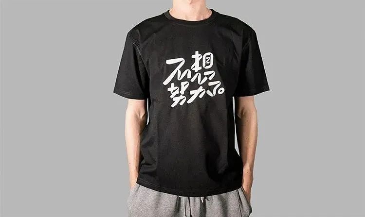
Now - September 1
Forward this article to Moments and collect likes59
Send the screenshot of Moments to the WeChat background of No. 9 Gutian Road
Little 9 will be randomly selected10Lucky Goose
Free Ms. Yue Xin original font customized T-shirt 1
The number is limited, please participate~

Articles are uploaded by users and are for non-commercial browsing only. Posted by: Lomu, please indicate the source: https://www.daogebangong.com/en/articles/detail/It%20has%20been%20online%20for%20more%20than%203%20years%20and%20has%20released%20more%20than%203000%20creative%20font%20design%20works%20A%20review%20of%20the%20100%20selected%20issues%20of%20the%20Writing%20with%20Heart%20column.html
 支付宝扫一扫
评论列表(196条)
测试