Yesterday, when I was browsing the circle of friends, I found a treasure boy who made a PPT of Guochao style. It was super awesome, so I invited him to write a review.
Written in super detail, let's take a look:
Hello, friends, we meet again, I amStudents from the circle of friends @石子.
Last week, the circle of friends assigned a Lantern Festival-themed homework, and I also took the time to do one:
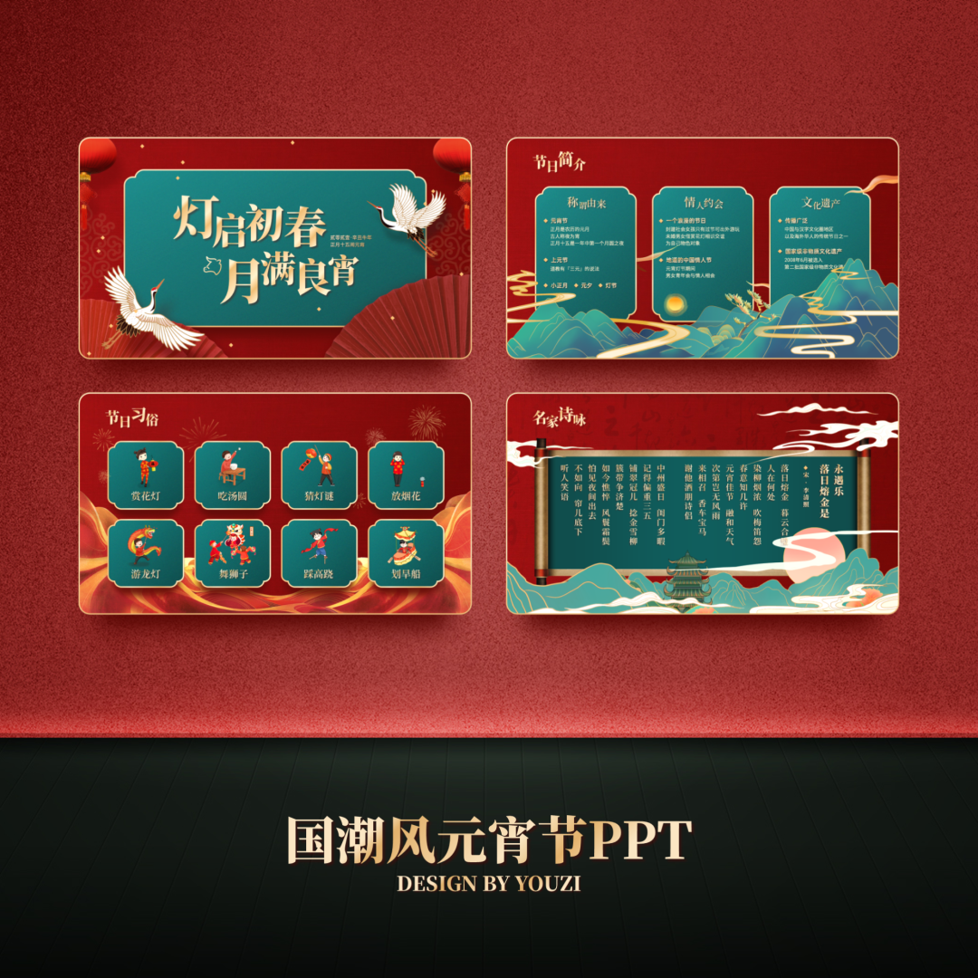
After the homework was sent out, I received a lot of likes from friends, and some friends even asked me privately, how did I make it so textured:

First of all, it is still the old rule, after getting the original manuscript, read it quickly:
The content is very simple, it is some introduction about the Lantern Festival.
After determining the design style, we can go to some inspiration websites to find some references:

It all looks very refined, right?
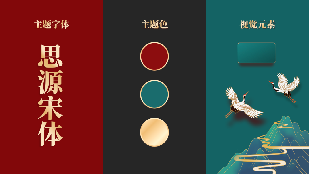
Referring to these cases, I determined the theme color, theme font and visual elements of the entire PPT:
After that, you can officially start the design.
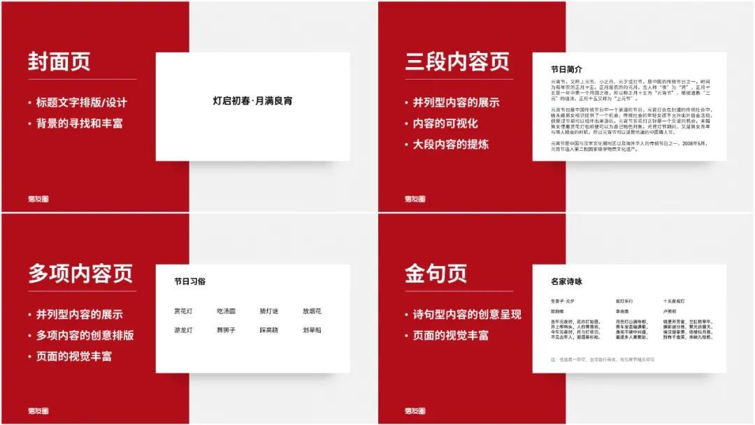
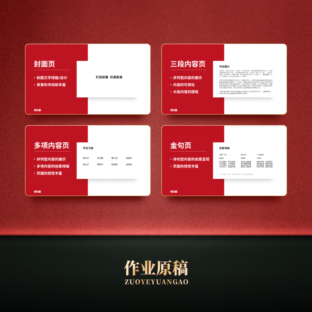
Cover page first
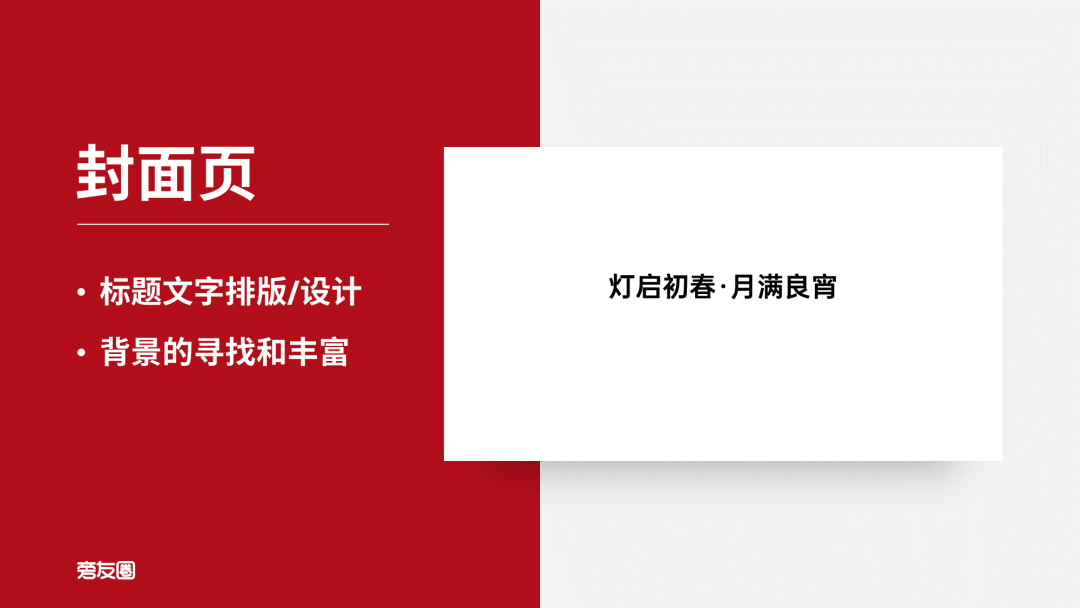
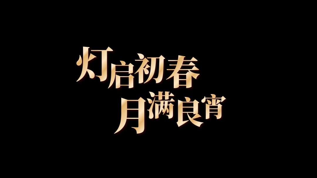
The original manuscript has only a two-paragraph title, and the entire page looks a bit empty.
In order to increase the visual weight of the title, here I adopt the method of increasing the font size and staggering the arrangement.
Split the title into single words and adjust the size, and arrange them in two lines:

At the same time, set a gradient for the text to add some texture:
The background is too monotonous, let's find a red texture map as a base:
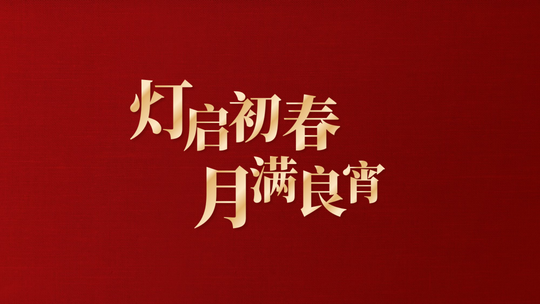
We can draw a Chinese-style substrate graphic to narrow the range of the version center.

After adding the background graphics, the page still looks a bit flat.
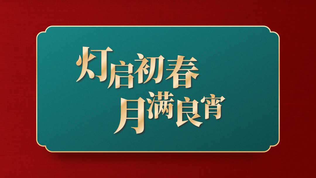
So, I looked for some elements of the national trend to enrich the visual effect and layering of the page.
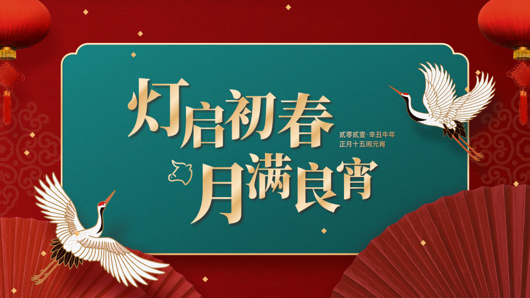
At this point, a cover is complete.
Insert a special benefit:
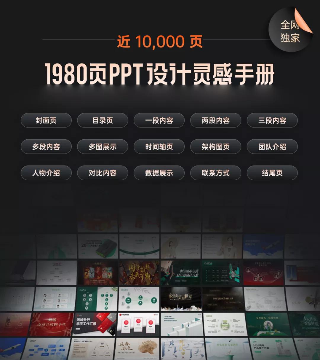
Pangyou circle PPT learning community opening year activities are in progress, Straight down 70 yuan.
Join now, not only can you get free 10,000-page PPT design inspiration manual:
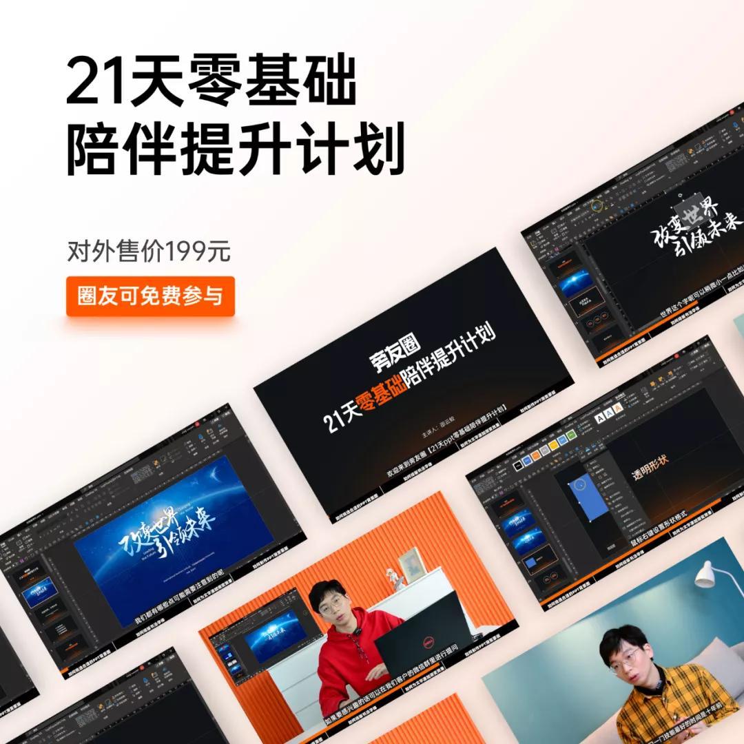
You can also book a free Pangyouquan training camp course once a year:
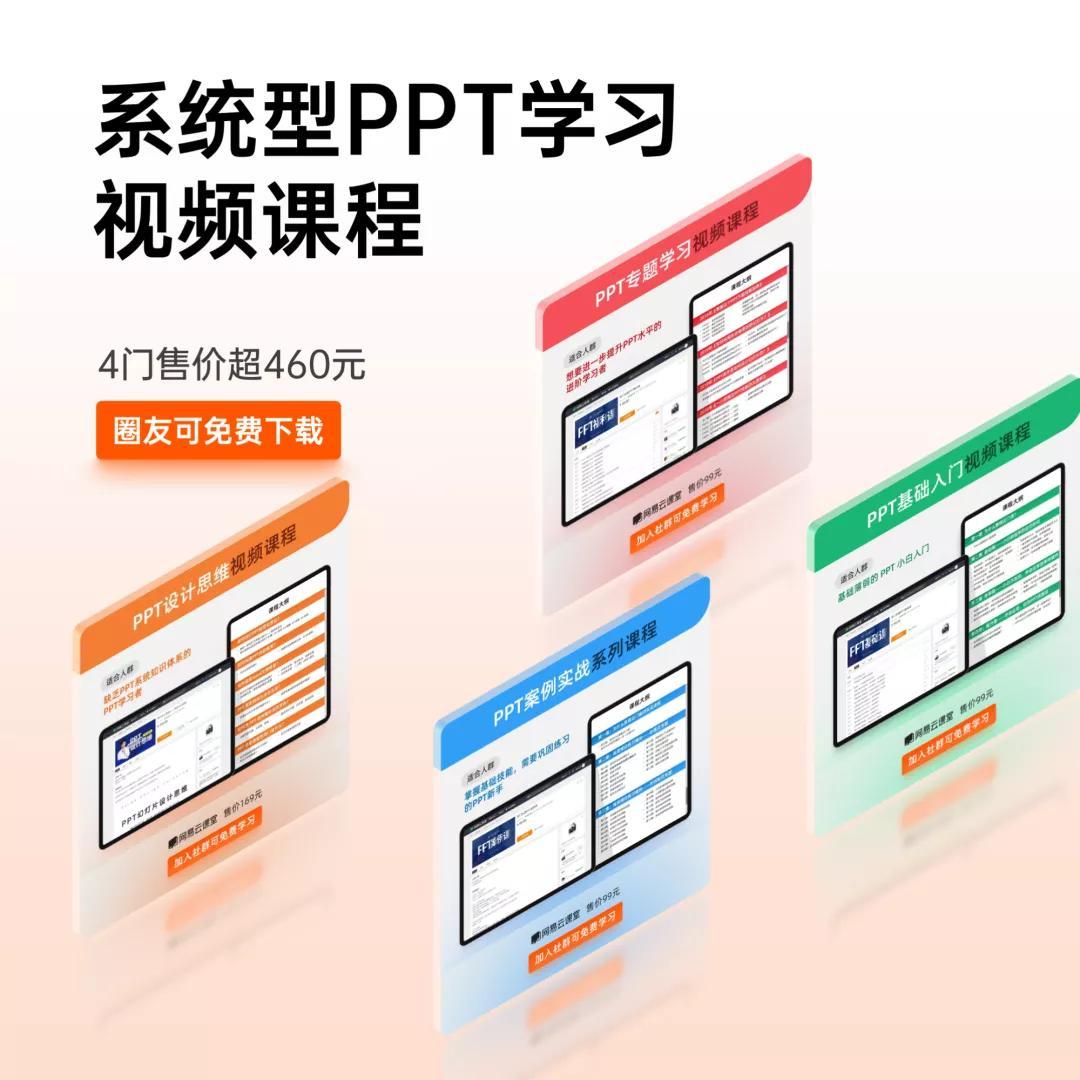
and free subscription to 4 system PPT learning courses priced at over 460 yuan:
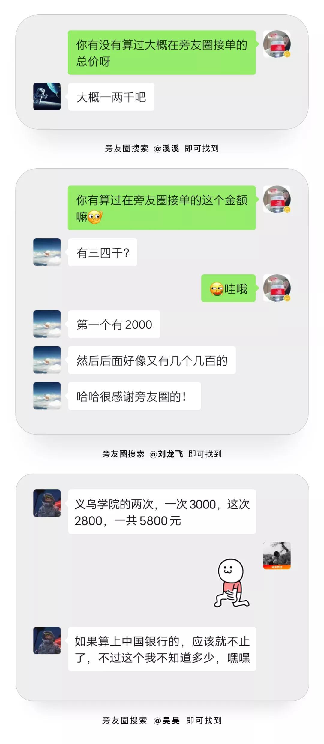
There are also business orders for extra money:
Join once, valid forever. The number of places in the event is limited, and interested readers can consider starting now.
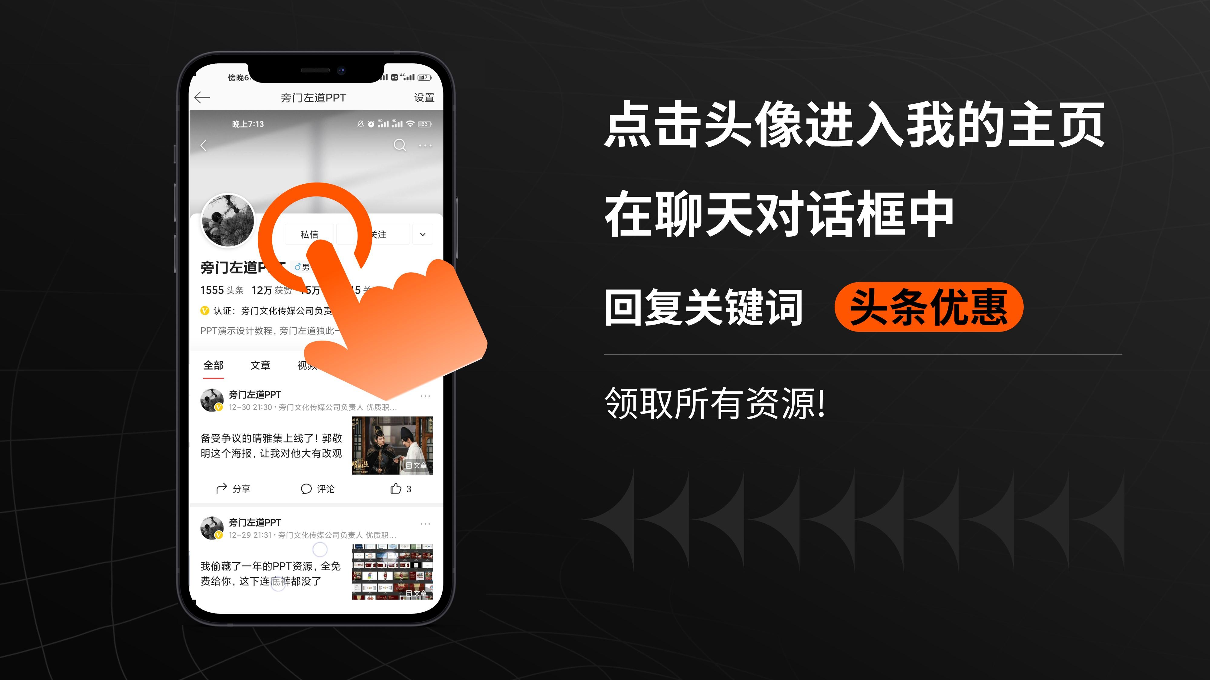
The PPT source file of this article, as well as all resources, how to get it:
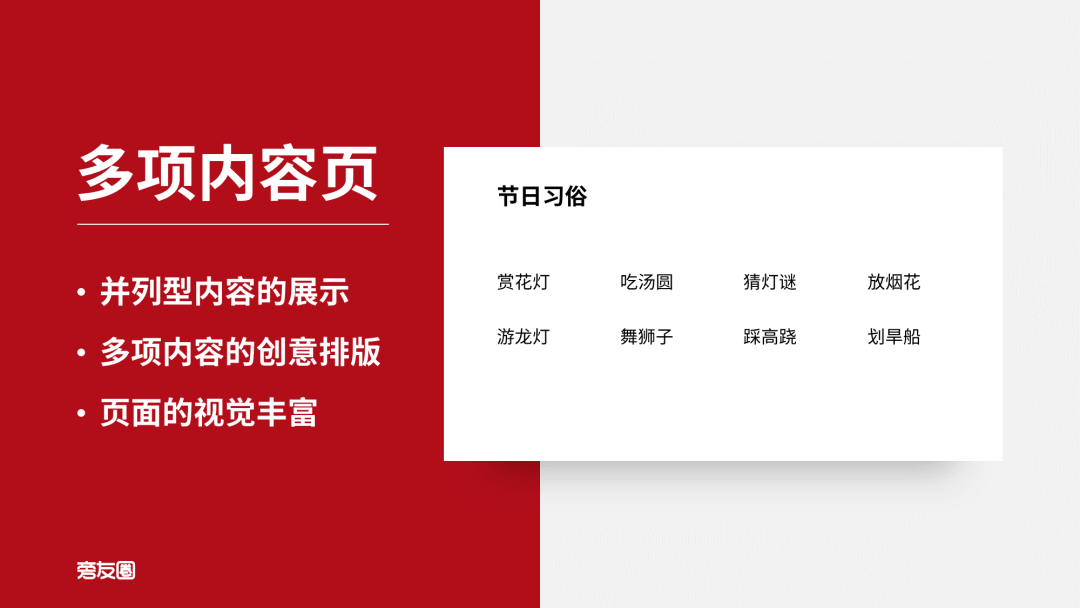
Next page 2:
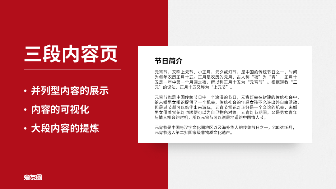
There is a lot of content on this page, we can refine the text first.
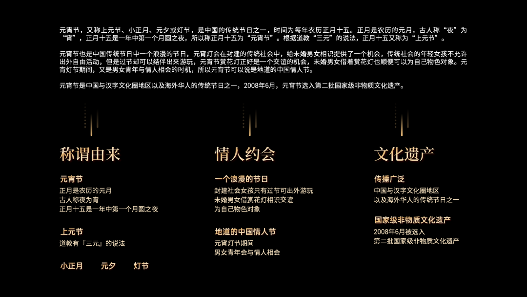
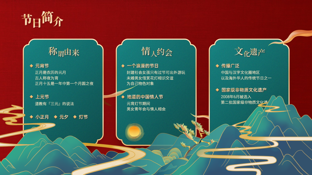
Because it is a three-paragraph content page, we can consider layouting the content side by side and uniformly add a substrate.

Looks good, right?
But the bottom of the page seems to be a bit empty, we can find some Chinese style landscape elements, to fill it visually.
Not bad, right?
Next comes page 3
We can go to the material website to find the material.

Then we arrange the found picture materials side by side in two rows, and also add a substrate uniformly.
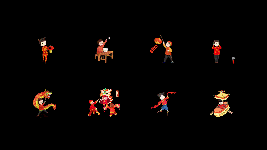
Still looks a bit bland, right? We can find some more national tide materials:
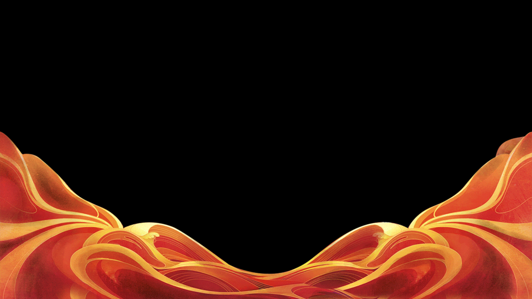
Then place the material below the substrate, add some layers to the page.

Finally, we can also find some fireworks materials, adjust the size and transparency appropriately, and then place them scattered on the page as embellishments.

Here, this page is complete~
Finally page 4
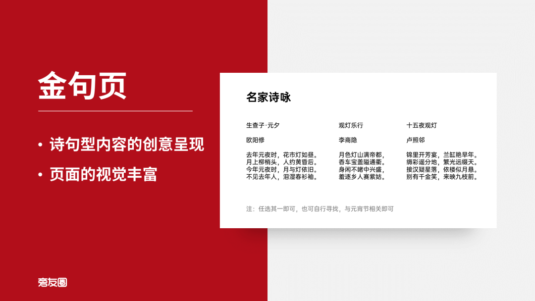
The content and requirement of this page is to display some ancient poems about the Lantern Festival.
So we can look for some PNG material of poetry inscriptions and stack them on the background of the page to enrich the details.

After that, we can find another scroll material and put the text on it. After all, the ancients used this stuff to frame calligraphy and paintings~
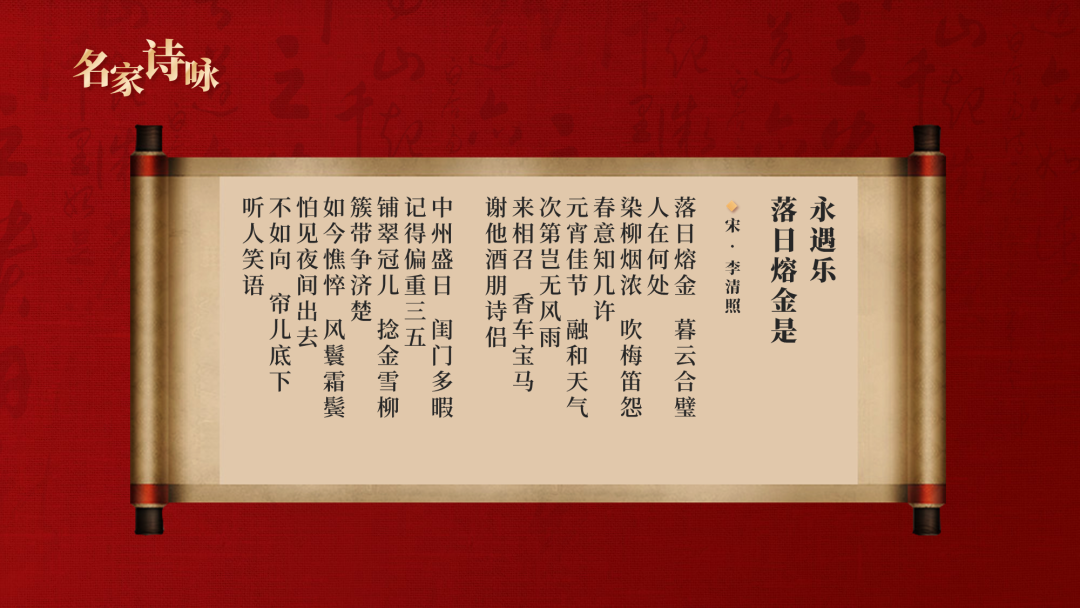
However, this scroll is not wide enough~
We can first move the scroll to the left to align it with the page title, and then cut off the part on the right that exceeds the dividing line of the central axis of the page.
Then select the rest, hold down CTRL+SHFIT and drag the mouse to the right, make a copy and flip it horizontally, and move it to the right side of the page , so that the scroll is wide enough~
Add some green to the scroll:
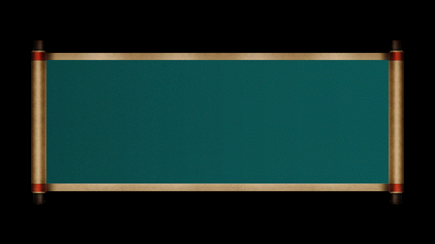
It's a lot more integrated, right?
Next, we can put the text on the scroll with confidence.
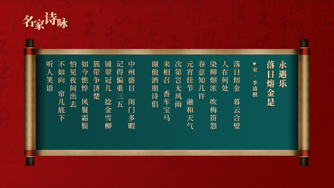
Finally, we can find some materials and place them at the bottom of the page to fill in the gaps at the bottom of the page.
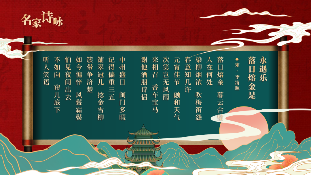
At this point, the entire PPT is complete.
Let's look at the final effect again.
-before modification-
-Modified-

Looks good, right?
Finally, don't forget to receive PPT resources and benefits~

Articles are uploaded by users and are for non-commercial browsing only. Posted by: Lomu, please indicate the source: https://www.daogebangong.com/en/articles/detail/Is%20red%20and%20green%20tacky%20This%20national%20trendy%20PPT%20is%20simply%20beautiful.html
 支付宝扫一扫
评论列表(196条)
测试