The following article comes from Big Cat Design, author Big Cat Design

Design, marketing, copywriting, strategy...everything you want! !
Reposted from: Big Cat Design id: cat_idea
This style of font is the simplest form of font design, because there are rules to follow. Then the article in this issue will take everyone to look at the composition of this font and the misunderstandings to avoid.
This article is divided into two parts, the remonstrance part and the case modification part. The remonstrance part will explain the knowledge points of this form of fonts; the case modification part will use the theory of remonstrance to modify, I hope everyone can understand.

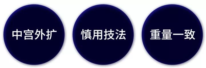
There are three advices that cannot be ignored when doing this type of font design well, they are
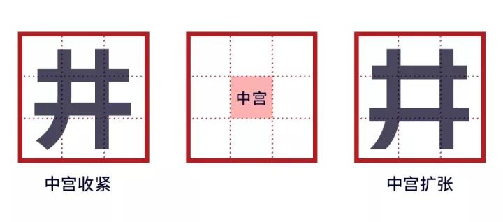
What is the middle palace of the font?
In ancient times, there were nine grids for writing, and the grid in the middle was the middle palace.
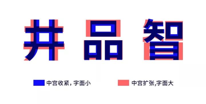
Taking "well" as an example, the font must be smaller when the central palace is tightened, and the characters appear compact and powerful; the font must be larger when the central palace is expanded, and the font structure is looser but more regular.
Traditional Chinese calligraphy pays attention to the tightening of the middle palace, because such characters appear compact and imposing. However, to make the square and square standard artistic characters of "Iron Armor and Steel Fist", it is necessary to go the other way, expanding the central palace to make the literal larger, so that it is more regular visually.
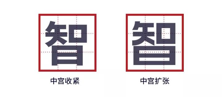
The picture below takes the character "智" as an example

The characters after the expansion of the central palace occupy a larger and fuller area in the nine-square grid, and are more regular than the compact fonts in the central palace.

Key points: To make a standard glyph, try to expand the center and the outside of the palace, so that the shape of the character occupies more area.

The technique mentioned here mainly refers to the connection and omission of strokes, because this technique will definitely reduce the recognition of the font, so these techniques should be used with caution.
Taking "Miao" as an example, with the increase of strokes in the font, the recognition of the font is getting worse and worse, and finally I don't know it at all

The connection and deletion between strokes will affect the recognition, let’s take a few more groups


It is undeniable that after the connection and deletion of strokes, the artistic quality of the font has been improved, but the recognition has been compromised. Especially in the novice period, if these techniques are not handled properly, it will cause a double lack of recognition and artistic sense. This is a taboo in business design.
Appropriate connection and deletion of strokes can increase points, but improper connection and deletion can make the design negative. These techniques should be used with caution. If they are not used well, it is better not to use them, because the simple processing of stroke details and structures can meet most needs.
Appropriate techniques must be moderate, like the "City" below, the artistry and design sense have been improved after deletion, but the recognition is still very strong.
In terms of pure recognition, the unprocessed ones are definitely stronger. What has been processed is the balance between recognition and design, so the techniques should be used with caution, the design should be moderate, and fonts with excessive design but no recognition should be avoided.

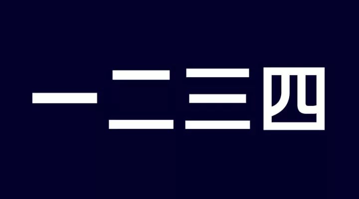
Consistent weight is to ensure that the weight of each word is similar. In standard characters, characters with more strokes must have thinner strokes; characters with fewer strokes must have thicker strokes.
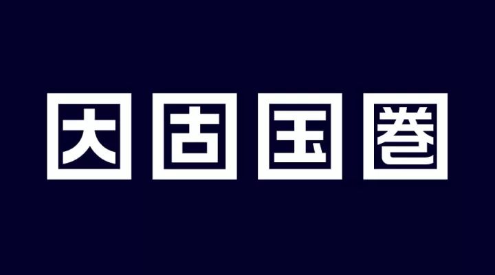
Those with fewer strokes must be thicker, such as the "one" and "three" above, the horizontal strokes of three are thinner, some friends may not be able to see it, and it will be clear after marking it.
The stroke thickness of one is a little heavier than that of three, and this change can make the weight more consistent visually.

Another example is this group, which is also a fully enclosed font, but the strokes of "圏" are much smaller and thinner than the previous strokes. If the thickness is the same, the character will definitely be bloated, and it will appear extremely inconsistent with other fonts.

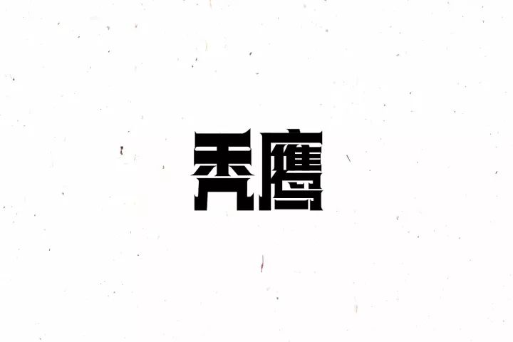
For example, the word vulture, because the word eagle has more horizontal strokes, in order to ensure that the two characters have equal weight visually, the strokes are made thinner.
So a good standard character design must have the same weight. When designing, you must ensure that the weight of the characters is consistent.
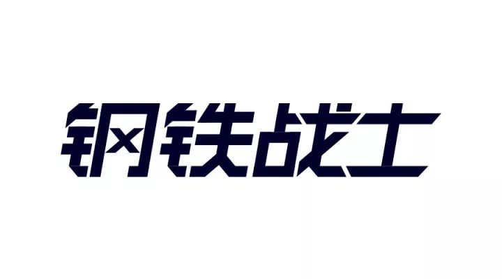
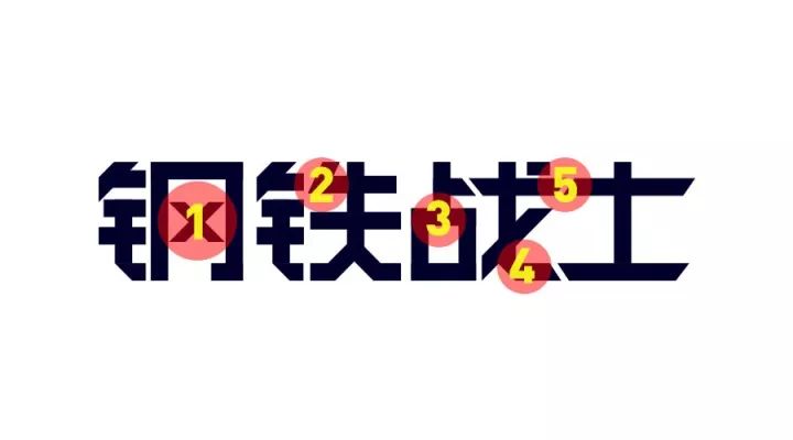
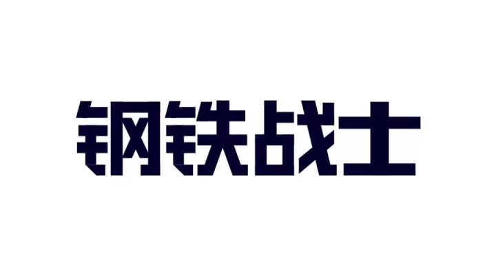
Novices in this case think it’s okay, but there are many problems in the eyes of veterans. For the convenience of observation, I flattened the font and marked it. 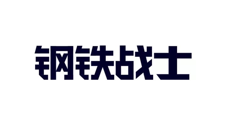
The "x" in "steel" is too thin, and the weight does not match the whole group of characters, which is the third point mentioned above, the weight is inconsistent.
The simplification of the strokes is not uniform enough. The structure of the gold border and the mark2 are the same, but the processing method is not uniform. The same is true for the beveling of the strokes. The horizontal strokes of the word "steel" are not beveled, but the word "warrior" is.
The center of gravity is inconsistent, the center of gravity of "Zhan" is too high, and it does not match the rest of the characters.
The vertical painting marked4 can be tilted to take up more space, which is the above advice of "expanding the central palace and expanding the strokes".
The connection method is too strange, the normal horizontal pen of "士" should be lower. In addition, to make the weight consistent, characters with few strokes like "士" should be thicker.
After you know the problem, you can correct it step by step. The following is the initial correction.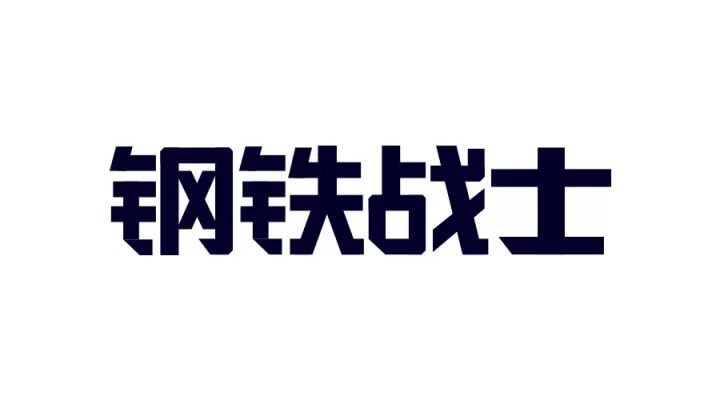
The adjustment to this structure is almost done, let's add details and unify the style on this basis.
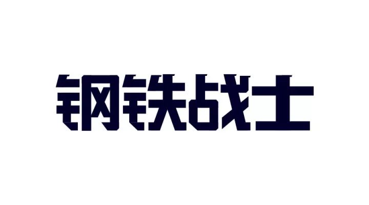
Unified the word warrior and the oblique cut next to the gold. In order to make the style stronger, the four corners of the "口"-shaped structure are slightly chamfered.
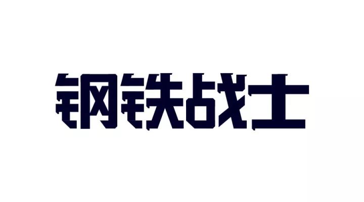
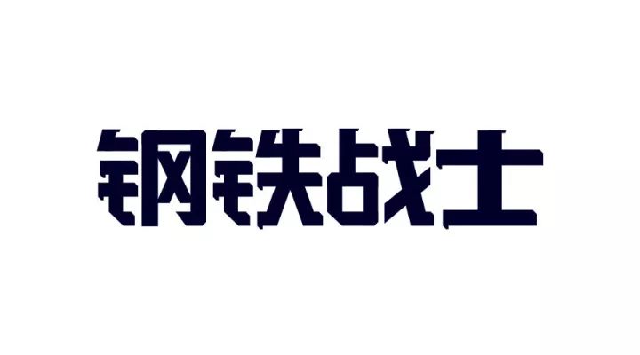
Add details to the top of the vertical pen. The cross-cut angle under the "士" is very strange, so modify it in this step. Then add more details to the horizontal painting.
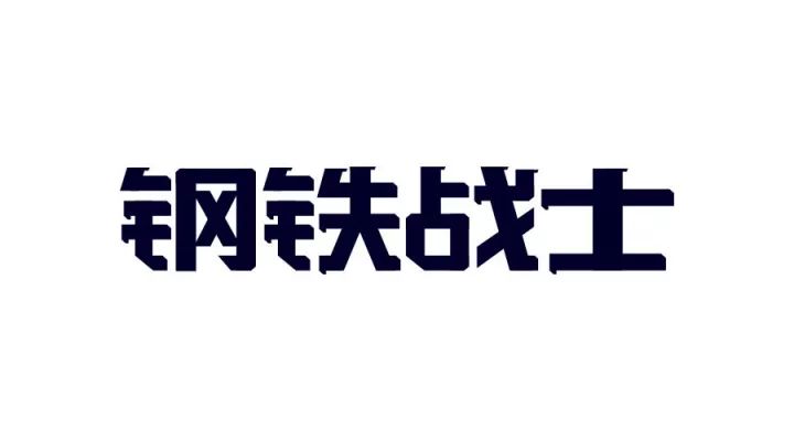

In-depth, the characters have been formed at this time, in order to make them more stable, you can do a slight flattening process, as follows
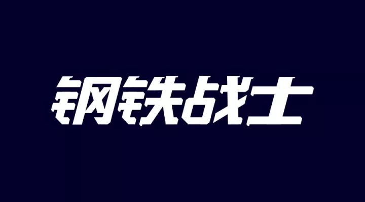
The word has been completed at this step, and on this basis, it can also be processed with an incline to express strength and speed
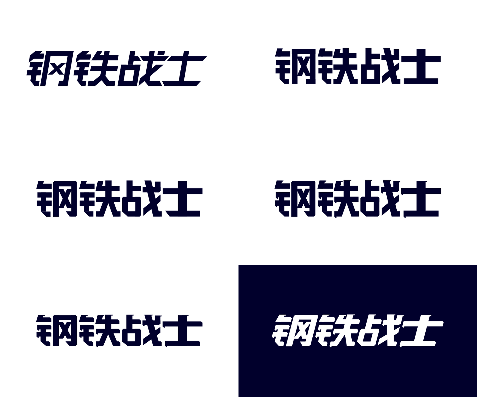
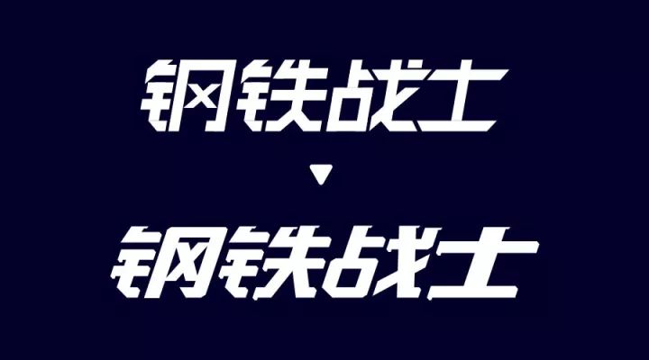
After seeing the finished product, take a look at the animation of the processgif, as follows

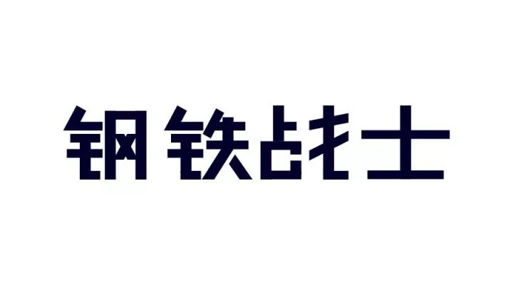
At the end, put a comparison before and after modification

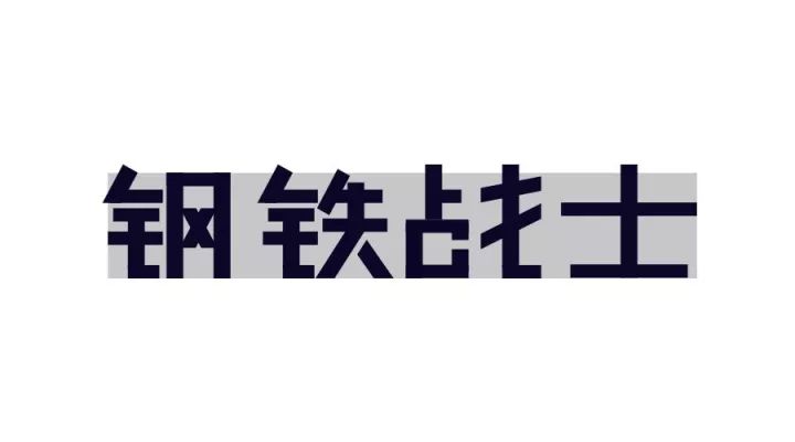
This example looks a bit messy, so where is the problem?
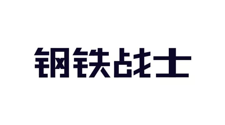
1. The central palace should expand outwards, so that the strokes occupy more space.
2. "X" is out of space
3. Simplified forms are inconsistent and lack unity
4. Inexplicable disconnection makes people feel inexplicable
5. A point is omitted, it is not recommended to omit
6. The tilting of the vertical pen will be better.
7. Characters with fewer strokes should be thicker.
Once we know what the problem is, the next step is to modify it step by step. The modification process is similar, so I won’t explain it in detail. You can understand it by looking at the picture.
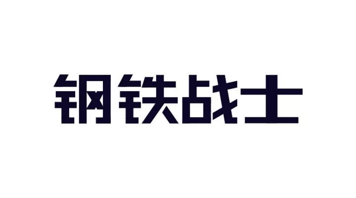
Draw a rectangle to specify the height of the word, and then modify it according to the above 7 points
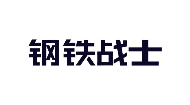
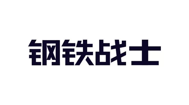
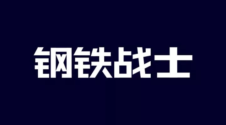
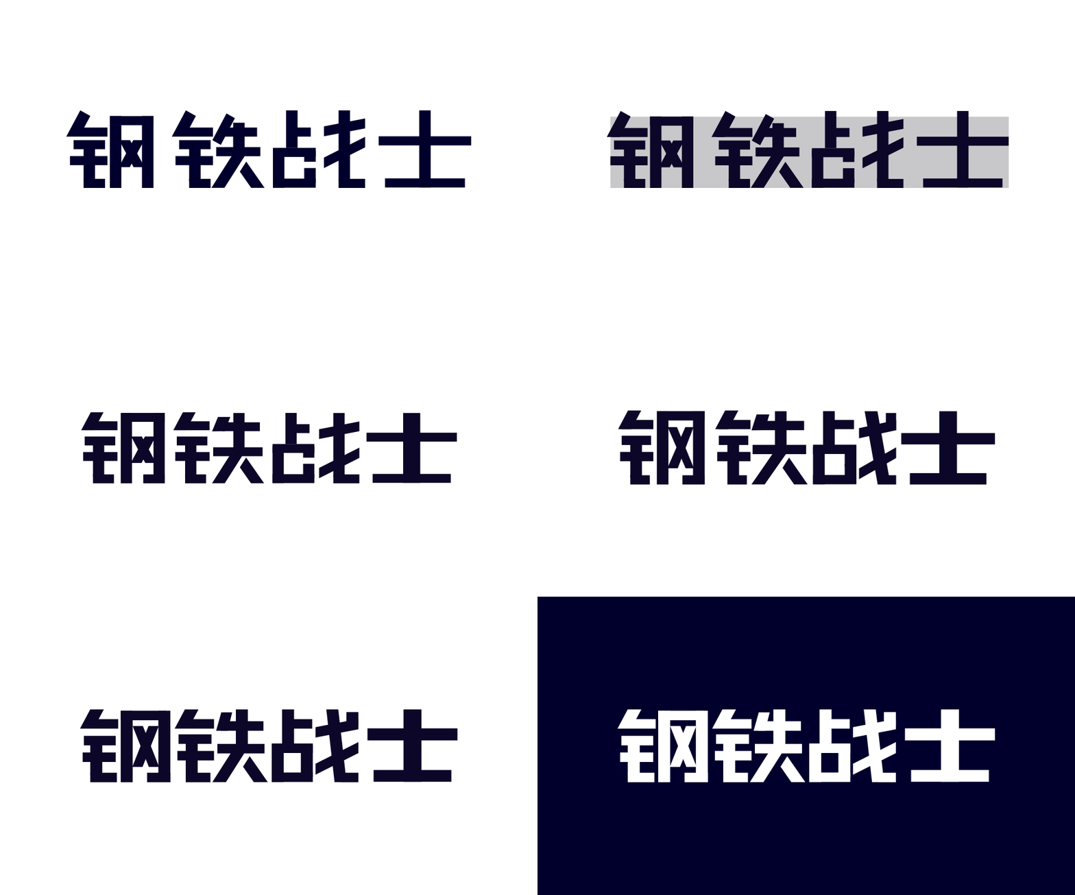
Let's seeGIFprocess

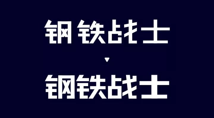
At the end, put a comparison picture before and after modification
Have you learned
The harder you work, the luckier you get.
This is the right path of Pangmen.
Articles are uploaded by users and are for non-commercial browsing only. Posted by: Lomu, please indicate the source: https://www.daogebangong.com/en/articles/detail/Iron%20armor%20steel%20fist%20font%20design%20method.html

 支付宝扫一扫
评论列表(196条)
测试