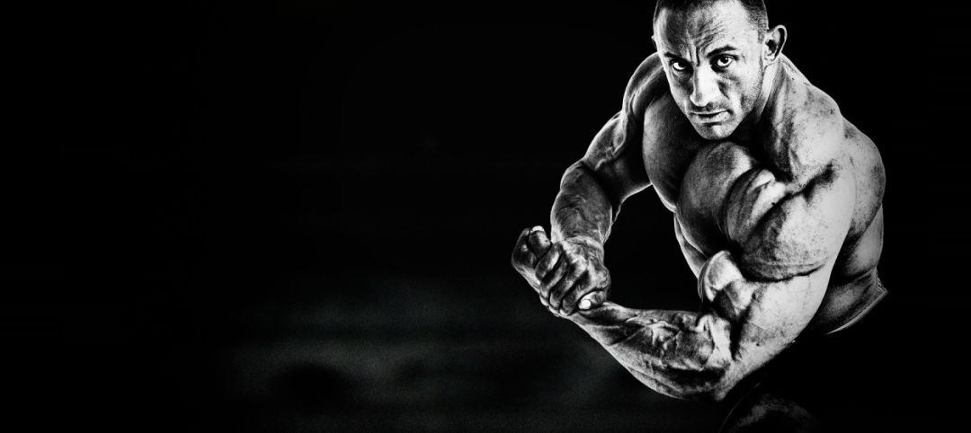
Example:< /section>Male traits:Strong, strong
Applicable font types: Corresponding fonts should also choose some strong, strong, eye-catching, explosive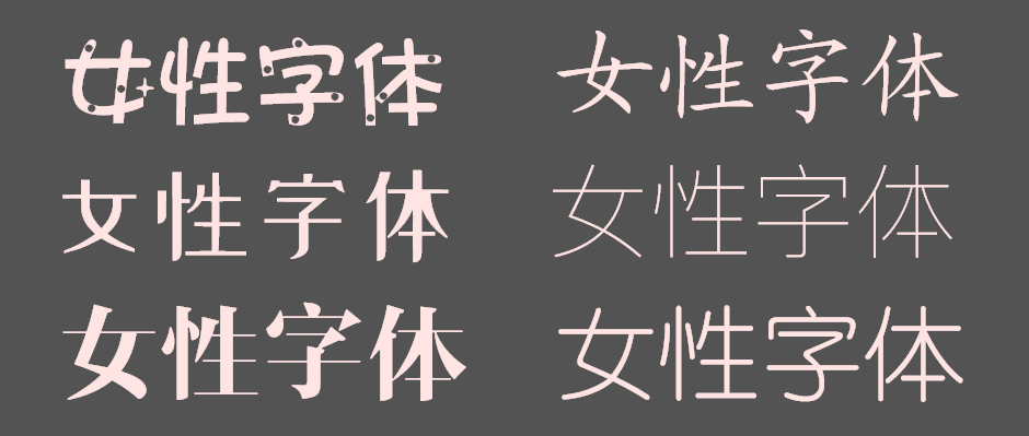
feminine characteristics: sexy, elegant, gentle, etc.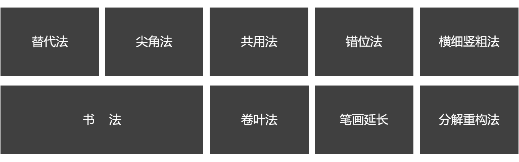
Applicable font type: Women give people the impression of curves and slenderness, so the font should also rely on this aspect . 
3. Design method
The so-called font design is also font deformation. There are many methods. At present, the following types are more common:
Simply speaking, it is based on the copywriting or product characteristics. Some strokes are replaced by anthropomorphic or quasi-object methods to make it more interesting and more in line with copywriting and product characteristics. 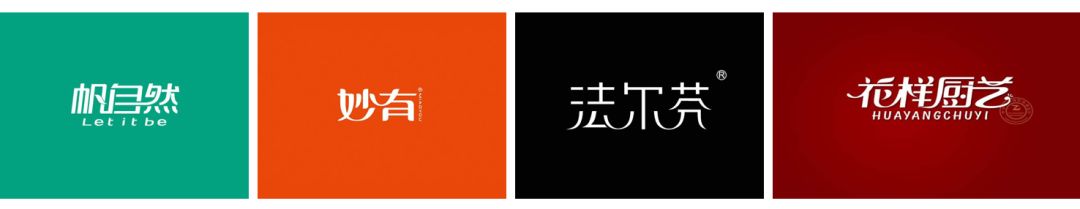
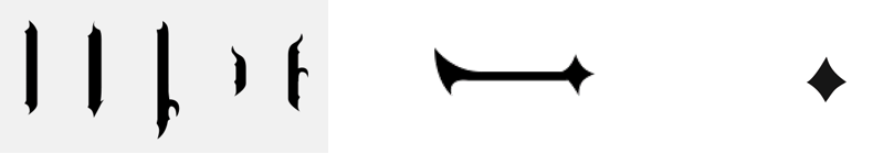
The sharp angle method, as the name implies, is to The font is horizontal, folded, and hooked into sharp corners. This type of font is generally tough and classical. 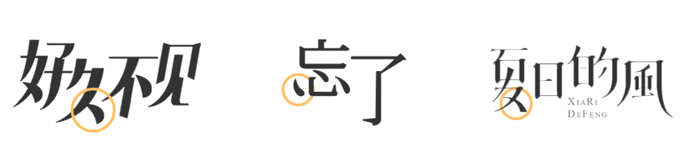
The common method is also called the method of connecting strokes, which is to design the strokes of some fonts together. It is more common. It is worth noting that some special fonts and strokes cannot be connected, so don’t force it, it will appear nondescript~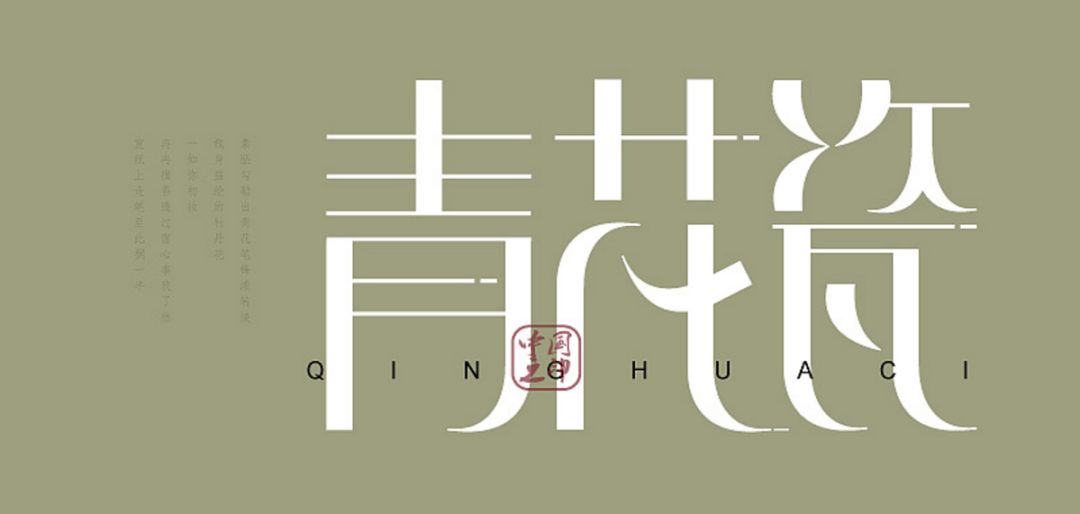
We can understand the dislocation method through the picture below. As far as the text is dislocated up and down, and the center of gravity is kept unified, this design method is relatively simple, so we will not be wordy anymore. 
Horizontal thin and vertical thick methodThe horizontal thin and vertical thick method is easy to understand, the horizontal becomes thinner and the vertical becomes thicker. The contrast between thickness and thickness increases artistic interest. 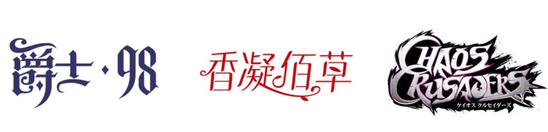
calligraphy
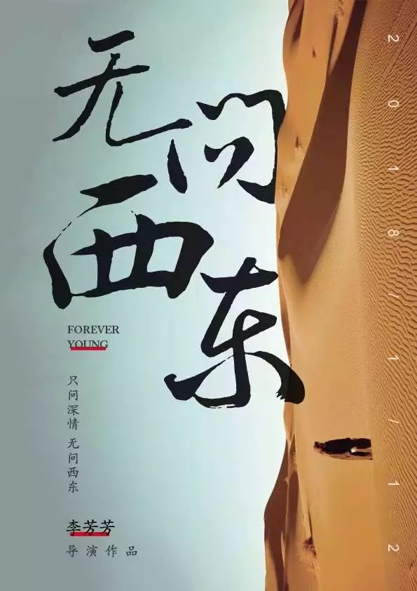
Calligraphic font design looks good, very bold. However, compared with other software word creation methods, calligraphy font design requires certain basic skills, because if you don’t know how to use the brush, the weight, and the structure, the characters you make will not have the artistic conception. 
Leaf Rolling
Curling leaf font design is more common in some European-style font designs. This design will appear more classical and charming. The design is to round and elongate the corners like vines growing freely. 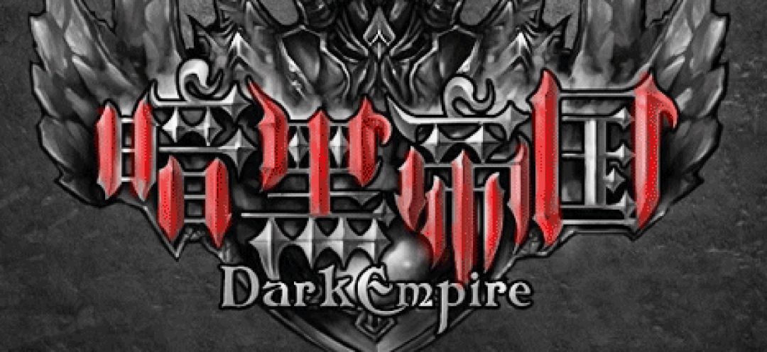
Stroke extension method
This method is similar to the leaf rolling method we mentioned above, and it is designed by extending the strokes. Decomposition and reconstruction method
The decomposition and reconstruction method is to break up and reorganize the strokes of the font, find a reference font blueprint to unify the horizontal, vertical, dot, and right, and then reorganize the design. 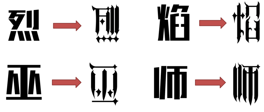
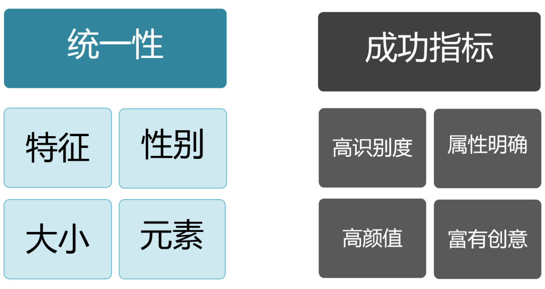
Fourth, what should be paid attention to in font design? 1. Unity
Style characteristics: Unify the overall style of the font, and cannot mix and match styles. Gender: Earlier we said that fonts also have gender , it is necessary to use corresponding emotional fonts according to product characteristics and copywriting to make it more in line with product characteristics. Size: Font design can be based on font characteristics Perform subjective zoom-in and zoom-in, unify the visual proportions, and avoid different sizes. At the same time, you must pay attention to the center of gravity of the font. Elements: When applying elements, be careful not to Putting the moon element in the font theme of Dragon Boat Festival will remind people of Mid-Autumn Festival! Font recognition:< /span>The so-called font design must be carried out in terms of recognition. What we design is not designed for ourselves, and we must ensure that users understand it. The attribute is clear:It is easy to understand, simply put, others can know which industry it is through your font design style Yes, so in addition to the recognition of industry attributes is also very important when designing.
Good looks: Good looking! Looks good! Looks good! Say important things three times! But be careful not to focus on looking beautiful from the very beginning of the design, you must consider looking good on the basis of the first two!
Creativity: Under the condition that all three are satisfied, the artistic value of the font should also be considered!
V. Summary
Today, I briefly talked about the most basic entry rules of font design through four directions. Simply speaking, it is to follow the rules of visual design and follow certain font shaping specifications and design principles to add text Careful overall arrangement, creative shapingWriting with a clear and perfect visual image, so that it can not only express emotions, but also show a pleasing aesthetic feeling. It is not only a relatively independent graphic design form, but also one of the important elements in the design. In these visual designs, it must not only reflect its own beauty, but also achieve perfect harmony with the whole work. Well, I will stop here with you in this issue. In the next issue, we will continue to talk about font design 2-advanced articles
Recommended reading
Designers publish a powerful illustration library for free, for free commercial use by anyone or business in the world
Design, Reflective Work Li Yongquan
tenfive exclusive Beijing designer recruitment groups
Enterprise Recruitment, Designer Looking for a Job, Design Exchange
Please note to add Beijing group
Zhao Liandong Design Studio
Design CooperationWeChat: zhao_design
Studio Packaging Works Click the link

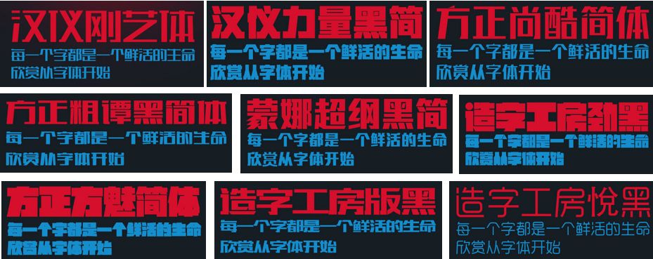
 People who have practiced calligraphy or have a little understanding of traditional Chinese culture should have heard of calligraphy styles such as Yanti, Shoujinti, Liuti, etc. This is the most traditional font design. But the text design is not stereotyped, but should be changed according to the design theme. Therefore, as the theme of the design is different, the style of the font design is also different. Through font deformation, optimization and transformation, or redefine a set of font structure and shape, consider its style, and the desired stroke shape, how to express the characteristics of the font, this thinking The process and behavioral process is called typography.
 支付宝扫一扫
评论列表(196条)
测试