♝Click on the top "Interaction Design School" to follow us, send ebook span>
Introduction and use of iOS 9 fonts
In the blink of an eye, iOS 9 has been released for a month, and Apple has updated the 9.1 system this morning. For UI designers, the most exciting update of iOS 9 is the newly designed Chinese font "Pingfang" and English font "San Francisco".
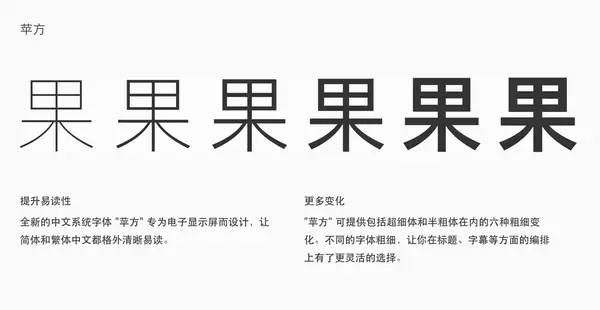
Chinese font "Pingfang"
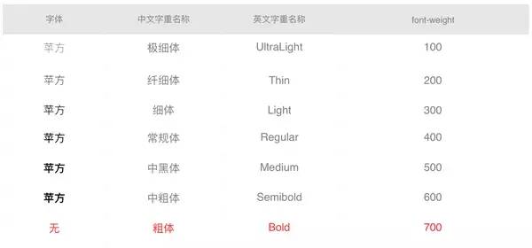
The Chinese font "黑体" before iOS9 has been criticized for a long time: the bell mouth design, only contains 2 weights, not only can not achieve a good display effect on the Retina screen, but also with the introduction of iOS 7 The flat design language and the "black body" with two font weights are completely unable to meet the design requirements. Just last year, Google and Adobe released "Siyuan Heiti" as the default Chinese font for Android. The new "Siyuan Heiti" is not only easier to read on the screen in terms of font shape, but also has 7 font weights, which fully meets the needs of the design. need. Finally, iOS 9 brings a brand new "Pingfang", the font is more "beautiful", and the display on the screen is clearer and easier to read, with 6 font weights, which meets the daily design and reading needs.
English font "San Francisco"
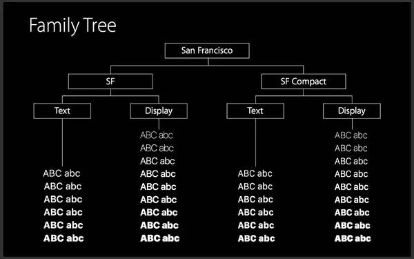
In English, Apple has added a new font "San Francisco" [official website] , this font family contains two fonts: for iOS and OS The SF designed for X and the SF Compact designed for Watch OS are divided into Text and Display respectively, of which the former has 6 weights and the latter 9 (three more italics).
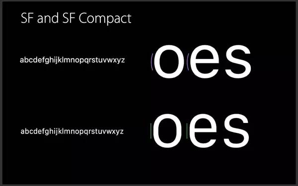
SF Compact is a font specially designed for Watch OS at present. The most obvious difference of this font is the design of the bowl (Bowl). Can improve the readability of fonts.
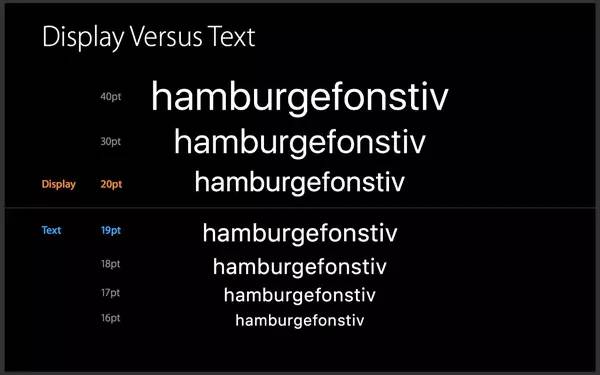
This is special because the SF font contains two, namely: SF-UI-Display and SF-UI-Text. The difference between them is mainly the font spacing. The font spacing of Text is larger, and the smaller The font is more readable.
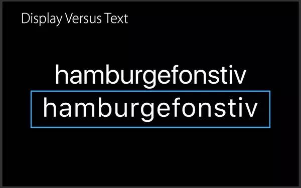
Apple’s suggested usage rule is: use Text if it is less than 19pt, and use Display if it is greater than 19pt. When you use SF fonts in the APP, the system will automatically choose to use SF-UI-Display or SF-UI-Text.
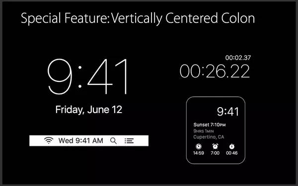
Another feature of SF font is to support the overall centering of symbols, such as time display. The colon of the previous Helvetica was not centered, but the new font can call its API to achieve centering. There are many such features, interested friends can directly go to the official website to check [official website].
Font usage rules and practical problems
Chinese font usage (font selection and font calling name)
If you have installed the latest El Capitan (10.11) for Mac, this font is already included. Older Apple systems or Windows users need to download it by themselves. The English name of the Simplified Chinese font is "PingFangSC", and there are 6 font weights to choose from. Now many apps are embedded with Html 5, so how to choose the font weight when designing? In Html, we choose Font-Weight to set the thickness of the font. The figure below shows the relationship between the thickness of the font and the number of Font-Weight:
Adjustment of the old design draft
If the "Heibody-Simplified" used in the design of the app before has two font weights: thin and medium, the corresponding ones can be adjusted to the square's thin and regular or medium bold, why is there a " or "? In fact, the medium weight of "黑体-简" is a bit thick, because this weight is directly used by the medium bold of "Chinese Blackbody"!
Font rendering issues
Now the mainstream of UI interface design is to use Photoshop and Sketch. In addition to the choice of fonts, how can the design draft be closer to the real rendering effect of the iOS system? We need to pay attention to two points: rendering method and font size selection.
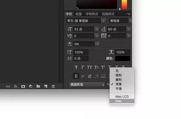
1. Select Pingfang font in PS, and select "Mac" as the rendering method
2. Sketch uses the default rendering method of Mac, so there is no need to choose it, but it has problems with Chinese, as shown in the picture below (above), the solution is: open Perferences → General and uncheck Font Rendering Normal.
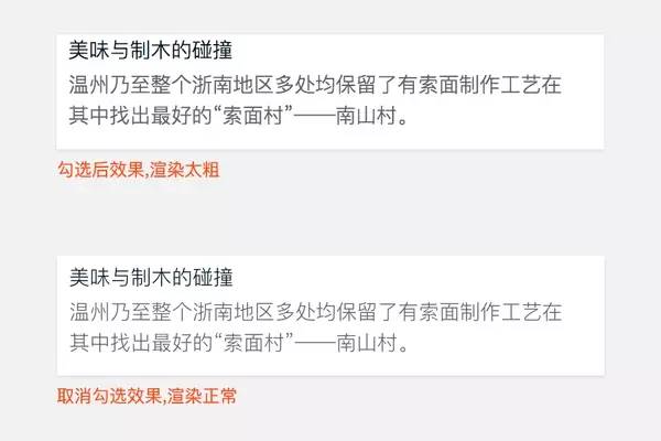 Sketch rendering comparison
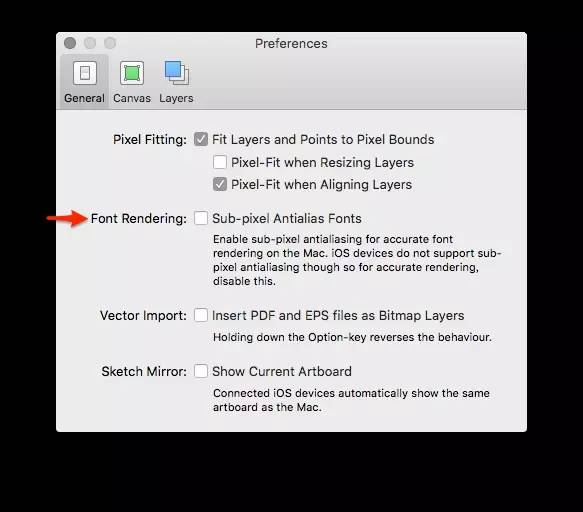 Sketch settings (Sketch 3.41 has changed the settings to the second option "Canvas")
English font usage
1. The difference between SF Compact and SF fonts, Watch OS uses SF Compact
2. Font selection for different font sizes, if it is larger than 19pt, choose SF-UI-Display, if it is smaller than 19pt, choose SF-UI-Text
Author: Xu Jiangping
Reply 003 to see the catalog of the best articles from August to December
Add WeChat 18605817040, and learn to interact with old D. I will post more good articles in Moments.
In addition, novice friends can ask questions, but only 3 questions.
Welcome to contribute: anhejiao@126.com
Articles are uploaded by users and are for non-commercial browsing only. Posted by: Lomu, please indicate the source: https://www.daogebangong.com/en/articles/detail/Introduction%20and%20use%20of%20iOS%209%20fonts.html
 支付宝扫一扫
评论列表(196条)
测试