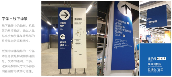
The size of materials and equipment in the offline scene is based on ergonomics as a reference. Under different positions, different distances, and different angles, the material type, layout structure, text level, font size, and word spacing are all different. affect the transmission of information to users.
1. Principle
1. Dynamic and static
People read information content in the offline environment into static and dynamic. When at different reading distances, the viewing angle of the material will also be different.
According to the data of "Ergonomics" and "Fogg Behavior Model": When a person enters the red dot position of the static sight distance from the dynamic sight distance, that is, the human eye can clearly see a target and obtain a visual impression, Average time is 170 ms, single word is 250 ms.
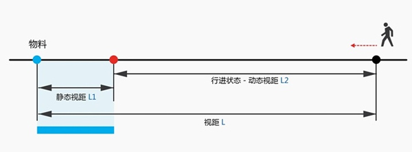
As the travel speed increases, the angle of view will decrease with the increase. Therefore, fast reading in a state of motion should avoid causing users to "look back" or "saccade".
Looking back: In the process of reading, when people encounter something they don’t understand, they quickly and unconsciously look back at the previous content.
Saccade: In the process of reading, when the fovea of the eye moves from one word to another, the eyelids suddenly tremble for 0.1 seconds.
Under the principle of "dynamic and static", we need to distinguish the status and time of receiving information from materials and people, such as "long distance + high viewing angle + and mostly viewed in a moving state" large vertical banner It is forbidden to present multiple information.
2. Angle of view and viewing distance
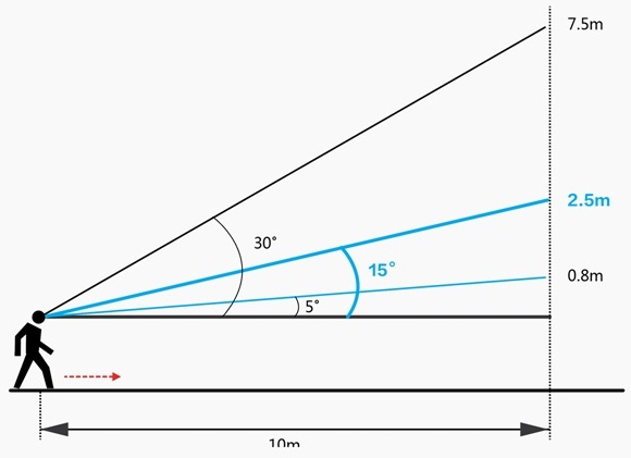
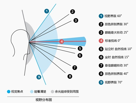
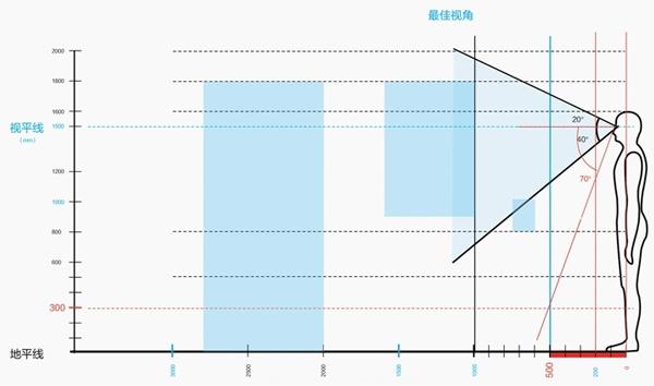
In a static state, the horizontal visual focus of a person is between 3°-10°. The best eye rotation is 25° above the horizontal line and about 35° below.
The image outside this viewing cone (the gray part) is the area searched by peripheral vision and perceived by peripheral vision, which ranges from 60° above and 70° below the horizontal viewing angle.
Taking a female user with an average height of 1.6 meters as an example, the range of information transmitted by the three materials (desk cards, posters, roll-up banners) with different viewing distances is different under their best viewing angles. When the line-of-sight is 0.5 meters, combined with the previous "field of view distribution map", we can roughly get its visual blind spot: 0.35 meters above the horizon.
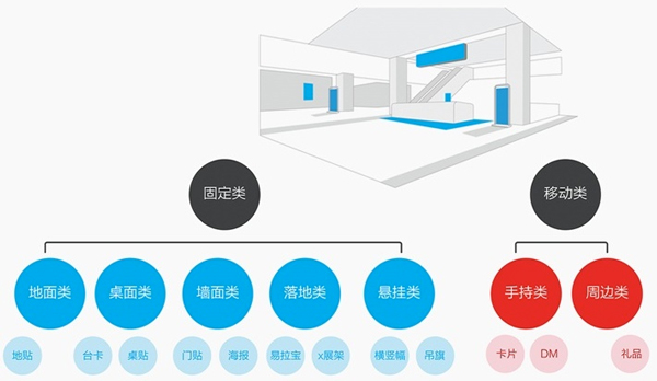
These three "representative materials" are obtained based on the classification and selection of Alipay's offline materials in various industries. There are two general categories: fixed and mobile, and the fixed can be subdivided into 5 Types: ground type, desktop type, wall type, floor type, suspension type.
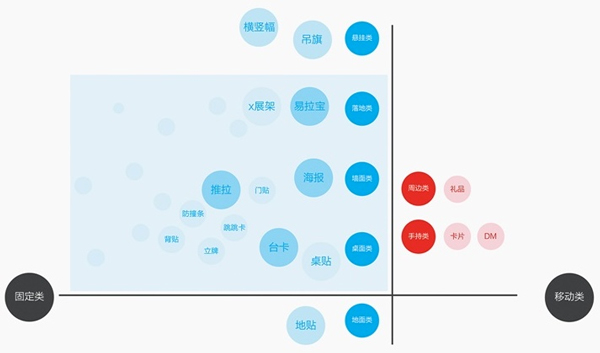
Put all these materials into the cross quadrant, from the "ground" to the "top surface of the desktop wall", and then look at the current focus: three types of materials: desktop, wall, and floor , and the most representative of these three categories are: Taiwan cards, posters, and roll-up banners. Therefore, the following "Principles & Norms" will focus on these three types of cases for analysis.
3. Order and rhythm
From the conclusion - function - detailing the "inverted pyramid" structure, it can quickly and effectively convey information to users in a short period of time in offline scenarios. The information is grouped and sorted according to the degree of importance, so that the information can be transmitted more easily.
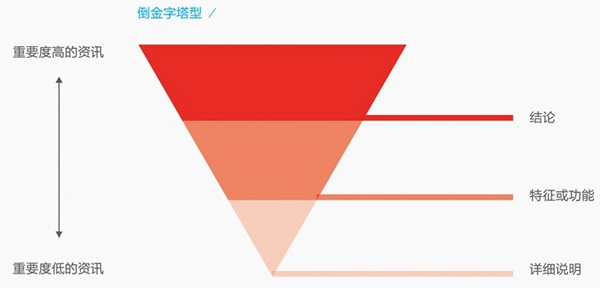
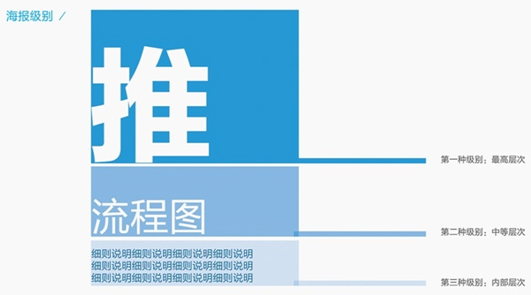
Taking poster-level material as an example, the layout should have three levels of information: "Top level headline - middle level flow chart , Functional Diagram——Low-level Instructions” Decrease rhythmically in sequence; the difference between each level may be extremely obvious, mainly depending on the type of material (layout size), one level may be very huge, while another level may be extremely large small.
4. Recognizable and easy to read
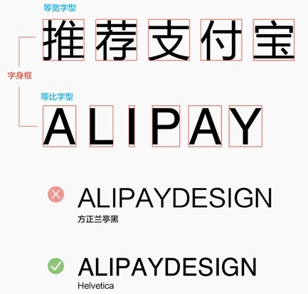
Chinese and English fonts are monospaced and proportional (different text widths). Text in proportional fonts has different widths, and the kerning will be automatically adjusted when typing. Therefore, when arranging numbers (English) fonts:Do not use Chinese fonts to input;
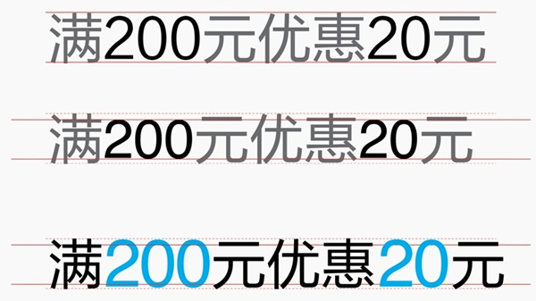
Under the same font size, numbers will be smaller than Chinese, according to the principle of "easy to read", it needs to be adjusted to a highly consistent visual balance.
5. Balance and contrast
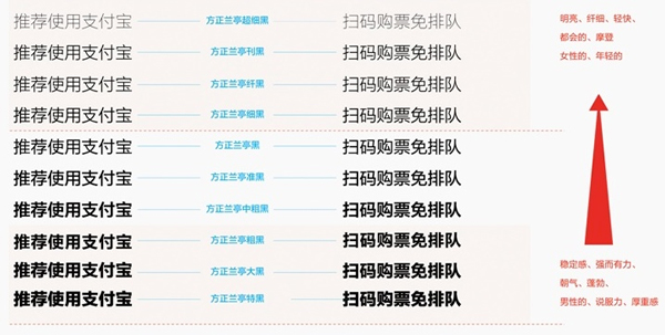
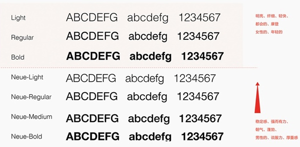
The font family of the Founder Lanting series provides at least 10 fonts with different weights. We use font families to maintain balance, and through the relationship between strength and weakness of different font weights, the parts that emphasize contrast (contrast) and the parts that coordinate (balance) coexist in the same layout, and the proportion of weight and thickness can be used in common. "Fonts family".
As shown in the picture, the more you go up, the more bright, light, urban, and modern you feel, and the more you go down, the more stable, persuasive, and heavy.
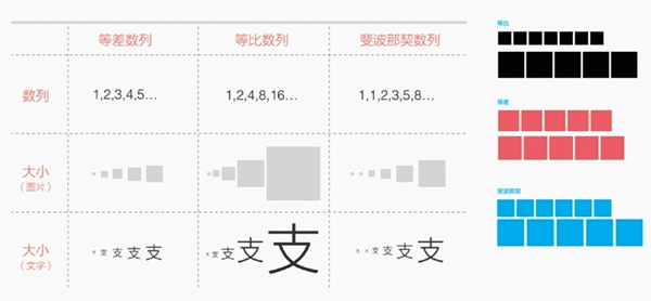
When setting different text sizes, if you are confused about how much difference should be presented, you can think about it in terms of "equal ratio", "equal difference" or "Fibonacci".
These three comparisons can help us think about what kind of gap relationship should be presented. When it is necessary to make the main and subtitles have a clear size difference, we can use the "geometric sequence" with the largest gap.
6. Alignment and space
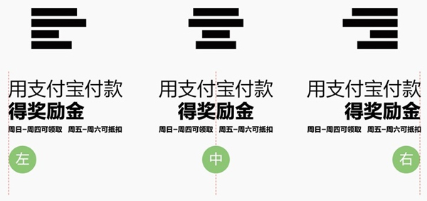
Text can be set in different alignments:
Left alignment: align at the beginning of each line
Right alignment: align at the end of each line
Center Alignment: Centers the axis at the middle of the paragraph width
The negative space left by the center alignment can easily lead to discontinuous and interrupted gray value appearance if not handled properly. So setting text to "justify" can produce a clean, geometric typographic effect. Following the "kerning" of Specification 2 or the "Schematic Method" of Specification 7 are helpful for evasion.
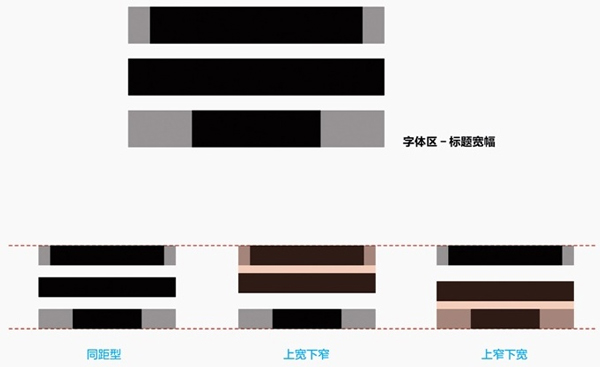
According to the above-mentioned "six principles" of offline font application, we have refined them into seven specifications: font size, word spacing, line spacing, punctuation, etc.
Second, specification
1. Font size
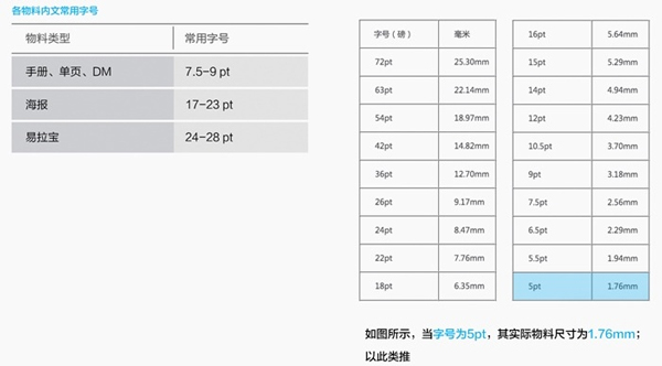
According to the ergonomics mentioned in "Principle 1" and the data of the Fogg behavior model, the setting can refer to the data as shown in the figure below.
Take the most commonly used materials as examples:
Headline: The font size varies according to the number of characters. It is best to obtain information with no more than 5 characters in a row of characters; no more than 9 characters are prohibited.
Internal text: The commonly used word level for brochures, single pages, and DMs is not less than 7.5-9pt; the commonly used word level for posters is not less than 17-23pt; the commonly used word level for roll-up banners is not less than 24-28pt.
2. Kerning
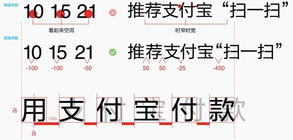
Chinese: When setting the width of a single word as a, it is recommended that the maximum limit of word spacing should not exceed 1/2a.
Numbers: There will be "holes" or "crowding" before and after some numbers, and appropriate adjustments must be made by visual inspection.
Punctuation: If there will be a huge space between the "quotation marks", which will destroy the overall gap, it also needs to be reduced visually according to the actual situation to achieve visual coordination.
3. Line spacing
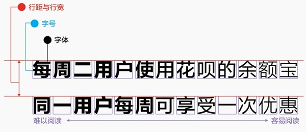
The optimal line spacing of the text is about 1.5-2 times the font size.
If the material layout is tight and the amount of information is particularly large (such as event rules, instructions, etc.), it can be appropriately reduced to 1.2-1.5 times the font size.
4. Prohibited text symbols
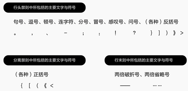
The main words and symbols included in the line header prohibition: period, comma, comma, hyphen, semicolon, colon, exclamation point, question mark, (various) back brackets.
Separate the main words and symbols included in the prohibition: (various) parentheses.
The main words and symbols included in the end-of-line prohibition: double dashes, double ellipses.
5. Jump ratio
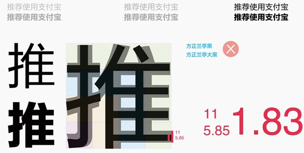
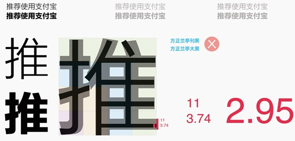
Select Fangzheng Lanting Dahei, which has a large font size and is suitable for reading, from the font family, and compare it with Publication Hei, Thin Hei, and Hei. The jump ratios are:
Black vs Big Black: 1.83
Janhei vs Dahei: 2.95
Small black vs big black: 2.04
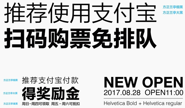
For the main and subtitles under the same font size, the best jump ratio is 1:2, which is Founder Lanting Thin Black & Choose Fangzheng Lanting quasi-black (black) & target Lanting Dahei.
6. Justified
On the basis of following the font size and word spacing, make corrections based on the width of the headline.
According to the type of material, the number of Chinese characters in the headline (one line) on posters and roll-up banners is preferably within 5 characters; no more than 9 characters are prohibited.
When the title is being aligned and corrected, if the maximum limit of "kerning" has been reached (standard 2), the "iconic" method (standard 7) can also be added.
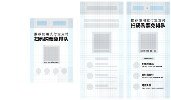
7. Graphic
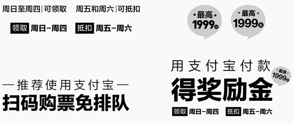
The three most common ways:
Method 1: Frame the text to be conveyed
Method 2: Numbers are enlarged and expressed in English fonts; integrated into a single unit for configuration
Method 3: Add graphic symbols
Echoes the negative space processing after "center alignment" in "Principle 6", except for "kerning adjustment, adding graphic decoration" and other methods to adjust to "alignment at both ends".
Articles are uploaded by users and are for non-commercial browsing only. Posted by: Lomu, please indicate the source: https://www.daogebangong.com/en/articles/detail/Internal%20Tutorial%20Ultradetailed%20Alipay%20design%20specifications%20for%20offline%20fonts.html

 支付宝扫一扫
评论列表(196条)
测试