

The rapid development of Japanese typography industry>>
As Japan's economy developed rapidly after the Meiji Restoration, new typography techniques emerged. >
In the 1980s, with the rapid development of computer technology, Morisawa Corporation of Japan created an international font design competition after occupying the computer font market. Tons of great designers and fonts. >>
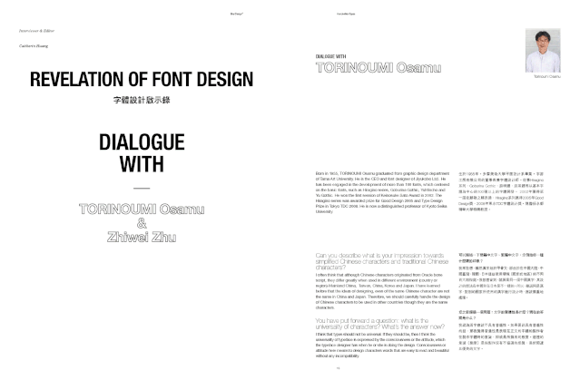
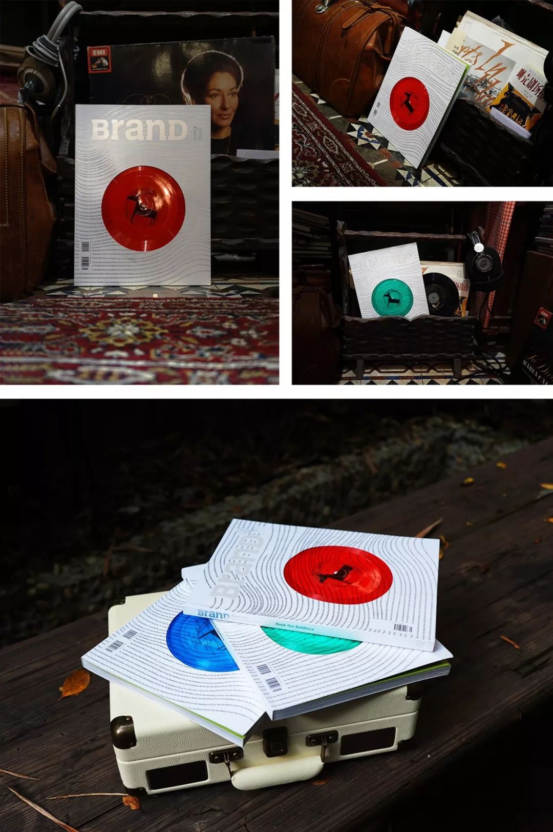
 The interview works of Osamu Tokai are included in BranD37 issue, sold out△>
Word Tour Workshop:>>
Torikai Osamu and Suzuki Tsutomu founded "Ziyou Studio" in 1989, and successively developed the "Yu" and "Yuzhu" series of Ming Dynasty styles. >>>
These typefaces are elegant and elegant, and are known as the best inheritors of the early Tokyo Tsukiji letterpress typefaces. The “Hiragino” series of Ming Dynasty fonts developed later has a more modern style. >>
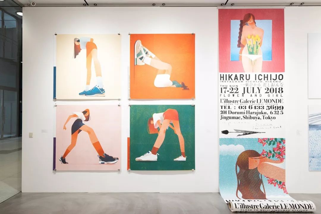
 Furuhira Masayoshi's font poster design work △>
It's no secret that Nobusuke Sato is another figure in the world of Japanese type design that cannot be ignored. >
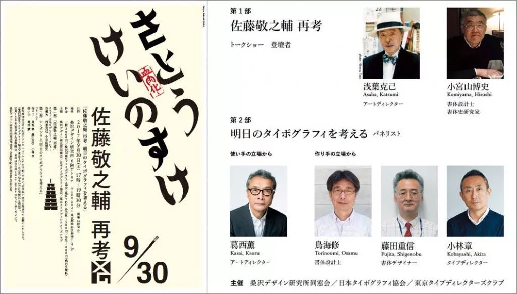
He not only designed many excellent fonts, but also trained a group of designers, including Katsumi Asaba, one of the founders of Tokyo TDC. >>
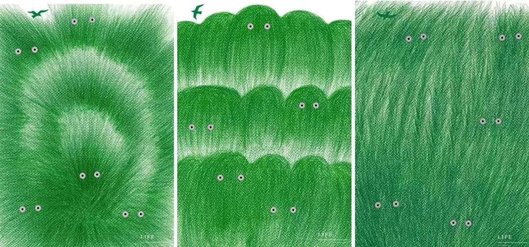
 Mitsuo Katsui’s font poster design work △>
The "Japanese Character Design Series" written by Sato laid the cornerstone of Japanese font design and is known as an insurmountable model. >
The achievements of Japanese designers in this field are remarkable, mainly due to their reverence for characters. Their works all reflect the designers' love, respect and dedication to fonts. >
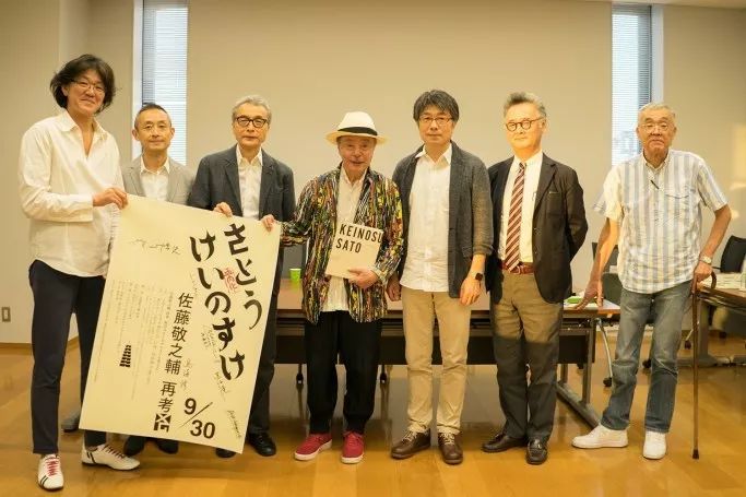
 Famous Japanese font designers organized to participate in a design analysis activity with the theme of "Rethinking the Typography of Nobusuke Sato" △>>

This kind of sincere enthusiasm has also been passed down from generation to generation over time. >
There are many graphic design awards and font design awards in Japan, and the categories of awards are also very refined. In order to continuously discover and cultivate outstanding young designers, it has continued to this day. >>
>
The Japan Graphic Designers Association (JAGDA), the national graphic design organization in Japan, established the JAGDA Awards in 2008. >>>
JAGDA is the Japan Graphic Designers Association founded by Yusaku Kamekura, one of the founders of modern graphic design in Japan. It is the highest association of graphic design in Japan and the only national organization of graphic designers in Japan. >>
 JAGDA Awards 2019 Winners>△>
JAGDA Four Awards:>
>
JAGDA, founded in 1978, is the largest design agency in Asia with about 3,000 members, and is carrying out various activities in Japan through design, such as holding, design education. >
JAGDA selects the winners of the Kamekura Yusaku Award, JAGDA Award, JAGDA Newcomer Award, and JAGDA Poster Award every year to commend young designers for their novelty and high Quality design. >>

JAGDA Newcomer Award:>
In 1983, the JAGDA Newcomer Award was established to recognize young graphic designers and make the graphic design industry more dynamic. The award has always attracted the attention of design and advertising professionals, producing more than 100 designers who are active as designers at the forefront. >
Taku Sato, Kenya Hara, Kashiwa Sato, Gaku Mizuno, Atsuki Kikuchi, Yoshiaki Irobe, Daiko Daigo, Atsushi Hirano... have all won this award award. >>
 JAGDA Exhibition△>
JAGDA Awards:>
The JAGDA Award was established in 2008 (originally named: JAGDA Category Award), it was established to commend and record outstanding graphic design works of each year, and it is also one of the important activities of JAGDA . >>
The main categories are: posters, packaging, news advertisements, environment and space, interaction design, video, etc.>
 Nagai Kazumasa won the JAGDA Annual Poster Design Award for 2 consecutive times△
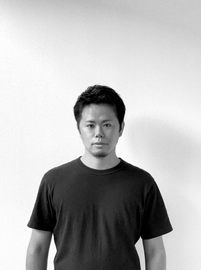
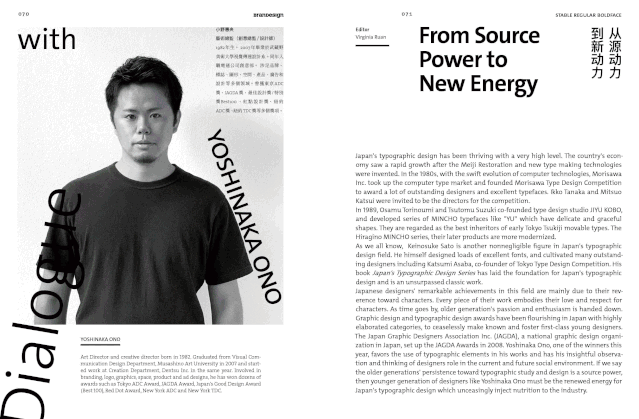
One of the awardees this year, Keio Ono, won the JAGDA Award for News and Advertising with her work "SINCE1995". >This time BranD magazine will invite Ono Huiyang to talk about his award-winning work "SINCE1995". >
>
Prefer using font elements for authoring:>
Emi Ono, born in 1982, graduated from the Visual Communication Design Department of Musashino Art University in 2007, and prefers to use font elements to create. >>
Joined the creative department of Dentsu in the same year. Involved in the fields of branding, logos, graphics, spaces, products, advertising and design. He has won many awards such as Tokyo ADC Award, JAGDA Award, Best Design Award/Special Award Best100, Red Dot Design Award, New York ADC Award, and New York TDC Award. >
 BranD>△
If the older generation’s dedication to font research and design is a source of motivation, then the younger generation like Ono Keiyo is the new driving force for Japanese font design, constantly injecting vigorous energy into font design. >
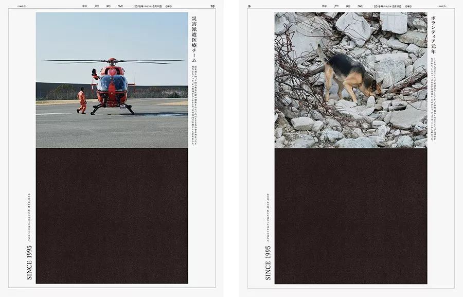
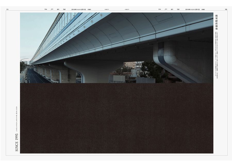
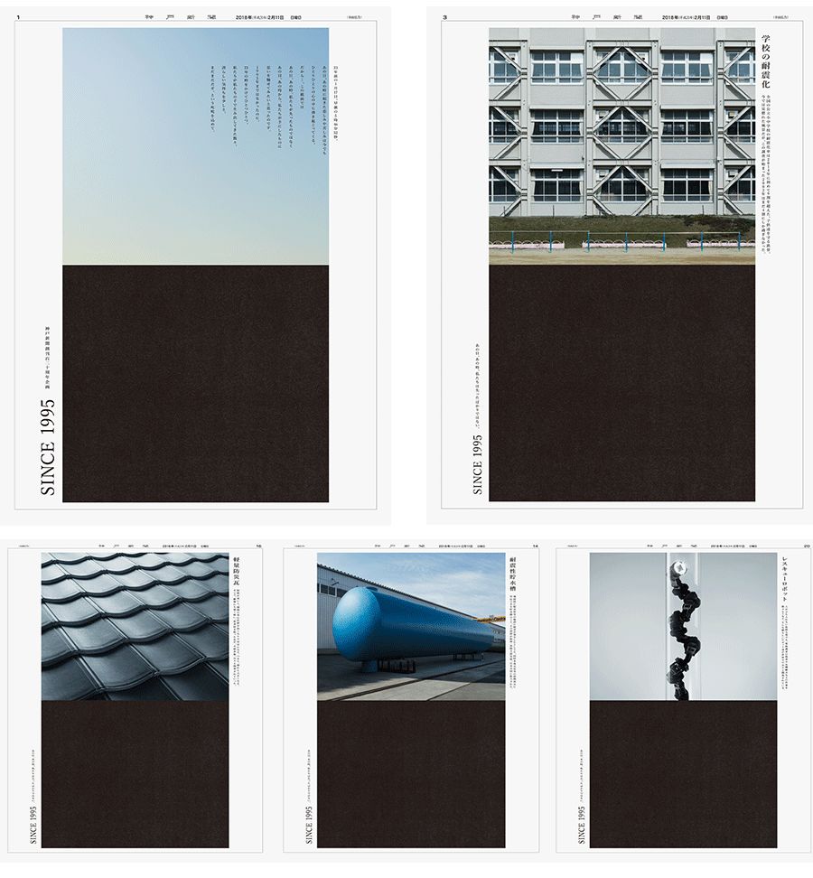
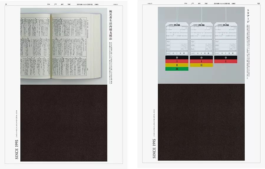
On February 11, the anniversary of the founding of the Kobe Shimbun, he published a special issue in commemoration of 1995, using 20 pages to visually present the changes and developments since 1995 due to the Great Hanshin-Awaji Earthquake created things. >>
 The winning entry "Since>△
Q: With your work "Since1995", you became the winner of this year's JAGDA Award for News and Advertising. Can you tell us about the charm of this work? >
A:>This is a special project led by "Kobe Newspaper" to review the "Great Hanshin Awaji Earthquake" in 1995. On the upper and lower pages of the newspaper, a comparison was made between the reconstructed present and the time of the great earthquake. >
 The winning entry "Since>△
The upper part is a photo of what people have created over the past 23 years, with the corresponding name and description added on the right. >>
The lower part uses a black rectangle to express the impact of the earthquake and the lack of technology and countermeasures, and adds a label and the words "SINCE1995" on the left. >>
>
>
 The winning entry "Since>△
“That day, that moment, we experienced more than loss.”>>
The purpose of our project is to let everyone not only feel sad when looking back on the earthquake, but also to bring the pride of the achievements we Japanese have accumulated little by little after experiencing the tragedy, and will This turns into energy for future progress. >
Design uses impersonal, non-decorative design and typography. >The contrast of a neutral photo with a restrained mood and a punchy, bold black rectangle creates a unique atmosphere. >
Q: The JAGDA award is a kind of recognition and honor. Can you share your feeling of winning the award and let everyone know about your growth? I'm sure everyone would love to hear your experience sharing. >
A:>I am very happy to receive the JAGDA Award. >>>>
But I don't design for awards, so there is no path to awards. Just as always, do it with your heart and try to interpret the theme you are facing perfectly, then you may reap very good results. >>
>
>
Q: Your works have always been recognized. In addition to graphic design, you have also been involved in product design. What kind of positioning or goals will you give yourself in your future design career? >
>
A:>Keep trying different things so that you don't get bored and feel happy all the time. >>
>
Anything can be done if you try. I have always held these two ideas, so my work has not been limited to the field. >>
Recently, I used adobe's illustrator (AI) to design my own home. Overhead view, elevation view, electrical wiring diagram, etc., from buildings to furniture, all drawings are completed. >
Generally people think that this kind of work should be done with CAD, but in fact, AI is more detailed in coloring, which makes it have a unique style. >Especially there are no rules about what the future must be. The work in front of me is naturally connected to the next one, that's how it feels. >>>
>
>
Q: With the development of technology, the medium of design is constantly changing. As designers, do we need to make any changes to cater to the development of society? What do you think future graphic designers should think about? >
>
A:>I think the more tools available, the better. But it's a bit of a waste of time learning how to use a tool that's constantly being updated and perfected. >
Tools are always just a means of media, therefore, in order to achieve the goal must be implemented ideas, as well as to improve and maintain the necessary visual design modeling ability no matter what tool is used, etc. are also very important. >
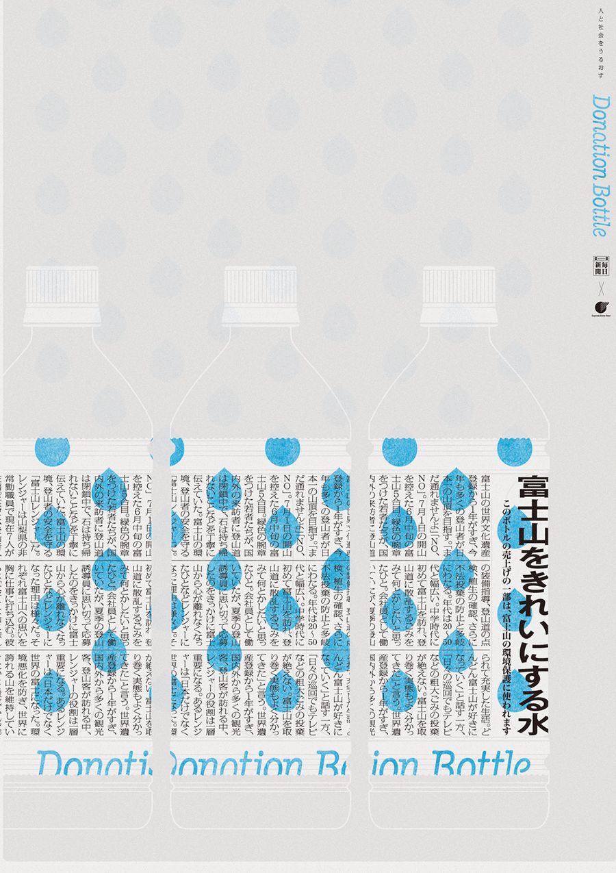
Q: The theme of this issue is boldface, and the headlines in the work "NewsBottle" also use boldface. How do you describe the feeling of boldface? When would you consider using boldface? >
>
A:>First of all, NewsBottle is a water bottle packaging design that accurately reproduces the format of the existing newspapers of the Mainichi News Agency. Therefore, the title uses boldface and the body uses Ming Dynasty font, not my choice of font. >
>
Generally speaking, boldface is used when you want to give a neutral impression. >>>>
Compared with Owen movable type and movable type (lead font), boldface is more casual, and the emotions it brings are weaker, giving people a dry feeling. >>>
Having said that, in boldface, there are also many soft shapes, hard ones, and strong characters. In addition, even with the same font, depending on the combination of text size, text spacing, line spacing, etc., the impression will change drastically. Therefore, I find it a bit difficult to say something about the bold font. . >>
>
>

 >>Transaction Guarantee>>BranD Magazine>>>>BranDNO.45 Issue >>>>>Mini Program>>>>
Articles are uploaded by users and are for non-commercial browsing only. Posted by: Lomu, please indicate the source: https://www.daogebangong.com/en/articles/detail/Inside%20the%20Japanese%20Type%20Design%20Boom.html
 支付宝扫一扫
评论列表(196条)
测试