Data visualization in business presentation scenarios has become a business language. It is not only a direct presentation of the analysis results, but also a comprehensive understanding of the relevant situation. We often see some industry analysis reports analyze various relationships from different angles and in-depth analysis. Professional data visualization embodies the rationality and logic of the presenter, and also reflects the professionalism of the workplace.
01-
What is data visualization< /h2>
Data visualization is actually telling a story with data
Data visualization consists of real data, aesthetic design and complete story logic:

These three items are not only components of data visualization, but also an essential part of the visualization process:
Data Analysis
Connect and correlate data that is intricate and seemingly unexplainable and unrelatable, and gain insights and value that are more commercially valuable.
Visual Design
As the terminal integration and graphic processing link of data analysis, invisible data phenomena are transformed into visible graphic symbols, and the connotation of data is described in a graphic language that the public can understand.
Storytelling
In addition, visualization requires a story-telling logic, from a macro problem to in-depth and detailed aspects of the problem, and finally to a convincing result.
The visualization of data is very different from the visualization of other information. The tool of data visualization is more prominent, and the requirement of logical level is stronger. The key point of its production lies in the chart, but it is outside the chart. In many cases, it is not just drawing a simple chart but visualizing it. The real core of data visualization is to describe the status, find problems and solve problems through chart tools.
02-
Data Analysis
Look at phenomena with data
Everyone in the kitchen knows that good ingredients are more critical than cooking techniques, just as data is the premise and foundation of visualization.
1. So, how to understand the data?
Data research expert Viktor Mayer-Schnberger once famously said: The essence of the world is data.
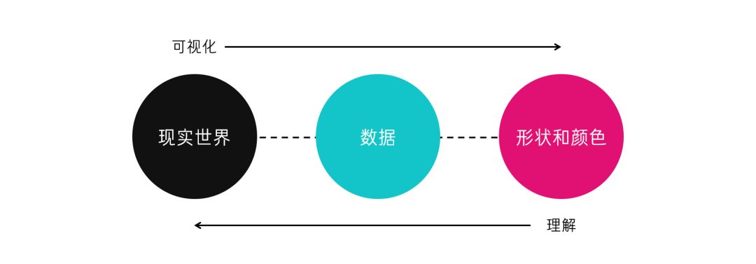
Data reflects the real world, and when we analyze and visualize them, we get not only the relevance of the data, but also what is happening around us. These stories, in turn, can help solve real-world problems.
To some extent, data is a simplified and abstract expression of the world. We try to quantify the world by collecting, organizing, and analyzing data, and describe the world in a graphic language that the public can understand, and finally realize the purpose of understanding natural phenomena, discovering the laws of social operation, and disseminating them.
2. What can the data tell us?
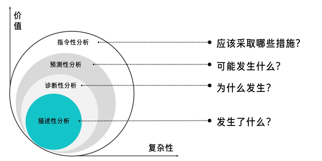
The process of understanding data is the process of data analysis, discovering problems and finding solutions through data. Although data analysis has multiple links of acquisition, processing, analysis and presentation, and the process is cumbersome, it is ultimately to answer four questions:
1) What happened?
2) Why did it happen?
3) What might happen?
4) What measures should be taken to address these problems?
03. What is the process of data analysis?
A typical scenario is that when we formulate a development plan, we need to do research, analyze industry data, and quantitatively judge whether the decision-making follows business laws based on real data information.
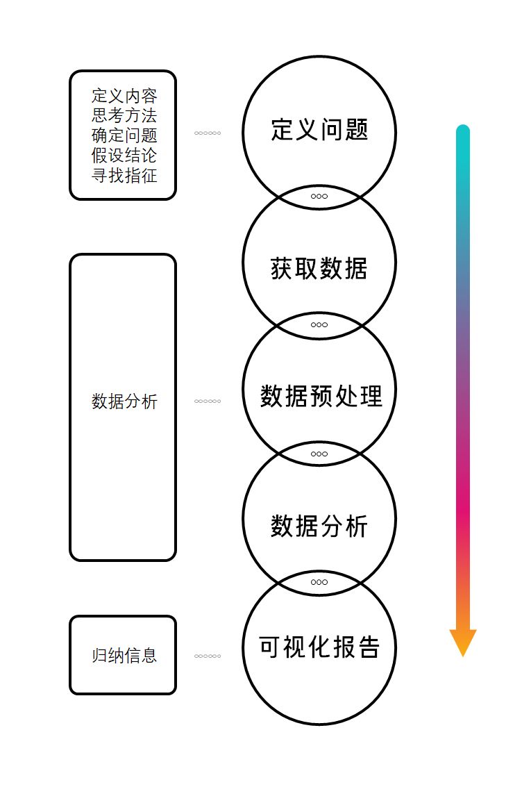
The basic idea of a decision-making program research is as follows:
Defining content: decisions about what to make
Thinking method: how to achieve (that is, the solution to the problem)
Determine the question: research purpose (what kind of questions do you want to answer)
Hypothetical Conclusions: Answers to Questions (Hypothetical Conclusions)
Look for indications: what kind of data to use to answer questions (quantitative indicators and capacity)
Data analysis: collecting, organizing and analyzing data
Inductive information: what is the fact (phenomenon and reasons behind it)
Using this way of thinking to analyze problems can connect decision-making with facts, and use facts to judge whether decisions are correct or not. Data can describe facts and answer hypothetical questions in this process. This is actually the application of typical structured thinking in business scenarios.
In general: decision-making (conclusion) first, hypothesize and decompose the problem according to the conclusion, summarize the influencing factors to determine the data index, and then find relevant data to analyze the logical relationship between the data.
This data-oriented solution analysis idea is widely used in our daily program writing. In addition, there is also a problem-oriented analysis scenario:In actual operation, after the financial data report finds a business problem, the problem is analyzed Do a delimiting analysis.
Problem-oriented visual analysis ideas should include the following parts:
Clarify the problem: what problem is encountered and what is the most direct data reflection
Think about cause and effect: what factors caused the problem, what are the key indicators (quantitative indicators)
Looking for data: Collect and organize performance data for each key factor
Data analysis: comparative analysis, to define the reasons
Propose a plan: give a targeted solution summary report: customize the data visualization plan
First, start from the overall operation
Identify the key factors that affect closing and performance. For example: effective list, demo quality, customer service, product attributes, etc., correspondingly look at the performance of KPIs corresponding to these key factors, analyze the key factors in depth to determine what factors lead to the failure of performance, and discover and dig out the performance that leads to the failure to meet the standard root causes and problems.
Second, comparative analysis
Observe the performance of KPIs corresponding to the key factors throughout the year one by one, and compare the KPI differences corresponding to the key factors corresponding to the month with the highest transaction performance and the month with the worst transaction performance, so as to quickly locate which aspects and factors lead to performance failure. Then it can drive and help the department to improve in a targeted manner.
Third, based on these problem factors
Make targeted improvements and explore solutions to improve performance. Based on the resulting answers, data visualization solutions are tailored to meet the specific requirements of each decision maker. Summarizing the above two ideas, we can get the flow of data analysis:
/Data Analysis Process/
There are many professional terms and methods involved in the analysis process, and it is required to master basic data processing tools, and some links even require programming. There are many related software, such as Excel, SPSS, R, etc. The technical methods involved can be searched and understood by yourself. The software is only a means to achieve the purpose of analysis. The analysis ideas and methods are clear, and the corresponding operations of excel can be directly displayed on Baidu.
03-
Visual Design
Telling Data with Graphics
After the data analysis, we got the data and preliminary conclusions, but the information is too primitive and complicated to be communicated to others, so it is necessary to visualize the data to form a visual report.
1. Principles of Data Vision Design
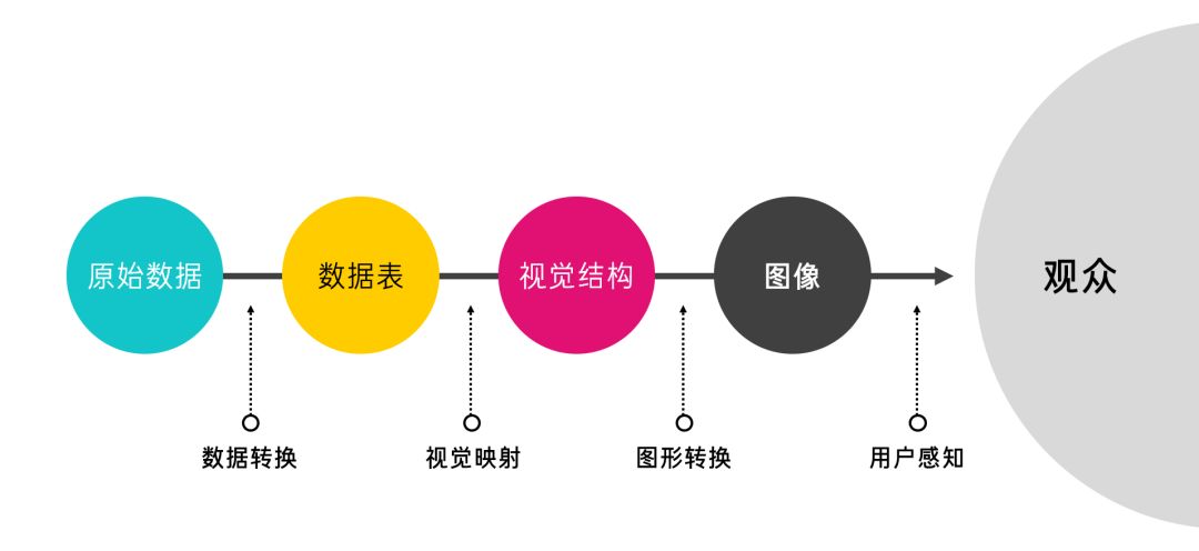
The visual design of data is the process of using graphics to describe data. The basic principles are shown in the following table:
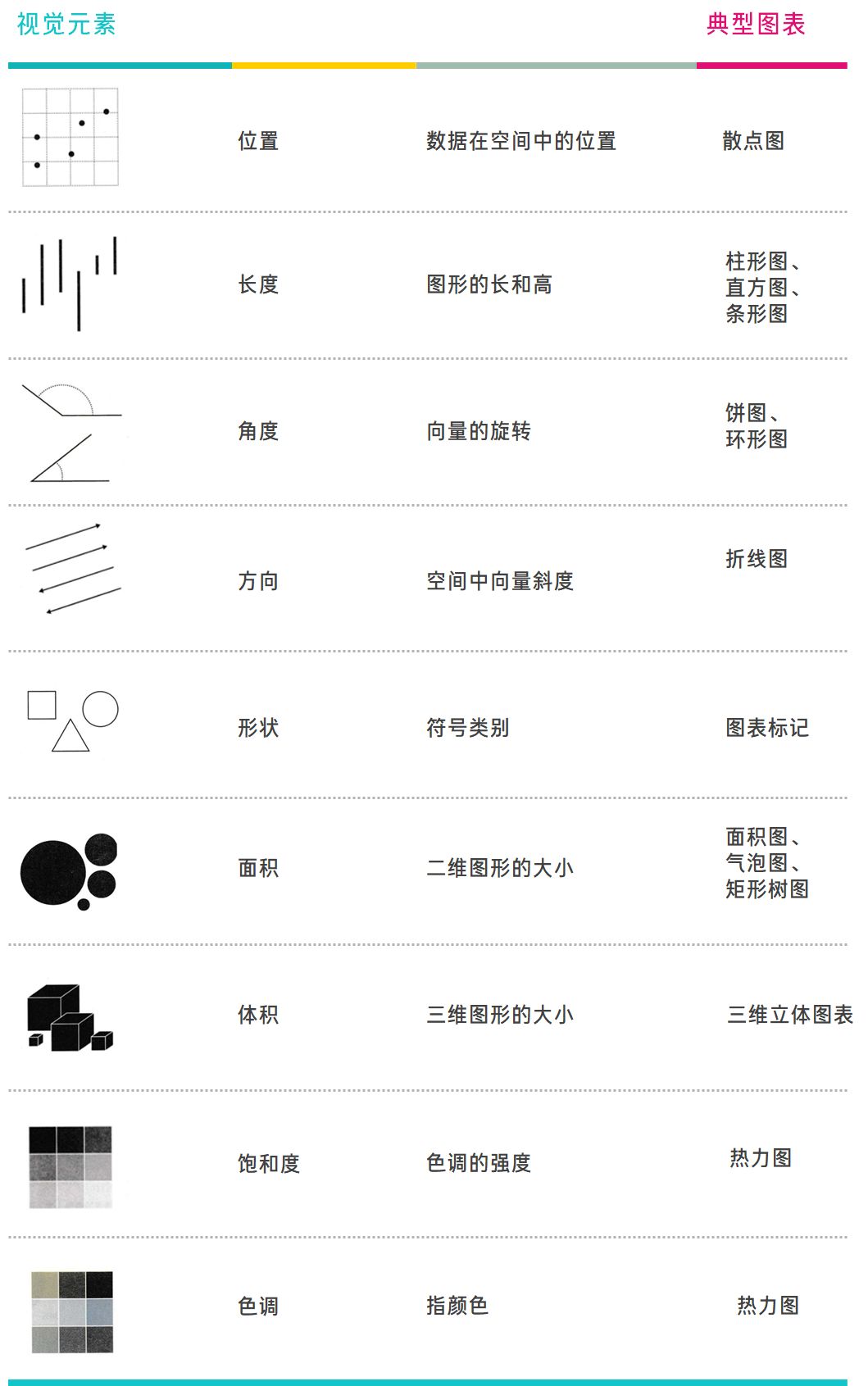
/ The basic principle model of data visualization /
1) Data Transformation
First, the original data is sorted and converted into a data table through tools such as excel. The original data is usually redundant or incomplete, contains noise and errors, and data patterns and characteristics are often hidden. Transform data into a processable mode through data processing operations such as denoising, data cleaning, and feature extraction.
2) Visual Mapping
To put it simply, it is the process of selecting a suitable chart for the existing data and using a graphical language to display the data relationship. The characteristics of the data are reflected through the orderly combination of visual elements, where the visual elements can be called visual channels. It may sound abstract, but the connotation is actually very simple, such as:
The line chart maps the data characteristics to the "direction"
Histogram maps data features to "length"
Pie charts map data features to "angles"
Ring chart maps data features to "arc length"
The area chart maps data features to the "area" of a polygon
In addition to these basic graphics, other visual elements can also represent the characteristics of the data:

/ Chart Principles: Visual Elements in Charts /
a. Location
When observing a scatter plot, the distribution and trend of data points are confirmed by observing the x-coordinate and y-coordinate of a point and the spatial relationship with other points. The laws of the data in the scatterplot are mainly in the following four categories:
/ Data law in the scatter plot /
b. Length
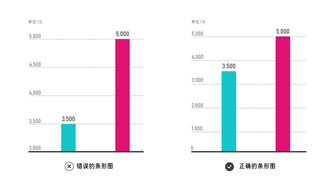
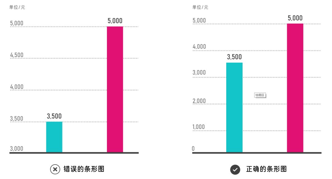
The size of the data is measured by the length of the graph, such as a bar graph (histogram). When making a bar graph, attention should be paid to maintaining the authenticity of the graph length. For example, in the two bar graphs below, the graph on the left uses 3000 as the starting point of the vertical axis , causing the length of the blue rectangle to become shorter. It seems that the length of the blue rectangle is only 1/4 of the length of the red rectangle, which distorts the length relationship between the two rectangles.
This obviously violates the original intention of graphics and charts to pursue true and accurate visual expression. What needs to be reminded is that some articles think that modifying the coordinate axis is a means of beautifying the data, which is a wrong idea.
c. Angle
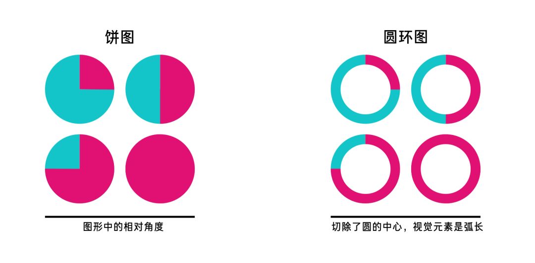
Pie charts and donut charts are both types of application of angle elements in charts, but they are different. The donut chart, like the pie chart, can show the relationship between the part and the whole. In addition, the donut chart can also directly and clearly see the size comparison relationship between the parts through the size of the arc length. From the functional point of view of the ring Graphs are better than pie charts.
d. Direction
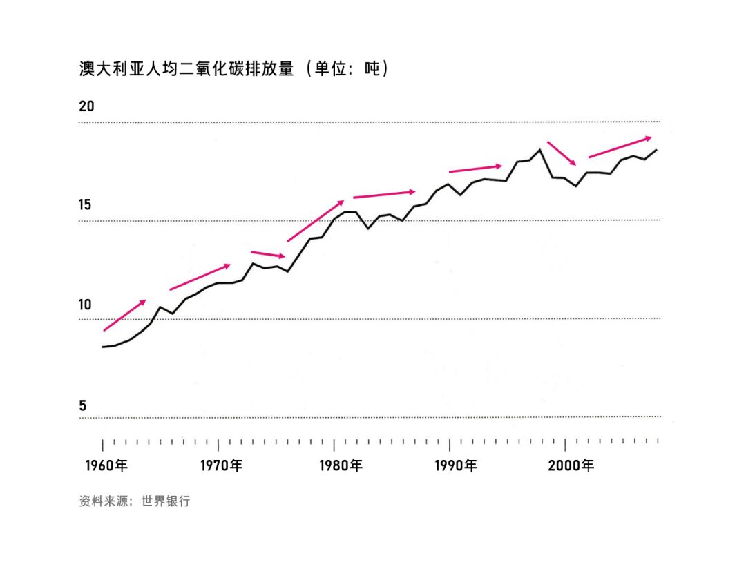
Direction is the concept of indicating dynamics, and it is a description of a trend. The most typical application of direction in charts is a line chart, as shown in the following figure:
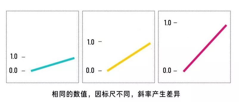
But the direction is actually an inaccurate measurement element, just like a pointer, which can only indicate the inclination of up, down, left, and right. If you want to accurately indicate the specific direction, you need to use a ruler or a reference line.
The same value, if the scale is different, the slope of the resulting direction will also be significantly different, so it is best to unify the horizontal and vertical axes when dealing with the directionality of multiple sets of data.
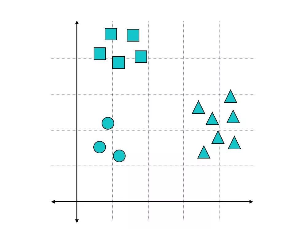
e. shape
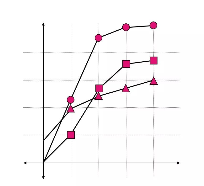
Shapes are mainly used to distinguish groups when analyzing multiple sets of data. We also call them markers in daily use, such as shapes in scatter plots and line charts:
/ Shapes in a scatterplot /
Three shapes are used in the scatterplot to represent three discrete data groups.
Shapes can also represent types, series, and groups of values. For example, each series in a line chart is marked with a variety of different shapes.
/ Shapes in Line Charts /
f. Area and volume
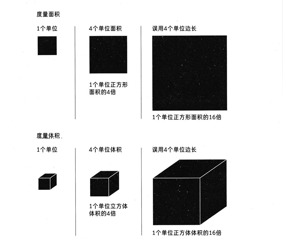
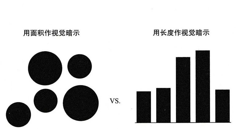
Large graphs represent large values. Length, area, and volume can all represent the magnitude of a value. Two-dimensional planes usually use circles and rectangles, and three-dimensional spaces generally use cubes or spheres.
However, when determining the area and volume, attention should be paid to the numerical conversion of the side length or radius to avoid erroneous hints, such as:
g. Saturation and Hue
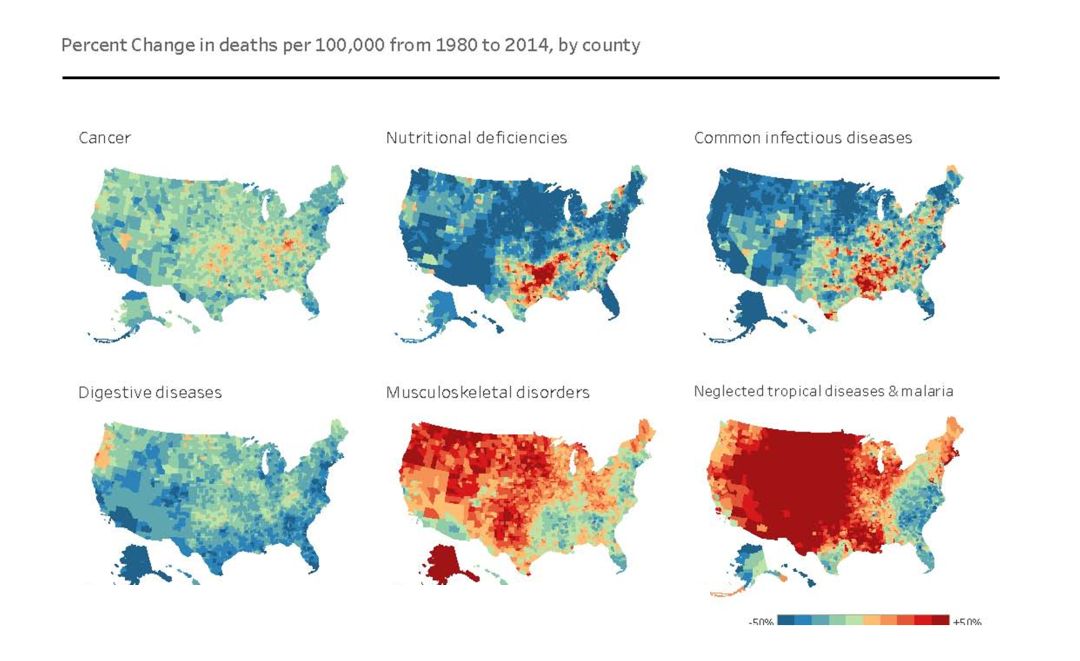
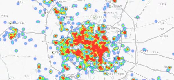
The two elements of color can be used to represent groups in charts, and can also be used to represent levels and numerical values. The most typical type of color elements in a chart is a heat map. By filling in colors, a heat map can use the saturation or hue difference of colors to show the distribution of values in a specific geographical area (or page area).
/ Heatmap: Percentage change in deaths per 100,000 people in the United States (1980-2014) /
/ Heat Map: Distribution of Chuan Chuan Xiang in Chengdu /
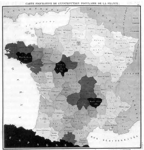
The picture below is considered to be the earliest heat map in the world. It was published by the Frenchman Charles Dupin on a black and white map in 1826. It shows the distribution of illiteracy in France with different depths from white to black.

3) Recognition accuracy of visual elements
Bell Labs published a suggestive ordering list of visual elements in 1985:
This list is used in many visualization specifications. The list shows that in the visual design, the position is the most accurate element, followed by the length. The histogram is more accurate to the data, and it is easier for people to understand the histogram, while the performance of the heat map is relatively much worse.
The visual mapping principle of these data is also the theoretical basis for designers and data analysts to break out of the traditional chart type framework and create a variety of novel visualization works.
When it comes to chart making, it is to choose the chart type reasonably and accurately.
2. How to choose the most suitable chart?
The choice of diagrams is a science, and there are more mature rules in it, which you can call the grammar of graphics.
There are many factors to consider when choosing a chart, such as chart type (distribution and trend...), data points (few or many), user role (operator, strategic planner, etc.), user familiarity with the data (such as analyst or business users), etc.
Charts help us understand data better. What charts to choose? The first question that needs to be answered is "what data do I have and what do I need to do with the charts?" rather than "what does the chart look like?" The chart function and the data characteristics reflected by the chart.
1) Select charts based on the characteristics of the data
Starting from the data characteristics, we have made a detailed classification of commonly used charts from a functional perspective:
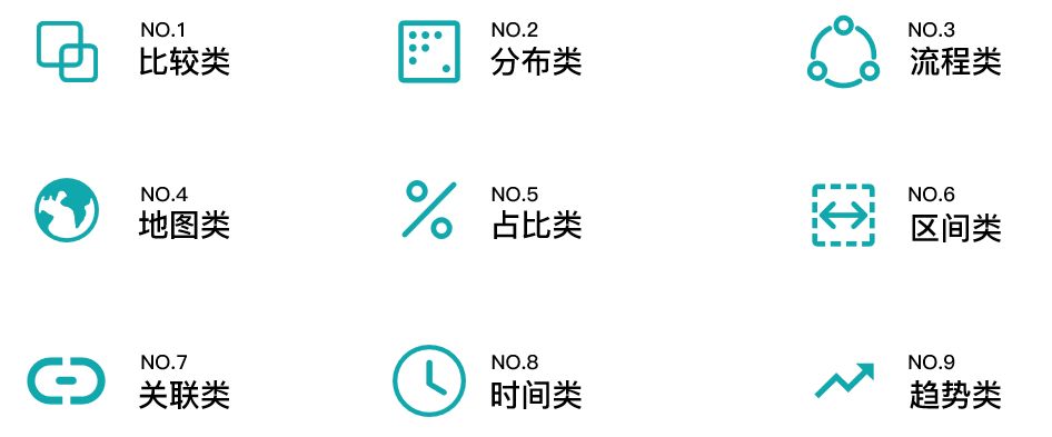
/ Chart type: nine types of charts /
According to nine classification standards, we classify charts commonly used in data analysis into chart types in turn.
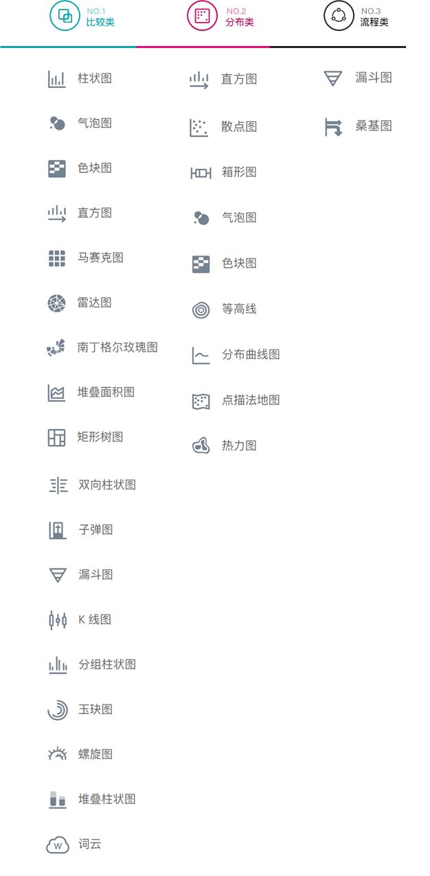
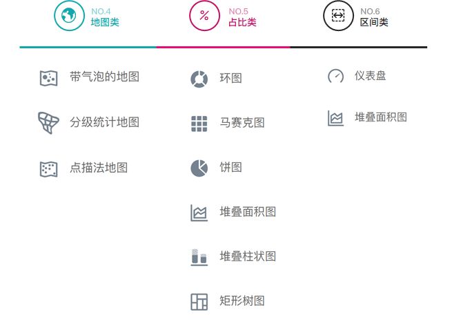
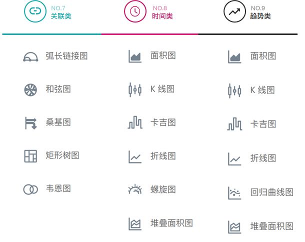
When selecting a chart, you can choose a specific chart according to the feature category you want to display the data:
/ Diagram Type Breakdown: Comparison, Classification, Process Diagrams /
/ Chart type breakdown: map, proportion, interval chart /
/ Chart type breakdown: correlation, time, trend charts /
It can be seen that there are many types in the chart world, and different charts have multiple functions. It is possible to write a book out of it.
Here we choose the most commonly used type - column chart, as an example to carefully analyze the correct use of charts in data visualization.
2) Detailed explanation of chart selection: column chart
a. Applicable scenarios: suitable for application to classification data comparison
(What is classification data? It can be understood as a type that exists side by side with each other in a large range)
h3>
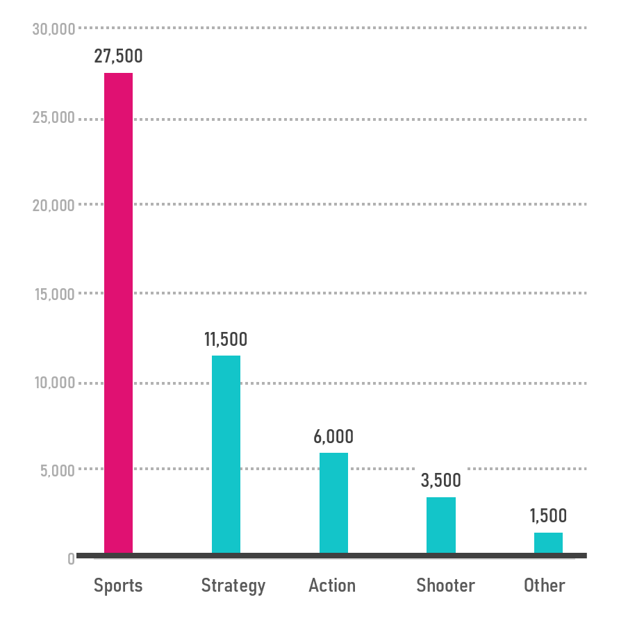
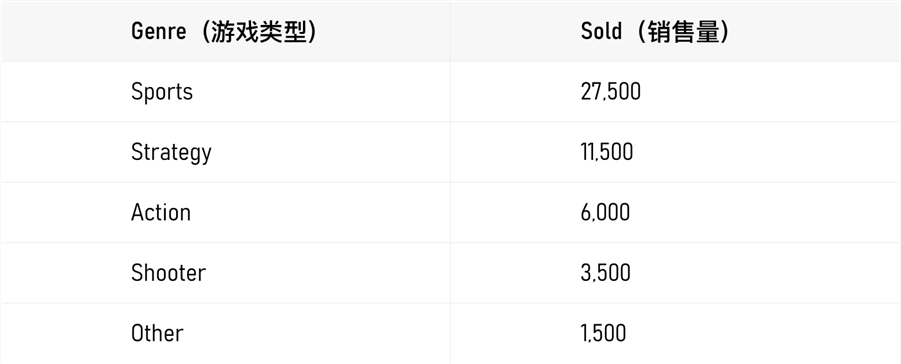
/ source data /
b. Not suitable for the scene:
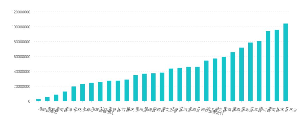
Too many categories are not suitable for vertical histograms
h3>
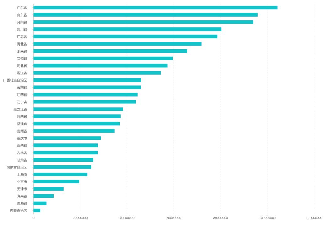
When there are too many classifications, the text of the histogram needs to be rotated in order to arrange it reasonably, causing confusion, resulting in redundant information, and affecting normal reading.
Using a horizontal histogram, the text can be arranged horizontally, which is convenient for users to read. The effect is as follows:

Histograms are not suitable for representing trends
< span > The histogram uses the length (width) of the rectangle to compare the size of the categorical data, which is very convenient for comparing the size of adjacent data, but it is not suitable for showing the trend of continuous data. The chart below was intended to show the daily price movement of ACME stock over a month, but the effect was not satisfactory.
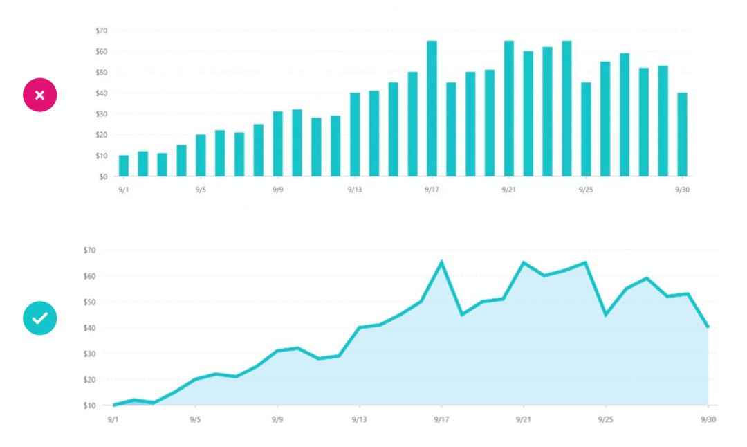
For numerical trends that change over time in an orderly fashion, line charts or area charts are more suitable.
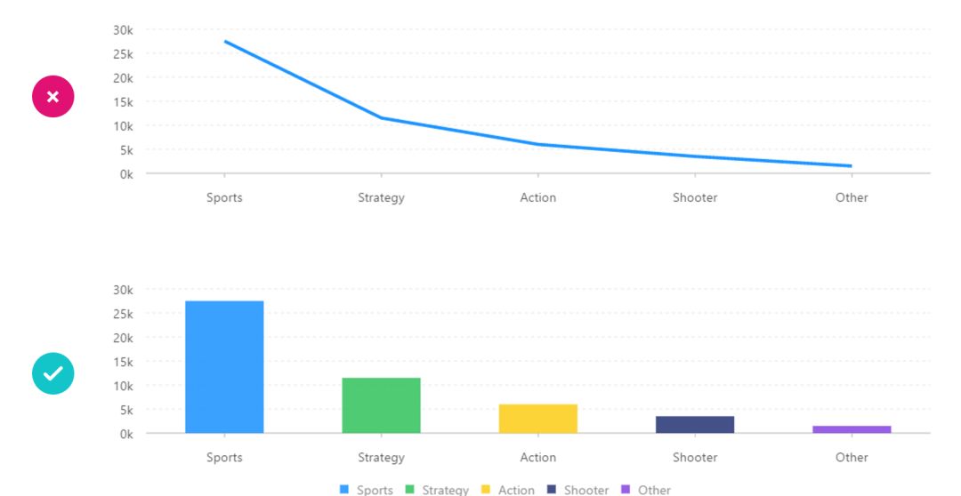
In contrast, when representing data for classification and comparison, we should use a histogram instead of a line chart.
Histograms are used to compare data between multiple categories, and line charts are often used to analyze the trend of data changes over time, and also analyze the interaction and mutual influence of multiple sets of data over time.
c. Derived chart:
The column chart is based on the chart logic of length and size, and several types of charts with specific functions are derived for various usage scenarios: histogram, stacked column chart and 100% stacked chart, etc.
I. Histogram
A shape similar to a histogram has a completely different meaning than a histogram.
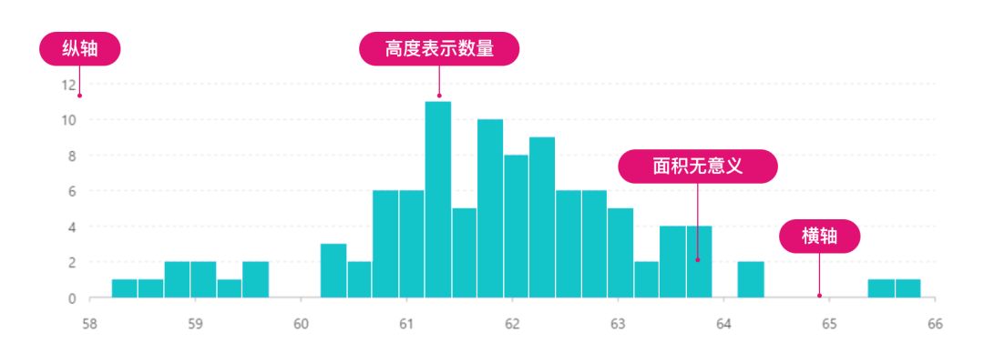
It can not only display the distribution of quantity (or frequency) of each group, but also show the difference of quantity (or frequency) between groups.
Histograms are used to represent the distribution
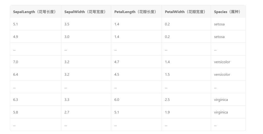
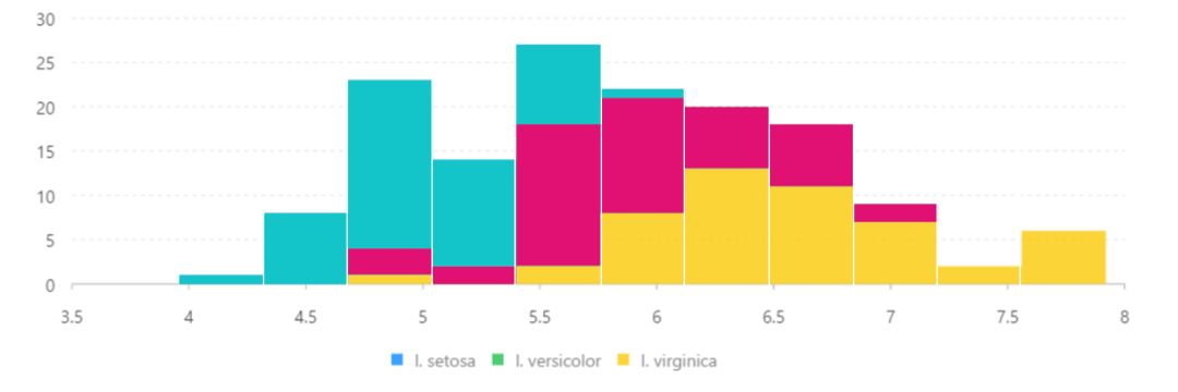
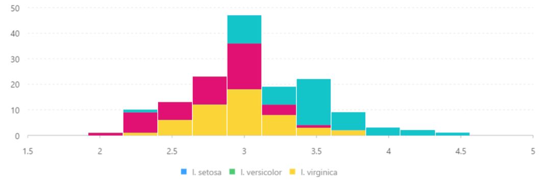
Quantitative analysis of samples (each subgenus of Iris) by four characteristics (sepal length, sepal width, petal length, and petal width) to determine the genus:
/ source data /
/ SepalLength (Sepal Length) /

/SepalWidth (sepal width)/
From the histogram, it can be clearly seen that the histograms of the four eigenvalues of various genera and species present a certain distribution pattern. According to this result, the sample can be identified as a species.
Histograms are good for observing outliers or isolated data
The figure below plots the statistical histogram of the diamond's total depth ratio data, and it can be seen from the figure that there are two isolated values around 66.
For the histogram, if the number of samples drawn is too small, large errors will occur, the reliability will be low, and the meaning of analysis will be lost. According to the study, the number of samples for the histogram should not be less than 50.
Stacked column chart
Visually display the data of each sub-category contained in a large category, and the proportion of each sub-category, showing the relationship between a single item and the whole.
The general stacked histogram is used to compare the total size of different groups, and compare the size of different categories in the same group.
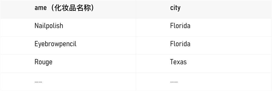
The figure below shows the sales of each cosmetic in each city. By stacking the histograms, we can clearly compare which city the same cosmetic sells better.
/ source data /
Stacking the sales revenue, compared with the traditional column chart, in addition to seeing the sales of a single product in a single city, you can see the total sales of a certain cosmetic in all cities. In addition, the visual effect of color contrast processing of color blocks is much better than that of thin column charts.
Of course, in general, the baselines of different categories in each group of the stacked histogram are different, so it is not suitable for comparing the sales volume of different cosmetics in different cities.
100% stacked chart
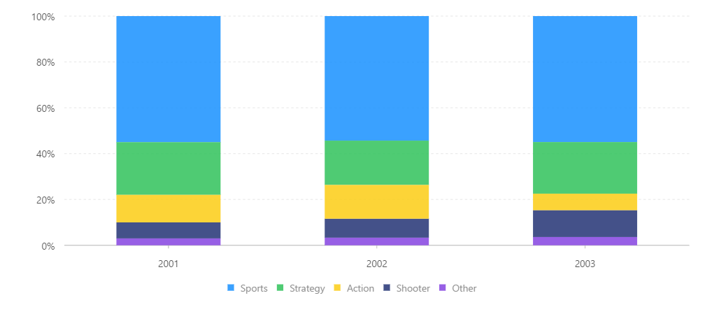
In addition to this stacked chart, there is also a 100% stacked chart, which is easy to observe the classification proportion:
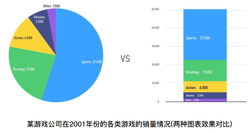
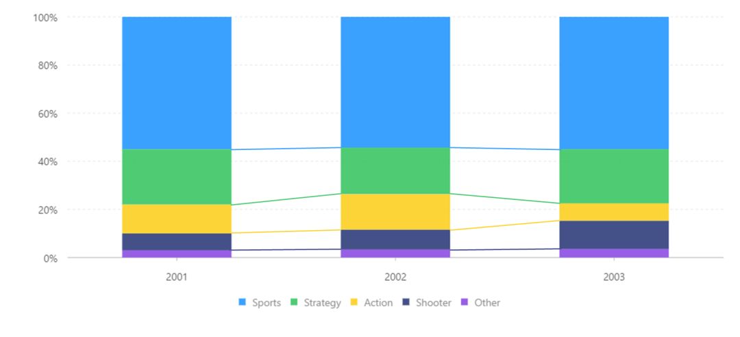
This function is similar to pie charts and ring charts, and can be used to display the proportion of categories, but compared with the latter, the 100% stacked chart is easier to observe the differences and dynamic changes between small categories.
At the same time, use lines to connect the first borders of the rectangular bars of each category, so that you can better observe the dynamic changes of the data in different years:
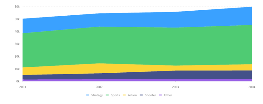
The stacked chart uses the "length" (or height) of the rectangle to represent the percentage value. Compared with the "angle" of the pie chart, it is easier to accurately identify the element of the size difference. Stacking can be used when it tends to represent the comparison of the value of each category The specific effect is shown in the figure below:
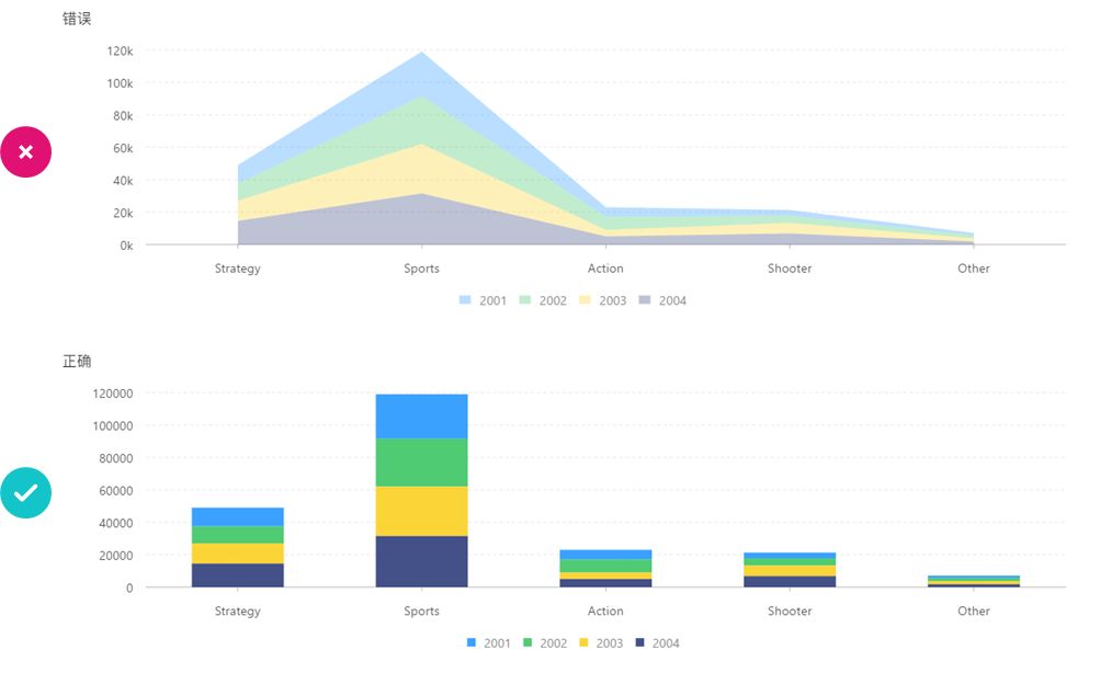
In addition to the histogram, stacked charts also have a stacked area chart. In this chart, each stacked area represents the size of each data volume, and the largest area represents the sum of all data volumes, which is a whole. Ideal for comparing multiple variables over time.
However, do not use area charts for the comparison of classified data. The game sales in the previous example are compared with the game sales of 4 years. If it is used to compare the sales of various game types, it is not appropriate to use area charts. Here should use a stacked column chart.
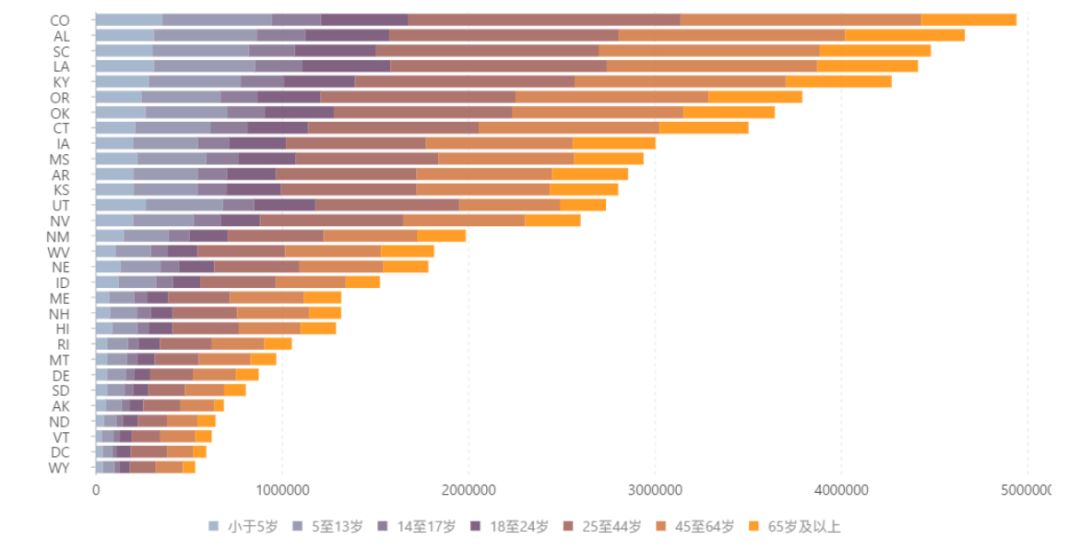
Like bar charts, vertical histograms show fewer data bars. When there are too many categories, we can use horizontal stacked histograms:
/ The distribution of population data of different age groups in the states of the United States /
Our brief summary of column and derivative chart usage:
It is recommended to use a column chart when comparing classified data, and use a horizontal column chart when there are too many categories (>15);
Use a column chart to compare the size of the data, but do not use a column chart to represent the trend of the data.
Histograms are used when representing the distribution of data, and can also be used when observing abnormal or isolated data.
Remember, the sample size of the histogram is preferably >50
Stacked column charts can be used when comparing the total size of different groups and comparing the size of different categories in the same group;
In addition, it is also recommended to use a 100% stacked chart when observing the distribution of data.
3. How to enhance the readability of the chart
Charts are made for readers and serve for information expression. After building a chart based on data, it is only the beginning. It is also necessary to consider whether the data information can be fully conveyed. There are four main points:
a. Data will lie, ensure the accuracy of information transmission
Sometimes charts used incorrectly can convey completely wrong information and go against the principles of visualization.
for example:
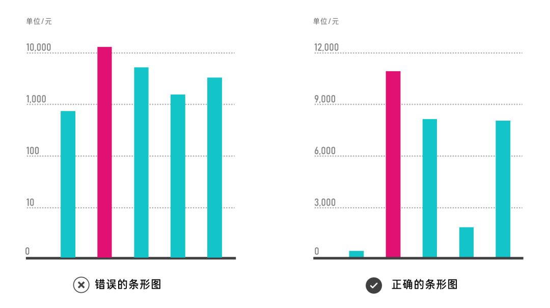
Axis mishandling
One is the improper interception of the starting point of the coordinate axis due to the exaggeration of the data difference mentioned above.
In addition, logarithmic processing is used for the coordinate axis, which reduces the data difference
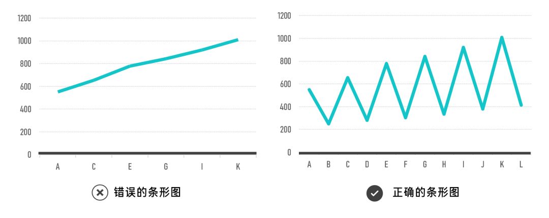
Graph Stretch
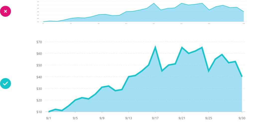
The abnormal ratio of the horizontal and vertical axes of the chart will also affect the expression of data information, especially for charts such as line charts showing trend directions, the ratio of the horizontal and vertical axes is most suitable between 1:1 and 2:1
Value Interval
It is most likely to appear in data processing with high volatility, and the interval value will get completely different results
b. Create visual hierarchy
A good visual report must be concise and focused. The specific performance is to display data and results with prominent elements, and weaken other unimportant information as the background. In addition, lines or arrows can be used to guide the line of sight to help the audience quickly focus on the topic information graphics.
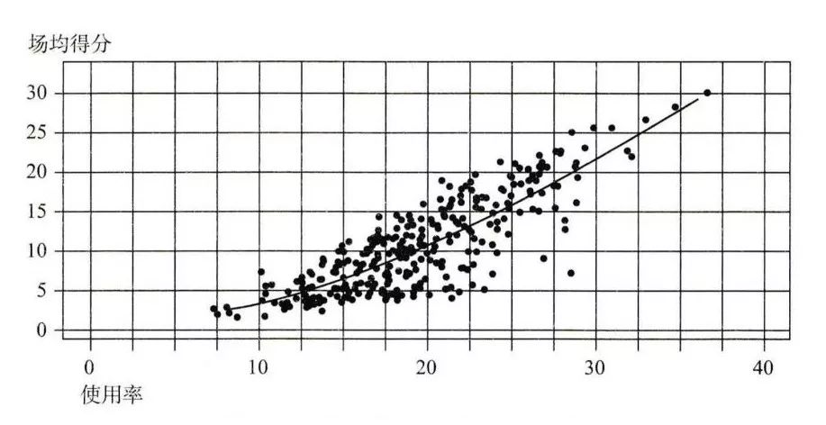
For example, in the following scatter plot of NBA player usage rate and average points per game, all visual elements are on the same level, too flat and unfocused:
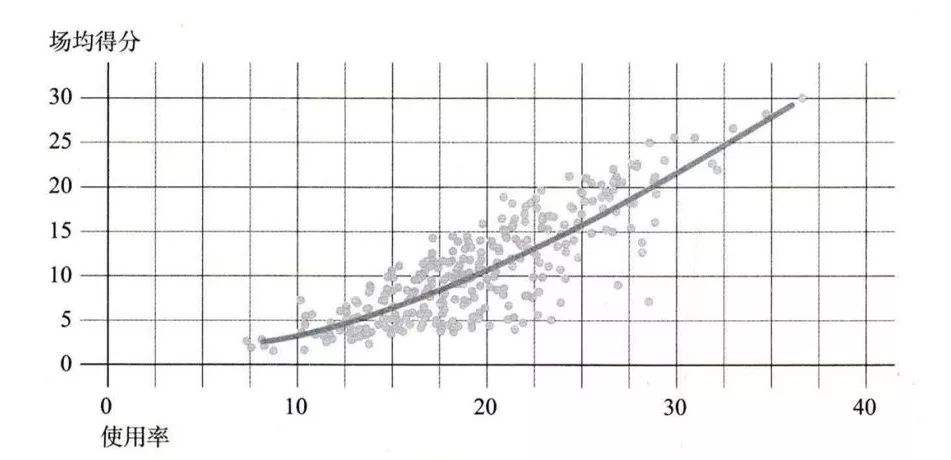
The following picture dilutes the data points, thickens the trend line, weakens the grid, highlights the trend line, and makes a hierarchy.
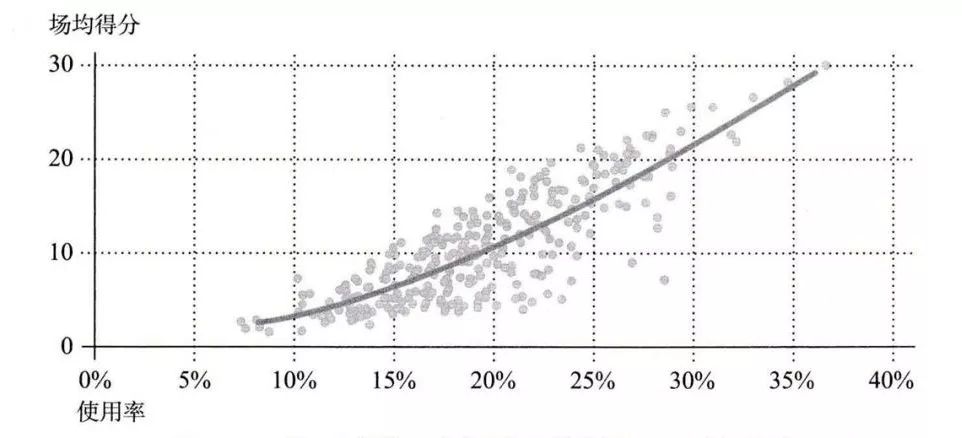
However, the grid is still too messy and dense on the page, and the ordinate labels are also too dense. After targeted processing:
It can be seen that there is less and less disturbing information, and the focus of the chart is on the rising trend line, which is the key information we want to express. As the usage rate of players rises, the average points per game also rises. There is a positive relationship between the two. relevant.
c. Allow data to be compared
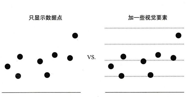
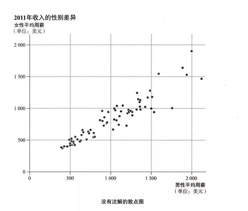
Compared with a chart that only displays data points, a table with a grid will make it easier to compare the positional differences between the data. For example, in the following example, it would be a good choice to add horizontal grid lines appropriately without adding data labels .
Differences in the recognition accuracy of graphics will also make it difficult to compare data. It is difficult for the human eye to distinguish the difference in two-dimensional graphics. For example, it is difficult to know the size difference of the circles at a glance in the figure below. Replace it with a column chart based on length much clearer.
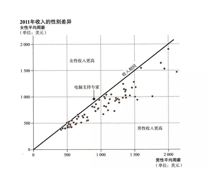
d. Add annotations
The annotations in the charts include titles, subtitles, data labels, units, trend lines, content notes, etc. All elements of the chart annotations should meet the criteria for addition and deletion of unattended scenarios, so that the audience can understand even in five-day explanations. Can understand graphs.


Secrets of Data Visualization (Part 1) Summary Review:
What is data visualization?
concept of visualization
Data analysis, use data to see phenomena
How to understand the data?
What can the data tell us?
What is the process of data analysis?
Visual design, see data with graphics
Principles of Chart Design
How to choose a chart
Enhanced chart readability
...
Story logic, tell a good story (Part 2)
see you next time
Articles are uploaded by users and are for non-commercial browsing only. Posted by: Lomu, please indicate the source: https://www.daogebangong.com/en/articles/detail/Indepth%20long%20articleThe%20secret%20of%20PPT%20data%20visualization%20Part%201.html

 支付宝扫一扫
评论列表(196条)
测试