Author: I am Design Wet
In the first article of 2019, let’s talk about one of the most frequently asked questions. Where did the inspiration for the logo come from? Some time ago, I took the time to try to make 26 pigs" to wish everyone an early year. We just took these 26 pigs as an example to talk about.
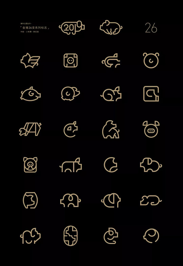
It doesn't matter who I am, look at how cute these pigs are. Do you really want to mess with him? When designing these 26 pigs, for the sake of overall unity and to explore how flexible the LOGO inspiration is under limited conditions. I limit the form of expression to linear structure and geometry, and use partial representation as the foundation, which makes the change much more difficult.
It is almost difficult to come up with new ideas in the later stage. After all, there are only a few forms of pigs, and limited to the premise, it is not possible to make too abstract and exaggerated deformations. The hole I dug by myself had to be filled even while kneeling. In the end, I insisted on finishing 26 pigs.
Back to the topic, where does the inspiration for LOGO come from? I split this problem into two main aspects, one is the extraction of LOGO creative inspiration; the other is the determination of LOGO expression form. The so-called sources of LOGO creative inspiration can actually be subdivided into many directions. When designing a business proposition, there are generally clear industry attribute backgrounds, products, corporate culture, etc., which can be the source of creative inspiration.
Taking "Golden Pig 26 Changes" as an example, the inspiration here is very direct, that is, to consider and make changes based on the shape of a pig. And what about the form of expression? It can be in different styles or different composition methods, such as common wired composition, surface composition, portrait, cartoon image, combination of positive and negative shapes, etc.
Here is the direction formed by the geometric lines. After these two parts are clear, you can have a clear focus when designing the LOGO.
Next, let's share my design process and some tips on the composition of animal lines for the "Golden Pig 26 Changes" series. In fact, during the design process, I did not have a clear method and idea. After repeated attempts, I came up with these few small methods after repeated attempts.
At the beginning, I didn’t encounter too many obstacles. Looking for a suitable animal form as a reference must not be limited to photos. Illustrations, cartoon images, stick figures, etc. may become the direction of inspiration. But a very important point, this direction is extremely easy to crash. Because there are only a few common forms of animals.
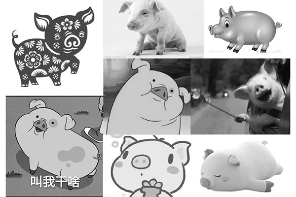
We need to try our best to improve the personalization of graphics through the change of lines. When designing the first one, we need to extract the core characteristics of animals and express them geometrically and concisely as much as possible.
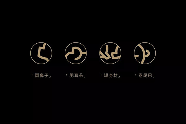
For example, several core characteristics of pigs, such as round nose, fat ears, short body, curly tail.
Catch these points to lay a foundation for the subsequent deformation. In the same way, we must grasp the core morphological characteristics when we are making other animals. How to grasp the core characteristics? Analyze a large number of animal photos and other materials, and do not work behind closed doors.
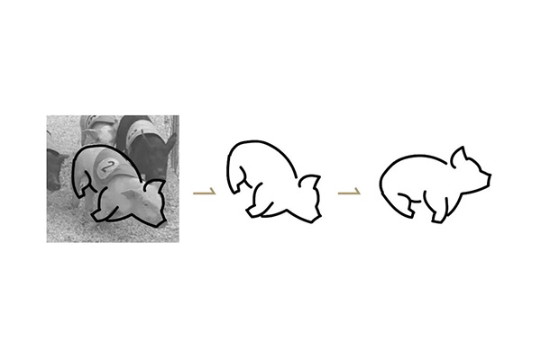
Taking the first one as an example, I would like to mention a little trick about drawing sketches. You can put the reference picture at the bottom, reduce the transparency, and select the brush tool in AI (I personally use the mouse to draw directly. If you can It should be better to have a hand-painted board), it can automatically smooth and optimize your lines. Outline the shape on the picture, and then continue to optimize your first draft.
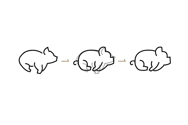
You can use the shortcut key: Ctrl+2 to lock the sketch reference first for further optimization. At this point, the final form has basically appeared. The whole process was relatively smooth, which is the source of our first plan.
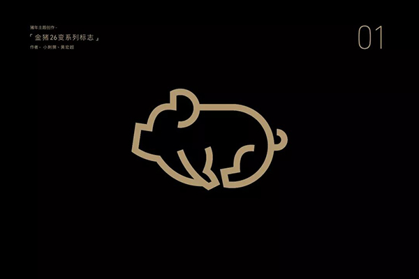
The method above is generic. Generally speaking, it is relatively easy to use, and there are a few of them that use similar methods.
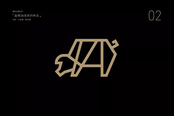
Pure straight line expression, highlighting the core features, strengthening the geometric features.
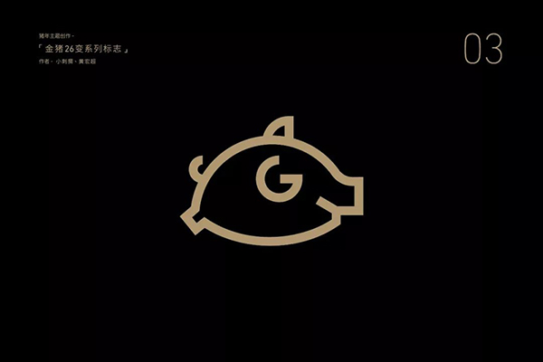
It is still in the form of running, and it has been simplified on the basis of the first scheme, which is more concise and clean, with a sense of logo.
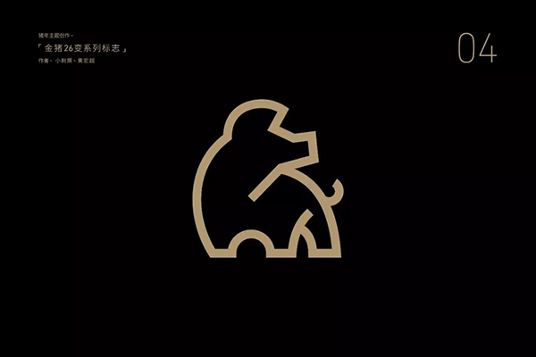
Different forms, the same design technique can also produce more changes.
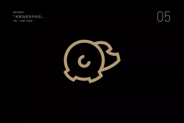
There are a few points to pay attention to in general geometric line structure:
[Notes] Find a suitable reference; grasp the core feature points; the lines are clean and concise as a whole.
[Advantages] Easy to use; clear features; intuitive effect;
[Disadvantages] Single performance; easy to crash; difficult to introduce new ones.
The so-called element combination method is actually an addition based on the first one. The shape of the overall core is still obtained on the previous basis, but part of the addition is done.
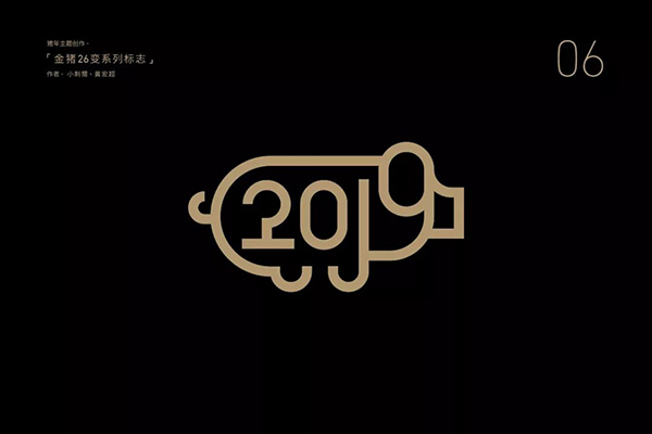
For example, the combination of the number 2019 and the pig fits the theme of the year of the pig in 2019, so this element is more reasonable.
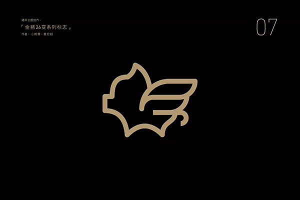
The shape of the flying pig is also well known to everyone, and it is unreasonable to say that there are no elements. The main thing is to pay attention to the fit and aesthetics of the combination of elements and the whole. Don't overwhelm the guest by all means, focus on one thing and lose the other.
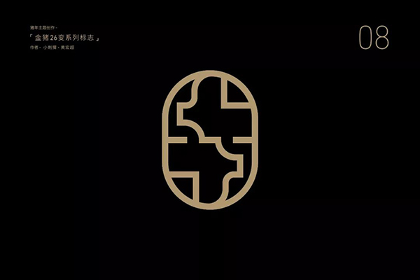
The combination of two pigs. Generally speaking, this is a relatively flattering method. One is to increase the degree of personalization and reduce the possibility of similarity, and the other is that the difficulty is not as great as the positive and negative shapes.
Element combination method:
[Points to note] Whether the combination of elements is reasonable; the combined shape is beautiful and appropriate; pay attention to the recognition of core features.
[Advantages] It is easy to enhance creativity and reduce similarities; it is easier to use.
[Disadvantages] Combining elements may overwhelm the host and lead to incoordination of the overall shape.
The feature amplification method is not difficult to understand, it is literally. Enlarge the core features we extracted in the first step, and highlight the theme by showing the most characteristic parts, which is also often said to see the big from the small. However, this method is not universal, and flexible judgment is required when using it.

Extract the buttocks and tail of the pig, and enlarge the core features of the ears, which is minimalist but can express the characteristics of the pig.
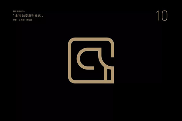
Enlarge the head of the pig and combine it with the square. On the one hand, the regular rectangular outline can enhance the integrity of the logo, and on the other hand, it also improves the overall creativity.
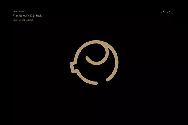
This one is relatively abstract and highlights the round fat shape of the pig as a whole. The shape of the pig can also be identified through the embellishment of the ears and nose. The core point is still that the characteristics must be accurately grasped and displayed.
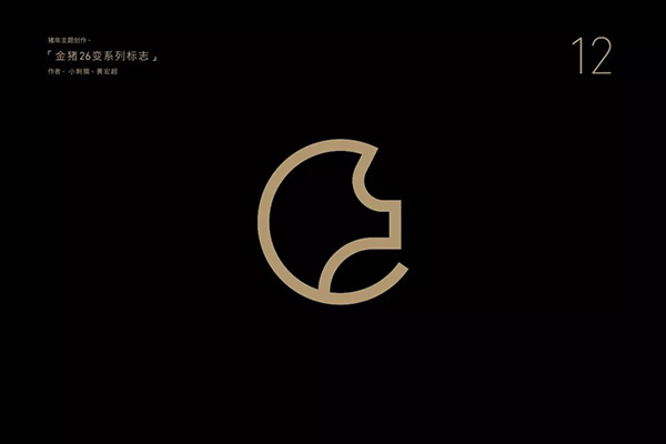
The combination of the pig's head and the round shape is a relatively common processing technique, which is almost universal. In fact, it can be more flexible by modifying the outer contour, such as pentagons, hexagons, and so on. can produce changes.
Feature amplification method:
[Points to note] The core features are extracted in place;
[Advantages] Make the graphics more concise, more logo and design sense.
[Disadvantages] The applicability is relatively limited, and not all animal types are suitable for feature amplification.
The geometric combination method has actually been involved in the above scheme, such as the outer contours of circles and rectangles. But the combination here has more meaning of "addition". Let geometry and elements do an addition, better integrated into a whole.
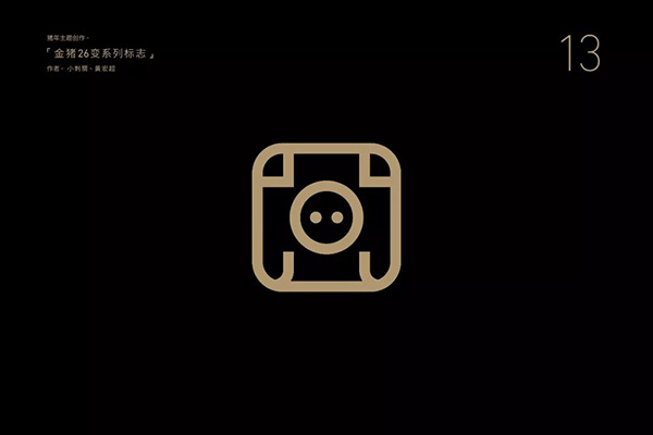
The rectangular pig's face and the round pig's nose are combined with geometric figures to make the figure more geometric and iconic.
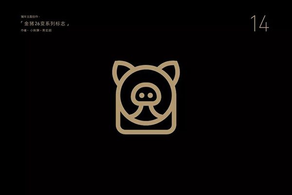
It is still the front face, except for the combination of circles. One of the main design points is the addition of the square below as the body part. This addition is obvious, but the degree of creativity is not high.
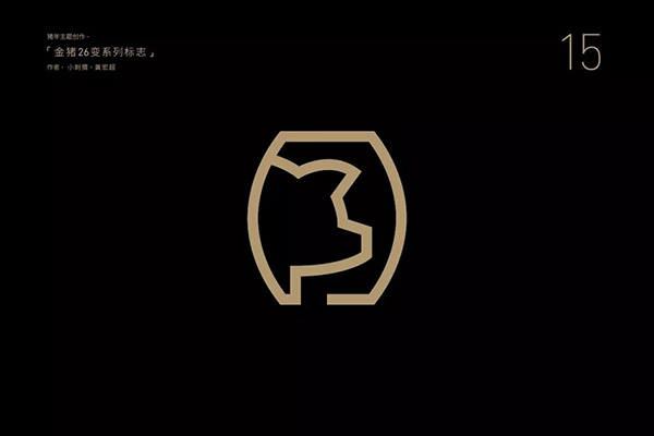
In fact, this plan is still mentioned above. The above plan is a geometry with a circle. On the other hand, it is a direct addition to the tank shape, a very clear combination of addition. However, by changing the shape of the side face, the combination still has strong specificity.
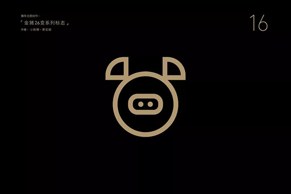
Geometric combination method:
[Points to note] Geometry and feature form points need to be unified; combine addition and pay attention to coordination and unity.
【Advantages】Enhance the geometric degree of the logo; generally speaking, it is more concise and has a sense of design.
[Disadvantages] The applicable geometry of the feature part is limited, and the flexibility and variability are obviously limited.
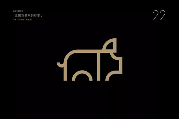
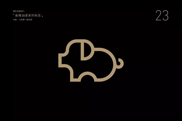
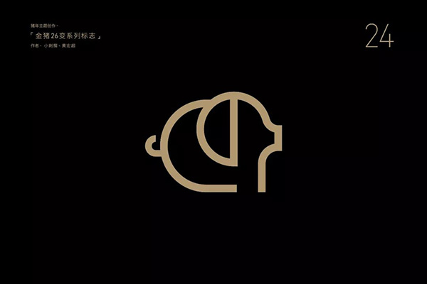
What is the difference between the geometric generalization method and the geometric combination method? Simply put, the geometric combination method is more inclined to do addition. The geometric generalization method is more inclined to use geometric lines and graphics to express the elements themselves. This is the most used method, but it is also the most difficult. What we usually say "geometry" largely refers to this method.
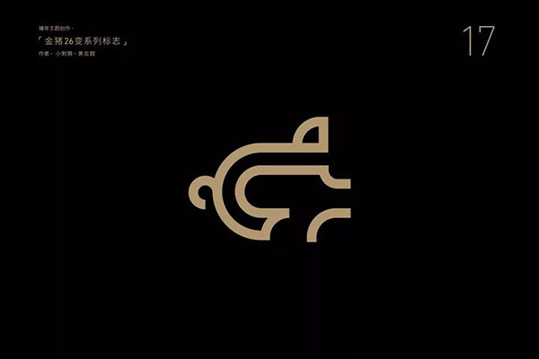
Directly use very obvious geometric lines, semi-circular arcs, quarter circles, and superimposed double lines to form the overall shape of the pig in a slightly abstract manner.
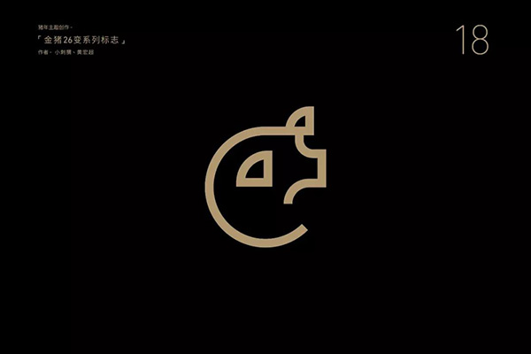
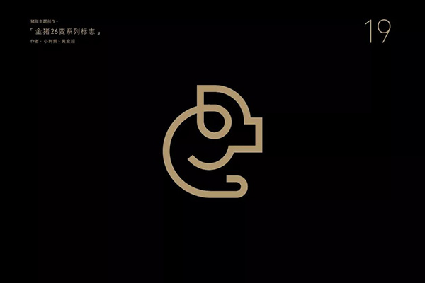
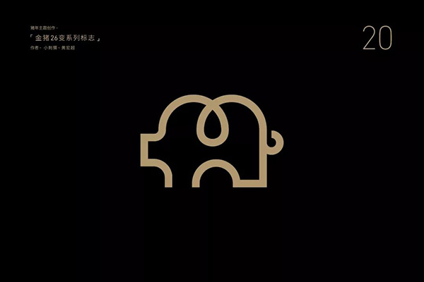
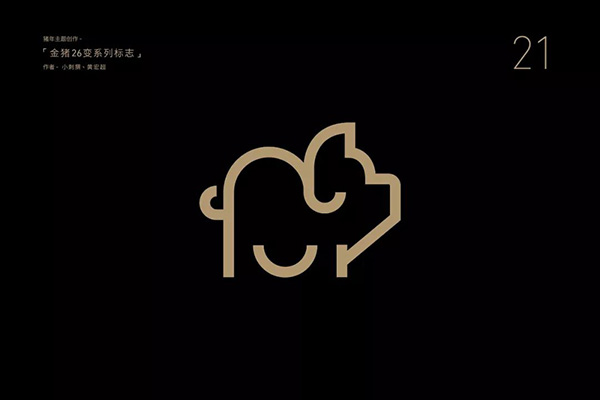
Geometric generalization method:
 ,
,
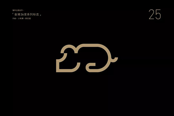
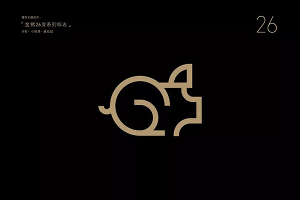
Partial adjustment method:
Articles are uploaded by users and are for non-commercial browsing only. Posted by: Lomu, please indicate the source: https://www.daogebangong.com/en/articles/detail/I%20used%202%20afternoons%20to%20make%2026%20golden%20pig%20logos%20and%20now%20I%20will%20tell%20you%20how.html

 支付宝扫一扫
评论列表(196条)
测试