For many readers in the workplace, making PPT can be said to be routine. [End of article big benefit]
But, you know what? Although many people make a lot of PPTs,However, they often use the same idea every time, which will lead to many PPTs using the same typesetting method and using the same graphics. Of course, sometimes they will make mistakes. same error. This is a typical limitation of thinking.

So, how do you break the limits in your brain? Starting today, I will launch a new series of articles from time to time. Borrowing the idiom of eye-opening, I named this column "Big Brain Opening". I hope to help you to complete a good workplace PPT with diversified design thinking.

In today's article, I will first share with you how to break through the limitations of typesetting. Take the following PPT as an example to talk about this topic with you.
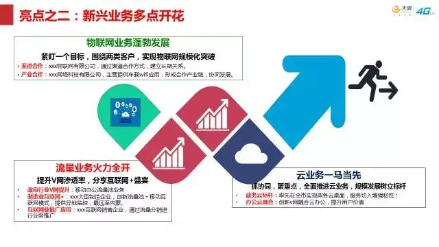
This kind of PPT is often seen in the workplace, but before modifying it, let’s analyze it first. What’s wrong with this slide?
We can see that this is a very typical workplace PPT. In order to make the page look beautiful, use some fancy graphics as decoration, However, just because there are so many useless decorations on the page, takes up a lot of space on the page, making the really important content less conspicuous, and putting the cart before the horse.
Delete extraneous elements
So, when we want to re-optimize this PPT, The first step, , is to delete irrelevant elements.
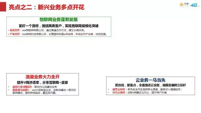
Everyone, isn't it instantly refreshing, right? Well, deleting irrelevant elements is not enough. Next, Let's analyze the hierarchical relationship of content to determine which ones need to be highlighted.
Obviously, this is the display of 3 paragraphs of text content. Each paragraph of content is divided into 3 levels. The first level is the business type, the second level is the development direction, and the third level is a concrete implementation. Therefore, it is obvious that the hierarchical relationship of the content has been sorted out. Draw a diagram for you to show:
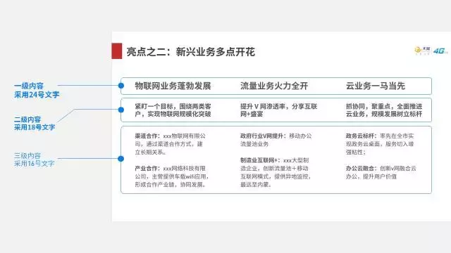
Okay, what should I do to better display the hierarchical relationship between content? There are several design ideas for your reference.
First, use lines to reflect the hierarchical relationship of content.
In order to highlight the hierarchical relationship between content, with the help of different colors and lines of different thickness, it is a very good choice.
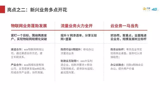
If you feel that the page is monotonous, you can use some numbers cleverly as embellishments, and also have a certain practical effect.

Of course, this page of PPT has a lot of content, In order to show one focal point at a time, we can also use color blocks to display appropriately:
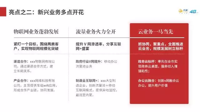
However, it should be noted that when a certain piece of content is highlighted, remember to add gray to other parts.
Second. Use color blocks to distinguish the layout.
As mentioned above, since the content contains 3 parts, we can start from this point and use 3 different color to differentiate content. is also a good choice.

Third. If you think the page is monotonous, you can also use some pictures.
Actually, for PPT page design, one of the problems that many people worry about is that if you simply use color blocks or lines, it may make the page It looks empty, if you also have this concern, then you might as well try pictures.
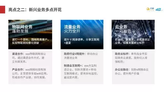
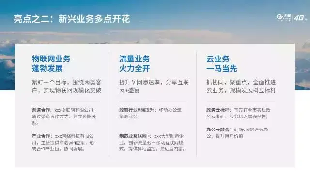
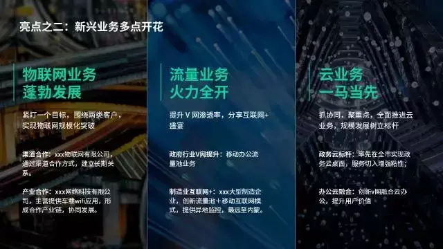
The above is the first article of "Big Brain Opening", to help you make a brief summary, when optimizing the PPT page, delete irrelevant Decorative elements to clarify the hierarchical relationship of content.
I hope it helps you! In order to help you make a better PPT, I also prepared a gift for you!
In order to help you make PPT better, I also prepared a gift for you, which also has a superb timeline layout! More than 30 super high-quality PPT templates!
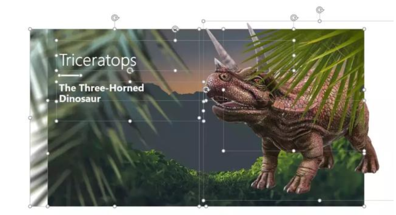
All pages are editable:
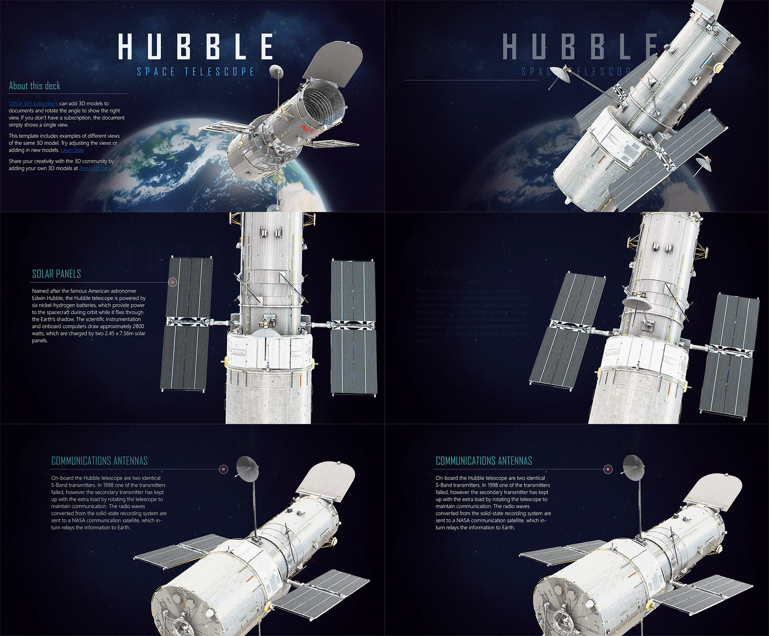
And the animations on some pages are particularly cool! Support 3D Oh!
After forwarding the article, click on my avatar, private message the keyword [high-quality template], and more than 30 sets of high-quality PPT templates will be shared with you directly!
Articles are uploaded by users and are for non-commercial browsing only. Posted by: Lomu, please indicate the source: https://www.daogebangong.com/en/articles/detail/I%20never%20thought%20that%20through%20these%203%20steps%20I%20can%20make%20a%20beautiful%20PPT%20so%20easily.html

 支付宝扫一扫
评论列表(196条)
测试