

-
I wrote a tutorial on "I changed the font in the elevator" before, and many students shouted that they didn't enjoy watching it, so I'm here again! This time we set our sights on a large supermarket, which has everything you need. Before we went, we thought it would be nice to get a few photos of the packaging with problems. After all, they are already commercial works, so they shouldn’t be far behind. , As a result, I went to the supermarket for a simple stroll and took more than 20 photos. It really shocked my jaw!


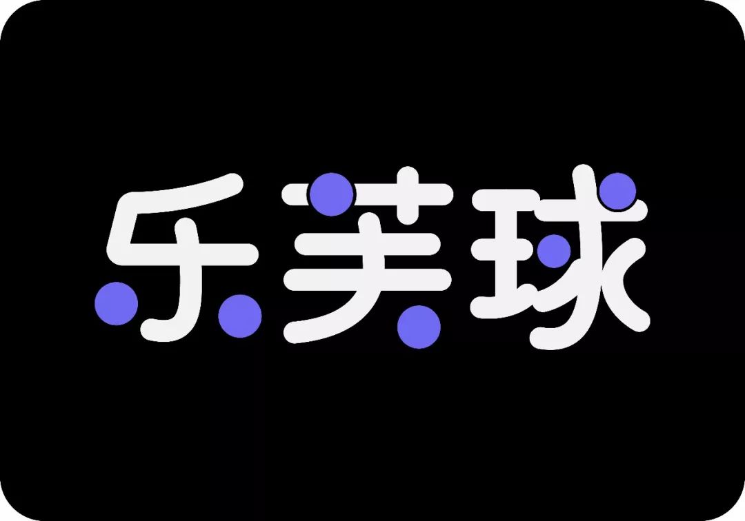
As shown in the picture below; the horizontal strokes are well-behaved and quiet, and the vertical strokes are mischievous, which is not coordinated.
The creative point of using circles instead of strokes is very good, but there are too many, it looks very broken, we need to filter and filter, keep the most suitable for you, and discard the dispensable, my mother said" One must not be too carefree.”

In the figure below; the position of the blue circle, similar to this kind of slash with a relatively small angle, can be processed into a horizontal line or a horizontal slash, so that the processing will show a more stable, more attractive, more durable, emmm, durable Forget it.
In the position of the yellow circle, the vertical line can be unified with the horizontal line, and processed into a straight line, and rounded corners can be added to the turning point, which can also increase the cute and playful feeling;
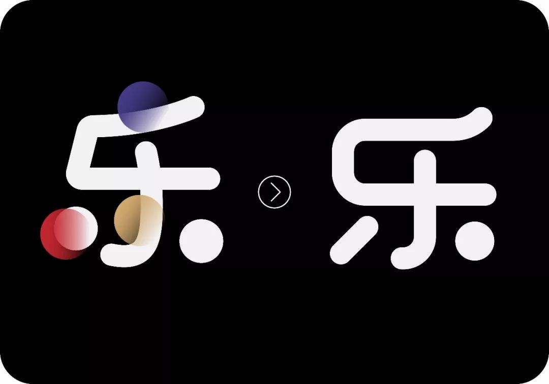
There are too many circles at the position of the red circle, only one circle is reserved for each word.

In the picture below; the position of the blue circle is a bit cumbersome. We can directly make a continuous stroke, which will be more concise. There are always some people in life who like to complicate simple things. For example, I am, hahaha !
The position of the yellow circle seems a bit procrastinated, limp, and not rigorous as a whole. After the modification, it instantly becomes a spirited guy. There is a sentence that I don’t know if I should say it"< /span>As long as the spirit of the guy is , he will be a powerful faction wherever he goes".

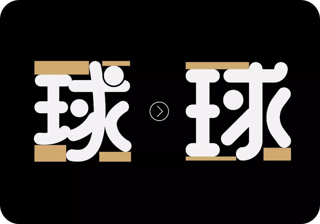
In addition, reduce the negative space of the font and make the shape more square, and you will find that the word will become fuller and more attractive.
Filling the white strokes and leaving a piece of negative space will affect the overall effect, so I simply filled the negative space together, "OMG, oh my god, it looks so good"!
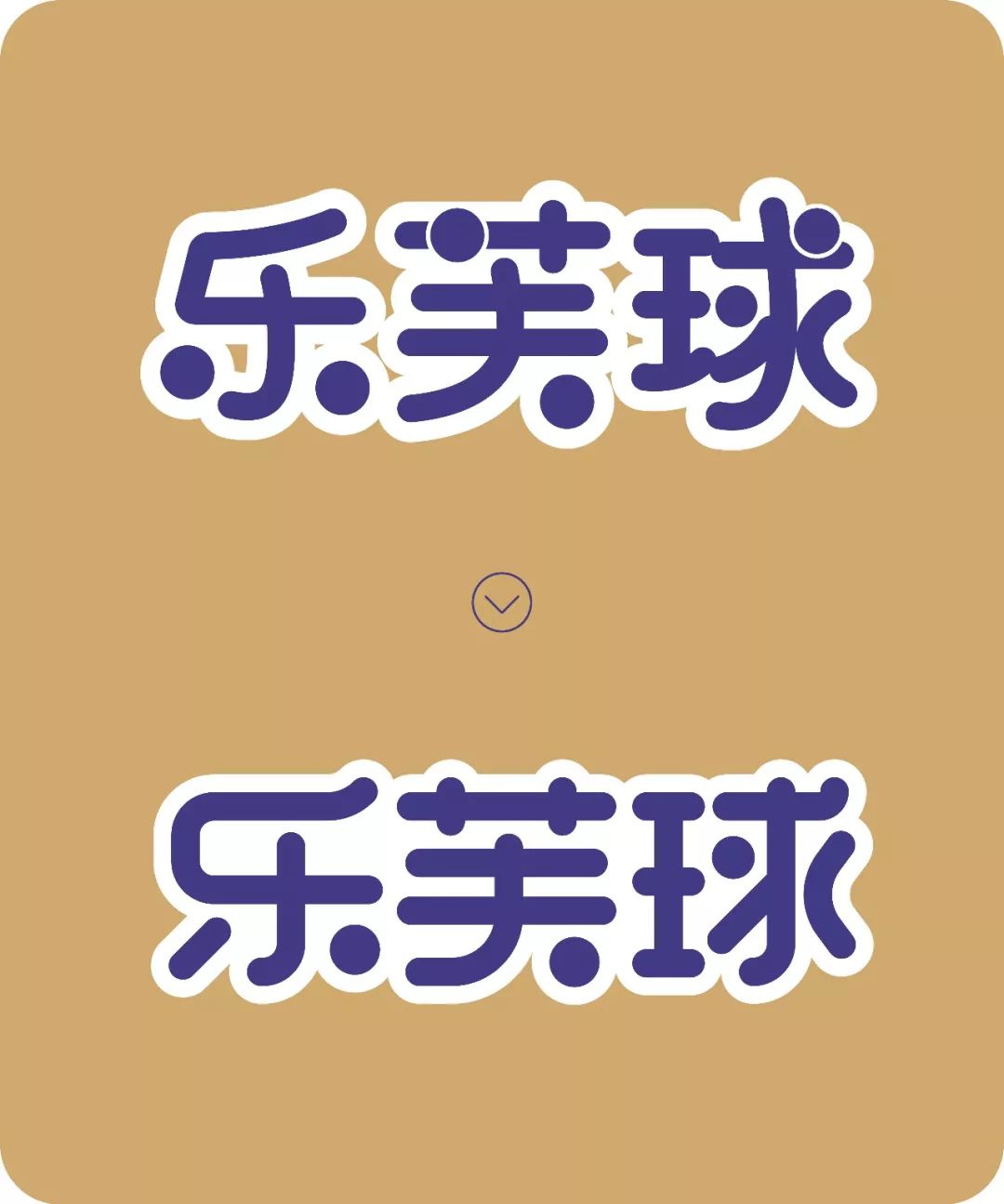
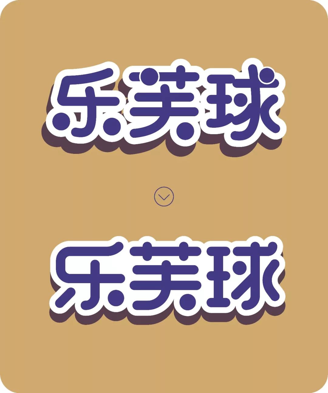

When the font reaches a certain level, the spelling is the details. If the details are not in place, you will always feel that there is something missing. On the contrary, if the details are in place, the whole set of characters will be more refined and attractive;
#Various fillet size
In the process of making characters, we must be coordinated and orderly, with rules to follow, as shown in the picture below; the rounded corners of each character are different in size, which is inappropriate. Let's be small together, be happy together and be good friends.
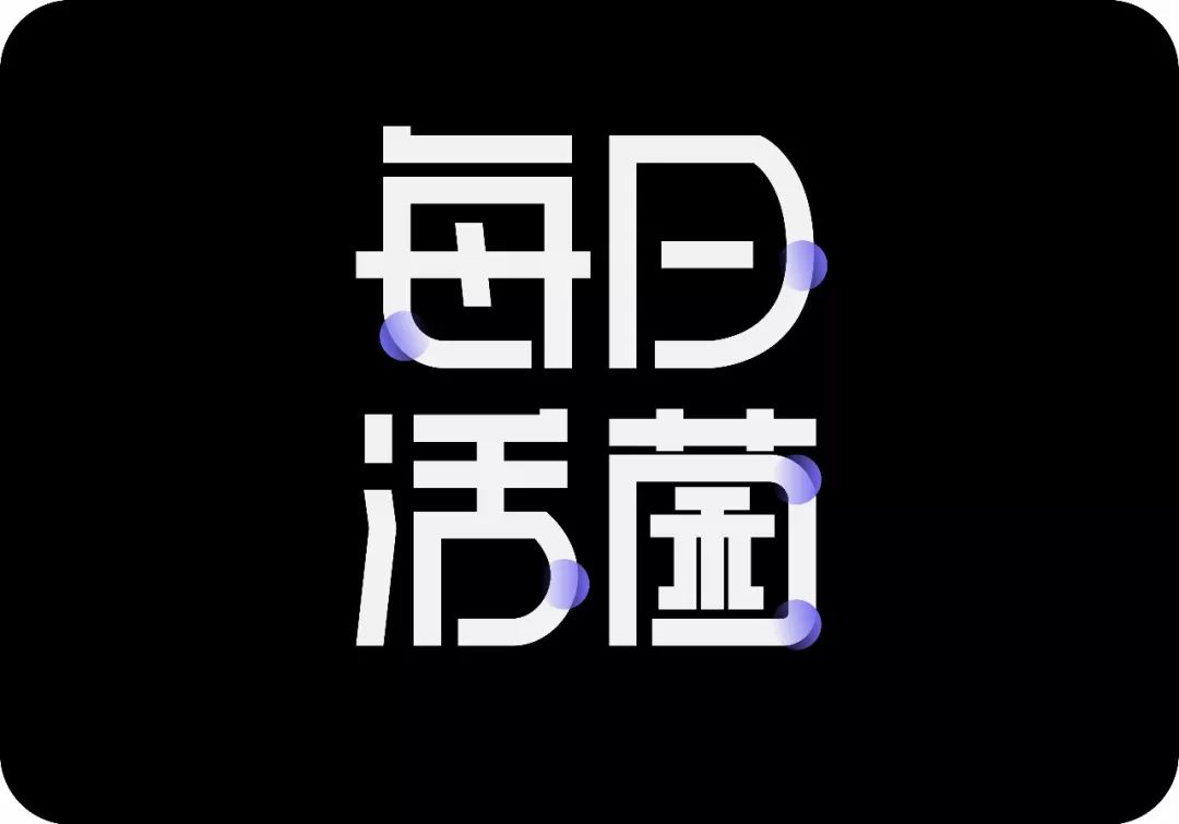
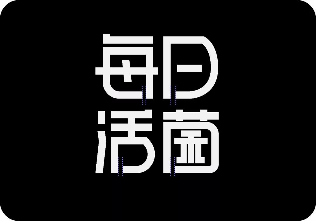
#Varying pen break distance
If you are careful enough, you will find that the distance between the broken pens at the dotted line in the picture below is different. In fact, the broken pens are also a bit particular. Not only must the distances between the broken pens be the same, but the distance between them should not be too close or too far. If it is too close, it will appear inconsequential and ambiguous, and if it is too far away, it will appear trivial. These details cannot be ignored.
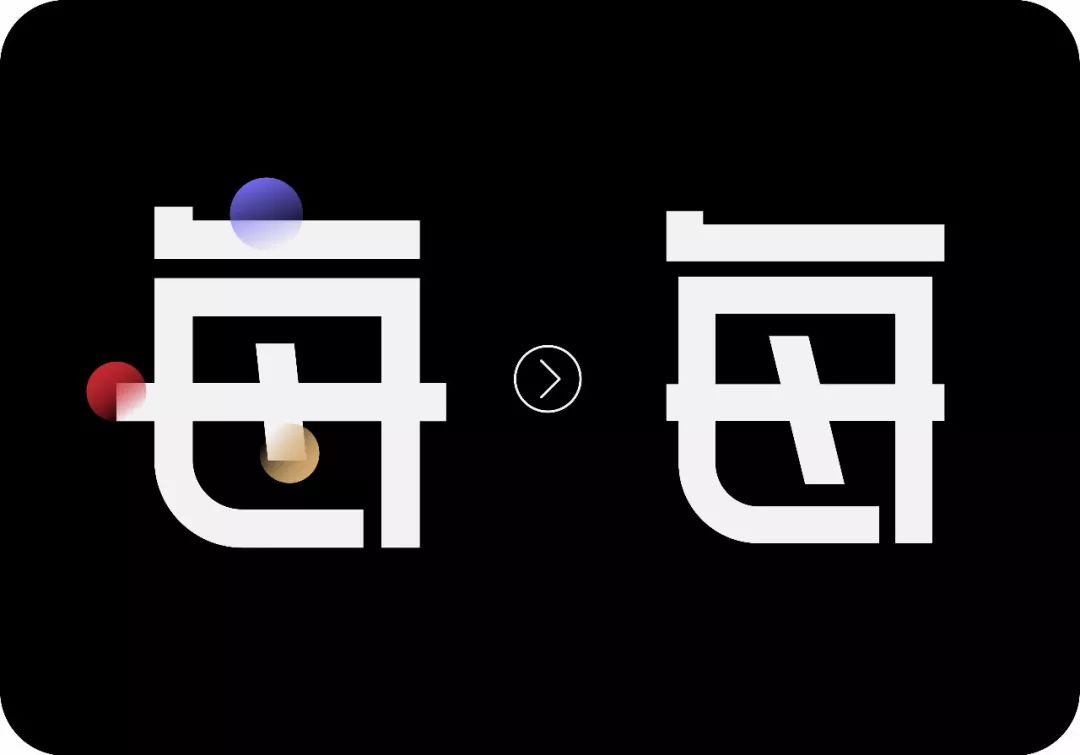
In the picture below; the horizontal line at the blue circle is obviously shorter and should be aligned with the horizontal line at the red circle;
The horizontal line in the red circle needs to be retracted a little, which will make the font look fuller;
The oblique line in the yellow circle is a bit short, resulting in a slightly empty space inside, and the angle of inclination of the oblique line is too weak, it can be enlarged;
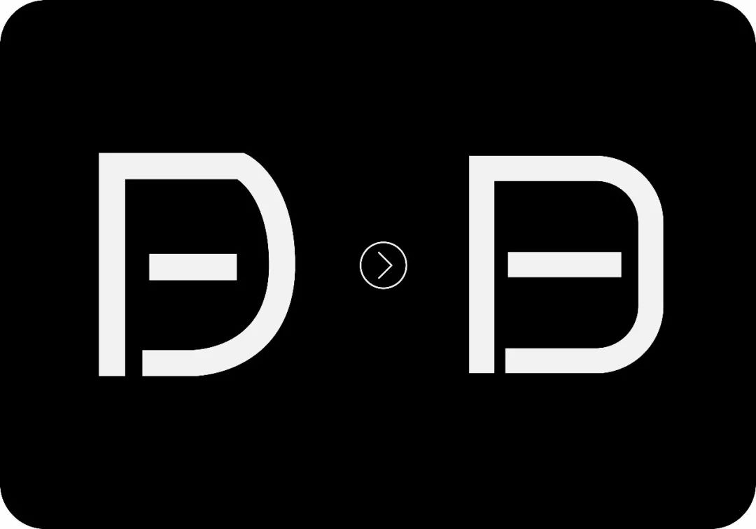
Unify the size of the rounded corners of the word "日".
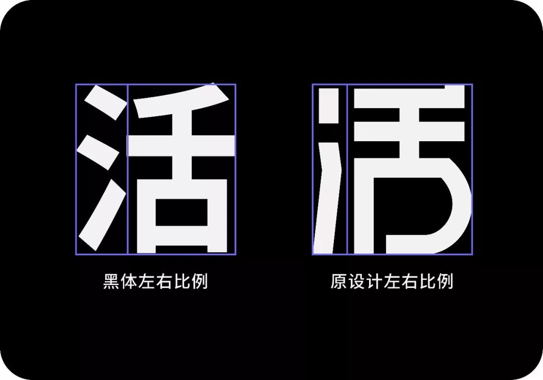
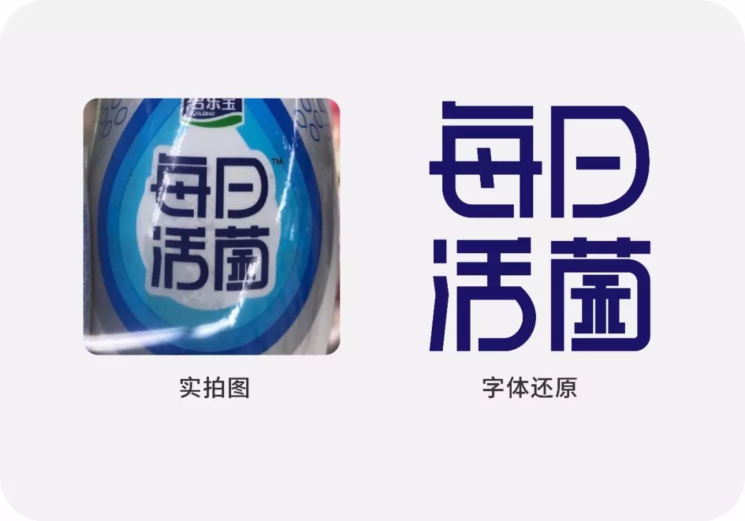
The proportion structure of fonts is a relatively common problem. This example font has a structural error. After the design of the "living" character, the right side is obviously too large and heavy, and the "three-point water" on the left is too narrow.
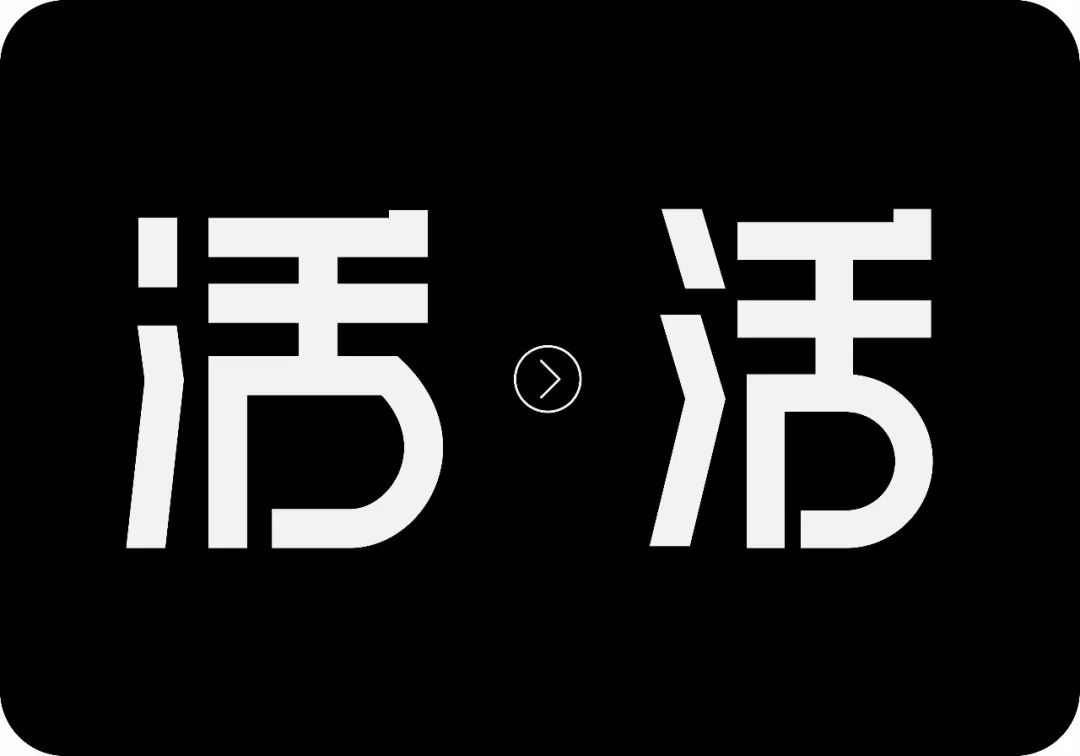
"Three dots of water" are uniformly processed into oblique strokes, and the angle of inclination is exactly the same as the oblique strokes in the word "every"; the arc in the lower right corner can be processed more smoothly.
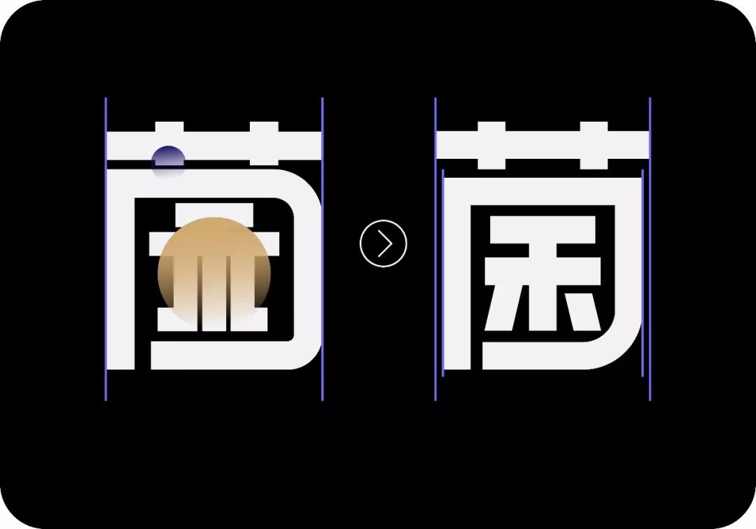
The vertical line of the word "口" needs to be retracted slightly (the position of the blue line in the picture below), and the rounded corners of the word "口" and the rounded corners of the word "every" can be echoed;
The strokes at the basket are too close together, if the font is reduced, it will be easy to paste together;
The arrangement of the stroke space in the yellow circle is not balanced enough, and it is crowded in the outer space. Here I have processed the two apostrophes into oblique lines, just to make a unity with the previous oblique line. The length of the two horizontal lines above the oblique line is very different. If it is too large, the second horizontal line also appears to be slightly higher.
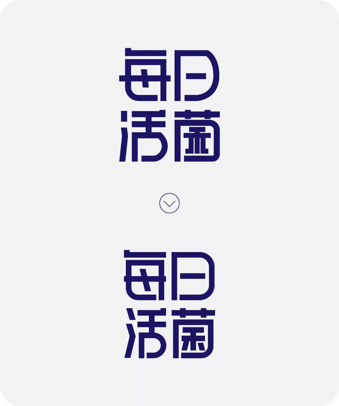
Let's look at the before and after comparison again.

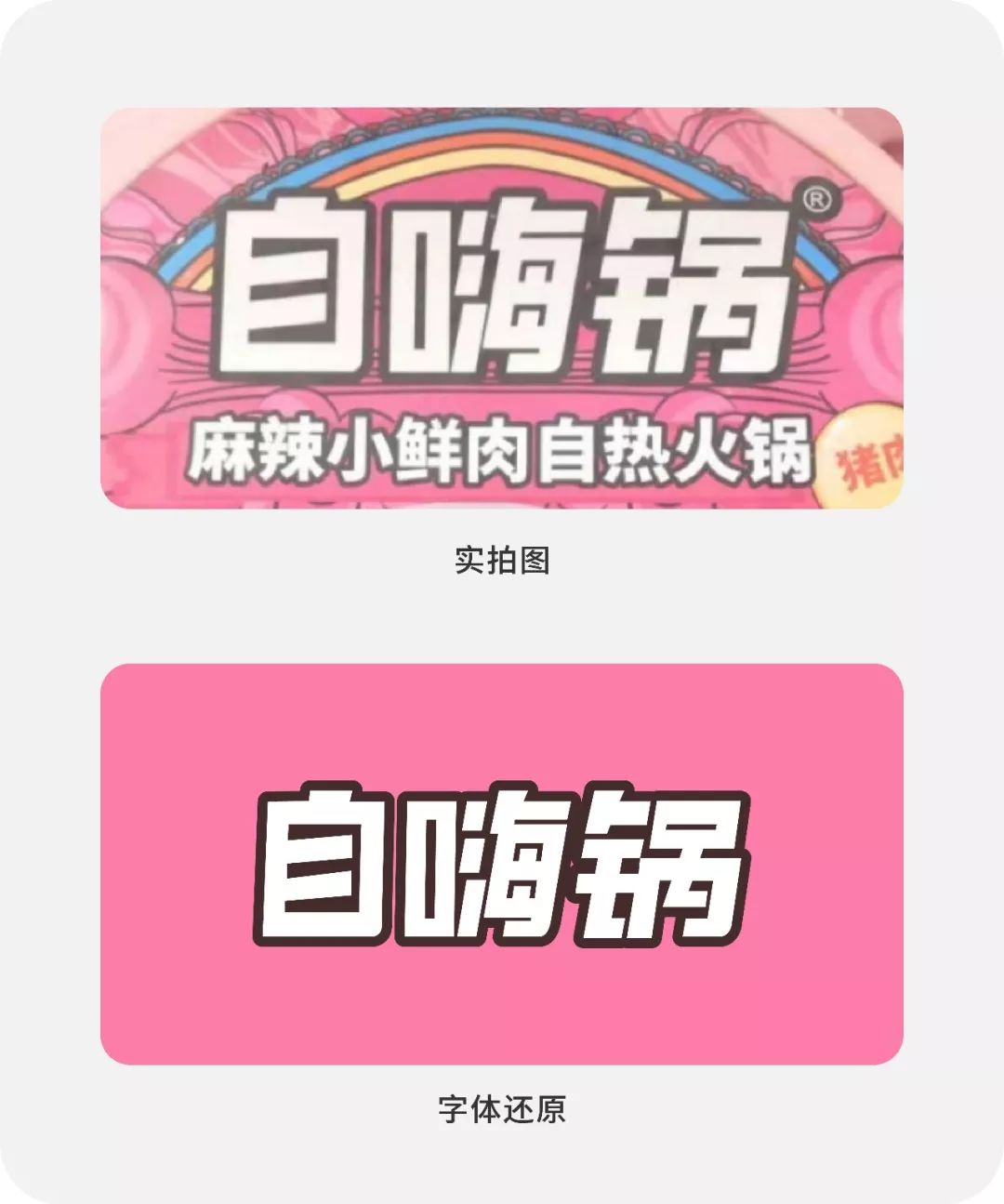
In my opinion, the most prominent problem of this group is that the angle of inclination is erratic, sometimes straight, sometimes crooked, which will make the whole group of characters look extremely unstable. The original author is probably a tangled person ! The only thing I can't forget is this coquettish color scheme.
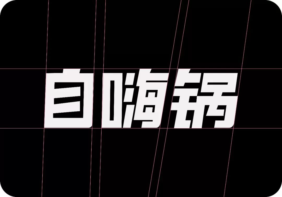
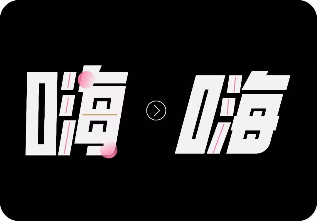
In addition to unifying the angle of inclination, we also need to optimize the internal structure of the font
1. The mouth is slightly wider;
2. The same angle of "three points of water" does not conform to the correct writing method. The inclination angles of the upper two points and the third point should be opposite;
3. I have simplified the strokes of the powder circle, so that the space will be more reasonable and the overall stability will be improved;
4. I always feel that something is missing at the position of the yellow line. It is bare and uncomfortable. Later, I found that the two ends need to protrude a little.
The radical on the left will be slightly higher, you can compare it carefully;
The original author added a rounded corner to the lower right corner of each word. This kind of careful thought is good, but the rounded corner is too small and not prominent enough. Here I slightly enlarged it.
The position of the fan circle has just been mentioned above, and it will be simplified uniformly.
The position of the pink line is sticky and ambiguous, which is not good, and sometimes it is necessary to keep a certain distance;
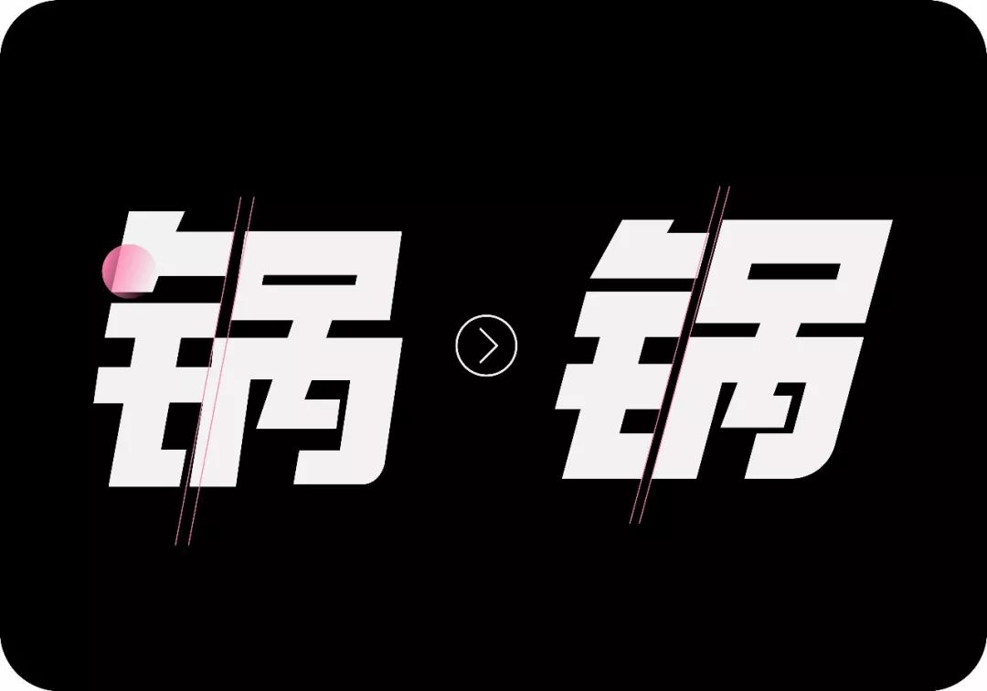
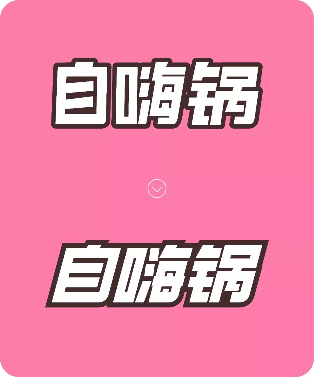
Adding a stroke to the font I also mentioned when modifying the first group, don’t have such broken lines and small dots, it will not appear as a whole, let’s take a look at the comparison before and after modification.

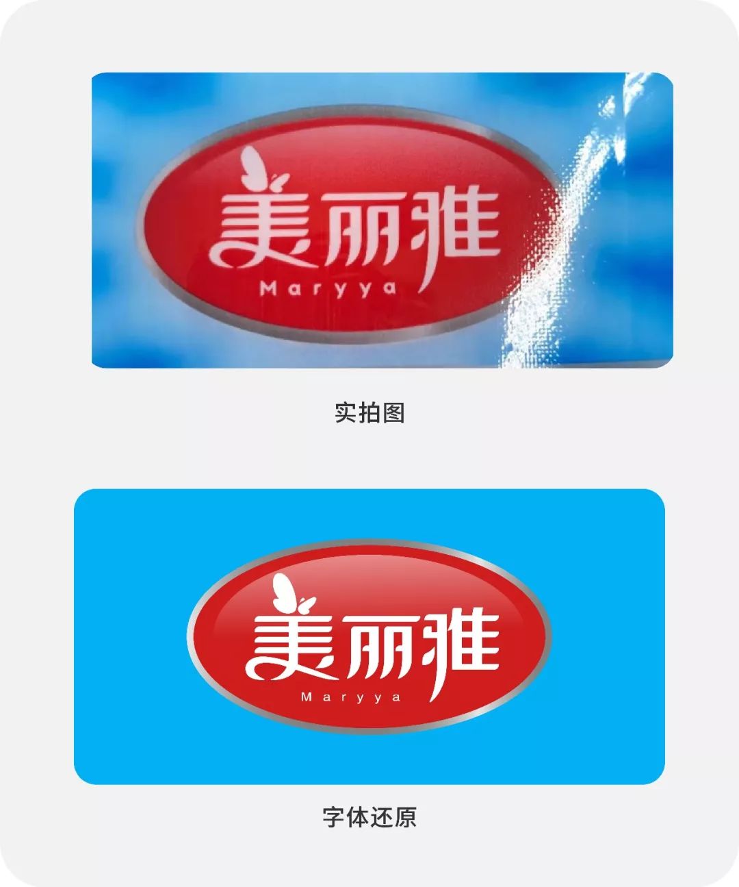
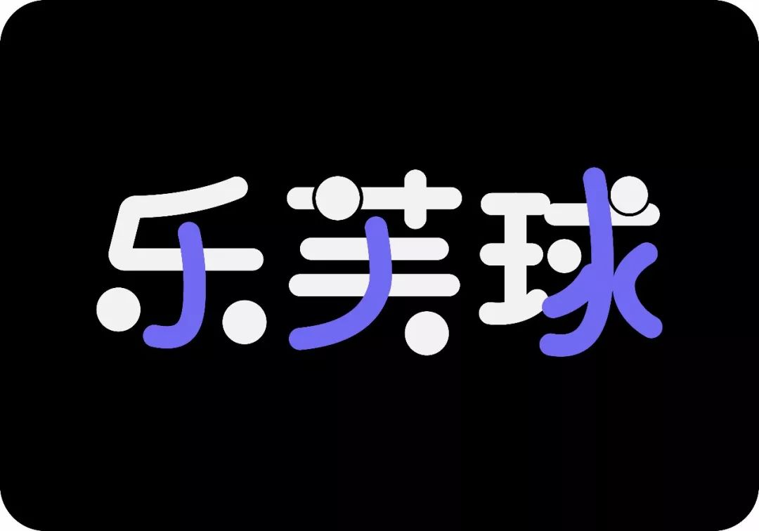
Since the title is "Meiliya", it is natural to create a beautiful and elegant feeling. Some curves are added to the original work, and the strokes feel good. The replacement of graphics also adds some highlights to the whole group of characters. But there is still much room for improvement.
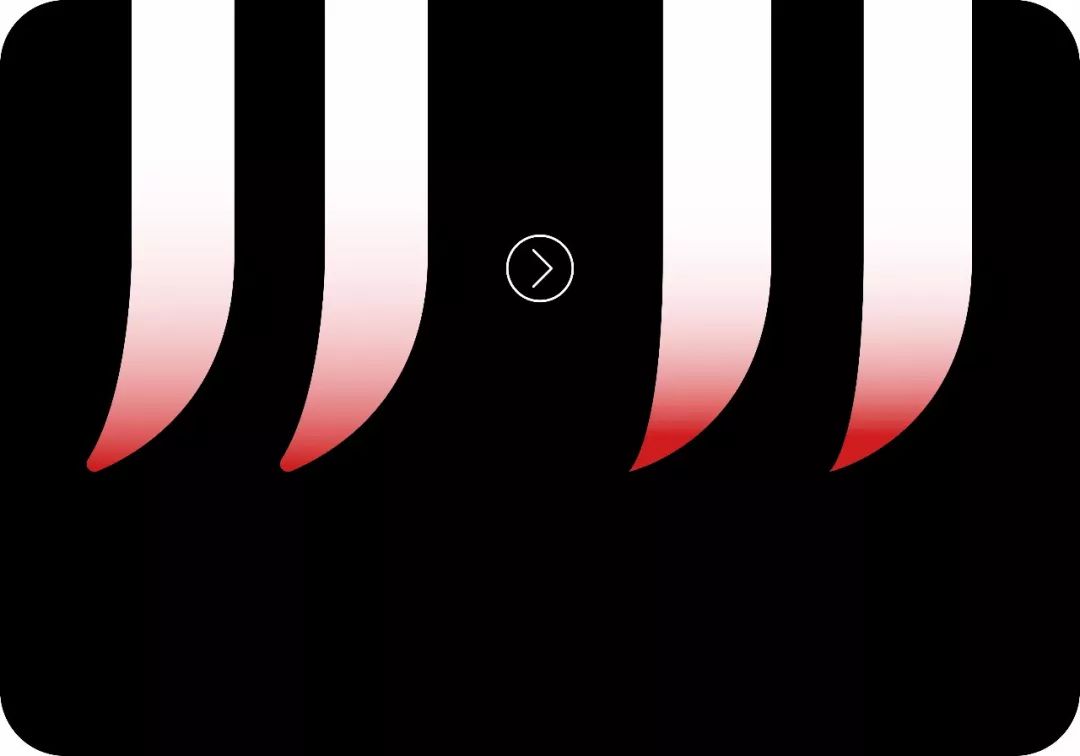
In the original work; the end of the stroke of the horizontal stroke is relatively sharp, but the end of the stroke of the vertical stroke is rounded. The temperament of the group characters does not match.
In the original work; the change of the curve at the bottom of the word "美" is a good highlight, but the effect is too weak, and there is a broken pen in the middle that is not smooth enough. Here I strengthened the change of the curve. The curve itself is self-contained. Aesthetic feeling (you need a little more patience when adjusting the curve, and you must achieve a smooth and silky effect);
The point in the lower right corner needs to be adjusted more smoothly;
The top four horizontal lines will be very rigid if they are fully aligned, and the middle two can be shortened a little;
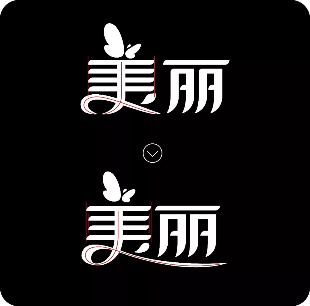

The character "丽" looks obviously smaller than the other two characters, and it doesn't look plump enough. This is because the lower part of the character "丽" is too narrow.
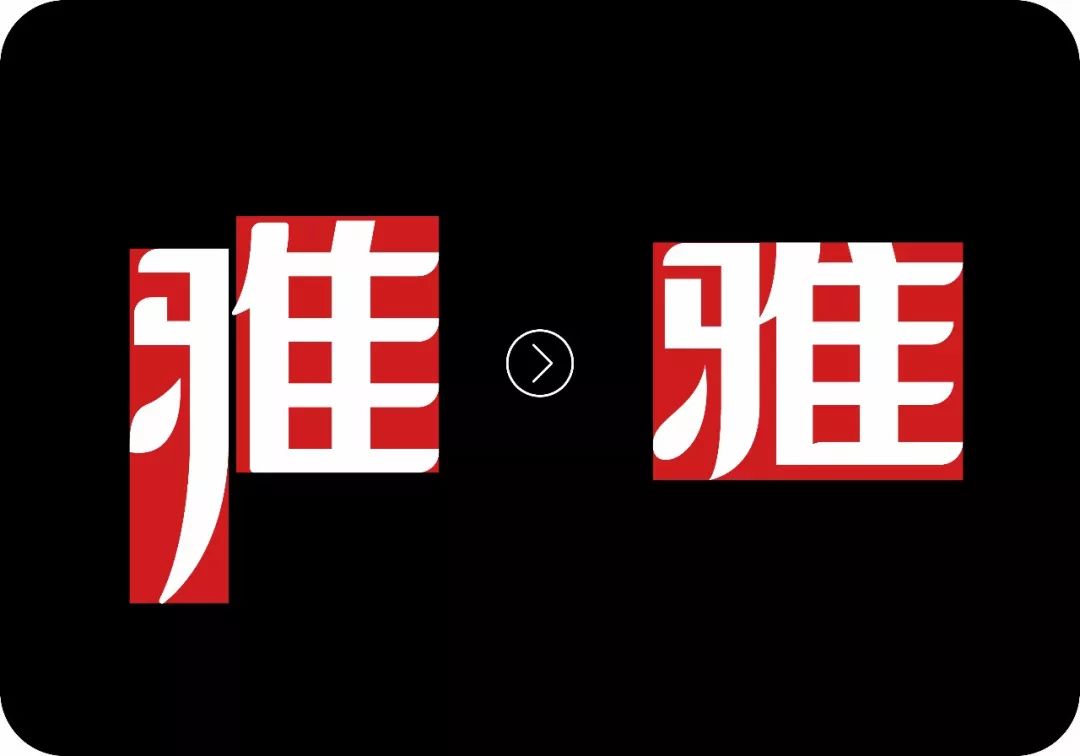
The word "雅" is obviously low left and high right at first glance. Here I chose top alignment, and I retracted the protruding strokes in the lower left corner, because I strengthened the deformation of the curve of the word "美" in front, so here You can't steal the limelight, or you will lose more than you gain;
The point in the lower left corner also needs to be adjusted more smoothly;
If the point in the upper right corner is written in the normal way, it should be in the wrong direction;
The right alignment of the four-point horizontal line on the right of is also very rigid.

Adding a slant as a whole can make the font smoother; English can be adjusted to a relatively empty position in the upper right corner.
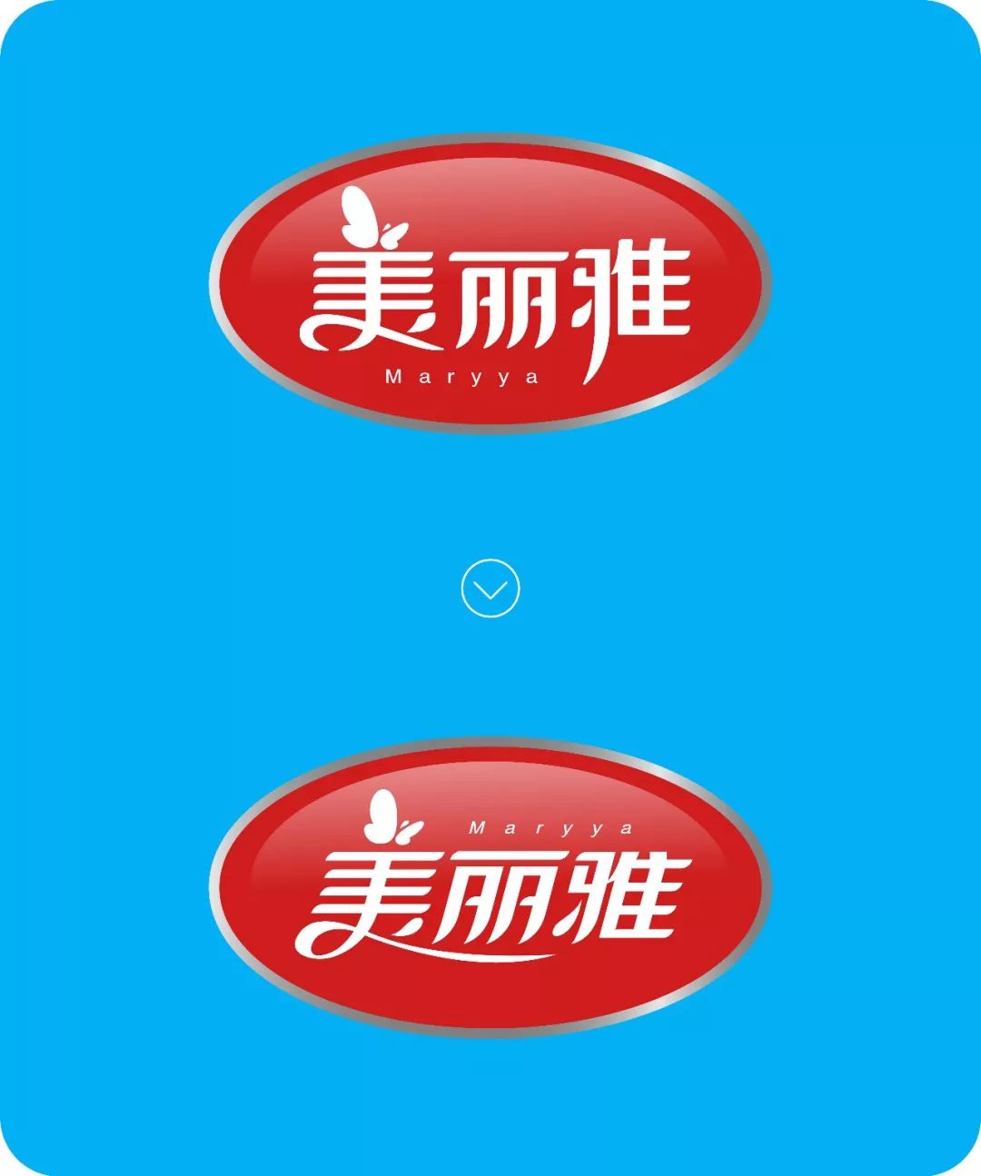
Okay, let's take a look at the comparison effect before and after modification.

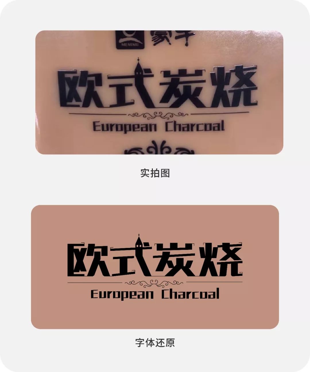
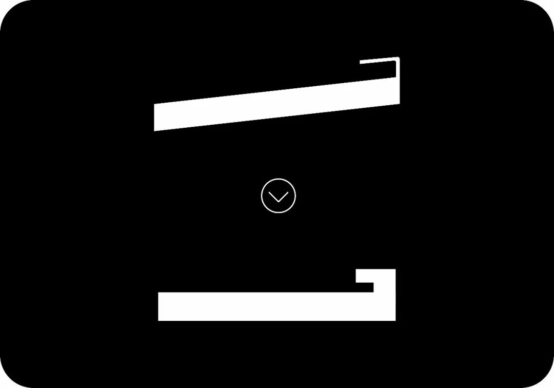
In the original work; the horizontal pen is tilted, it always feels weird, it seems not stable enough, and there is a tendency to fall to the left, so I adjusted the horizontal pen to a straight line;
The style added at the end of the stroke of the horizontal pen is great, but it is too thin. If the font is reduced, it will not be visible at all, so I made it bolder.
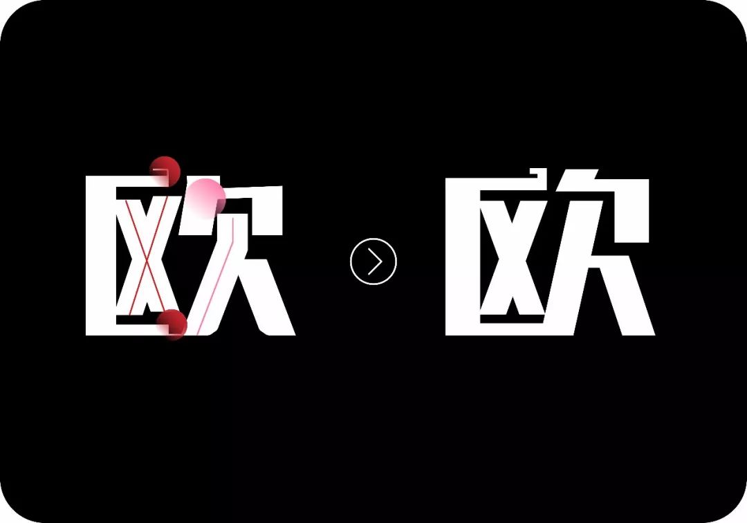
In the original font; the strokes of the red line are one high and one low, a little twisted, I adjusted it to align up and down;
The horizontal pen at the position of the red circle is slightly shorter;
The strokes at the position of the pink circle seem to be a little crowded, here is a simplification;
The strokes at the position of the pink line can go straight and straight, try not to beat around the bush;
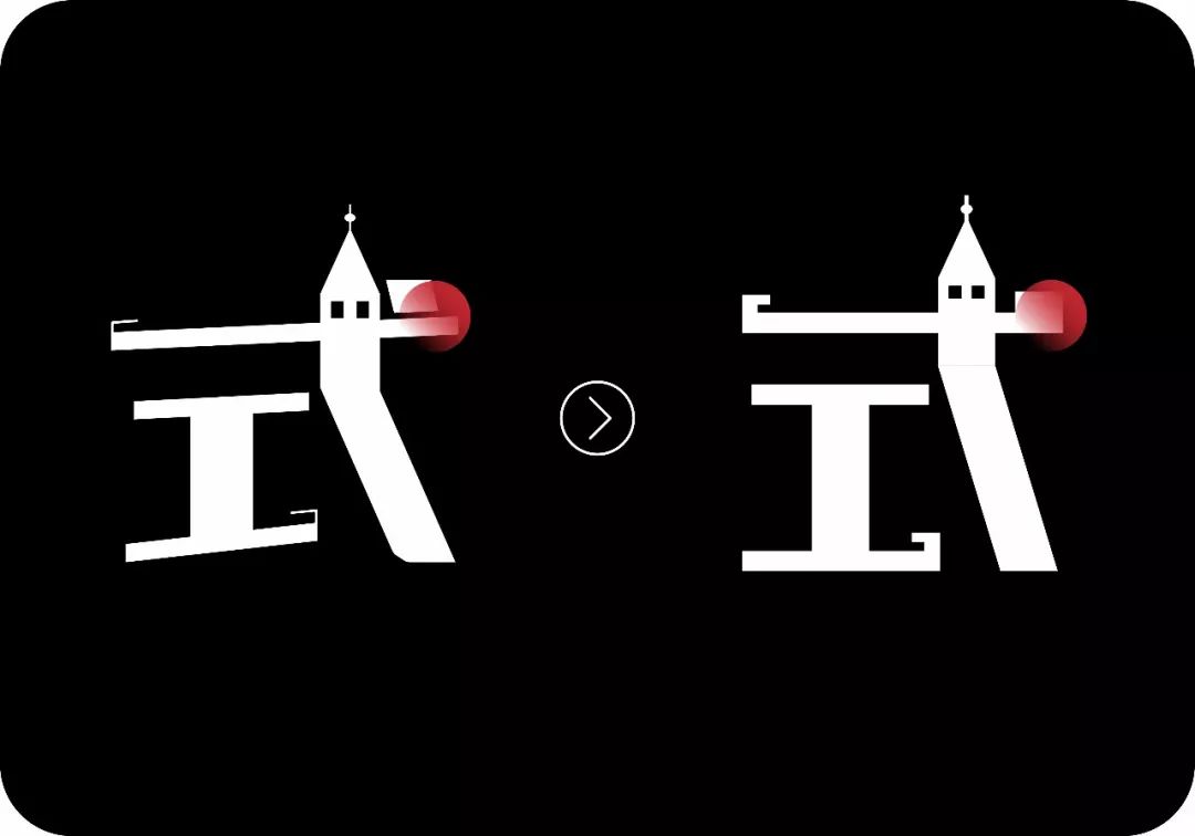
The "dot" at the position of the red circle will be more smoothly connected with the horizontal pen, The inclination of the "point" can be treated as vertical, just parallel to the building next to it.
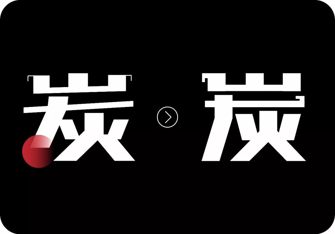
There is some space in the lower right corner, so I used the bottom alignment for the slanted pen in the lower right corner, and the place where the slanted pen starts is too far inward.
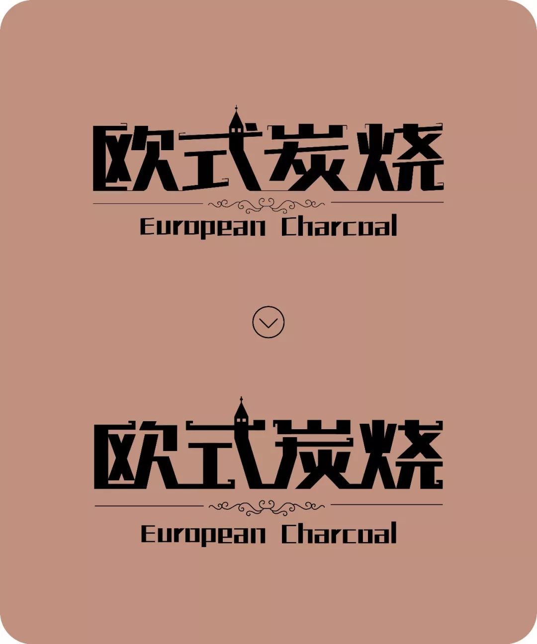
The English horizontal strokes also need to be adjusted to be direct, let’s take a look at the before and after comparison effect;

ok This is the end here, and I want to say goodbye to everyone again, wait a minute, let's have a wave of picture integration.


Well, when you go to the supermarket in the future, remember to pay more attention to the packaging. There are many fonts, which are worth learning. Of course, there are also many fonts, which can be modified to be better by using the above ideas. In short, fonts are all around us. Design is all around us, pay more attention to observation and summary, you can do better too!
Well, I won't have any more BBs, see you next time!
last
Happy New Years everyone
Wish you all a new year
Every day on the list, every day is cool
! ! ! ! ! ! ! !
Recommended recent tutorials
▼


Articles are uploaded by users and are for non-commercial browsing only. Posted by: Lomu, please indicate the source: https://www.daogebangong.com/en/articles/detail/I%20changed%20the%20font%20in%20the%20supermarket.html

 支付宝扫一扫
评论列表(196条)
测试