
-
Well, next, look at mine!

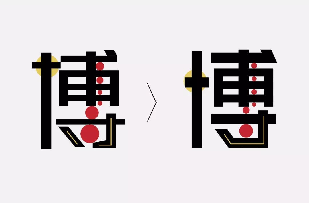
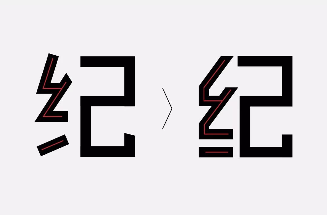
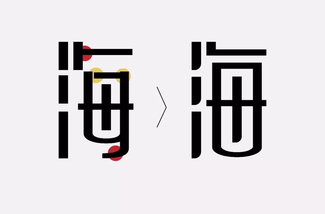
Let’s take a look at the details. Some students who are new to font design don’t pay much attention to details, so it’s hard for their works to stand up to scrutiny, as shown in the figure below; the stroke angles in the original font are different. It doesn't seem to be well-behaved and steady at all. We deal with it uniformly through the tilt angle. At the same time, the structure next to the skein is slanted and horizontal, and I processed it into a slanted vertical and horizontal, which will make the font look more stable and full.
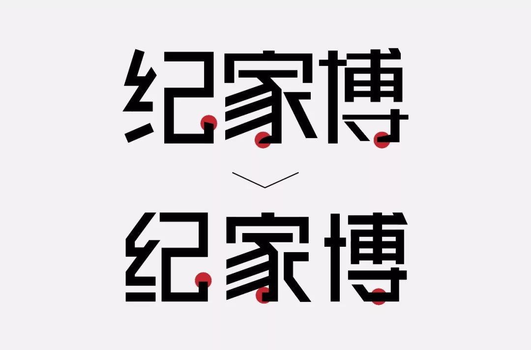
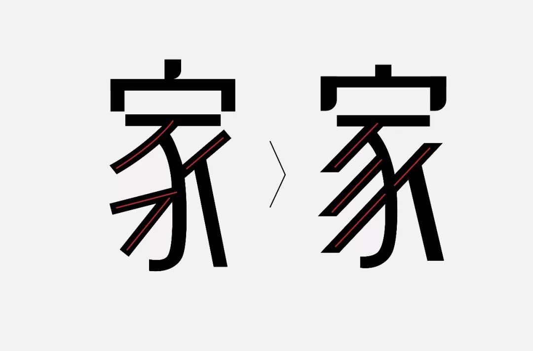
In the process of making characters, it is no problem to add some features to the strokes so that the font changes have characteristics, but all of these must be changed based on the overall situation. Make the overall consideration of your temperament, rather than changing it at will. As shown in the picture below; the deformation of the three strokes circled, the three deformations of the three strokes, this is probably the strokes of the old Wang’s house next door, it always feels a bit out of place, and it also destroys the overall temperament. Do a unified treatment.
#Unification of literal size
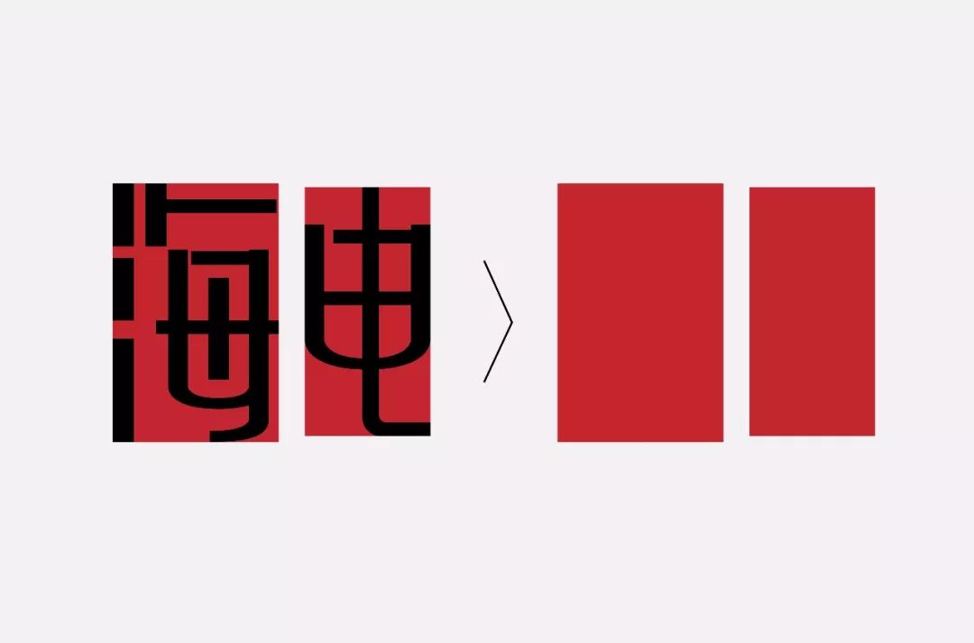
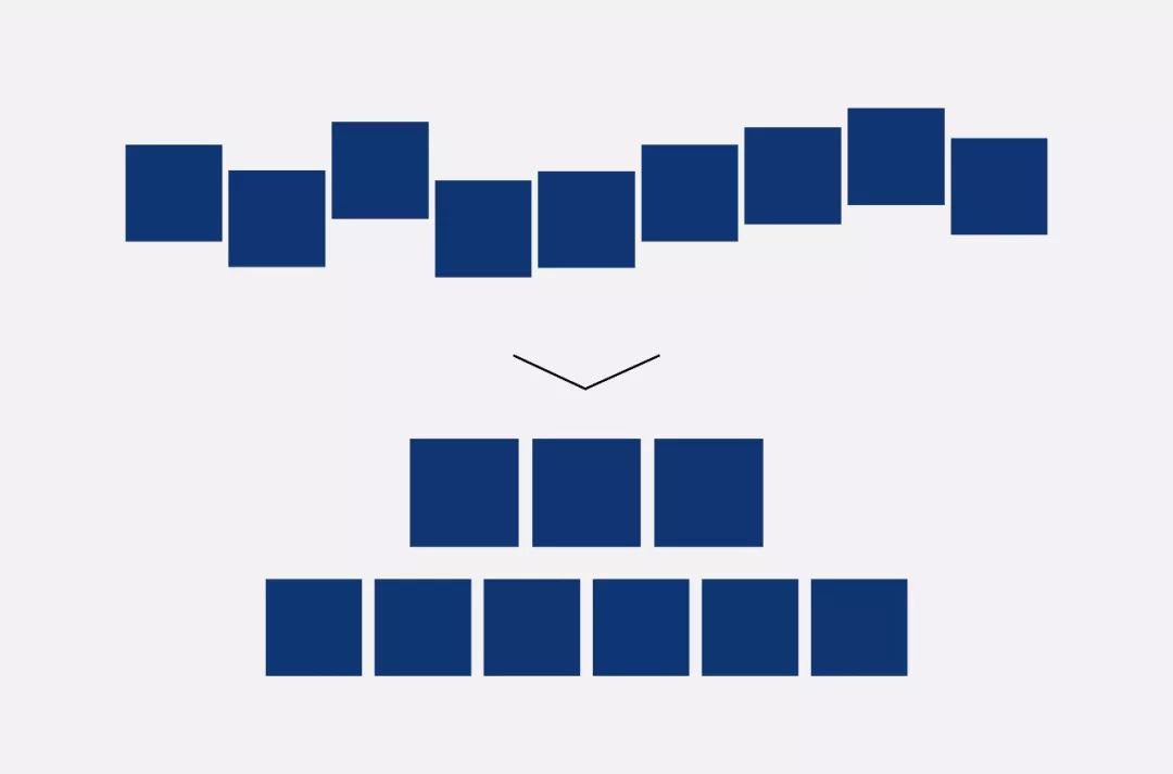
The proportion of the font size of the original font is a bit out of balance. It is not difficult to find that the font becomes smaller as it goes to the back, as shown in the figure below; we compare the characters "海" and "电" and it seems extremely uncoordinated of.
#Unity of center of gravity
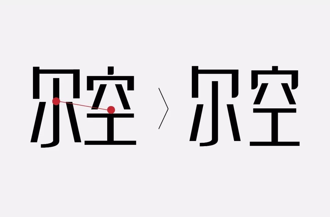
The high and low center of gravity will make the whole group of characters look a bit floating, as shown in the picture below; the character "kong" is obviously shorter than the character "er".
#Unity of stroke angle
The unity of stroke angle can always bring us some sense of order.
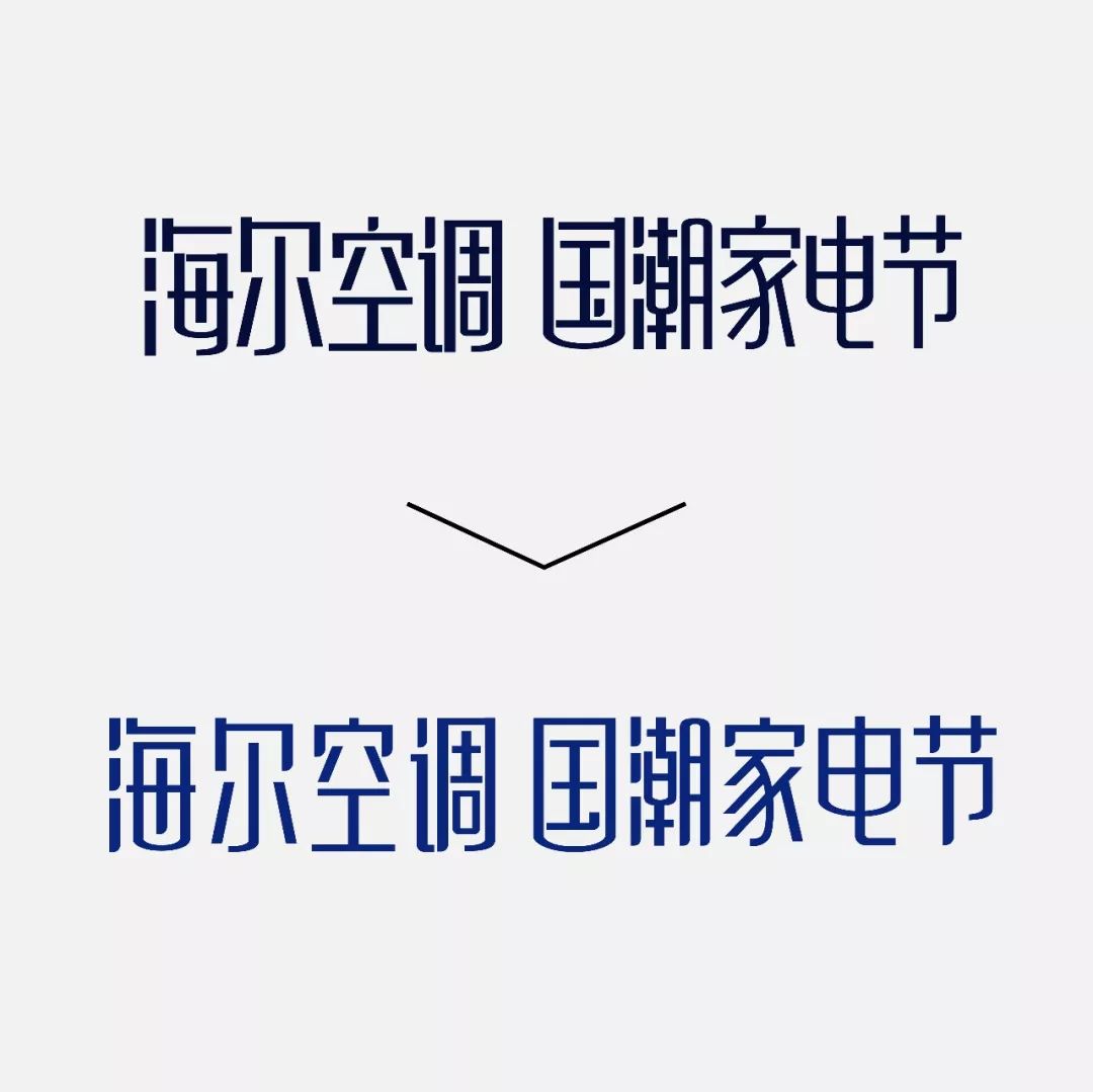
The problem of font connection. Font connection is a common method for our daily creation of characters. Before making characters, we need to think about whether such a proposition is suitable for connection, and whether such font characteristics are suitable for connection. If you want to connect, you must "connect to the end, decisively and simply". The original work was abandoned halfway through the connection, which is not complete enough. Since the propositions in this group are relatively long, if you connect them all, it will affect the recognition problem, so I canceled the font connection. , Sometimes not connecting is also a kind of whole.
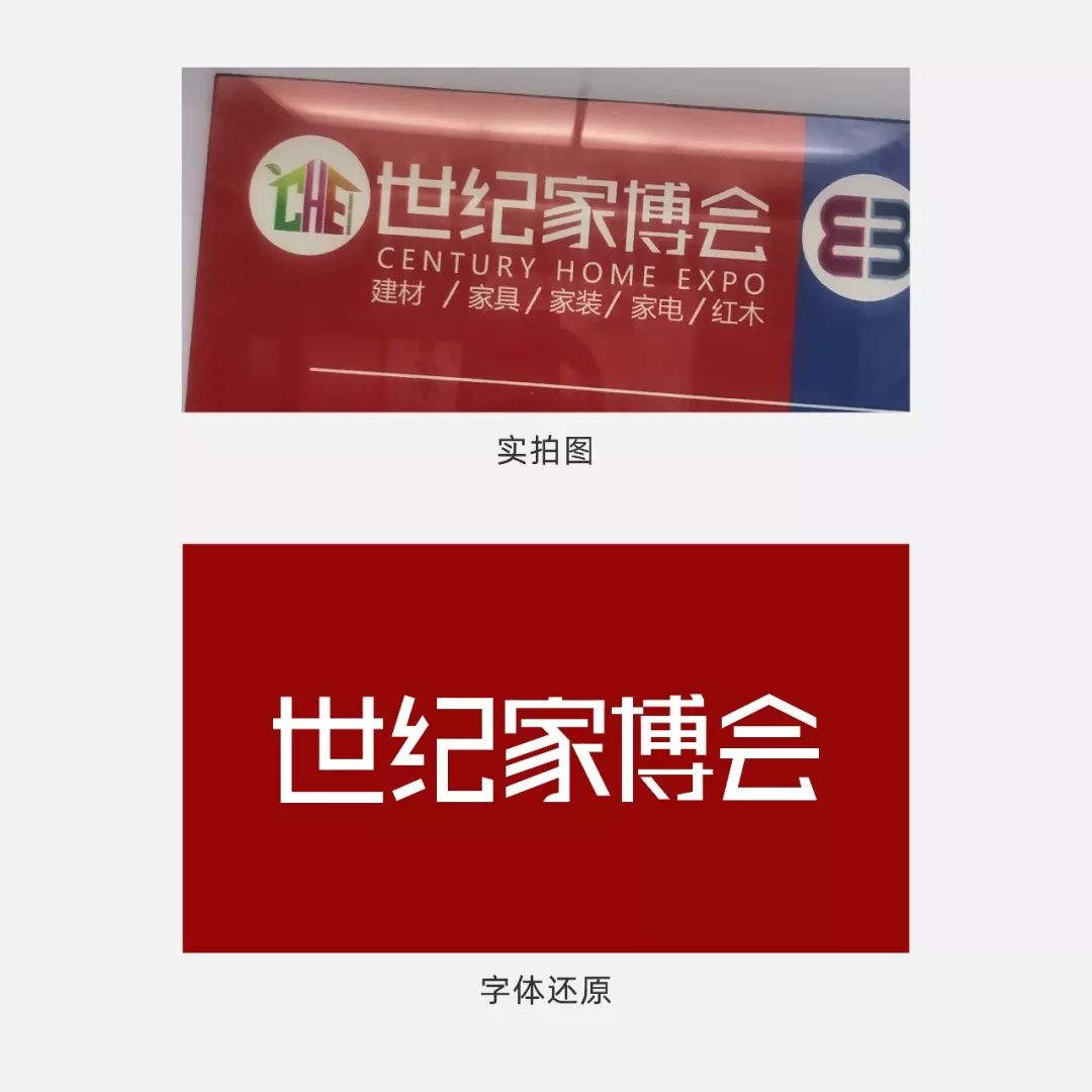
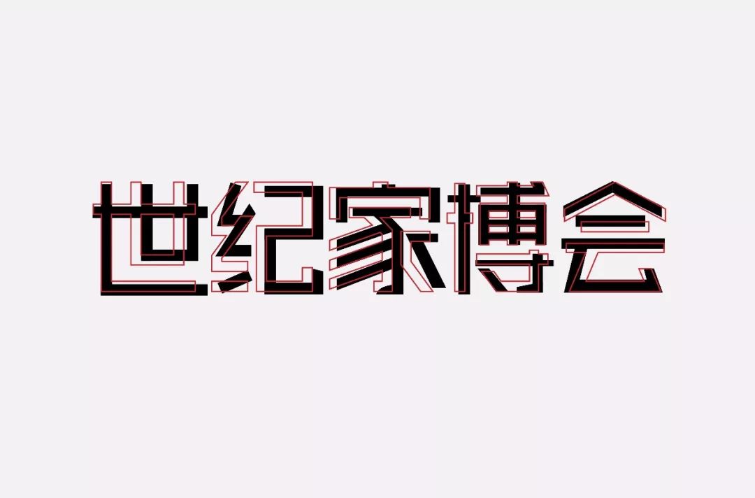
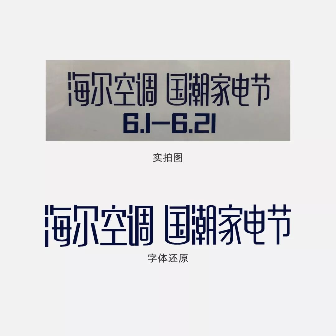
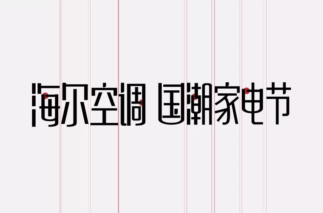
Regarding the typesetting problem, the word spacing of the original font is too close, which does not seem breathable. Considering the title is too long, I chose to arrange it in two lines, which will be more intuitive, and the font misalignment of the original font appears to be It's messy.
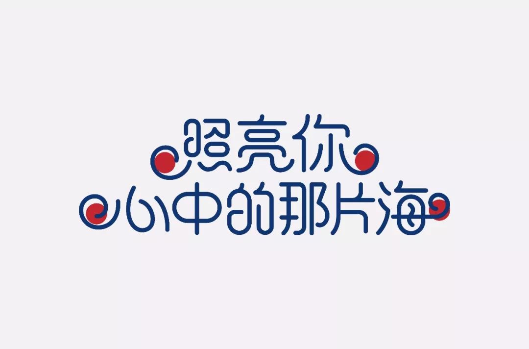
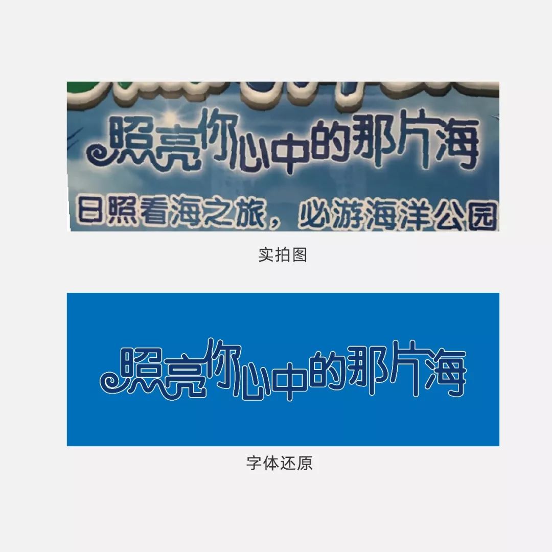
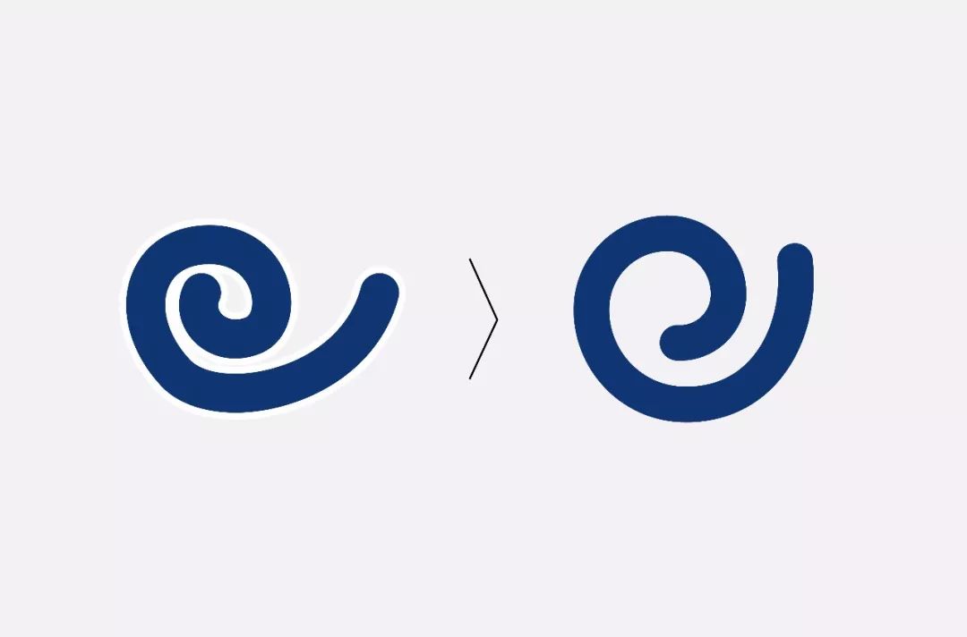
The coiled thread needs to run through the whole to "wave". In the original work, only the character "Zhao" has a coiled thread. Only when everyone surfs together can the surf be happy. In the picture below, I have uniformly added winding lines in the four places circled in red.
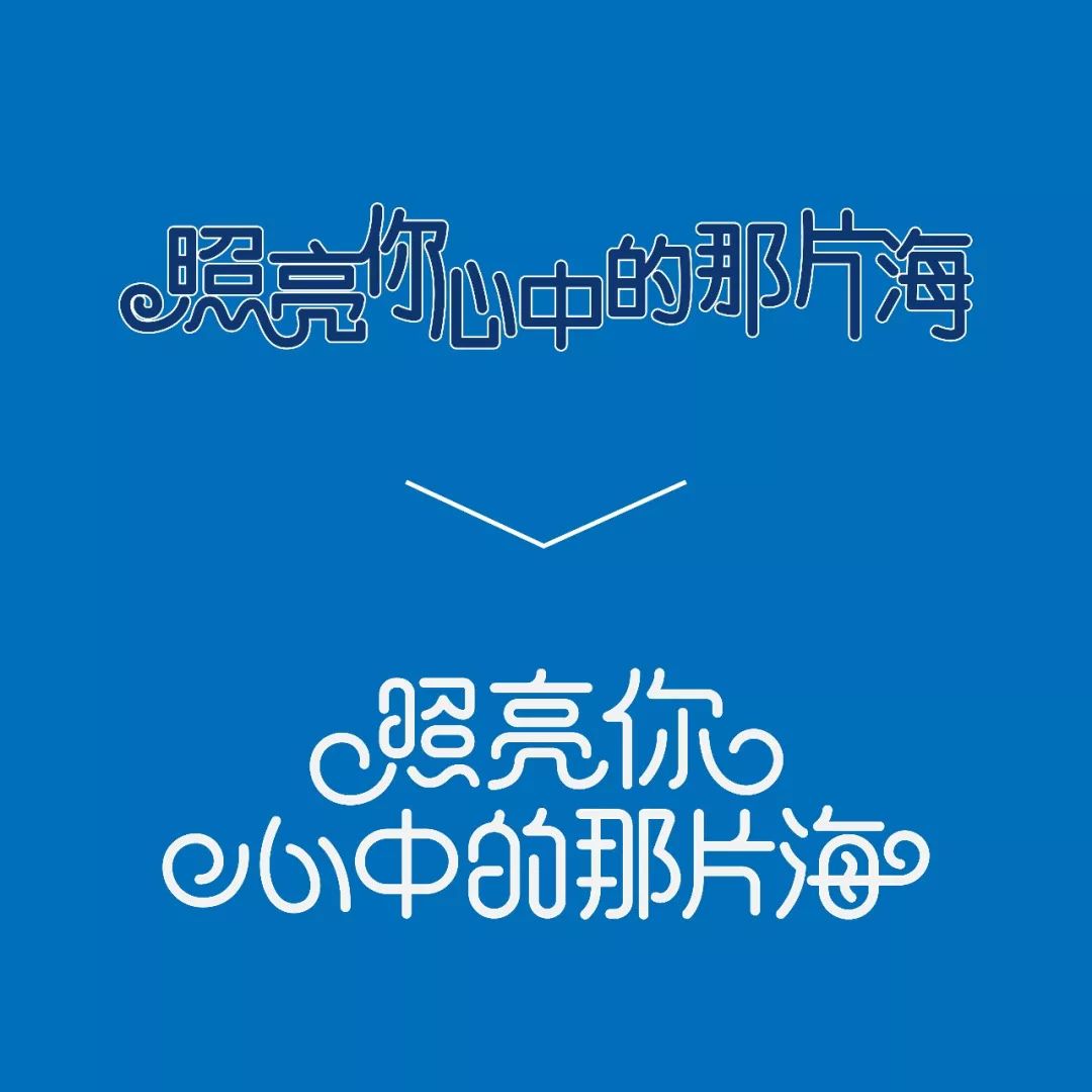

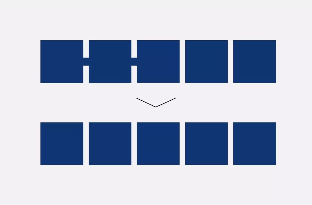
The original work only cuts at the sharp corners at the end of the strokes, which seems a bit blunt, and the angles of the sharp corners are not uniform, which makes it appear too messy.
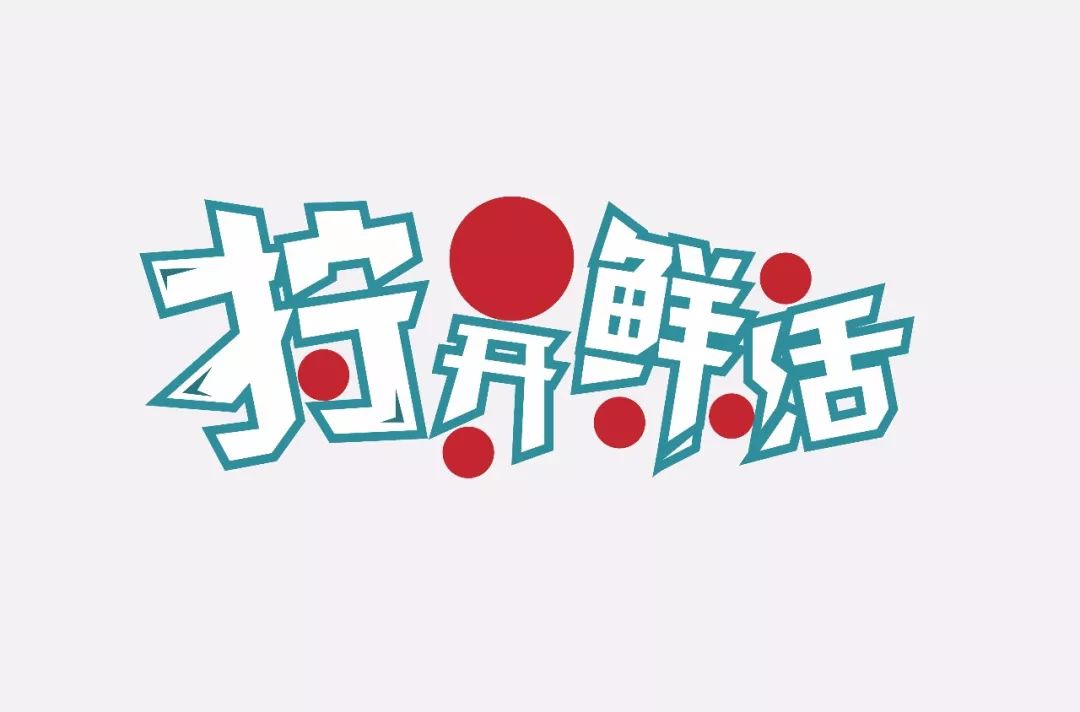
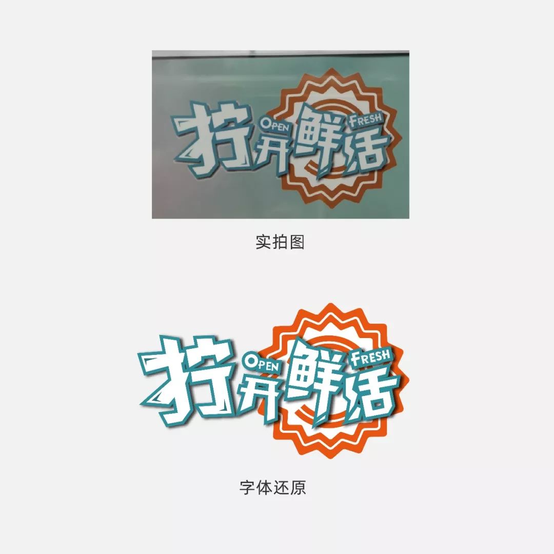
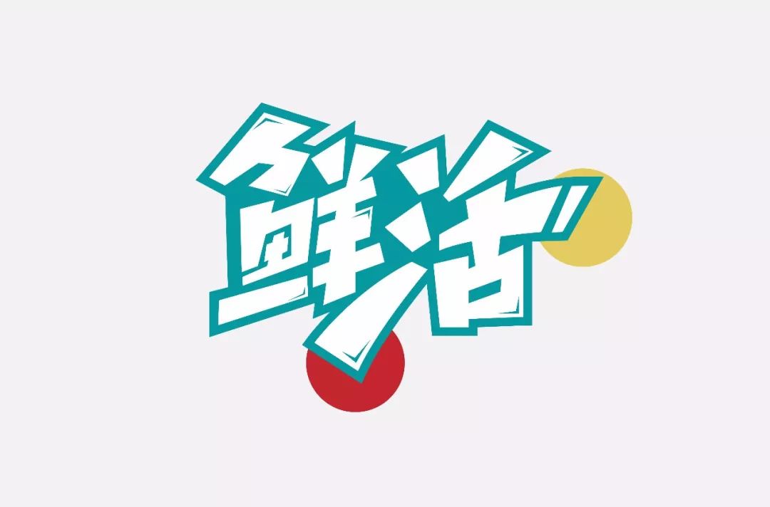
We removed the bottle cap and English to expose the problem more clearly. There is no echo between the words. The red circle in the picture below is very empty, which will make the whole set of words appear too trivial.
Here I adopted the feeling of handwriting as a whole, and the horizontal strokes were uniformly made an upward slope. In order to make the font more dynamic, there are more interspersed words between words, which can just solve the problem of unbalanced negative space. (I found that the difference from the original font is a bit big after the modification, I tried my best)
In order to make the font more tense, I exaggerated some of the strokes (the position of the red circle in the picture below), and added a cutting effect to the end of the last stroke of the word "Xian" in the original work. This position did not have the effect it should have. I added the cut to the position of the yellow circle in the picture below to make it more prominent.
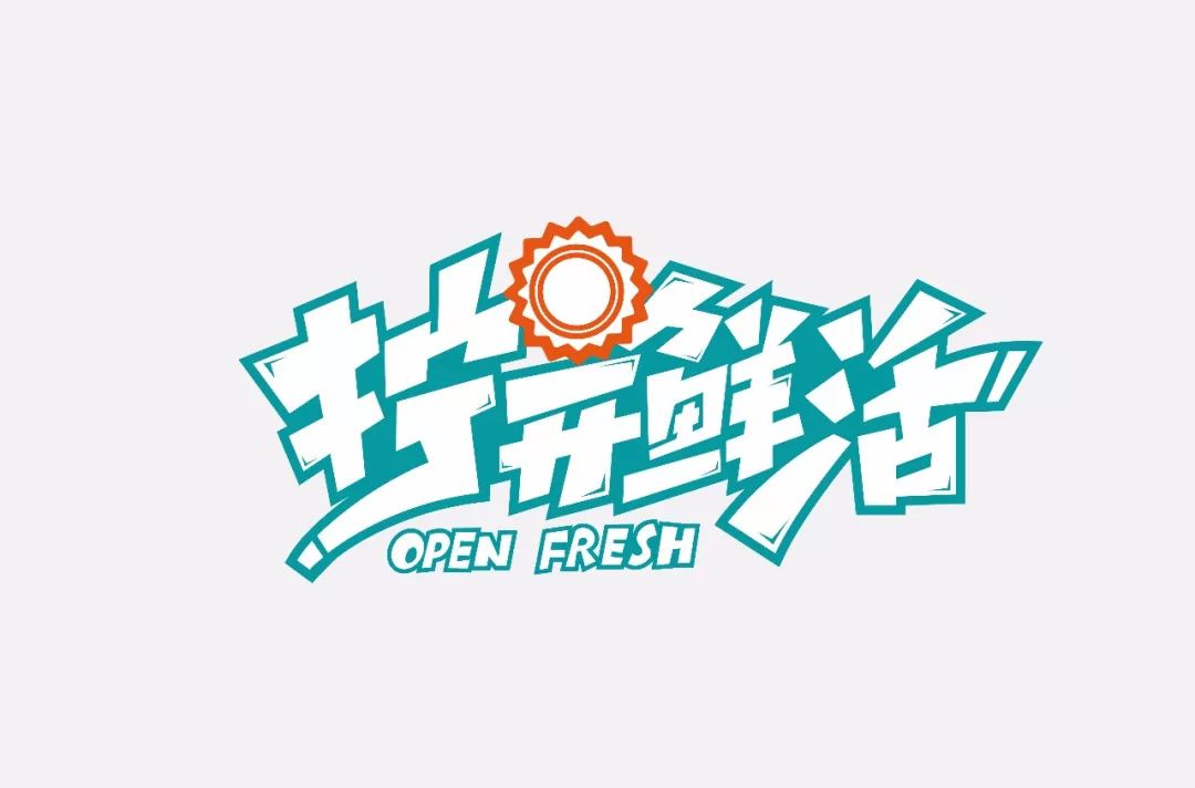
The beer cover is pressed behind the font, which affects the recognition and is not beautiful. Put it at the front and shrink it a little. Don’t steal the limelight of the font. The English part is a bit scattered and needs to be integrated. Put it on the bottom left The corner is relatively vacant.
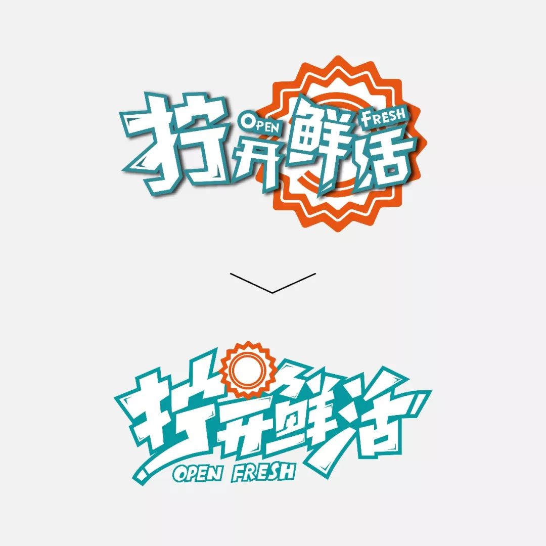
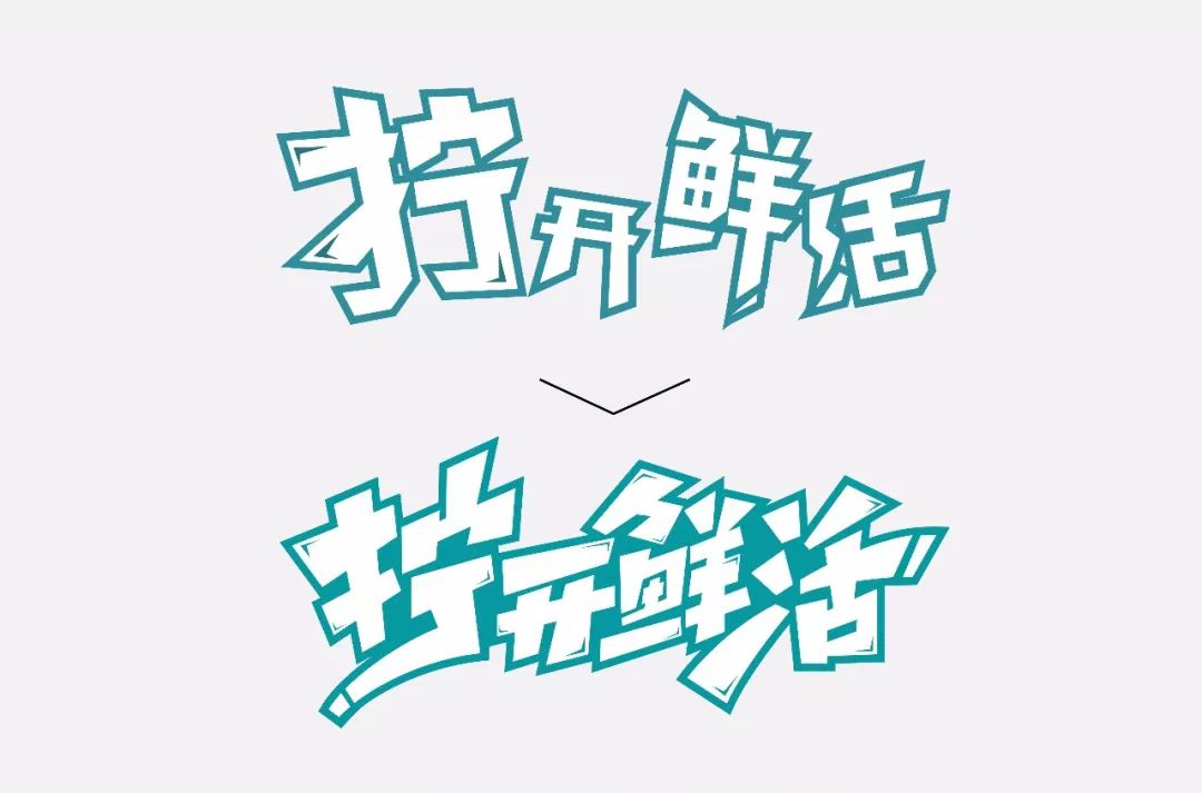
In this kind of design, we have used the "pen-making method". This method is more convenient and flexible. We can "play" happily, but we need to master a "degree" in the process of "playing". ", if the "play" is too big, there will be recognition problems. If the "play" is small, it is better not to play. Let's take a look at the before and after comparison.
OK, this one is finally finished. Although there are only 4 cases, it also contains a lot of knowledge points and dry goods. I hope everyone can taste and learn slowly. Finally, the four cases will be combined , Come to a wave of picture summary!

Well, it's over here, when you take the elevator tomorrow, remember to watch the advertisement a few more times! Goodbye everyone!

Articles are uploaded by users and are for non-commercial browsing only. Posted by: Lomu, please indicate the source: https://www.daogebangong.com/en/articles/detail/I%20changed%20the%20font%20in%20the%20elevator.html
 支付宝扫一扫
评论列表(196条)
测试