Original Author: Martin_K
What is an optical illusion
False vision refers to the phenomenon that the visual perception is inconsistent with the objective physics, and this phenomenon is called false vision. After receiving the information from the visual system, the human brain will make a correct judgment as much as possible after comprehensively comparing and analyzing it. However, when the information is not sufficient or the error is disturbed, visual problems will appear The phenomenon that the form is inconsistent with the objective physical form will also produce false vision.
The presentation of things in the eyes
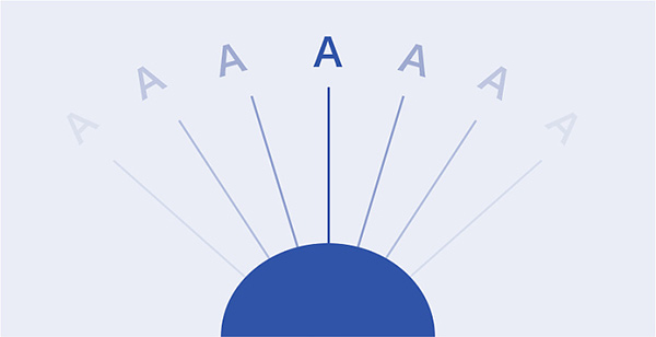
As shown in the figure, under normal circumstances, when the human eye looks straight ahead, only the middle position is the clearest, while the two sides are relatively blurred, and it is also relatively easy to produce Visual illusion, and the cause of visual illusion is not only the influence of the characteristics of the objective stimulus itself, but also the physiological and psychological reasons of the observer. The most common in design is the visual illusion, and the optical illusion will affect the layout, font size, spacing and so on.
Common types of optical illusions
1, Lyell's illusion
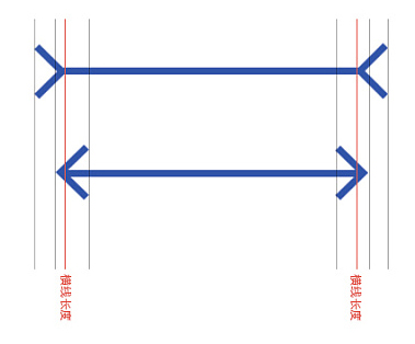
The left middle line segment is the same length as the right middle line segment, but it appears that the left middle line segment is longer than the right one, also known as the Müller Lyer illusion. The principle is that because the directions of the symbols on both sides change, when the directions of the two symbols change, their vision will also change accordingly.
2. Fick illusion
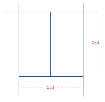
The vertical line and the horizontal line are equal in length, but it seems that the vertical line is longer than the horizontal line, also known as the Fick illusion; from a visual point of view, it is because the human eye The visual center point of the vertical line is in the middle of the vertical line, and the horizontal and vertical links tend to give people the illusion of being divided into two, so in visual perception, the vertical line is considered to be longer than the horizontal line.
3. Ebbinghaus illusion
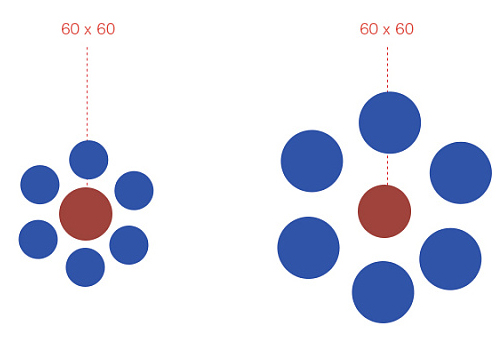
The two middle circles are equal in area, but the left middle circle appears larger than the right middle circle; known as the Ebbinghaus illusion. The principle is that the visual perception is deviated due to improper reference. Although the central circle is the same size, due to the comparison of the peripheral reference objects, the human eye has an illusion when it perceives.
Visual experience in font

In font design, people’s reading order of information can generally be divided into the above three perceptions. When designing text, these habitual reading perceptions are usually taken into consideration, and then the elements in the screen are adjusted. Adjust to avoid the production of optical illusions to achieve a comfortable reading effect.
Left light and right weight
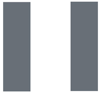
In two vertical rectangles of the same size, according to the visual viewing order of left and right, when we first see the rectangle on the left, we will feel narrower than the rectangle on the right, because the first perception of the human eye is usually Be faster than the final perception speed. When two rectangles are put together, there will be contrast. Visually, the left one will be smaller than the right one, but in fact the two are the same size.
Up light and down heavy
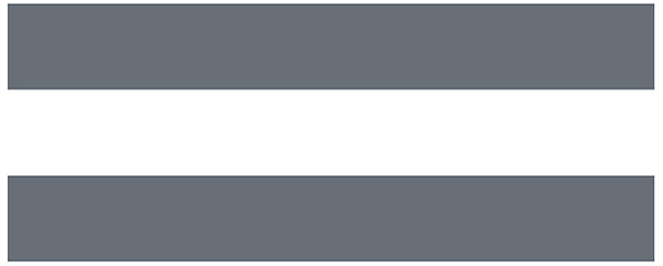
The same problem will occur in two rectangles of the same size. From the perspective of visual perception, the upper one is thinner than the lower one, and the color is darker. When, this subtlety The gap is common in design. The visual center of gravity of the human eye is usually lower in the middle of the two rectangles. The visual perception of the upper rectangle is slightly weaker, while the lower one feels heavier or wider. The color will also be darker. These are the perception of optical illusions, which need to be adjusted in the design to avoid visual deviation of elements and fonts as much as possible.
Horizontal and vertical light

When two rectangles of different sizes are arranged horizontally and vertically, the horizontal one is slightly wider than the vertical one in terms of visual perception. Usually, the horizontal one will give people a thick feeling, while the vertical one will be thinner and longer. This is also a kind of perception in the heart. The most characteristic Song typeface has a more comfortable distinctive feature of horizontal thinness and vertical thickness after this point of visual adjustment.
Geometric illusion in typography

As shown in the picture: Three kinds of geometric figures are often used in the layout, and there are certain visual differences. The classic geometric figures are visually wrong. In the case of the same size, the visual area of the rectangle is larger than that of the circle and the triangle, and the surrounding area of the rectangle is relatively full, while there is a corresponding visual space around the circle and the triangle. In this case, appropriate adjustments are required. Adjustment.

Enlarge the circle and triangle to avoid the virtual space on the edge of the circle and triangle, so that the actual visual area is consistent with the size of the rectangle. This way is to use the visual illusion in the design to create the same size graphics.
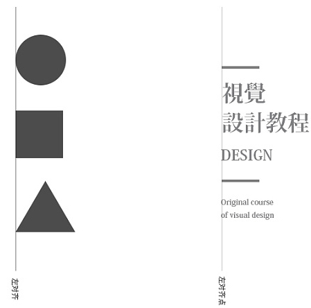
The visual difference in the layout is not only between graphics and graphics, but also between graphics and graphics, especially the visual illusion between Song and Song is the most serious; as shown in the above case, the line on the right is the same as Song After the left alignment of the system is implemented, it will be found through observation that the visual extension of the Song typeface and the rectangle seem to be out of alignment visually, and there is a certain visual error.
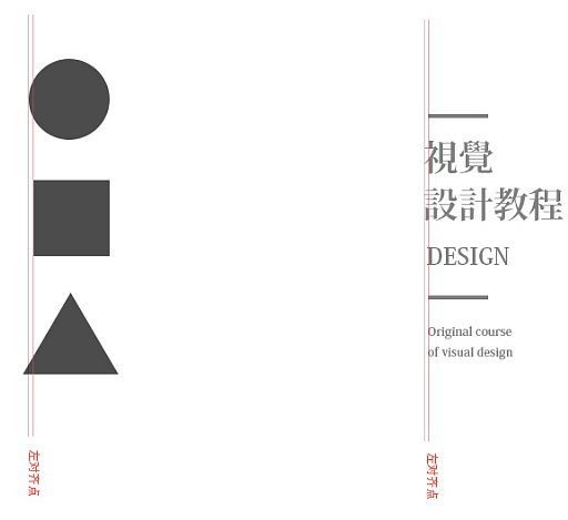
Aiming at the phenomenon of optical illusion, we need to make appropriate visual corrections from the perspective of human perception. The geometric figure on the left is based on the rectangle, and the circle and triangle are moved to the left. In the case on the right, the rectangle is moved to the right to avoid errors in the visual extension of the font.
Research in practical application
1. Word spacing
People usually have two modes when reading, especially when reading a book; one is word reading, and the other is line reading; word reading is relatively more inclined to read in a comfortable and leisurely environment, while line reading is It is more suitable for intense and fast-paced reading behavior. For text, the speed of reading is affected by the spacing between words. Comfortable spacing can make users look more relaxed. The case is as follows:
Fast, tight, slow, loose

As shown in the figure; in addition to the influence of the font type difference between Song and HeiTi, there is also the problem of spacing; the left side is the default spacing of conventional fonts, and this spacing is not the only standard. It is set by the font designer at the time of design, and the spacing of different types of fonts is also different; in the case of normal spacing, it is more suitable for line reading; while the one on the right is enlarged by 200 on a regular basis, and the distance between characters and characters The gap between them is larger, giving people a chance to breathe, which is more suitable for the way of reading words.
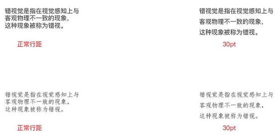
Whether it is line reading or word reading, line spacing also needs to be designed, and the corresponding size can be set according to different reading methods; the left side is automatic line spacing, while the right side is set to 30pt line spacing, for In terms of the comfort of reading with the human eye, the right side is better.
Case Analysis
In the design, we usually arrange the text of the main title normally or randomly, but the distance between the words will not be too loose, so that the viewer can quickly understand the information conveyed, and the Enlarged word spacing is usually arranged as explanatory text or decorative text in the screen, and it is a further explanation for the theme, usually words such as slogans and slogans. The examples are as follows:
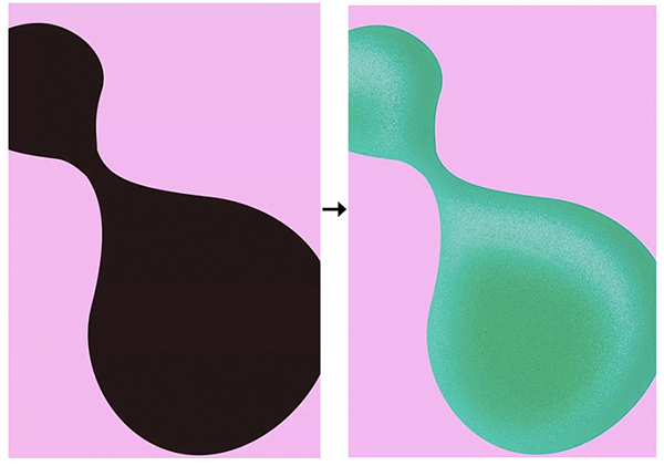
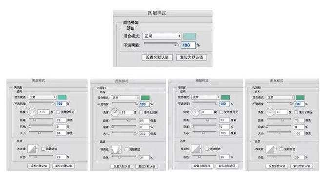
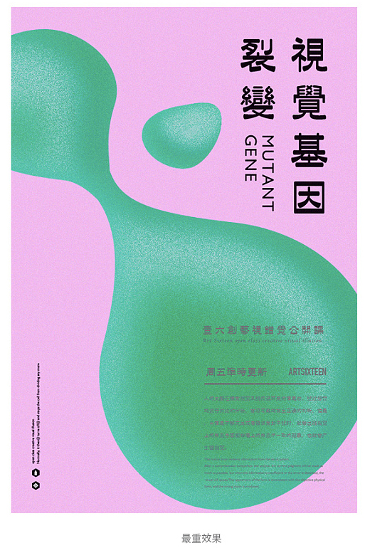
Create a new canvas, take the geometric figure as the main vision, first overlay the color on the geometric figure, and then add a multi-layer inner shadow effect to the geometric figure, you need to pay attention to the adjustment of the noise and contour lines inside.
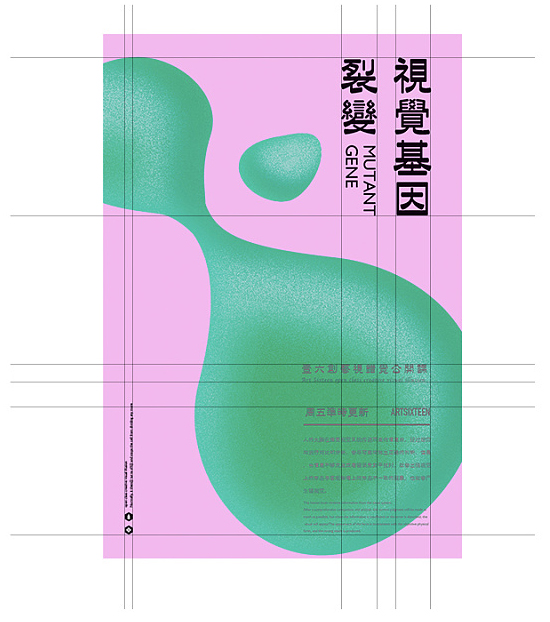
After adjusting the most desired effect, the next step is to start adding copy information to enrich the visual effect of the screen and the information to be conveyed. In order to show a strong visual sense, the text chooses a The Japanese font is more in line with the temperament of the picture. Under the normal arrangement, there are certain optical illusions between the text and geometric figures, and the text spacing is not ideal. Further adjustments are required.
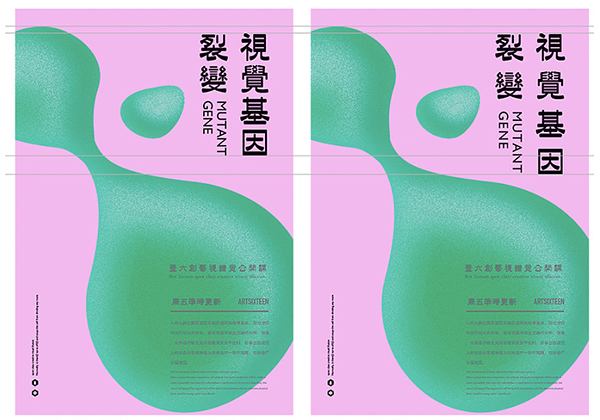
Through the comparison, it can be seen that the text spacing on the right is enlarged, and the font is moved down to avoid the optical illusion of geometric figures. The effect of adjusting the word spacing and line spacing is basically the same, increasing the The gaps between the words make the layout more comfortable and the information conveyed more effectively; of course, this is not fixed, and the specific adjustment or not depends on the specific case.
2, Chinese and numbers
The most common optical illusion in text is when Chinese and numbers are mixed. Usually, Chinese is slightly larger than numbers. When editing, you need to pay attention to adjusting the size and center of gravity of numbers or text, and some fonts are even in terms of numbers. The default spacing will also be slightly larger; in the mixed use of Chinese and numbers, since Chinese is based on squares, and the characters of numbers are all slender, it is not suitable to use the standard of squares, usually in English Standard development, so the numbers are usually smaller than Chinese, but the visual center of gravity remains unchanged; it is also one of the details that are usually overlooked in the design.
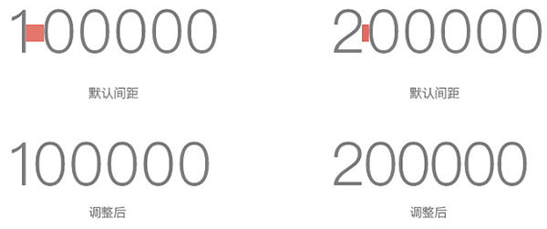
Take the commonly used Pingfang black body as an example. When using the default conventional spacing, the spacing between the numbers 1 and 0 is too large. If you need to use the default spacing at this time, you need to adjust 1 The distance between 0 and 0; the distance between 2 and 0 is normal, but the overall feeling is too loose. When the distance is reduced to -50, it is relatively more visually than the default distance. The reason for the comfort is mainly because Chinese is based on matts. You must pay attention to adjustments when using it to achieve a visually balanced effect, avoiding the software’s default routines that ignore the visual illusion of the human eye, and then affect the Human eye reading comfort.
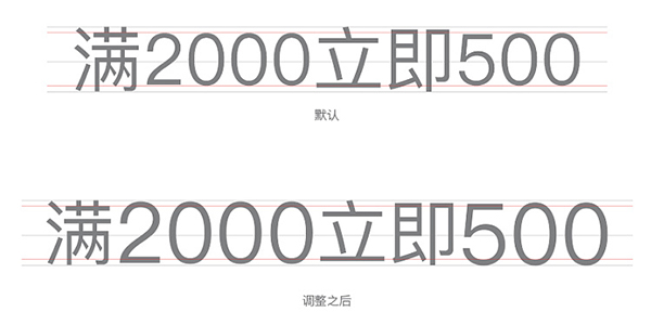
As shown in the picture above: Take the Pingfang font as an example. After the normal input of Chinese and numbers, the numbers are based on the center of gravity line, and the upper and lower margins are smaller than those of Chinese, which is a bit shrunken. Feeling, it looks uncomfortable; after adjustment, a set of characters is added with optical illusion, and presented in the form of optical illusion, visually it looks the same size, in fact, the numbers are more important than Chinese It is a little bigger and slightly thicker; it should be noted that when adjusting, it must be adjusted according to the center of gravity, and remember to align with the upper and lower margins.
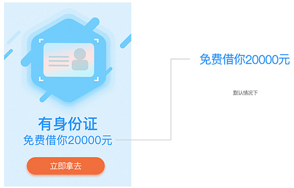
As shown in the case, in e-commerce or in the financial industry, a combination of text and money is often encountered. The text and numbers on the left are the default spacing of the font library. Due to the font, the overall spacing looks Slightly larger, and the numbers are smaller than the text, and then use the optical illusion to adjust.
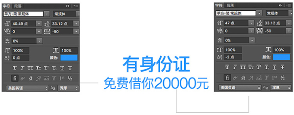
You can directly select a single number to zoom in, but do not let the visual center of the number go up after zooming in. At this time, you need to adjust it down - 2px has reached the visual balance; in addition, you can also re-establish the text box and adjust it to Just the right size.

As shown in the case, a combination of text and finance is often encountered in e-commerce or the financial industry. The text and numbers on the left are the default spacing of the font library. Due to the font, the overall spacing appears It’s a little bit bigger, and the numbers are smaller than the text. After using the optical illusion to adjust, as shown in the case on the right, the adjusted text information looks more compact, and the visual size of the numbers and Chinese is basically the same. It is consistent, but in fact the overall spacing is reduced and the numbers are enlarged. Based on the center of gravity line, the top is consistent with the Chinese, and the bottom is higher than the Chinese. The overall look is more comfortable, because it is an advertisement Posting pictures can help viewers understand information more quickly and give viewers a sense of urgency; there is no limit to the adjustment method, and they can be operated according to their own habits.
3. Font design
The most common problem in font design is the thickness of strokes. For example, the Chinese Song typeface is the most classic case. In fonts with horizontal and vertical coexistence, the human eye usually feels that the horizontal strokes are thicker, so it is avoided in Song typefaces. The problem of optical illusion is eliminated, so the current font design usually regards horizontal thin vertical thick as a technical term, which is opposite to the first perception of the human eye;
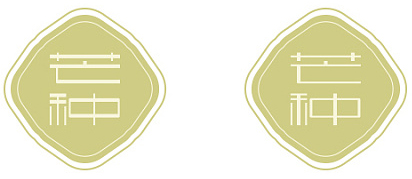
As shown in the figure; when we change the characteristics of horizontal thin and vertical thick into horizontal thick and vertical thin, it can be seen from the case that the visually heavy horizontal pen feels thicker; after two Comparing the two cases, it can be seen that the right side has the characteristics of Song typeface with thinner and thicker verticals, and the effect is more comfortable after weakening the thicker horizontal. Of course, this method is not fixed, and needs to be fine-tuned according to different structures.
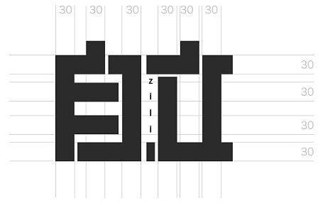
When using strokes of the same thickness to create a thick and powerful feeling in font design, the horizontal strokes tend to feel thicker, while the vertical strokes will appear thinner. In order to avoid the visual illusion of such strokes, The horizontal pen needs to be adjusted accordingly.
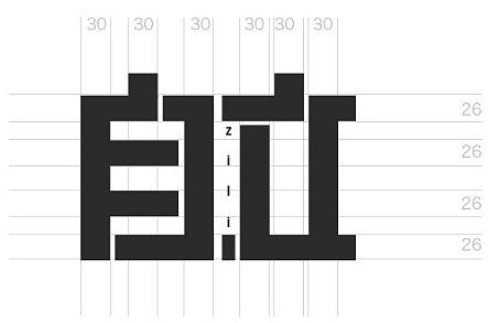
Scale down the horizontal pen by 4px or 6px accordingly to reduce the visual thickness of the horizontal pen and make it visually consistent with the horizontal pen, which will make the font look more comfortable.

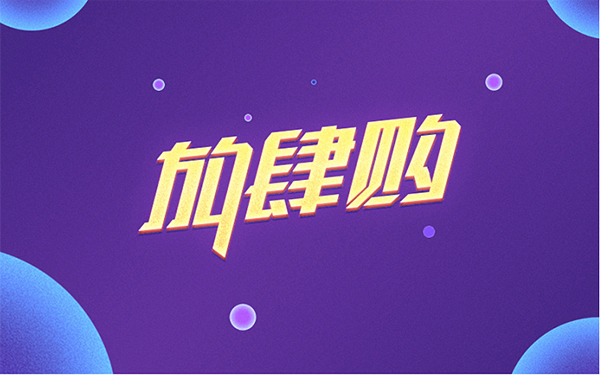
As shown in the case: the font design uses the principle of thinner and thicker strokes in the vertical direction, but the horizontal strokes are only about 5px thinner than the vertical strokes, and the structure of a single character will be relatively large. Otherwise, it will appear very crowded, reduce the internal white space, and greatly reduce the recognition of the font, but the overall appearance seems to be the same thickness, and the difference will be found after careful observation and comparison. This is also designed using the principle of optical illusion. It is worth noting What is more important is that if all vertical strokes of the same thickness are used for the radical on the left side of the word "buy", there will be no gaps in the city. In this case, it needs to be thinner accordingly to keep the structure of the font clear. In fonts with more vertical strokes Be sure to pay attention to the subtle thickness adjustments of the vertical strokes.
Another situation is that when the dot meets the horizontal, or when doing creative design, it is also necessary to pay attention to the optical illusion of the dot and the horizontal.
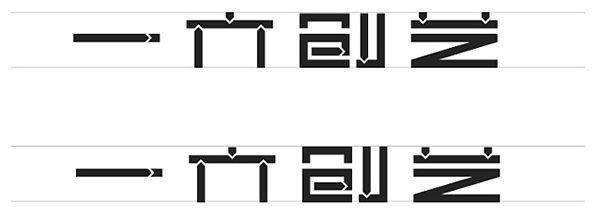
As shown in the figure, there seems to be basically no difference between the two groups of cases. If you look closely, you will find that the character "Chuang" on the top is flatter than the character "Chuang" on the bottom, and at the same time, it is taller than the dots of the two characters on the left and right. Some, this is because when the horizontal pen meets the dot, the visual area of the dot is smaller, while the horizontal and vertical ones are larger, visually it will appear taller horizontally and vertically, and it is necessary to adjust the visual balance .

After overlapping the two groups of cases, the obvious difference will be seen when displayed in different colors. The black creation character is about 1-2px higher than the top of the other two characters.
Summary
In font design, optical illusions usually appear in Song type fonts, multi-horizontal and multi-vertical fonts, and between font points, left and right, and horizontal and vertical, while typography is related to the choice of fonts and the relationship between geometric figures Among them, as well as the relationship between geometric figures, most of the visual illusions in design are some visual phenomena that often exist in life. Everyone looks at the problem with the perspective of discovery, tries more, and uses it skillfully in the design to create Very good design works, but at the same time, you need to pay attention to adjusting the common optical illusions to optimize your design works, and only by controlling the details can you improve the sophistication of your works.
Articles are uploaded by users and are for non-commercial browsing only. Posted by: Lomu, please indicate the source: https://www.daogebangong.com/en/articles/detail/Human%20Eye%20Optical%20Illusion%20in%20Typography%20and%20Typography.html

 支付宝扫一扫
评论列表(196条)
测试