
Everyone has a font they like to use, but your favorite font may not be suitable for use all the time. Only when the style features are combined with suitable patterns can the power of fonts be brought into play.
We need to make a font complement other elements in order to really bring out the personality and charm of the font, otherwise your use of fonts may seem out of place, or it may be just interesting.
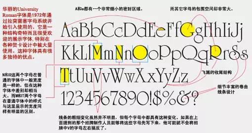
Take the UniversityRoman font as an example:
Font Observation:
Type all the letters of the font and write what you see on them. Why write it down? To make sure you've really paid close attention to the letters.
Detailed observation:
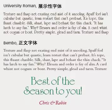
The ethereal structure of UniversityRoman gives it a cursive, Christmas-inspired quality, making it perfect for use in fantasy or romantic themes.
Pros and Cons:
The composition of University Roman letters is very irregular, and there are many decorative details, which is destined to have a good presentation and a pleasing face, but it is not suitable for text reading. Make sure the font size is large enough when using it.
From the above comparison, we can easily see that if University Roman is used as the main text, it will make people look crazy. We generally use a neutral font with a fixed rhythm and not too ostentatious. suitable. UniversityRoman is perfectly fine as a very short title or synopsis (as shown above and below), but if your text is longer than one sentence, you'd better use it sparingly.

Application in practice:
In the actual design we want to use this font, the biggest challenge is how to perfectly combine the font and graphic elements into one. Let's first talk about some of our thinking in the design through two completed works.
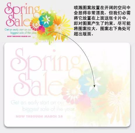
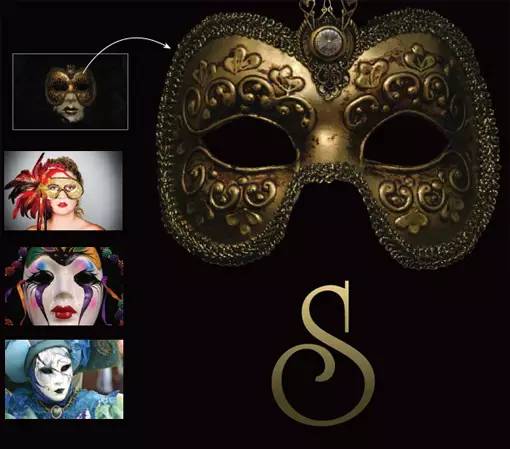
(a promotional card name design for spring sale)

Both cards above are beautifully designed. Whether it is the lines, shapes or colors of the fonts, they are closely matched with the graphic elements, presenting a natural and harmonious atmosphere as a whole. Separate text and separate graphics have their own strengths, but if the two are combined, the effect of one plus one greater than two can be achieved.
Look for similarities between text and graphics:

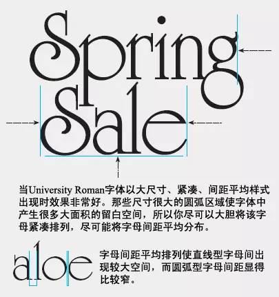
Circle: For some letters that are arc-shaped, we can easily find the existence of circles, but please pay attention to some details. For some letters, the blank space and the area surrounded by curves are also the same. It has a circular structure.
We use another font (Futura font) as the text for the explanatory text below the picture. This font is not so fancy, and it is suitable for reading when the size is relatively small and there are many texts. The interesting thing is that although this font is very different from University Roman, the arc structure is still a common feature of these two fonts.

The beaded elements in the pattern are very similar to the negative space area in the letter S.
Use color and "edges" to combine text and graphics
In this design, the text and graphics are placed separately, but the text area and the edge of the pattern are closely combined, and then a beautiful gradient color is used to connect the two.

Use color combinations:
Purple-yellow gradient and green-green gradient are fresh and bright. Pick individual colors from the pattern and apply a gradient color to the entire graphic including the text, giving the entire layout a natural glow and bringing all the elements together perfectly.
Make edges join:
Placing the text close to the edge of the graphic gives the two a seamless feel. You don't need to use fine guides to do it, just go with your eyes. This combination also makes some trivial and complicated small elements at the edge of the graph ignored.
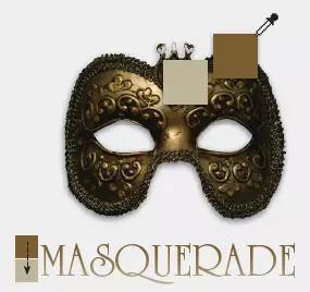
Typesetting on the card:
Typography implies a limit and a constraint! We balance the entire structure by duplicating a small element diagonally.


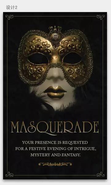
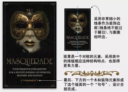
 Now let's look at the design process of the second card:
For the second design, the whole design is full of a royal, mysterious and fantasy atmosphere. The UniversityRoman font we used works equally well in this masquerade invitation card name design.
An attractive image, with the right colors and fonts, placed directly on the page can already form a unique and powerful design.
Take two shades of gold on the mask, one light and one dark, as gradients and apply them to the text. The texture of the overall presentation and the sense of light and illumination are perfectly consistent with the picture visually.

In real life, some designers will only use typography, color, font according to personal preference, and ignore the in-depth consideration of the actual situation.
Wonderful article recommendation
Simple creativity|text design
The wonderful use of Helvetica font, classic and unique!


Articles are uploaded by users and are for non-commercial browsing only. Posted by: Lomu, please indicate the source: https://www.daogebangong.com/en/articles/detail/How%20to%20use%20English%20fonts%20correctly.html
 支付宝扫一扫
评论列表(196条)
测试