I've always felt that each typeface has its own character and emotion. So in actual applications, the importance of which font to choose is much more important than imagined. The information conveyed by fonts can even affect people's purchasing decisions, and affect whether customers say "YES" to you.
Here I refer to some articles, summarizing some sentimental and applied research on fonts.
This article will introduce:
Fonts and the Reading Experience
Fonts and Cultural Connections
Stories and emotional expressions of several common fonts
Font Application Suggestions>
font reading experience
Everyone comes into contact with fonts, every day, in all kinds of situations. Font design and typography are actually beyond the scope of designers. Whether it is writing business emails, making presentation reports, or publishing blogs, each of us is actually more or less exposed to font design.
The importance of font and typography can be seen from the following experiment. 20 volunteers, half boys and half girls were divided into two groups, and each group was shown the New Yorker with the same content and different layouts: one group had the layout, fonts and pictures designed, and the other group arranged them randomly .
The researchers found that users had a bad impression of a poorly formatted article, and even reflected it physiologically by frowning.
The corrugator is closely linked to the amygdala next to the hippocampus of the human brain, which is responsible for emotional management.
The group of people who read well-typed types had stronger cognitive attention, a stronger analytical state, and clearer thinking.
The researchers thus concluded that good typography doesn't necessarily help you understand the text better, but it does make you feel better about it and thus respond more positively to it.
Well, maybe you will say, isn’t this nonsense, of course I know that good typography is more helpful for reading than poor typography. But what I want to emphasize here is that font and typography are two inseparable parts, both of which belong to the category of "typograhpy" in English. The English "typograhpy" also includes font art, typographic art and other connotations.
Typography and Culture Links
One of the reasons a typeface makes you feel that way is because of its deep connection to culture.
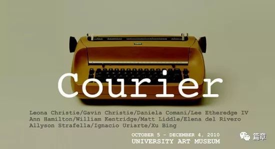
For example, the font of Courrier (meaning letter in French) is deliberately designed to be nostalgic and reminiscent of the fonts typed by old-fashioned typewriters.
Many people associate Helvetica with the U.S. government, also because it is the font used on U.S. tax forms.
And if you don't live in the United States, or have no idea about Western typewriters, you may be indifferent when you see these two fonts. Because of this lack of cultural connection.
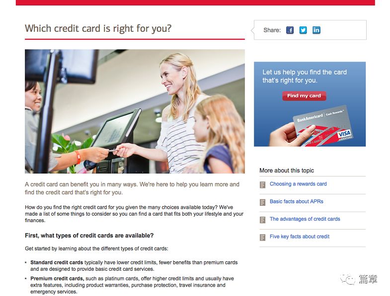
So, the advice here is to be mindful of cultural connections when using fonts. Look at the example of Bank of America. Here's the original webpage:
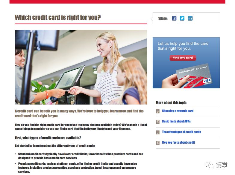
Here is the improved page (linked to newspaper headlines)
When the font on the Bank of America website was changed to Impact, it looked less reliable.
Fonts are designed by people. There must be some kind of cultural meaning behind it. So when choosing a font, take into account the cultural context of the font, I'm sure you don't want to pick a font that's reminiscent of something that some culture tries to avoid.
Several common fonts and their emotional expressions
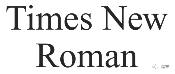
1. TimesNewRoman

In Western, the most common font is TimesNewRoman. This sans serif font comes from the British "Time" magazine. In 1929, type expert Stanley Morison criticized Time magazine's typeface as unreadable and ugly. The people in the magazine accepted his criticism and asked him to design a new font suitable for magazine reading. So Morison and the magazine's internal VictorLardent collaborated to design this famous TimesNewRoman.
At the beginning, Morison suggested to improve the design on the basis of Plantin, but in order to be compatible with readability and save space, he finally made a major change in the font: the contrast between strokes was strengthened, thus creating a crisp a feeling of.
Roman refers to a regular font with traditional serifs. But TimesNewRoman's font design has nothing to do with Italian-origin fonts called Roman or Romas.
Style: Influenced by early modernization and some baroque printing, the structure is dignified and clear. Suitable for formal occasions.
2. Helvetica

Also as one of the common fonts in Western languages, Helvetica is a sans-serif font, and its source name is not so pleasant: NeueHaasGrotesk. (neue=new, Haas=very manly, rude, Grotesk=grotesque). Created by Max Miedinger and Eduard Hoffman in Switzerland in 1957, the unisex design of this font quickly became popular in various applications. But the name of the font is not so attractive. When D. Stempel AG planned to start promoting this font a year later, they decided to change to a more international and fresh name. In the end they settled on a name that draws attention to their Swiss roots: Confederatio Helvetica is the Latin name for Switzerland.
Stylistic traits: high x-base; tight letter spacing; narrow t's and f's. Widely applicable to various occasions, especially favored by brand logos, including 3M, BMW, Nestle, the former Apple and so on. In addition, the font is favored by the government. As mentioned above, the font used on US tax forms is Helvetica.
The corresponding Chinese fonts should be a variety of boldfaces that are more suitable.
3. Verdana
Verdana is a sans serif font designed by Matthew Carter for Microsoft Corporation. Originally a request from Virginia Howlett in Microsoft's font group. The name Verdana is derived from verdant (the green thing) and Ana (the name of Howlett's sister).
Like the humane font Frutiger, Verdana was designed to fit the low-resolution computer screens of the time. Its style is characterized by a high X-base, loose spacing between letters, and wide letter hollows (such as the distance between a and p closures) for legibility at small print sizes.
IKEA has abandoned Futura, which has been used for many years, since 2010, and turned to Verdana. According to IKEA's explanation, the reason for this change is to ensure that the fonts can adapt to the characters of various countries (the previous IKEA fonts are not compatible with Asian characters), so as to ensure the consistency of IKEA's design style. It can be seen that Verdana has a relatively wide range of internationalization adaptation.
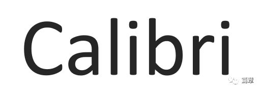
4.Calibri
Known as "a warm and gentle font", Calibri has gradually become the default font for almost all Microsoft products since 2007. This font belongs to one of the Cleartype font series launched by WindowsVista and is used to adapt to LCD displays. The same series of fonts also include Cambria, Candara, Consolas, Constantia and Corbel.
At large font sizes, the rounded corners of the font are clearly visible. And its italic italic contains calligraphic influences that can be seen in modern typefaces. While the Calibri font is somewhat controversial in the design world, thanks to its slightly curved lines and slight curl at the end of the stroke, the font still looks good when displaying large font sizes on slides.
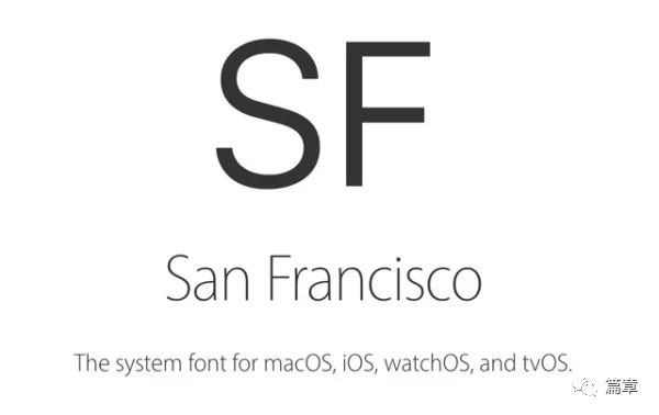
5. San Francisco
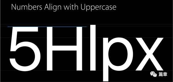
SanFrancisco is a sans serif font designed by Apple specifically for its products. According to Apple's official introduction document, this font is also a high X benchmark, and the height of numbers is consistent with the height of capital letters.
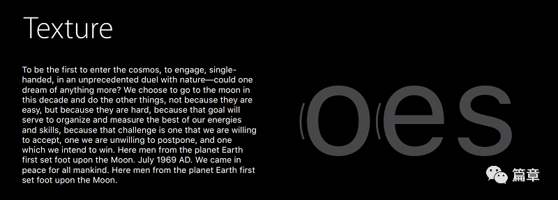
Compared with the Helvetica used by Apple before, the display performance of this font on the small size is much better. The positive evaluation of this font is mainly in the following aspects:
Uniformity of font color. Reduce the text size, squint your eyes and feel:
Font Flexibility
SanFrancisco is an entire font family. When designing, the designer does not need to worry about which specific SanFrancisco to use (for example, only need to change the system to UILabel), the system will automatically select the appropriate font to adapt to the screen and font size.
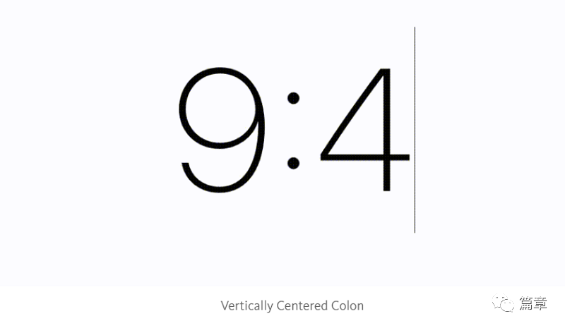
In particular, the colons in this font need to be pointed out. Generally, the colon of fonts will be a little higher than the bottom baseline, but when the colon of SF is in the middle of two numbers, it can just be in the middle of the height of the number.
Overall, SF is a font adapted to the digital age.
Font Application Recommendations
In order to conveydifferent emotions, there are some suggestions for reference when using fonts.
1. Select a benchmark font
Generally, on the same occasion, only one font may not be used. For example, the title and the body may be two fonts. However, you must first select the font of the main text, and then choose other appropriate font styles to match according to the font of the main text. It's like dressing up. Generally speaking, you choose which clothes to wear first, and then decide which accessories to match.
Generally speaking, fonts are mainly divided into the following four types:
Serifed fonts: That is, fonts with small dashes at the corners of strokes. This typeface is generally considered more formal and traditional. And is more suitable for print.

Sans-serif fonts: As opposed to serif fonts, sans-serif fonts are small, short-line fonts with no stroke corners. Correspondingly, it was also thought to convey a more convivial, less formal feel.
Handwriting: imitating handwriting, often used in formal invitations. Not suitable for use in bulk article bodies.


Ornamental: A distinctive informal typeface. It is suitable for use on titles that express personality and add color to the overall design, but never in the text.
In short, when there is a large amount of text, it is most appropriate to use serif or sans serif fonts. Because at this time you need readers to focus on the content, not the font.
In the past, it was suggested that sans-serif fonts were best used on the web due to screen resolution issues. However, as screen resolutions increase, it’s okay to use serif fonts where appropriate. In some content-heavy blog sites, TimesNewRoman with serifs is even directly used as the main text.
In short, in most cases, clear and easy to read must be the first priority of the main body text.
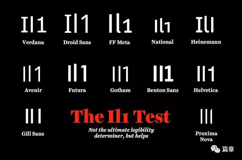
Here is a little trick for checking fonts (from Jessica Hische) to test whether your Western I, lowercase L and 1 are recognizable.
Using this standard to test, it is obvious that many fonts cannot stand the test...
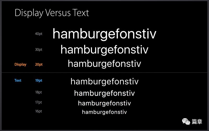
2. Choose a font size greater than 12 points
Here, scientists have done another experiment. experiment procedure*&……%. Well, the conclusion is that as the screens of our electronic devices get bigger and bigger, 12-point fonts are a more appropriate choice. And within a certain range, a larger font tends to create a stronger emotional connection. So it was also proposed that 16 pounds is 12 pounds in the new era. Take a look at the font sizes of other websites for your reference:
Medium—22px
37 Signals: Signal vs. Noise—22px
Zen Habits—21px
Of course, this font size also has a range. If the body text exceeds 30 points, it is meaningless. However, you can try to increase the font size a bit. If you're using 12 pounds, try 16 pounds, and if you're using 18 pounds, try 22 pounds. There may be surprise discoveries.
3. Pay attention to the length of the text
Text length refers to how long the text stretches on the screen. Generally speaking, 50–75 characters in Western language is more appropriate. Of course the bigger the screen the wider the range.
A line of Zenhabits has 78 characters and is about 16.5 cm. This length proved to be the length most effective in helping readers read according to their trajectory tests.
Text lengths that are too long or too short will disrupt the reader's reading rhythm. So pay attention to the length of the text. Here are some website text length references:
Zhihu article: 43 Chinese characters (about 86 Western characters)
Medium—75 Western characters
37Signals:Signalvs.Noise—76 Western characters
4. Pay attention to spacing
If the font arrangement is too tight, it will be difficult for readers to read the text; if the font arrangement is too loose, it will reduce the reading efficiency.
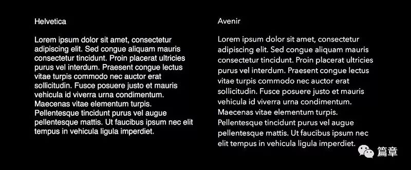
Here is a comparative example given by Jessica. She would recommend Avenir because of its more comfortable spacing. It's easier to read.
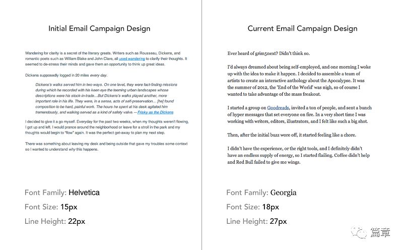
This is the Crew team email font before and after typography:
After changing the font and increasing the word spacing, the email is obviously much more readable.
Font collocation suggestion
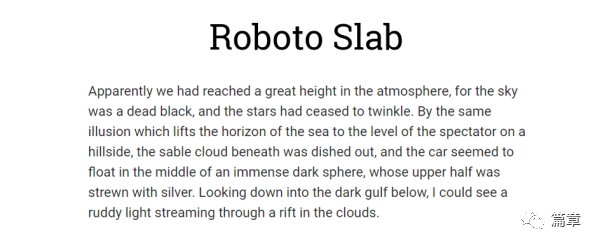
1. Roboto Slaband Roboto
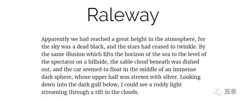
2. Raleway and Merri Weather
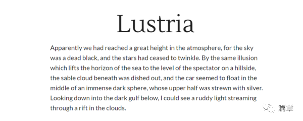
3. Lustria and Lato
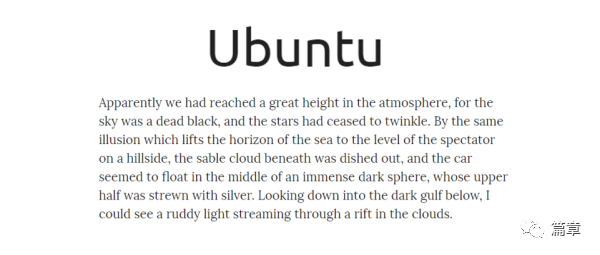
4. Ubuntu and Lora
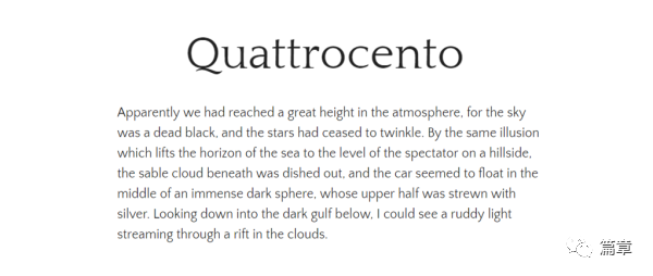
5. Quattrocento and Quattrocento Sans
Next time when choosing a font, don't always stick to the default font, or mix it randomly. Use fonts to convey your love for your readers. As some unknown great man said:
People will forgive your mistakes if you send them positive emotions.
Good Luck~
Articles are uploaded by users and are for non-commercial browsing only. Posted by: Lomu, please indicate the source: https://www.daogebangong.com/en/articles/detail/How%20to%20use%20English%20fonts%20Times%20New%20Roman%20Calibri.html
 支付宝扫一扫
评论列表(196条)
测试