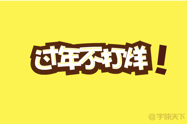
EDIT: chopped green onion
For designers who are new to the workplace, they see a lot of beautiful and interesting font effects, but they don’t know how to realize them. Here are some simple and fast ways for you to teach you.
1. Add a drop shadow to the font
Method 1: In the AI software, break up the fonts, then select the object-offset path, and put the fill color on the bottom layer.

The font in the picture: Word making workshop Yanqu

The font in the picture: Huakang Poster
Method 2. Copy it directly to the next layer and fill it with different colors.

Font in the picture: Font Manager Marshmallow
2. Add a stroke
Method 1: In AI, the method is very simple, just stroke a color directly and fill in a color.

Font in the picture: Font Butler Donut
Method 2. Mix stroke and shadow to make the font have a three-dimensional effect.

Third, add auxiliary graphics to the font
Method: Use a pencil or pen tool in AI to draw the corresponding long and short lines according to the stroke direction of the font to simulate the highlight of the font and make the font look thicker.

Fourth, add shading or material to the font, this method was mentioned in the previous article.
"Making a superhero comic text effect with AI"
"How to add a tasteful rough texture effect to text"
Articles are uploaded by users and are for non-commercial browsing only. Posted by: Lomu, please indicate the source: https://www.daogebangong.com/en/articles/detail/How%20to%20quickly%20improve%20the%20texture%20of%20fonts.html

 支付宝扫一扫
评论列表(196条)
测试