EDIT: chopped green onion
The Spring Festival is coming soon, babies who still haven't got a promotion and salary increase, come on. This year has passed quickly, why don't I summarize it, why didn't I raise my salary? Does the leader dislike my ugly handwriting? But this baby is not a font designer, I really want to force my baby to learn design all over the world, my baby is only three years old, don’t howl, Scallion here will teach you a trick to quickly design good-looking characters, hold your horse and don’t worry distracted.
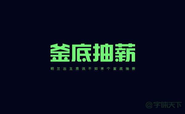
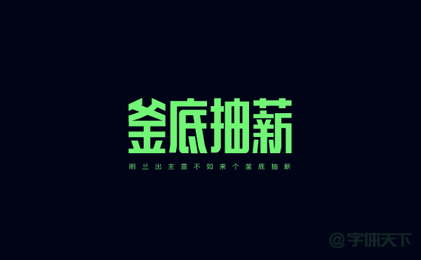
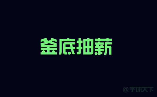
Recently, Scallion was possessed by Ming Lan. Ming Lan remembered everything she said. Taking the four words “Drawing from the bottom of the pot” as an example, here is the rendering:
style 1
style 2
Before making characters, Scallion should first talk about the things that need to be paid attention to before making characters. When we get the design requirements, we need to judge the direction of the design, what kind of industry it is, the promotion point and What is the theme, so that you can make a font that matches the temperament, such as women, gentleness, and industries with this style, it is not appropriate to use bold fonts. For the cute and cute infant and toddler industry, it is inappropriate to use standard fonts. For example, the style 1 made with chopped scallions above has thick and powerful font strokes. This type of font is usually used in a wide range, such as food promotion, clothing Brand promotion, promotion of electronic products, etc. are all possible.
Once you understand the requirements, you can start creating fonts. You need to draw a draft of your creative ideas on paper one by one. Their style is also a way to learn. Another thing is to compare the characters in the font library. This is not to draw completely according to the font library, but to create according to their skeleton structure. For learning reference, it is as happy as a flower. So long-winded so much, start writing.
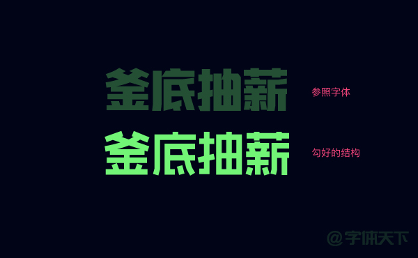
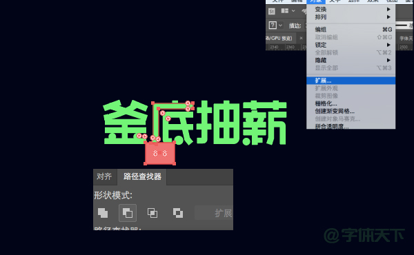
Step 1. Enter a font with a similar style as a reference. The font used here is Hanyi Xiaobo Ganggu. Lock this layer, then create a new layer, and use the pen tool to draw the basic skeleton of the font on the new layer compared with the reference font.
Step 2. Adjust the strokes of the font, such as the word "kettle", the three horizontal lines below are deliberately adjusted to the same length to make the font look more orderly, and the weight on the right side of the word "pay" is directly folded down, Make this font with dense strokes appear more concise and smooth. The word "Xin" on the left was directly replaced with a short horizontal line, because the strokes here are relatively dense, taking into account the weight on the right side. After this change, it adds interest and the font becomes breathable. The small dots added at the end replace the short strokes in the font. Not all of them need to be replaced with dots here. For example, the dot on the word "bottom" cannot be replaced. If it is hard replaced, the upper part of the font will not be replaced. Neat, to take care of the feelings of other fonts.

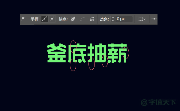
Step 3. Adjust the corners of the font. In order to make the font look powerful, here only adjust part of the corners as shown in the picture.
Step 4. Select the font selection object-extend. At this time, all the strokes are scattered, and we need to cut some strokes neatly. As shown in the picture:
Step 5. Adjust the thickness of the horizontal and vertical strokes to make the font look more layered. Let's make the vertical strokes thicker, and adjust the horizontal strokes a little thinner. In order to let everyone see it more clearly, I was worried that the font drawn out too thick would be a mess. I set the font thinner at the beginning of the pen stroke, and set it thicker in the actual operation. In the end, I only need to adjust the horizontal stroke The thickness can be.
Step 6. Finally, add some English or slogans as embellishments. The effect is as follows:

So style 2, how to make it quickly, in fact, the method is the same, we just need to go back to step 1, remember to keep the middle steps, you can modify it at any time, tick the step 1 The lengthening ratio of the font, after lengthening, we need to adjust the strokes of the font, especially if the weight of the font changes, we also need to increase some strokes, and the rest of the steps are the same, and they are integrated. Chopped green onions will not be introduced in detail.
Articles are uploaded by users and are for non-commercial browsing only. Posted by: Lomu, please indicate the source: https://www.daogebangong.com/en/articles/detail/How%20to%20quickly%20design%20several%20goodlooking%20headlines%20for%20design%20novice.html
 支付宝扫一扫
评论列表(196条)
测试