
Xiao Wan went to play on vacation recently~
As soon as I came back, my partner sent a private message, saying that I urgently need help to make an academic PPT.
On a whim, I let him send it to see.
Then there is a Word document that I can't understand at all.

Since it was so urgently needed, I quickly made this effect.
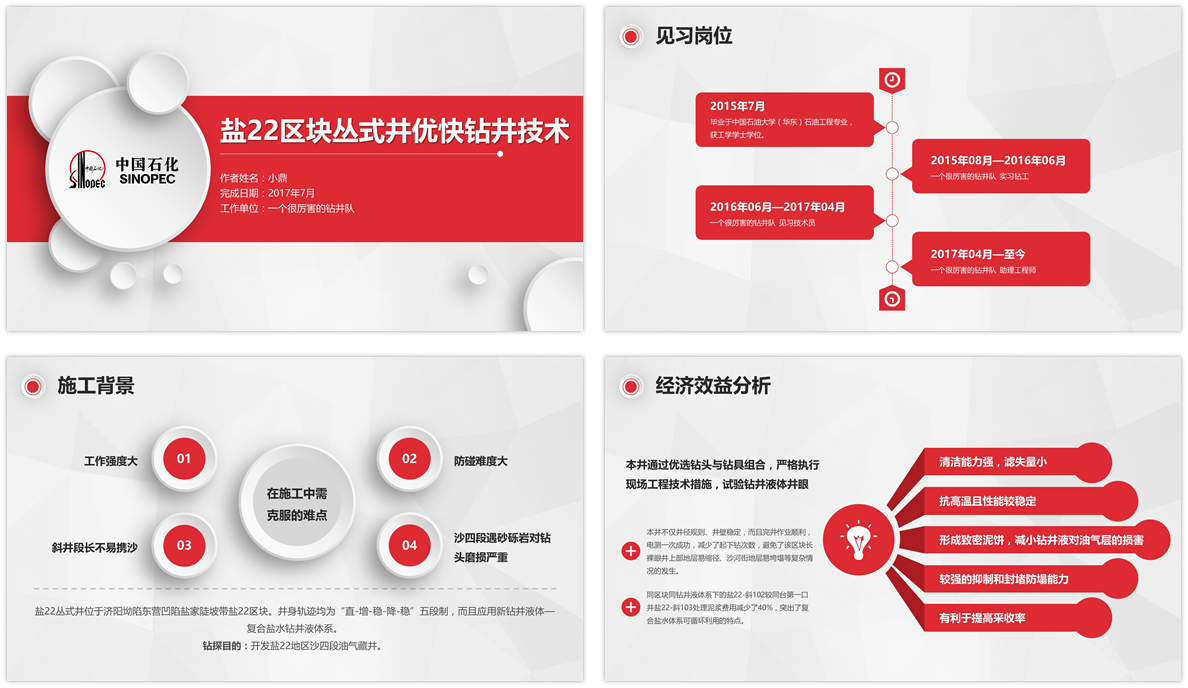
After accepting the partner's knee, I decided to take off the great god's coat and teach everyone how to finish it quickly.
Know my routines, come and feel the feeling of becoming a god in a second.

From a series of materials sent by my partners, I learned that the theme color of this industry is red.
So I chose a set of red micro-stereotypes among many templates and downloaded them.
That's right, it is a template. Most people know that there is such a thing as a template.
But I can't use it when I get it, so I have to ask someone for help.
After all, the material graph of a set of templates is very different from the content you want to display.
How to deal with this situation? Let me tell you below.
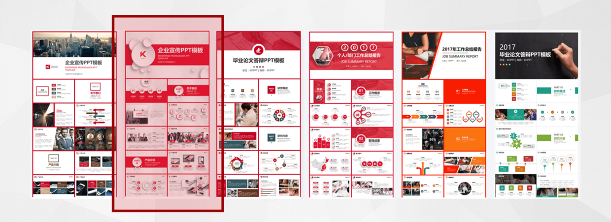
After selecting a set of templates, zoom in and take a look.
It is a set of corporate publicity PPT, but we are going to make a set of academic PPT.
Of course, that's not a problem. The template is used to unify the style and save time.
After all, I have to change the material according to my own situation.

Let's do a cover first. Well, Word is going to deform.
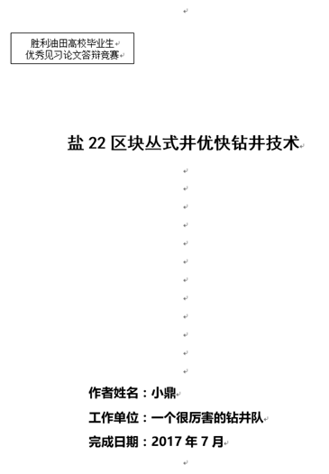
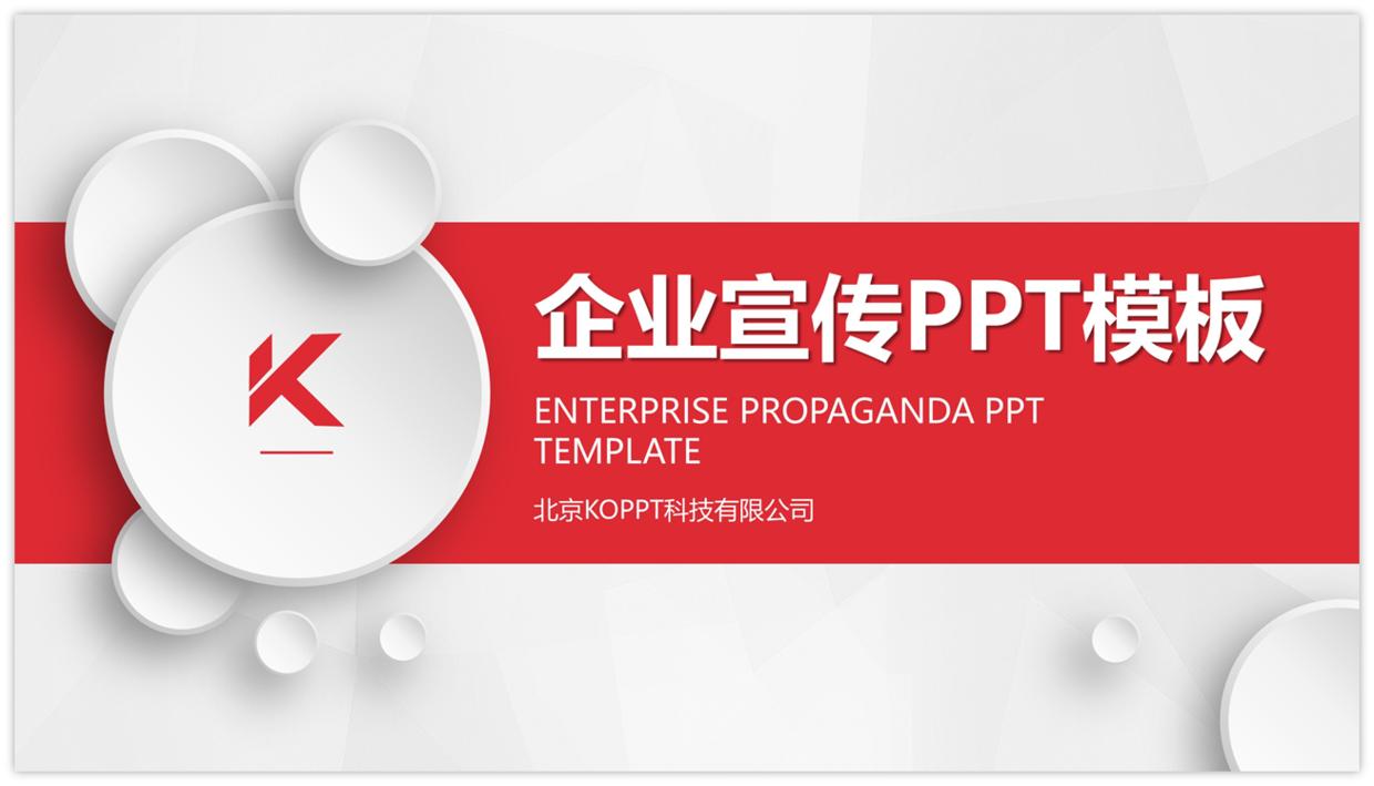
Replace the theme text and Logo in the Word cover with the PPT cover.
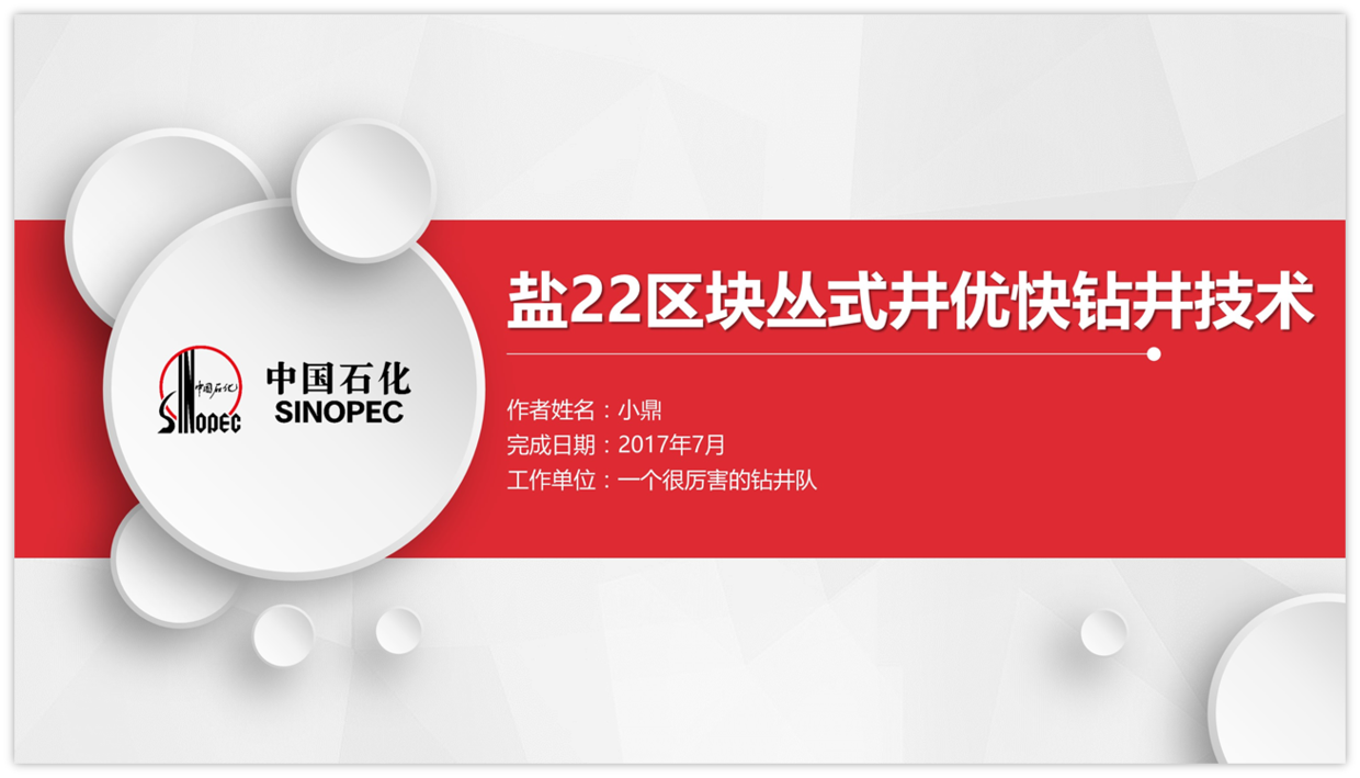
If you are proficient in PPT, it can be completed in two minutes by replacing and adding simple typesetting.
Next make an author bio.
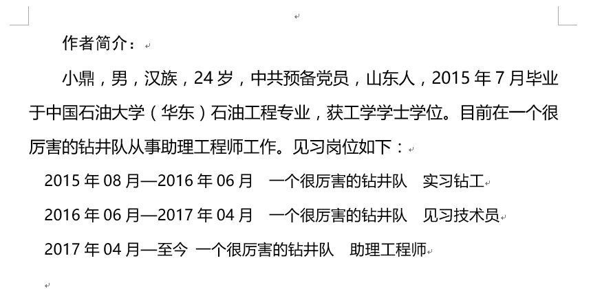
There is no chart that matches the content in the template. This is a common problem that everyone encounters. What should I do?
Find a suitable chart, but first you need to sort out the content.
It depends on what kind of graphics are suitable for your content.
For example, if the above content has time, then we can choose to display it sequentially and on the time axis.

With the chart type selected, let's find a chart we like.
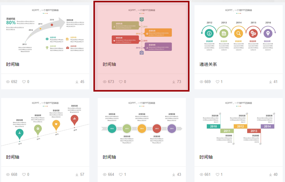
The picture comes from KOPPT
Xiaowan chose the chart below.
After downloading, copy Ctrl+C, paste Ctrl+V into the template.
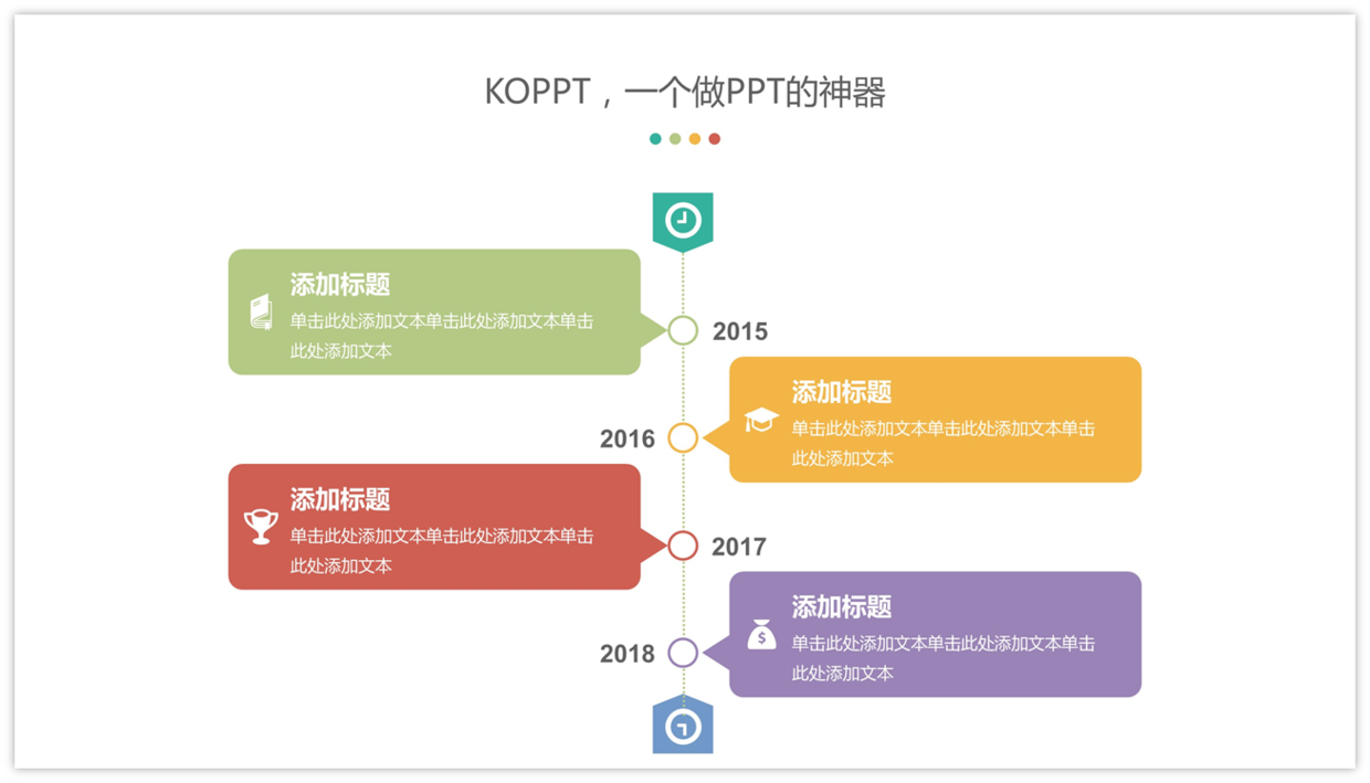
It directly changes to the theme color red, which is the advantage of this website.
Each theme color is bound, and you can change the color with one click.
Afterwards, I replaced the text and simply modified it.
A section of Word is converted into a page of PPT in this way.
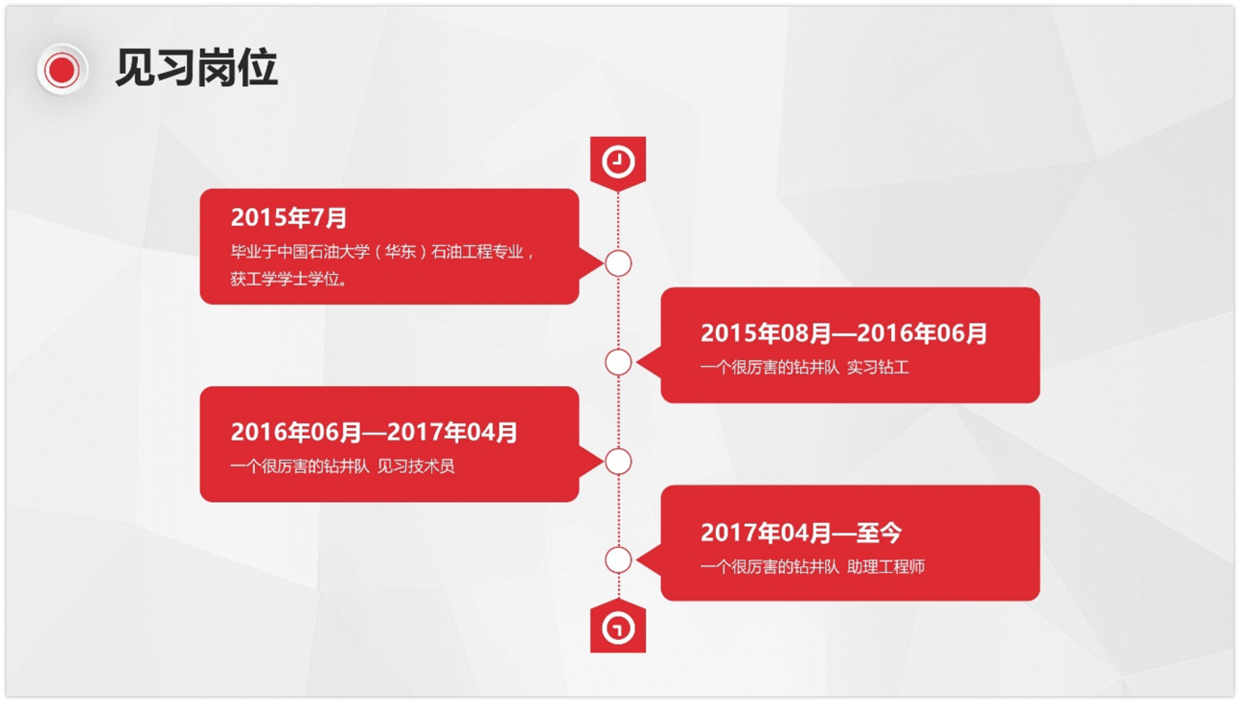
In this way, let's do a few more pages.
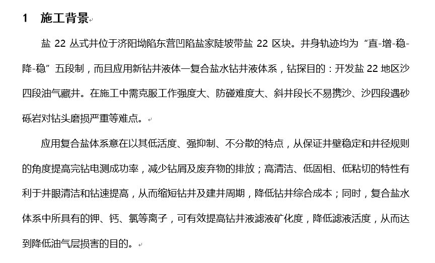
Apparently I can't read it either, the content blah blah blah blah blah blah blah blah blah blah blah blah blah so what.
Find the focus and visualize it.
Two paragraphs of text, I divided it into two pages, one page with one key point, which is what Xiaowan repeatedly emphasized before.
If there is a lot of content, the key content will be extracted and displayed in pages.
On the first page, there are several difficulties that can be made into a logical chart of the total score.
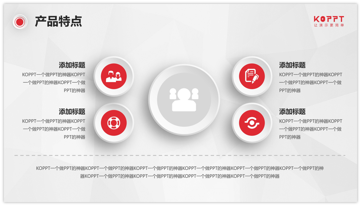
Find the appropriate chart and replace the text.
You don't have to copy everything from the template.
If there is no suitable icon, delete it, and change it to a number.
Decorations that do not conform to the content will affect the whole and should be used flexibly.
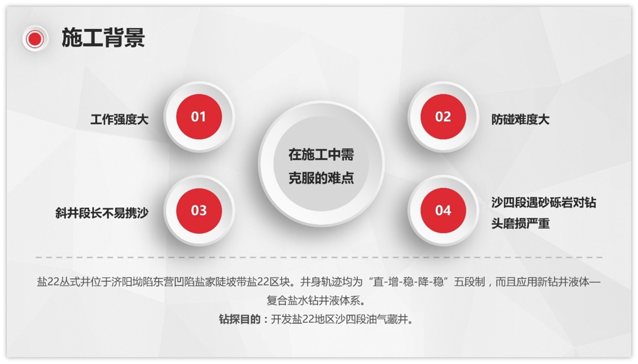
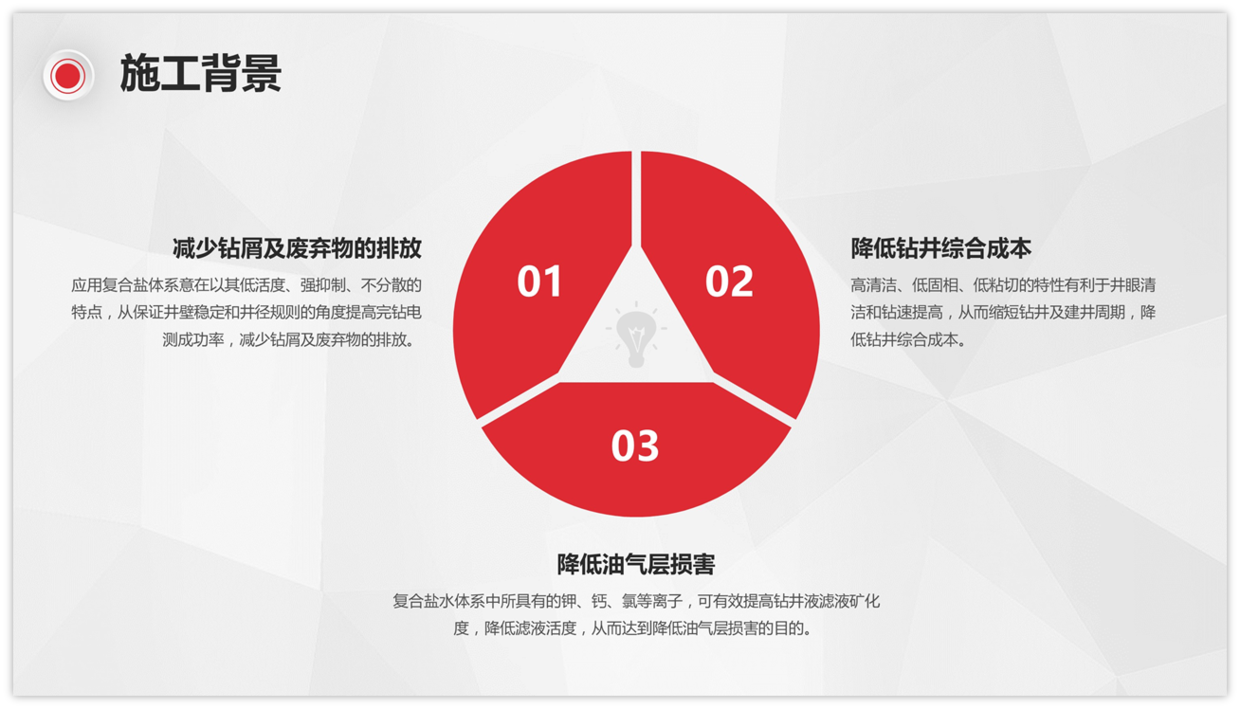
A rough reading of the second paragraph roughly understands the characteristics and benefits of the compound salt.
Both the logical icons of the total-score relationship and the parallel relationship are acceptable. Find a chart that is pleasing to the eye.
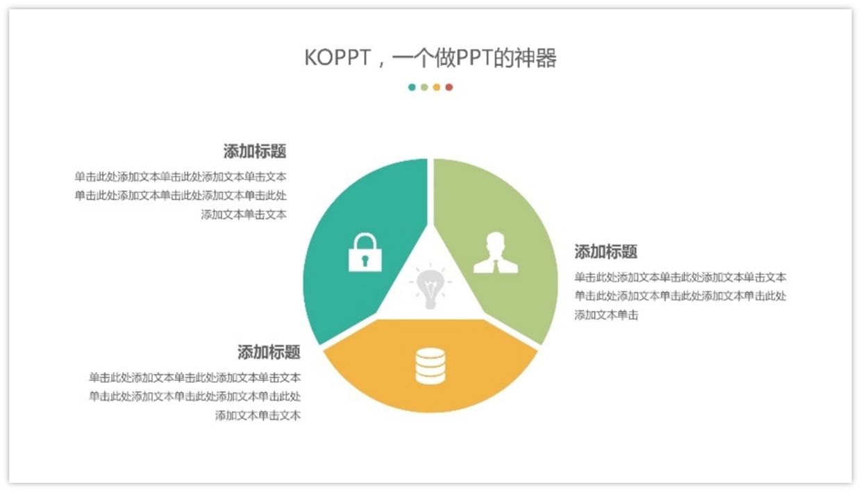
Extract the main point as the title.
Simple typography, done.
One more paragraph?
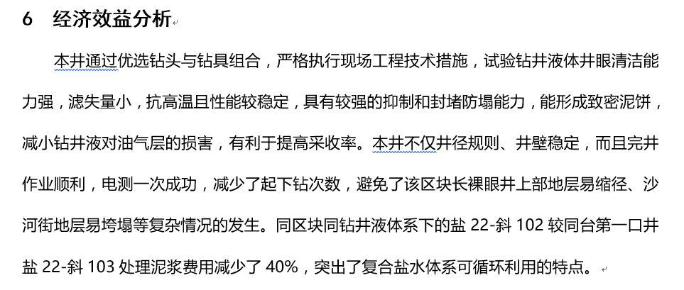
I still can't pretend to understand.
But I probably understand that the combination of drill bits and drilling tools will be more powerful.
I will summarize these powerful points and find a chart to put them in.
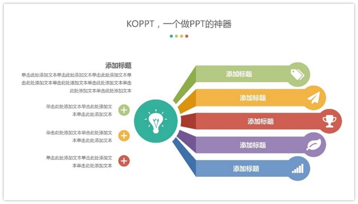
Copy and paste into the template for instant color change.
Although the content is incomprehensible, general sorting and simple extraction can be done.
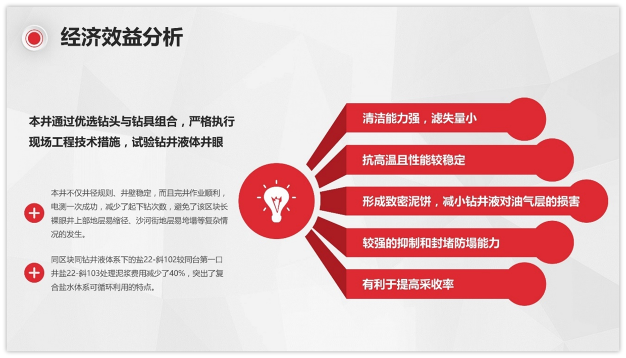
the last one.
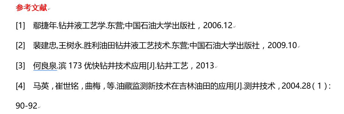
Also find the right material.
Creative charts can be used to try, and instantly improve the quality.
Then copy and paste the text to replace it.
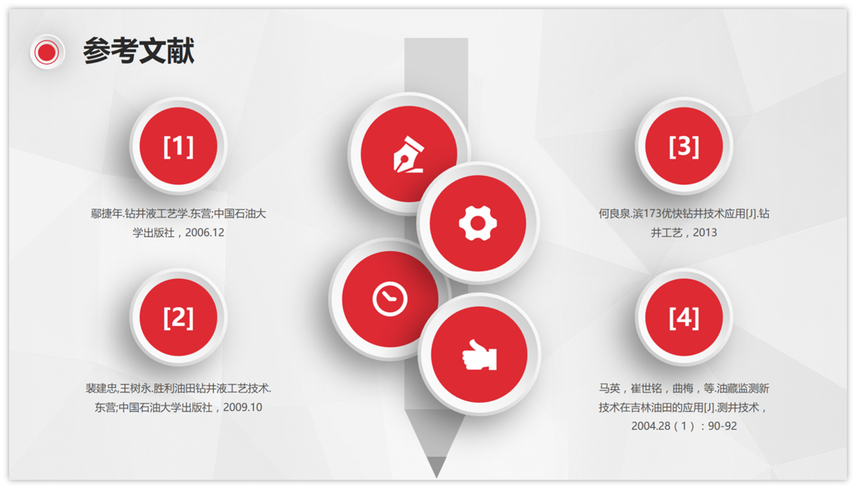
The back cover at the end is important.

Summary~
In this way, it is not that difficult.
When you need to complete PPT quickly, it is absolutely right to choose a template, but you must learn how to use it correctly.
The routines in this issue mainly teach you how to use templates.
How to find a suitable chart to replace when the chart is not suitable.
Afterwards, extract the key points of the content and replace the text.
After reading this issue, you will no longer be dumbfounded when you see inconsistencies in the content of the material.
The routine has been taught to you, do you want to get started?

Note: Xiaowan uses PowerPoint2016, and the material picture comes from KOPPT.
Articles are uploaded by users and are for non-commercial browsing only. Posted by: Lomu, please indicate the source: https://www.daogebangong.com/en/articles/detail/How%20to%20quickly%20complete%20an%20academic%20PPT.html

 支付宝扫一扫
评论列表(196条)
测试