Different fonts can create different atmospheres and emotions. Here are some suggestions on how to match fonts: 1. Determine the theme and style: Before choosing a font, first determine the theme and style of your work. For example, if your work is about

When shooting and sharing become daily life, no matter you are a popular Vloger, or a UP master>, matching fonts to your works is undoubtedly the key operation for setting the theme. >Fonts can enrich the visual beauty of the work. Different content and styles can be matched with different fonts, which can not only highlight the theme, but also increase the style. So, How to quickly select a font that perfectly complements the temperament of the work? Today, I will summarize a few simple routines for your reference—>Black body, clear structure, concise and powerful, can make the work look solemn and eye-catching and full of modern sense . There are no strong and distinctive features, and it is the most versatile and versatile font. The only downside is the lack of personality, which can appear mediocre if used poorly. >>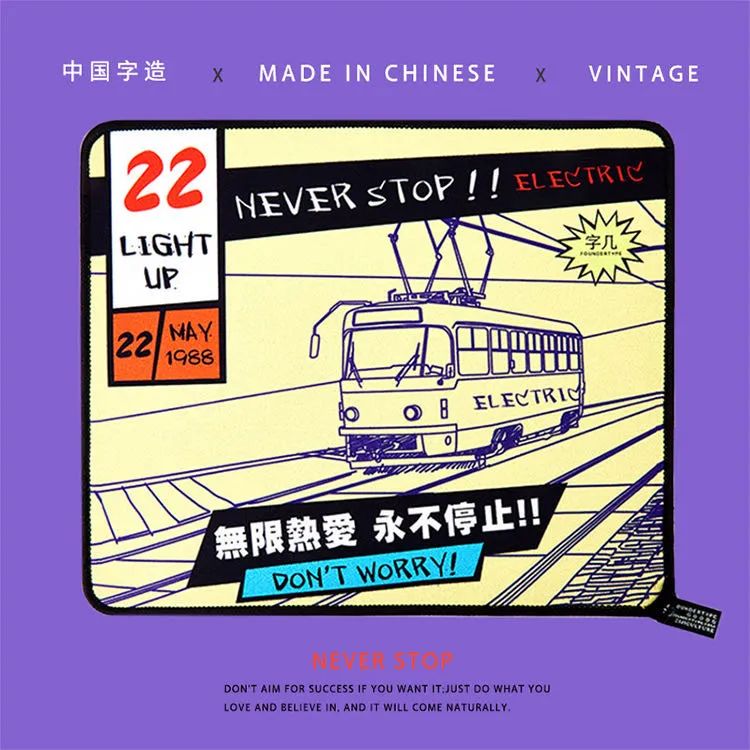
words-embroidery stickers>
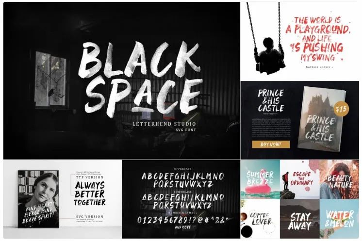
The black body with thick strokes is eye-catching, rough, tough, and has a sense of power, which can quickly attract the viewer's attention. It is suitable for use in sports, automobiles, games, architecture and other types of works , emphasizing the title, it will be more brilliant with creative English. >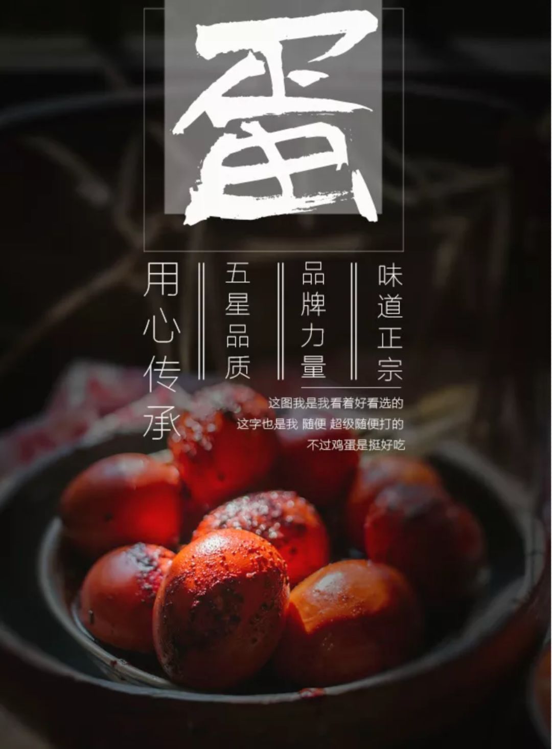
The black body with thinner strokes is simple, elegant and meticulous, suitable for use in cosmetics and food In other works, it can be used to express content and enhance contrast. >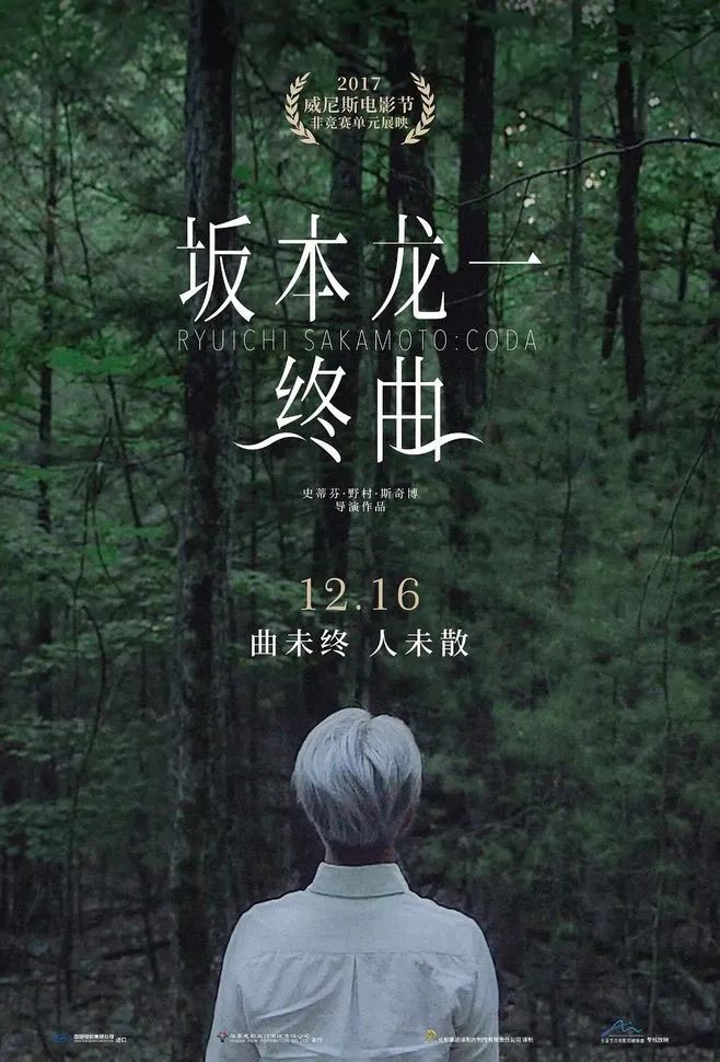
Today, March 3rd, I made this bowl of eggs~>
The picture comes from @小小工作>
Song type, with clear edges and corners, straight strokes, thin horizontal and vertical thick, has a strong emotional color, rich in profound cultural heritage, >Elegant style>. It is suitable for documentary or cool style works, such as documentaries and fashion films. >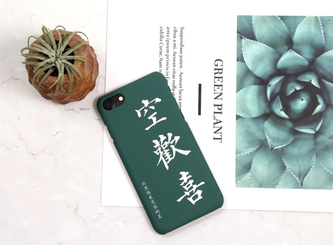
Poster of the documentary "Ryuichi Sakamoto: The Finale">Italics, capital letters are more suitable for solemn, simple, For imposing architectural landscapes or traditional and retro style films, lower case is more elegant, suitable for some quiet landscape scenery or small fresh films with a soft tone. >
Ziji-Trendy Text Phone Case>
>
Round body, full of vitality, full and rounded corners give people a sense of affinity, soft and non-aggressive, suitable for lively, Relaxed scene. >>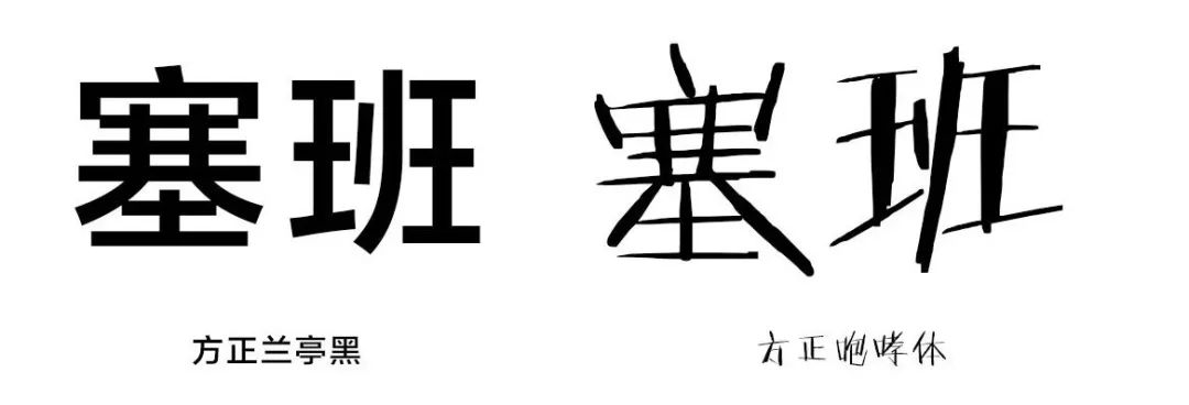
>
art style, strong creativity and uniqueness, rich in emotion, has the function of amplifying emotions, suitable for culture and art, strong creativity, specific themes , such as variety shows, cartoons, graffiti, art, etc. >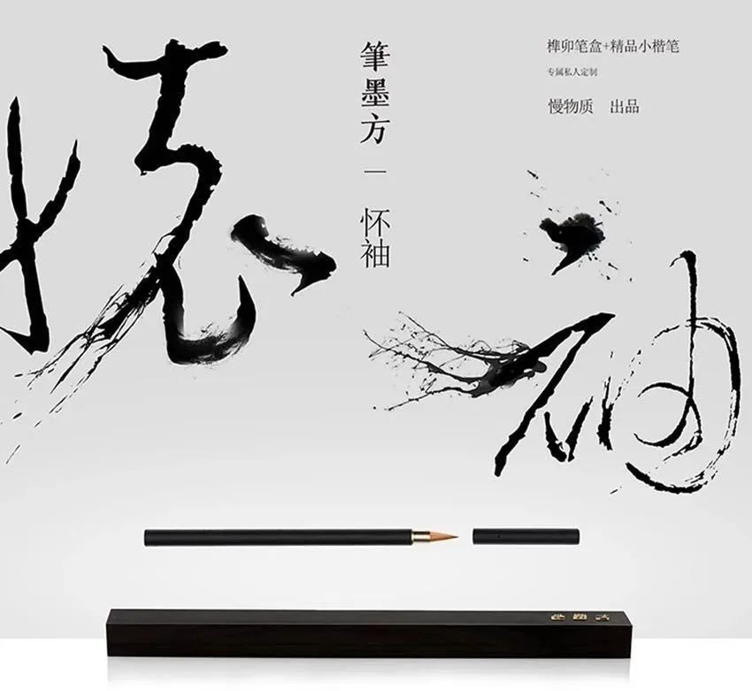
You taste, you taste~>
You can also use PS brushes to process the basic characters to increase visual tension. >
>
Words-Private custom small script pen "Huaixiu">
Handwriting>, cursive and cursive strokes are free and easy, expressing traditional and retro temperament, Some specially designed fonts strengthen the sense of touch , It has the feeling of splashing ink, suitable for works with strong style. >>>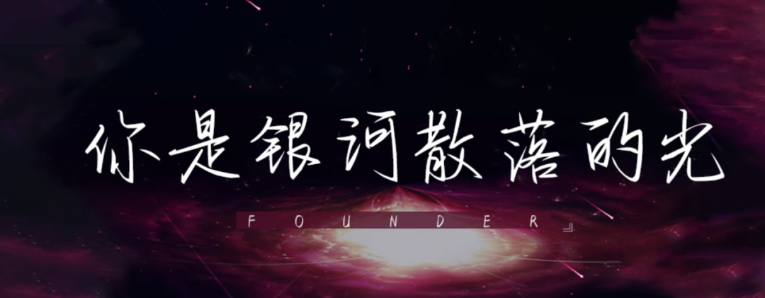
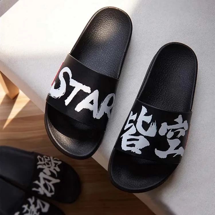
Words-Guochao Word Slippers>
And most of the hard pen fonts are slender and delicate, suitable for fresh literary films, or used to make short sentences narration. >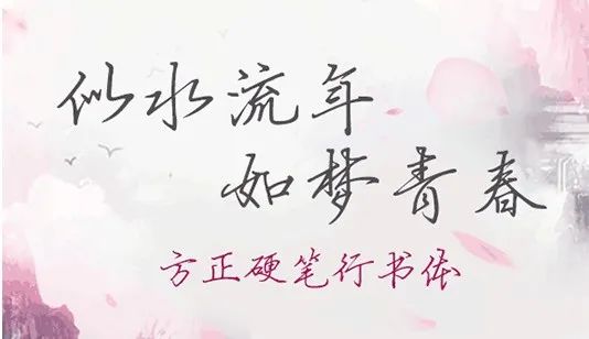
font-You are the scattered light of the galaxy>
And some playful and childlike handwriting, the strokes are even and round, and the emotions are richer, which is suitable for cute scenes. >
English fonts, Commonly used are serif, sans-serif, Handwriting, serif fonts have decorative lines at the end of strokes, the font looks more elegant, suitable for expressing retro, fashion, and small freshness; sans-serif fonts give people a more simple feeling, versatile, suitable for cool colors or futuristic, design sense Strong works; handwriting matches various styles according to different brushes. >
serif>
>>>
 >>
>>
no lining>line>body>
 >Unless the theme of the work requires it, the fonts are too decorative and have too many colors, which can easily fall into the pit. It can be adjusted in the theme color, combined with the atmosphere of the work, and the transparency can be changed to make the overall vision more transparent. If you want to add motion effects to the video, don’t be complicated, simply display word by word, fade in, fade out, and then combine with music to appear, it’s perfect! >Text> Place the in the blank space of the screen to avoid crowding and interference. >Use a large font to increase the line spacing, or combine the size and thickness intervals. Use small fonts to increase the kerning appropriately. Pay attention to multi-line text, the line spacing is greater than the word spacing, otherwise it will mislead the reading of the content. >
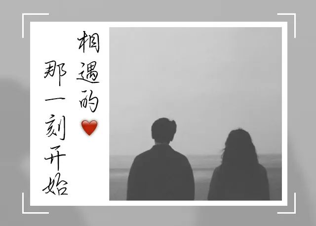
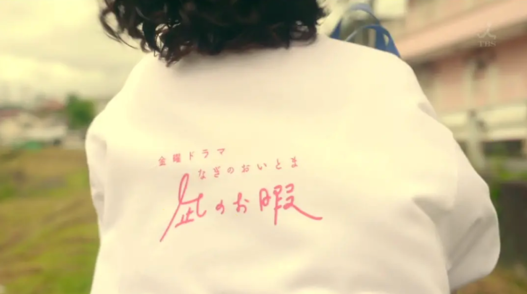
Still from "A Calm Leisure">
In addition, you can also add other details. If you change the position of the subtitle, you will have a different feeling, or combine symbols to increase decoration, and use vertical typesetting, which is suitable for retro literary works. >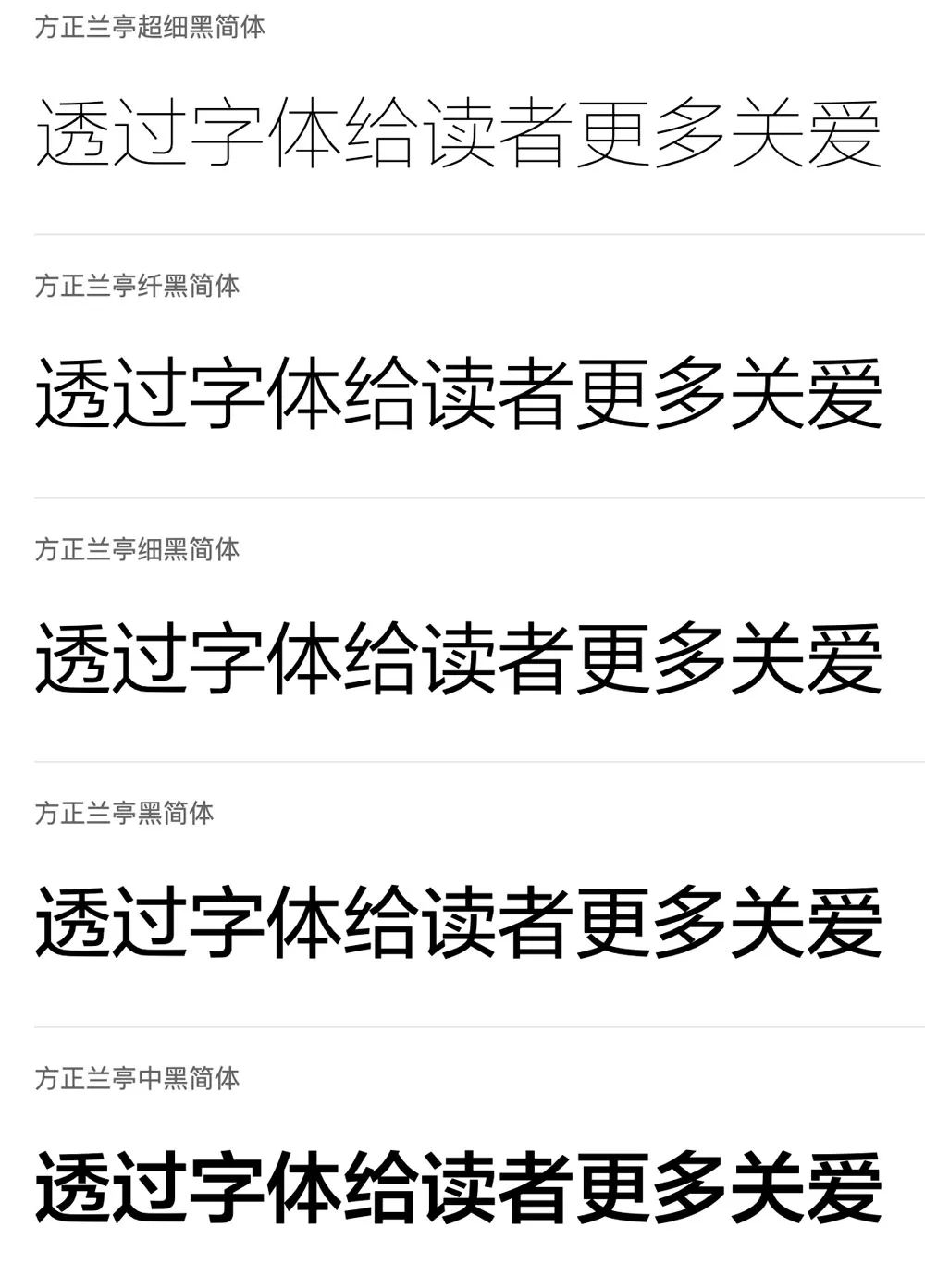
Font - the moment we meet>
>
Note that in a work, it is best to use no more than three fonts ,> otherwise the visual effect will be messy and lack focus, you can choose different weights of fonts of the same family to distinguish them. >
The above are the word selection routines shared today. Friends can freely use them according to their own preferences. After all, works are personal expressions, so how can they stand out from the crowd? At ordinary times, you can pay more attention to the application of fonts in excellent design works, broaden your horizons and deepen your understanding of fonts.>Pay attention to the sharing of handwriting bacteria> , I hope today's content is helpful to everyone. >
Topic of this issue>
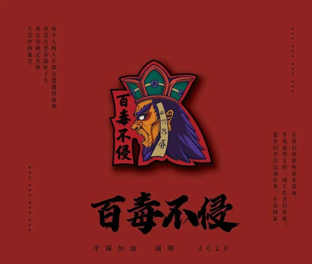
Friends are welcome to share their experience in using words, and the handwriting fungus will pick out 3 cute little ones to give away the Original Ziji Badge—Hundred Poisons Don’t Invade. >
>
3 prizes for this issue~>

35mm x 35mm>
>
Click on the mini program to view more creative products>
Ziji Culture>
"Handwriting Creation" applet >>Transaction Guarantee>>Create characters with handwriting>>>>Flick your fingertips to create characters online. >>>>>Mini Program>>>>— long press the following QR code —>>< /section>Experience handwriting and writing>— Long press the following two QR Code —>>
Articles are uploaded by users and are for non-commercial browsing only. Posted by: Lomu, please indicate the source: https://www.daogebangong.com/en/articles/detail/How%20to%20match%20fonts%20to%20make%20shooting%20and%20sharing%20look%20more%20elegant.html
 支付宝扫一扫
评论列表(196条)
测试