Transferred from| >Design IN Taiwan>>
>
>
Recently, all kinds of popular predictions are overwhelming, and fonts are also coming to join in the fun. The design media CreativeBoom recently released a list, predicting the top 20 fonts that may be popular with designers in 2020. Let’s learn about them together! >
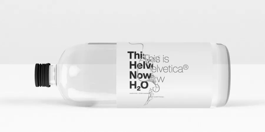
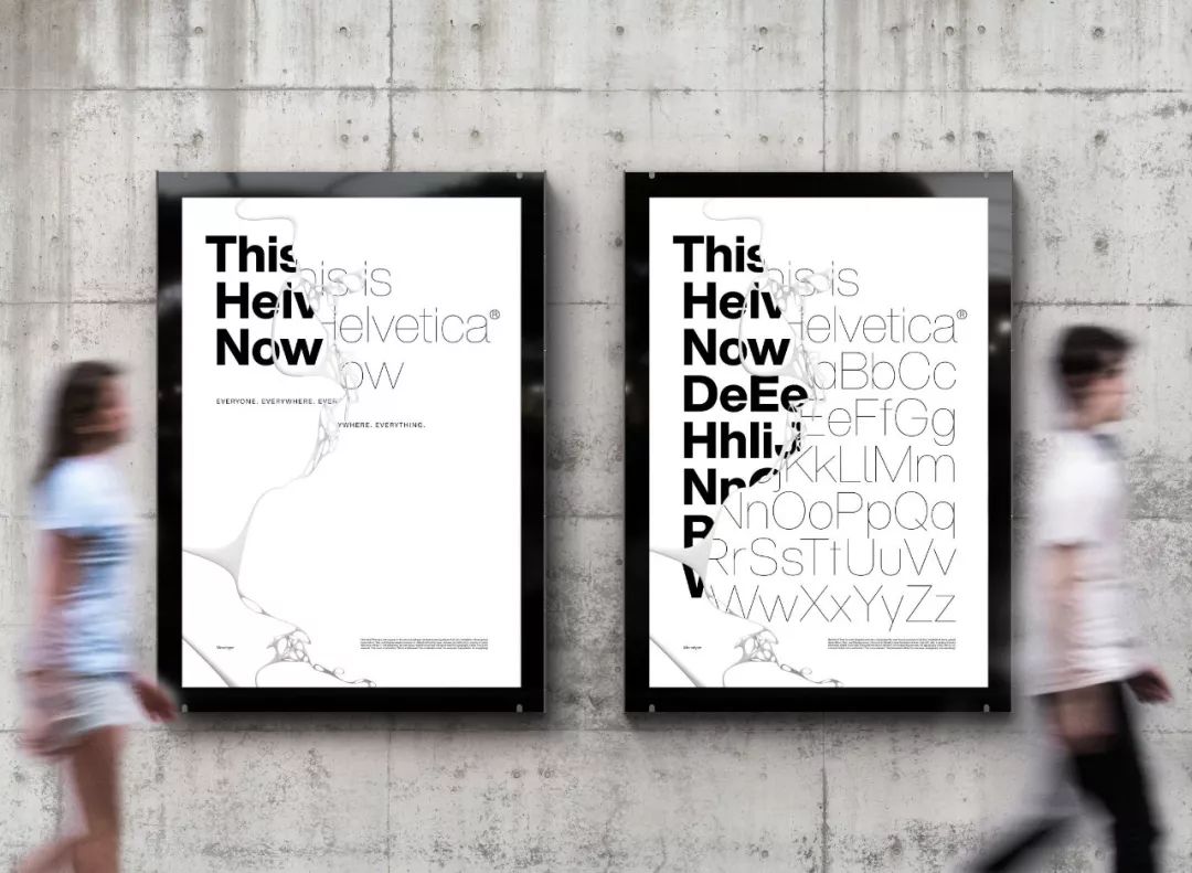
#01HelveticaNow2019 >
The biggest news this year is that Monotype launched HelveticaNow in April. This is the first redesign of Helvetica in 35 years. Every letter has been redrawn and provides practical options suitable for the needs of modern designers. >
HelveticaNow has been very popular in the past 6 months, and I believe it will continue to be popular in the future. >
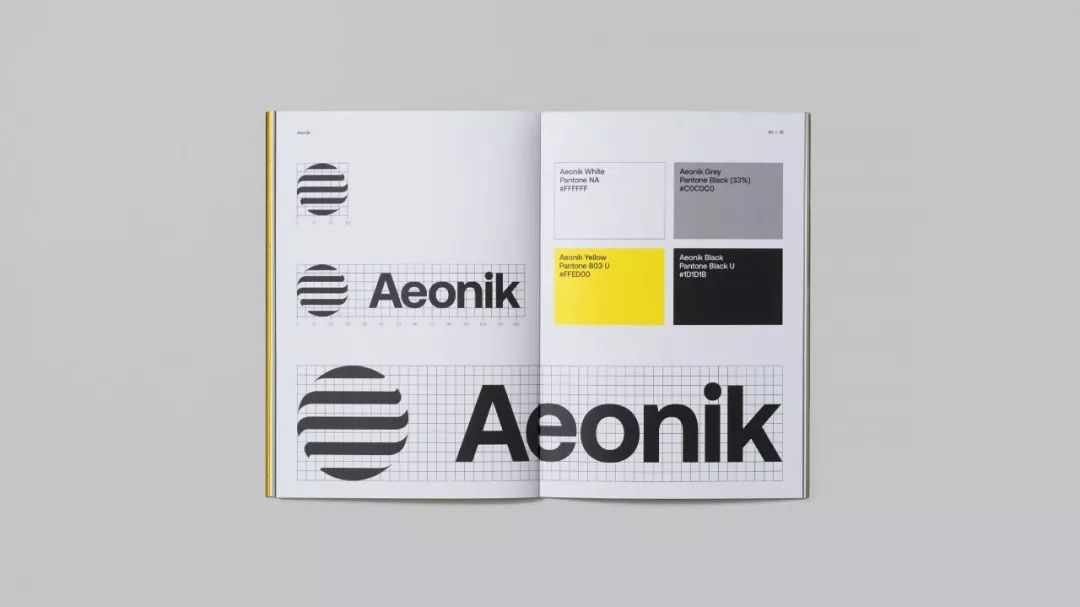
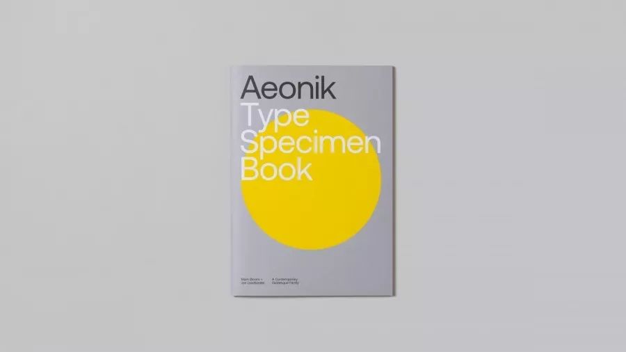
#02Aeonik >
Designer Mark Bloom has worked in the font field for many years when he was at MashCreative. He launched his own brand CoType this year. >
CoType's font Aeonik has a strong structure and mechanical details. The designer positions it as a neo-grotesque with a geometric skeleton. There are a total of 7 font weights and italic (italic) that can be widely used. >
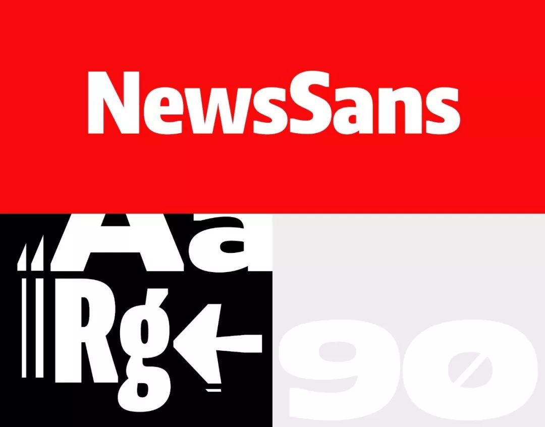
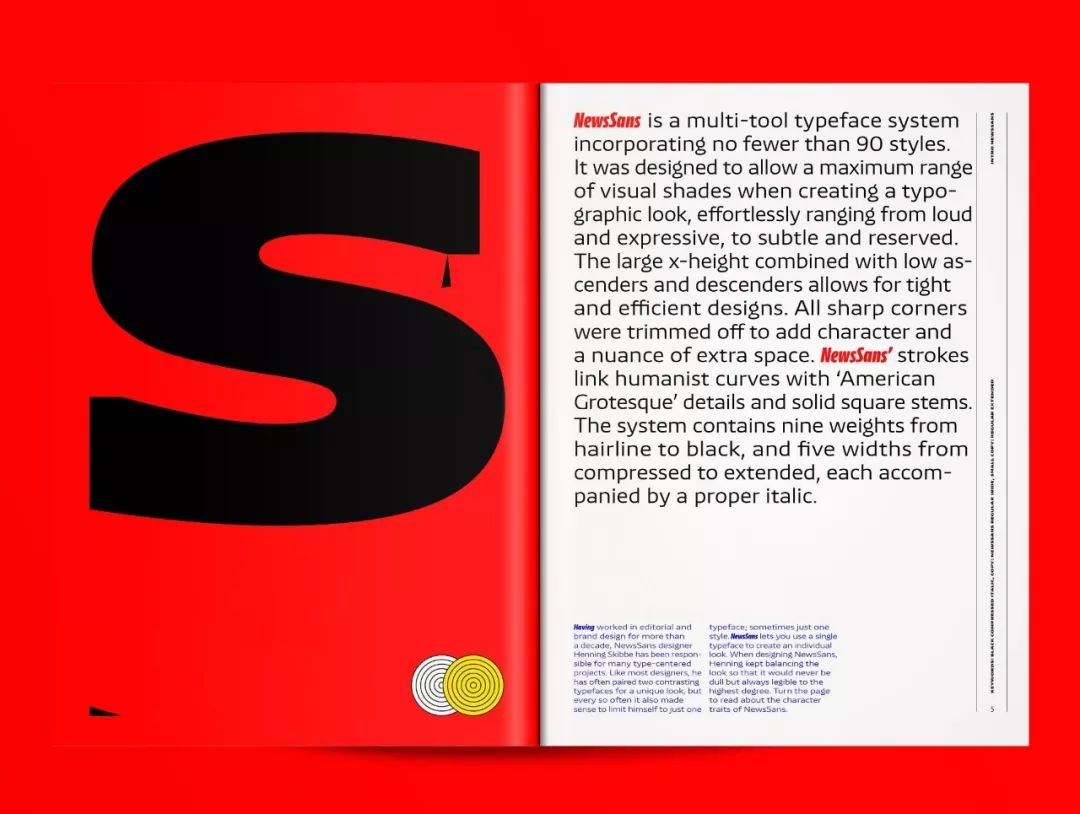
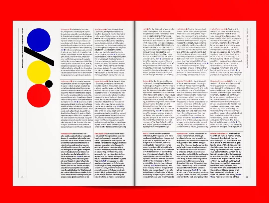
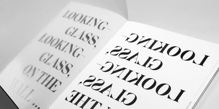
#03NewsSansNewsSans>
can create a changeable vision, switching freely between noisy and high-spirited emotions, low-key and quiet. All the sharp corners have been changed into arcs, giving NewsSans a little more personality. >
has a total of 9 font weights and 5 widths (width) to choose from, all of which are equipped with italics. A free trial version of NewsSans is available for download at charactertype.com. >
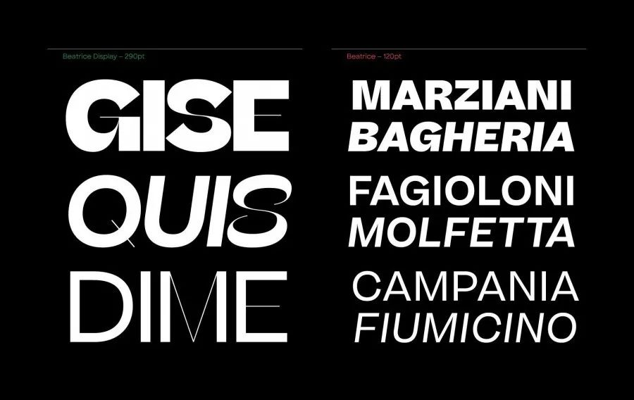
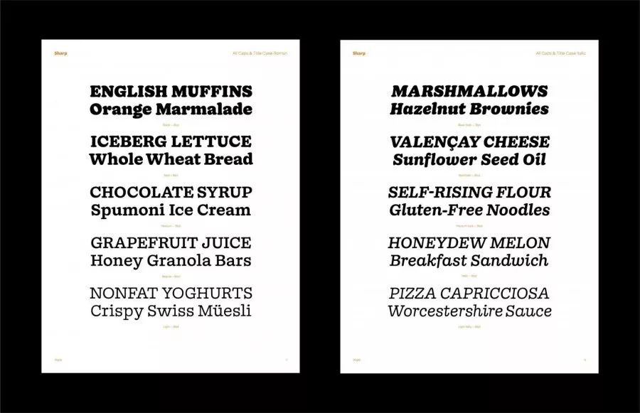
#04BeatriceDisplay >
New York font company SharpType’s newly released Beatrice is based on traditional AmericanGothic and tightens the kerning. The Beatrice font family provides many font weight options, including BeatriceDisplay with high contrast and tight kerning (left in the picture below) , and standard low-contrast fonts. >
#05UntitledSansUntitledSans>
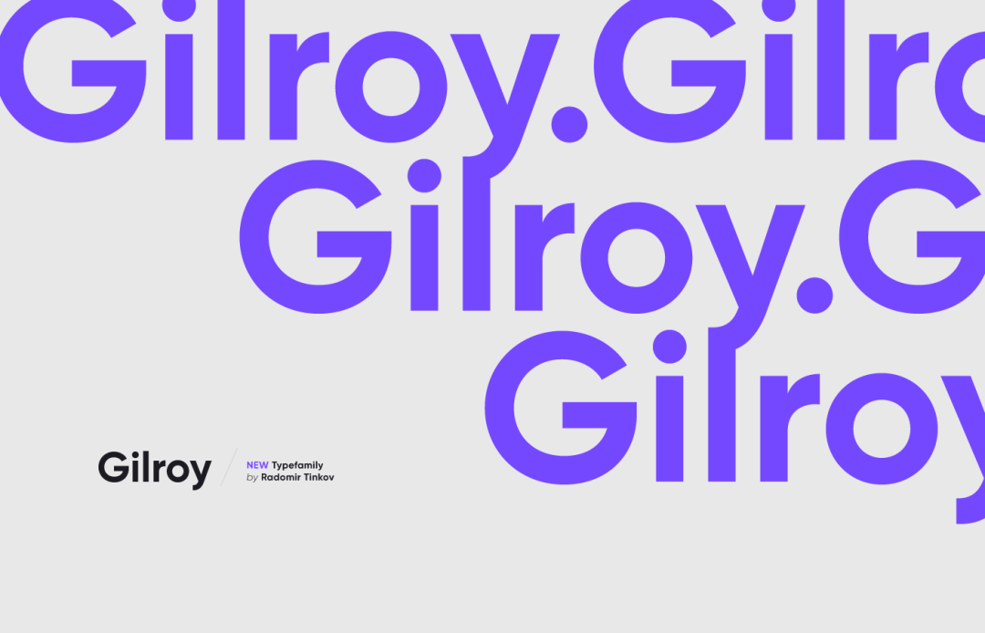
#06GilroyGilroy>
is a modern sans-serif font with a geometric style. It can be regarded as a relative of the Qanelas font family. There are 20 weights in total, including 10 upright versions and corresponding italics for selection. >
Among them, Light and ExtraBold are free fonts, which are worth a try. >
#07DINNext >
The classic design of DIN > is not a problem, but its font weight and width options are limited, which is another disadvantage that cannot be ignored. This century-old design has definitely stood the test of time, but it also needs a more modern redesign. >
DINNext, which can be used flexibly and never goes out of fashion, was born. After the redesign, the classic DIN has transformed into the indispensable DINNext of this era. There are 7 font weights from light to black, each with italic and condensed designs. >
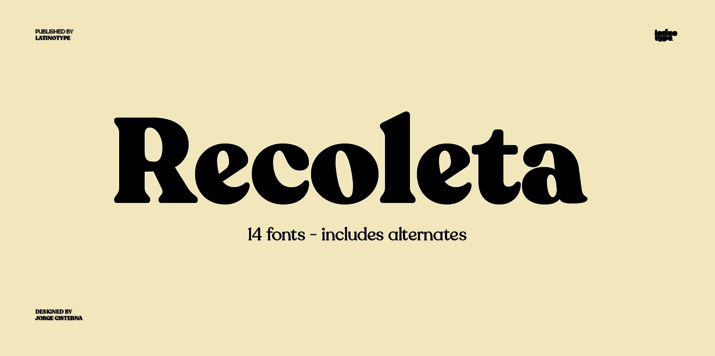
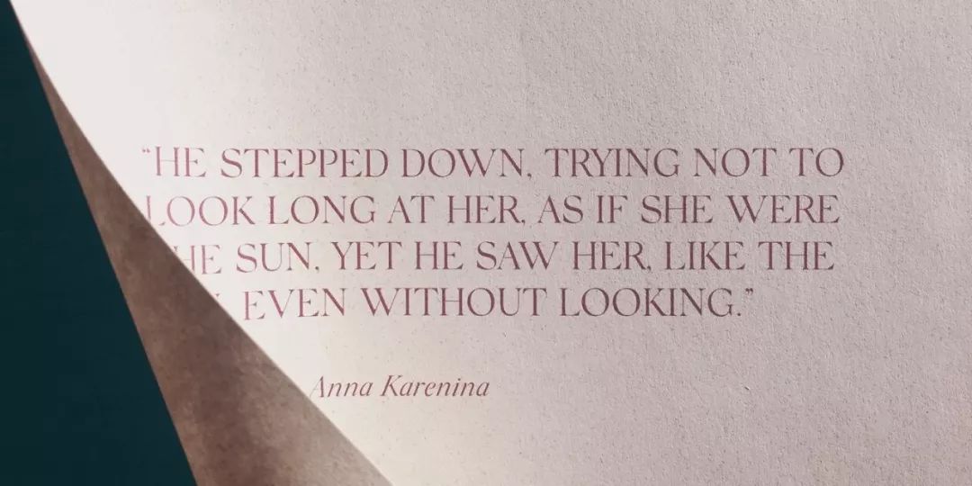
#08RecoletaLatinotype>>
The company combined the soft-bodied Cooper, a favorite of the '70s, with the slightly left-angled, fluid Windsor, into the familiar yet fresh and modern Recoleta. >
Latinotype provides a variety of font weight options, the thin font is suitable for the text, and the bold font is suitable for the title. >
#10Doyle >
The same as No. 4 NewsSans comes from New York SharpType company. Doyle with a sense of the times combines CooperBlack and ITCA AmericanTypewriter to create a brand new result. >
While the Doyle font family has a strong structure, it looks a little loose visually, hiding a kind of moist vitality when the ink is still wet. >

#12FFMark >
was completed in 2013 by German font designers Hannes von Döhren, Christoph Koeberlin and the FontFontTypeDepartment. FFMark has a total of 10 font weights from Hairline to Black. It is very suitable for movies, TV, advertisements, packaging, publications, publications, logos, etc. Design, used in Music, software, video games, sports and even web design all work well together. >
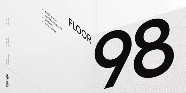
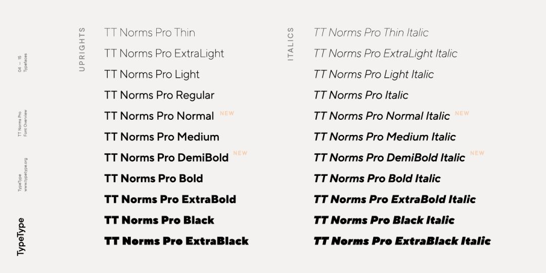
#13TTNormsPro >>
TT >NormsPro is one of the best-selling geometric sans serif fonts (geometricsans), very attractive and easy to use. The design team provided 11 weights and their italics. >
TTNormsPro can be used in a wide range, whether it is a large text block or a subtitle, it is a geometricgrotesk that is commonly used in various situations. >
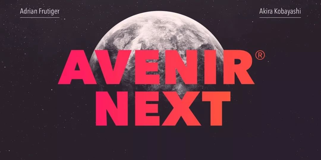
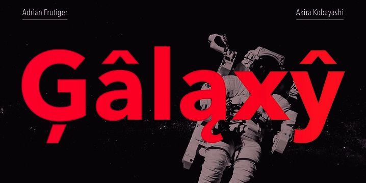
#17AvenirNext >>
Akira Kobayashi, a well-known font designer, and Adrian Frutiger, who invented the Avenir font, worked together to complete the new version of AvenirNext. This is a reinterpretation of a classic, an extension of the original concept. >
The AvenirNext family has a total of 32 fonts from ultra-light to heavy. Overall, the design of AvenirNext is simple and direct, whether it is used for copy content or titles, it is very good. >
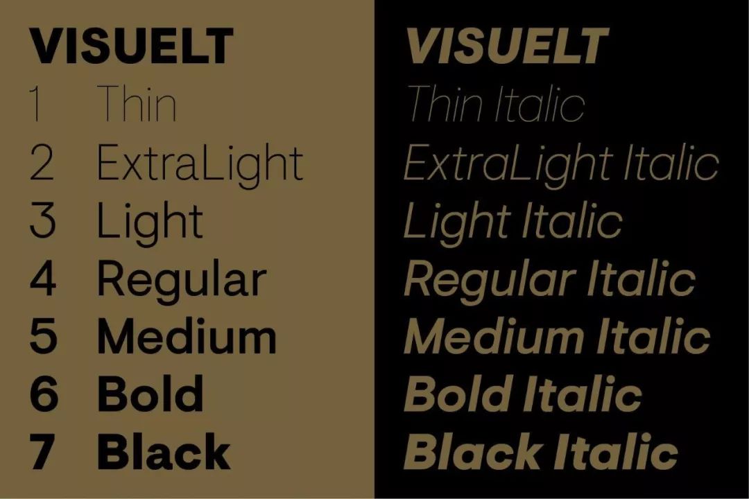
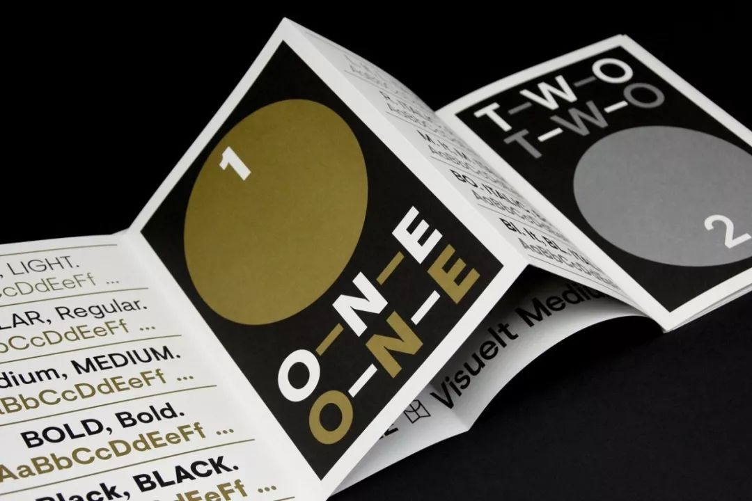
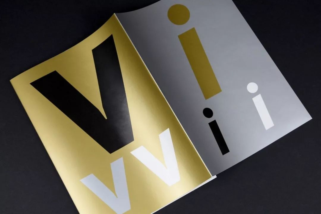
#20Visuelt >>
Another work from the Colophon font company. The prototype of Visuelt is more conservative and somewhat similar to the Aperçu font. In the process of multiple revisions, adding new details and removing features belonging to Aperçu, it was only then that Visuelt found a font that belongs to Aperçu. own voice. >>


Editor: Design Empire - Make Design More Efficient Design IN Taiwan> > Special statement: > All content is for learning and exchange only, other individuals and institutions need to reprint, please Acknowledge the source. If the articles and works we publish infringe your interests, please leave a message through the official account, and we will deal with it within 24 hours. >
》》 Collect it at your fingertips, so it's easy to find when you use it! "">>


-END->
Share︱Grow︱Happiness>
Design Empire WeChat group is open to designers>>
The background of the public account sends 05 into the group>
Don’t add to the ones already in the design group>
WeChat business, advertising, do not disturb people>
>
Growth platform for design students and design newcomers>
Together with Design Empire|Discover the fun and improvement of design career>
WeChat: sjdgjy>>
Business cooperation/Contribution please indicate your intention>
Articles are uploaded by users and are for non-commercial browsing only. Posted by: Lomu, please indicate the source: https://www.daogebangong.com/en/articles/detail/How%20to%20make%20your%20English%20font%20not%20outdated%20Make%20good%20use%20of%20these%20popular%20fonts.html
 支付宝扫一扫
评论列表(196条)
测试