1. Combination of graphics and text typesetting
1. Correspondence between pictures and text
The pictures and explanatory texts are aligned one by one, and the sizes of the pictures are consistent and aligned to achieve visual unity and harmony.
This typesetting method is suitable for pictures with similar aspect ratios, otherwise some pictures will be stretched and deformed, which will affect the appearance.

<<Click here to get the above template for free
2. Add color blocks
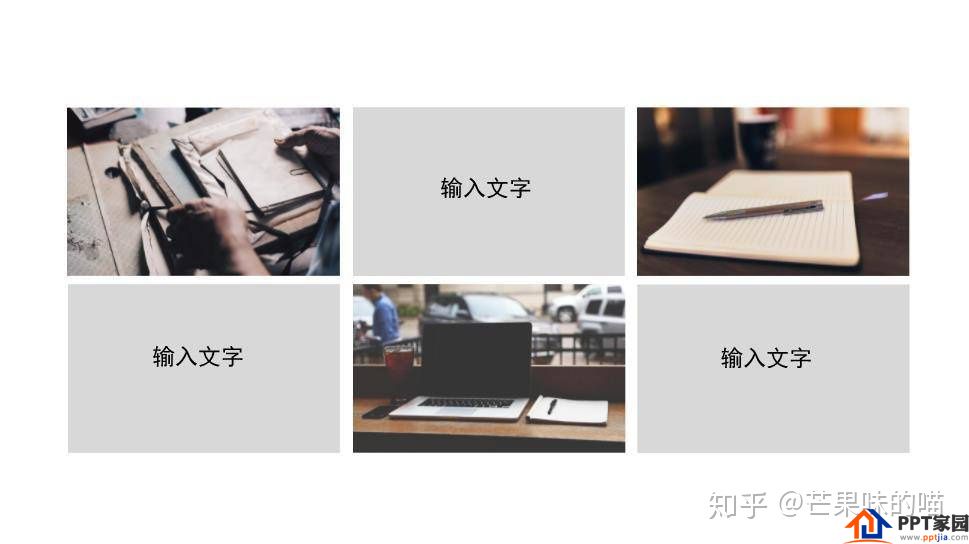
When the size of the picture is not uniform, both horizontally and vertically, the layout is easy to cause inconsistency, and the slide page is very confusing. At this time, adding color blocks can solve the above problems.
Advantages: It does not destroy the proportion of the picture, can achieve the effect of consistent picture size, and achieve harmony and unity visually.
It is worth noting that when adding color blocks for graphic layout, you must not stretch the picture to the same aspect ratio, because the picture will be stretched to deform.
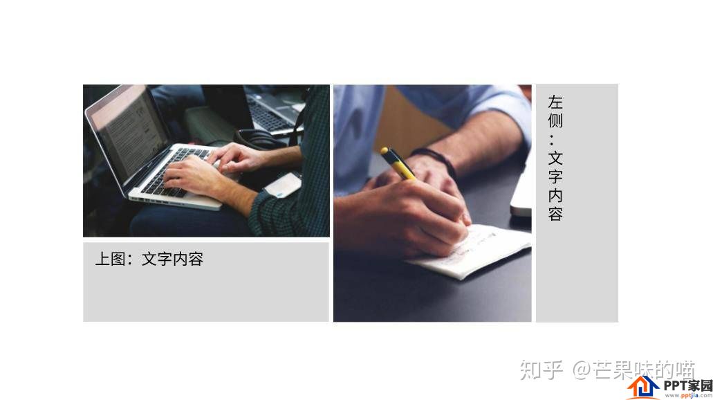
There are both horizontal and vertical versions of pictures, adding color blocks to achieve harmony and unity
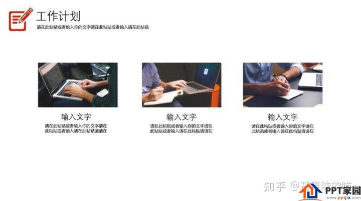
When PPT needs to display a lot of pictures, such as certificates, work photos, activity photos, etc., add color blocks and add text descriptions to each picture, so that the audience can more clearly understand what these pictures are.
<<Click here to get the above template for free
3. Add bottom support
When there are many logos and icons on a slide, you can add a bottom bracket to each logo and icon, and instantly make the chaotic and crowded pages neat and harmonious.

4. Direct attention
If the picture contains factors such as human face/direction guidance, when the picture and text are typesetting, the audience's attention should be drawn to the position where the key information is conveyed.
This is often overlooked by most people. But if you see this little graphic typography trick, you won't ignore it in the future.
When a very conspicuous human face appears on the slide, the audience's attention is mainly focused on the direction in which the person is looking. At this time, the position of the text should be consistent with the gaze direction of the characters to attract the attention of the audience.

The direction of eye gaze is exactly where the text information is located
There is no human face, but there is an obvious guiding direction, and the above method should also be followed to place the text content on the guiding direction to guide the audience's attention.
2. Background layout
In the work/campus PPT, the use rate of pictures as the background is very high, such as introducing companies, project teams, and assignment team members. There are two simple and practical methods to solve the background image typesetting problem.
1. Directly as a background image
Use high-definition and high-quality pictures directly as the background picture to highlight the key points and form a visual impact (the entire page is the information that the picture wants to convey).
There are two ways to add text:
One is to add a solid color text box. When the content of the picture is very full, add a solid-color text box to the text to make the slide show harmonious and enhance the presence of the text.
The second is to add text directly, which is suitable for simple pictures with enough blank space.

2. Weaken the color of the background image
Weaken the color of the background image directly, or add a mask to weaken the background image. This can also highlight the text content without affecting the viewing experience.
<<Click here to get the above template for free
3. Principles of using pictures
The selection of pictures for PPT is also very particular. The principles are as follows:
1. Clear and concise big picture
If the picture is related to the theme of the PPT, or related to the slide content of this page, try to use a clear and concise large picture. Big picture relative to small picture:
Can improve the quality of the slideshow
more attention-grabbing
More prominent themes/content

2. High quality
For work/study PPT, only high-quality pictures can show professionalism and improve the quality of PPT. Just be sure to avoid crappy images.
3. Fit the theme
Choosing pictures that fit the theme can play a finishing touch. On the contrary, if you choose a picture that does not match the theme, it will appear that the PPT is very unprofessional, and even mislead the audience's understanding.
Articles are uploaded by users and are for non-commercial browsing only. Posted by: Lomu, please indicate the source: https://www.daogebangong.com/en/articles/detail/How%20to%20make%20typesetting%20more%20coordinated%20in%20PPT%20design%20and%20production.html
 支付宝扫一扫
评论列表(196条)
测试