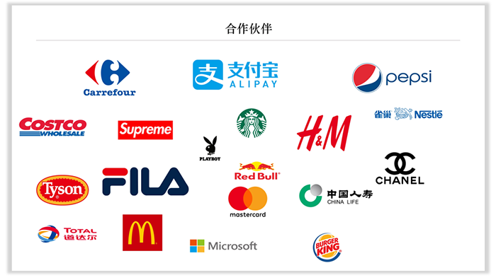
Logos with other company brands often appear in the PPT, representing the company's partners. And sometimes, there are as many as five or more cooperative companies, sometimes even more than a dozen. I don’t know how to make the typesetting more professional, atmospheric and beautiful?
Today, the editor recommends a typesetting technique for everyone.
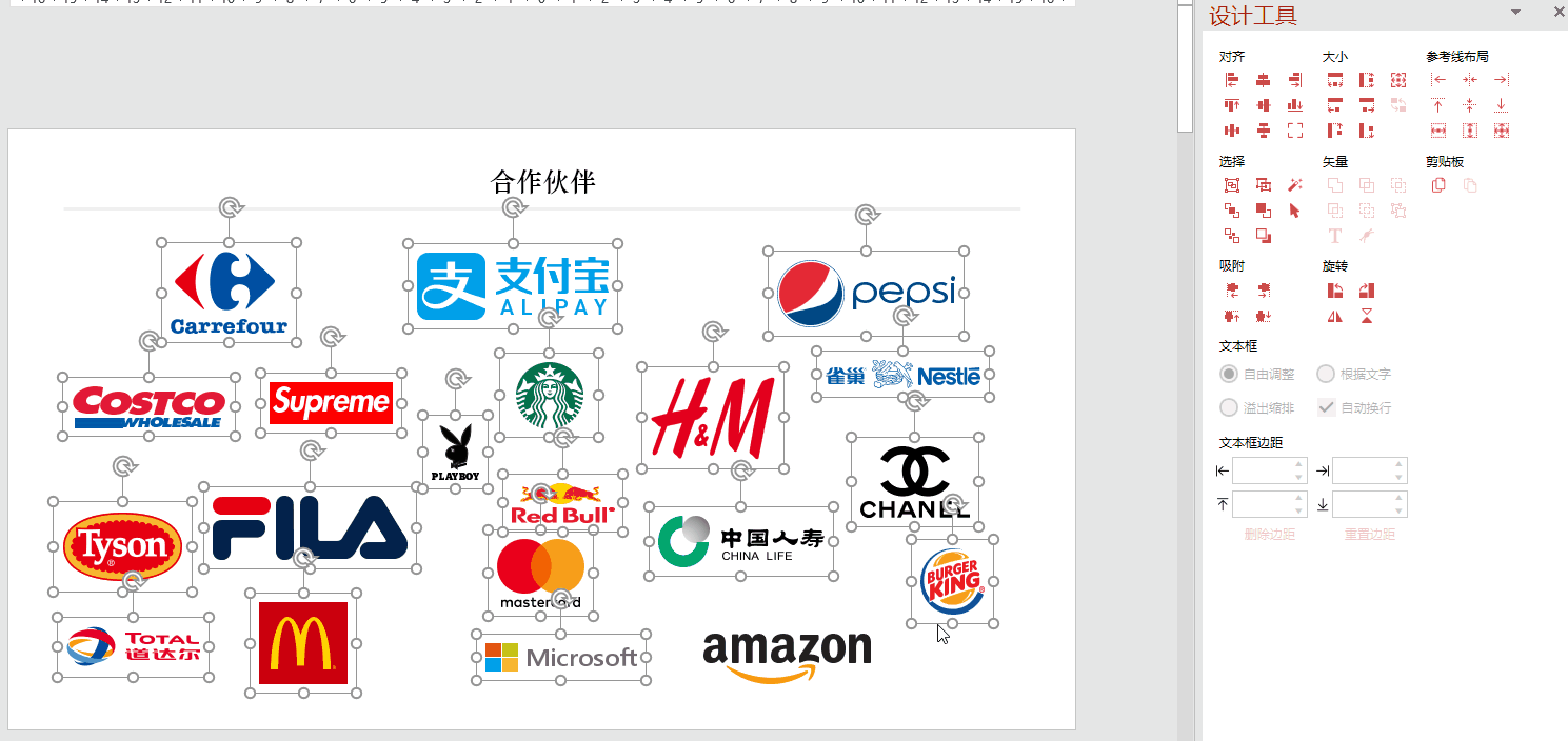
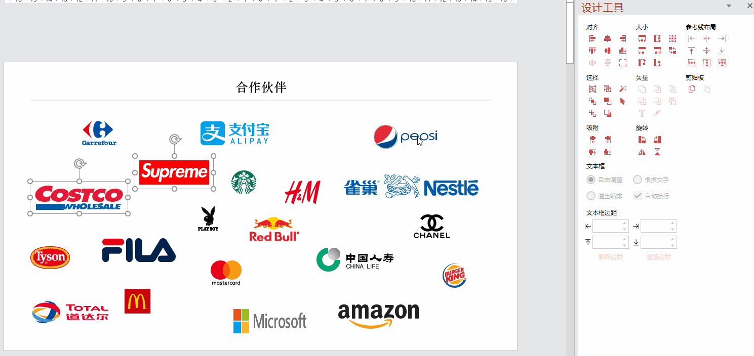
1. First look at so many logos of different sizes and sizes squeezed into one PPT page at the same time. It seems that there is no way to start, and I don’t know where to start. In fact, this kind of page is not difficult to deal with, just achieve alignment and unity.
2. Unified logo size: equal height
Select the logo that needs to be adjusted and open iSlide "Design Tool"
Frame the logo with the mouse (the height of the last selected shape is used as the basis for "contour height"), and select "contour height"
3. Unified logo size: equal width
Select the logo that needs to be adjusted and open iSlide "Design Tool"
Frame the logo with the mouse (take the width of the last selected shape as the basis of "equal width"), click "equal width"
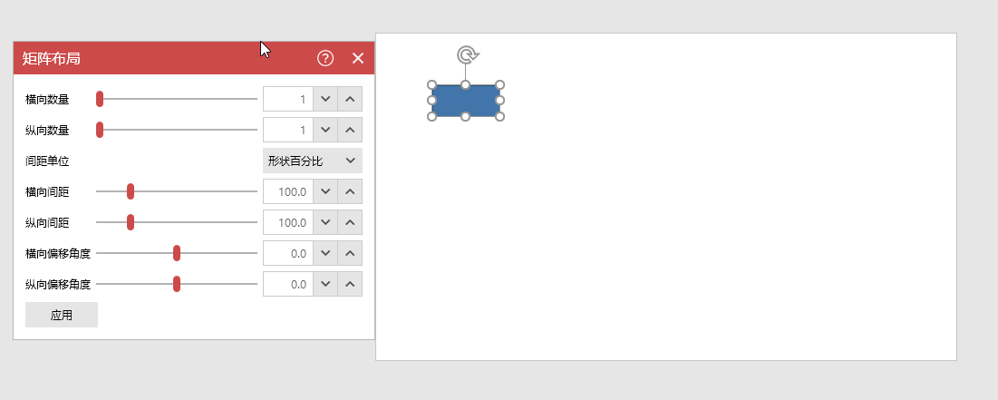
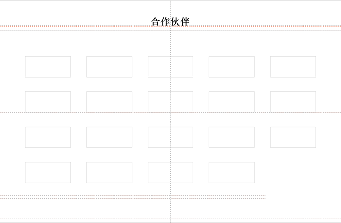
4. Matrix layout
Insert 1 rectangle: Insert » Shapes » Rectangle
Open iSlide "Matrix Layout" to set the number of layouts, and enter the actual number required
Number of Landscapes: 5
Number of portraits: 4
5. Reference line
Open the "Smart Guide" in iSlide One-key Optimization
With the help of the reference line, adjust the vertical spacing and horizontal spacing of the rectangle to standardize the position of the rectangle
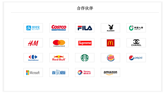
6. Fill the logo
Fill the logo with a uniform size into the rectangle, adjust the shape format position, and complete
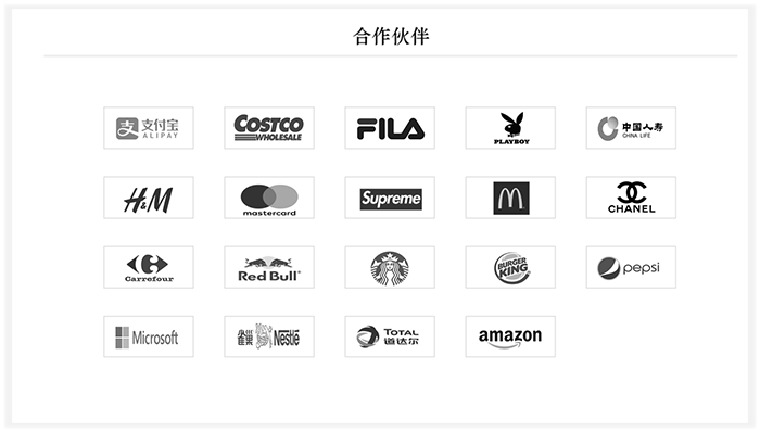
7. Extension:
Uniform Color/Style
When too many colors appear on the same page, it will interfere with the vision
You can try desaturating the color (more black or white and less hue) to make the page more "professional"
Articles are uploaded by users and are for non-commercial browsing only. Posted by: Lomu, please indicate the source: https://www.daogebangong.com/en/articles/detail/How%20to%20make%20the%20typesetting%20of%20Logo%20more%20professional%20in%20PPT.html
 支付宝扫一扫
评论列表(196条)
测试