What is graphic design? To put it bluntly, the most commonly used is nothing more than the combination of text and pictures. Comprehensible and attractive design. The same picture, with different fonts, will have different feelings. Today, according to everyone’s feedback, the editor will give you a detailed interpretation from the three most troublesome aspects of text color, font, and typesetting: how to design in graphic design Add text in the United States and the United States.
What font to choose
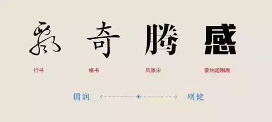
The choice of font should be determined according to the meaning and tone of the picture and text content, for example: the text is clearly intended to express the cuteness of children, but you choose traditional Chinese characters with brush. . . This is obviously not suitable. Therefore, before choosing fonts, you must figure out the artistic conception that the graphics and texts want to express. Painful fonts also express different breaths.
Coarse and thin◢
Bold fonts are thicker and more powerful, and thin stroke fonts are lighter. Of course, this is a very intuitive feeling, and you can see it just by looking at the fonts.
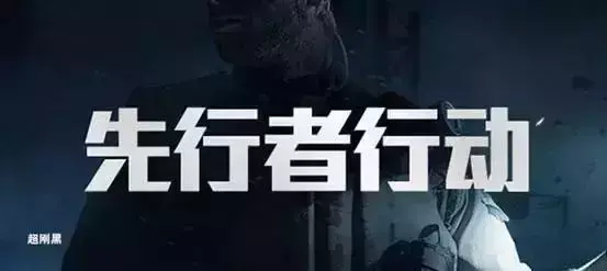
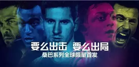
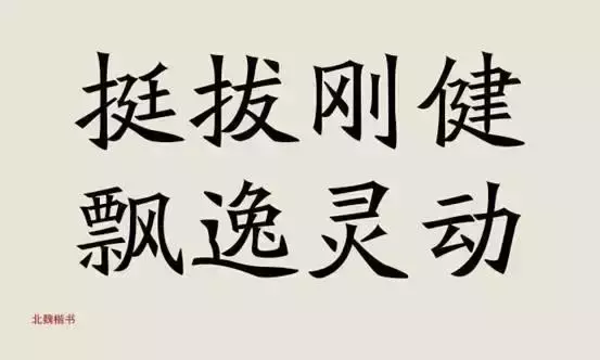
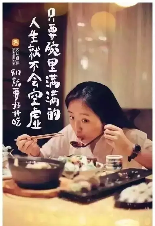
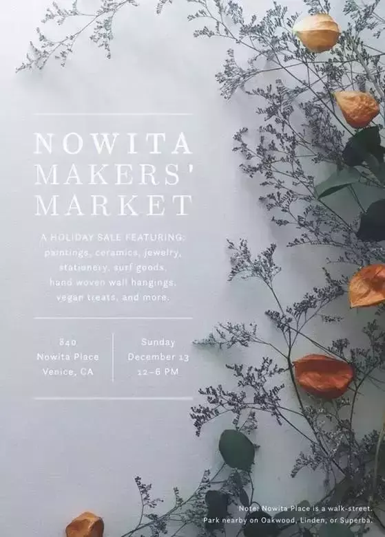
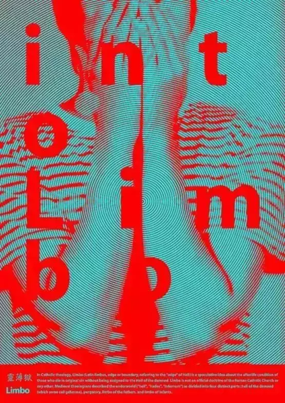
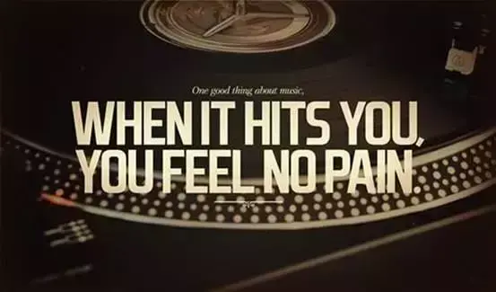
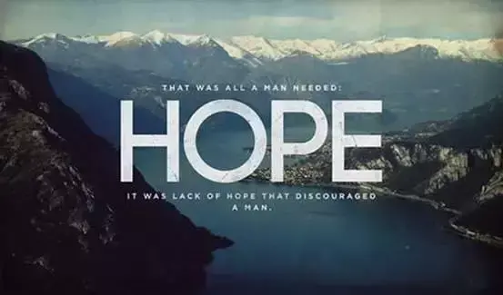
Bold fonts are more used in titles, which are more eye-catching, oppressive, and play an emphatic role.
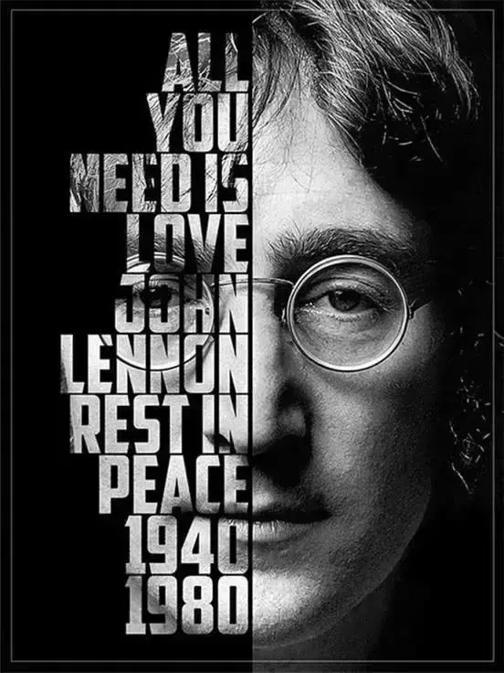
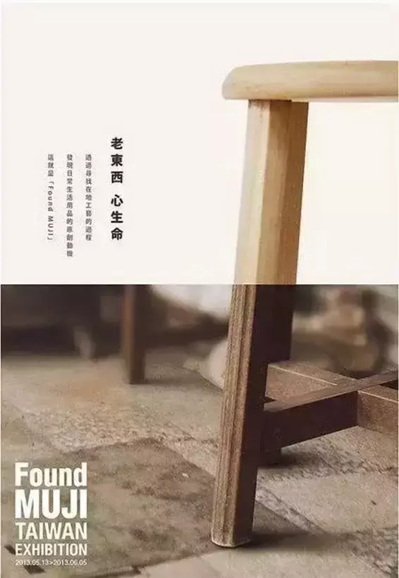
The following are some examples of bold fonts as titles, which are more intuitive from the picture, you can refer to them:
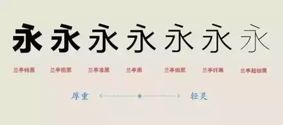


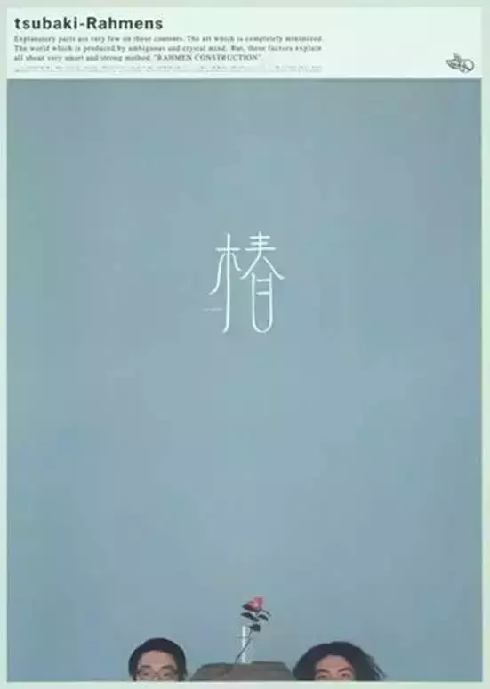
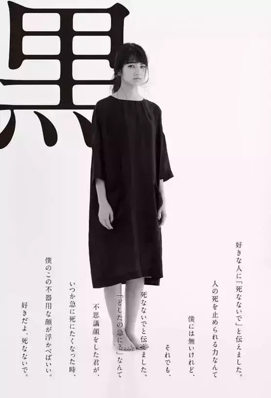
A thinner font is not as heavy as a bold font, and it does not give people a visual impact. Compared with it, it is softer and more elegant, but if it is used improperly, it will easily give people sparse a feeling of.
Curved and straight◢
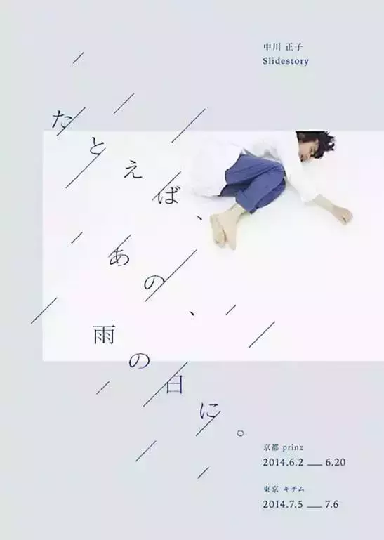
The difference between square and square fonts and ligatures~ Straight lines are more decisive and powerful than curves, but they can also be a bit dull, while curves are more tactful in comparison.
Justify ◢
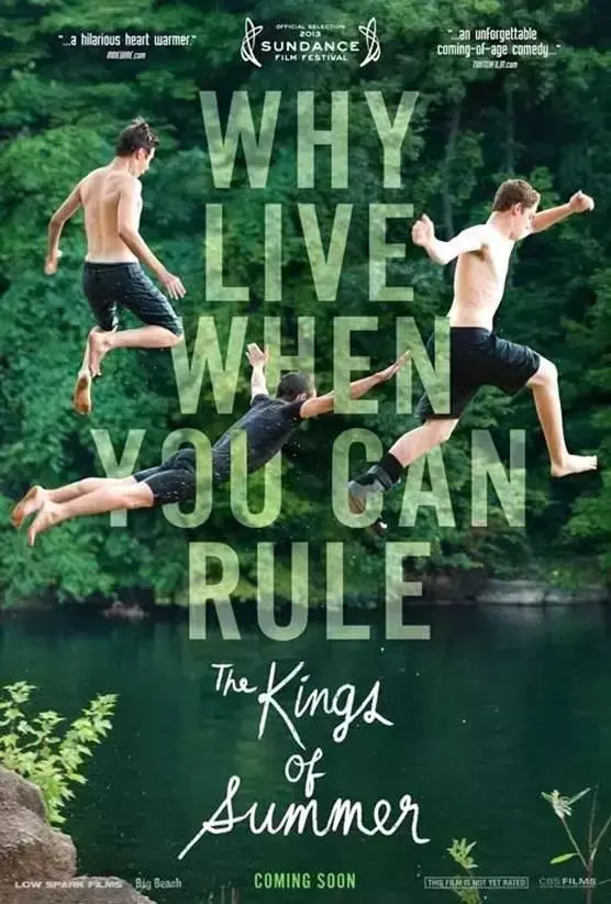
The pictures below are some straight font designs, moving on! go ahead! Does it look like a soldier assault? Haha~ Very decisive.

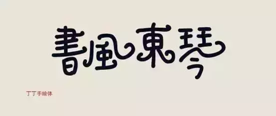
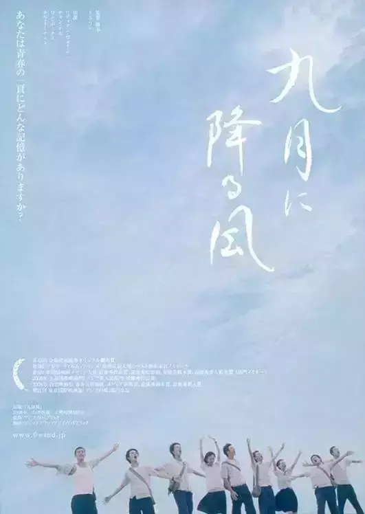
曲◢
Here are a few designs of curved fonts. Everyone can experience it for themselves. Obviously, the styles are very different.

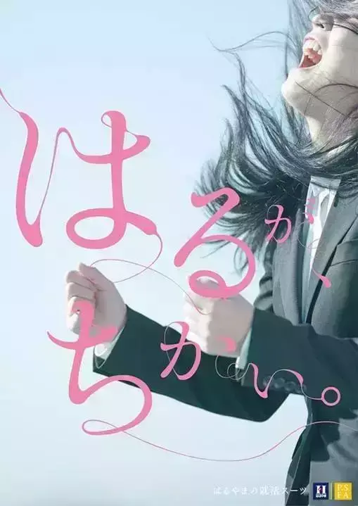
However, not all fonts are straight when it comes to strokes, and when it comes to curves, they are all gentle. Like our Chinese characters, they are horizontal and vertical, but they are curved when left and right. The combination of straight lines and curved lines is rigid and soft, which has a special flavor.
Loose and rigorous◢
A lively and casual font will make the atmosphere more relaxed, and a well-behaved font will appear more rigorous. In later generations, there is a rigorous and dignified beauty. The essential difference is the loose and rigorous structure.
A more relaxed font is usually used in materials that reflect children. Children do not have so many rules and regulations, and this font can better represent their immaturity and liveliness.
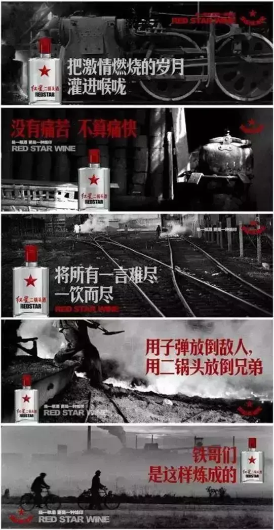
The contrast is sharp, and the tough fonts in the following pictures are more rigorous and rigid.
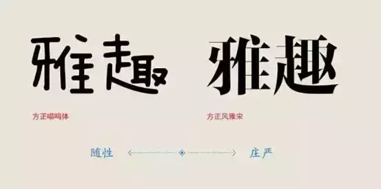
Simplified and Traditional◢
The simple and complex mentioned here are not simplified and traditional, but the complexity of stroke details. To take the simplest example, serif fonts are relatively more complicated than sans-serif fonts, and Arial is also more complicated than black fonts. The complexity and simplicity of fonts also represent the classical and modern trend to a certain extent.
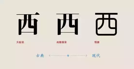
Simple◢

繁◢
Recommend some good-looking and easy-to-use Chinese fonts according to the above categories
Bold: Holly Black Body, Founder Rhyme Dynamic Black, Founder Da Wei, Han Yi Power Black, Character-making Workshop Edition Black, Character-making Workshop Wenyan, Character-making workshop Langqian, Character-making workshop Lihei, Character-making workshop Langsong, Fangzheng thick Tanhei, A-OTF series, Minglan script, Fangzheng paper-cut simplified
Slim: Kunlun Thin Round, Founder Thin Gold Book, Hanyi Qingya, Founder Lanting Slim Black, Siyuan Heibody, Kozuka Series, Japanese KozGoPro , AXIS std Japanese, Hanyi Banner Black
Qu: Founder's handwriting-Lv Jiande Xingkai, Great Wall Zhongxing Script, Shutifang Mifu Script, Founder Yellow Grass, Fashion Zhonghei, 851 handwritten miscellaneous fonts
Straight: Hanyi Strength Black, Character-making Workshop Edition Black, Character-making Workshop Wenyan, Character-making Workshop Shanghei, Character-making Workshop Shanghei, Fangzheng rough Tanhei, Hanyi Lingxin simplified
Loose: Tengxiang Acacia Style, Huakang Girl Style, Tianshifang Brush Traditional Style, Fang Zheng Tong Style Brush Font, Xindi Small Style Ball style, Fangzheng Jidi simplified style, Fangzheng meow style, Hanyi leisurely style, Hanyi wheat style, Hanyi Lemeow style
Rigorous: Simplified Chinese Yiquan Tang Poetry, Founder's Handwriting - Elegant Kai, Founder's Song Block Printed Xiukai Simplified, Kangxi Dictionary (Traditional) European Regular Script, Founder Su Xin Poetry Liu Kai Simplified, Founder Song Block Printed Show Regular, Founder Northern Wei Regular Script
Simple: Hanyi Banner Black 25, Founder Zheng Slim Black Simplified, Microsoft Ya Hei, Founder Fine Line Simplified, Fang Zheng You Hei, Fang Zheng Jun Hei, Founder Shuiyun, Founder Zhenghei
Traditional: Founder Book Song Simplified, Founder Qing Block Book Yue Song Simplified, Founder Lanting Magazine Song, Founder Ya Song, Founder Yan Song, Founder Feng Ya Song, Fangzheng's engraved version imitates the Song Dynasty, and Fangzheng Qing's engraved edition pleases the Song Dynasty

The color of the font
Tip: Pixelate the picture, basically you can find the main content of the picture of several colors.
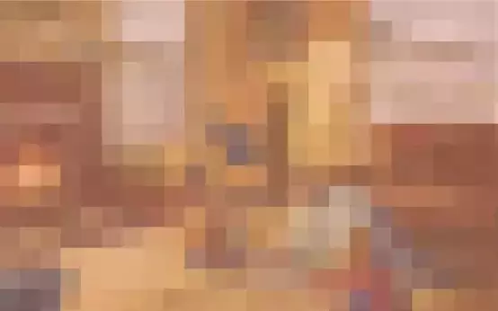
Extracts colors from mosaic images.

Choose contrasting and complementary colors for the added text. The visual effect is very strong, full of vitality, warning, and strong visual impact. Through this strong contrast, intense emotions and Unlimited enthusiasm.
Analogous color is a very natural color scheme, giving people a harmonious, calm, comfortable and pleasing to the eye.

In addition, I would like to explain the problems that need to be paid attention to in the universal white font method:
It is important to have a good contrast between text and images, white text on a dark background, or a filter or overlay element on a light background is an effective way to ensure that you use enough contrast.
Where to place
Choosing the size and proper placement of text in relation to image-focused elements is as unquestionable as the readability of the text itself.
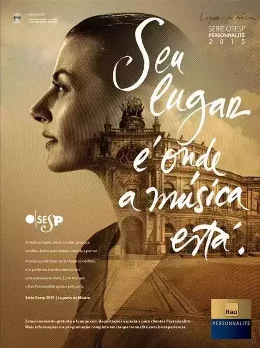
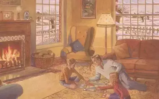
As shown in the picture below, choose a relatively uniform, open sky area, which is an excellent place to place the text. On the contrary, placing the text directly in the middle of the picture, with the horizon line, makes the text less legible.


According to the different depth of field of the picture, placing the text in the out-of-focus place can also highlight the text, increase readability, and achieve the effect.


Specifically, it is the position of the text relative to other elements in the image, whether it is behind the image or before the image; whether it is integrated into it or exclusive; further analysis, how to associate the text with the image Rule of thumb for focused elements: the smaller the text, the farther it appears spatially.
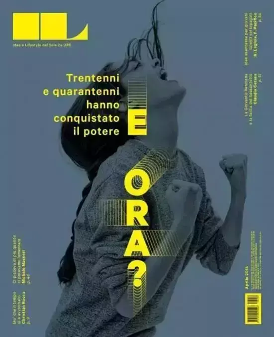
As shown in the figure below, although the background image is rich in details, our vision will stay on the super long text and ignore the image. At the same time, the characters and the text seem to be on the same level, with a weak layering.

After enlarging the text, the sense of hierarchy comes out immediately.

The content comes from the network. The copyright of all articles, pictures, audio and video files and other materials reproduced in this official account belongs to the copyright owner. The non-original articles and pictures used in this account cannot be contacted with the copyright owner one by one. If the author of the selected content And editors think that their works are not suitable for everyone to browse online, or should not be used for free, please leave a message to inform us in time, so as to take appropriate measures quickly to avoid unnecessary losses to both parties.
Articles are uploaded by users and are for non-commercial browsing only. Posted by: Lomu, please indicate the source: https://www.daogebangong.com/en/articles/detail/How%20to%20make%20the%20text%20in%20the%20works%20a%20magic%20stroke.html
 支付宝扫一扫
评论列表(196条)
测试