
When it comes to making PPT, everyone must not forget to use one element, that is shape.
Shape plays a very important role in PPT. It can not only distinguish layout information, but also increase the design sense of the page.
Therefore, this time, I will introduce to you the method of using shapes to help you quickly improve efficiency and beauty when designing PPT. Let's first look at a few cases of shape design.
Case 1
First of all, let’s take a look at the design method of this timeline. Although there is not much content, it is also tricky to deal with.

According to the content of the timeline above, the gradient design method is used here, and the content is organized with a gradient shape.
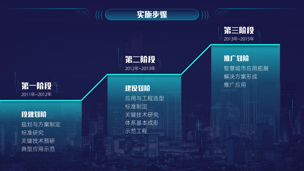
There is also a relatively simple method, directly using progressive shape processing to make the time period clear.

Case II
Then, for the following pages with less content, the effect of processing is also very single, and the colors are also very messy.
At this time, according to the above theme content, split it on both sides, and then use a symmetrical layout design and decorate it with lines and surfaces.

Apart from that, you can also add the middle as a background image design.
Case Three
There is obviously a lot of content in this PPT page, right? If you want to make it more professional, you really need to think more.
However, there are ways to find out, here are 8 design ideas.
First of all, simply process the above content to make the text clearer.
Next, under normal circumstances, I think everyone will use this large-area regular shape, right, obviously this effect is relatively simple.
If you want this type of page to have a more design sense, then follow my steps and give you some design ideas.
When designing a PPT, the most important idea is to conceive the layout, followed by adjusting the content details inside.
So this time, first determine the layout, and then design the content, for example, use the following layout effect.

After the layout is determined, the content can be placed on the page next, obviously not directly, otherwise it will be very monotonous.
We need to further process and add some design elements, such as designing with gradient shapes, lines, etc., to enhance the visual effect of the page.
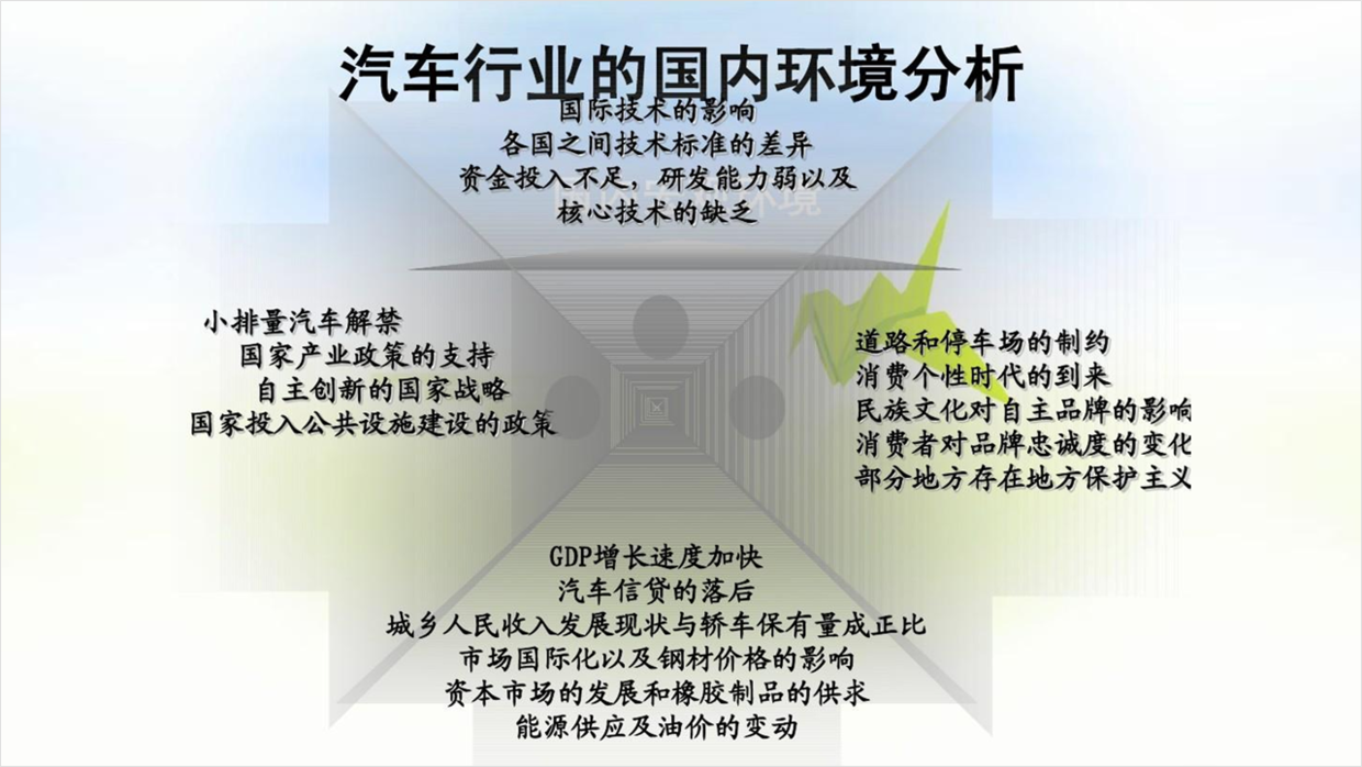
Case 4
The overall content of this page does not look very good, mainly because the use of this gray gradient shape makes the page blurry and a bit dirty.
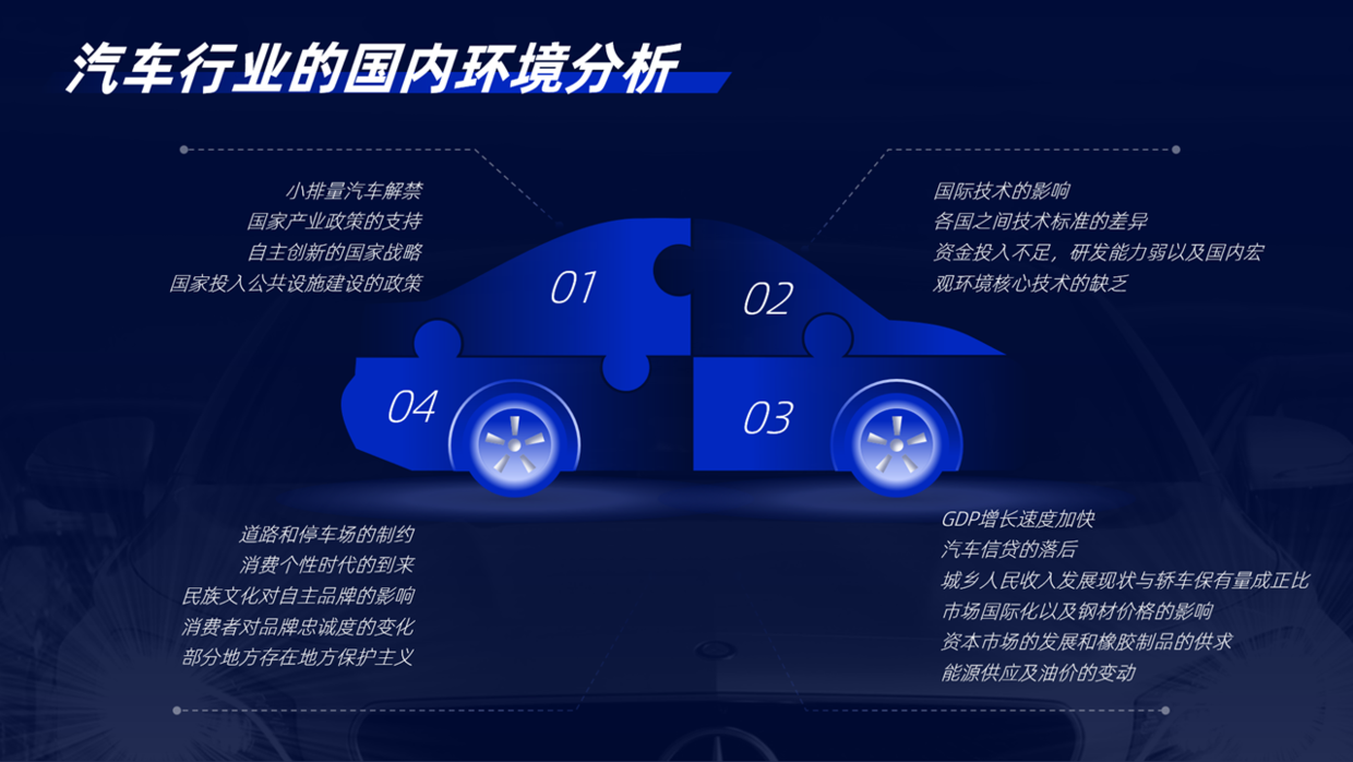
At this point, you can rearrange the typesetting, for example, you can adjust it to the following horizontal effect, and use the shape to regularize it.

Or, you can also use this typesetting design up and down, and then center the title, the effect is not bad.

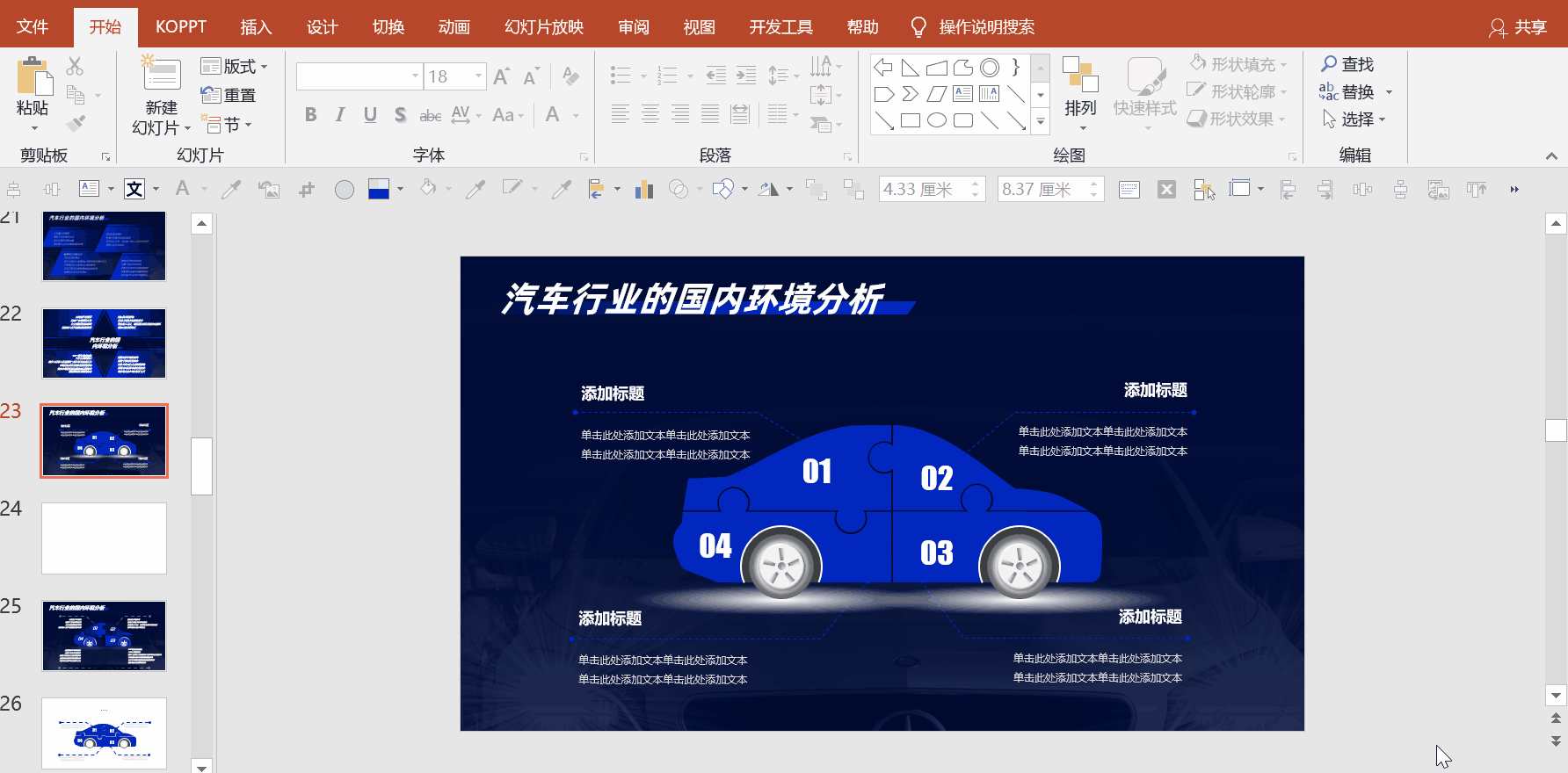
In addition, you can also use this car graphic design to make the page more visual and increase the sense of the scene.
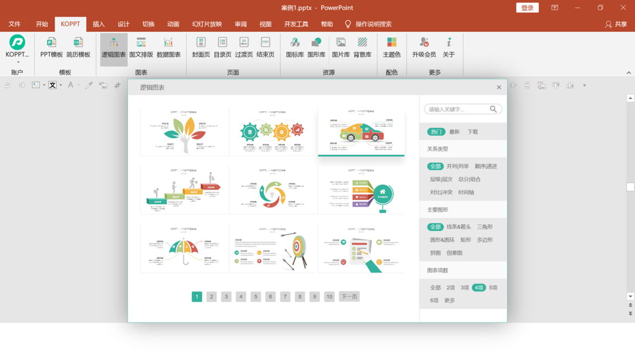
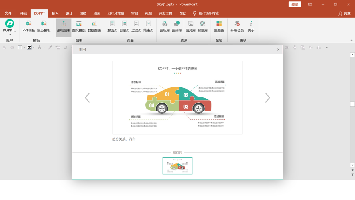
Regarding this kind of logic chart, here I found one in the [KOPPT] plug-in, directly choose to download, and have a look.
The plug-in material comes from the KOPPT website
The plug-in material comes from the KOPPT website
In fact, it can also be selected according to different topic types, including the amount of content, etc., and then directly inserted into the PPT for use.
Obviously, when the material is downloaded to the page, it cannot be used directly, otherwise the overall effect is completely inconsistent. At this time, select the previous gradient element, double-click the format brush, and then modify it.
Case Five
For some types of structural diagrams, some special content, such as the time axis, will be mixed in.
The following page is a typical content, take a look.
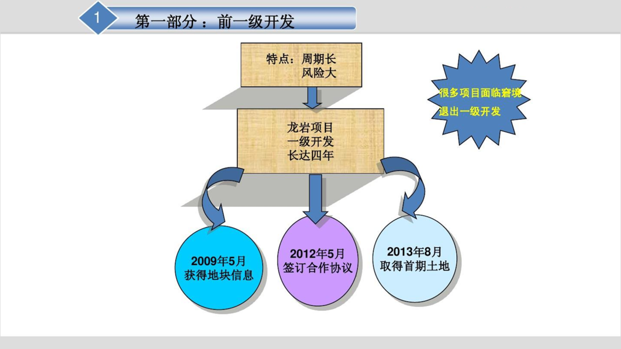
Well, in order to make this kind of PPT page have a more design sense, first reorganize the logical content.

Next, you can design according to the style of the structure diagram and display it with the following relationship diagram, and the page will be very clear.

The above pictures and case materials are all from network sharing, intrusion and deletion
There is so much to share about this topic, I hope it will be helpful to you.
See you next time!
Articles are uploaded by users and are for non-commercial browsing only. Posted by: Lomu, please indicate the source: https://www.daogebangong.com/en/articles/detail/How%20to%20make%20good%20use%20of%20the%20basic%20shapes%20in%20PPT%20to%20make%20beautiful%20pages%20share%205%20cases.html
 支付宝扫一扫
评论列表(196条)
测试