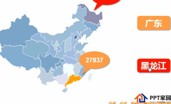
There are a lot of data in the PPT table, and I want to use the area to represent it, so the number of display in the map of China is clear and clear. The following is the rendering. Let's take a look at the detailed tutorial.
1. First of all, we have to make the shape of the map, annotations, etc. as basic tools.

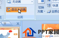
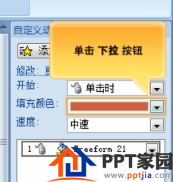
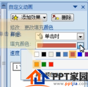
2. Select the Guangdong region, click the animation tab, customize the animation, and add effects. In Effects select the Emphasis option, and in the selection change the fill color.

3. Use the fill color drop-down menu in the custom animation on the right, and click Color.
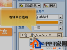
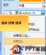
4. Right-click the option, select the timing option, open the timing dialog box, click the trigger button, select the activation effect when the following objects are clicked, and select the corresponding Guangdong image in the drop-down list. Final confirmation.

5. Select the graphic, click Add Effect, select the appearance effect in the entry, and adjust the animation sequence.


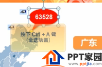
6. The same is true for the animation of Heilongjiang, let’s practice it yourself!!! The steps of Heilongjiang are done. We select the graphics, and hold down ctrl+a to select all animations, and then set the start to before in the custom animation window.


7. Finally, we click the slide show button in the lower right corner to view the effect.
The above is the method of making a map of China. It is very simple. It is very convenient to display the data and the region can be clearly seen.
Articles are uploaded by users and are for non-commercial browsing only. Posted by: Lomu, please indicate the source: https://www.daogebangong.com/en/articles/detail/How%20to%20make%20a%20data%20display%20chart%20of%20China%20map%20in%20PPT.html
 支付宝扫一扫
评论列表(196条)
测试