Author: Little Hedgehog Authorized to reprint from: I am Design Wet
Students often ask that when designing a LOGO, due to the constraints of specific industries and brands, they don’t know where to start. After learning the composition and expression forms, they still feel at a loss when encountering constraints. So in the next few articles, we will analyze ideas and practice cases for several common industries, so that everyone can easily start when designing LOGOs for similar industries in the future.
Overall thinking direction
Students who have seen previous LOGO tutorials will be more familiar with it. When analyzing a specific LOGO, I often talk about ideas and techniques separately. This set is no exception, and we're still going that way. In fact, whether it is the specific industry attributes or the brand's own differences are prominent. In terms of ideas, LOGO design still has common elements and meanings in the industry; while in terms of techniques, composition, color matching and common techniques are also basic methods that are often combined and used.
So here comes the point, we have to do a few things.
1: Accurate tonality; (logo reference of the same type and style)
2: Extraction of common elements; (Mama no longer worries that I am confused
3: Difficulties in performance techniques to overcome; (It was so easy, I patted my head again)
Tonal and Elemental Analysis
Before starting the design scheme, we first need to have a basic cognition and understanding of the LOGO of the same industry. In this part, we will not involve the analysis and differentiation of commercial projects for the time being, but mainly focus on the visual aspect. Collect and sort out the common LOGOs of the agricultural product industry, and we can extend the cases of different industries but with similar tones, which can broaden our thinking.
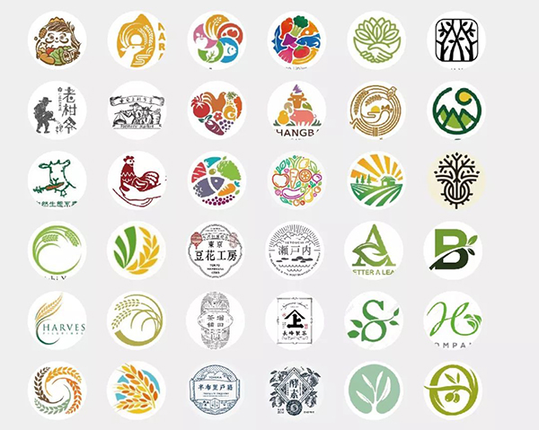
It can be seen that the tonality conveyed by most of the agricultural product LOGOs is simple, natural, humanistic, and friendly. So we are basically clear about the major tonality. Next, analyze which elements are commonly used.
Industry directly related elements
The so-called industry directly related elements are not difficult to understand. It is the elements related to agricultural products. The most frequently appearing elements in the LOGO are: landscape, natural crops, wheat and rice, poultry animals, green plants, etc.. According to the actual situation, you can consider which ones to integrate with the main products of the brand. directly associated elements.
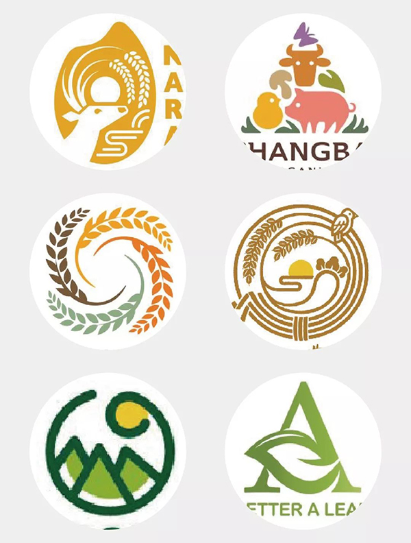
Enterprise directly related elements
What about the directly related elements of the enterprise? That is, the specific part is stronger. Take the following four as examples.
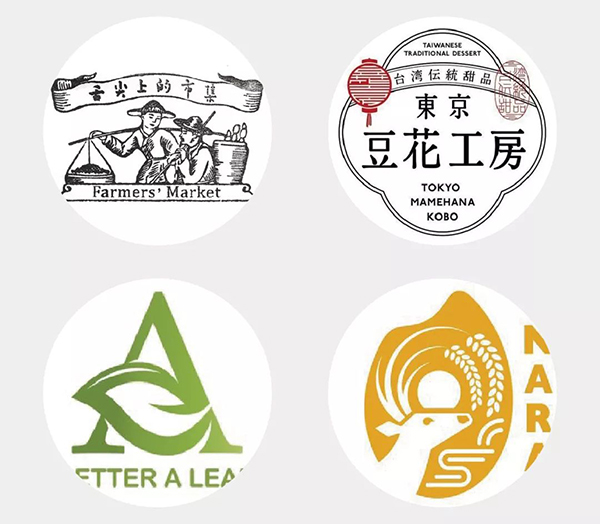
[Bazaar on the Bite of the Tongue] The clothes and gestures of the characters should all have very strong regional characteristics. It is not difficult to understand that they should have a very strong direct connection with the location of the company and its products.
[Douhua Workshop] directly uses the corporate brand text as the core of the display with badge-style typography.
[A] The letter A is the initial letter of the brand, and it is also an element directly related to the enterprise, but the letter LOGO is not widely used in agricultural products.
[Rice] The form of rice serves as the shape, which can directly highlight the main product category.
Elements like this are directly related to the enterprise.
Implies indirect association elements
In what scenarios does it imply that indirect associated elements are more widely used? It’s the feeling that Party A’s papa told you that our LOGO should wear Pinru’s clothes. Since you are looking for excitement, you need more.
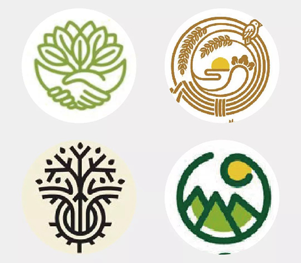
In this case, we need to integrate more elements to reflect rich connotations and meanings. For example, [hand] means hard work and natural work; [bird] means a bright future and a free future; With the hope of thriving... and so on. These elements that are indirectly related to industry attributes have a better effect in making up for the logo space and enhancing the meaning of the logo.
Analysis of common techniques
All the techniques are actually the results obtained based on the basic composition method. This sentence may not be understood by you now. It will be clear in the practical part of the case. Several common techniques for agricultural products, I have summarized six more common ones, just for attracting jade, there may actually be more.
Portrait, animal performance
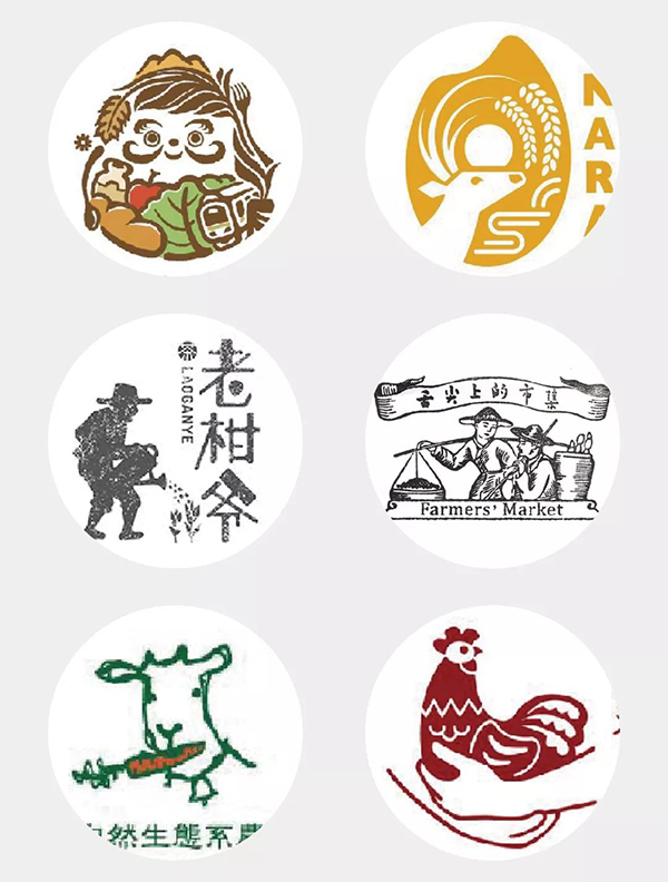
Portraits and animal images have the highest applicability and frequency of use in agricultural product LOGO design due to their simple temperament and strong sense of humanity. The practical part of the case will involve some skills in this area.
Multi-element fusion
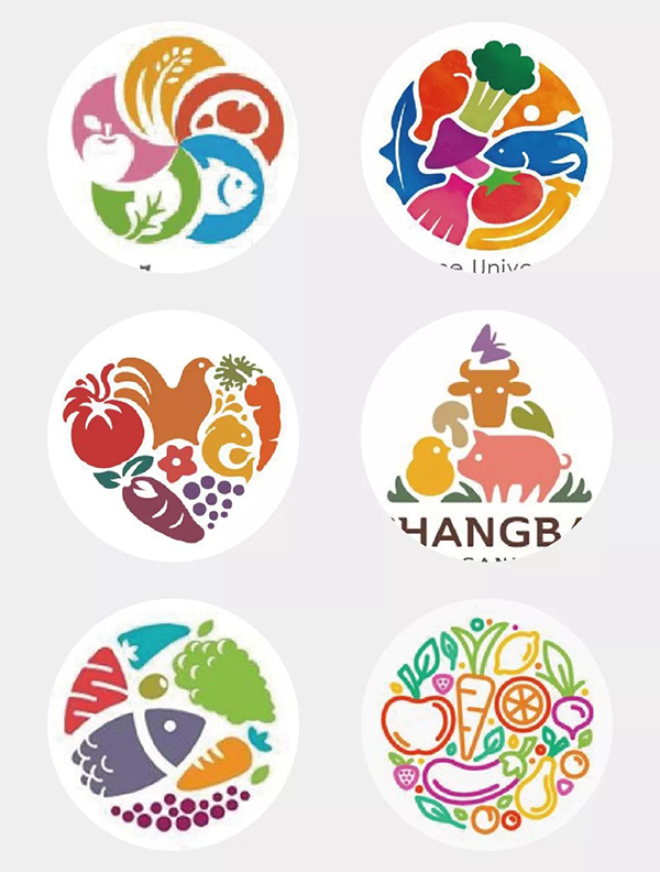
The form of multi-element fusion is also relatively common. The difficulty and the key point are that the elements are refined reasonably, the size ratio between elements is coordinated, the space is reasonable, and the density is consistent. Avoid the problem that some elements are too fine to be recognized, or a certain element is too large to cause the overall imbalance. The outer contour is similar to the heart shape and triangle. Pay attention to the stability and the fit between the inner figure and the outer contour.
Single element deformation
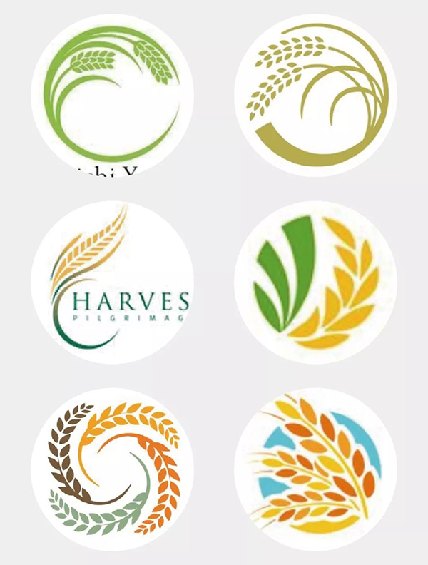
The core point of the deformation of a single element is that the single element itself should be refined enough. The direction of deformation can be considered from the deformation of the outer contour or the adjustment of the element itself. For example, in the above two schemes, the large-scale outer contour is the prototype, and the fine-tuning produces changes, and a new scheme is produced by changing the shape of the internal wheat. The third is to remove the outer contour and stabilize the whole through typography. The fourth is to enlarge the part of the adopted element; the last two are to obtain new schemes through repetition in different ways.
Font badge style
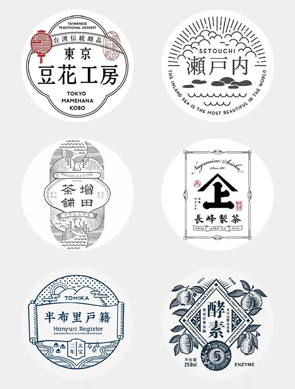
The font badge style is also a very common form in the logo of agricultural products. There are two major directions, one is dominated by font design, and the other is rich in graphic details. Each has its own advantages and disadvantages. In fact, if fonts from the font library are used, the difficulty of the graphic part is not that great. The core techniques are similar to those of portrait animals.
Integration of linear elements
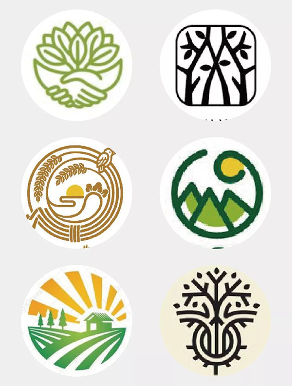
The integration of linear elements is to complete a single element through the linear structure, and then find the spatial relationship between the elements to fill in or integrate them through the outer contour, similar to the combination of the second rectangle and the third circle. The details need to be noted that the thickness between the lines needs to be relatively uniform, and the space should be well-proportioned to avoid a certain part from being too crowded or sparse.
Initial combination
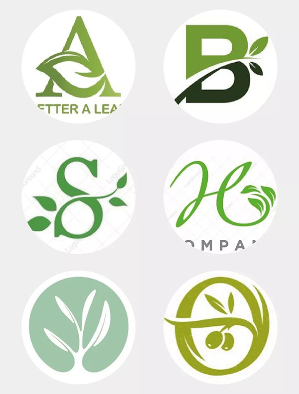
Case practice
It's finally time to get to the practical...fucking... part, and I'm a little excited just thinking about it.
This case is a business case in the early years. The brand name is [Pufeng Liangnong], which mainly deals in agricultural and sideline products. The brand keywords are refined as: original ecology, rare, ancient and handmade. After the basic information is clear, we extract four elements from the above common elements, wheat, clouds, rivers, and farming. First of all, we need to draw these elements. When it comes to painting, many students start to be confused. What should I do without ten years of art skills?
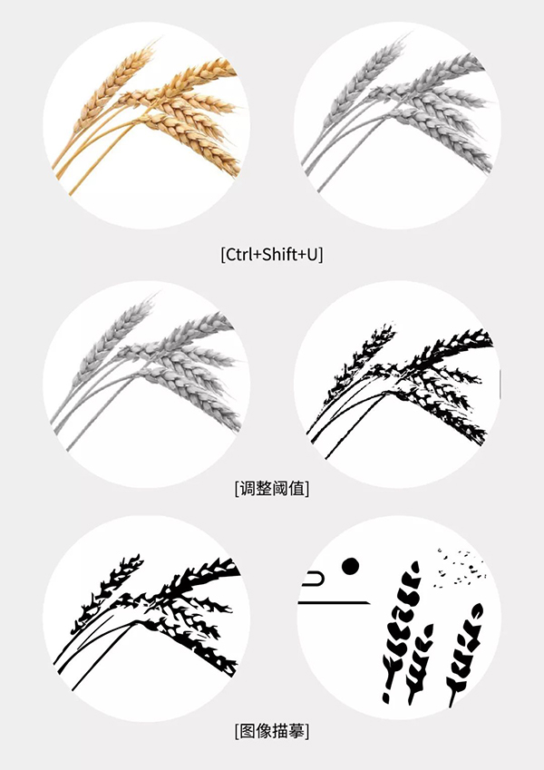
Not much to say, let's just operate it directly, and you can get the effect you want in just three steps. Find a suitable reference according to the desired elements. Taking wheat as an example, the reference picture needs to meet the characteristics of a clean background and clear layers of black and white elements.
1. Decolorize the picture, the shortcut key is [Ctrl+Shift+U].
2. [Adjust the threshold], the effect is that the ratio of black and white is relatively balanced.
.Drag the adjusted picture into AI, [image tracing] to get vector graphics, and optimize the details to get the final plan.
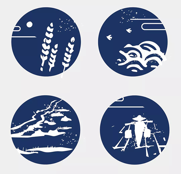
Use the same method in turn to draw other elements. Put all the elements in a frame and build a scene, using a processing technique similar to multi-element fusion. Finally, match it with a suitable font design. Our agricultural product LOGO is basically completed, let’s extend it a bit.
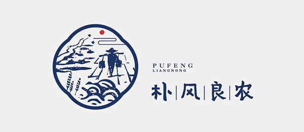
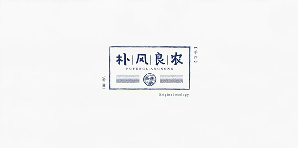
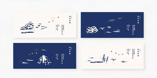
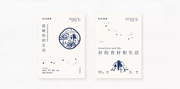
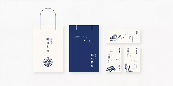
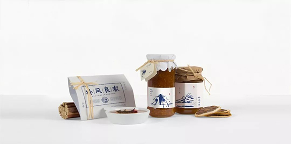
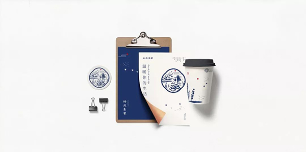
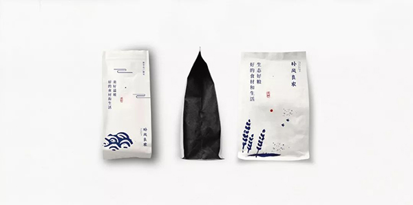
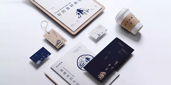
(Is it really that simple? Don't doubt yourself, you're a genius)
Articles are uploaded by users and are for non-commercial browsing only. Posted by: Lomu, please indicate the source: https://www.daogebangong.com/en/articles/detail/How%20to%20make%20a%20LOGO%20of%20agricultural%20products%20in%203%20steps%20and%20make%20ordinary%20people%20feel%20unaffordable.html

 支付宝扫一扫
评论列表(196条)
测试