
Go on to answer everyone's questions, but this one, only answer one of them, because this question is relatively big: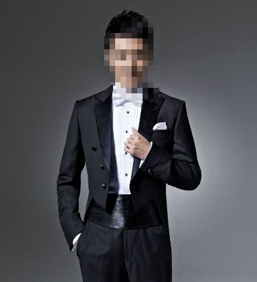
How to judge the quality of a font is also a question I am often asked, and it is also a big problem. Today, I will explain it carefully:
First, be clear about what you want to do. The daily propositions of our font gang include commercial propositions and personality exercises, and most of the commercial propositions are my virtual ones. Occasionally, Party A will offer rewards, such as yesterday. And those personality-type propositions, all kinds of themes are readily available, such as "double-click 666", "hardcore", "Ollie" and other Internet hot words, such as "obsession", "irony", "childhood" These commonly used words, such as "Lichun", "Mid-Autumn Festival", "Winter Solstice", "Christmas" are related to festivals and solar terms.
So here comes the problem,Commercial fonts and personalized fonts, in the design What's the difference when Look at two pictures first: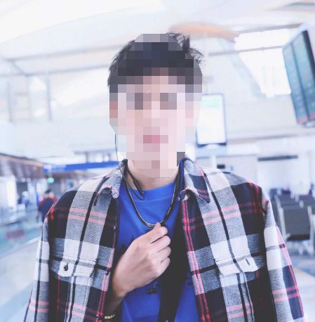
The first one: suit and leather shoes
Second photo: Relax and relax
With such an example, everyone should understand what it means.
When making business propositions, we must be clear that these propositions have a clear purpose. As a font logo for a brand or product, it generally needs to be more formal and standardized, not willful, let alone messy.
When designing a personalized proposition, the design sense of the font is allowed to be relaxed, even exaggerated, and it is allowed to add appropriate graphic creativity, or add appropriate word effects, because what we have to do is simply to express the meaning of the word or Related scenarios, do not need to consider too many practical issues.
Then, let’s take the submitted works of Font Gang as an example:

This is a business proposition two days ago, about real estate. The above are two examples of works on the list. They are very standardized and rigorous. The design of the strokes is just right, including color matching, which is also in line with the real estate industry. tonality. So, this type of font should not be too casual, because once you are casual, once you do it too creatively, too boldly, you will be "unserious", just run away Off topic. Think about it in the opposite direction. If a real estate logo makes a very playful and fun feeling, then who dares to buy this house with confidence. For example, this example submission: 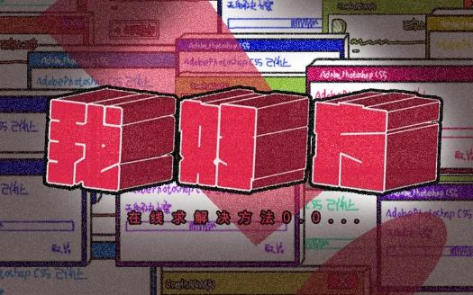
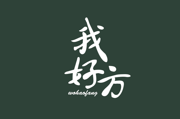
Let’s take a look at an example of the proposition of the personality type, the previous "I am good":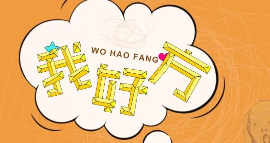
The above two are two of the works on the list that I think are good. Through different angles, they reflect the feeling of "square", including color matching and layout, which are also very relevant and in line with "I like square" " related scenarios. 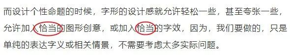
And this example is an ordinary handwriting. To put it bluntly, it is plain and simple.
Obviously, such a design has no sense of substitution and no atmosphere. I'm so good, I can write like this, rainbow fart, I can also write like this, I can write like this, I can also write like this...
So, for personality propositions, we generally need to convey the proper atmosphere and feeling through the design changes of fonts and strokes according to the meaning or emotion of the font, and then through the color matching and layout of the scene, so that people can see it , you can instantly feel your creativity or emotion in it, instead of forgetting it in a flash.
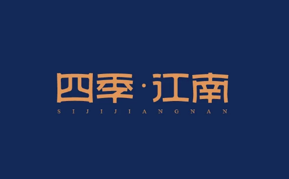
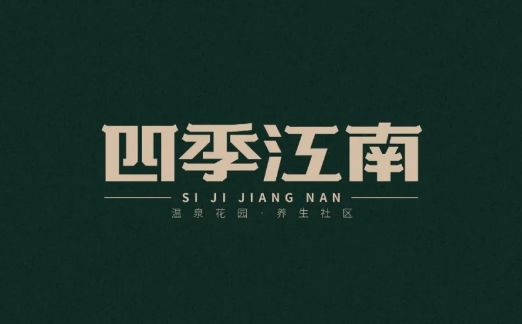
Above, one case of "Four Seasons Jiangnan" and one case of "My Way", I have explained the problem of what to do from two extremes, whether it is commercial or personal Theme. So, first figure out the direction, and then go to work, don't do useless work. Of course, there are also many propositions, such as snacks, pregnancy and infants, games, etc. The fonts can also be relaxed, and you don’t need to be so rigid . Also, it is also critical to determine the general direction and the small direction. The so-called small direction refers to the choice of strokes. Whether the font should be flat or tall and thin, whether the strokes should be thick or thin, soft or hard, whether it needs to reflect the sense of age or show the trendy atmosphere, it has to be determined according to the theme. deal. Here, we will not expand on it. The general direction is clear, let’s discuss the second criterion:Moderate and appropriate fashionable. In fact, at the beginning, I have already mentioned it: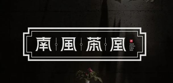
Whether it is commercial or personal, it needs a proper sense of design. If the force is not enough, it will be vague, and if the force is too strong, it will be too much. Continue with an example:
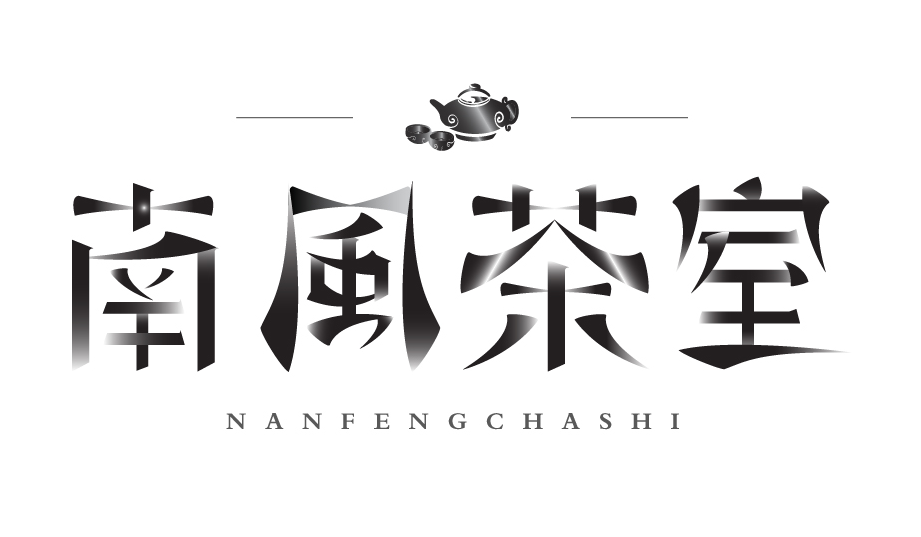
The picture above is the previous work of Nanfeng Tea House. The design of the font, the details of the layout, and the decoration of the outer frame are all done properly, and the force is just right. A good example of work. 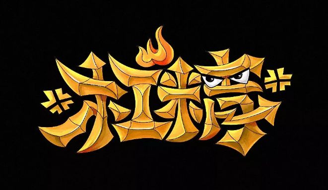
In this case, we can also see that the author also wants to reflect the ancient or traditional feeling through the details of the strokes, but the degree of deformation of the details of the strokes is obviously out of control, including these gradient colors. It is unnecessary, this is "excessive force". Look at this example again, "bar essence": 
This picture does not need to be explained, the font, font effect, and graphic elements are all very mature, stable, accurate, and ruthless. After people see it, they can immediately imagine the "bar essence", that's how it should look. 
In the example above, there is no problem with the font, and there is also a large and small comparison. It can be seen that the author also wants to be more flexible, but the overall font is indeed too regular and conservative, so it is difficult to present" Lever fine" look.
We can't say that this word is bad, but we should be wild and bold in the face of such a meaning of the word, and not be so honest.
This is "not pushing hard enough."
Whether it is "too much force" or "not enough force", in the final analysis, it is still a matter of experience. Here, I have finished two points: One: Be clear about what you want to do. Two: Moderate and appropriate sense of design. Next, let’s talk about the third point: Three: Glyph details and completion. The third point is the most troublesome and cumbersome. However, for the font lovers, it is the easiest to explain, because I write fonts every day in the "Daily Comments" of the Font Gang detail. If you often read "Daily Review", you will find that I always emphasize the same details over and over again, here I make a rough list of problems:
1: The problem of font ratio, big and small, high and low;
2:The problem of inconsistency and inconsistency between strokes;
3:Some strokes are broken and small;
4:Stroke spacing problem, tightness problem;
5: The problem of uneven center of gravity between fonts;
6:The problem of ambiguous and unclear graphic expression;
7: The graphic creativity is too concrete and not concise enough;
8: position and typesetting between words;
9: Pinyin, English, typesetting of copywriting;
10:color matching problem;
11:The font effect is too cumbersome and inaccurate:
12:The stroke design is not simplified and not in place;
13:And frequent typos and typos.
…………………
Well, the so-called font details are a series of problems. When you understand these problems, then your font design will not be a problem.
Finally, a brief summary.
What exactly is a good font?
One, figure out the general direction;
Second, the appropriate design strength scale;
Third, perfect font details.
The difficulty of the above 3 points is gradually increased. Making fonts is like clearing customs and fighting monsters. It is not difficult at the beginning, but the middle process is a bit difficult. The ultimate big boss. The result is really fragrant! It's really cool! If you finish the last level without any effort, it's really meaningless, and it's impossible. I believe that every time you practice and pay hard, will definitely make you stand in the end. Font Help - Recommendations for recent font tutorials
▼


Articles are uploaded by users and are for non-commercial browsing only. Posted by: Lomu, please indicate the source: https://www.daogebangong.com/en/articles/detail/How%20to%20judge%20the%20quality%20of%20fonts.html
 支付宝扫一扫
评论列表(196条)
测试