Today, I will share with you how to use PPT2013 to draw compound statistical charts, mainly talking about the method of drawing bar compound statistical charts. For more downloads, please click ppt home.
ppt template article recommendation:
How to draw human figures with PPT
How to use PPT to draw pear effect
What should I do if the graph drawn by PPT is not closed
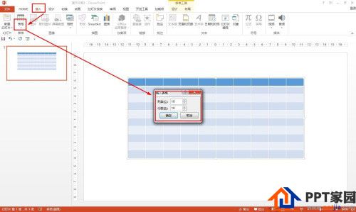
Click Insert - Table - Insert Table - Set the number of columns and rows to 10 - click OK.
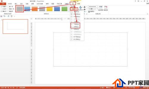
Click Design - select no style, grid type in the table style - click on the border to leave only the left border and the bottom border.
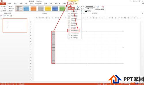
Select all the cells in the first column - click Design - Border - select the inner border.
Click Insert-Shape-Select Arrow-Insert Arrow on Vertical and Horizontal Coordinates-Click Format-Shape Outline, set it to black and thickness to 1 point.
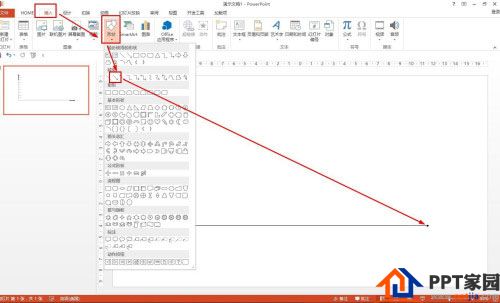
Then insert a text box to set the content of the ordinate and abscissa—insert different rectangles to represent the number of men and women, and draw a bar graph.

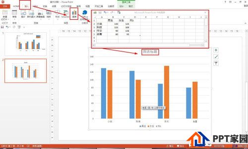
In the PPT, you can also directly insert a chart to draw a compound statistical chart: click Insert - Chart - select the column chart - set the category of borrowed books, set the series to boys and girls - enter data - and then design the title, so that you can Quickly make a compound statistical chart.
Articles are uploaded by users and are for non-commercial browsing only. Posted by: Lomu, please indicate the source: https://www.daogebangong.com/en/articles/detail/How%20to%20draw%20a%20compound%20statistical%20chart%20in%20PPT.html

 支付宝扫一扫
评论列表(196条)
测试